

The before and after of this South Seattle kitchen is doing the rounds on Pinterest and Reddit for all the obvious reasons. Dark blue tile climbing the whole backsplash wall. Teak slab cabinets. A big white quartz island with a wood frame around the base.
Almost every comment argues about the finishes.
The finishes aren’t the story. The thing that actually changed this kitchen is a move the designer made before a single tile went on the wall. Once you see it, you can’t unsee it in your own kitchen.
The bones were fine, the overhead wasn’t
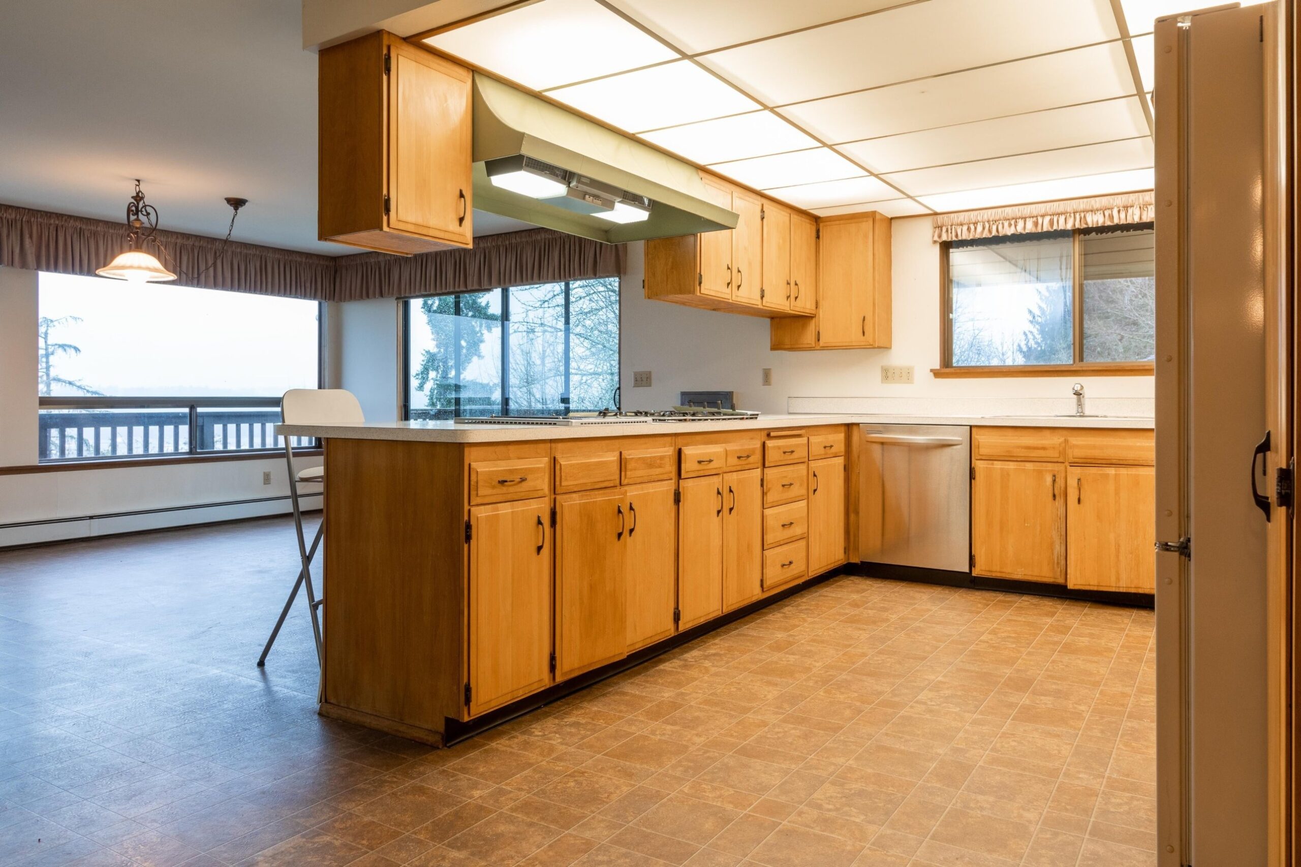
Here’s what the owners were living with. Maple cabinets that were still in decent shape. Solid-surface counters. A view through the trees that any Pacific Northwest buyer would pay for. The bones were fine.
The problem was overhead. A dropped box ran across the whole peninsula with a fluorescent light grid underneath it. A second lowered box held the exhaust ducting over the cooktop. Together they pulled the kitchen ceiling well below the dining room next to it. The room felt cramped before anyone even noticed the cabinet color.
The green hood tells you the decade
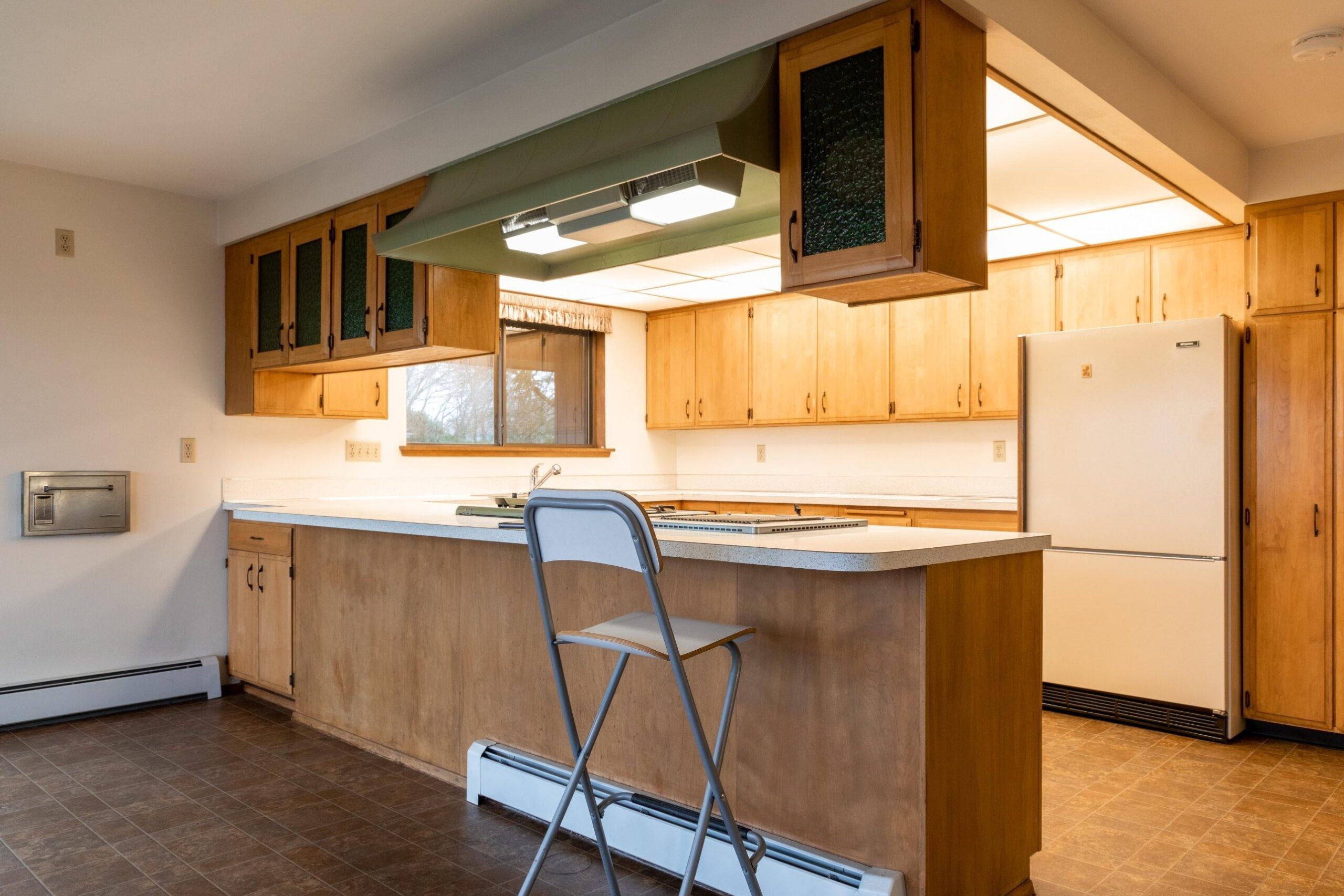
From the other side you can see the second lowered box over the stove, the green range hood, and the green glass accent cabinets. All of it hangs. All of it crowds. The eye never gets to go up.
Side by side, the ceiling tells on it
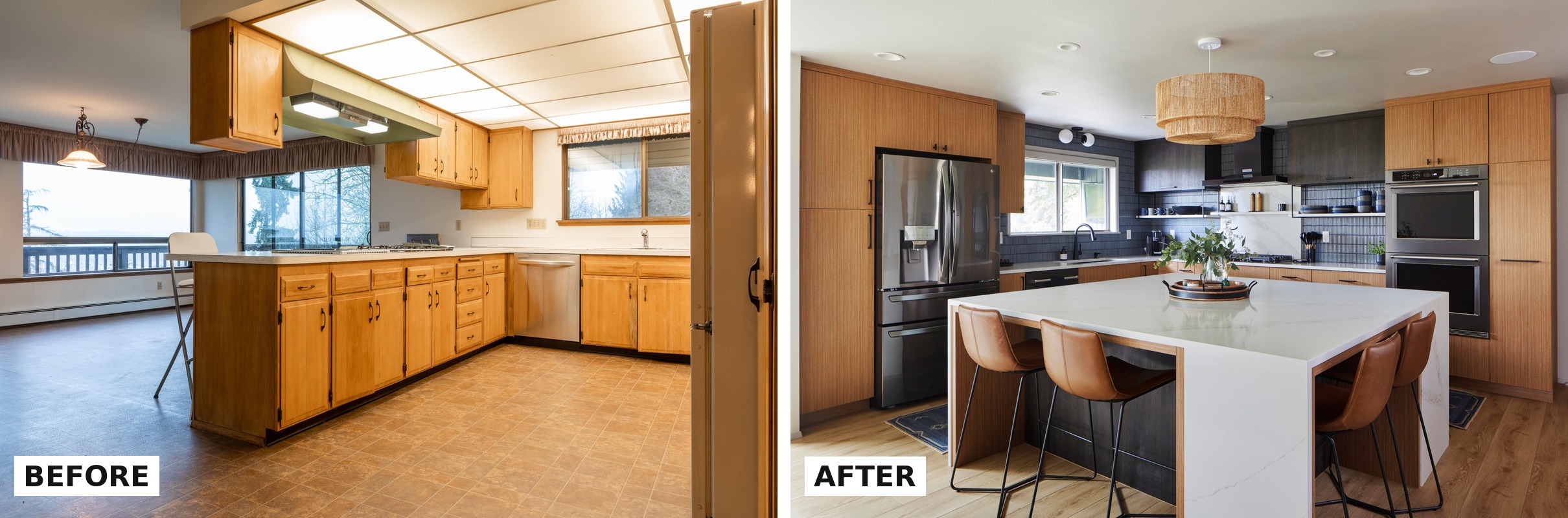
Side by side the change looks total. New cabinets, new counters, new everything. That’s the Pinterest story.
But look at the top of each frame. The ceiling on the right runs flat and continuous. On the left, it drops.
The one move that did the work
That is the move. The designer pulled out the dropped soffit. The entire lowered ceiling box with the fluorescent panels, the secondary bulkhead over the cooktop, all of it. Gone. The hood now vents through the back wall as a slim chimney stack instead of hanging from a lowered box.
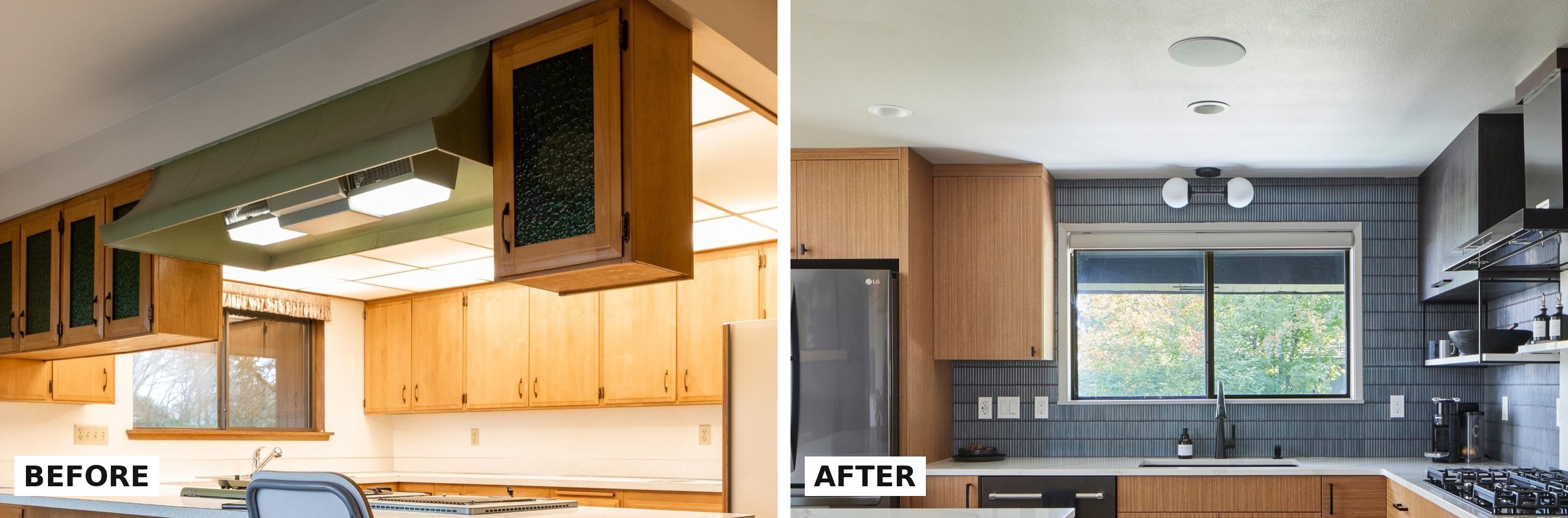
One frame tells you the whole story. Same walls. Different ceiling plane. The room feels twice as big because every square foot gained real vertical breathing room.
Now put the finishes back in
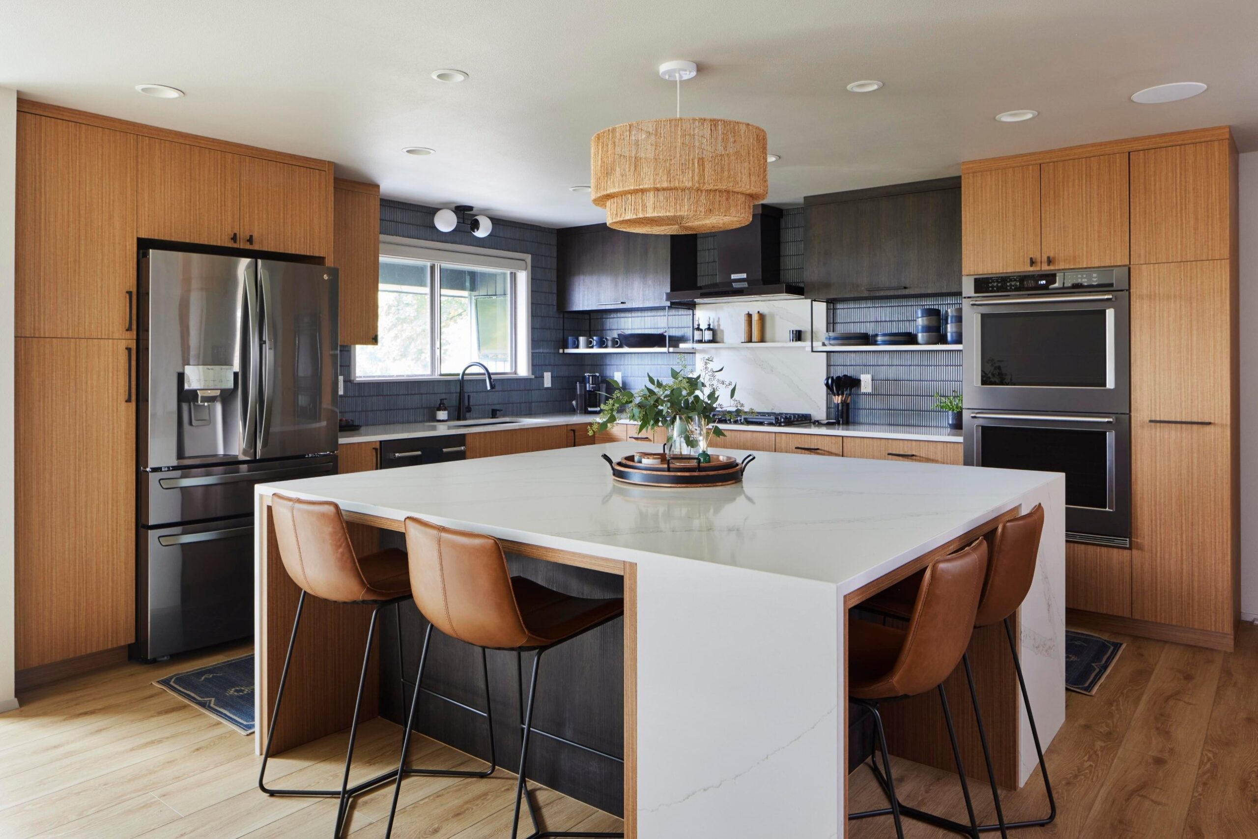
The dark blue kit-kat tile runs from counter to shelf and keeps climbing up the hood wall. It only reads as architectural because the ceiling above it is unbroken. Keep the soffit, and that same tile would cut the room in half.
The pendant finally has room
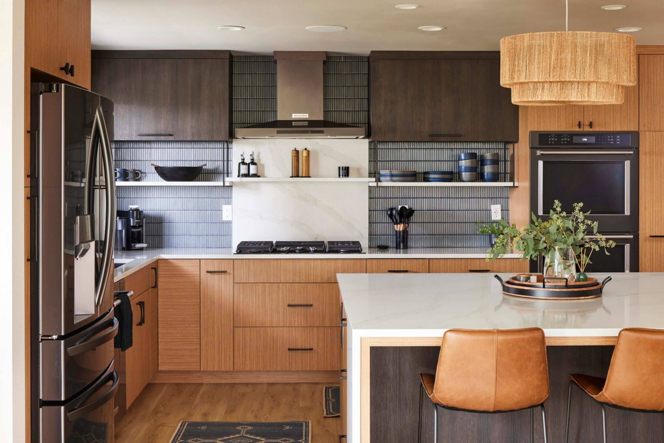
The chunky two-tier rattan pendant needs real ceiling height to hang without crowding sightlines. Under the old dropped ceiling it would have felt crowded. Here it has room to be a statement.
The open shelves work (one warning)
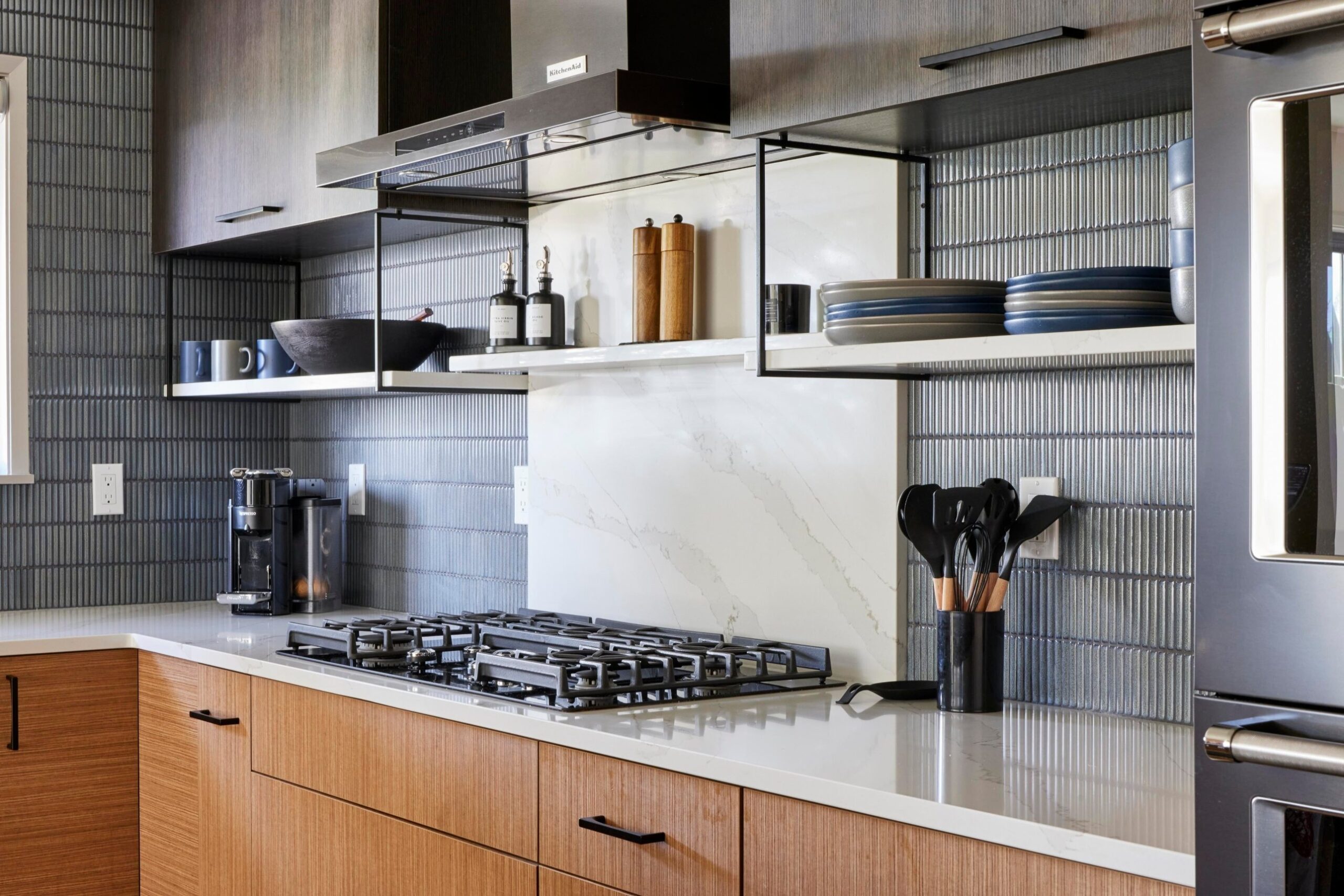
The open metal cage shelves work as a floating element because they terminate against a flat upper wall. A bulkhead edge would have made them look stuck.
Fair warning on this detail. Those shelves tucked between the cooktop and the hood will catch grease. Several Reddit comments flagged it and they’re right. The owners will clean more than most. Worth knowing if you’re thinking of copying the look.
Light the fluorescent panels used to fake
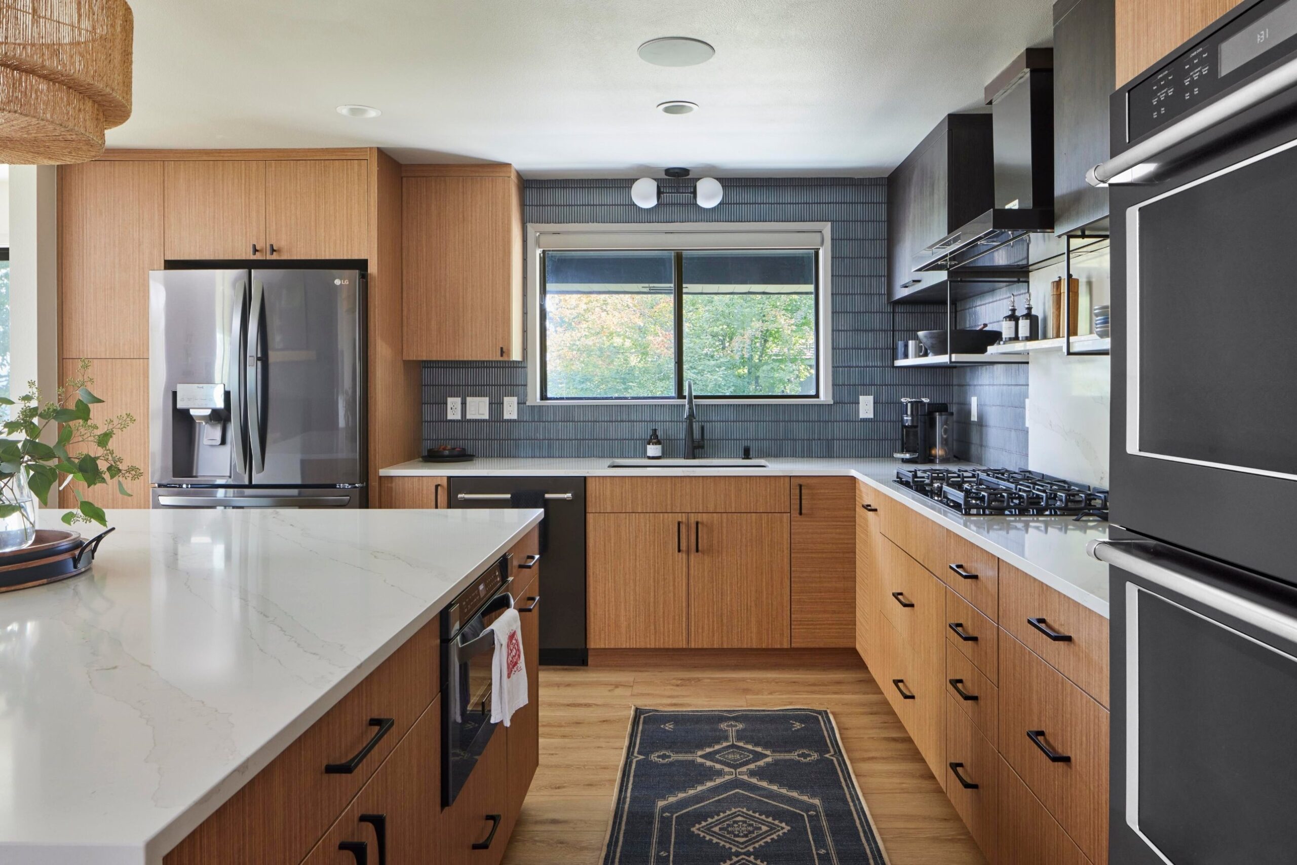
The valance is gone. The light the fluorescent panels used to fake now comes in for free through a cleaner stretch of glass.
What the finishes are actually doing
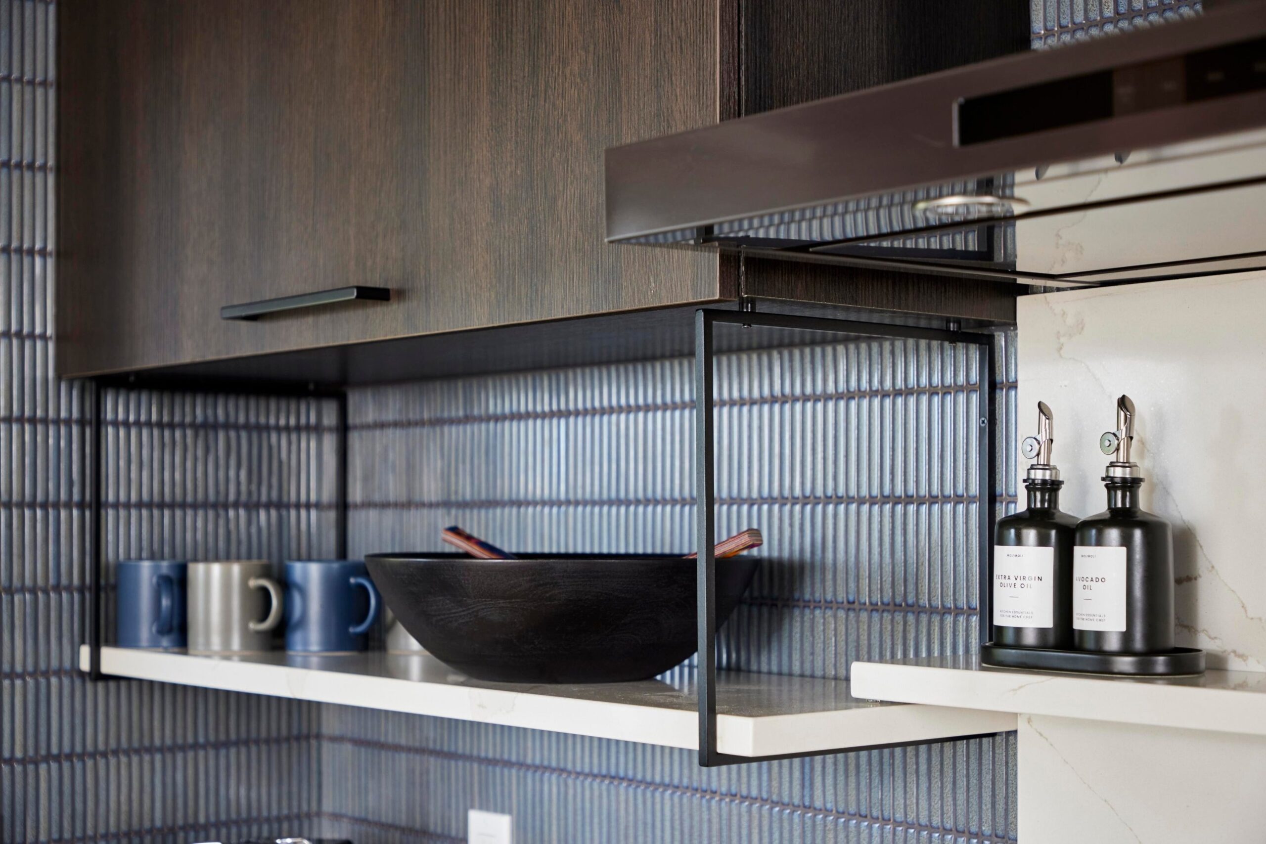
Up close you can see what the finish story is really doing. Matte black metal. Dark ceramic. Warm wood tones. The blue tile reads as background, not statement.
The whole level reads as one room
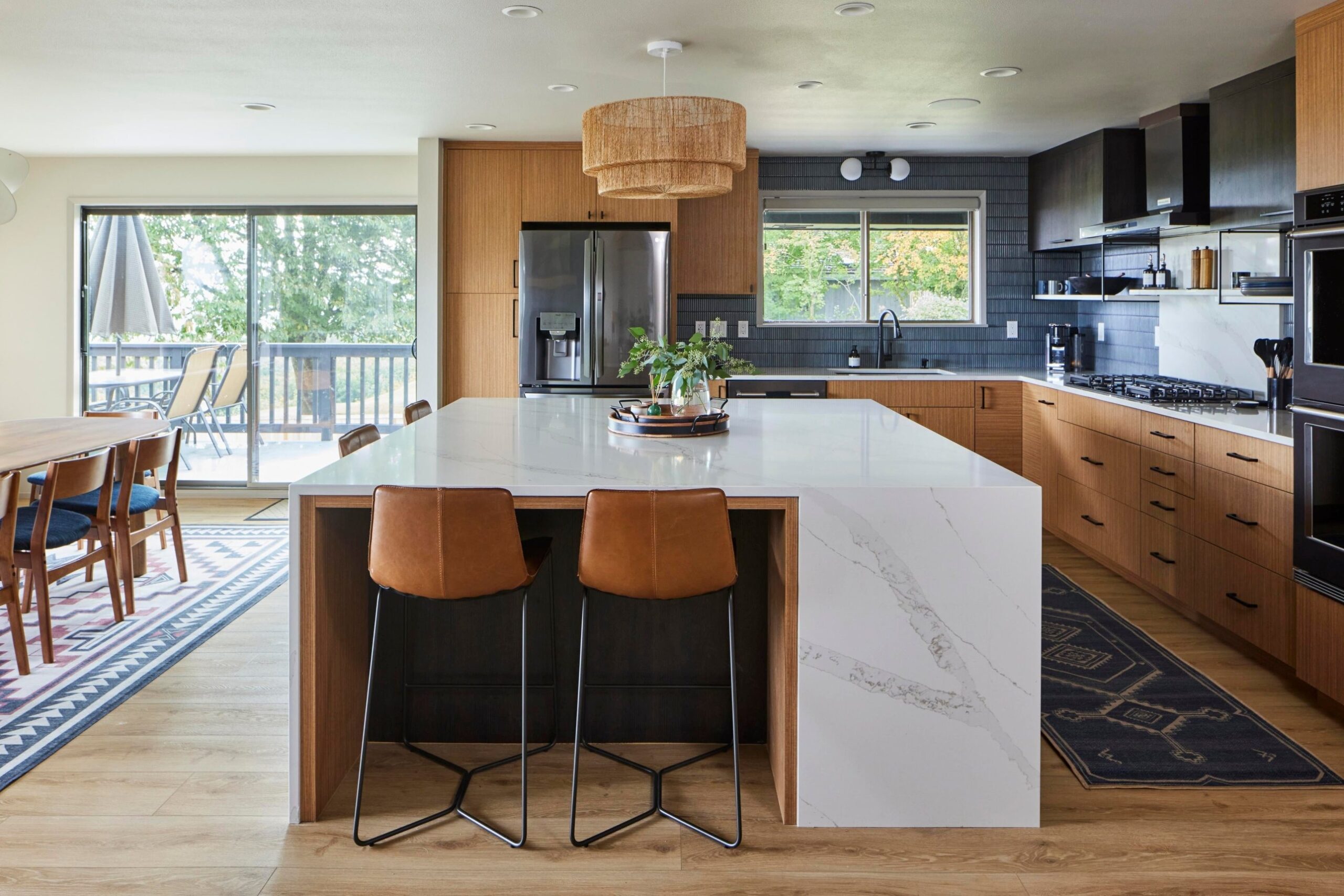
The old peninsula is gone, replaced by this big central island. A dining table a step away. Deck doors behind. The whole level reads as one room now because nothing drops the ceiling to divide it anymore.
Why cognac leather lands here
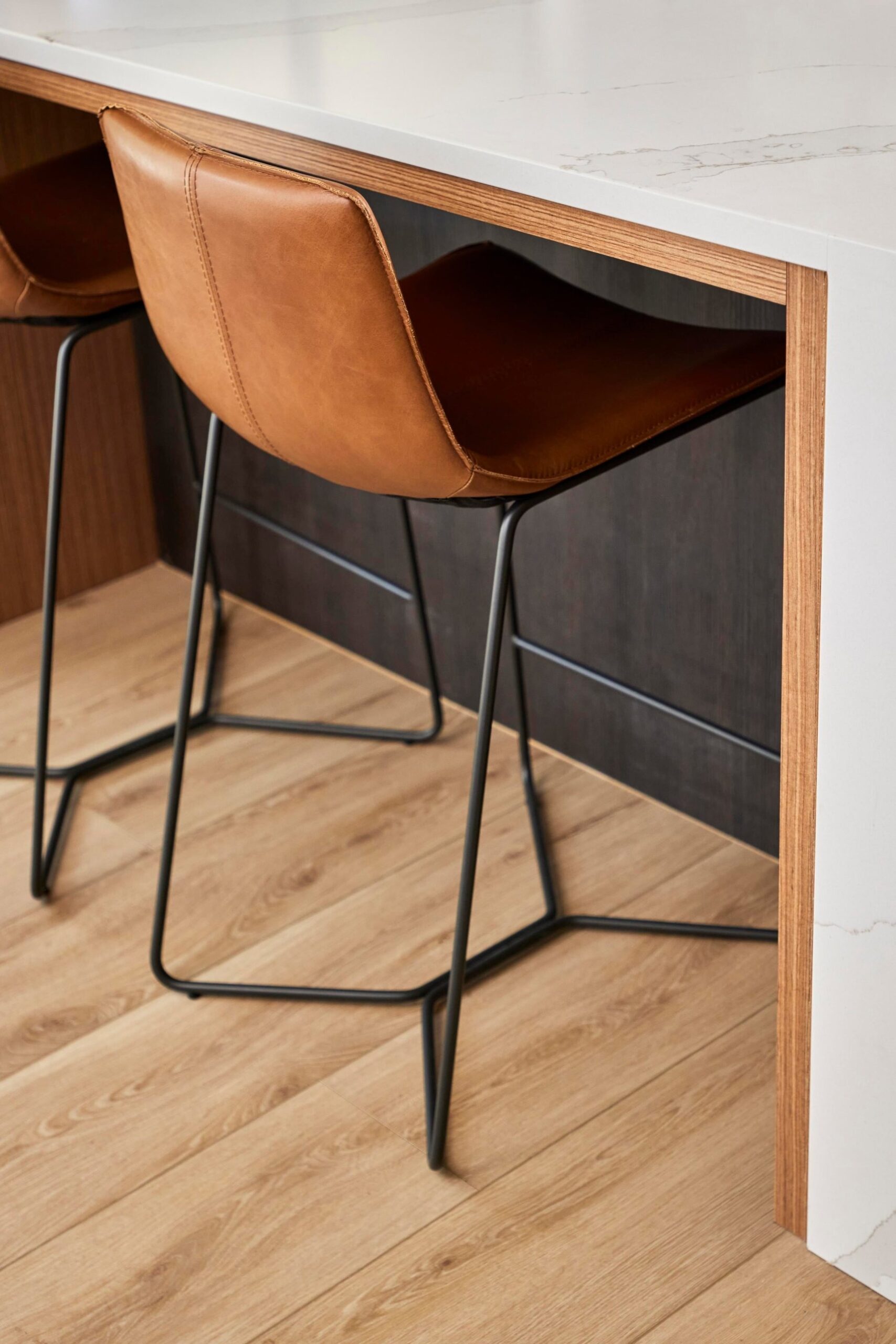
Even the stool choice benefits. Warm cognac leather reads soft against hard white quartz because the eye has somewhere to rest up top.
Look up before you price out cabinets
The takeaway, if you’re staring at your own dated kitchen: before you price out new cabinets, look up. A dropped soffit or a lowered bulkhead box is often the one thing standing between your room and the finished-photo version of itself.
That’s the move everyone is missing in the comments. It isn’t the tile.