View in gallery
When it comes to wine packaging design, that small stretch of paper on glass is seen as a blank canvas by some of today’s greatest designers. It is a space for both art and communication, a place where a designer can tell a story to a prospective buyer of fine wine. These 30 amazing wine packaging designs are amongst the best in the world, a complimentary list to 30 wine label designs we published in 2009. Together, these 60 wines represent the most creative and unique wine packaging designs on the market today.
Arrepiado Collection Wine
View in gallery
Designer Marta Neto wanted to create more than just a bottle of wine for her client, she aimed to craft a cult object for collectors of Portuguese wine. This bottle was designed for Herdade do Arrepiado Velho’s 2006 vintage, using inspiration from the company name itself in its development. The gold pattern is based on a simplified design of a bird beak, specifically the Arrepiado bird which is native to Portugal. Two beaks meet with a kiss, the “x” in the pattern above, which are then repeated across the bottle. That liquid gold splash certainly helps sell the bottle, but the design itself will certainly stand out on the shelf.
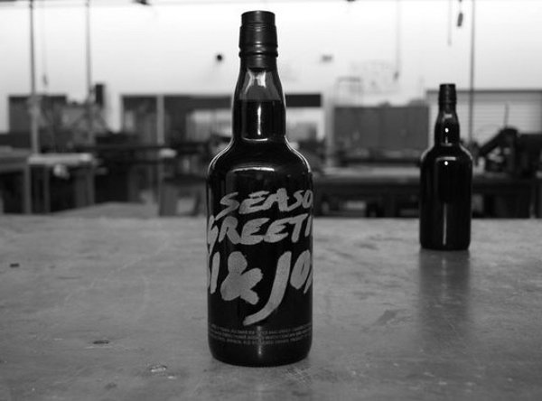
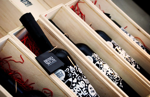
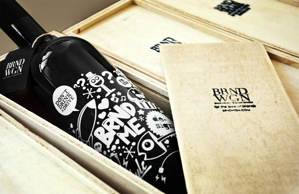
BRND WGN Christmas Wine
View in gallery
The Maltese design and brand consultancy BRND WGN gave their clients the gift of wine over the holidays. BRND WGN’s Christmas Wine was a chance for the company to thank their clients and show off their skills in a win/win for everyone involved. This wine packaging design featured a playful, illustrative pattern around the bottle which was then housed in a wooden box bearing the BRND WGN logo. While the black bottle, white print and natural wood yielded an attractive visual arrangement, it is the playfulness of the pattern that we enjoy most.
BRND WGN Christmas Wine Gallery
View in gallery View in gallery
 View in gallery
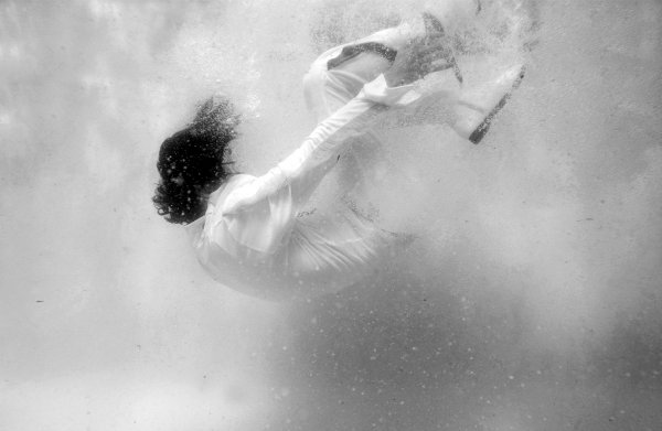
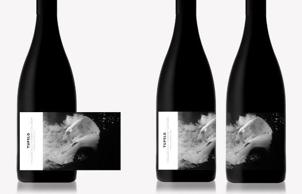
Tupelo Wines Packaging by Mash Design
View in gallery
When it comes to progressive wine packaging design, the people at Mash Design are the rock stars of the industry. We’re not talking trashed hotel rooms and groupies, but some of the best modern wine labels on boutique racks today. Tupelo Wines is inspired by the original rock star, Elvis Presley himself, so the hiring of Mash Design was a fitting choice. This label features a photograph of an Elvis impersonator immersed in the flood waters of Tupelo, the place of Presley’s birth. Since Tupelo is an Australian Cab Sav trying to find a niche in a flooded Australian wine market, the visual here is quite fitting.
Tupelo Wines Gallery
View in gallery View in gallery
 View in gallery
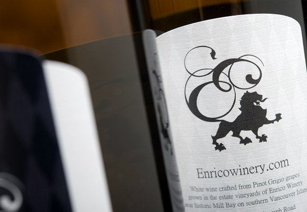
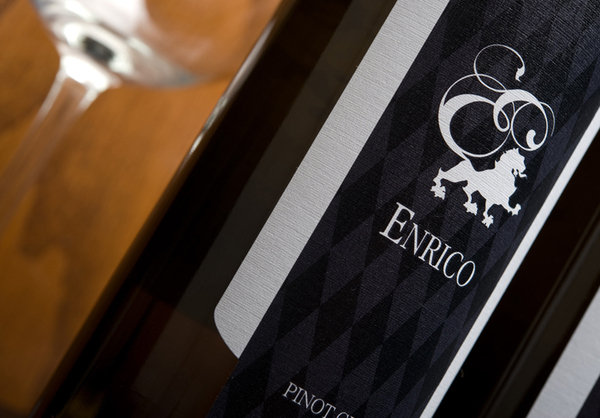
Enrico Winery
View in gallery
To launch their first vintage, Enrico Winery desired a wine label design that communicated regality– and Hired Guns Creative most certainly delivered. Hired Guns crafted a hand-illustrated logo of a lion set upon a checkered background with the feel of a stately tapestry. The logo and pattern are continued over the cork with a black-and-purple seal over the white foil. The result communicates the brand that Enrico Winery is working to build, a fitting bottle for their fine Pinot Grigio.
Enrico Winery Gallery
View in gallery View in gallery
 View in gallery
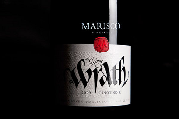
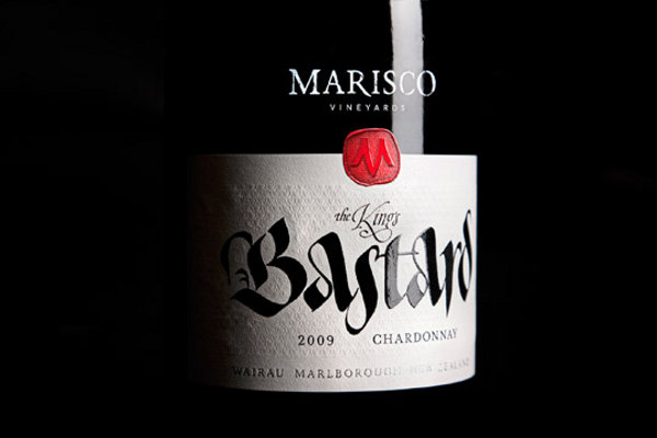
Marisco Vineyards Wine
View in gallery
The ancestry of Marisco Vineyards’ proprietor dates back to the Marisco pirates of Lundy Island, UK. In branding their wine, the vineyard hired designer Christopher David Thompson to give it a visual connection with the family’s history. Thompson responded by creating a line of bottle designs that recalled the story of the Marisco pirates, which was said to involve an assassination attempt on King Henry III himself. Each bottle is named after part of this story, including The King’s Wrath Pinot Noir and The King’s Bastard Chardonnay. The calligraphy by Peter Gilderdale completed the look for a series of bottles which have received commercial and award acclaim since their release.
Marisco Vineyards Wine Gallery
View in gallery View in gallery
 View in gallery
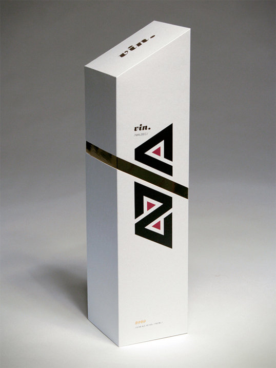
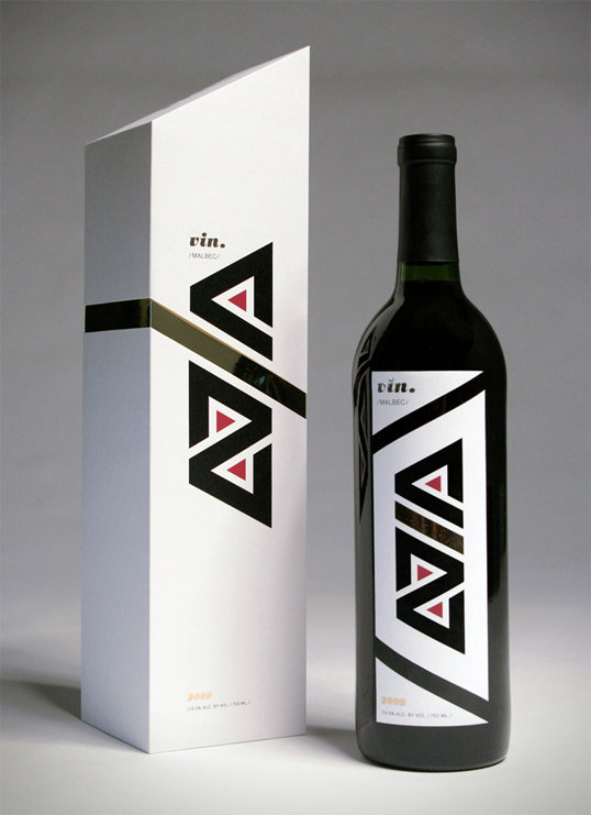
Vin Malbec
View in gallery
Designer Adrian Grilling developed this conceptual line of packaging for a brand of Malbec he has named “Vin”. The Vin wine packaging design features the word “vin” in an angular font on its side that is repeated on the box and the bottle. While the design was conceived for a student project, we’re confident that work like this will earn Grilling some real-world client projects.
Vin Malbec Gallery
View in gallery View in gallery
 View in gallery
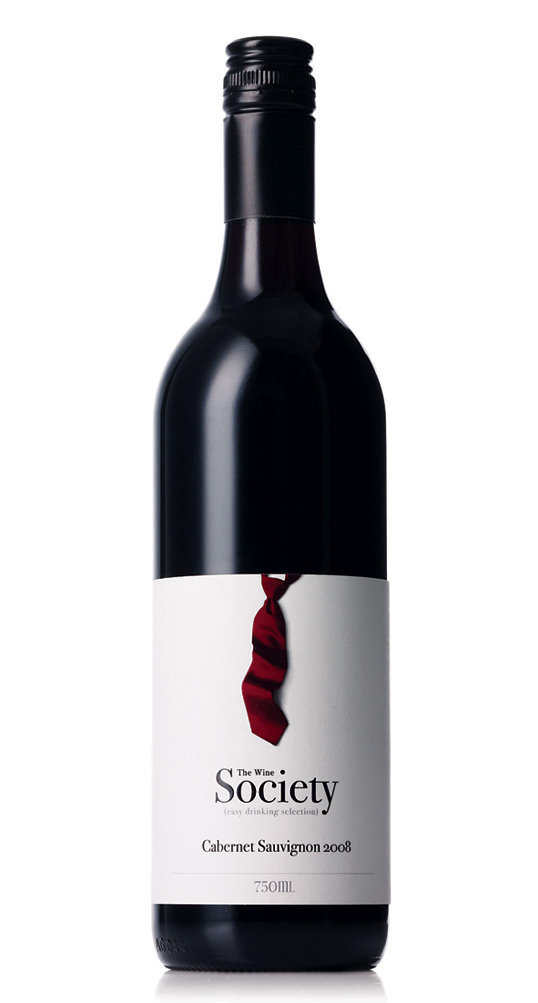
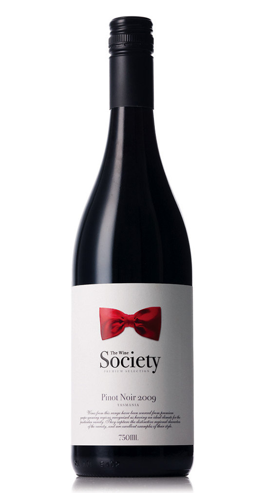
The Wine Society
View in gallery
The Wine Society recently rolled out a new design theme that is shared across over 30 different bottles of wine. The Society produces a large range of wines from value to premium and beyond, with each level and vintage getting its own neck wear identifier in design. The philosophy here is that neck wear in formal society is suggestive of different classes. For this wine, the bowtie denotes premium and fine vintages, whereas the loose necktie marks the value wines. Nice touch, courtesy of TheCreativeMethod.
The Wine Society Gallery
View in gallery View in gallery
 View in gallery
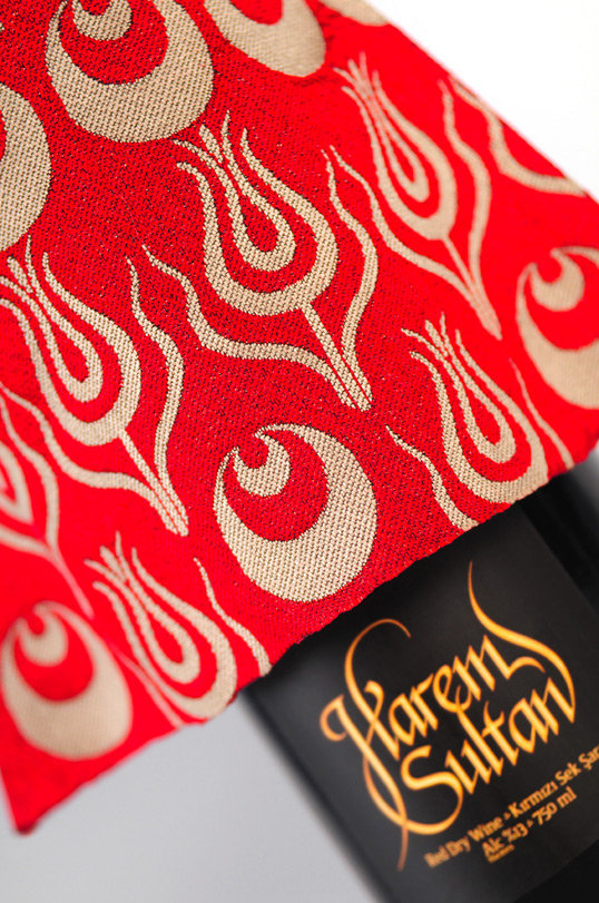
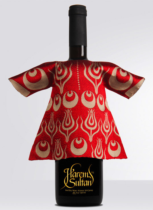
Harem Sultan Wine Packaging
View in gallery
Harem Sultan Wine is as much a lasting souvenir as it is a wine bottle, a keepsake for tourists after a visit to Turkey. Each bottle is dressed with a traditional kaftan of an Ottoman sultan, bearing the pattern worn by an historic ruler of the Ottoman Empire. These silk kaftans can be removed to pour the wine, then replaced upon the bottle as a conversation piece for Turkey travelers.
Harem Sultan Wine Packaging Gallery
View in gallery View in gallery
 View in gallery
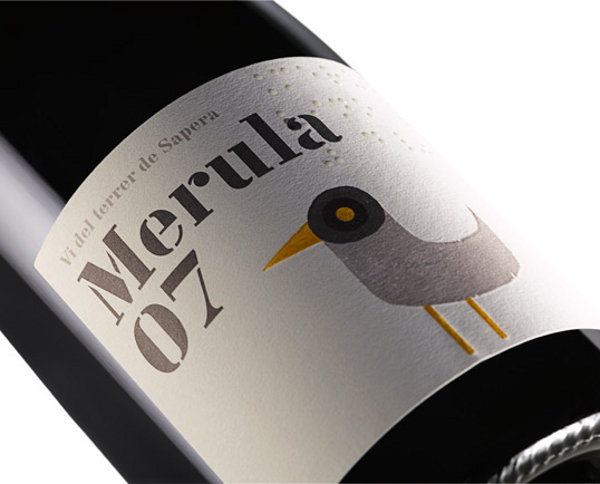
Merula Wine Packaging by Base
View in gallery
The Alt Penedes wine region outside of Barcelona, Spain isn’t known for its merlot grapes. Merula Wine chose this grape as its central focus, and wanted a design that was both progressive and historic at the same time. Merula is the name of a black bird that, when translated to Latin, shares precisely the same root as the word for merlot– mirlo, to be exact. The word “mirlo” was used to describe merlot wine because the color of wine these grapes produce is the same color as blackbird feathers. The designers at BaseNow used this history to craft a label inspired by the blackbird that pushes the envelope. Our favorite touch is how a “bird’s eye view” of the bottle and its yellow cork shows the face and the eye of the bird on the label.
Merula Wine Gallery
View in gallery View in gallery
 View in gallery
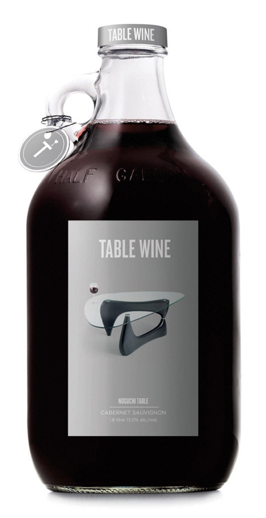
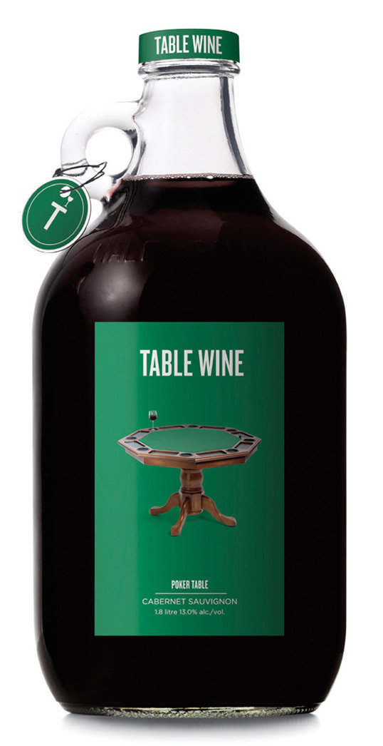
Rethink Table Wine
View in gallery
Jug wine is rarely a thing of elegance, but the people at Rethink Communications turned this truth on its head with their own wine packaging design. Rethink Table Wine is a conceptual product used to showcase this design firm’s talents with packaging. This series of wine labels features iconic contemporary tables like the Saarinen Tulip Table above, the Noguchi Table below and even the classic TV tray table. Let’s just hope these things aren’t filled with Carlo Rossi…
Rethink Table Wine Gallery
View in gallery View in gallery
 View in gallery
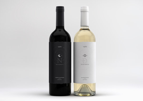
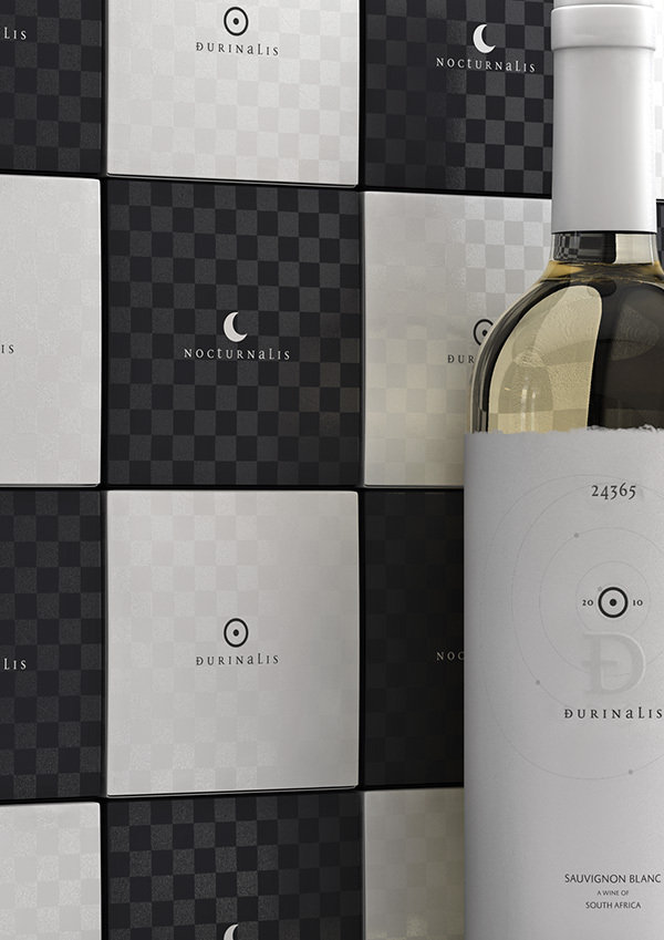
Nocturnis – Duralis Wine
View in gallery
To some wine lovers, the difference between white and red wines is one of night and day. Designer Marcel Buerkle created a series of packaging for two wines, a Cabernet Sauvignon and a Sauvignon Blanc, that represent the dynamic nature of the fermented grape. His Nocturnis and Duralis wine packaging designs are inspired by the moon and the sun and the movement of the earth between them. Their courses throughout the skies are documented on these labels, giving a starry sense of wonder for what awaits those who pop these corks.
Nocturnis – Duralis Wine Gallery
View in gallery View in gallery
 View in gallery
Skylark Wine
View in gallery
The progressive oenologic nature of New Zealand is featured often in this list, including this simple-yet-stunning wine label design by Inhouse Design. This series of classic red and Sav Blanc wines both bear the simple Skylark logo with an illustration by Hello Von, a London-based artist. It is the simplicity of the Skylark Wine packaging design that captured our attention, the same way it would if we were to find it on a shelf in our local wine boutique.
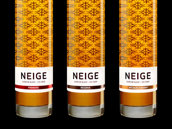
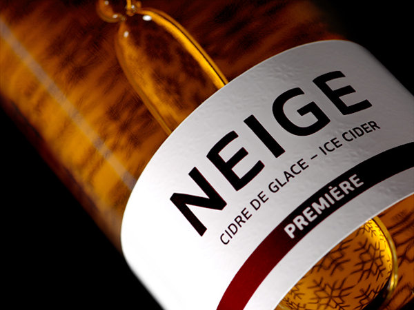
Neige Ice Cider Packaging
View in gallery
Neige Ice Cider is amongst the most premier ice ciders in the world, a delectable alcoholic drink inspired by ice wine production in chilly Quebec. Neige translates to English as “snow”, icons of which flurry behind the product that fills this bottle. The Neige Ice Cider packaging portrays the elite status of this drink in the world of hard cider, a recipe which yields a truly rare flavor in the world of fermented fruit cocktails. In warm summers or cold winters by the fire, this bottle and the drink within are both a treat to be enjoyed.
Neige Ice Cider Packaging Gallery
View in gallery View in gallery
 View in gallery
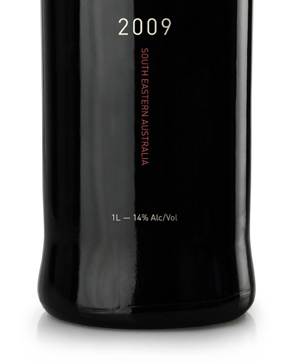
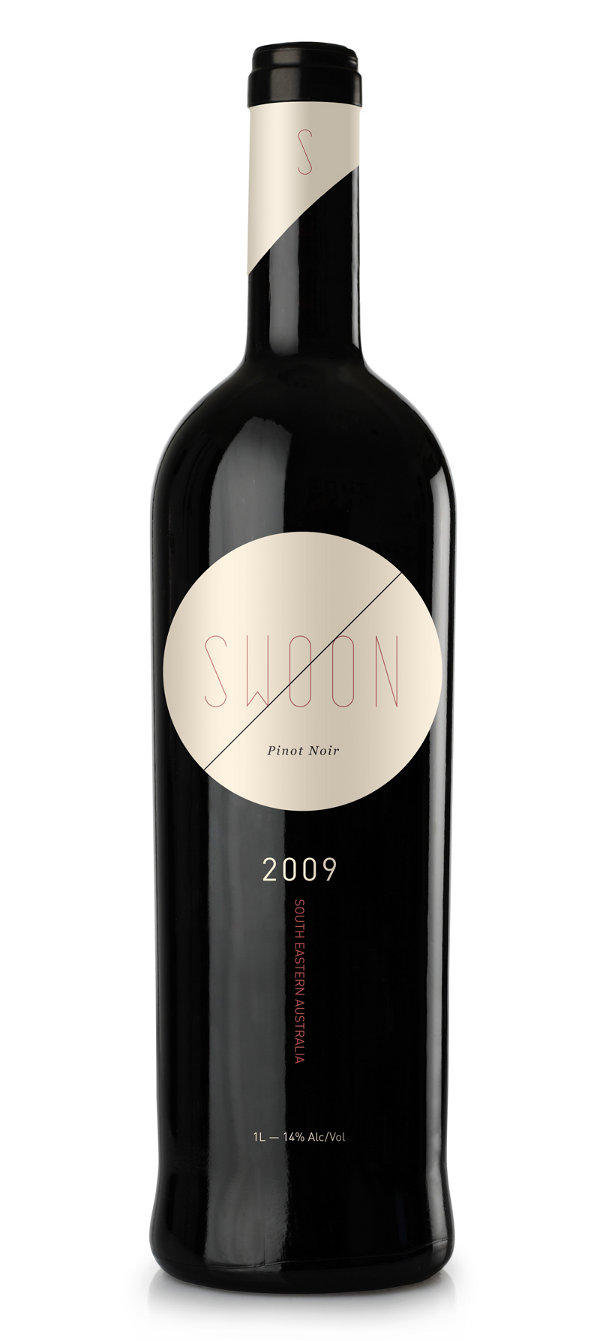
Swoon Pinot Noir
View in gallery
The simple design sensibility that led to the Swoon Pinot Noir design is one that has us, er, swooning. Designer Amanda Mocci crafted not only the layout, but the custom font which bears this wine’s name. This simple-yet-captivating design does a solid job representing the wine within, a bold Australian Pinot Noir that is lush with chocolate, berries and mocha. If that wine is as flavorful as this design, it is a success all around.
Swoon Pinot Noir Gallery
View in gallery View in gallery
 View in gallery
Tierra Earth Wine
View in gallery
The Monastrell grape is not an easy one to grow, nor is it easy to produce wine from. But Agapito Rico, a master of Spanish viniculture, worked to produce brilliant wines from this and other grapes in Spain’s wine growing region. The Tierra Earth Wine packaging design was created to honor him, to stock a fine Monastrell wine within and the earth from whence it came without. This, the work of Eduardo del Fraile, is a stunning and simple package, and we hope its execution avoids a drop of earth into the glass while pouring– that could devastate the value of such an unique wine packaging design.
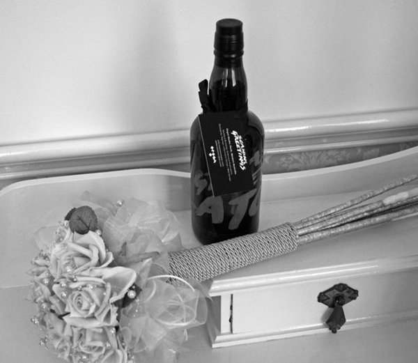
Organ Studio Christmas Wine
View in gallery
For the last holiday season, Organ Studio sent out bottles of wine to clients, friends and family as a thank you for their involvement. This fun, stylish bottle of wine is labeled with a hand-written font style that has been laser etched into the glass of these bottles. The neck is then fitted with a small card with thanks and well wishes by Organ Studio, an excellent way of showcasing their value in the world of design and branding. To us, it looks like this design fell right out of the pages of a Frank Miller comic book.
Organ Studio Christmas Wine Gallery
View in gallery View in gallery
 View in gallery
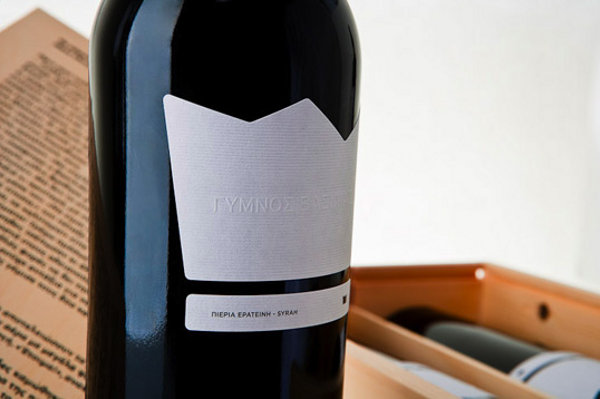
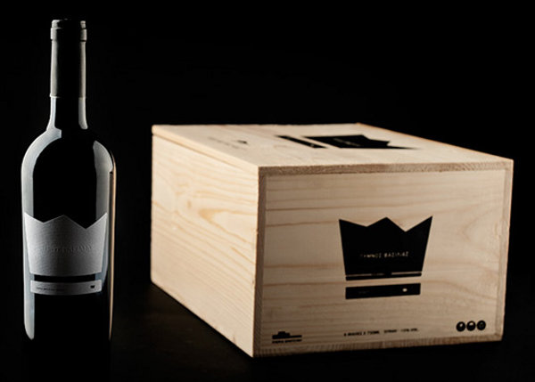
Naked King Wine Packaging
View in gallery
A fine Greek wine was produced to be the best of its growing region, a king amongst Grecian viticulture. BeetRoot Design Group was hired to clothe this wine, and adopted the tale of The Emperor’s Clothes to tell this story. The Naked King Wine, as it was to be called, showcases this wine wearing nothing more than a crown– no loud logo, no overbearing selling points, just a simple white crown on an otherwise blank bottle. To continue the story, BeetRoot placed a page of the story by Hans Christian Andersen on the exterior of the box with the words highlighted, “the king is naked”.
Naked King Wine Packaging Gallery
View in gallery View in gallery
 View in gallery
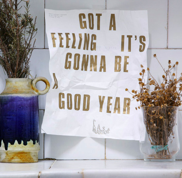
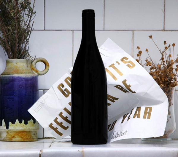
2010 Wine Packaging
View in gallery
This single-use wine packaging design is intended to help roll in the new year. 2010 Wine by Bendita Gloria is wrapped in a salutation of sorts, a message to be unrolled when the right occasion strikes. As the clock struck midnight and the year rolled over from 2009 to 2010, this wine wishes its drinker well for what is “gonna be a good year”. While 2010 is now behind us, we can at least drink to the one ahead!
2010 Wine Packaging Gallery
View in gallery View in gallery
 View in gallery
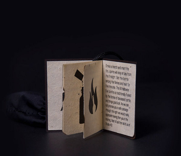
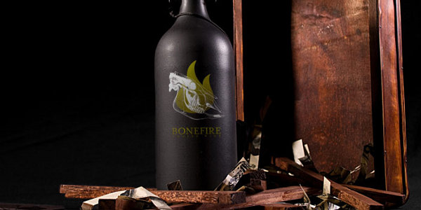
Bonefire Wine Packaging
View in gallery
The branding design for Bonefire Wine is a reference to the ancient Celtic observance of Old Hallows Eve, where a bone-fed bonfire was held to deter passing spirits. The drink within this bottle is a mulled wine, intended to be heated before drinking, so a buyer is welcomed to start a little fire of their own to warm the wine. The branding, the packaging design and the story are all brilliantly executed by Justin Colt, for a total package that is amongst the best in recent years.
Bonefire Wine Packaging Gallery
View in gallery View in gallery
 View in gallery
Buddy Mulled Wine
View in gallery
Speaking of seasonal mulled wine, the folks at Buddy Creative came to party with a product of their own, the Buddy Mulled Wine. Buddy sent this playful bottle out to friends and clients for the holidays, a design that featured a drunk-o-meter to show just how much fun this drink will deliver. Having had our fair share of mulled wine ourselves, we think another line would have been fitting below “Christmas”– namely, “hangover”!
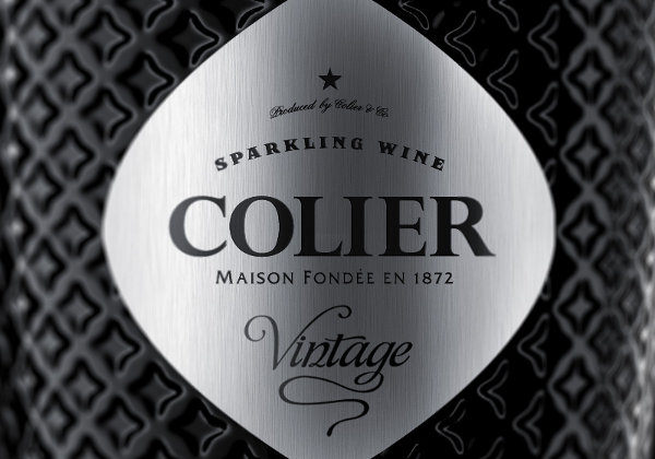
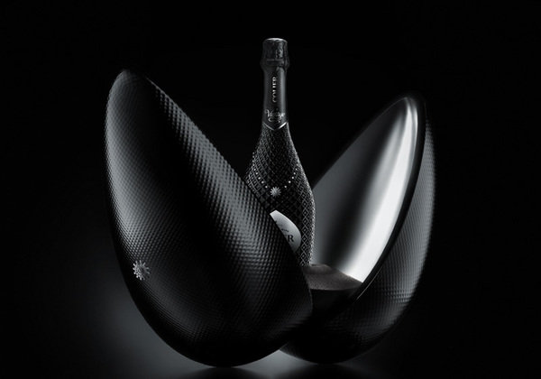
Colier Sparkling Wine Packaging
View in gallery
Reynolds and Reyner developed a conceptual wine packaging design that they call Colier, an example on how they would brand a limited run, elite-class champagne. This sparkling wine packaging is intended for a split release of 23 bottles in traditional packages and 5 collectors bottles in the studded egg shown above. As champagne is often associated with the finest in luxury, this packaging design is intended to push the envelope of both expense and style.
Colier Sparkling Wine Packaging Gallery
View in gallery View in gallery
 View in gallery
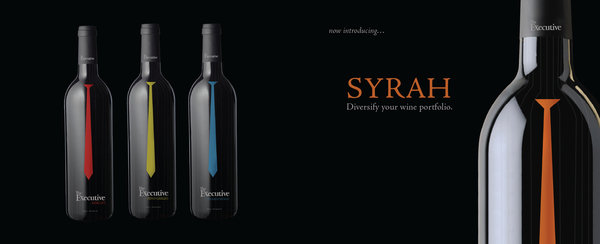
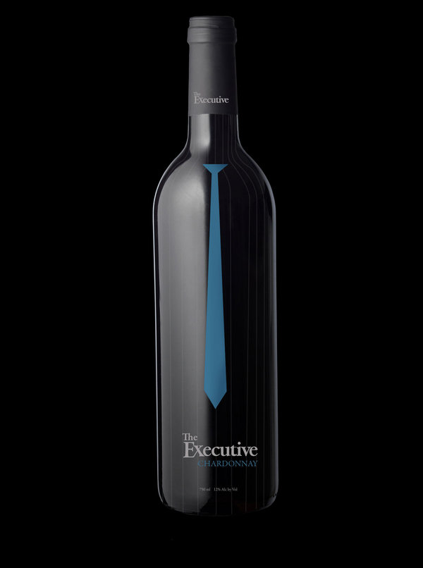
Executive Wine
View in gallery
Designer Derek Perez has fashioned a collection of wine packaging designs called The Executive Wines for his student portfolio. Inspired by modern day business wear, these bottles are lined with pinstripe patterns and color-coordinated neck ties that match the color of the grape within. Merlot, Pinto Grigio, Chardonnay and more are all matched with a simple label that looks ready for the conference room or the first glass of happy hour.
Executive Wine Gallery
View in gallery View in gallery
 View in gallery
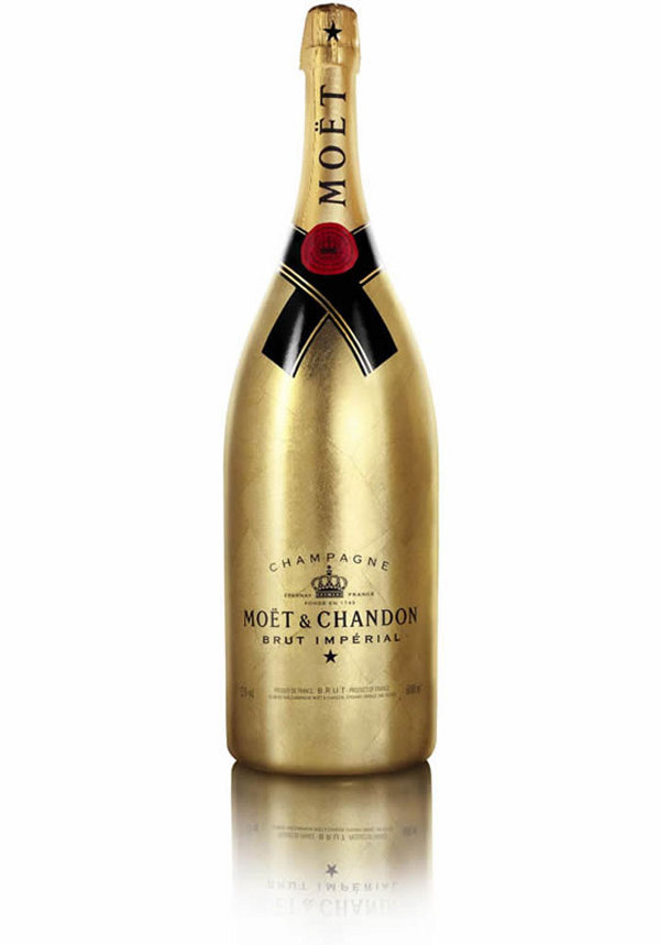
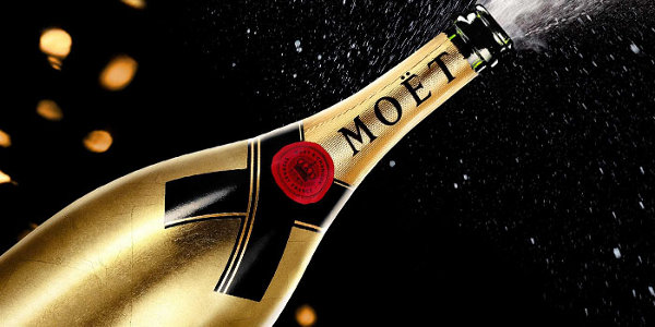
Moët & Chandon Golden Jeroboam
View in gallery
Moët & Chandon released a special edition bottle for the 2010 holiday season, a limited run package laced in pure gold leaf. The Moët & Chandon Golden Jeroboam bottle is exquisite as it gets, produced in a run of 1,743– representing the year of the brand’s birth. Designer Arthus Bertrand crafted this bottle for Moët & Chandon, one of the most bright and beautiful bottles of champagne we’ve seen.
Moët & Chandon Golden Jeroboam Gallery
View in gallery View in gallery
 View in gallery
Longitude Wines by Rob Schellenberg
View in gallery
The Longitude Wines Collection by Rob Schellenberg are a design homage to the great wine growing regions of Italy. Each of these five bottles is marked with a longitude measure of a growing region, plus a topographical map of that region’s geographic character. This simple but poignant design communicates the details of a wine’s vintage without traditional text, and does so with a refreshing modern layout that sets it apart from the rest.
Longitude Wines by Rob Schellenberg Gallery
View in gallery View in gallery
 View in gallery
Field Recordings Wine
View in gallery
Wine maker Andrew Jones has developed a touching label series for a collection of wines he calls Field Recordings Wine. These bottles feature prints of Proof Wine Collective’s photography of starling bird flocks in flight, a visual pattern that is as rare as a snowflake in nature. Each numbered, unique bottle features its own print and its own wine within, one that represents a person or a place that Jones values in his craft of wine making.
Diwine Wine Packaging
View in gallery
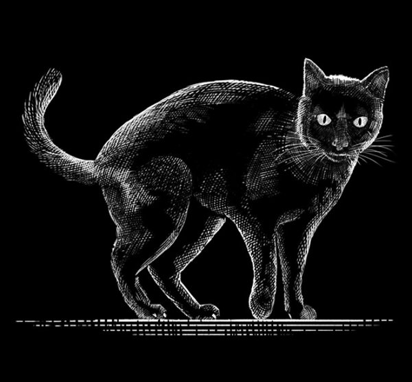
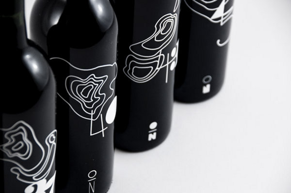
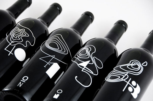
Designer Samy Halim has crafted a series of wine packaging designs for a conceptual product line he calls Diwine. These stunning black-and-white bottles feature their own custom font, an illustration of their animal namesake and a black-and-white pattern collar around the neck. Our favorite is The Black Bird, with a heavy serif font and a dashing houndstooth pattern above its shoulder.
Diwine Wine Packaging Gallery
View in gallery View in gallery
 View in gallery
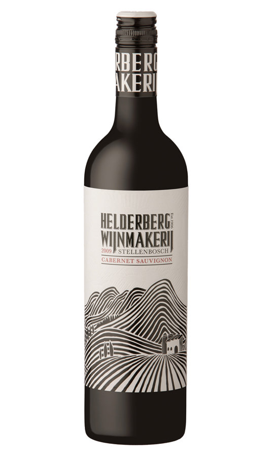
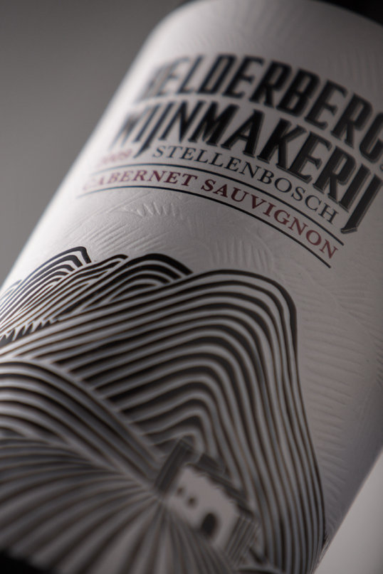
Helderberg Wijnmakerij
View in gallery
We saw a bit of this in our last list of wine packaging designs– a triptych-style panorama created by arranging multiple bottles together. This design by Fanakalo for Helderberg Wijnmakerij is the most impressive we’ve seen in this style, a stunning landscape illustration with embossed clouds in the white space above. Arrange three bottles as shown above, the whole scene rolls out for the viewer. The detail really must be seen (or felt) to be believed, as the detail shot below and to the left shows a bit of the whirling embossed clouds that stand out from the label.
Helderberg Wijnmakerij Gallery
View in gallery View in gallery
 View in gallery
Marks and Spencer Wine in a Cup
View in gallery
While this design may have been laughed out of most wine circles, it’s hard to argue that it doesn’t have functional value. A range of venues could make use of the Marks and Spencer Wine in a Cup design, including air travel, movie theaters, gourmet take-out and more. While wine purists may scoff, we felt the sheer utility of this design deserved inclusion on our list.
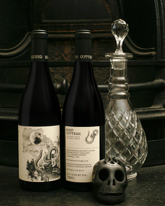
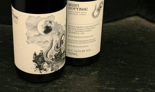
Burn Cottage Wines
View in gallery
Mash Design returns with a grand slam to round out this list, plus the encore below. The Burn Cottage Wine label design is at once mythically-inspired and representational of the wine within. This imported French glass is wrapped with a collage illustration with the icons of Von Goethe’s 1795 story ‘The Green Snake and the Beautiful Lily’. It is artful, thought-provoking and loosely connected to the biodynamics agriculture philosophy of this New Zealand wine maker.
Burn Cottage Wines Gallery
View in gallery View in gallery
 View in gallery
Changing Lanes Wine
View in gallery
Changing Lanes Wine is the product of two “Lanes”, specifically Mark Lane and John Lane who are both shown in the label above. The image changes as the bottle is tilted, showing one Lane and then the other to communicate the brand name Changing Lanes. While the execution is quite complex, the impact is strong and simple– enough to have garnered this design its fair share of awards.
– – – – – – – – – –
If this list of 30 wine packaging designs didn’t fulfill your appetite, we’ve got another list of 30 wine label designs that you’re certain to devour. For this list, we’d like to thank Behance, TheDieLine, LovelyPackage and Liqurious for helping us with the inspiration. If you love packaging design (and wine), you’ll enjoy each of those resources for yourself as well. In the mean time, here are a handful of other features on TheCoolist that we think you’ll love:
- Beautiful Beer: 10 Brilliant Beer Bottle Designs
- Drunken Design: 10 Intoxicating Designer Bar Accessories
- Delicious Design: 20 Delectable Chocolate Packaging Designs


very nice https://valueboxprinting.com/
nice