
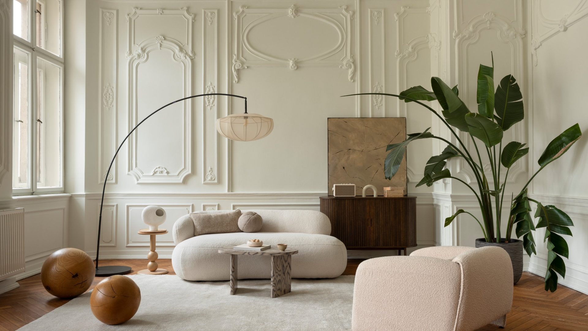
For almost ten years, the rule was simple. White walls. White sofas. Pale rugs. The “safe” look. The “clean” look. The look that was supposed to feel modern and expensive.
Walk into most living rooms done up between 2016 and 2024 and you’ll see the same quiet beige-and-white room with just a different throw pillow. Now, almost overnight, designers are walking away from it.
Not for a softer white. Not for greige. Not for the sage green that took over the last few years. They’re walking straight into the one color most people have spent years running from because they were sure it would make their room feel like a basement from 1978.
In 2022, fewer than one in five designers called this color a trend. By late 2025, that number had nearly doubled. It’s now the most-picked color in one of the industry’s biggest designer surveys, while white has quietly dropped into single digits.
If you’ve been loyal to white, this one’s going to surprise you. The strangest part isn’t the shift itself. It’s which color they’re picking, and why most of us would have laughed at the idea even five years ago.
The number almost nobody saw coming
Every year, the design marketplace 1stDibs asks interior designers around the world what’s actually showing up in real client homes. Not a mood board. Not a paint-brand forecast. A count of what designers are really putting on walls and sofas.
The 2026 edition came out in November 2025. It polled 468 designers through the research firm Surveys & Forecasts, LLC. According to the official 1stDibs release, 33% of them picked the same color as the top trend for 2026, up from 17% in 2022. Almost double in four years. White dropped out of the top tier.
Luxury Portfolio, covering the same survey, said designers are moving into “a darker, moodier color palette,” with this color sitting right at the top.
So this isn’t a Pinterest board or a one-magazine guess. It’s what working designers are putting in real houses right now, in rooms their clients are actually paying them to design. And it’s the exact shade most of us were told to steer clear of.
So what is it?
It’s the color your parents probably had in their den in the 80s and painted over the second avocado-green fell out of style. The one most of us tie to heavy wood paneling and oversized leather couches.
Yes, really. The color designers are picking instead of white is deep chocolate brown.
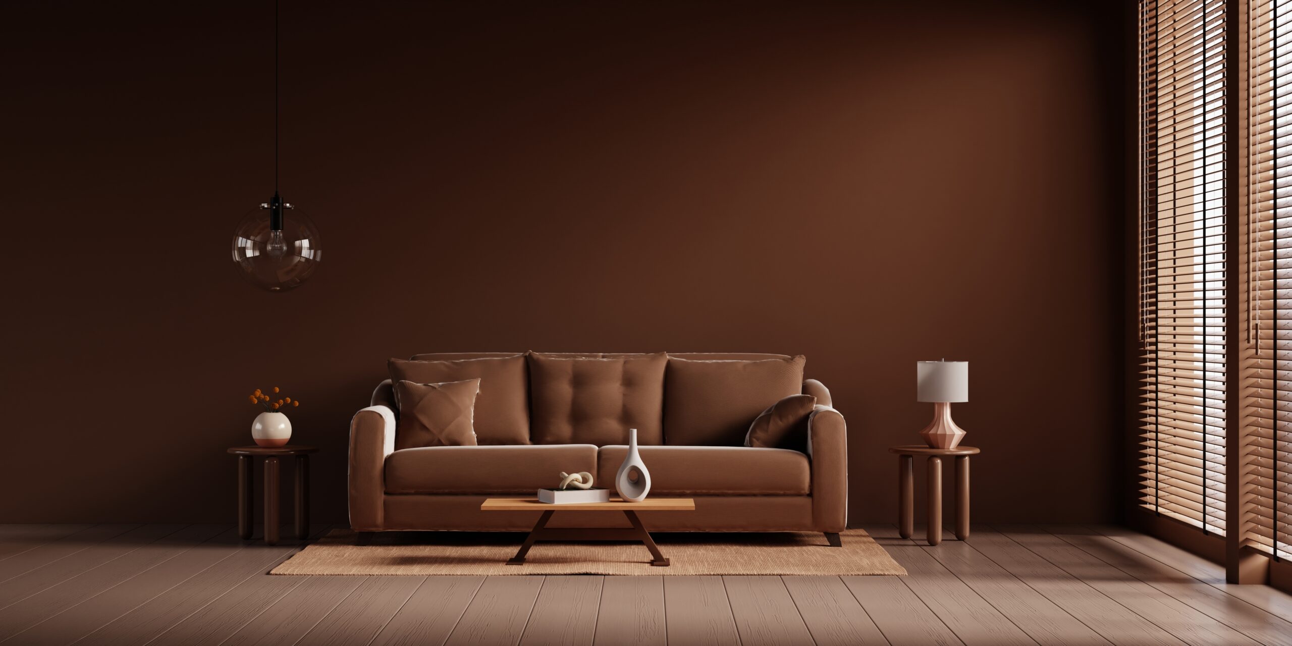
Not muddy brown. Not beige. Not the orange-brown of a 1970s rec room. A warm, cocoa-rich shade with red undertones, closer to melted dark chocolate than coffee.
As Christopher Boutlier of Christopher Boutlier Interiors told House Beautiful, “For a long time, brown was seen as dated or heavy, but designers are embracing it again because it adds depth and warmth without feeling loud.”
White walls look great in photos. They just don’t feel like much to sit in. Done right, chocolate brown wraps around you instead of lighting the room up like a gallery. “Done right” is where almost everyone slips up.
The fix: how designers stop it from feeling like a cave
Designers dodge the “closed-in” feeling with a short list of simple moves:
- Paint the ceiling two shades lighter than the walls. The one trick that stops a brown room from feeling like a box. A warm cream or soft bone lifts the eye.
- Pair it with cream, not white. Bright white fights brown and makes it look darker. Cream, oatmeal, or bone sit next to it like they belong.
- Switch to warm bulbs. Use 2700K (soft warm white) across the room. Overhead cool-white is what makes dark walls feel heavy. King Living’s guide notes that dimmable lamps at a few heights keep the color from “deepening as the light drops.”
- Let texture do the work. Boucle, velvet, linen, aged leather, raw walnut. Andrea DeRosa of Avenue Interior Design told House Beautiful that “cozy and luxurious fabrics like boucle and velvet are perfect textures for warm, caramel, and rich, chocolate shades of brown.”
- Start with one wall if you’re nervous. The accent wall behind the sofa, or the first one you see from the entrance.
- Add one bright moment. A brass lamp, a cream rug, a mirror, one pale piece of art. Something that keeps the eye from sinking.
As Mary Patton of Mary Patton Design told Hunker, “The key is striking the right balance with texture and lighting so the room feels intentionally warm, not heavy.”
Turns out your gut feeling about warmth was right. The old rulebook was the thing that was off.
Sources: (1) 1stDibs 2026 Interior Design Trends Survey press release; (2) Luxury Portfolio coverage of the 1stDibs 2026 report; (3) House Beautiful on the #1 paint color of the year; (4) Hunker interview with designer Mary Patton; (5) King Living guide to styling chocolate brown; (6) Designers Today coverage of the 1stDibs survey.


