

The house was built in 1904. The kitchen inside it was not.
In the 1960s, a past owner took a Victorian room with tall ceilings and good light and turned it into something it was never meant to be. Sliding glass cabinets. A ceiling fan. A glass block window. White laminate counters. A big black fridge in front of the only real window.
The glass doors needed two hands to slide open. The oven door swung into the dishwasher. The fridge ate the daylight.
So she tore it all out. Here is the twist: the new kitchen looks older than the one she replaced.
The kitchen that didn’t belong
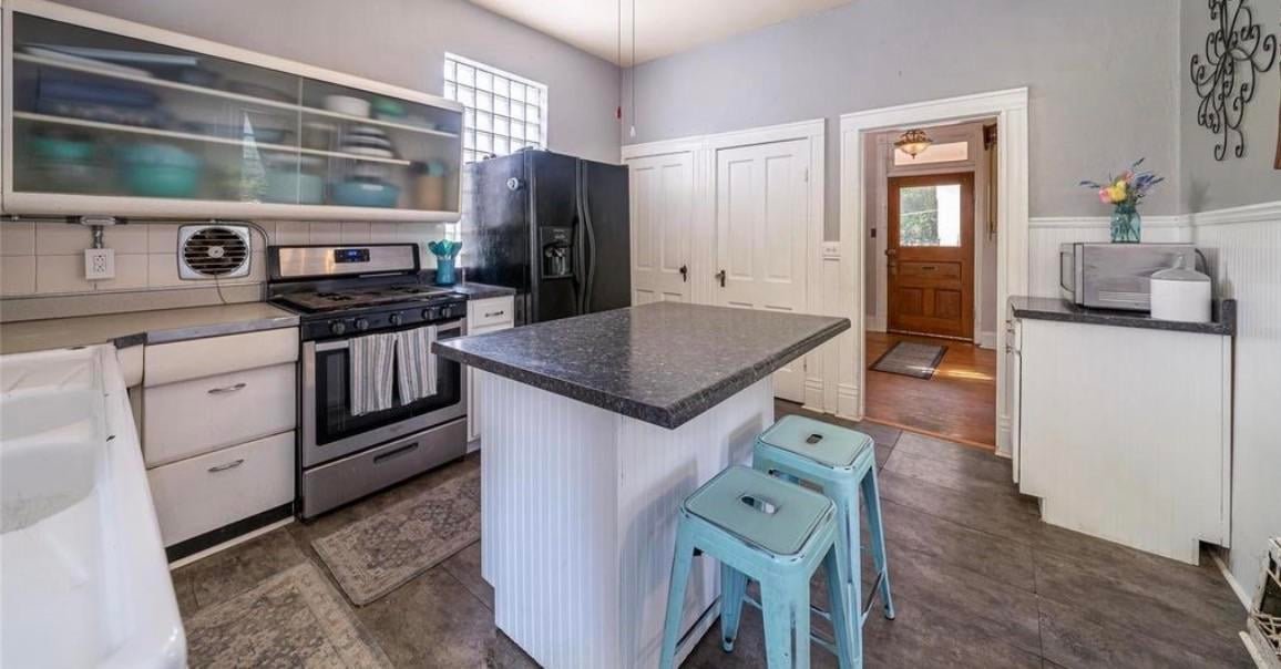
Look at the first picture and you can see every problem at once. The dark fridge dominates. The window behind it is a strip of glass block. The uppers float at a strange middle height, leaving a wide blank wall above them. The whole room feels like a 1965 apartment dropped inside a Victorian.
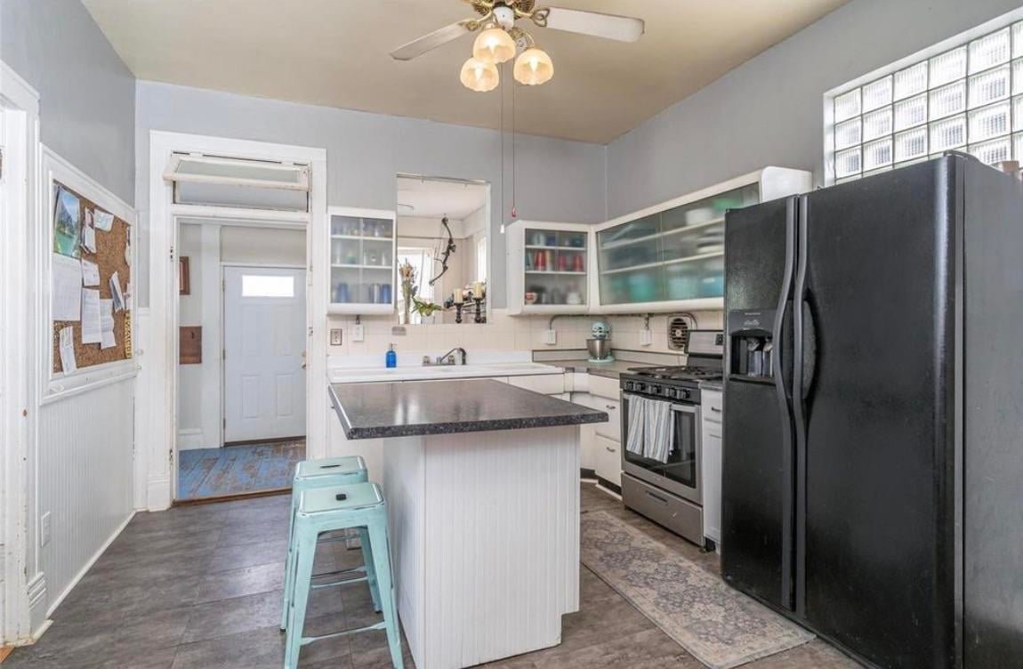
Commenters later called those cabinets “cool, but always covered in grease.” That ceiling fan is pure late 1960s. In a 1904 house with original trim just outside the door, every piece in this room was pulling the wrong way.
The reversal
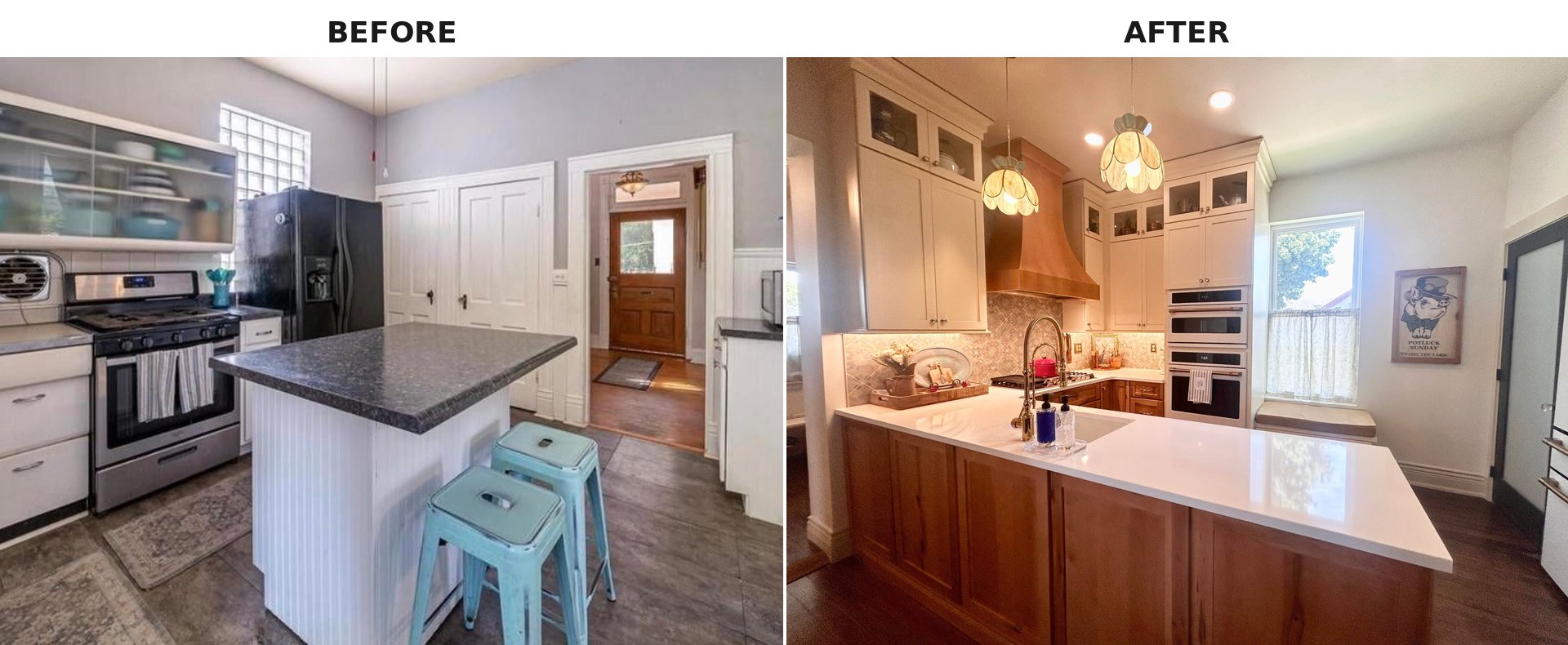
Here is the new room next to the old one. Nothing about it says 2026.
The ceiling fan is gone. In its place, two stained glass tulip pendants that read straight out of the early 1900s. The laminate counters are gone. The sliding cabinets are gone. Shaker cabinets now run all the way to the crown, the way built-in pantries did in pre-war American homes. A hand-painted Moroccan tile backsplash sits where plain white tile used to be. A copper hood anchors the wall.
Almost every choice points backward in time, toward what a kitchen in a 1904 Victorian might have looked like if money had been no object.
The one choice that fixed everything
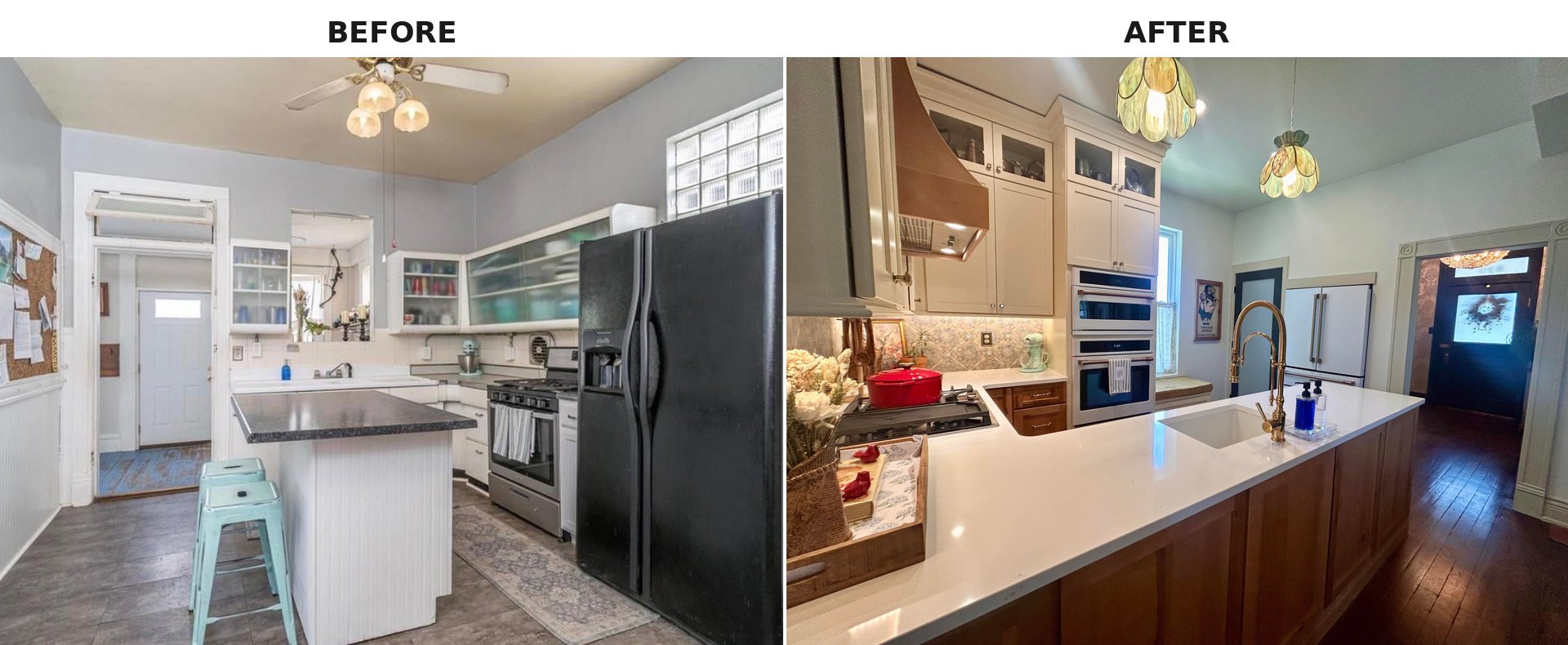
Of every move, one solved more problems than any other. She built a closet for the fridge.
The old layout had no place for a modern fridge except in front of the window. Her designer framed a shallow closet along one wall and dropped the fridge inside it. Three things happened at once. The window was freed. A window seat became possible. And the fridge stopped being the first thing you saw when you walked in.
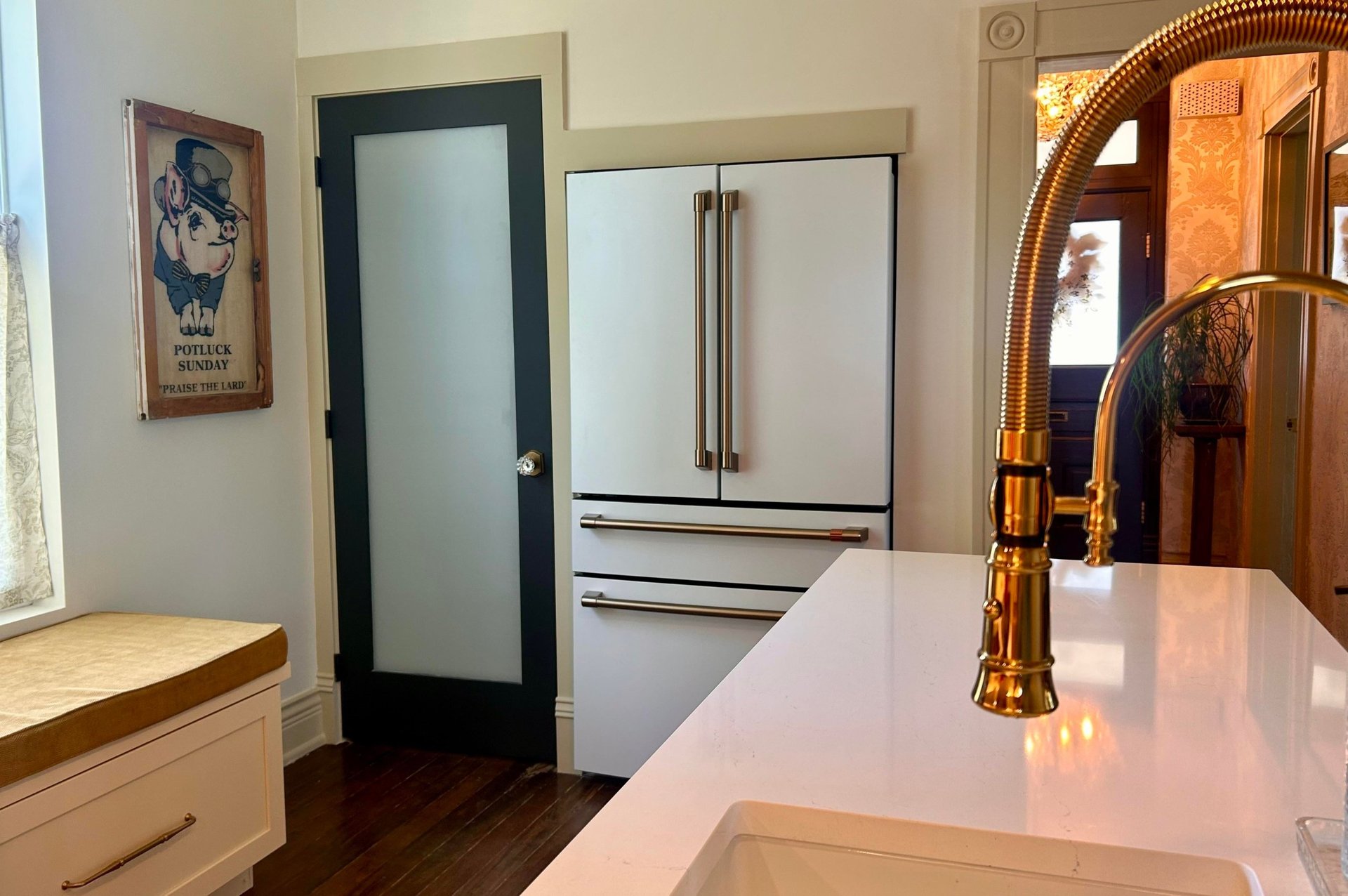
A commenter said it in six words: “A closet for the fridge?? So clever.”
The backsplash gamble
[IMAGE: 122-year-old-kitchen-after-moroccan-backsplash-copper-hood.jpg] Close-up of the hand-painted Moroccan tile backsplash | Credit: Reddit u/Remote-Station4687 Alt: Hand-painted Moroccan-pattern tile backsplash in blue, terracotta, and cream behind a stainless gas cooktop with a bright red Dutch oven and a copper range hood above.
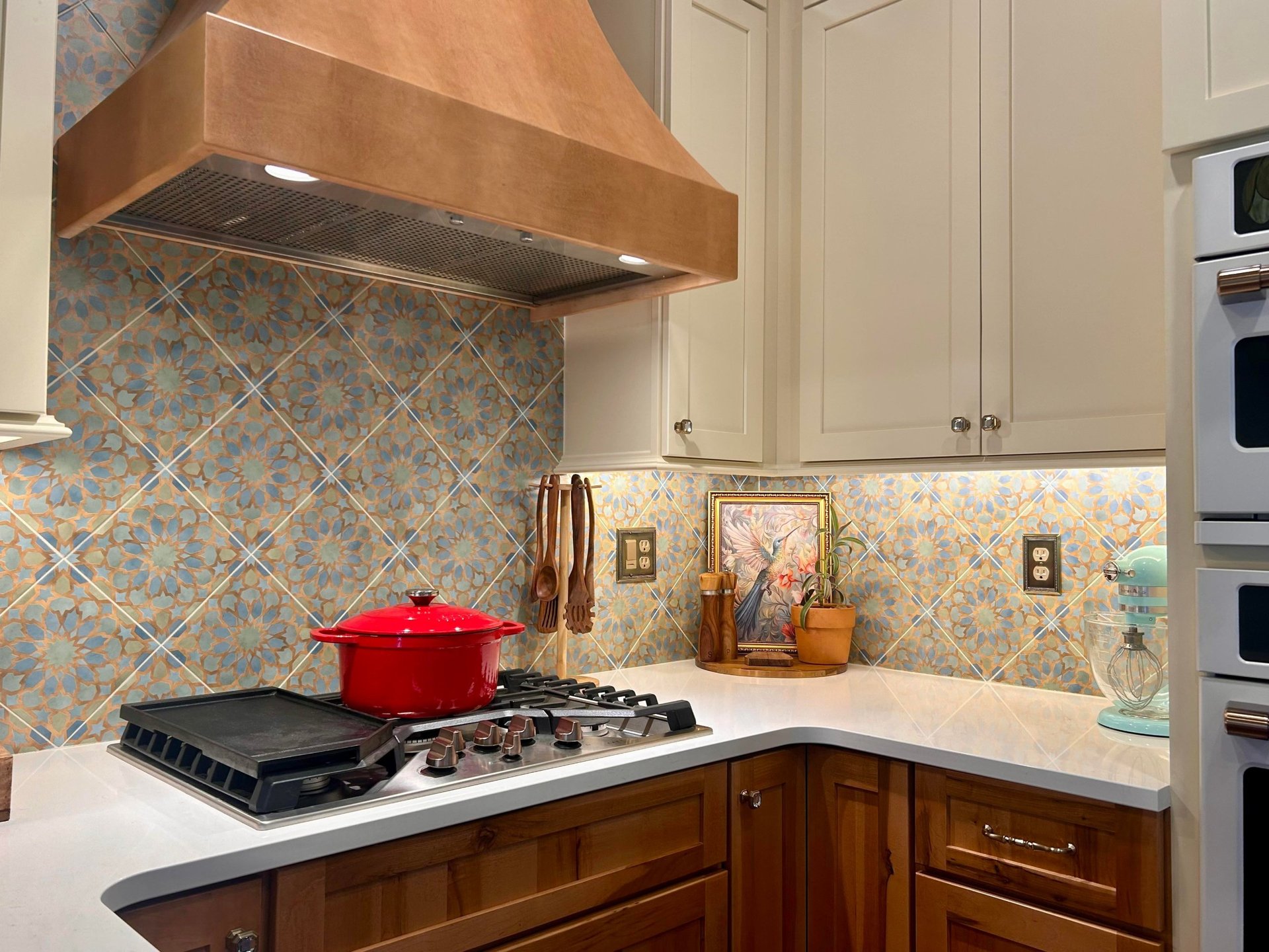
Everyone warned her she would get sick of it. That is what people always say when you pick tile with real pattern. Play it safe. Pick white subway.
She picked Tile Club’s Amira Green anyway, a hand-painted Moroccan pattern in blue, terracotta, and cream. It is now the single most-praised element in the whole project. One commenter who rarely bothers to post nice things wrote, simply, “This A+ so good.”
The lesson is tucked inside that choice. Safe tile picks read as 1960s picks in a 1904 room. Pattern, color, and ornament are how turn-of-the-century rooms felt alive. Taking them out was the mistake the old remodel made.
The cabinets that reach the ceiling
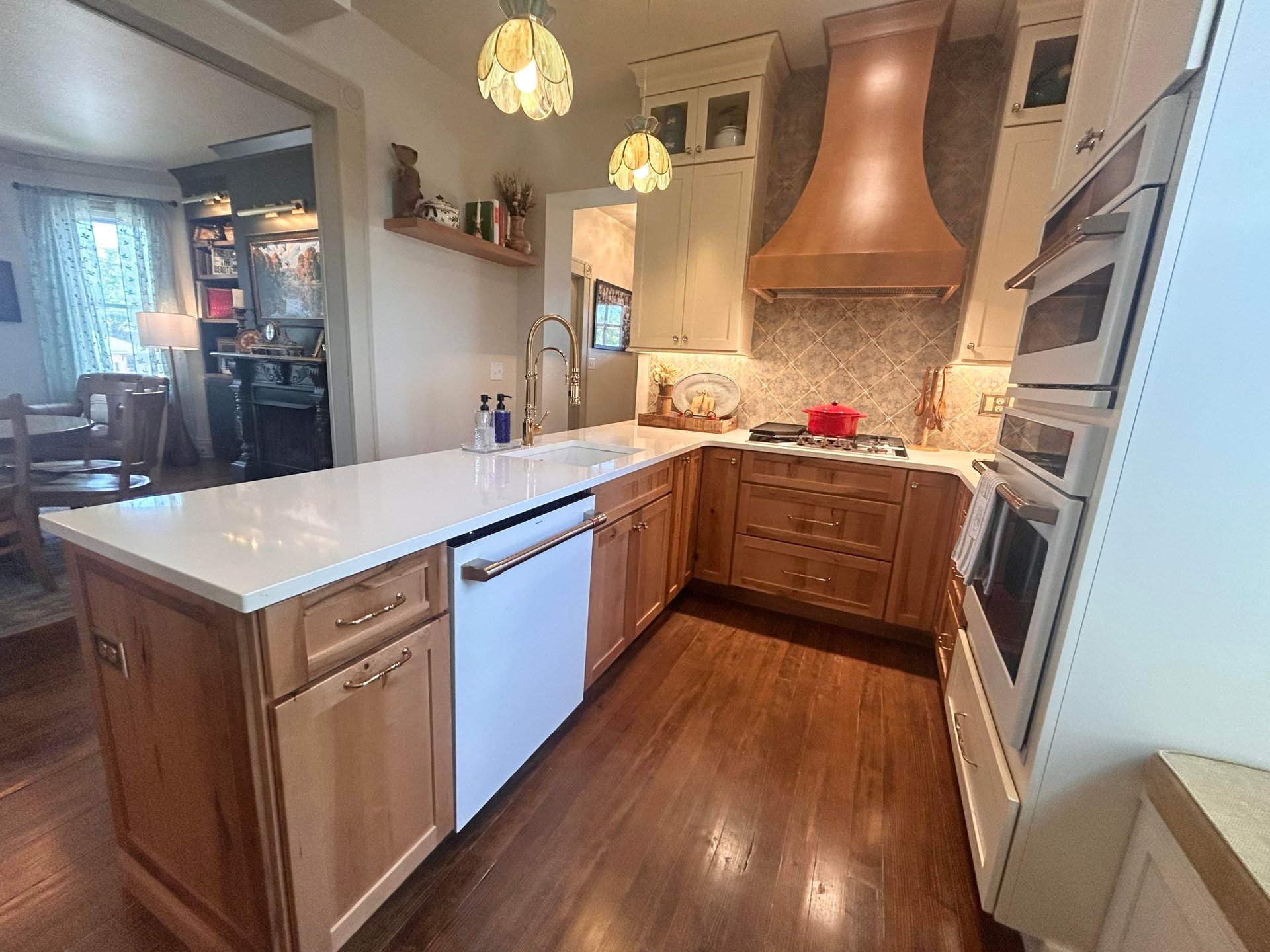
The 1960s uppers stopped at normal height. The new cabinets climb all the way to the crown, with a row of glass-front display cabinets up top. Warm stained wood on the bottom, cream painted on top. The two-tone split keeps the room from feeling heavy top and bottom at once.
The window she got back
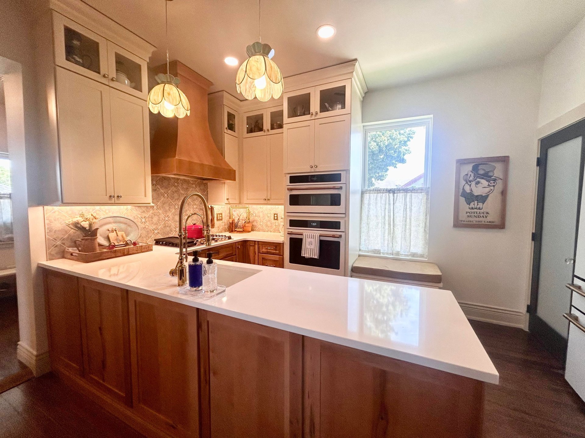
Here is the window the old fridge was hiding. Underneath it now, a padded window seat and soft curtains. The light pouring in is the biggest change in the room, and the one thing a tape measure could not have promised at the start.
The dining nook that completes the trick
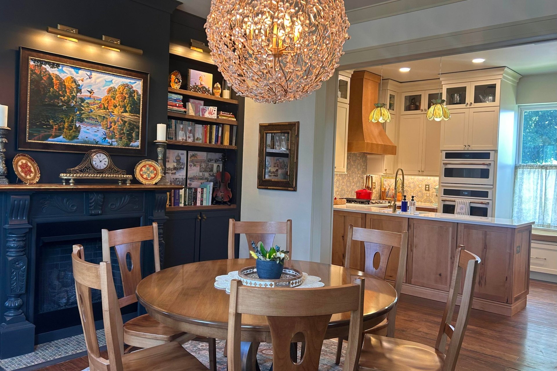
Walk through the archway and the trick finishes itself. A moody dining room with dark built-ins, a carved fireplace, and a crystal branch chandelier. Looking back into the kitchen, nothing clashes. The whole house finally feels like one house.
The hidden workhorse
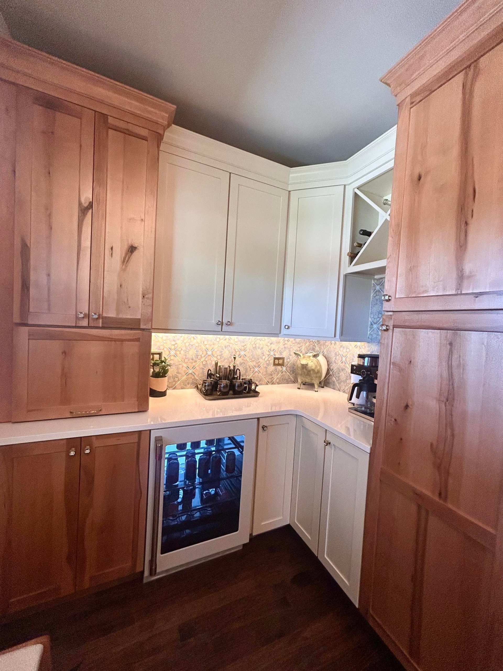
Behind the main kitchen, she added a butler’s pantry. Most mid-century remodels ripped these rooms out of old houses because they felt old-fashioned. Hers holds a wine fridge, the coffee station, and the same Moroccan tile tying it back to the kitchen it serves.
The quiet details
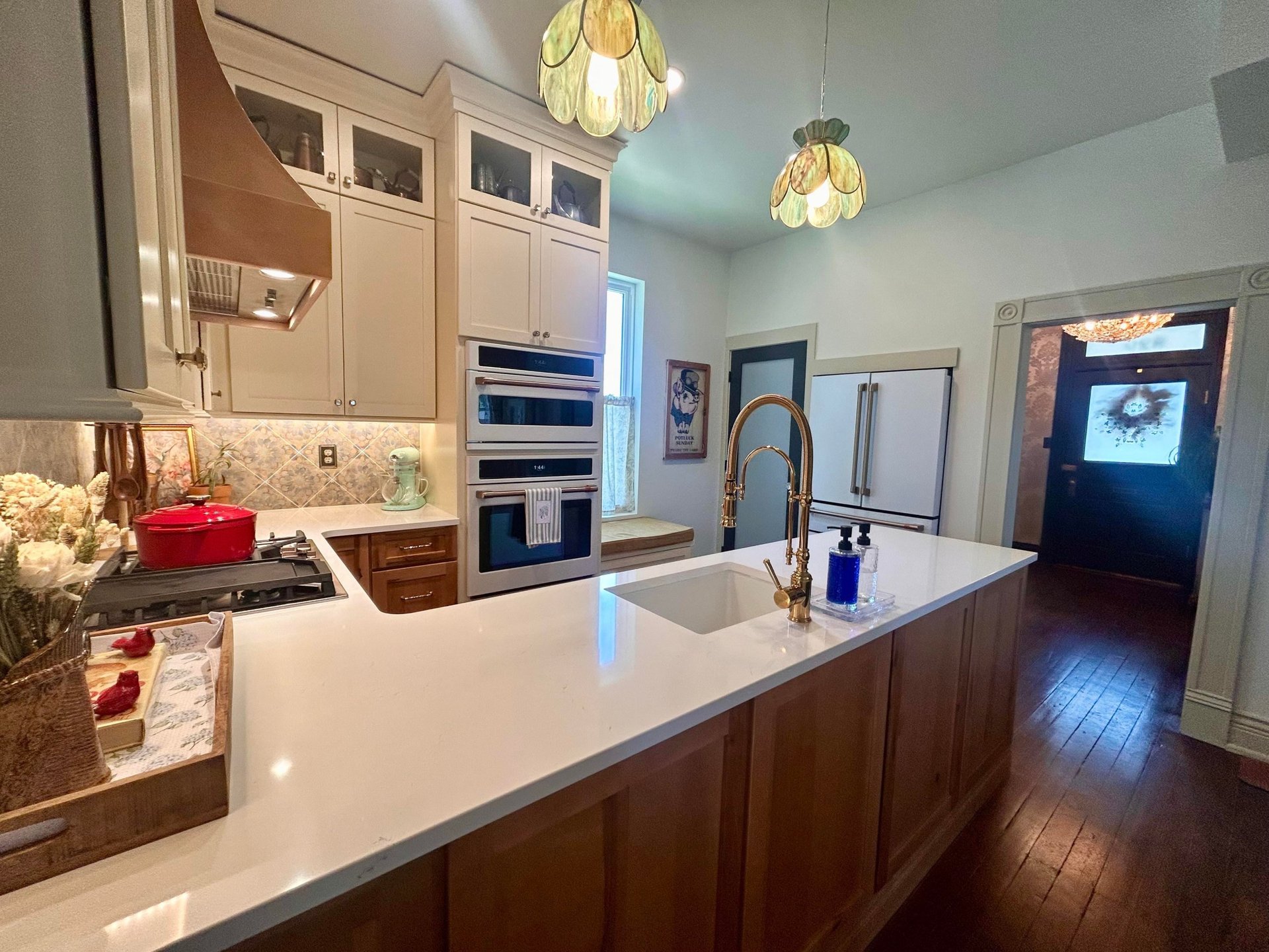
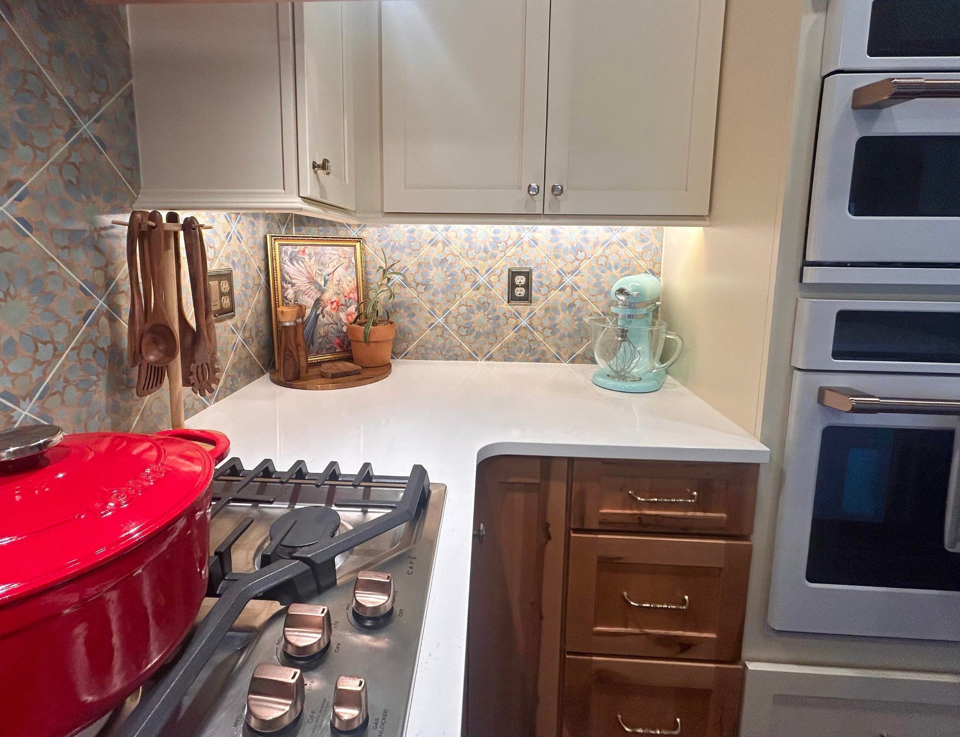
The brass faucet, the matte white appliances with brushed bronze trim, the mint KitchenAid: none are big moves alone. Together they look like somebody actually lives here.
What the comments all circled
Scroll the thread and the same phrases keep coming back. “This looks way more accurate for a 122-year-old house.” “A renovation and a restoration.” “It just looks so right.” One person framed the whole thesis in a single thought: the room doesn’t look modernized, and yet everything in it looks new.
That is the move. The newest kitchen in a 122-year-old house looks like the kitchen that house should have had all along. Sometimes the right remodel is not another modernization. Sometimes the right remodel is undoing the last one.
Project credit: Reddit u/Remote-Station4687. Tile: Tile Club Amira Green. Appliances: GE Cafe (matte white with brushed bronze).


