
A designer named Louise Mulholland just wrapped up a bathroom at the Waterfront Marina, and the before-and-after shots keep ending up on Instagram with the same question underneath. How did you make the room so much bigger?
She didn’t. That is what makes the whole thing worth sitting with for a minute.
The bathroom is the exact size it has always been. No wall was moved. No closet was swallowed up. No square inch was borrowed from the hallway outside. The toilet drain, the shower drain, the window, and the door are all in the same spots they sat in a month ago. And the finished room still reads like a quiet boutique hotel suite, while the old one looked like a city rental nobody had loved since 2007.
The reason it works is surprisingly simple, and it is something almost any small bathroom could copy.
The old room was carrying way too much
Before anyone picked up a hammer, this bathroom had a lot going on inside it.
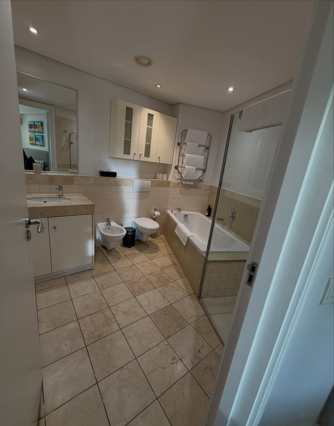
Count the fixtures along with me. A bidet nobody was using. A pedestal sink parked inside a chunky little cabinet. A bathtub tiled down into a stone-topped deck that ate up a chunk of the right wall. A framed glass shower cubicle jammed into the far corner. An upper cabinet with frosted doors hanging above the toilet. A towel warmer loaded with folded towels. And beige marble-look tile running up the walls and across the floor, with fussy grout lines heading in every direction.
Every one of those pieces is quietly asking for your attention. Your eye tries to rest somewhere and keeps getting pulled back. Your brain adds up all that visual noise and reports back: small, crowded, busy. The actual footprint is normal for a city apartment. It was the stuff inside that made it feel tight.
Same box, completely different mood
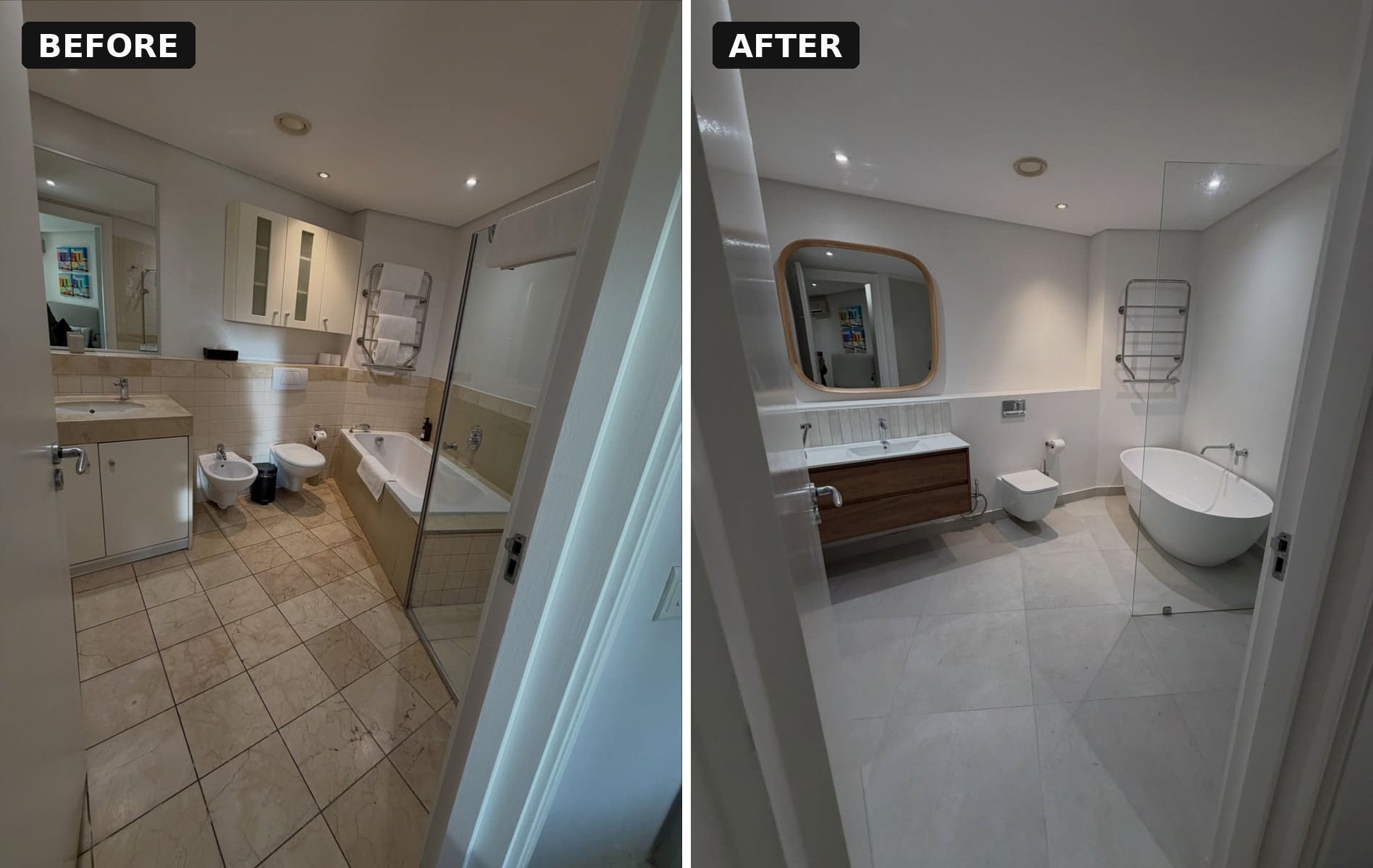
Line up the two door shots and the shape of the room is the same. Right wall in the same place. Left wall in the same place. Far wall in the same place. The new version just has less inside it and the surfaces have gone quiet, and that is the entire illusion.
The demo photo settles the argument
If a tiny voice in your head still thinks a wall must have moved somewhere, this mid-renovation shot puts it to bed.
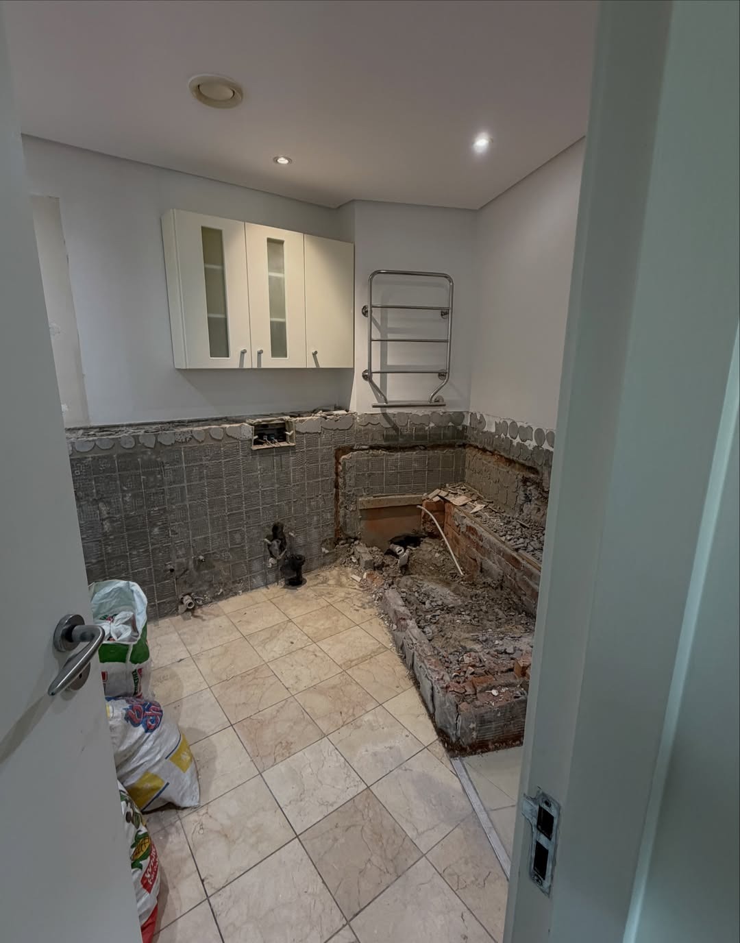
That bare red brick on the right is where the old built-in tub used to sit. You can see how much room the stone platform and the thick tile surround were quietly stealing. Pull that out and the corner opens up on its own, before a single new fixture goes in.
Four quiet moves did all the real work
None of these are big renovation swings. No bump-outs, no structural changes, no stealing from the hallway. Just four honest decisions.
The built-in tub got traded for a freestanding one. A built-in tub sits inside a bulky tiled deck plus a surround that climbs up the wall. A freestanding tub stands on the floor on its own four little toes. The tile keeps running underneath it on all sides. Your eye follows that unbroken floor across the whole room, and your brain reads a bigger space without being told to.
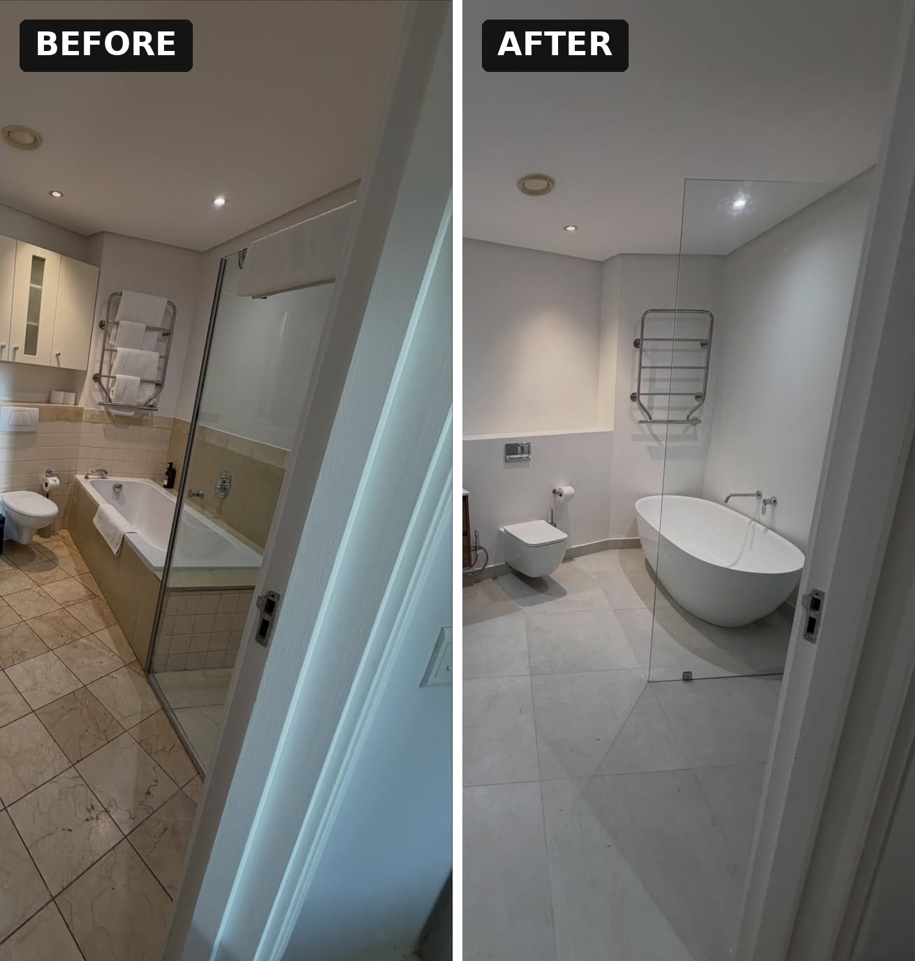
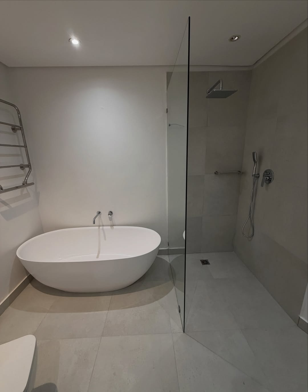
The shower cubicle lost its frame and its door. No metal profiles, no step over a raised shower pan. Just one clean sheet of glass with a tiled wet-room floor behind it that slopes gently to a drain. From the doorway your eye now travels all the way to the back wall with nothing in its path.
The bidet and the upper cabinet got shown the door. That bidet was giving up almost two feet of floor width for a fixture nobody in the house was using. The upper cabinet was eating the vertical breathing room above the vanity. Both gone, and the whole room can finally take a breath.
Every surface got quieter. Big pale tiles run floor to wall with grout lines pulled almost invisible. The walls and the ceiling share one soft off-white. Faucets come straight out of the wall, so the tub rim and the vanity top stay totally clear. The room now reads as one calm shell instead of a dozen loud pieces.
The vanity wall tells the same story
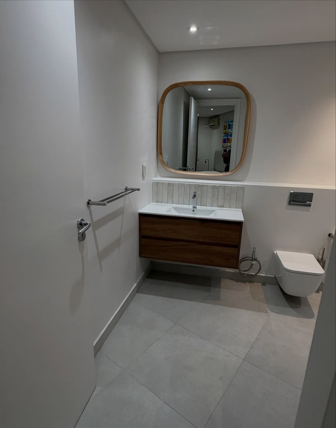
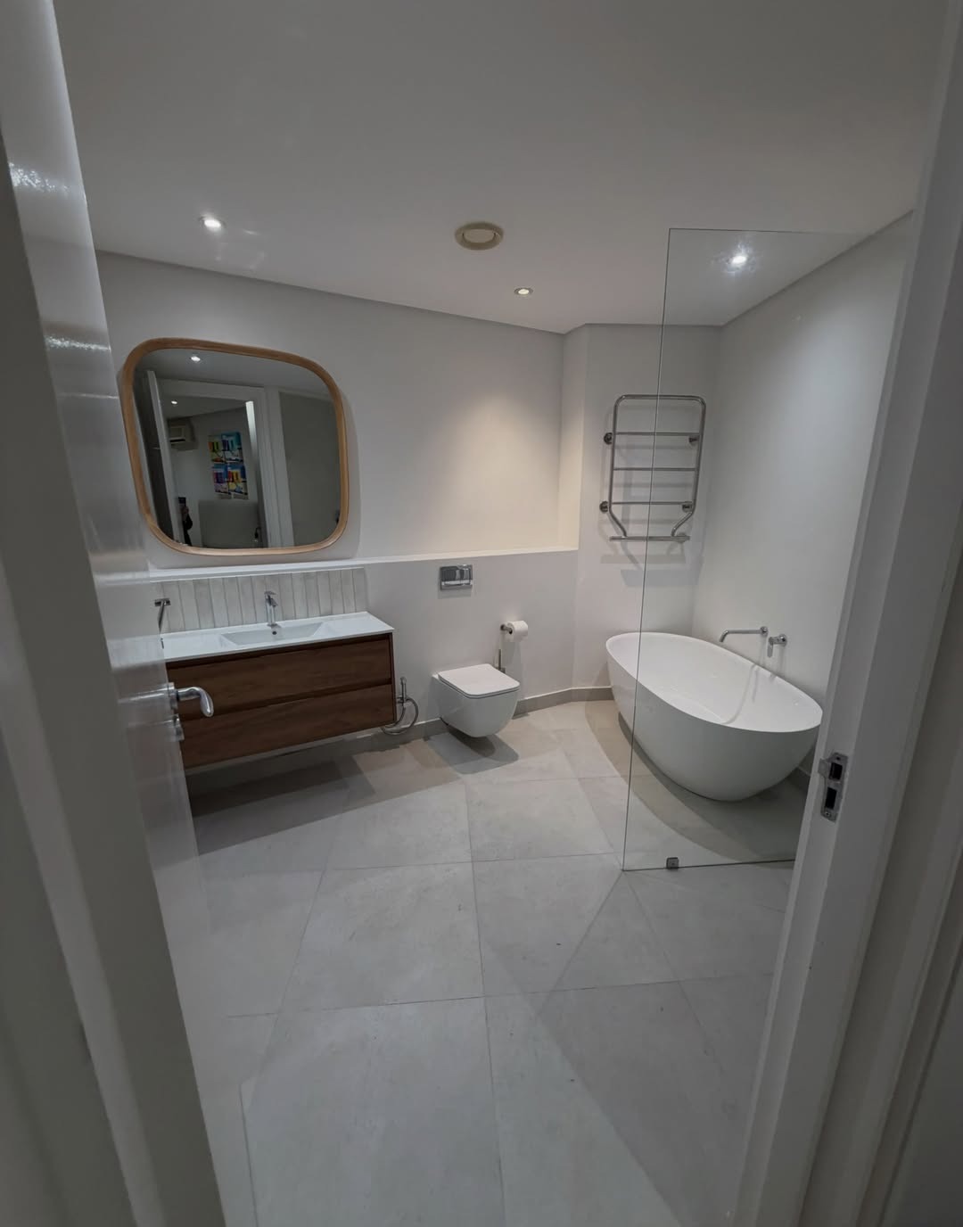
A floating walnut vanity takes over for the chunky cabinet. The tile keeps running underneath it, which is exactly why that whole wall feels lighter. A warm wood mirror with soft corners does the job a plain rectangle used to do, with none of the clinical feeling. One wall-mounted faucet and nothing else cluttering the counter. Your eye has one warm thing to land on and a lot of quiet around it.
The corner that used to feel cramped
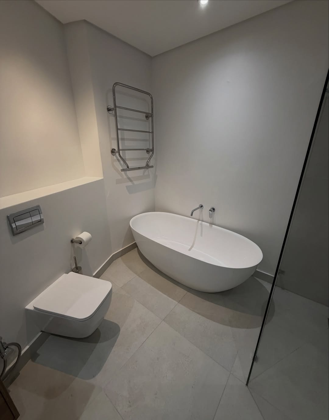
From this angle the hotel feeling really lands. Toilet on the left, tub on the right, open wall between them, and only a slim chrome towel warmer breaking up the back corner. There is nowhere for clutter to pile up and nowhere for your eye to snag on the way across the room.
Same walls, same plumbing, same square footage. The only thing that really changed was the attitude.