

If you’d stood in this kitchen a month ago, you probably would have told the owners the same thing everyone else did: “That busy tile has to go.”
The Moroccan-style strip ran straight across the backsplash in navy and gray. Set against orange cherry cabinets, it looked random. It fought the warm wood. It fought the black appliances. It even fought the white quartz counters. Any renovation advice would have started with ripping it out.
They didn’t touch it. They didn’t replace a single door, a single appliance, a single tile, or a single piece of flooring. They opened two cans of Sherwin-Williams paint, and the “ugly” tile suddenly looked like the whole plan.
Here’s how it happened.
The kitchen everyone wanted to change
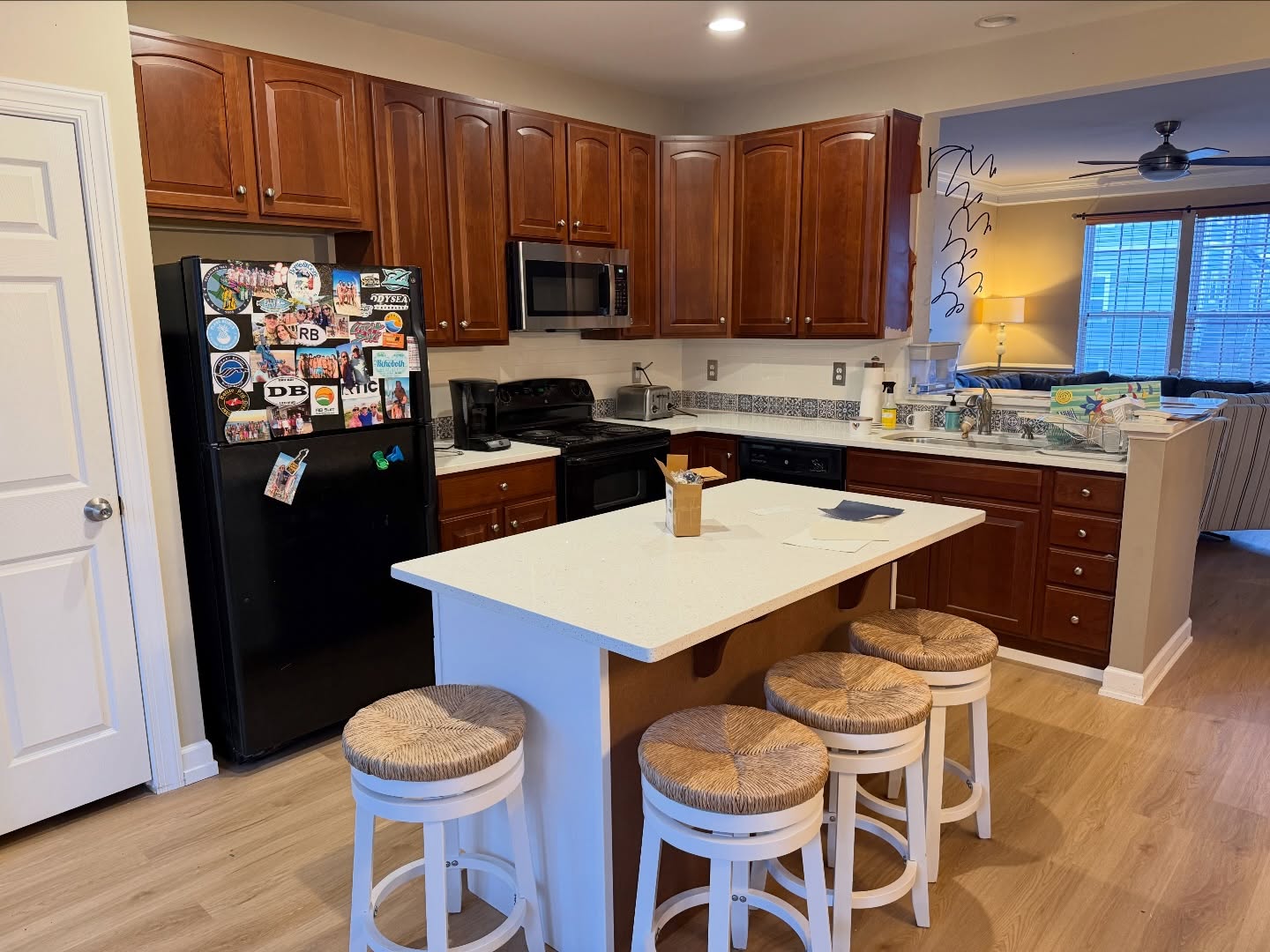
The bones were good. Solid wood cabinet boxes with arched raised-panel doors. Fresh white speckled quartz counters. Clean light oak LVP floors. A big island built for four stools and family breakfasts.
But everything got dragged down by one thing: the orange cherry stain on every cabinet surface. The warm wood tone fought the cool quartz. It fought the black appliances. It made the floor look like it belonged in a different house. And it made the Moroccan tile strip on the backsplash look like a mistake nobody had the budget to fix.
The problem wasn’t the tile
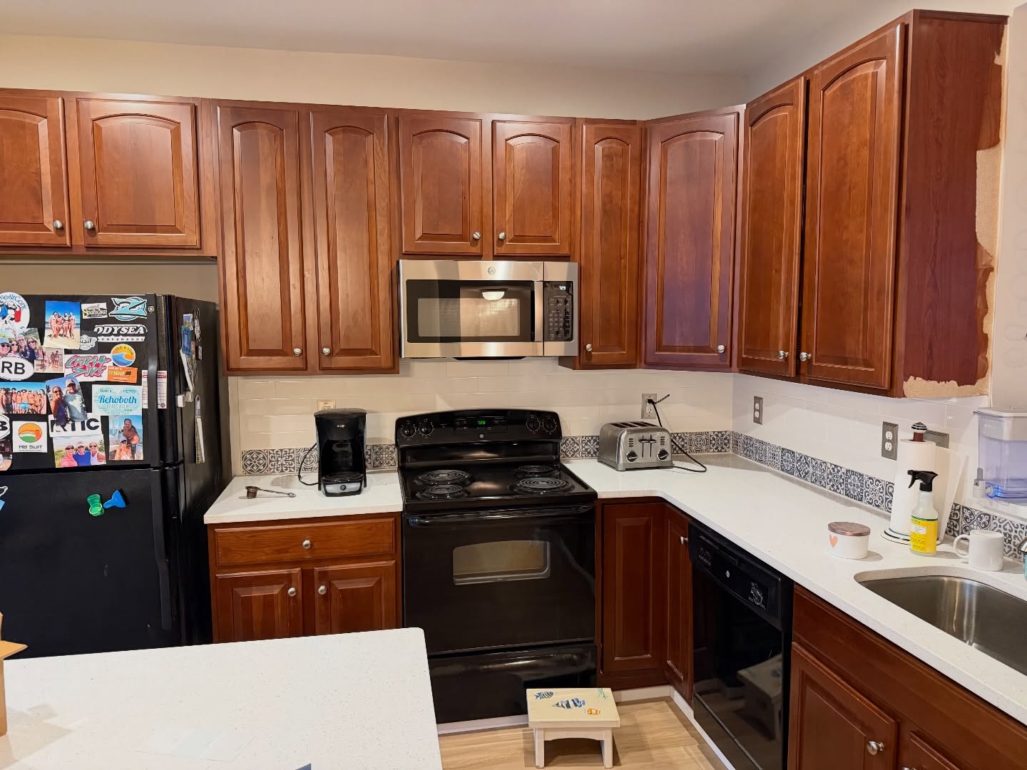
Look at that wall. Navy pattern on the tile. Black stove. Stainless microwave. White countertop. The elements didn’t match because the cherry wood was the loudest voice in the room, and it drowned out every chance those other pieces had to work together.
The homeowners could see something most people couldn’t: the tile wasn’t broken. It just didn’t have a partner. Nothing in the room was echoing that navy pattern, so it floated there with no reason to exist.
One decision changed everything
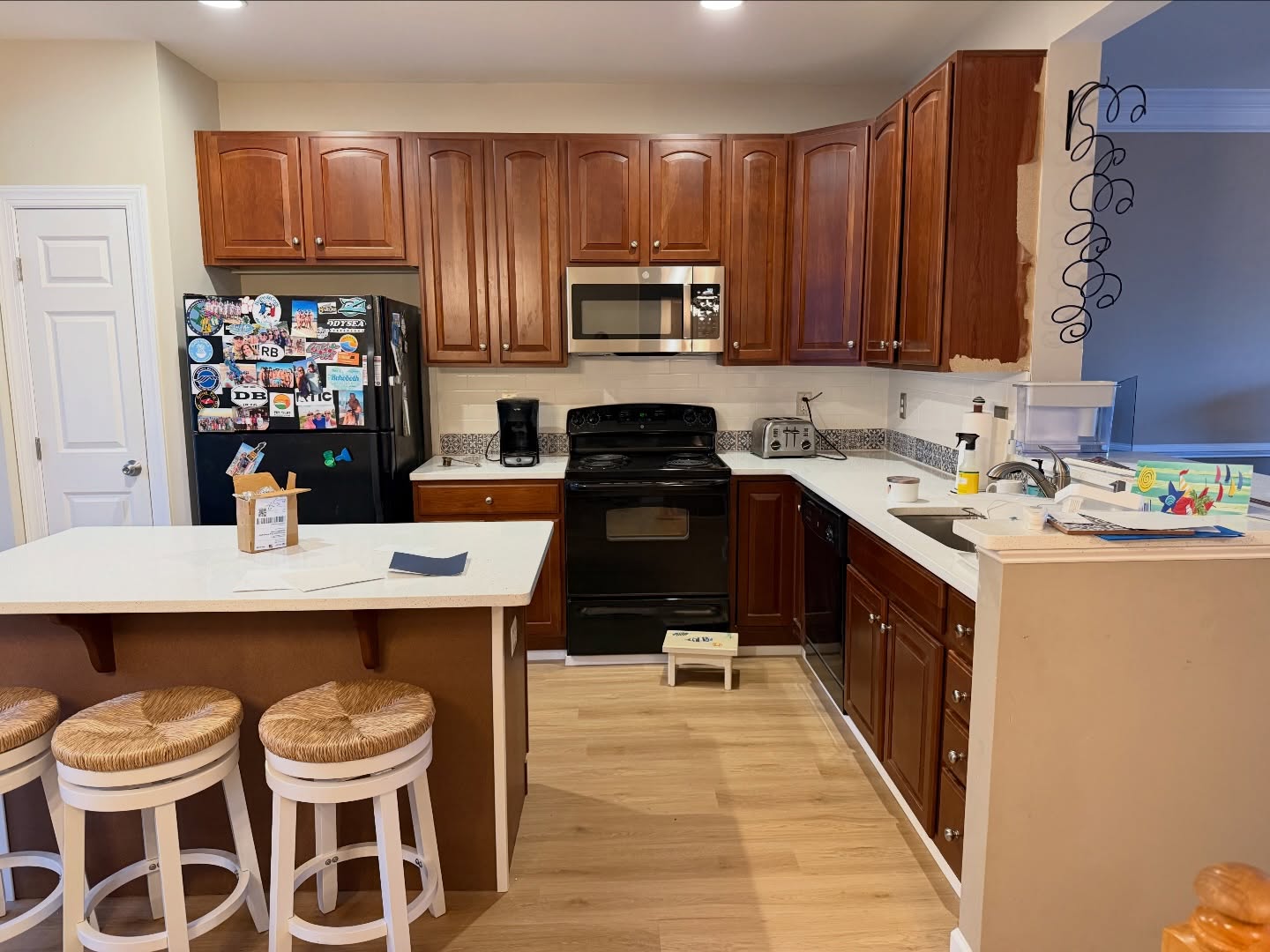
Instead of ripping out tile, the plan went the other way. The tile would stay. Everything else would be rebuilt around it with two paint colors.
Sherwin-Williams Pure White on the perimeter cabinets. Sherwin-Williams Indigo Batik on the island. Both in a 20 sheen satin finish. That was the entire renovation.
Mid-project proof it was working
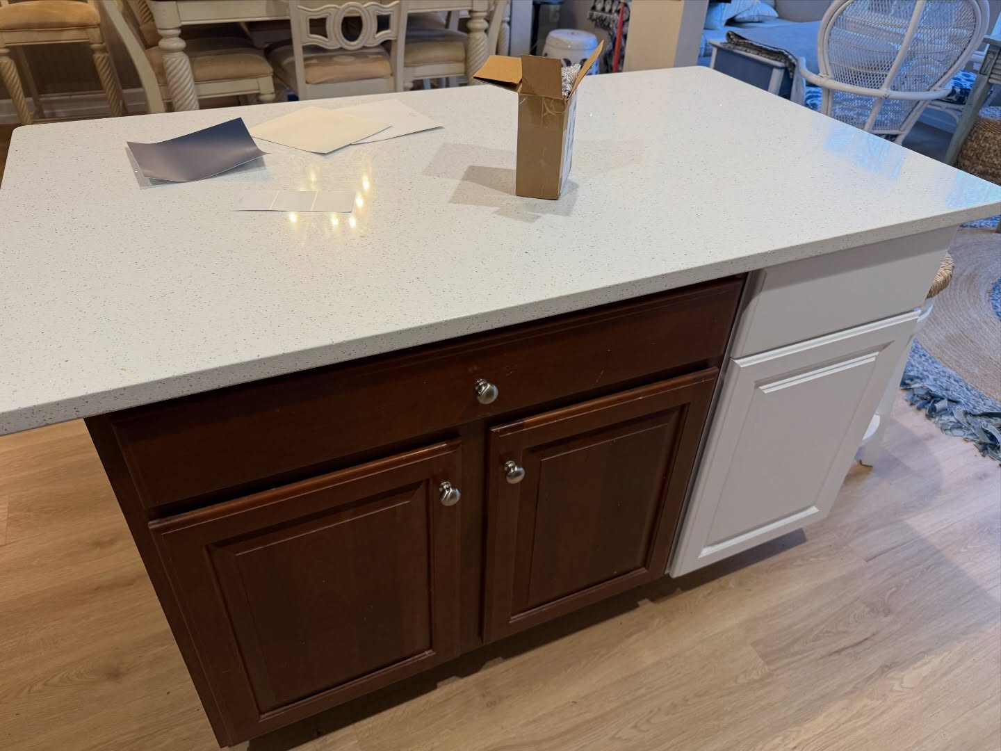
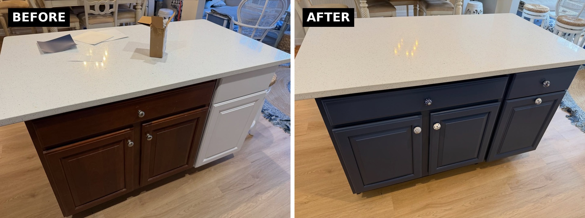
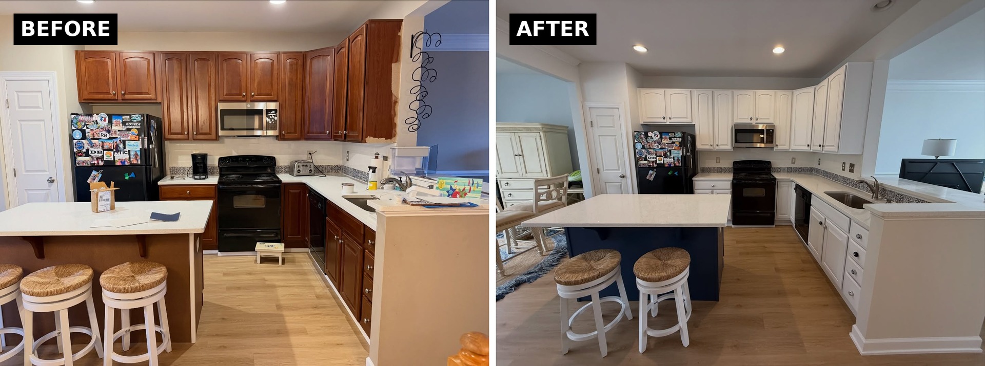
This is a quick peek mid-project. The island was still cherry wood. The cabinet right beside it had already been painted Pure White. You can see on this one angle how different the room would feel once the warm orange was out of the picture.
That contrast was the whole bet. Pure White on the perimeter would brighten everything, and the island needed to anchor the room without going too dark. Indigo Batik is a deep, slightly dusty navy that reads as calm instead of heavy.
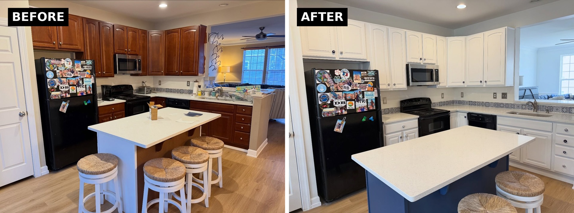
The before and after of that stove wall
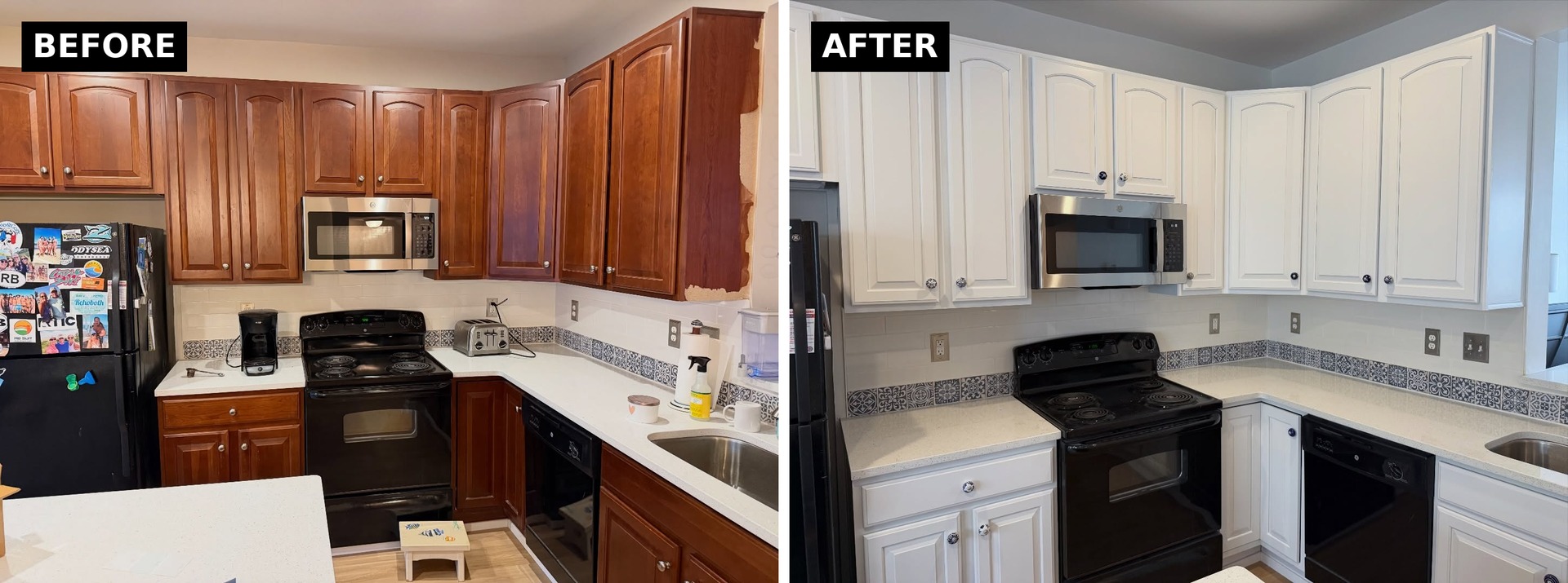
Same tile. Same stove. Same microwave. Same counters. The only thing that changed was the cabinet color, and suddenly the navy pattern reads as the thesis of the room instead of a mismatch.

The island reveal
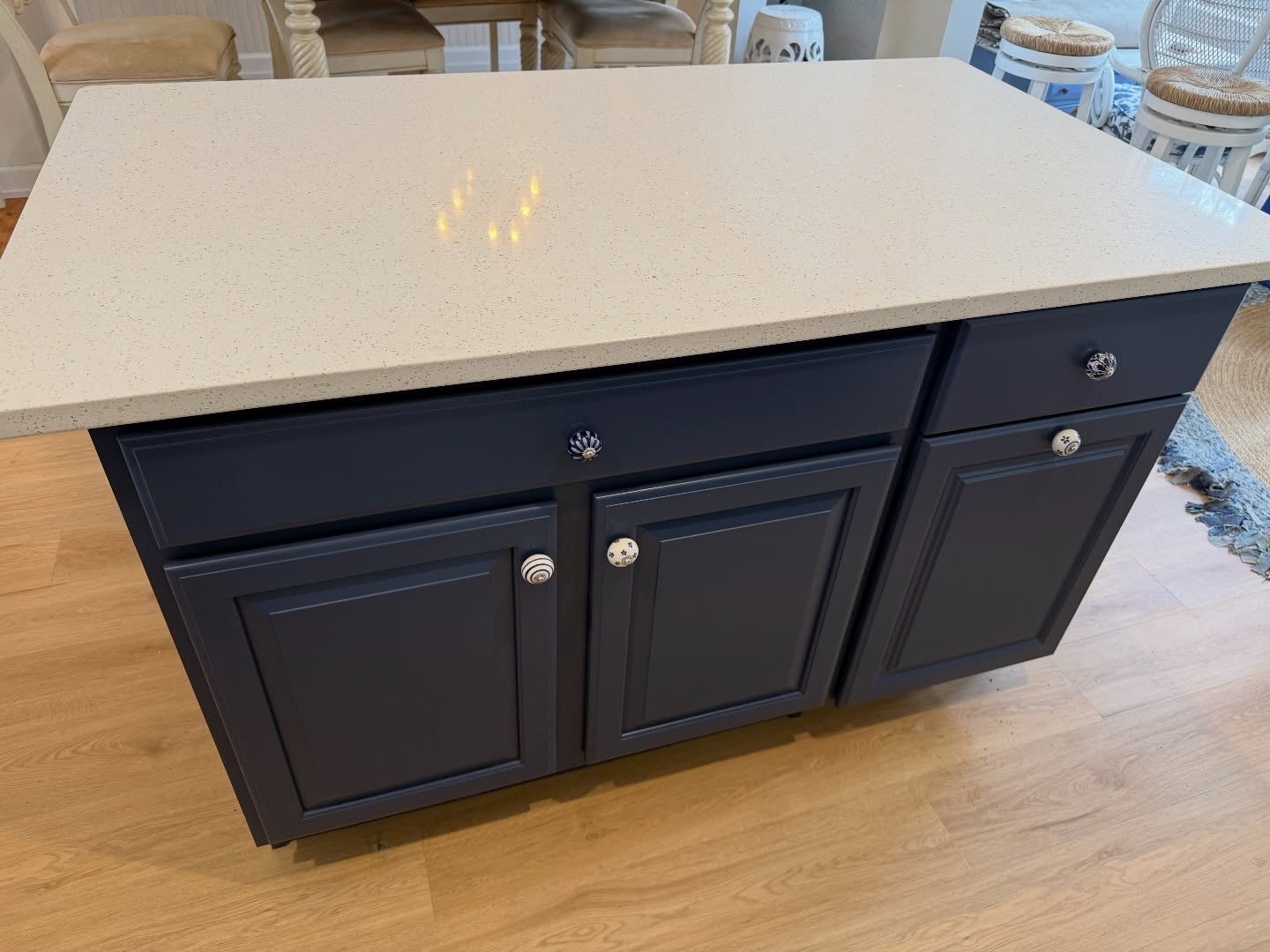
The island went from fighting the room to leading it. The dusty navy picks up the exact tone in the Moroccan tile, so your eye finally has a reason to travel from the backsplash down to the island and back up again. The ceramic knobs, which looked random on cherry wood, now read as intentional detail against the dark paint.
White on the perimeter did the heavy lifting
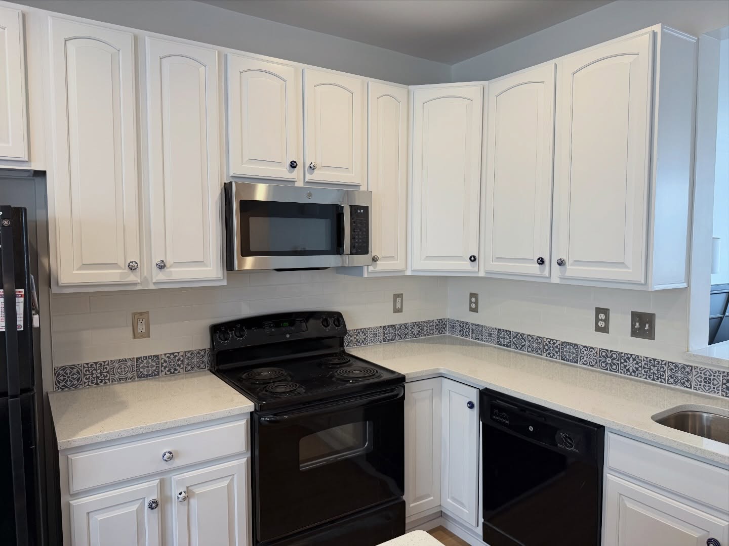
Pure White let every other piece in the room breathe. The black appliances stopped reading as outdated and started reading as iron contrast, the kind you’d see in a coastal cottage with white millwork. The light oak floors finally looked like they belonged. Even the small blue and white ceramic knobs on the drawers, barely visible on cherry wood, became a real design detail.
The full new kitchen
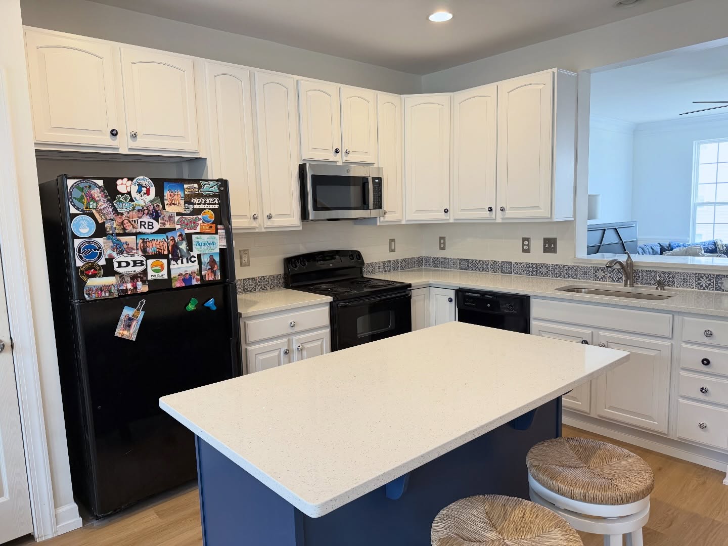
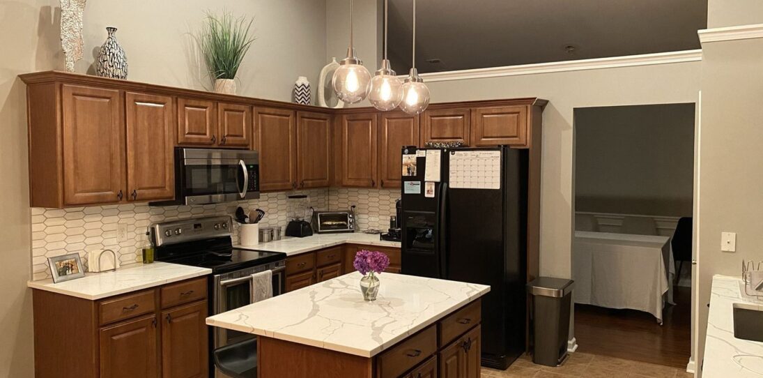
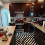
Pull back and the room reads as one plan. White, navy, white quartz, black appliances, light oak floor, Moroccan tile strip. Every surface points at the next one. Nothing is fighting.
The view from the other angle
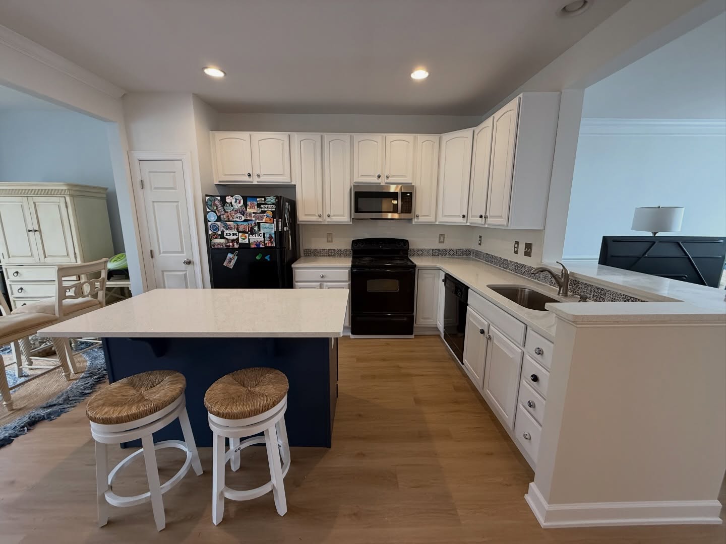
From this side, the color plan reads even clearer. The white pantry door blends into the wall. The island reads as a piece of furniture instead of a cabinet run. The ceiling feels taller because the cabinets stopped stealing the light.
The arches finally get noticed
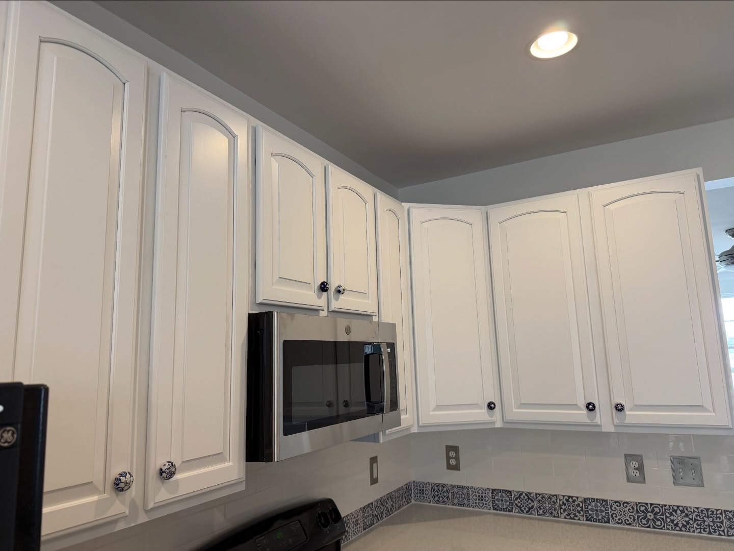
One more thing worth pointing out. Those arched cabinet door tops were there the whole time, but on cherry wood they just looked dated. In Pure White, they read as architectural detail, like the kind of millwork you’d pay a cabinetmaker to add.
The takeaway
The owners didn’t follow the usual demo-first renovation playbook. They didn’t swap the “ugly” tile. They didn’t replace the black appliances. They didn’t touch the counters or the floor. They painted two things, and every element that looked like a problem turned into a plan.
If your kitchen has one piece you’ve been told to rip out, look at it again before you call a demo crew. It might not be the mistake. It might be the blueprint.
Paint colors used: Sherwin-Williams Pure White on the perimeter cabinets, Sherwin-Williams Indigo Batik on the island, both in a 20 sheen satin finish.
Credit: Transformation by Pezzotti Painting on Instagram

Everything looks really good, but declutter the refrigerator. There’s too many things on the front.
The cherry cabinets were completely outdated, and more than likely may not have been solid wood. I personally, as a designer, would have gone with a hue that was less white. Like a soft gray white. And yes, that refrigerator mess makes the whole thing less put together.
Tragic to cover those gorgeous cabinets. Especially white and boring. The problem was the countertops. Color is key. White is just….safe and again such a bore
There were so many different wood colors going on it was ugly. But they went to all the work of painting and trying to update and all I see is the mess on the refrigerator.
Absolutely! They had beautiful rich cherry cabinets and ruined them for a small amount of tile. Now it looks like any other basic builder grade kitchen. I would love to have those cherry cabinets. Well have fun keeping those stark white cabinets clean 🙃
You don’t have to live with someone else’s taste. They would have taken the cabinets out and rarely are they reused. What drives me crazy are refrigerators covered in “stuff”. All that work and then that messy distraction. Clean off the fridge and then it’s perfect!
Painting cherry wood cabinets and covering up such beautiful wood is a travesty to woodworkers all over the world. You take the beauty of the wood and hid it behind stark white paint obscuring the wood’s natural grain, rich reddish-brown tones, and high value. I’ll never understand how people who do this can not appreciate the beauty of wood.