
Dark wood floors can be the most expensive-looking feature in a room. Yet put the wrong paint beside them, and the whole space can feel harsh, dated, or strangely gloomy. Before blaming the floor, check the color directly above it.
The problem is choosing paint as though the floor were not there. A shade that looks clean on a sample card still has to work beside a large stretch of brown wood.
Designers interviewed by Southern Living flag four groups to approach carefully. These are risky pairings, not universal bans. “Cheap” describes the disappointing overall look, rather than a change in the wood’s quality or value.
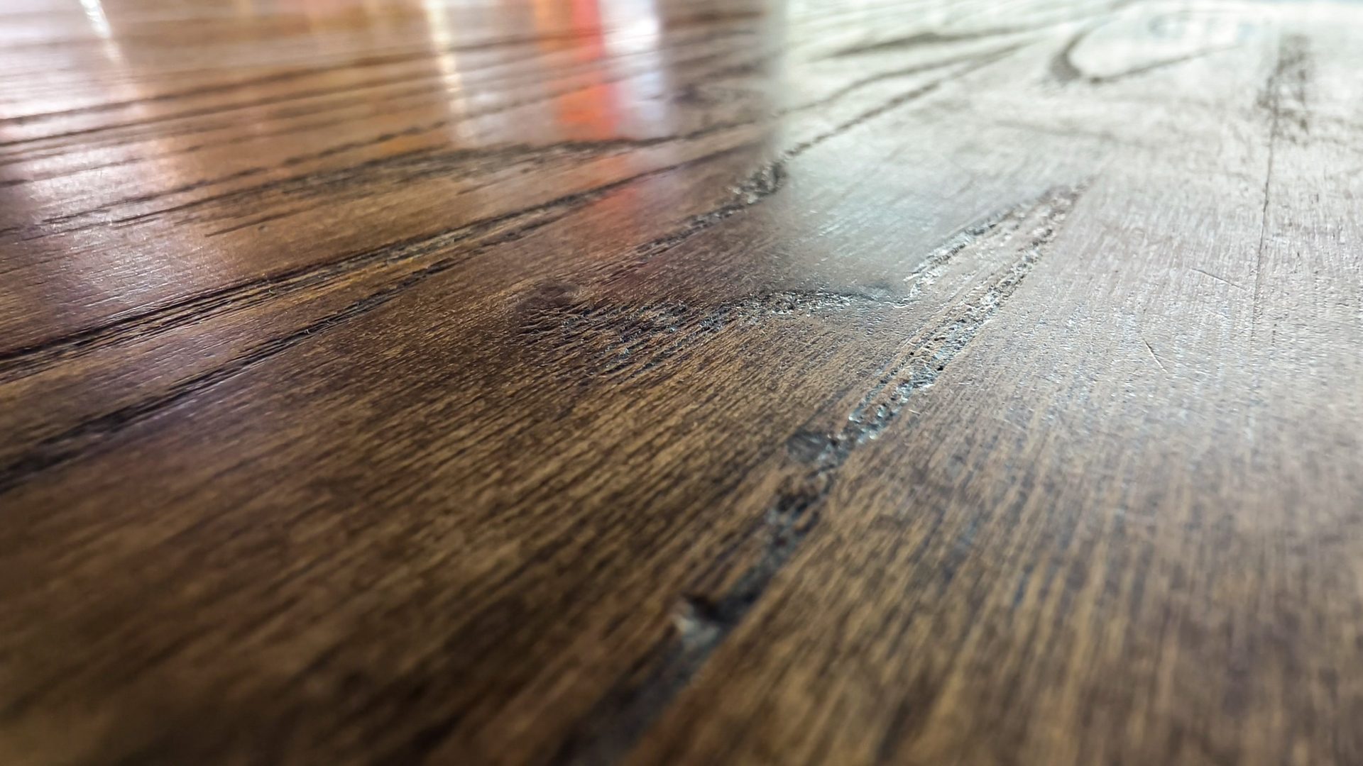
Cool blues and grays beside warm wood
Whitney McGregor tells Southern Living to avoid cool blues and grays with dark floors in north-facing rooms. Her alternatives include pale pink or red lacquer.
Before ruling out blue altogether, check the wood’s undertone, meaning the hint of color beneath its main brown shade. Sherwin-Williams explains that an icy gray can clash with golden wood yet work beside a cool, deep brown. Darkness alone does not tell you which paint will work.
Try this: compare your blue-gray sample with a warmer alternative immediately above the baseboard. Keep the floor visible while you judge them. The question is which pairing you prefer in that room, rather than which sample looks better by itself.
Stark whites and yellow-based beiges
Ashley Ayer Gallion tells Southern Living that stark white can look harsh beside dark floors, while yellow-based beige can feel dated. She recommends warmer whites and softer neutrals.
That does not mean every off-white should be creamy. Speaking to Homes & Gardens, designer Gray Walker recommends Benjamin Moore Seapearl, a balanced off-white, for open spaces with wood flooring.
Use it as a candidate to test, rather than a guaranteed match. Put your chosen neutral beside both the floor and the existing trim before committing to the whole room.
Pale pastels that feel disconnected from the floor
Lindsey Herod tells Southern Living that pastels can create an unwelcoming contrast with dark stained floors. Her preference is richer, warmer color.
But Sherwin-Williams explicitly includes pastels among options for making dark-floored rooms feel airy. The useful takeaway is to test the particular shade, rather than reject every pale color.
For another direction, Homes & Gardens reports that designer Miranda Cullen favors olive and sage with both light and dark wood. These offer a practical starting point if your pastel sample feels too sharp beside the floor.
Very dark shades without enough contrast
Shannon Kadwell tells Southern Living that dark walls and floors can feel heavy without sunshine, bright trim, or a light rug. Tracy Morris suggests either a deliberate enveloping scheme or lighter walls that showcase the floor.
Sherwin-Williams also advises against combining dark walls and dark floors in small or dim rooms. Its guidance notes that natural light changes how colors interact, with low light potentially making neutrals appear darker and muddy.
If you want a brighter room, start by sampling a lighter wall color. If you want a cozy, dark room, judge the entire arrangement, including the trim and furnishings, before deciding that a dark paint is the problem.
Check the pairing before buying the paint
If one of these combinations sounds familiar, use the next paint sample to test a different pairing. You can make that decision with the existing floor in place.
- Identify the floor’s undertone. Sherwin-Williams suggests placing white paper on the wood to help reveal its underlying color.
- Compare samples near the floor. Place painted sample boards just above the baseboard, then move them to a second wall. Include your existing trim in the view.
- Check changing daylight. Homes & Gardens recommends testing paint at different times of day. Also inspect your samples under the lamps you normally use in the evening.
- Choose for your intended room. Decide whether you want a bright, open feeling or a darker, cozy one, then assess the sample against that goal.
Choose the paint beside the floor, not away from it.


