
She had the countertop quotes on her phone. New quartz, backsplash tear-out, haul-away, somewhere around twelve thousand dollars before anyone swung a hammer. And she was still worried it would come out wrong.
Then her painter asked her to hold off for a weekend. Two gallons of Sherwin-Williams, a set of gold handles, and one spray job later, the kitchen looks like someone spent thirty grand on it. The granite she wanted gone is now the thing visitors notice first.
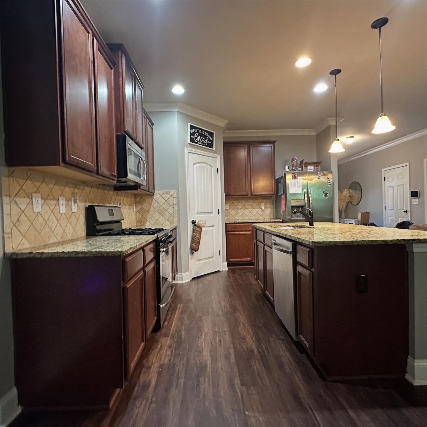
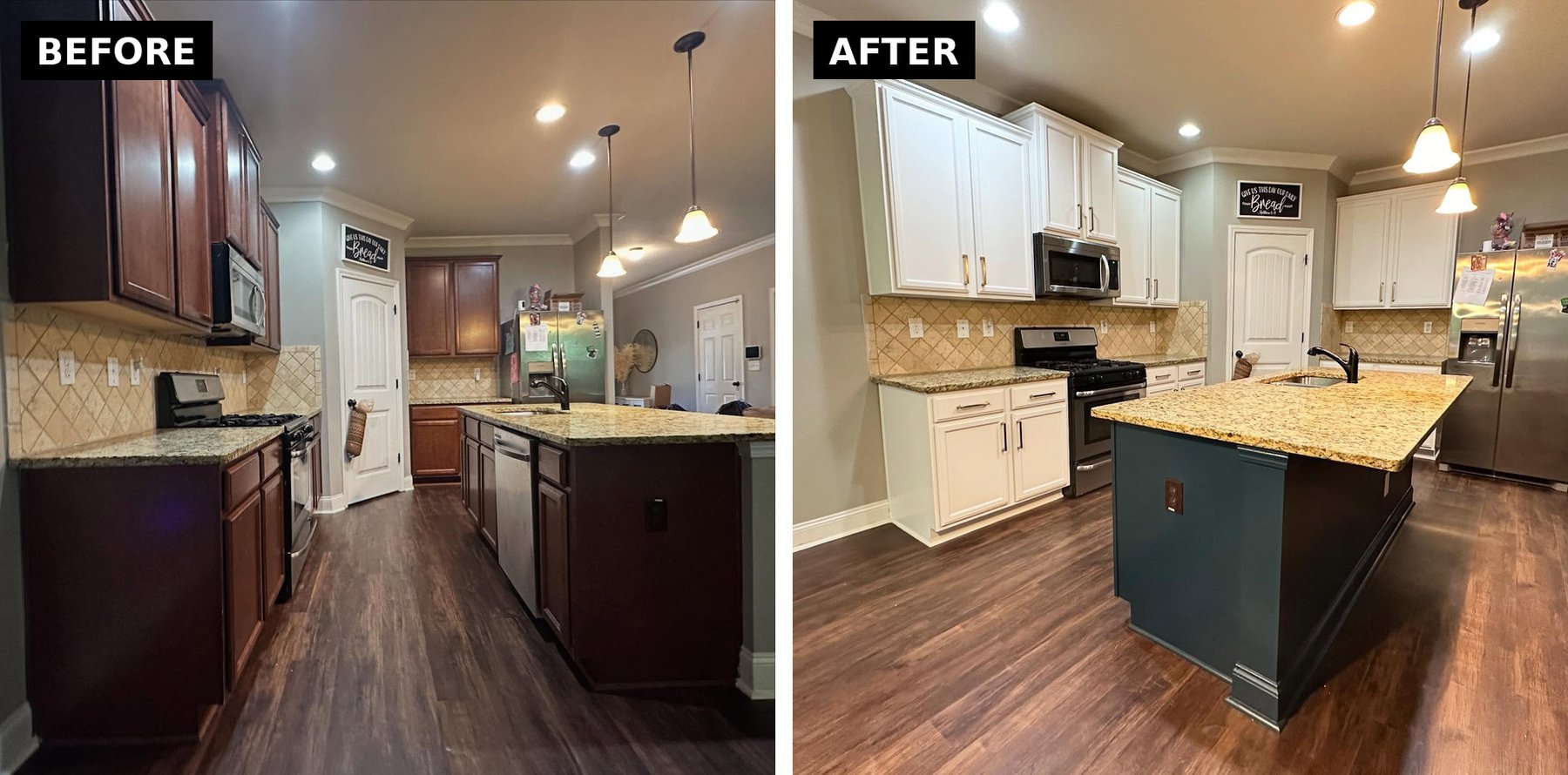
What the kitchen looked like before anyone touched it
The bones were good. Crown molding, pendant lights, real stone on a proper island. But every finish was stuck in 2008. Cherry cabinets soaked up the light, Santa Cecilia granite ran heavy with gold and brown, and a travertine backsplash filled the gap in a tired diamond pattern.
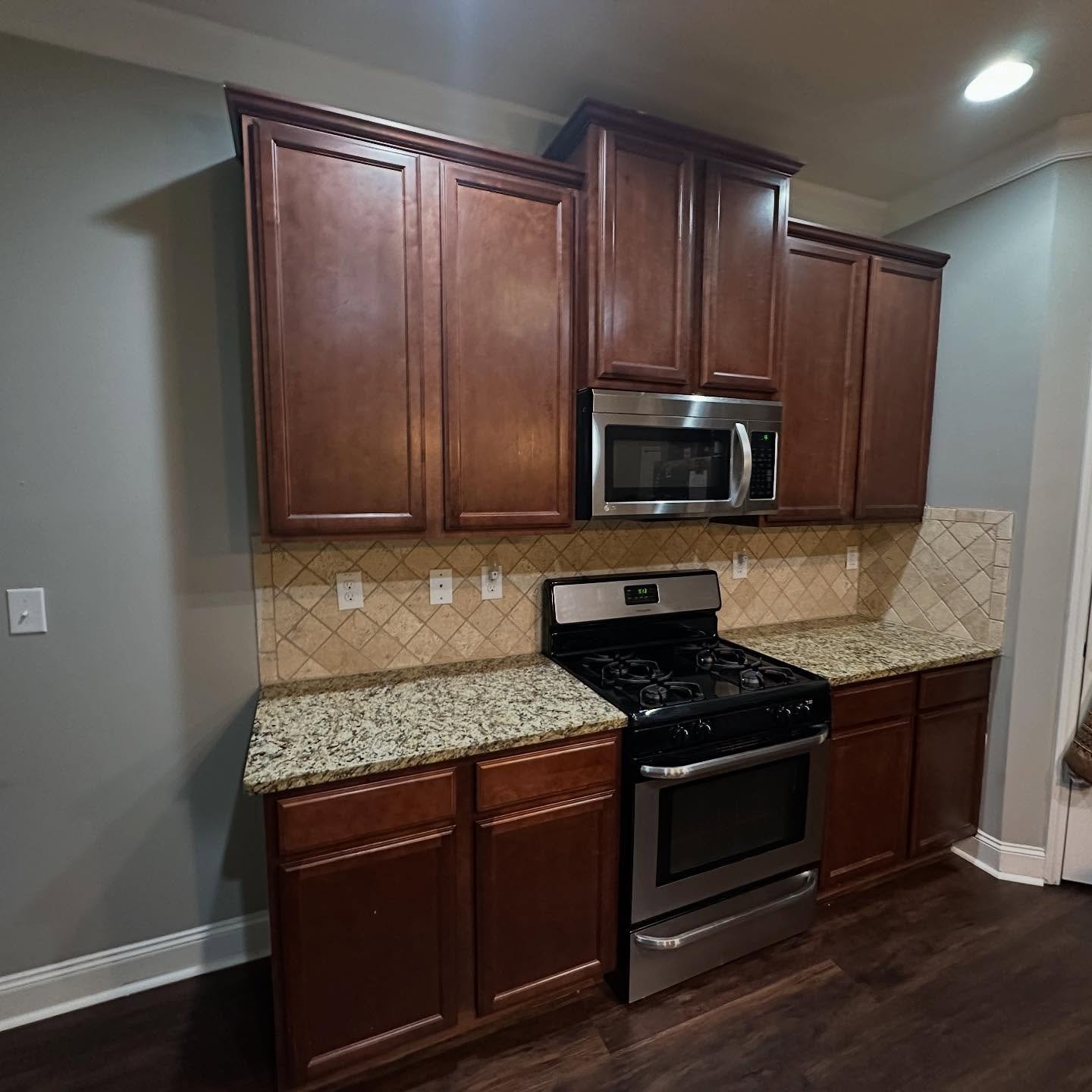
You walked in and your eye didn’t know where to land. The cabinets pulled everything down, and the warm counter and backsplash were doing their own thing. Nothing was talking to each other.
The three moves most people make, all wrong
This is where kitchens get ruined. You have warm counters you can’t afford to replace, dated cabinets, and Pinterest telling you what to do.
Move one is paint every cabinet cool white. The gold in the granite starts shouting. The backsplash reads as orange. The room looks like a renovation that ran out of money.
Move two is paint everything a safe greige and call it done. The kitchen disappears. Same tired room, slightly beiger.
Move three is the pricey one. Replace the granite first. Eight thousand dollars gone, cherry still cherry.
She almost did move one. Her painter talked her out of it.
The one idea that saved the granite
He looked at the Santa Cecilia and saw a feature, not a flaw. The stone is warm and expensive-looking in the right room. Build the right room around it and you don’t need to touch it.
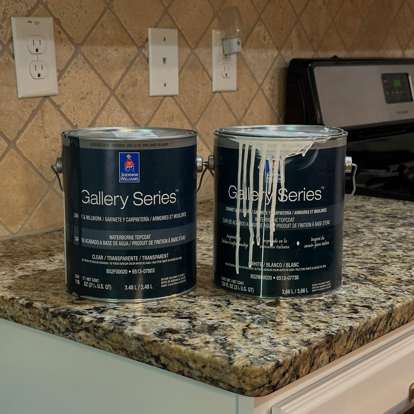
Two colors, both Sherwin-Williams Gallery Series, sprayed for a factory finish.
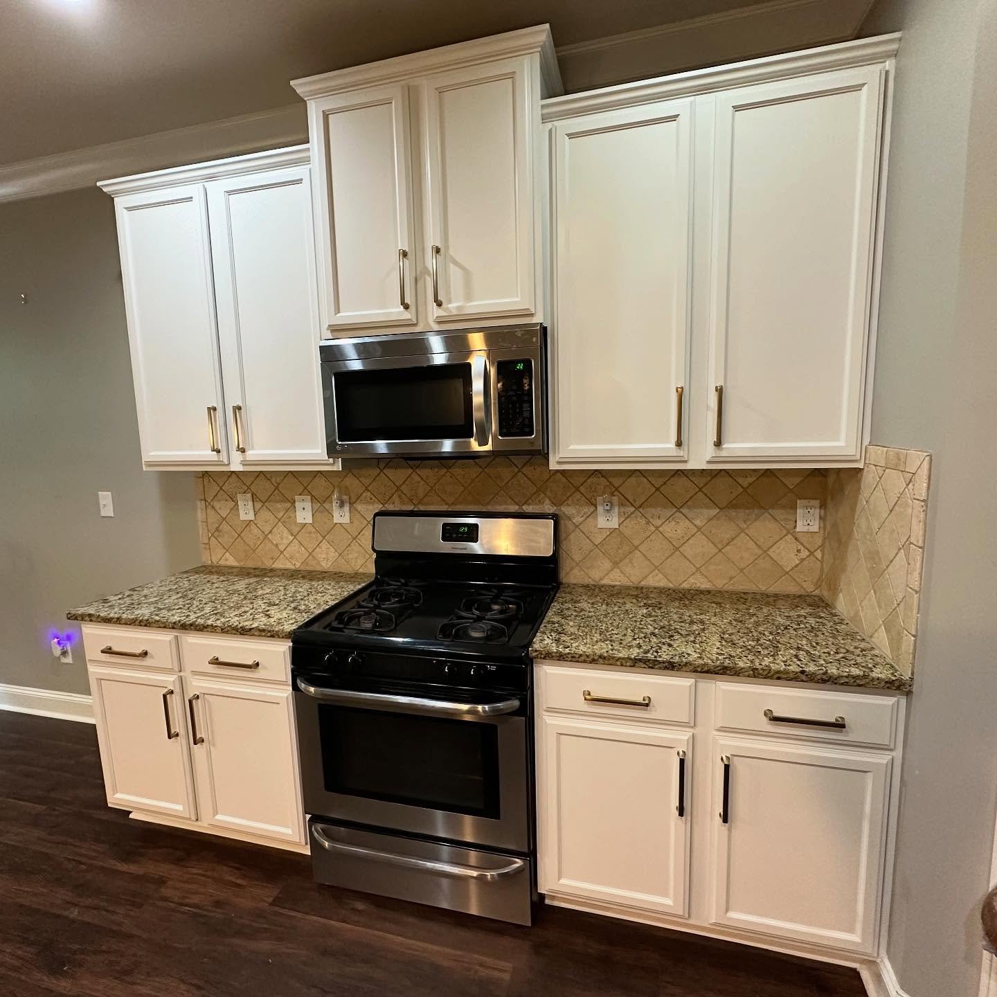
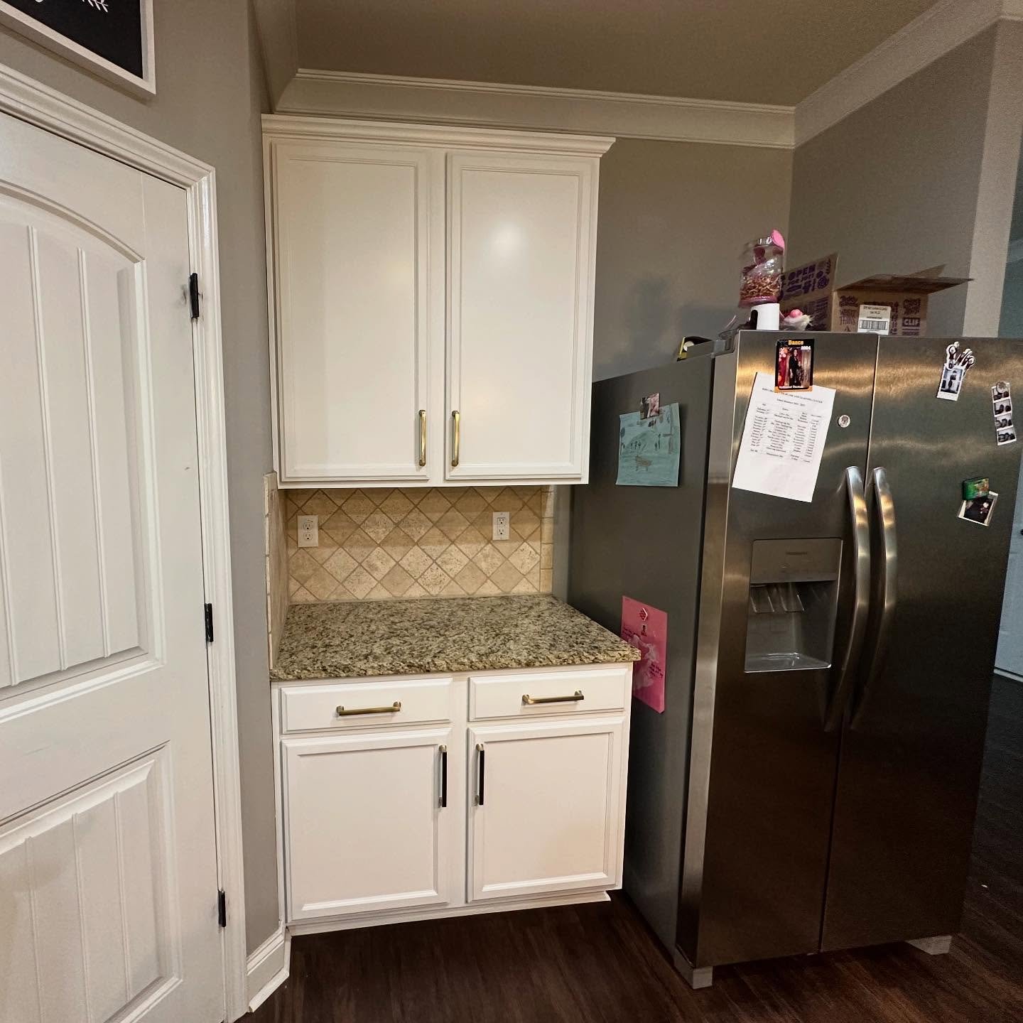
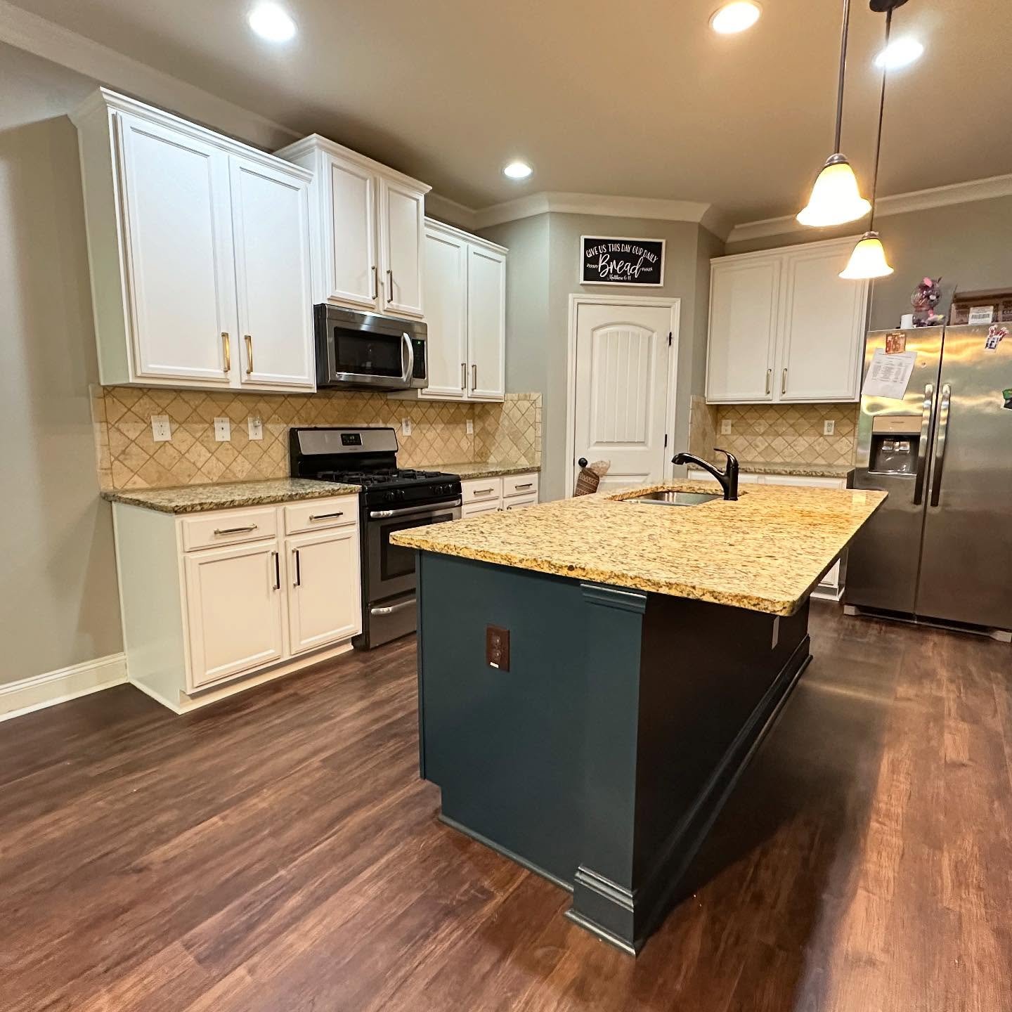
Alabaster SW 7008 on every upper and perimeter base. A warm white with a creamy undertone, so it speaks the same language as the travertine and the gold in the stone. The warm tones stop fighting and start agreeing.
Dark Night SW 6237 on the island alone. A deep navy with a soft green pull, and that green is the quiet hero. Green sits across the color wheel from warm gold, so the navy makes the gold look richer instead of competing with it.
Gold handles tie it all back to the gold already running through the granite.

The stove wall, where you see it click
Nothing changed here except the wood color. Same stove, same backsplash, same counter, same wall.
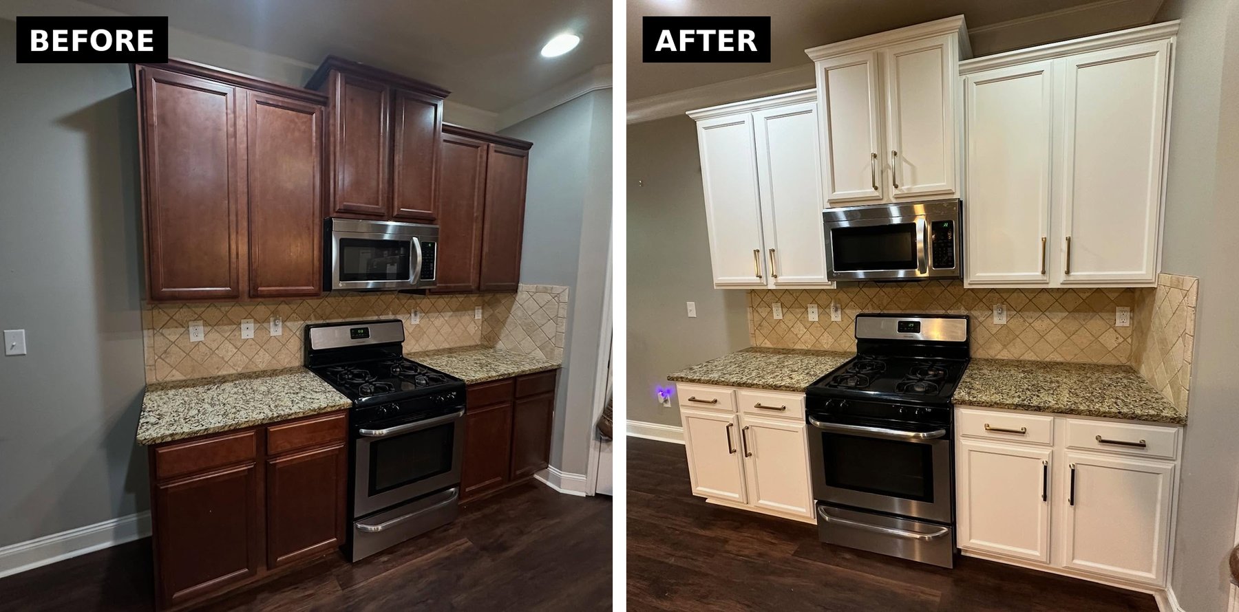
Look what the Alabaster does to the backsplash. It stops looking like a tired square of tile and becomes soft texture holding the wall. Before, the cabinets were the first thing you saw, and they weren’t flattering anything. After, your eye finds the gold hardware, then the gold in the stone, then the backsplash pattern, in that order.
The island is the whole trick
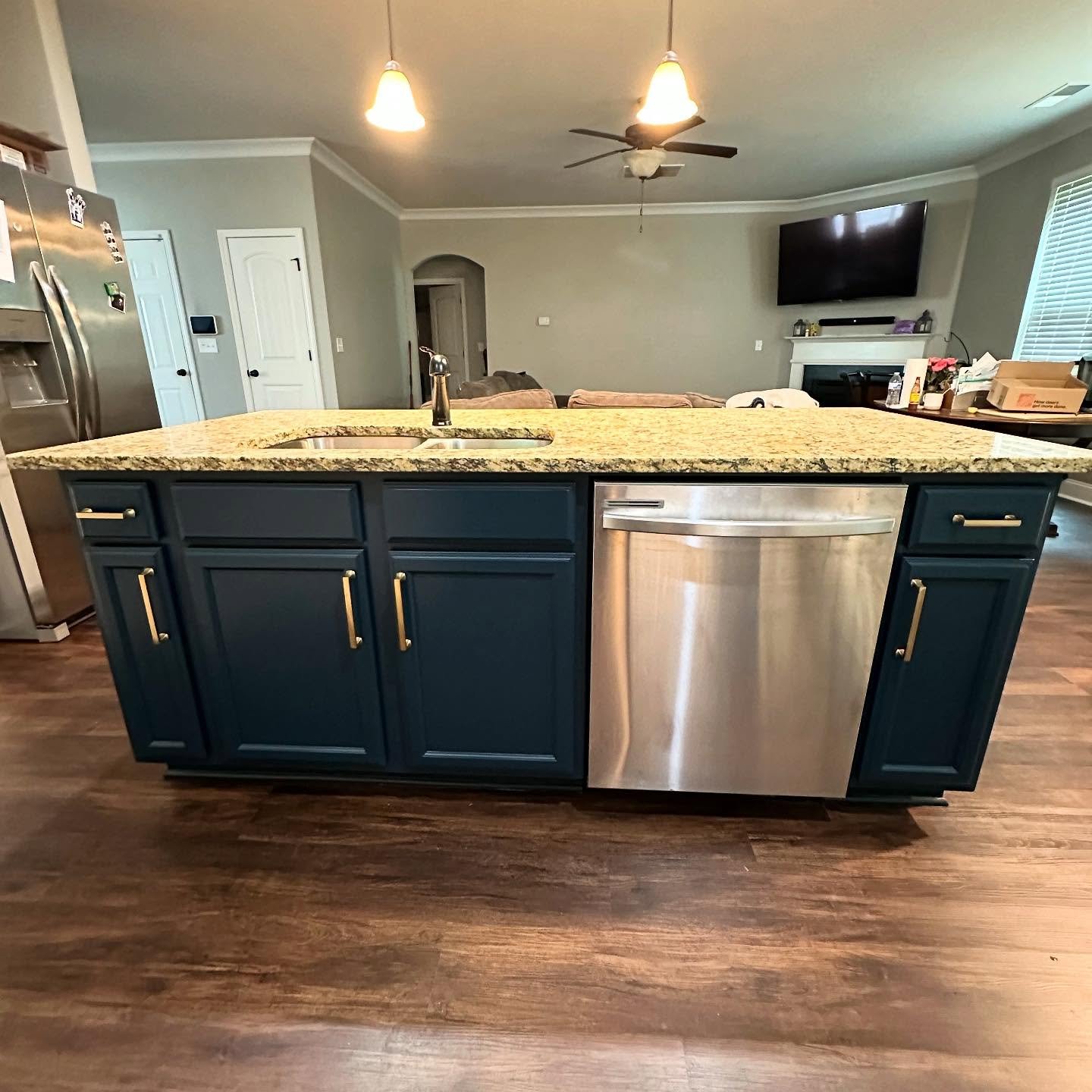
She was dead set on painting the island white. Every roundup she pulled up said white on white, clean and timeless. Her painter pushed back. A white island would flatten the room and leave the warm counters stranded. He wanted a dark anchor in the middle to pull the space into this decade.
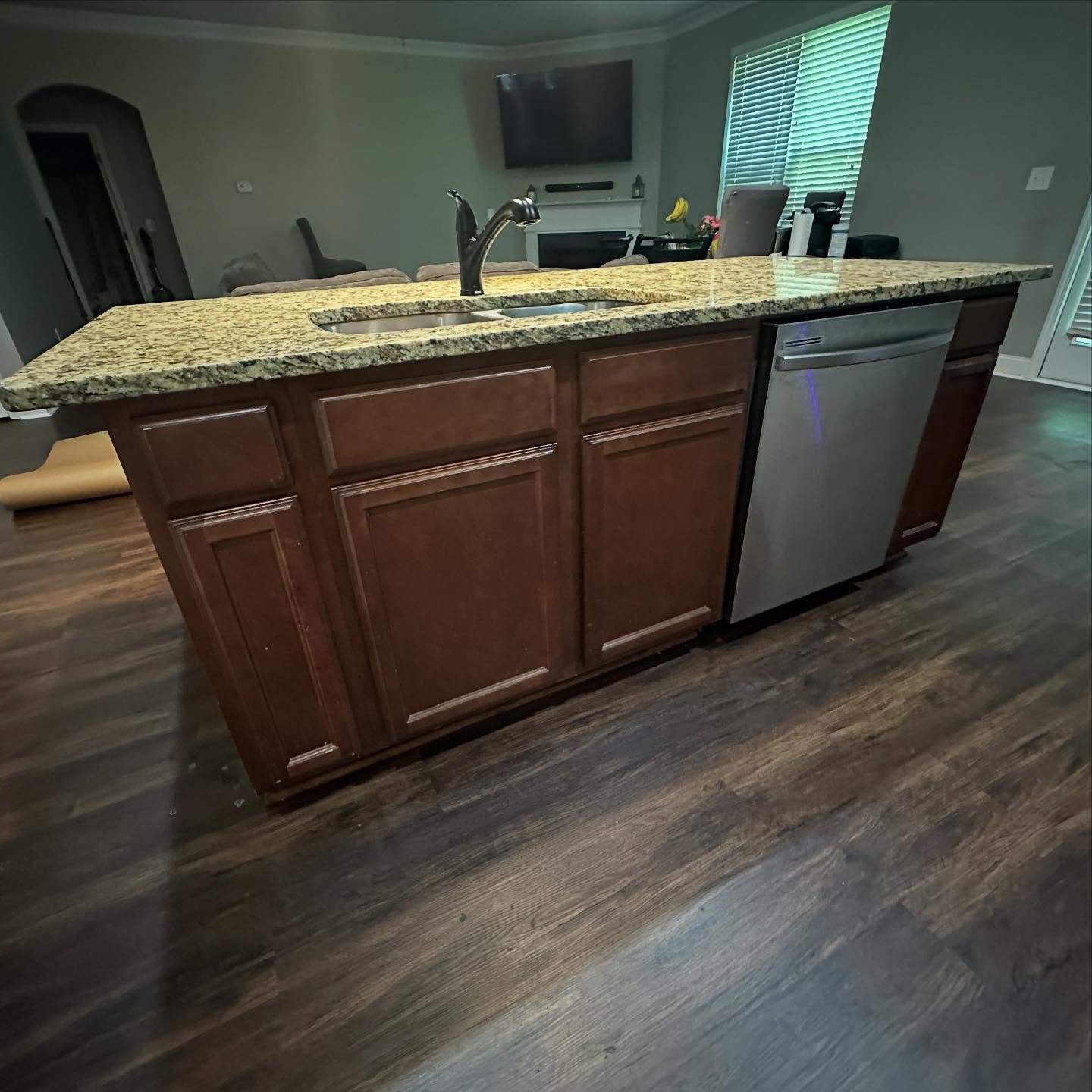
Look at what the dark cherry does from this angle. It eats the whole lower half of the room, so the granite and the floor read as one continuous brown blur. There is no visual break between the island and the floor beneath it.
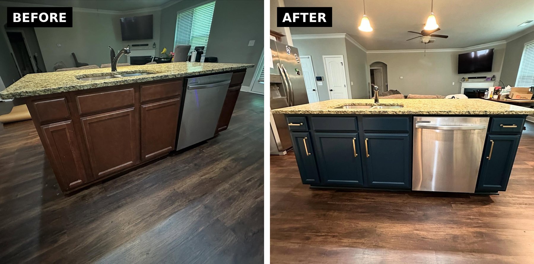
She trusted him. The island is now the piece that makes the room. A deep navy base under warm granite reads like custom millwork, not a painted-over builder island. A designed moment that quietly says someone spent real money here.
The fridge nook that used to feel like a closet
The coffee corner beside the fridge was the saddest spot in the old kitchen. Dark cabinets jammed into a narrow run, fridge on one side, pantry door on the other. You walked past it instead of using it.
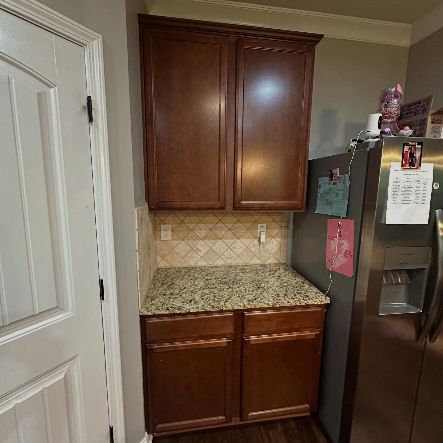
See how the dark cabinet in the middle disappears into the fridge beside it. The whole nook reads as one tall, dark lump against a lighter wall. There is no sense of counter space, no sense of a usable zone, just visual weight.
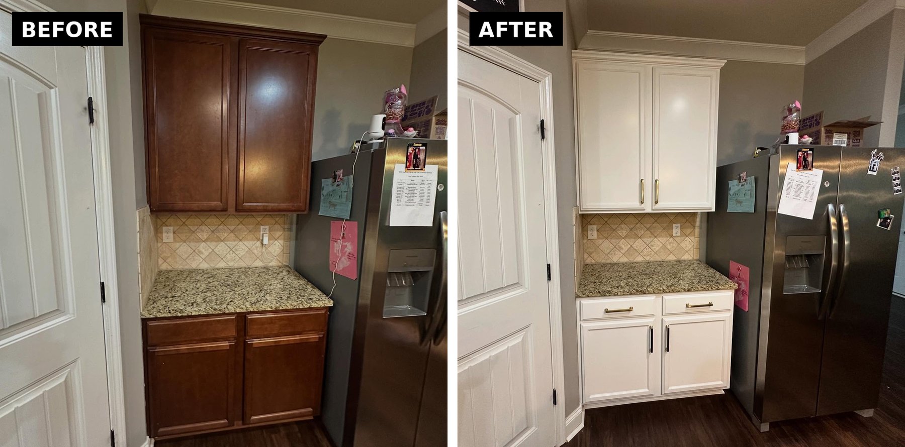
Alabaster opened it up without anyone touching a wall. The backsplash is finally visible, the counter has room to breathe, and the whole corner reads as roughly twice the size. Nothing physical changed.
The pullback, where the full plan shows
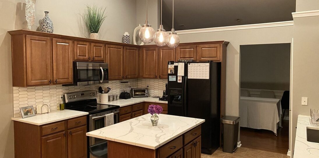
Step back and the logic clicks. White around the edges, deep navy in the center, gold threading it all together.
The Santa Cecilia and the travertine, the two surfaces she was ready to pay thousands to remove, are now what make the kitchen feel warm and expensive. Swap them for cool quartz and white subway tile and you lose exactly what makes this room feel built, not flipped.
What the whole job actually cost
Two gallons of Sherwin-Williams Gallery Series. One set of brushed gold pulls. A weekend of prep and spray work. That is the entire bill.
The granite, backsplash, appliances, floors, pendants, and wall color all stayed. Every expensive thing in the kitchen never moved, and the room still reads as a full renovation.
The lesson most homeowners miss is simple. When your counters run warm, your cabinets have to work with that warmth, not against it. A warm white on the perimeter gives the eye a place to land. A slightly green navy on the island gives those warm tones a complement to lean against. Gold hardware connects all three so they act like one piece.
The parts you were sure you had to replace are usually the parts worth keeping.
Paint colors used Perimeter cabinets: Sherwin-Williams Alabaster SW 7008 Island: Sherwin-Williams Dark Night SW 6237 Finish: Gallery Series waterborne cabinet and millwork topcoat, satin Application: Sprayed


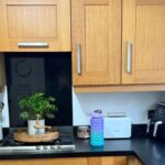
Hmm. The gold countertop on the island is not my cup of tea with cherry or blue. Not a fan of the backsplash/countertop combination.
The painted cabinets are beautiful.