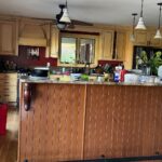

A huge fluorescent troffer light had been hanging from the ceiling, and according to designer Alysha Ahrens, it made the ceilings feel about a foot shorter than they actually were. Removing it did more than get rid of an unmistakably dated ’70s fixture. It opened up the entire upper half of the kitchen, setting off a chain of changes that made the room feel dramatically different.
The kitchen wasn’t actually that small
View in gallery
Jenessa and her husband bought the 1977 home intending to tackle the kitchen first. It had nearly every visual signature you might expect from the era: mustard linoleum floors, brown cabinetry, laminate countertops, a giant fluorescent ceiling fixture, and the famously dated “boob light.”
The room itself wasn’t particularly cramped. But all those darker, heavier elements worked together to make it feel yellower and smaller than it really was. That distinction mattered.
Instead of treating the kitchen’s footprint as the problem, Ahrens looked at the things visually weighing it down. The goal was farmhouse charm with better functionality, but the transformation didn’t begin with moving the plumbing or completely changing the layout.
It began above eye level.
One giant light was making the ceiling feel lower
The fluorescent troffer was the kind of fixture that could dominate a room without looking like much of a design decision. Here, its impact was bigger than its size suggested.
Ahrens says removing the bulky light made the ceilings feel about a foot taller. Once it was gone, there was also room to install taller cabinets that extend all the way to the ceiling. That created a useful visual trick without actually raising the ceiling.
The eye now has a clean vertical line to follow instead of stopping at a bulky fixture hanging below it. The taller cabinetry emphasizes the height of the room, while the new can lighting and central pendant provide illumination without the same visual weight.
It is a small change with an outsized effect: the ceiling didn’t move, but the room suddenly reads differently.
The rest of the room followed the same idea

Once the heavy elements were being stripped away, the rest of the kitchen could reinforce that sense of openness.
The cabinets, walls, and trim were finished in Behr’s Poetic Light, while a large white farmhouse sink, white subway tile backsplash, and off-white quartz counters added more light-reflecting surfaces.
The upper cabinets became glass-front, and the cabinets in the right corner were replaced with open shelving. Those choices matter because they reduce the visual block created by a wall of solid cabinetry.
Even the floor changed from the original yellow linoleum to brown hardwood, giving the room a stronger foundation without bringing back the yellow cast that had made the original space feel so dated.
None of these changes, individually, required reinventing the kitchen. Together, they changed how the same basic room was perceived.
Most of the kitchen never moved

This is perhaps the easiest detail to miss when looking at the before-and-after.
The sink and dishwasher stayed in their original positions, so there was no need for major plumbing changes there. The range stayed put, too, although it was replaced with a stainless steel model and paired with a sleek hood.
The refrigerator was moved into a recessed wall, and the wall separating the kitchen from the dining area was removed before the family moved in. That opened the room to the dining space and created enough room for a large island.
So although the finished kitchen looks like a completely different space, its basic working arrangement remained surprisingly familiar.
That’s what makes the ceiling change more interesting. The renovation wasn’t dependent on moving everything. A large part of the transformation came from removing the things that made the existing space feel visually heavy.
The island fixed a problem created by making the kitchen lighter
Removing upper cabinets can create another problem: where does all the stuff go?
The new design answered that with the island.
Opening the kitchen to the dining area created room for a much larger island, which added both workspace and a place for family and friends to gather. It also helped compensate for storage lost when some of the upper cabinetry was removed.
That makes the island more than a fashionable centerpiece.
It became part of the solution.
The kitchen gained visual breathing room overhead while gaining practical storage and workspace below. The room could feel less crowded without becoming less useful.
The biggest change wasn’t really the kitchen

The finished kitchen is certainly a makeover. But the more useful lesson is how much of the transformation came from changing perception rather than completely changing the room’s bones.
A bulky light made the ceiling feel lower. Dark cabinetry and yellow flooring made the space feel smaller and yellower. Heavy upper cabinets interrupted the visual openness. Separating the kitchen from the dining room limited the room’s sense of connection.
One by one, those problems were removed.
The result is a kitchen that feels taller without a taller ceiling, more open without an entirely new footprint, and more functional without relocating every appliance.
That is the part worth stealing.
Before deciding that a dated kitchen needs to be gutted, look at what is visually making it feel dated. Sometimes the thing making a room feel smaller isn’t the room itself. It can be the fixture hanging from the ceiling, the cabinets stopping short of it, or the collection of heavy elements competing for attention.
In this kitchen, changing what was happening overhead helped change the way everything below it was seen.
The ceiling never got higher. The kitchen just stopped making it look low.