
Most people would have ripped these cabinets out.
The arched cathedral doors. The honey oak stain. The gold-flecked granite. The warm cherry floors. If you type “dated kitchen” into Pinterest right now, this is the exact kitchen that comes up in the before shots. The standard advice is loud and expensive: tear it all out, go white, swap the granite for quartz, start over. Budget twenty to forty thousand dollars.
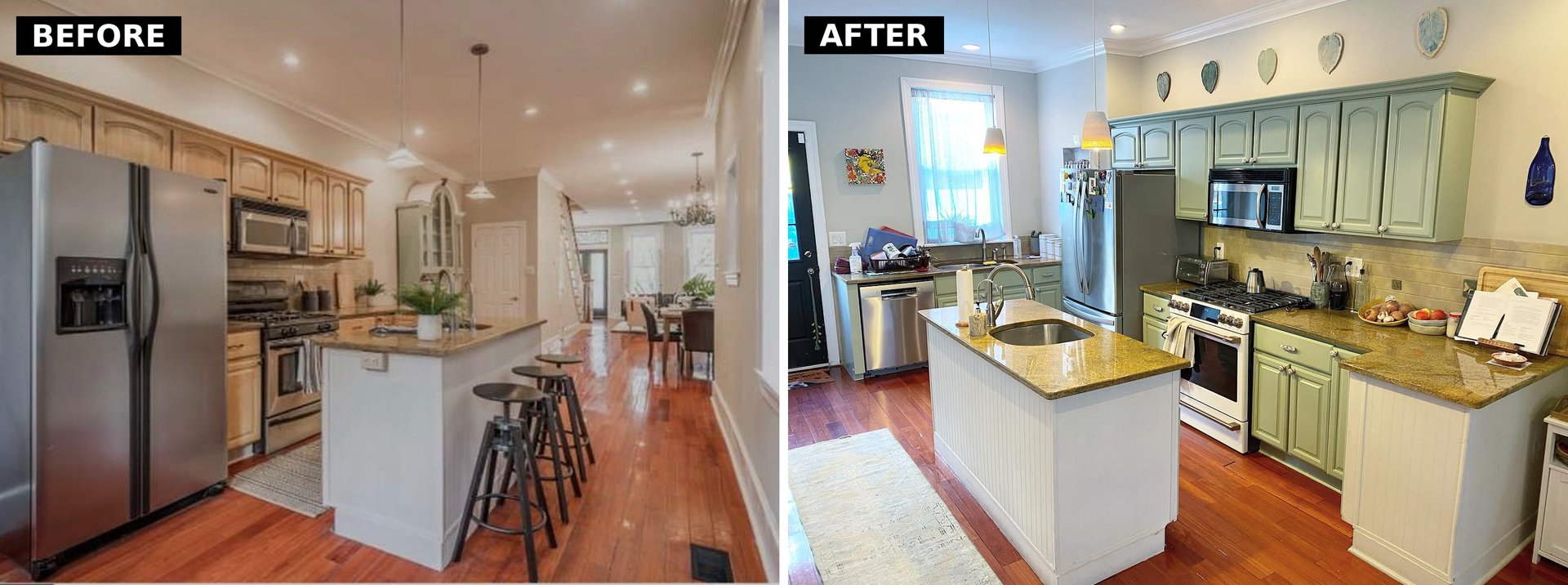
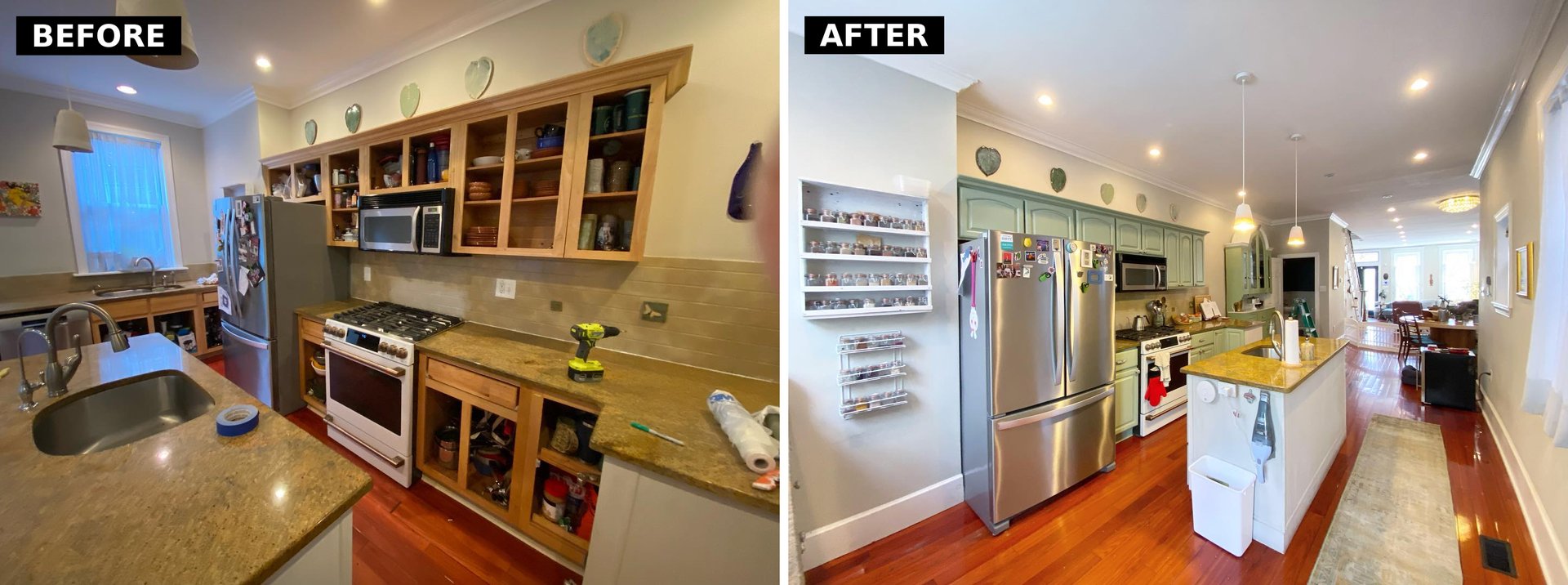
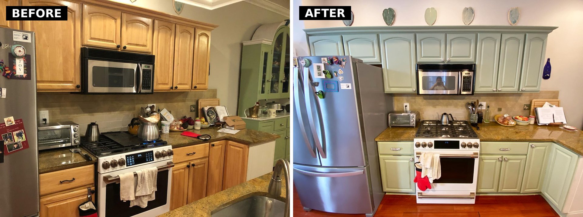
She did none of that. She kept every door, the gold granite, the cherry floors, the beige stone backsplash. Then she picked up a sprayer and painted the cabinets one color: Sherwin-Williams Clary Sage. That was the whole plan. And it worked so well it looks like a different house.
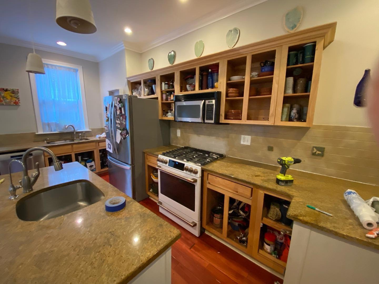
The kitchen she started with
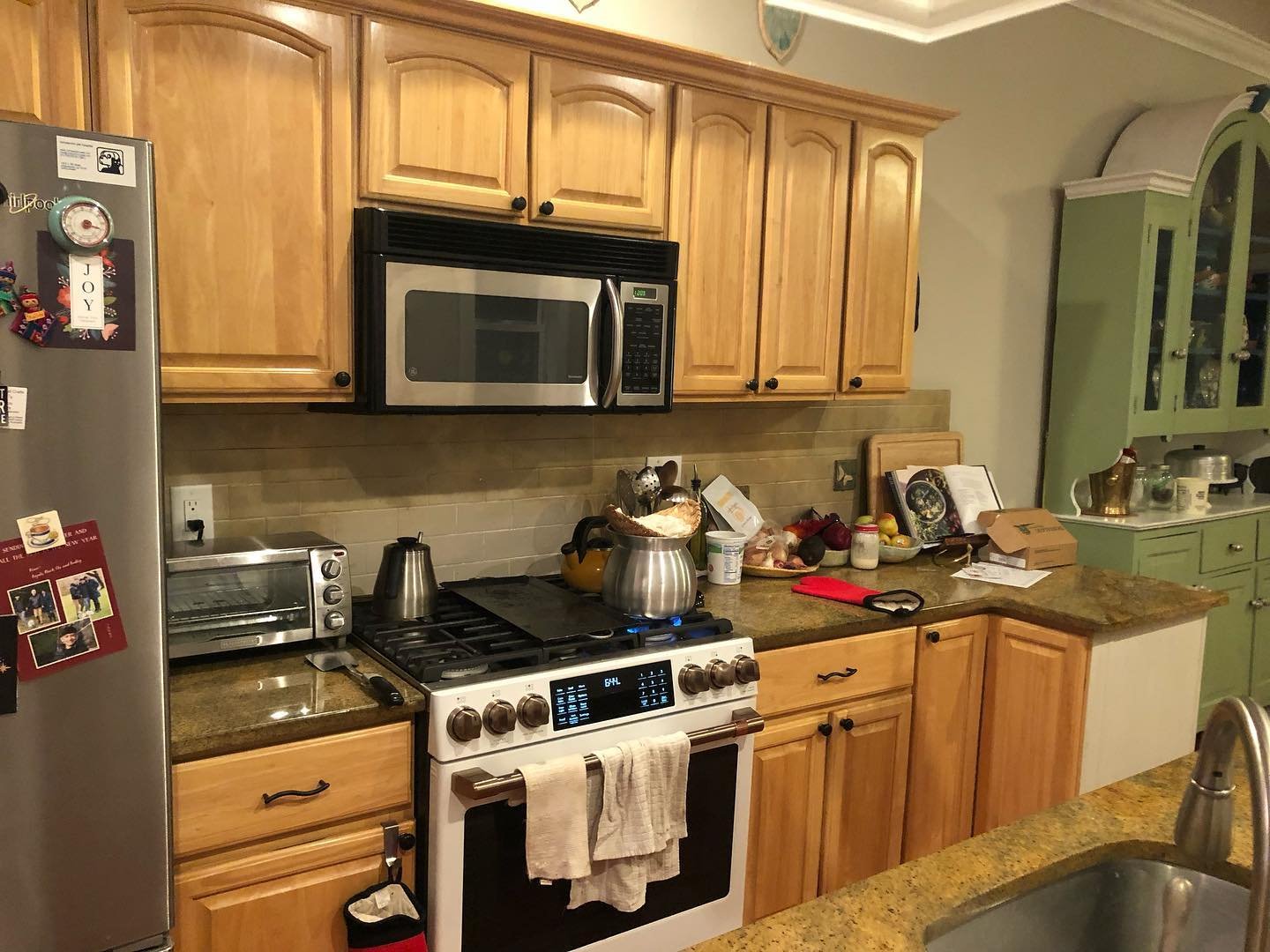
You can date the house in two seconds. Honey-stained maple uppers with cathedral arches. Tumbled travertine backsplash in warm beige. Gold speckled granite. Cherry floors so warm they almost read orange. A classic early-2000s builder package, the one half the country moved into and has been quietly resenting ever since.
Pull back and the whole room reads the same way. Oak cabinets down the galley, a white beadboard island with gold granite, pendant lights, cherry floors, warm walls, everything on the same note.
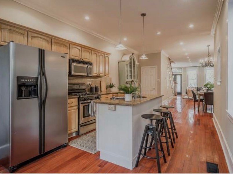
The problem isn’t that any one piece is ugly. It’s that every surface sits on the same warm, orange-leaning note. The wood, the granite, the backsplash, the floors, all warm. Nothing breaks the loop.
Most “modernize your kitchen” articles say to break that loop by going cool and bright: paint the cabinets white, rip the gold granite out, replace the floors. She went the other way.
Why Clary Sage is the hero
Sage green doesn’t just look pretty here. It does something very specific that white paint cannot.
Clary Sage is a muted, dusty, slightly grey-green with a tiny bit of warmth in it. That’s the trick. White paint on these cabinets would have made the cherry floors look even more orange by contrast. A cool grey would have made the gold granite look yellow. Black would have shrunk the room.
Sage sits in the same temperature family as the warm wood and gold stone. It adds the one thing the room was missing: a cool note to break up all that warmth. Suddenly the gold granite reads as warm metallic, the cherry floor reads as intentional, the backsplash reads as neutral stone. Nothing else changed, but everything else got reframed.
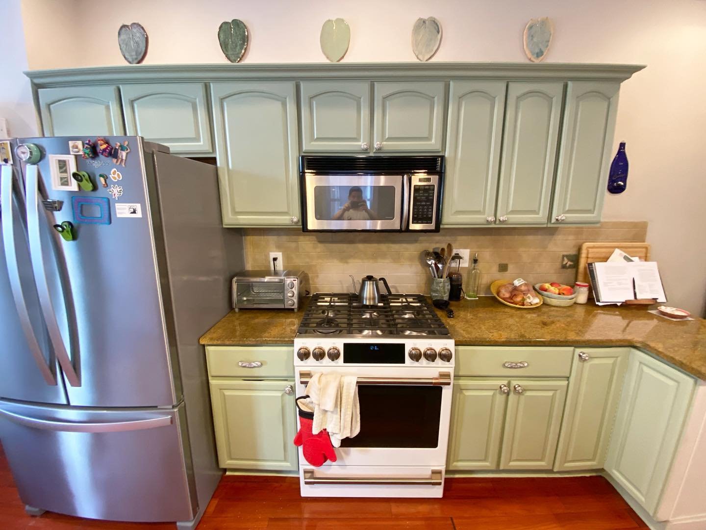
The arched doors stopped looking dated
This is the part nobody expects.
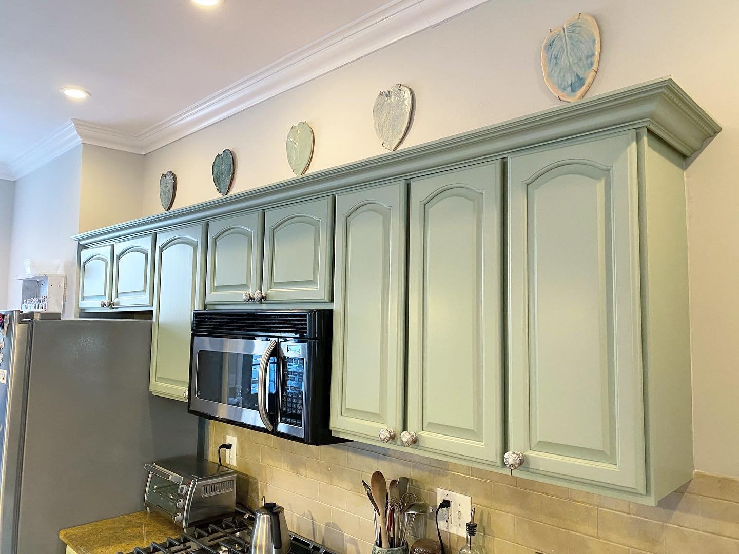
Cathedral arch doors are the most mocked door profile in kitchen design right now. Every “trends that need to die” list puts them in the top three. People spend thousands replacing them with flat Shaker fronts.
But paint them sage, and the arches stop reading as 2003 builder package. They start reading as English country cottage. Swap the old black knobs for small floral ceramic pulls (she did) and the room looks like it belongs in a Cotswolds cookbook, not a tract home.
The prep work was the hard part
Before any paint went on, the kitchen looked like a crime scene. Every door came off. Every surface that wasn’t being painted got taped and plastic-wrapped. Counters disappeared under drop cloths. The fridge got mummified in blue tape and green paper. The backsplash vanished behind sheets of plastic.
This is the part most cabinet-painting posts skim over, and it’s what makes the finish look professional. A sprayed finish only looks sprayed if nothing else in the room has overspray on it.
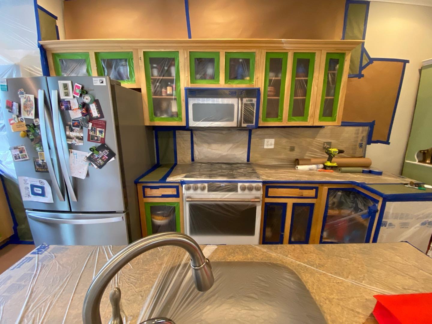
The doors came off and got sprayed somewhere else, probably in a garage where dust could be controlled. The cabinet boxes stayed on the wall.
What the finished kitchen feels like
The reveal is quiet. That’s the point.
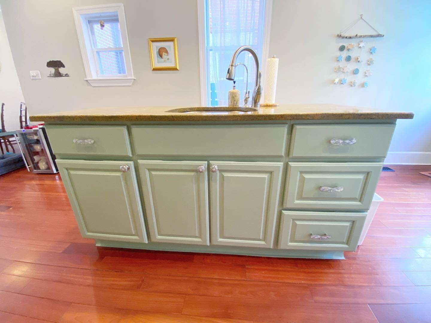
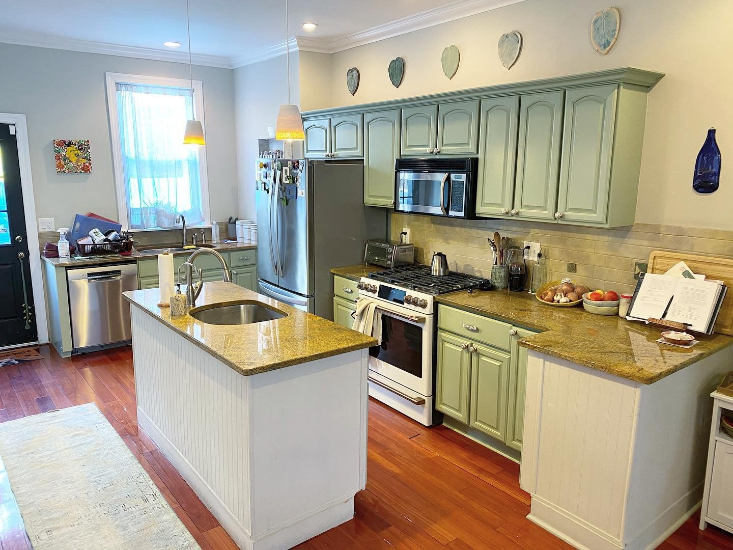
There’s no shocking contrast. No black island against a white perimeter. No two-tone statement. Just one color on every cabinet, top and bottom, perimeter and island, with slightly different little ceramic pulls on the island to keep it from feeling flat.
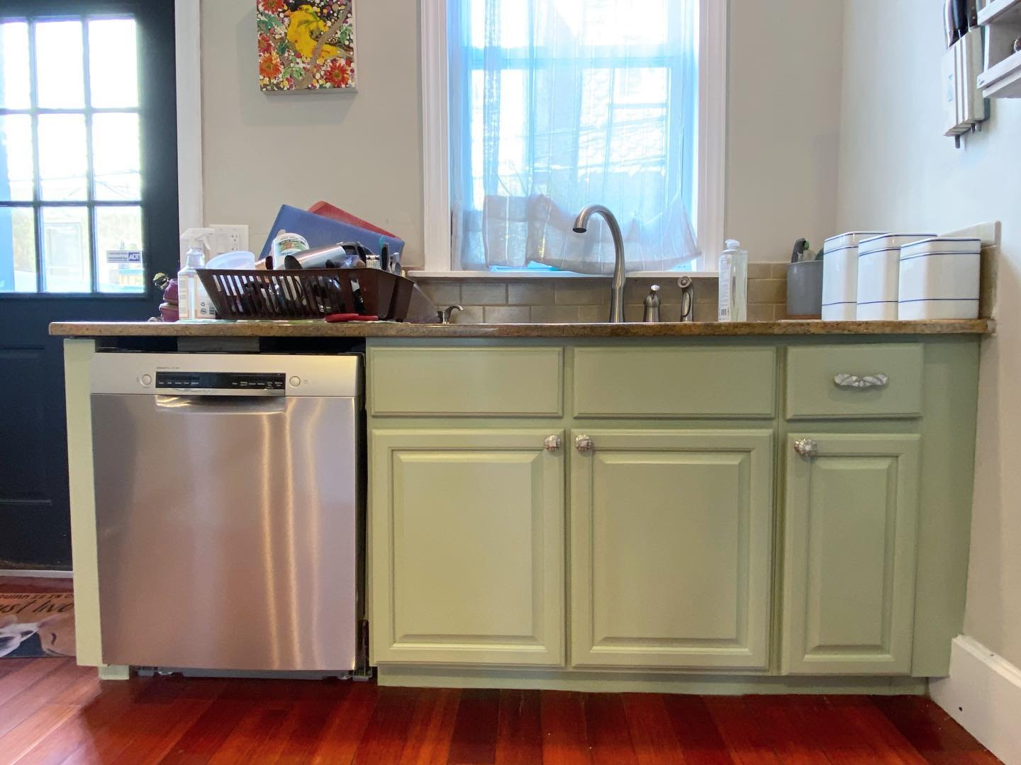
The lower cabinets by the dishwasher got the same treatment. Dated raised-panel fronts, same decade as the uppers, same honey oak originally. Now they match the rest, calm and dusty and quiet.
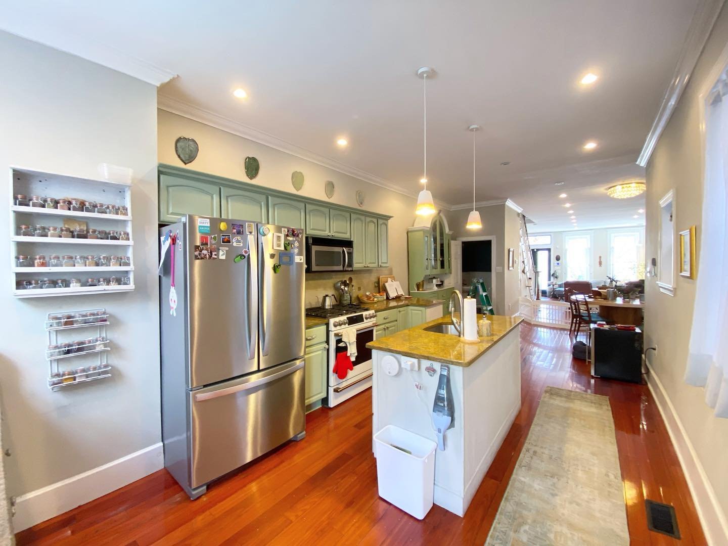
Step back and look at the full room, and the thing that hits you is how settled it feels. The gold granite finally has a job. The cherry floors finally have a partner. The arched doors finally make sense.
The lesson most people miss
You don’t actually have to replace what’s dated. You have to break the loop.
A dated kitchen almost always has one problem underneath it: every surface sits on the same note. Same temperature, same era, same undertone. Replacing one thing rarely fixes it, because the rest still carries the old note.
Painting the biggest surface in a color that sits in the opposite temperature slot fixes it in a weekend.
Sage was her answer. A deep blue would have worked. Soft black would have worked. A dusty terracotta would have worked. The point isn’t the exact color. It’s picking one that sits across the temperature line from the counters and floors you’re keeping, so the room has a counterweight.
Hers was in a Sherwin-Williams fan deck. One color, one weekend, a kitchen that stopped looking like 2003.