
You see this dresser at every estate sale. Carved drawer panels, a scalloped apron, little cabriole legs, three rows of ornate brass pulls. Pieces like these have been sitting unsold on Facebook Marketplace for years because nobody wants anything that reads as “grandma’s bedroom.” The standard rescue plan is to paint them chalky white, strip them back to raw wood, or walk right past them.
Olive Street Designs ignored all three options.
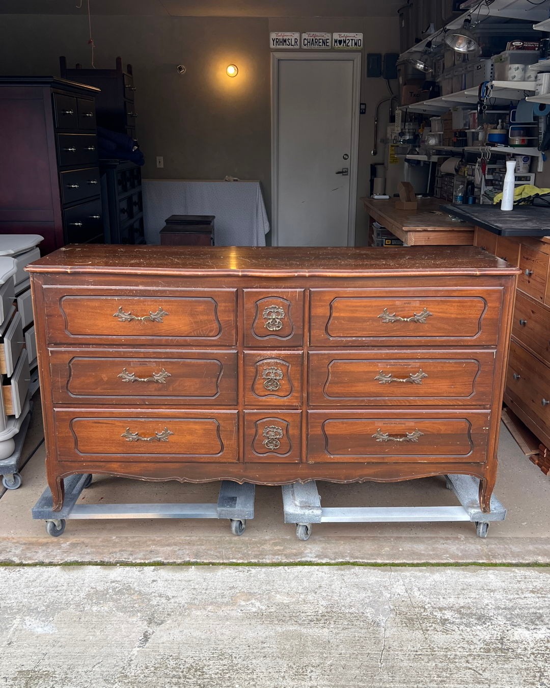
This is where it started. Parked on two moving dollies in the garage, under a single overhead bulb, next to a workbench full of bottles and tape. Scratches across the top. Hardware that had gone dull years ago. That specific shade of 1970s warm brown that reads as “old” the second you walk into a room.
“Highly worn and in desperate need of saving,” is how the post described it, and the photo doesn’t even show the full damage. It’s the kind of piece most people on Marketplace would scroll right past, and a fair number of flippers would, too. The shape was still good. The joinery was still tight. But that didn’t matter when the first thing anyone noticed was the color.
What one color decision did
And then this is what came out the other side.
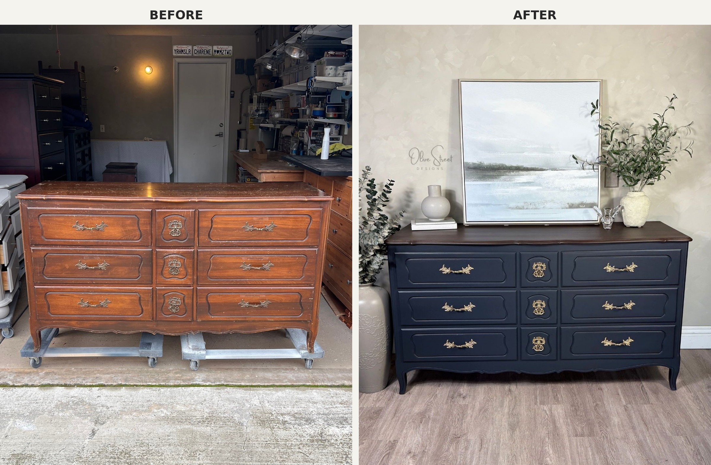
Same dresser. Same carved panels. Same hardware, right down to the original brass pulls. What changed was the paint on the body, the stain on the top, and a bit of polish. No new feet. No new handles. No jigsaw work on the apron. Nothing structural moved.
Why dark paint works on carving like this
Every flipper tutorial tells you to go lighter on ornate furniture. Cream, soft gray, chalky white, even pale pink. The thinking is that light paint “modernizes” a fussy shape and helps it fit a brighter room.
The problem is that light paint flattens carved detail. Routed lines and raised panels need shadow to read as depth. When you paint them the lightest color in the room, the shadows disappear, and you end up with something that looks like a wedding cake.
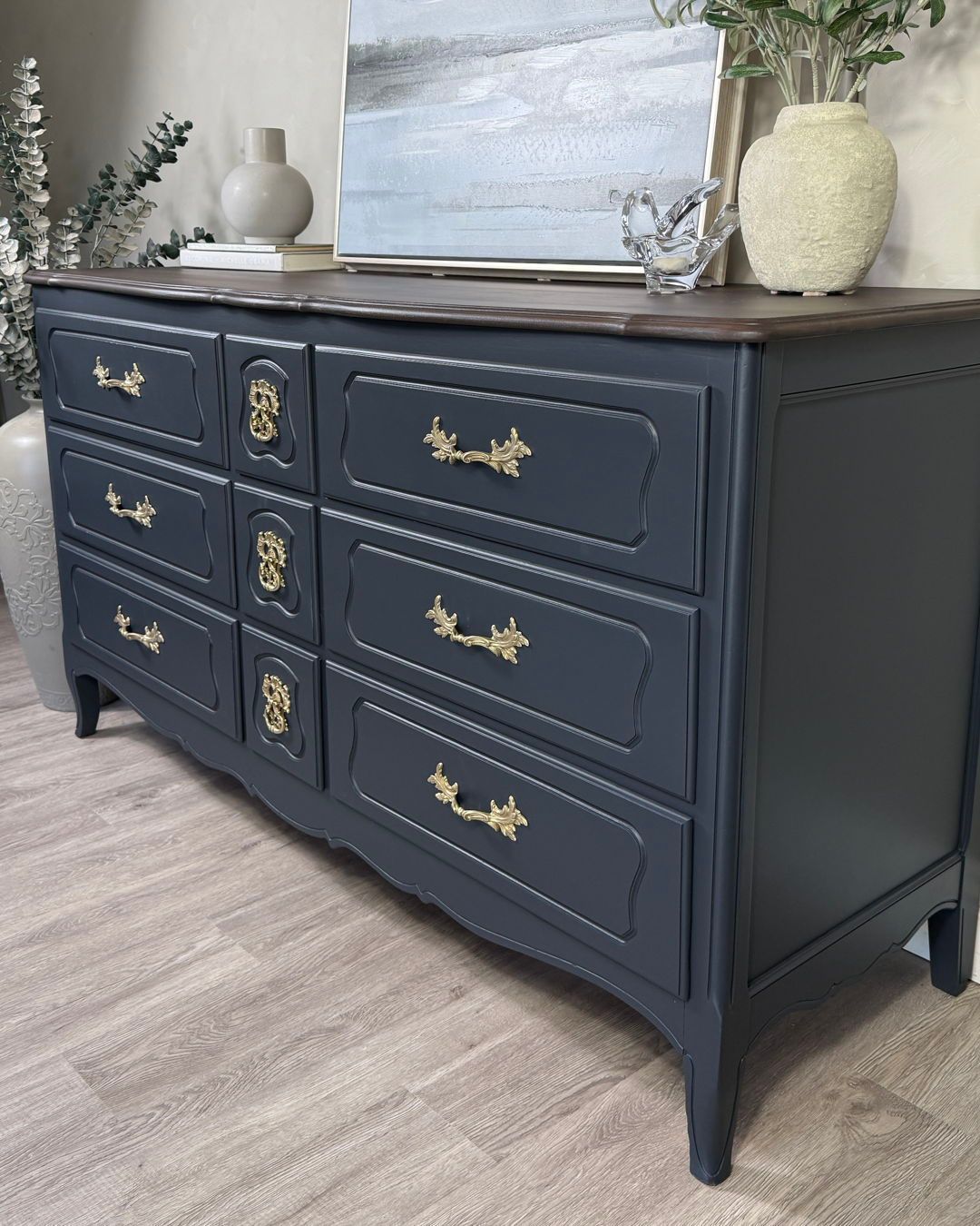
Dark paint does the opposite. Every routed line sinks into shadow. Every raised panel catches a highlight at its edge. The piece starts looking like something a joiner built by hand, not something that rolled out of a 1970s showroom with ten identical siblings. It’s the same reason high-end cabinet makers lean into deep green and inky blue on raised panel doors. The paint isn’t the feature. The shape underneath is, and the paint just lets you see it.
Look close and you can see what the paint did
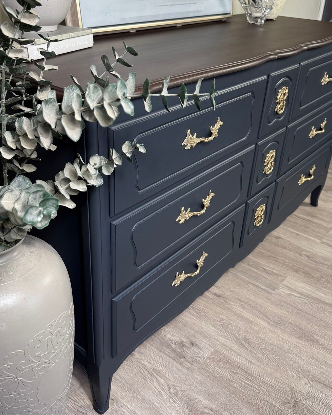
The notched corners on each panel. The curves along the top of every drawer. The little medallion plates around each keyhole. None of that was visible in the before shot, because the brown stain and the brown carving were all one color.
Against navy, every line reads. Your eye finds the geometry first and the color second. The hardware stops competing with the body and starts acting like trim on a tailored jacket. That’s the part most makeover photos miss. The paint color isn’t what makes the piece look expensive. The paint is what makes the carving look expensive, and the carving was always there.
The top she refused to paint over
The easy call, once you’ve committed to dark paint, is to paint the top too and go full matte black. It looks dramatic in a quick phone shot and heavy in person. You lose the warmth, and the piece ends up feeling like a prop instead of furniture.
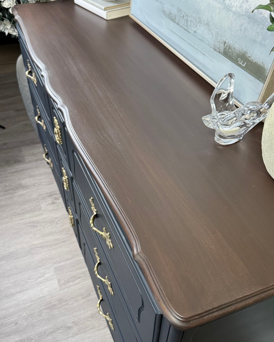
The top got stripped and re-stained in a deep brown instead. The grain stayed. The shaped edge stayed. Now the wood acts as a warm frame around the dark body, and the piece has somewhere to breathe. Without it, this would feel like a dresser-shaped hole in the room.
The hardware that finally looks right
The original brass pulls went straight back on. No swap, no modern knobs, no brushed-nickel replacements from the hardware store. A quick polish and that was it. Against the brown wood they’d looked tarnished for years, which is usually when people decide to toss them and spend fifty dollars a drawer on replacements. Against navy, they look like jewelry.
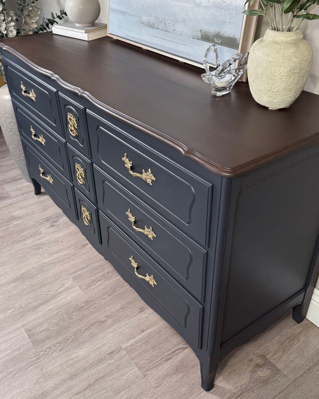
From this angle you can also see what the paint did to the silhouette. The scalloped apron and the small cabriole legs used to look dated the second you saw them. In one solid dark color, they turn into a continuous shape that reads sculptural instead of fussy.
The finished piece
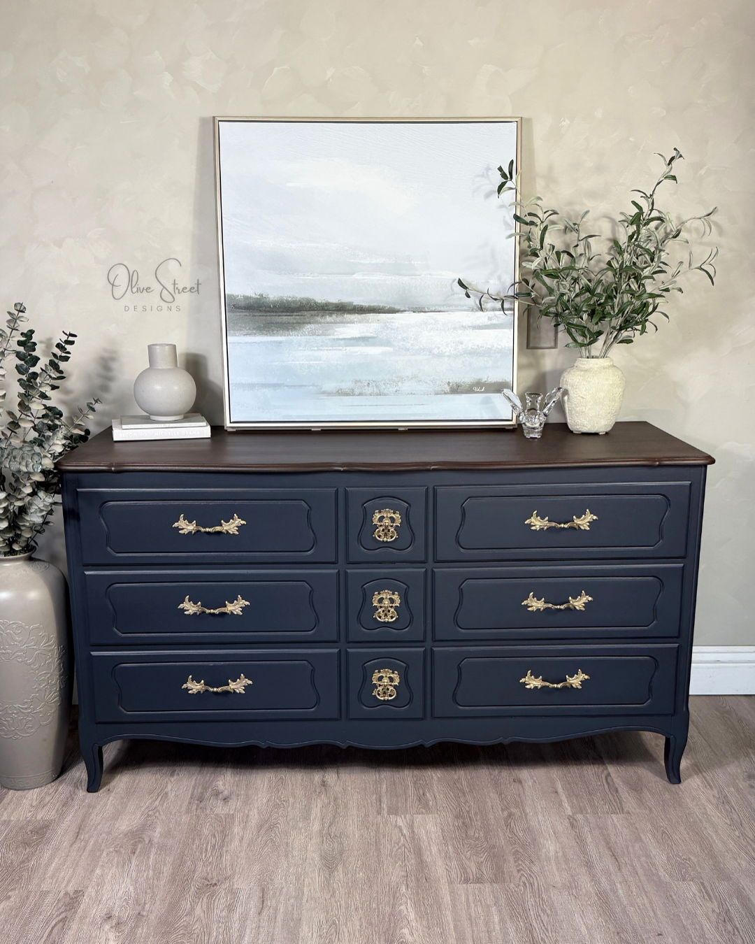
Put it all together, hang a soft landscape above it, and the piece looks like something you’d price at four figures in a boutique. The lesson for anyone eyeing a carved dresser at a thrift shop: if the carving is still crisp, the piece has more range than it looks like. The default move is to lighten it. The move that makes it look custom is to go darker, keep the top where there’s warmth, and let the hardware do the talking.
Would you risk the dark paint on carving like this, or play it safe with cream?