

Most kitchen design rules say the same thing. Pick one bold piece and let the rest stay quiet. If the cabinets are a strong color, the backsplash should go neutral. If the backsplash is loud, the cabinets should stay calm. Doing both in the same color is the “don’t” example in almost every design guide you’ll read.
She did it anyway, in the same shade of green, and it worked.
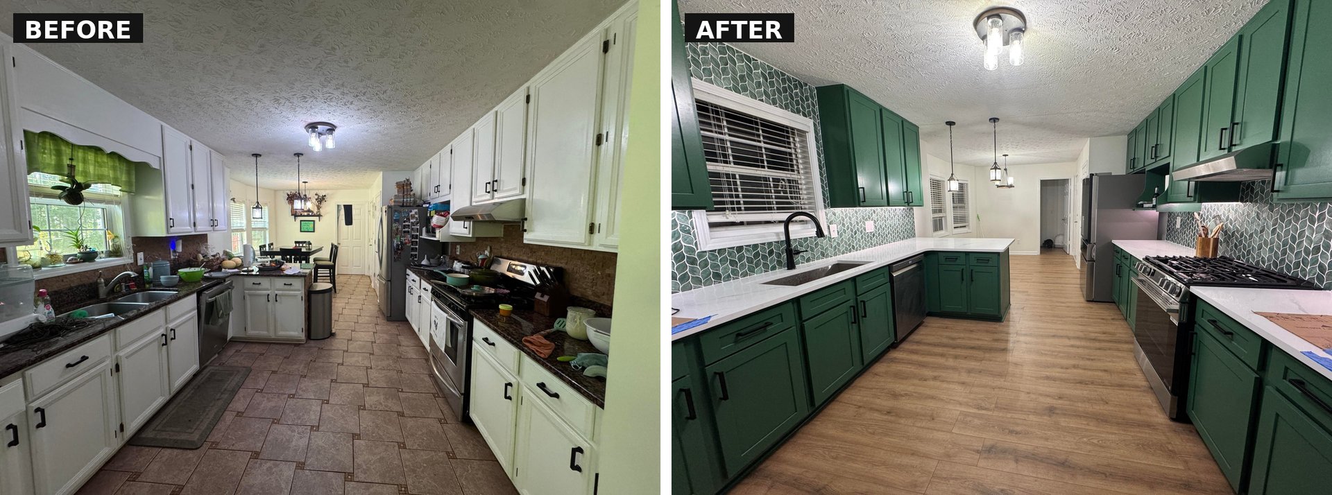
What actually changed, and what she kept
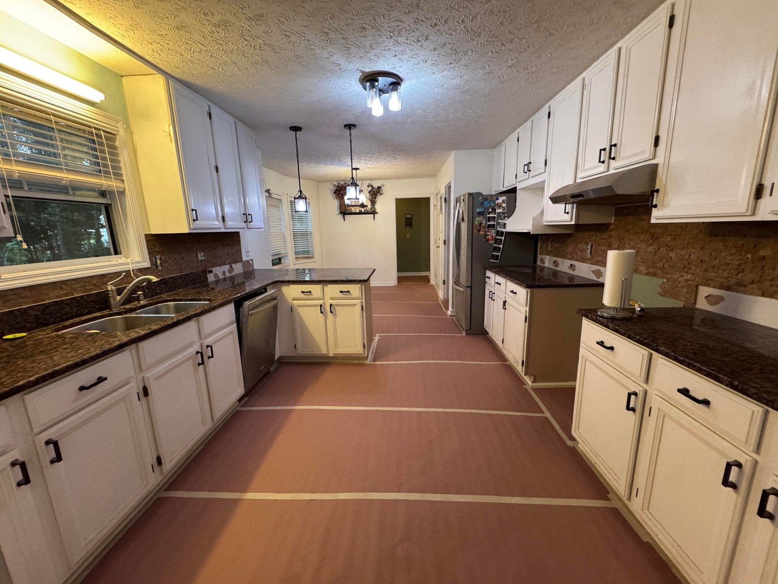
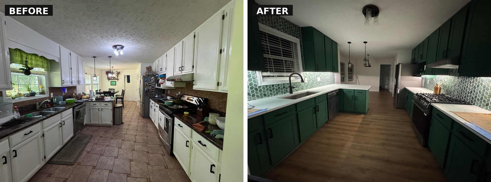
This wasn’t a gut-the-whole-room project. The cabinet layout stayed. The window stayed. The pendant lights stayed. Even the footprint stayed. What changed was the surface read of the kitchen, and the risk she took on color is what carried the transformation.
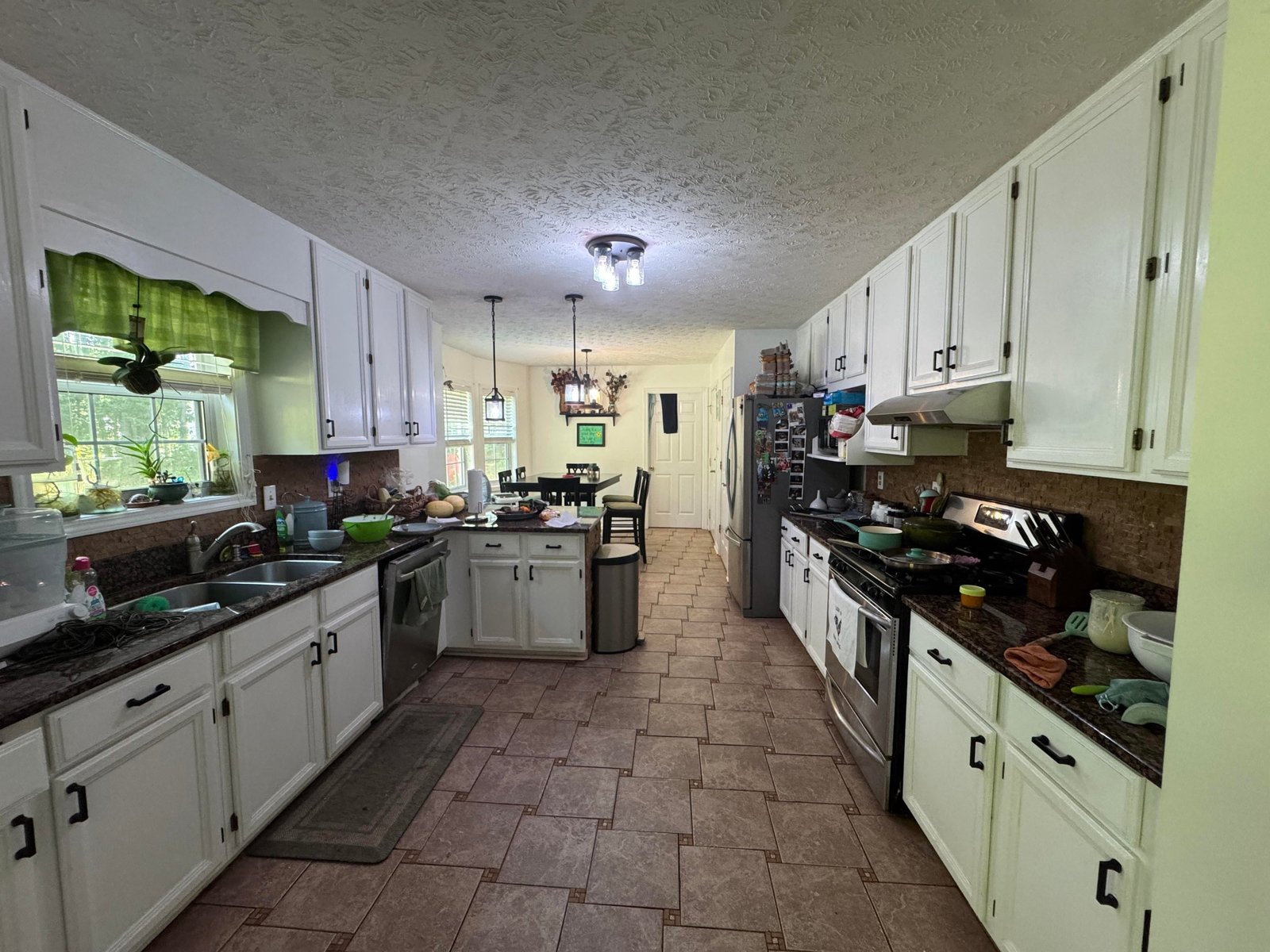
Reddit told her not to do it
Before any tile went up, she posted her plan on Reddit’s kitchen remodel board and asked for opinions. Most of the top comments told her the same thing. Don’t do the green backsplash with your green cabinets. Pick the lighter neutral option you were also looking at. Save yourself from a kitchen that reads like a theme.
Her contractor brought her more than ten tile samples. She bought four more on her own. She held each one up to the cabinets, taped them to the wall, and lived with them for a few days at a time. The green leaf tile kept winning on her eye, every single round.
Why she trusted her own eye over the rule
Here is the pivot the whole story turns on. There is a real difference between picking a bold choice because you haven’t seen the alternatives, and picking a bold choice because you’ve seen fourteen options and this one still beats them. The first one is a gamble. The second one is data.
She was giving herself feedback based on her actual kitchen, in her actual light. Reddit was giving her advice based on a general rule. When those two sources disagree, the sample test wins.
Why green on green actually works here
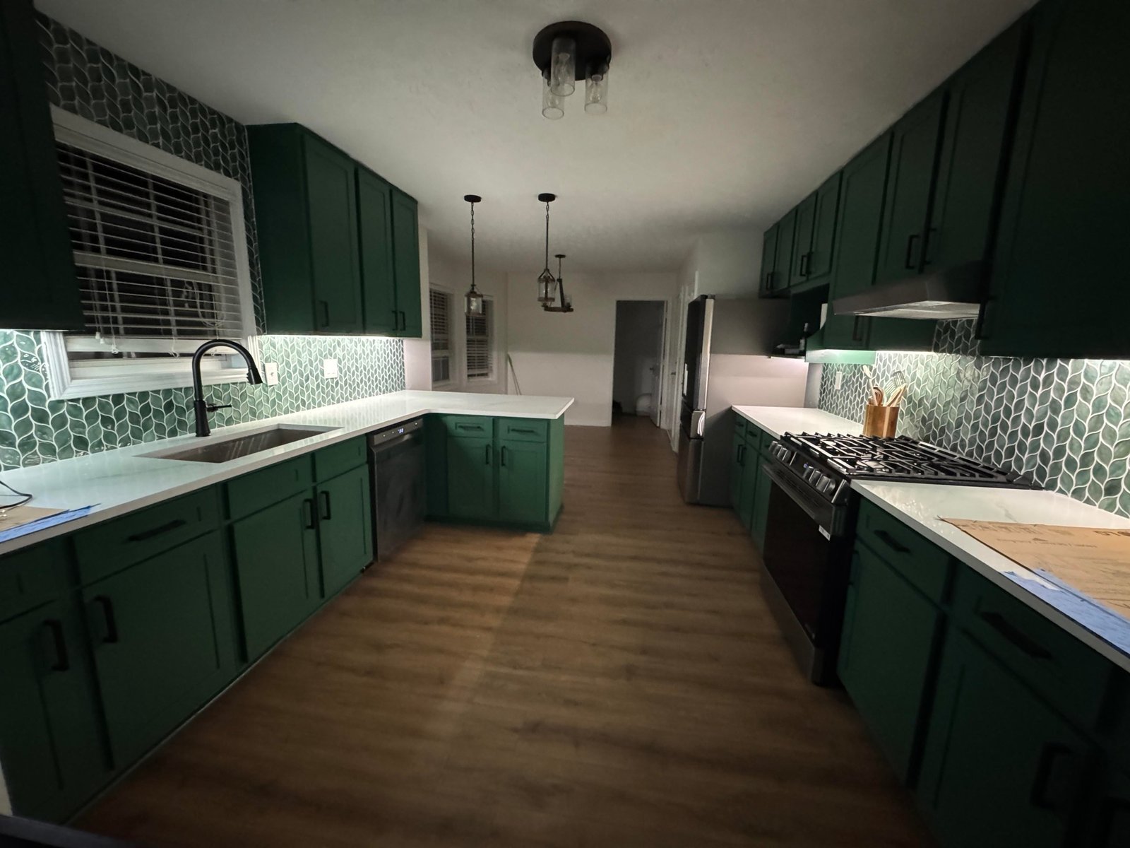
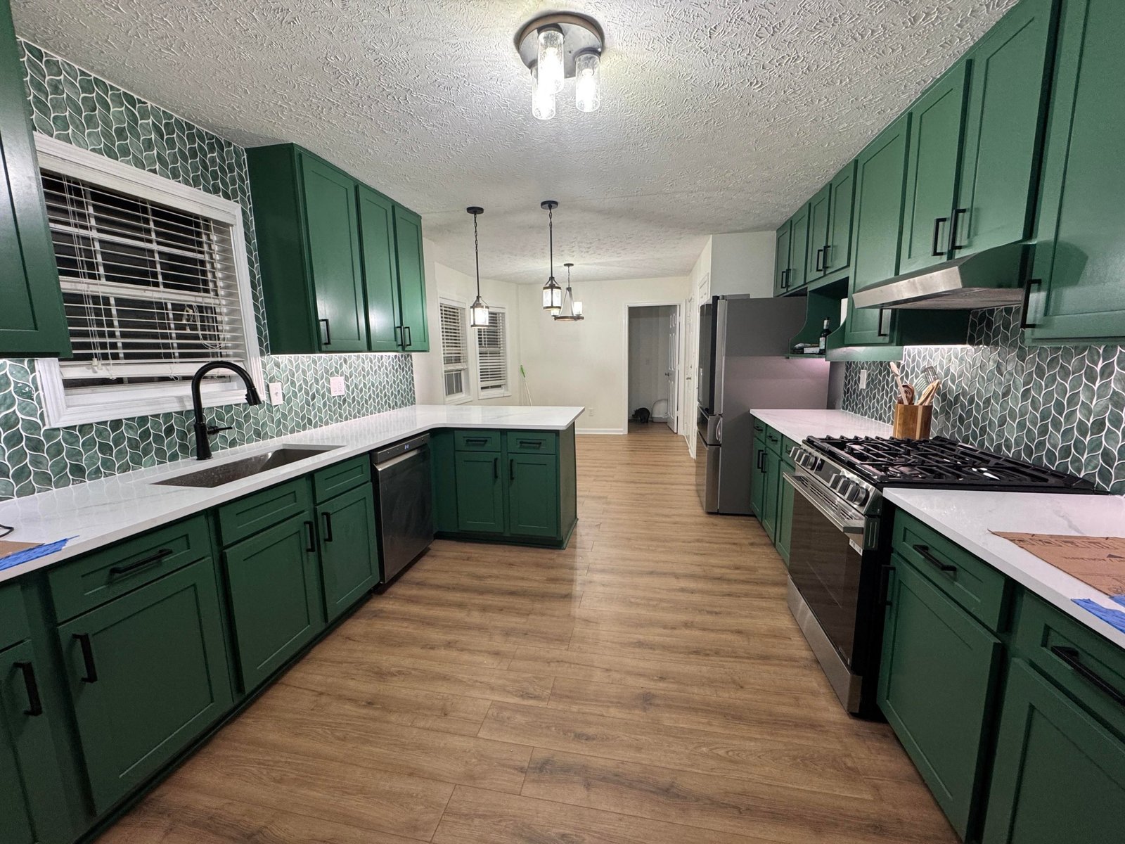
The reason the finished room earns the custom-made read is that doubling down on one color actually looks more intentional than hedging. Two statement pieces in the same hue stop fighting each other. They start to feel like one confident decision instead of two separate ones.
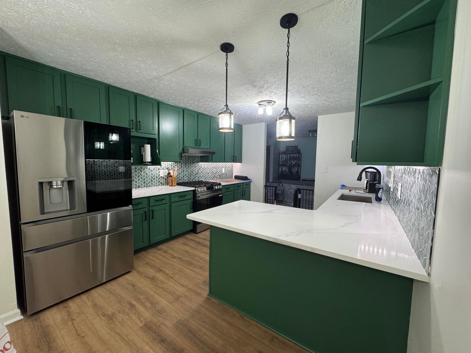
The matte Kale on the cabinets anchors the room. The glossy, dimensional leaf tile shimmers against it. Same color family, two different jobs. White quartz counters give the eye somewhere to rest between them. Matte black hardware, which she also defended against a wave of “do gold instead” comments, keeps the green as the only character in the room.
The small detail doing a lot of quiet work
The tile wraps up and around the window instead of stopping flat at the frame. That one choice pulls the eye higher, makes the ceiling feel lifted, and sells the whole room as planned. Most backsplash installs cut off at the window trim and lose that lift completely.
What the whole thing cost
The whole project came in just over $21,000 before appliances. She also caught the tail end of a Lowe’s Labor Day sale on her flooring order and saved about $5,000. The visual result is custom-kitchen territory. The spend is in reach for a lot of people who think a full color-forward remodel is out of their price range.
Where she sourced the pieces
- Cabinet paint: Sherwin-Williams Kale, applied with Galaxy paint from Sherwin-Williams
- Backsplash: green leaf-shaped mosaic tile from Floor and Decor
- Flooring: LVP in Sapelo Shore from Floor and Decor
- Hardware: matte black pulls
- Approximate budget: just over $21,000 for the remodel, appliances separate
The lesson for your own kitchen
Strangers will give you confident advice based on a general rule. Your own eye, after you’ve compared the real options side by side in your own light, is the better source. She trusted the second one and ended up with a kitchen that reads custom.