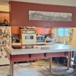
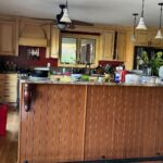
The painter was supposed to be the warm-up act. She had a quote for new quartz counters sitting in her inbox and a Pinterest board full of white tile backsplash. The cabinets were just going to get freshened up first so the “real” reno wouldn’t look weird next to tired walnut.
Then the paint went on. The quartz quote sat unopened for two weeks. Then she deleted it.
Nothing in this kitchen was actually broken
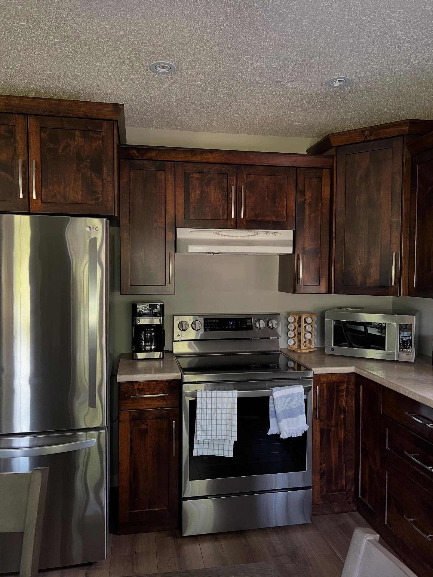
That was the whole problem. The walnut shaker doors were in good shape. The counters hadn’t chipped. The LG fridge was practically new. On a checklist, every finish got a pass.
On the eye, though, the room was closing in. The dark walnut was eating all the light. The white range hood looked like somebody forgot to swap it out. And the warm wood floor was pulling in the exact same direction as the cabinets, so the whole kitchen read as one long brown blur with a stainless fridge stuck in the middle of it.
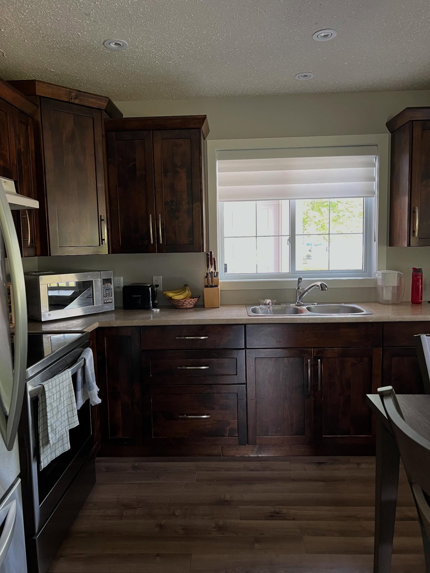
The sink wall is where it really hit. The lowers felt enormous. The counter blurred into the floor. Standing there at seven in the morning with the kettle on, your eye couldn’t find anywhere to rest.
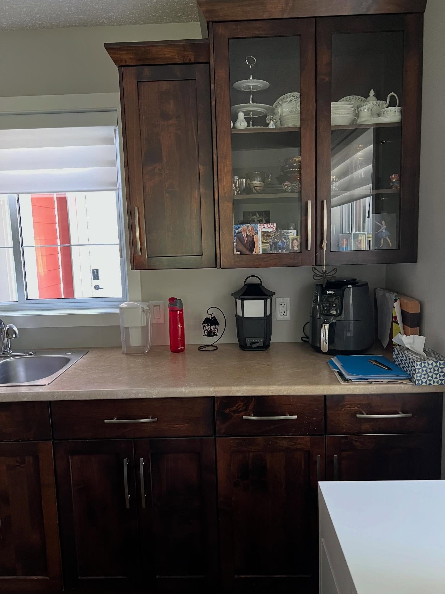
The hutch was the saddest casualty. She’d styled it with pretty white china and framed family photos, and from six feet back you couldn’t see any of it. The dark doors swallowed the display whole. It looked less like a feature wall and more like a cabinet nobody had bothered to tidy up.
Why she picked a beige everyone told her was over
The color is Accessible Beige by Sherwin-Williams, SW 7036. If you’ve spent any time on design TikTok lately, you already know the reputation: tired, builder-grade, done, the paint color your mother-in-law would pick. There’s a whole little genre of videos burying it.
Here’s what those videos miss. Accessible Beige has a soft warm undertone with a touch of pink and yellow in it. Her warm wood floor has the same undertone. Her tan laminate counter has the same undertone. The three of them are finally reading from the same page.
A cool white would have made that counter look dirty. A trendy sage green would have picked a fight with the floor. The “boring” neutral turned out to be the one color that actually spoke to the finishes she already owned.
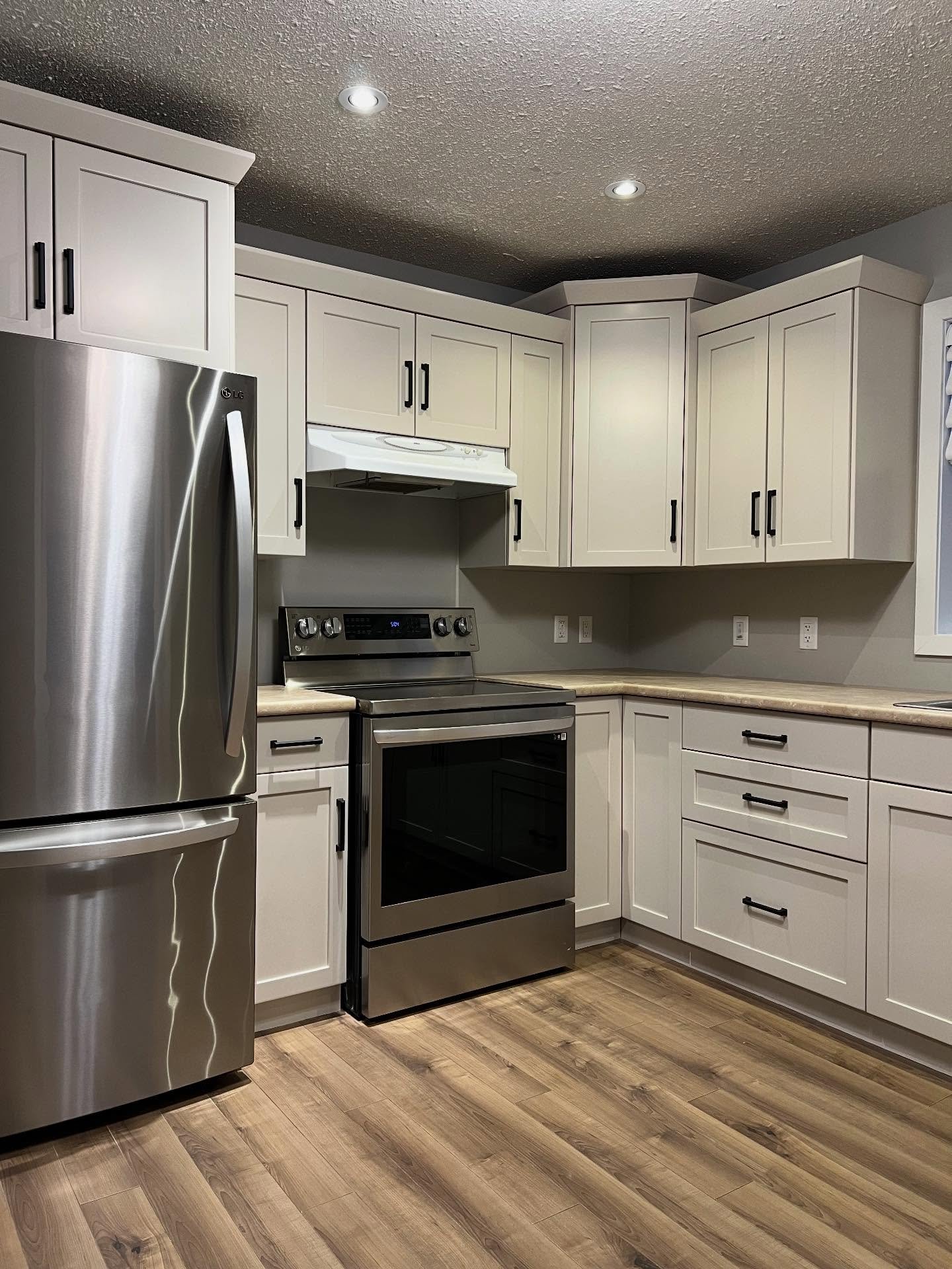
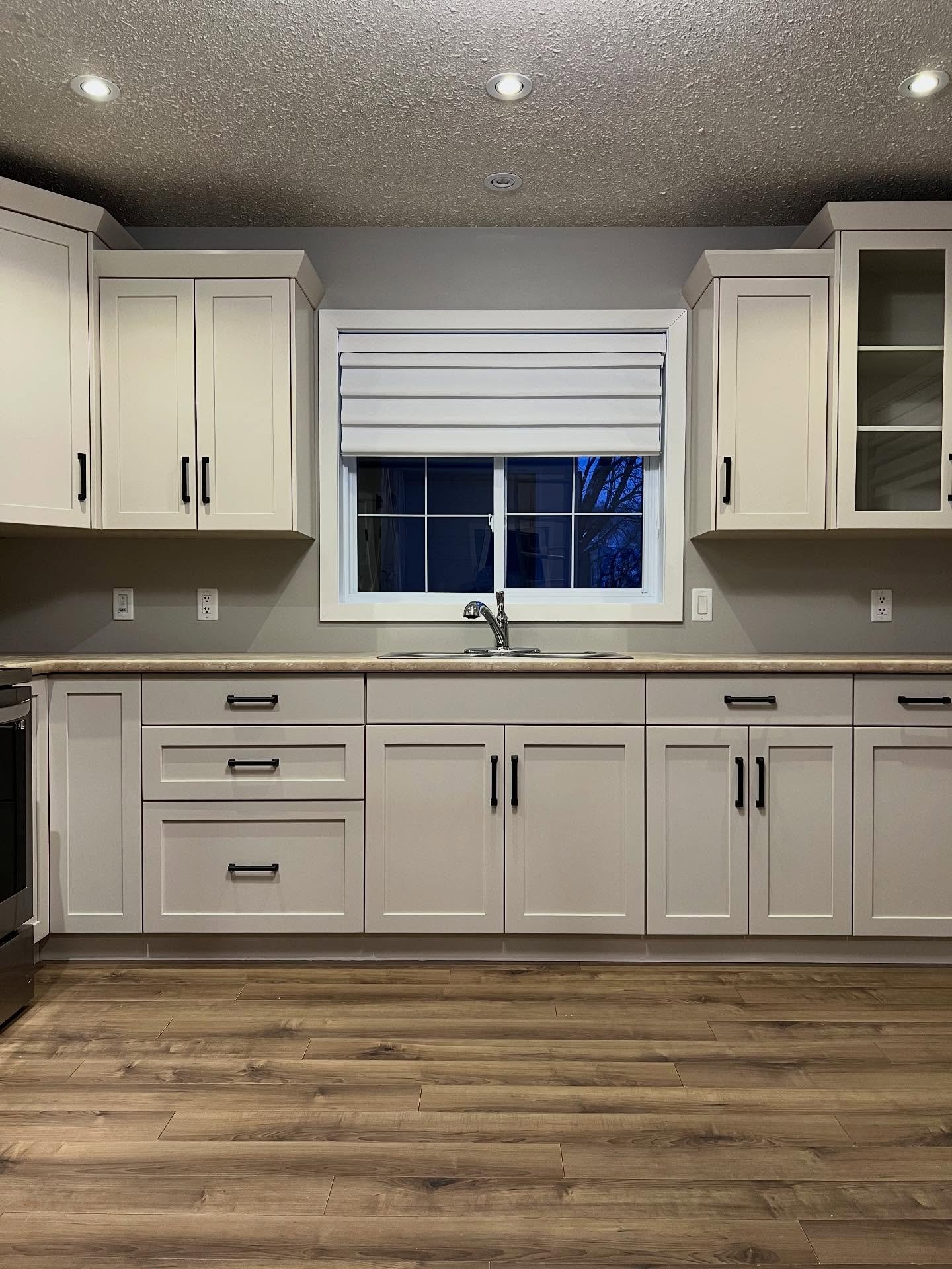
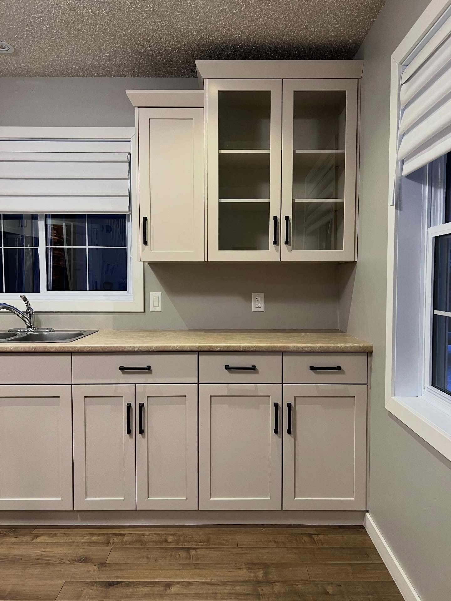
She didn’t touch the counters. Didn’t touch the floor. Didn’t touch the fridge, the stove, or the hood. The only other move was swapping the mixed silver pulls for matte black bar pulls from the hardware aisle, which ran about forty dollars for the whole kitchen.
That is the full project.

Three side-by-sides that show what the paint actually did
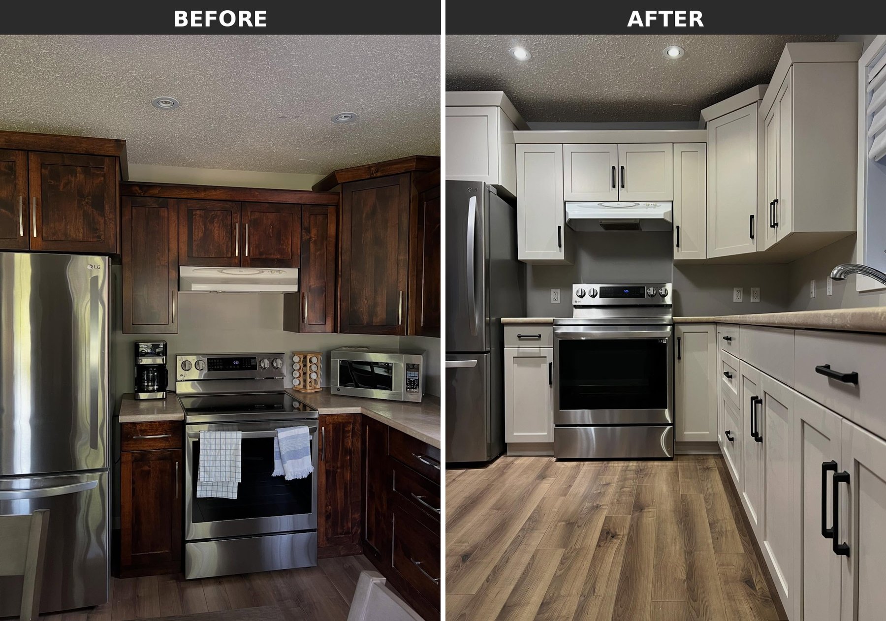
Keep your eye on the range hood. In the before shot it looks like a leftover. In the after shot it looks like somebody picked it on purpose. The hood is the same hood. All that changed was the color of the wood around it, and that was enough to flip how your brain reads it.
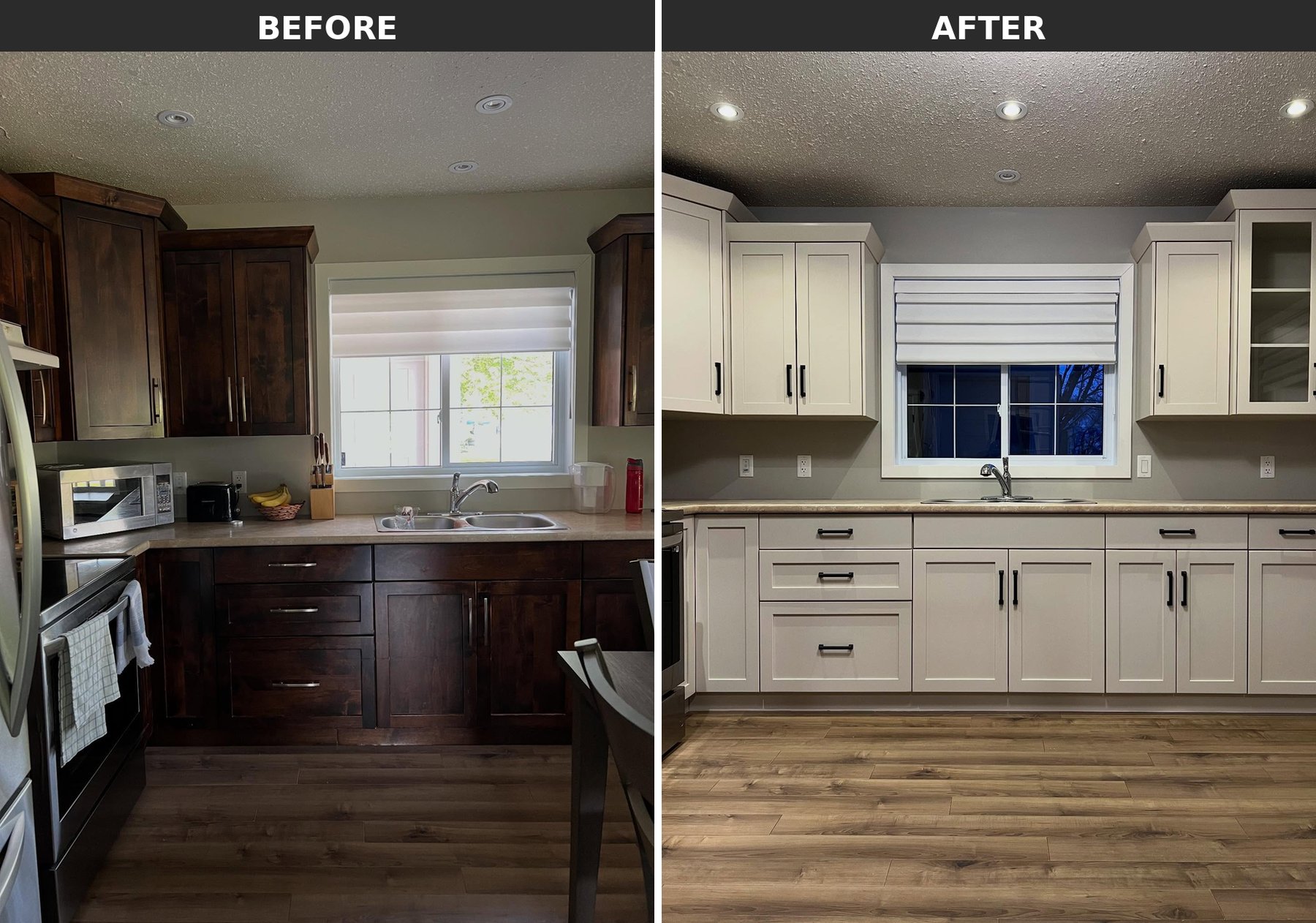
This is the frame that killed the quartz quote. The tan counter looked tired against the walnut. Against the beige, it suddenly reads like warm stone. Same slab, no shopping, a brand new job.
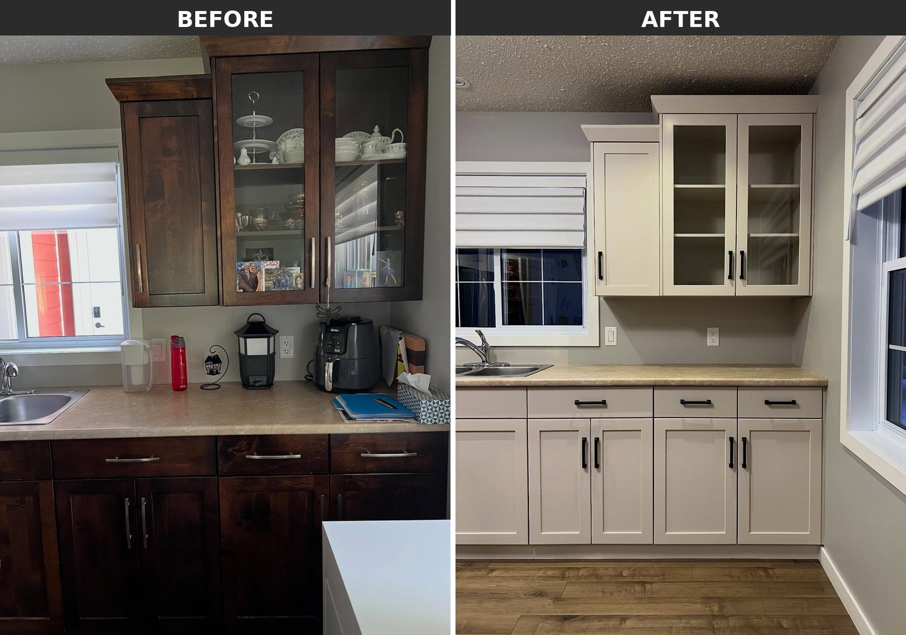
The hutch is the giveaway that this is really a custom-looking kitchen now and not just a paint job. Empty beige shelves feel taller and lighter than loaded walnut ones. That lift is a trick stylists charge actual money for, and she got it from a can.
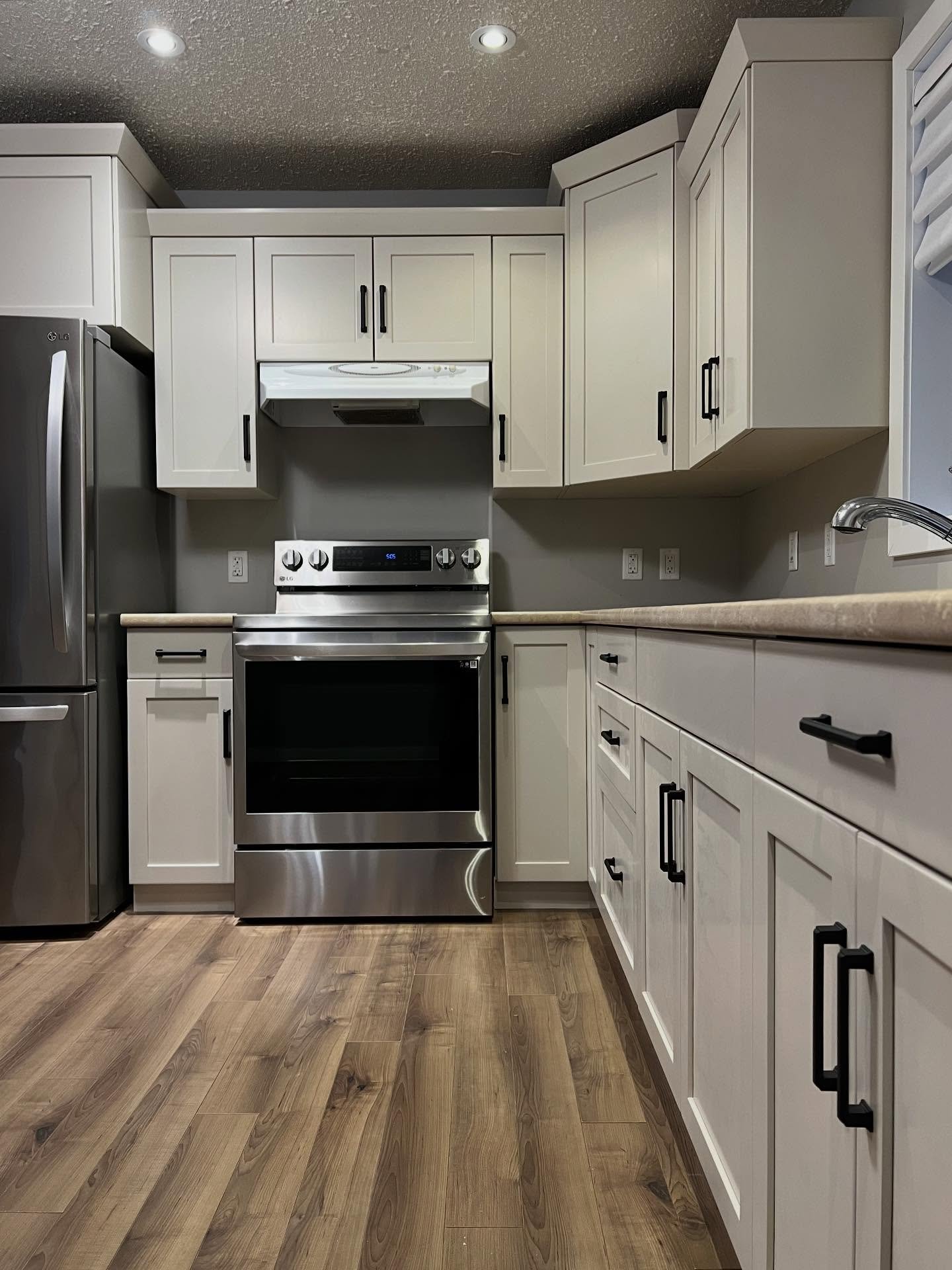
A few more angles so you can see for yourself
The reno order most people get backwards
Standard advice says to pick your hard finishes first, then paint around them. Paint is cheap and flexible, the thinking goes, so you save it for last.
She did the opposite. She painted first, with every hard finish untouched, and let the paint pull the hard finishes together.
If she’d done it the usual way, she’d have ordered white quartz, written a four-figure check, waited six weeks for install, and then still booked the painter after. Instead, she’s sitting in a kitchen that looks finished for the cost of one paint job and a bag of pulls.
The trend accounts aren’t wrong that Accessible Beige is safe and popular. They’re wrong that safe and popular means boring. When your floor is warm and your counters are warm, the “played out” warm neutral is the one color that makes everything you already own look like you chose it on purpose.
Try the paint before you order the quartz. If the paint does its job, the quartz quote can wait forever.