

A Reddit homeowner just posted phase one of her kitchen remodel, and the before and after is throwing everyone off. The kitchen on the right looks like a full gut job. It isn’t. She didn’t swap a single cabinet door. She didn’t touch the granite. The island is the exact same brown island it was before. She even kept the ornate raised panels that every design guide tells you to rip out.
What she actually did is almost embarrassingly small, and it’s the whole reason the kitchen reads as custom-built now.
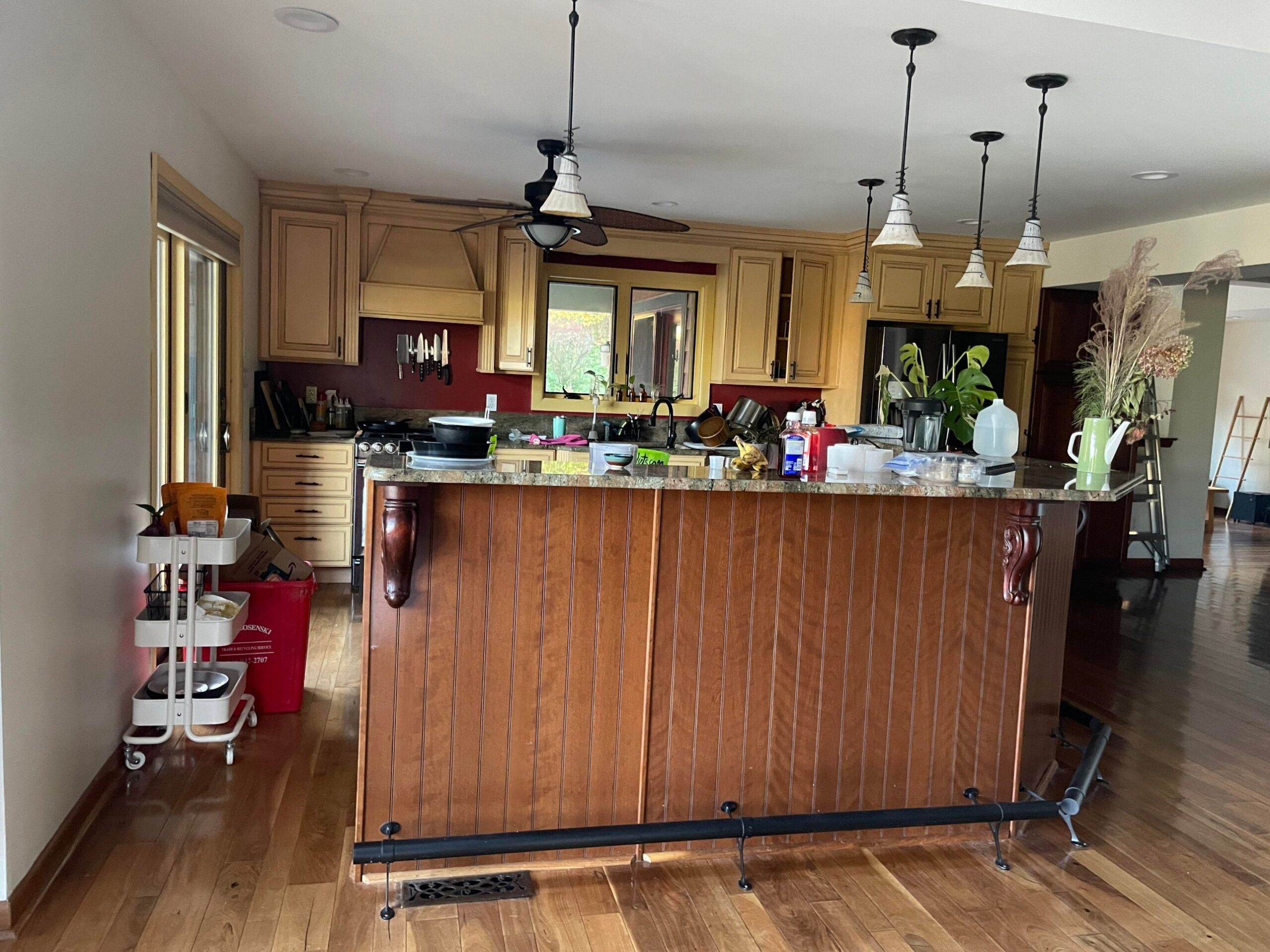
The kitchen she started with
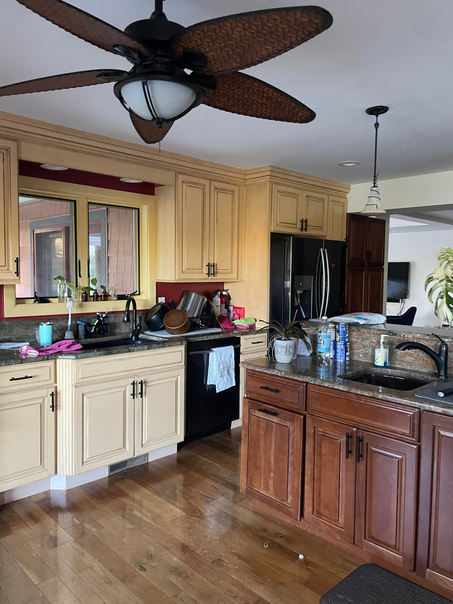
This is a textbook late-2000s Tuscan kitchen, the look that showed up in half of American builder spec homes between 2005 and 2012. Buttery yellow glazed cabinets. A burgundy accent wall behind the range. Ornate raised-panel doors with chamfered edges. Gold-veined green granite counters. A huge tropical ceiling fan with woven bamboo blades. Globe pendants on wrought-iron chains. Yellow-painted window trim. A cherry-stained pantry tower stacked next to a black Samsung fridge. A beadboard island with heavy carved corbels and a dark bronze foot rail.
None of these pieces were picked at random. They were sold together as one coordinated package. That’s what makes a Tuscan kitchen so sticky to date-stamp. Every element props up every other element.
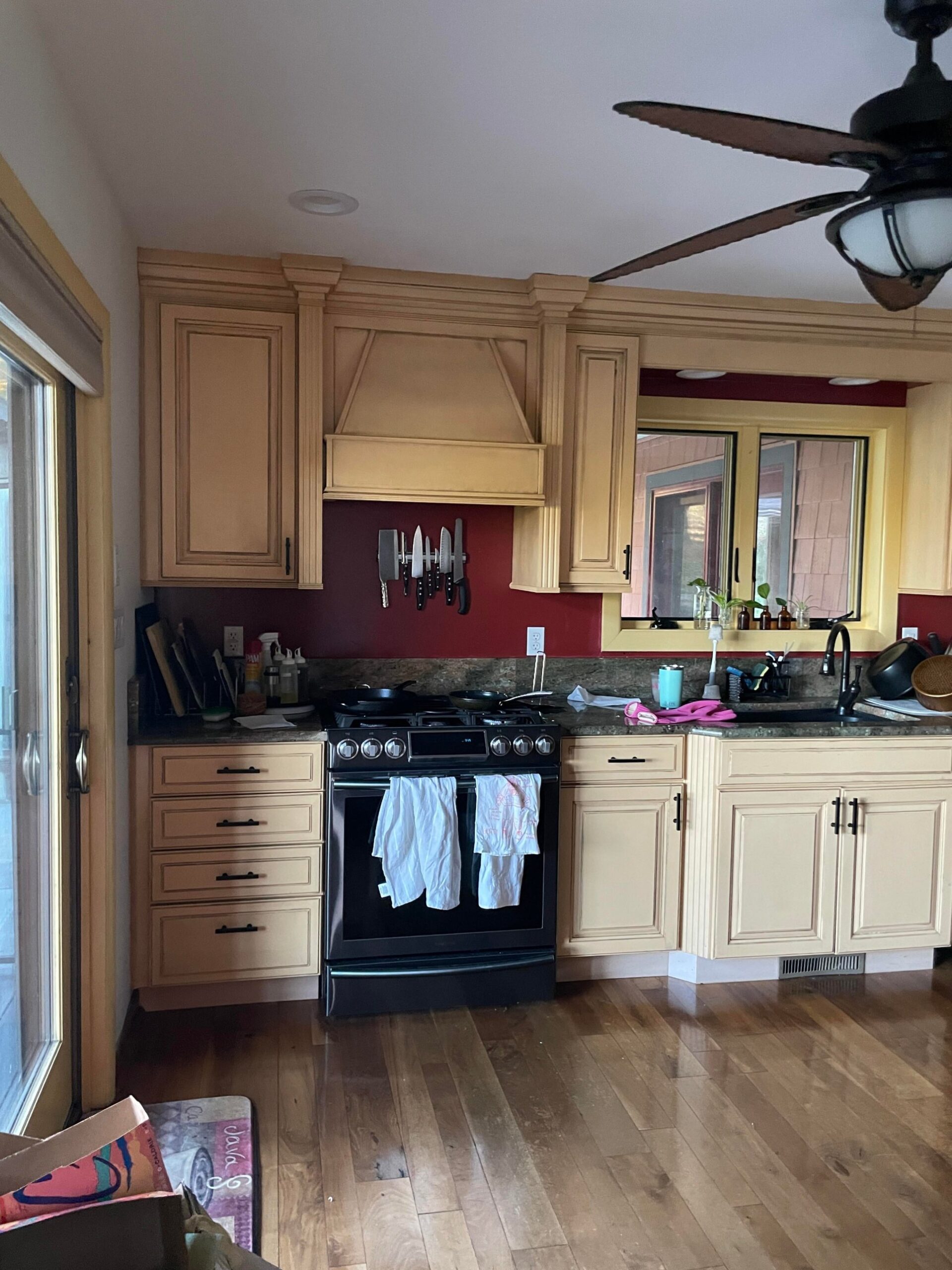
Swap the backsplash and the yellow still ages the room. Swap the fan and the burgundy still ages it. Swap the doors and the granite still ages it. That’s why so many homeowners get stuck in half-fixes for years. They attack one piece at a time, and the Tuscan story just keeps pulling the room back.
What she actually changed
A short list. Cabinets, walls, and lights. That’s it.
She painted every perimeter and pantry cabinet in Benjamin Moore Providence Blue, a deep cool slate blue that sits almost directly opposite warm Tuscan yellow on the color wheel. She painted the burgundy accent wall and the yellow window trim out in a clean neutral. And she pulled down the tropical bamboo fan and the globe pendants and put up small terracotta dome ceiling lights instead.
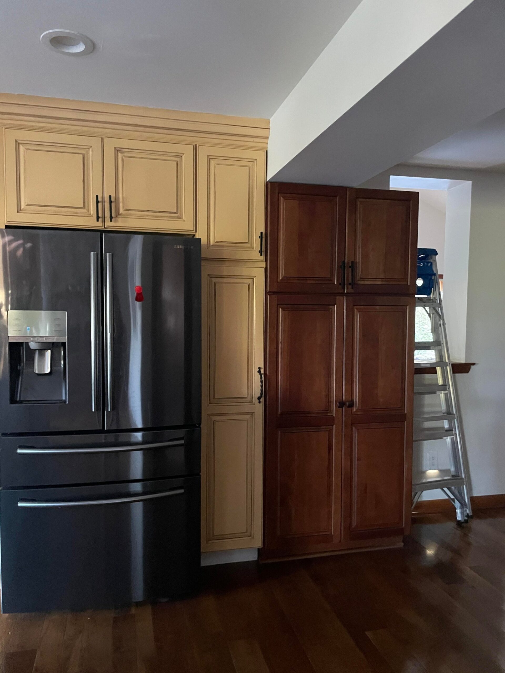
Everything else stayed. Same raised-panel doors. Same ornate hood with its corbels and crown molding. Same cherry island with the beadboard sides and heavy carved legs. Same green granite with the gold veining. Same honey hardwood floors. Same bronze cabinet pulls. Same Samsung fridge. Same layout, down to the inch.
Why it suddenly looks custom
Here is the part most people miss. The second the yellow and the burgundy both go away, the whole warm-palette conspiracy collapses.
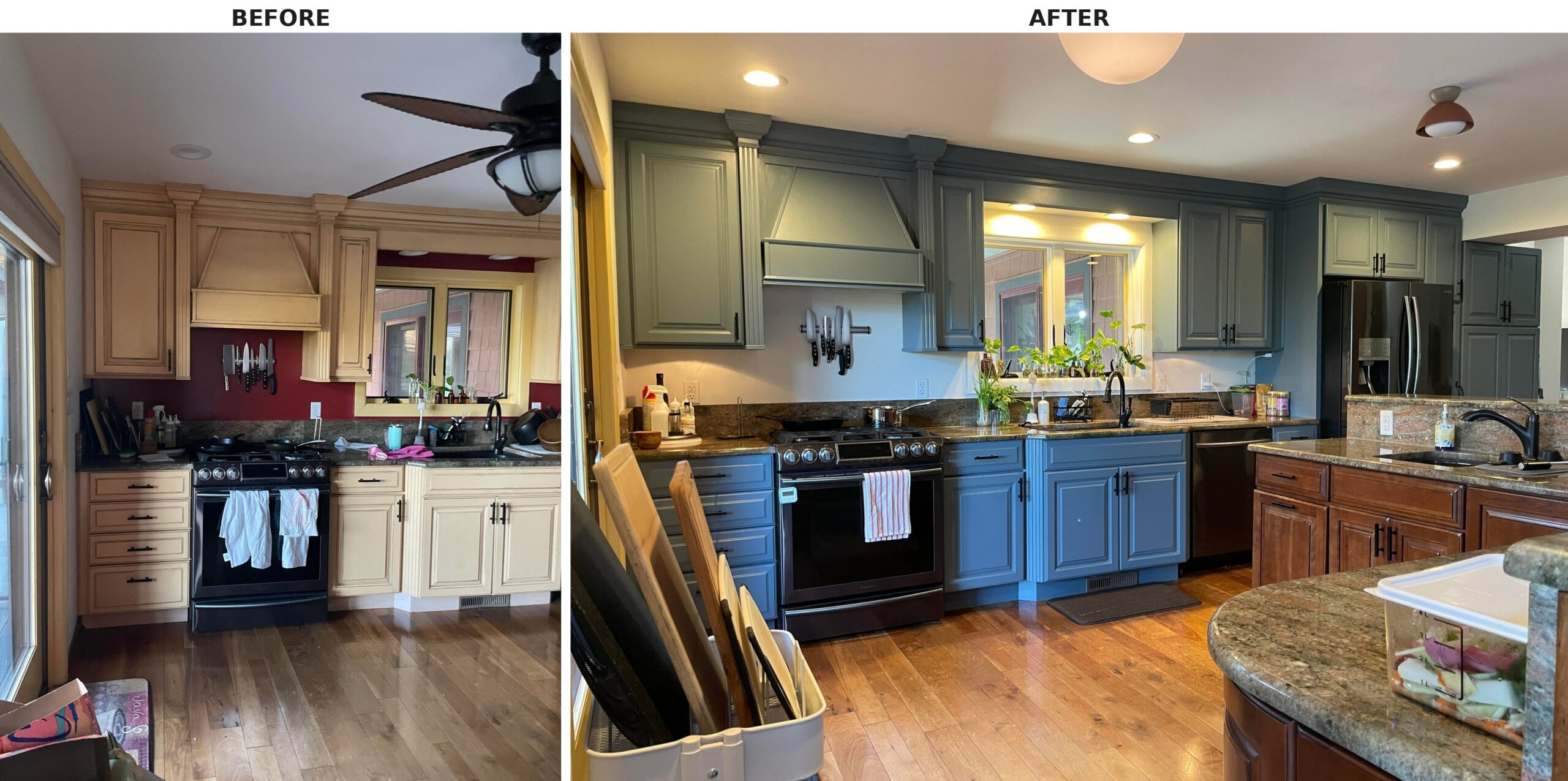
The granite stops reading as “Tuscan earth tones” and starts reading as geological and moody. The dark bronze hardware stops reading as rustic Mediterranean and starts reading as modern matte black. The raised panels, the exact doors every HGTV reno guide says to replace with flat shaker fronts, now read as deep traditional, almost English pub. The hood, with its carved corbels and crown molding, suddenly looks custom instead of fussy.
Even the hardwood floor looks different. In the before, it reads orange and dated because the yellow was pulling the warm tones out of it. In the after, with cool cabinets above it, the same floor reads rich and intentional.
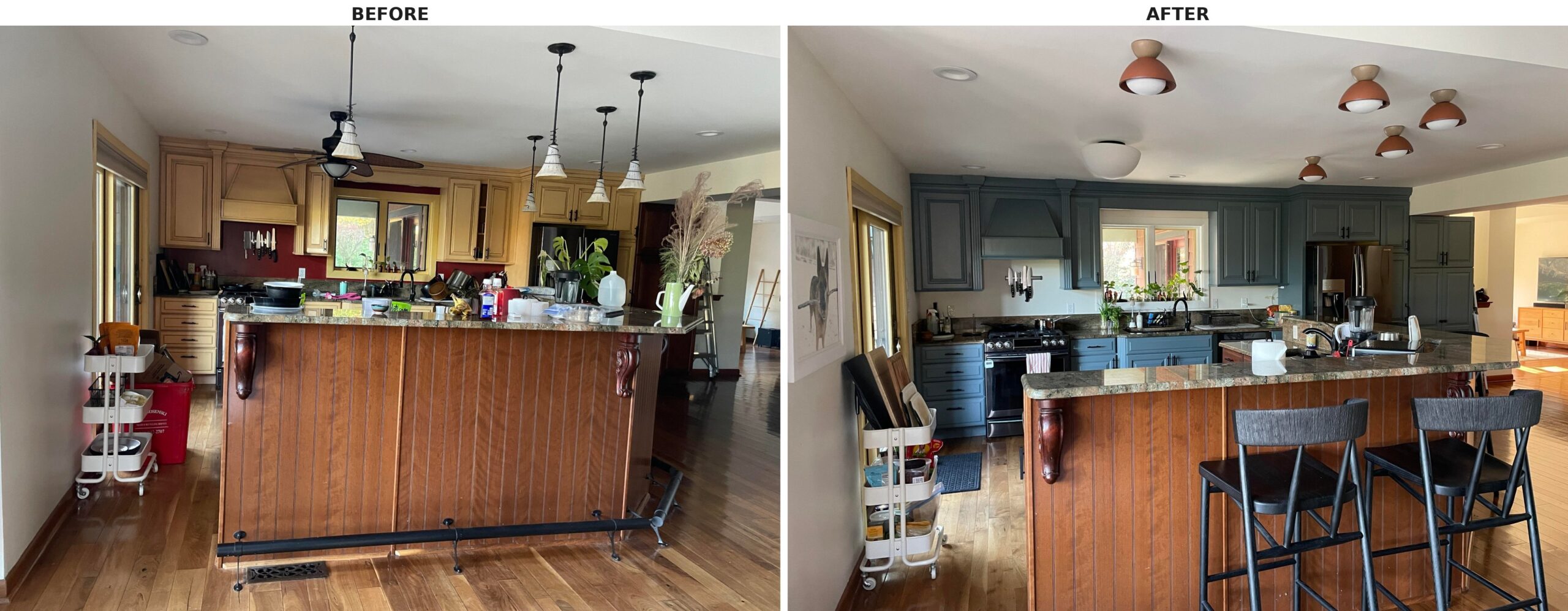
The small terracotta ceiling lights do real work too. They add the one calibrated point of warmth the cool blue needed to keep the room from going cold, and because they’re flush-mount domes instead of a giant fan, they stop fighting the ceiling plane for attention. The whole room reads taller.
What the Reddit comments missed
Scroll her thread and you see the same pattern that haunts kitchen remodel advice. Commenters kept pointing at structure (replace the island, fix the dishwasher clearance, get a counter-depth fridge) or at style surface (swap the doors, go flat panel, paint it white). All of those are standard renovation prescriptions. All of them cost thousands of dollars.
The paint-only phase one is a quiet counter-argument to all of it. She bought herself years of modern-feeling kitchen for a few gallons of paint and new ceiling fixtures.
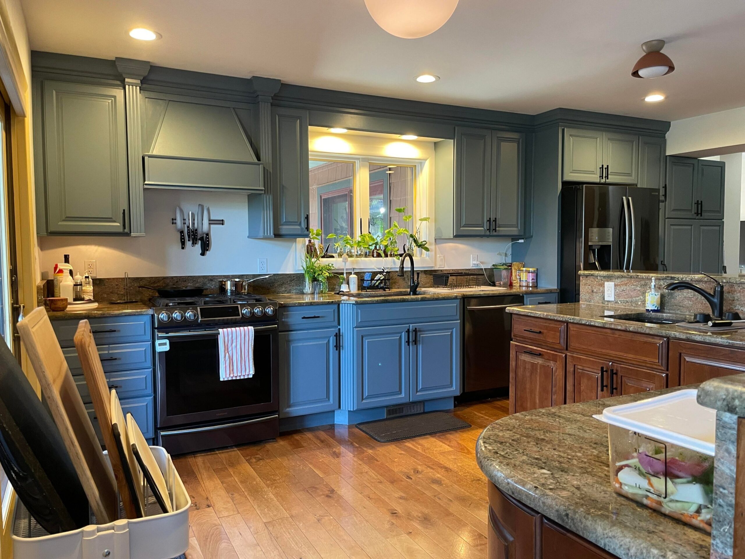
The island replacement she has planned for phase two (she wants a usable rectangular island with 48 inches of clearance) and the counter-depth fridge she’s eyeing are functional upgrades, not aesthetic rescues. The kitchen already looks current.
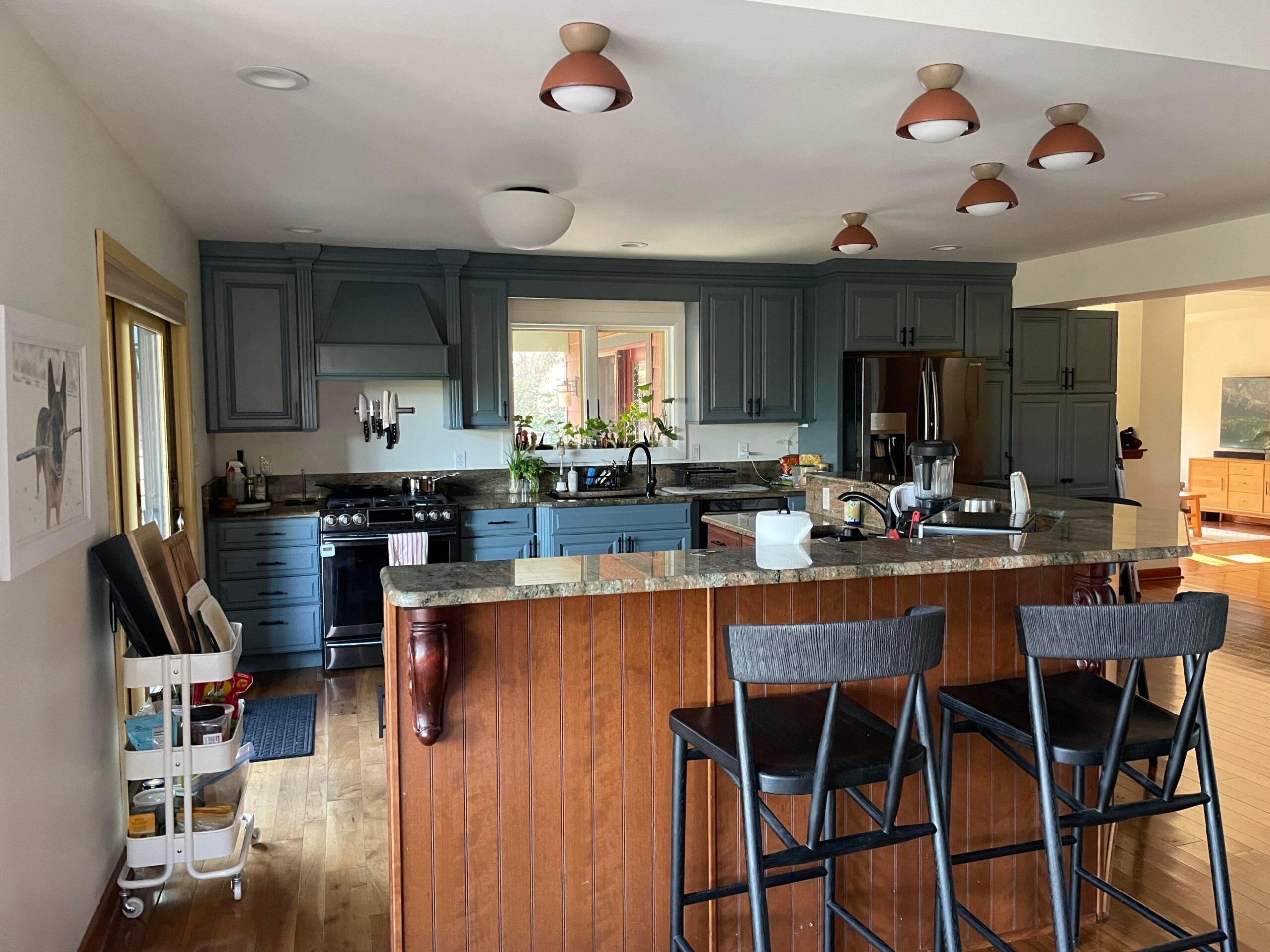
Her brown island, which commenters begged her to sand and restain, now reads as a deliberate warm-wood accent against the cool cabinets. It’s the same island. The context around it changed, and that was enough.
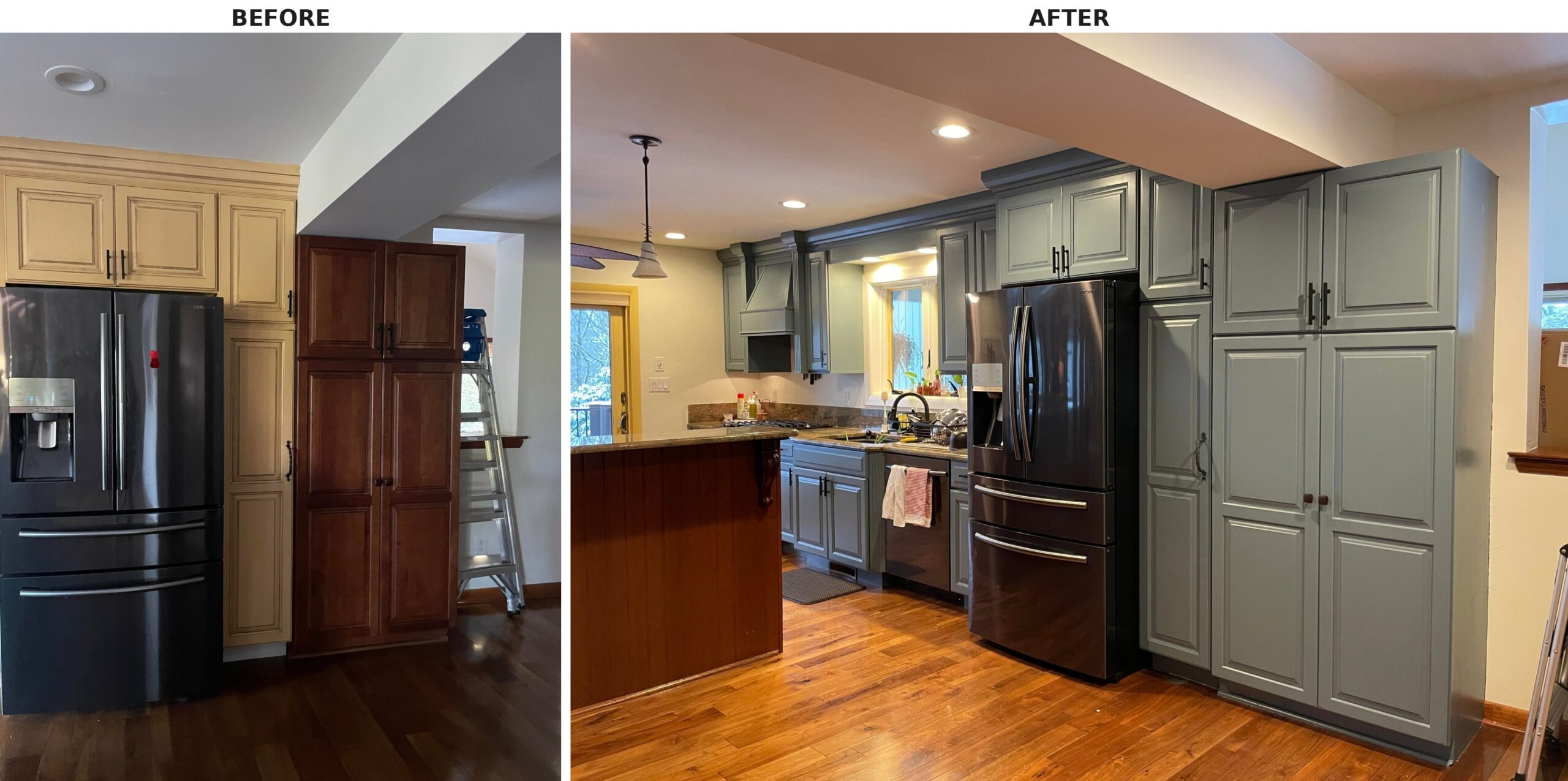
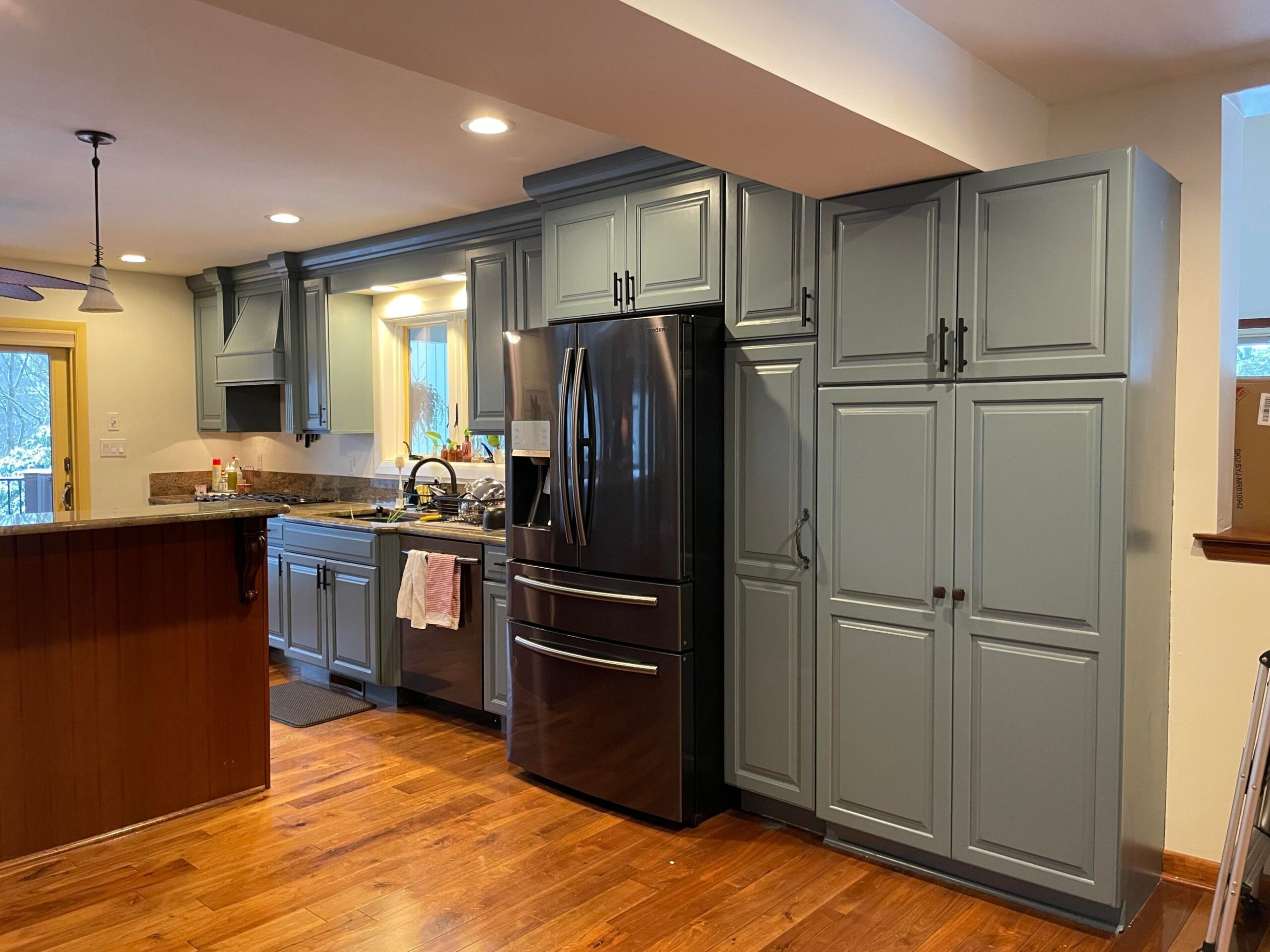
The pantry tower got painted blue too, so the fridge wall finally reads as one continuous bank of cabinets instead of a yellow section awkwardly bolted to a cherry section. Nothing structural moved. The illusion of a custom built-in came from matching the color.
The real takeaway
Dated-looking traditional kitchens are almost always a color problem pretending to be a cabinet problem. The ornate raised panels aren’t the villain. The yellow glaze and the burgundy wall coordinating the whole dated story are.
She picked the paint color that pulled hardest in the opposite direction (Benjamin Moore Providence Blue), neutralized the burgundy wall, swapped two dated ceiling fixtures for small warm-toned domes, and left everything else alone.
Which room in your kitchen would collapse first if you took the warm color out of it?


It looks like 3 colors – sage, blue, and then wood color on the island. It’s not an improvement. Looks more like an unfinished job. Too many colors that do not sit well together. Not a fan.
I agree with your comments. I also thought the story was about ways to update your kitchen without spending a fortune and taking months to complete the job. It’s amazing how people just start making remarks before seriously looking at the overall job and the story that goes with it. Do I care if people don’t like the new lights or the paint color. The difference changing the paint color and some light fixtures can make is amazing. I love the blue color, maybe not for my kitchen and I most likely would have selected different light fixtures. But that’s the point of these stories. Another point of view on an economical way to update a room and also not have your kitchen gutted for weeks or months with a big mess.
Wow people are so critical. The cabinets are all the same color. The light in the room makes them read differently. You can say it is not your taste. I believe the point was that she did not have tens of thousands of dollars to rip it all out.
The yellow looked much better than the blue. It would have helped if the cabinets left wood colored would have also been painted yellow too. The red backsplash is too bold for the yellow.
Correct me, but the lighting is doing nothing for this “blue” paint, it looks green on the uppers and sky blue on the lowers, and the island should have been at least cleaned and restrained, if not painted a lighter color tone of the blue, I really like the old kitchen better then this circus tent of color.
Read The post it says the cabinets were painted one color providence blue…not avocado green or 2 shades of blue. You do understand lighting plays a major role in how photography turns out.
It really didn’t matter if the kitchen was yellow, blue or any other color. What mattered the most was everything was put away and the counters were clean and uncluttered. That’s what made the kitchen look 100% brighter and more useful and clean.
The whole kitchen is a single shade of blue. The last picture shows the color best. The other pictures look like two colors because the yellow lights are reflecting green, while the sunlit cabinets on the bottom aren’t.
She should have painted all the cabinets blue OR green not both, it breaks up the kitchen too much. She needs to take out the high counter, and make it the same height as your regular countertop.
I’m guessing the “Tuscan Yellow” painted cabinets were once the same as the natural wood cabinets like the pantry cabinets and the cabinets under the second sink and island area. They would have been far better off having the painted yellow cabinets stripped and refinished to match the original wood cabinets. If they didn’t like the darker color, a color that is making a major comeback now, they could have had them all restained in a color of their liking but left the warm natural wood grain cabinets. Painting cabinets is a major mistake. The paint will never last long regardless of how well the cabinets were prepped first. Natural wood ought to be stained and then clear coated. It’s the only way anyone should go. Unfortunately these “designers” like to “modernize” or make “contemporary” but those trends tend to be very short lived and are the cause of “dated” interiors. Natural wood cabinets are timeless and have been used for centuries in kitchens and elsewhere.
The blue and green clash to me. I’d go back to the Tuscan yellow which was light and bright. Then do all the cabinets and the island the same color. There is to much going on there.
The blue makes the kitchen look warm and cozy.
The color is better but the raised bar at the sink screams 1994. I would have leveled the top of the sink island and replaced the granite. It would have made the kitchen look less cluttered and been better for entertaining.
Ignored the 2 idiot above comments . It looks great
I love the Providence Blue color, my biggest problem is the lower brighter blue that doesn’t match at all. Perhaps in person it looks better.
Ehhh, kind of loved the dark wood cabinets in the before pic on the end. The blues don’t really look great together either with a different color on top and bottom.
It’s super pretty though the avocado green and the blue kinda clash for me. Something I feel dumb about is when you say that she painted her own kitchen, what do you mean? She bought a brush and a roller and painted it herself? Or did she hire someone to do it?
I agree
What shade of blue are the lower cabinets around the oven?
Not my taste at all. I do not like the before NOR after. The original brown island still looks run down and needs a refresh, even if the owner wants to keep the wood. The flush mounts belong in an office, not a kitchen. Never liked the original fan style unless it’s for a porch or beach house.
The blue makes it look small and cramped and dark
You made such a big deal about the blue paint, but most of the cabinets were painted 1960’s avocado! Which looks dumb.