

Say “1970s paint colors” and the picture almost draws itself. A dark paneled den. An orange-and-brown kitchen. A burgundy dining room with mustard curtains. Shag carpet, harvest gold fridge, the whole mood. For most of the last ten years, that’s the exact look most Americans were running from.
So it’s strange what’s happening in the fanciest rooms photographed in 2026. A pale blue closet with a cherry red door. Mustard walls next to burgundy upholstery. A tangerine lamp on a navy wall. Cinnabar paired with lavender in a living room by Jonathan Adler. On paper, each pair sounds wrong. In real rooms, they look expensive.
These aren’t one-offs. Real Simple just rounded up five designers across the country saying the same thing. The color combos that defined 1970s decorating, the ones most people grew up quietly hating, are the ones high-end homes are using again.
None of these rooms actually look 70s. You won’t find shag carpet, wood paneling, or dusty 70s pottery in any of them. The colors are the same. The feeling is completely different. That gap is the whole story.
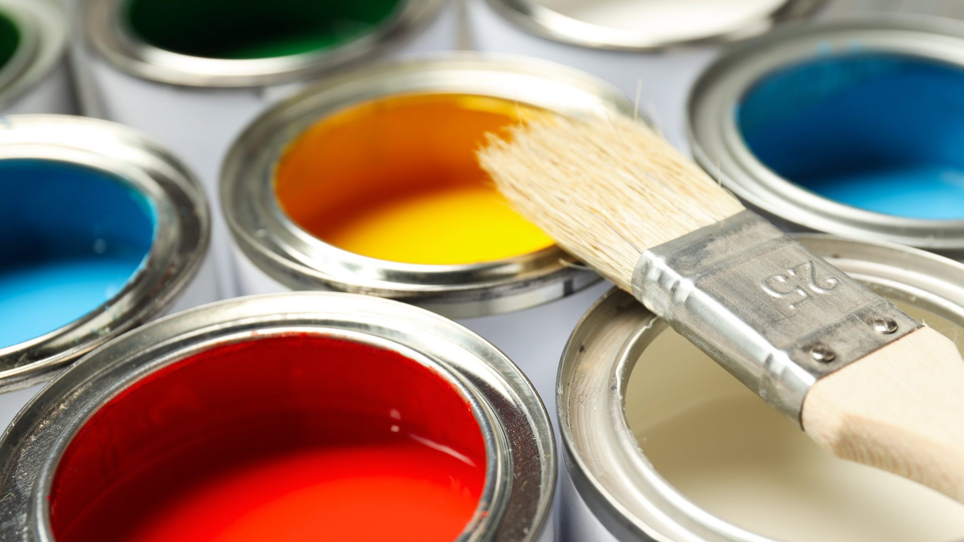
What most Americans have been trained to do
For almost ten years, the safe move in American homes was simple. Warm white walls. One accent, usually black or oak. Everything else in the same soft color family. Greige floors, oat couch, cream walls, dusty sage pillow.
Minimalism wasn’t really a style. It was a rule. Don’t put two bold colors in the same room.
Jonathan Adler said it plainly in Real Simple: “Life’s too short to look back and see an endless haze of beige.” A whole generation of homeowners picked up that rule without anyone ever saying it out loud. Two bold colors in one room meant amateur. One color plus beige meant tasteful.
What these designers are doing instead
The designers in the piece aren’t picking one 70s color and bringing it back. They’re pairing two at a time. And they’re picking the exact combos the beige decade told everyone to avoid.
- Pale blue with cherry red, from Liz Hoekzema of KLH Homes, shown in a closet by Salvesen Graham.
- Mustard with almost anything, from Morgan Blinn of Rumor Designs, who uses mustard all through a home and expects yellow tones to keep climbing.
- Mustard with burgundy, which Daniele Doerge of California Paints calls “typically considered a 1970s color combo.”
- Cinnabar with lavender, from Jonathan Adler. Cinnabar is a red-orange with brown undertones.
- Tangerine with navy, from Kia Weatherspoon of Determined by Design, in a palette built by Angelica Mohabir for a Delta Sigma Theta Sorority project in Washington, D.C.
The common thread isn’t the color. It’s the nerve to put two of them in one room.
Which leaves the real question: how does this not look like 1973?
Rule 1. One color gets the room. The other gets one object.
Daniele Doerge spells it out in the article. Mustard and burgundy works today “with restraint through accent seating, textiles, or color-drenched rooms.”
That one line packs a lot in. One color gets the walls. The other gets one small, deliberate spot. Hoekzema’s closet by Salvesen Graham is the clearest example. The walls are a soft pale blue, and the cherry red shows up in one small dose. Not a red wall. Not a red ceiling. One red door against a soft blue background. Your eye reads the room as calm first and bold second. The old 70s cranked every color to full volume on every surface. The new version lets one color carry the room and uses the second as a surprise.
Rule 2. Swap the mental picture, not the colors
Liz Hoekzema compares mustard and burgundy to Le Sirenuse in Positano, the famous Italian coastal hotel where warm yellows sit next to deep rust red. Same two colors a Boomer dining room used in 1976. Totally different picture in your head. Call it “70s” and you picture shag and brass. Call it “Positano” and you picture linen, lemon trees, and expensive travel. The colors didn’t change. The mental picture did.
Rule 3. Pick the muddy version of each color
Nobody in this story is painting anything traffic-cone orange. The oranges in play are cinnabar and tangerine, not pumpkin. The yellows are muddy mustard, not school bus. The reds are cherry or wine, not fire engine. If you want to try a 70s pairing at home, pick the muddy, dialed-down version of each color. That one choice does most of the work in making the pair look 2026 instead of 1973.
Rule 4. The 70s is the green light, not the goal
Kia Weatherspoon says the quiet part out loud: “Retro becomes a doorway here, not a destination.”
The 70s isn’t the look. The 70s is the green light. Once you accept that two bold colors can share a room, the room doesn’t need shag or wood paneling to pull it off. It just needs the nerve minimalism trained out of us, plus the three rules above so it lands as chic, not chaotic.
If your beige room has started to feel flat
That isn’t random. It’s the tail end of a long beige decade, and these are the pairings quietly taking its place. Start small. Pick one combo that makes you a little nervous, cinnabar and lavender, mustard and burgundy, or cherry and pale blue, and give the second color exactly one job in the room. If these designers are right, the room won’t look dated. It’ll look like you finally stopped playing it safe.


