
For two years, every formal study on the internet has worn the same uniform. Deep inky walls. Even darker trim. Drenched in one moody color top to bottom. It worked, and then everyone did it, and now it reads less like a decision and more like a reflex.
This decorator refused to drench. What they did instead sounds counterintuitive on paper and looks obvious the second you see it.
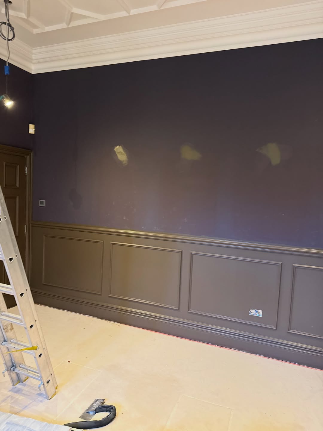
The brief was the usual one for a serious room: go dark, go moody, color-drench. You can see where that got them. Three primer patches staring out of the plum. A wall that reads heavier than it should. Nothing on the surface for the eye to grab.
The ceiling nobody could see
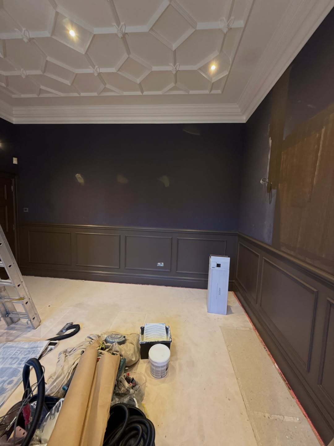
That ceiling is a showpiece. Octagonal coffers, hand-run plaster, a motif someone paid real money for. Under all that plum you looked at it once and then never again. It couldn’t compete with the walls.
The bay window felt like a leak, not a feature
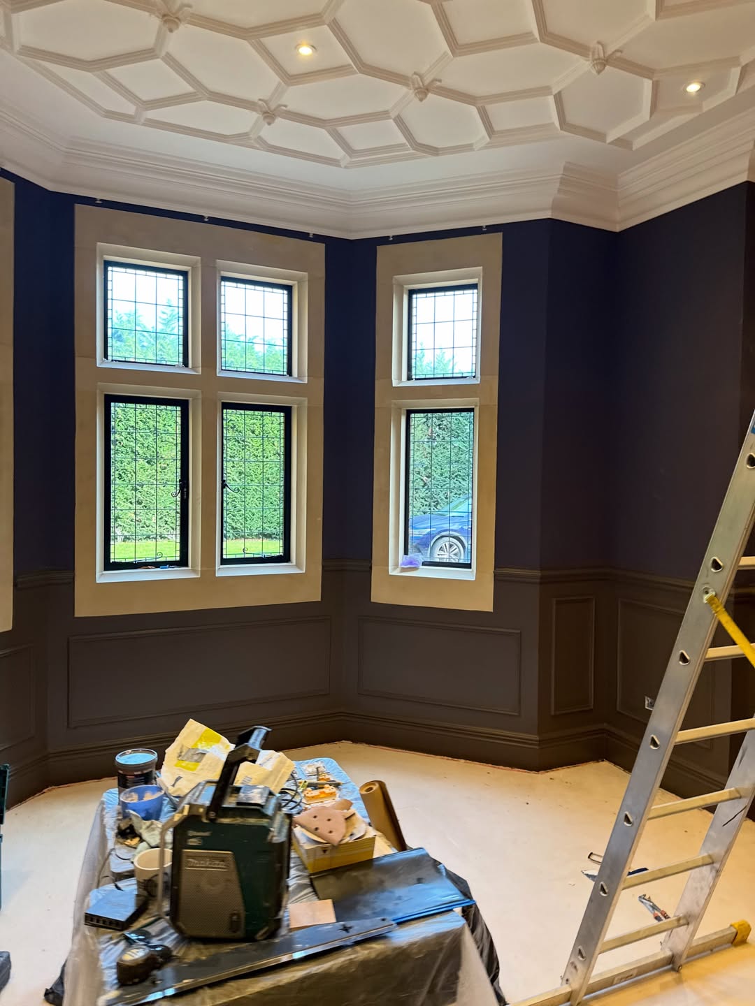
Dark drench is supposed to let the architecture shine. In this room it did the opposite. The leaded panes stopped reading as jewel boxes and started reading as gaps where light got in by accident.
A bay that deserved better than this
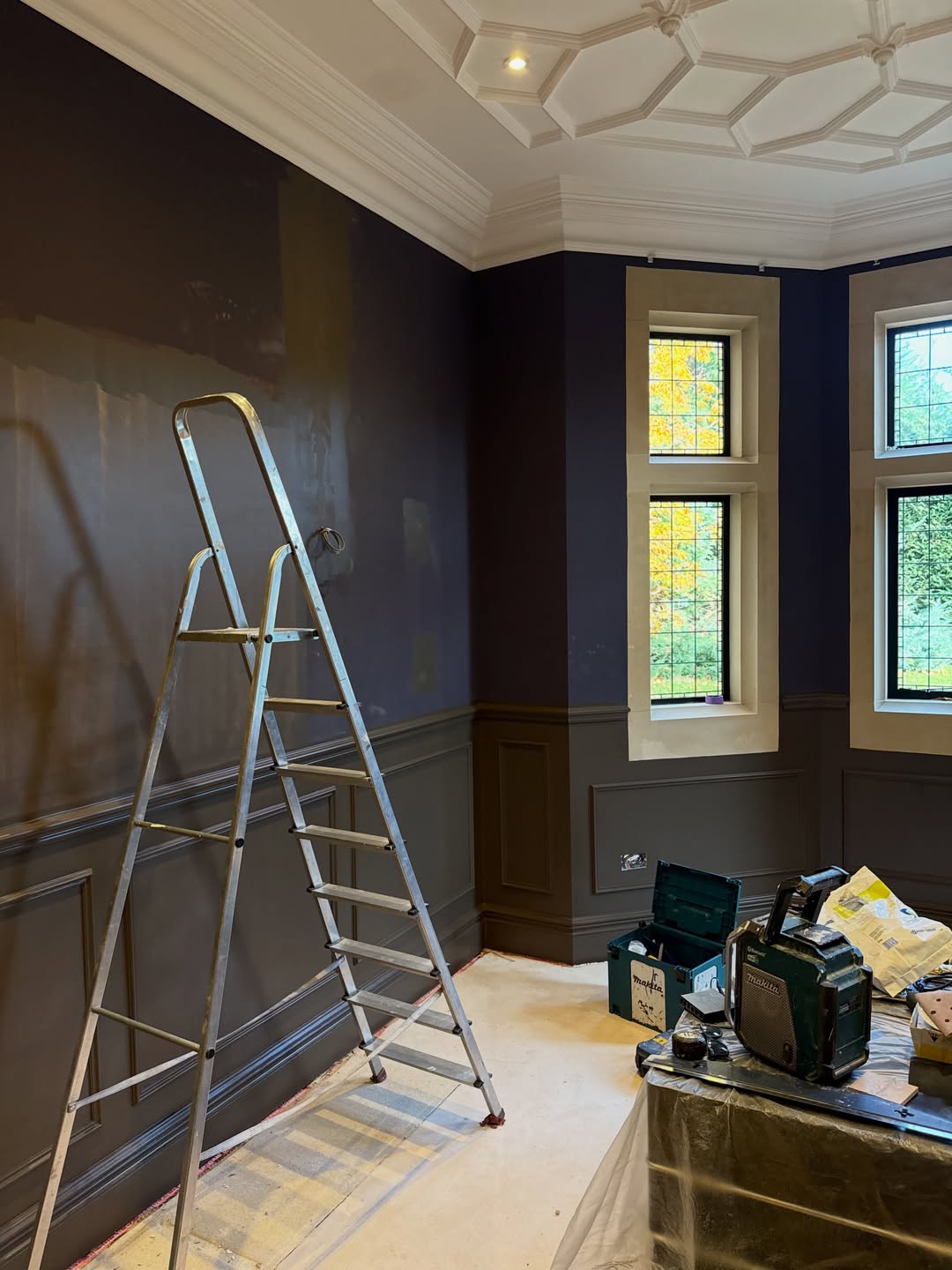
The tall paired windows on the side wall tell the same story. Beautiful stone surrounds. Lovely diamond-pattern leading. Both getting swallowed by paint that was supposed to make them pop.
Why “just drench it deeper” was never going to fix it
Most decorators faced with a flat dark room reach for the obvious lever: go darker. Add a tint. Lacquer the ceiling. Push the color till the room becomes a cave.
That works in a small snug where the point is to disappear. It doesn’t work in a room with a coffered ceiling that cost more than most people’s cars.
The decorator went the other way
They stripped the plum back to bare wall. Kept the wainscoting exactly as it was. Kept the dark painted door. Then hung a tonal pinstripe wallpaper in soft taupe with fine near-black vertical stripes across the entire upper wall. Same for the corridor outside.
A quieter wall that does louder work
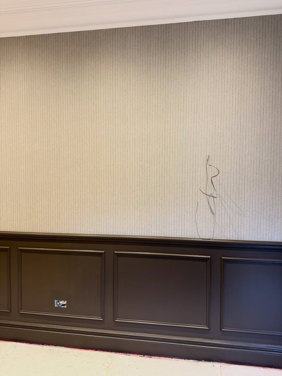
What’s doing the heavy lifting here isn’t the color. It’s the rhythm. Vertical lines, evenly spaced, running floor to coffer. Your eye climbs them without being told to.
Up close, the stripe starts to behave like fabric
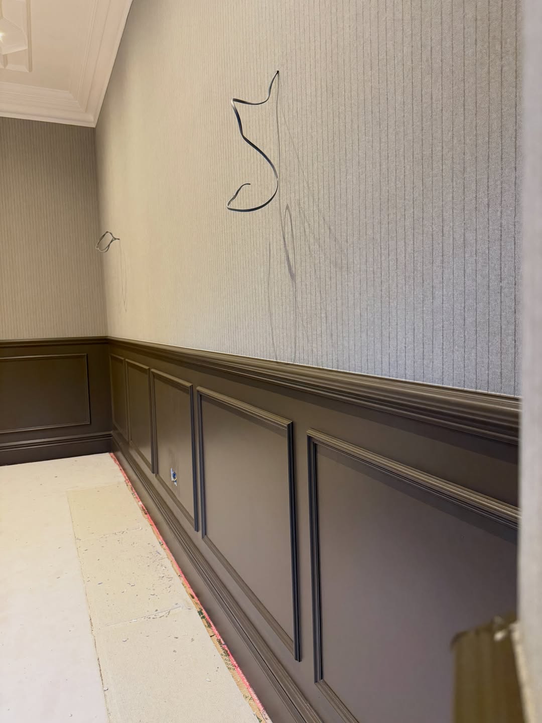
Walk up to it and the paper reads as tightly woven linen, not print. From across the room it’s texture. Close up it’s pattern, two different rooms depending on where you’re standing.
Why pinstripe reads as expensive without saying a word
Pinstripe is one of the only patterns the brain already files under “tailored.” The suiting association does the work for you. You don’t have to prove the room is serious, the reference is doing it silently.
The blind trick that makes the windows disappear into the wall
The decorator didn’t stop at the walls. The Roman blinds across the bay were made up in a fabric that speaks the exact same stripe language. That’s not a coincidence, it’s the whole move.
The bay, now dressed in the same stripe language
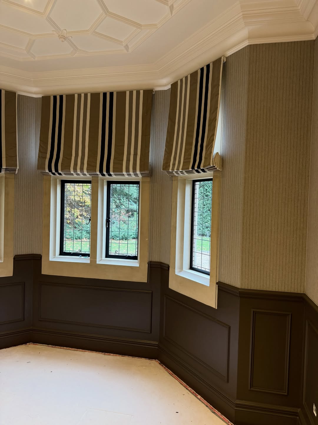
Because the stripes continue straight across the blinds, the windows stop being holes in the wall and start being panels within it. The leaded glass glows inside the pattern. The whole room reads as one continuous tailored envelope.
Even one window pulls off the trick
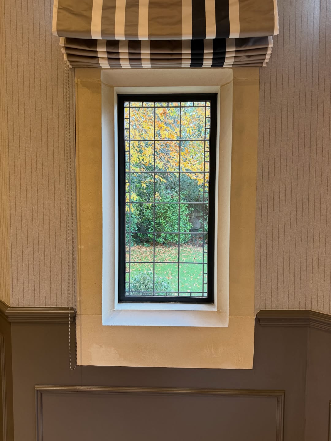
Even on its own, the effect holds. Stripe above, stripe beside, leaded glass centered in the middle like a framed print.
The dark door now reads as a hem, not a weight
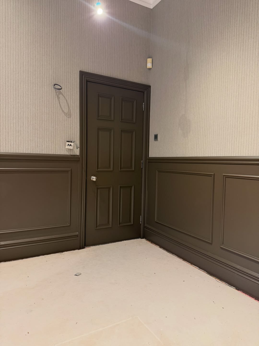
Nothing on the door changed. Same dark paint, same six panels, same brass knob. But against taupe pinstripe instead of plum, it stops feeling heavy and starts feeling grounding, the way a dark trouser hem grounds a cream suit.
The corridor got the same treatment, and it works
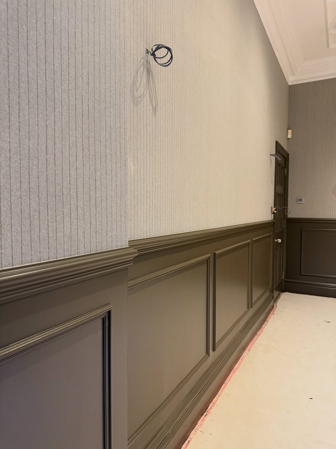
The decorator carried the pinstripe and wainscoting out of the study and down the corridor. That continuity is what sells the whole thing. You don’t step out of a “tailored room” into a plain hallway and lose the spell.
The corner that first sold me on the whole thing
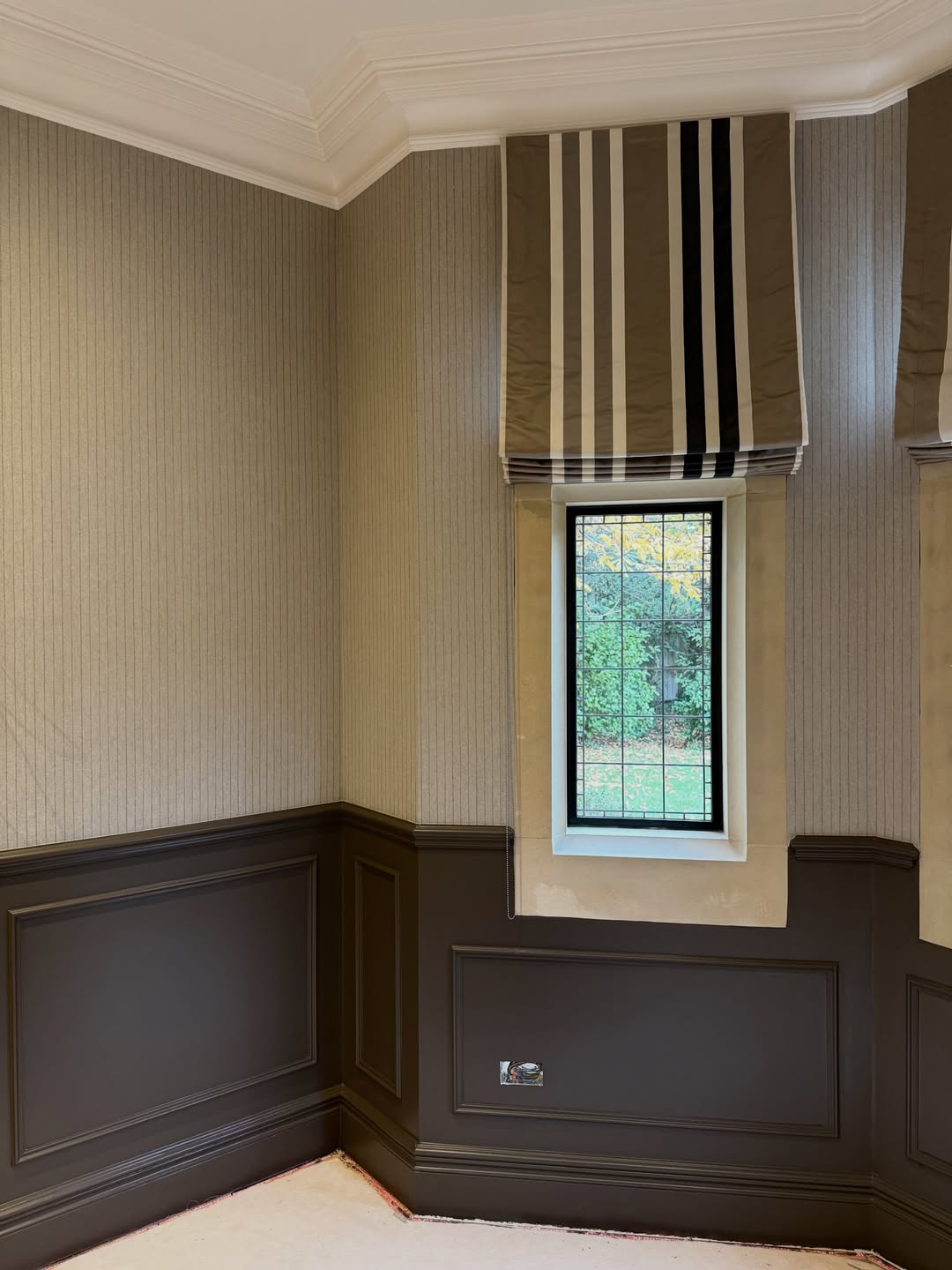
This is the shot that makes the case. Nothing loud is happening. The wainscoting is still dark. The window is still leaded. The ceiling is still ornate. But the room now has air, a vertical pull, and a confidence that the plum version never had.
Steal this move for your own study
Three steps, no Edwardian bones required.
Keep the lower third dark. Wainscoting, paneling, half-height boarding, whatever you’ve got. Above it, skip the drenched paint and hang a tonal pinstripe in a taupe warmer than your trim. Then dress your windows in a fabric that echoes the same stripe, so the glass dissolves into the wall instead of fighting it.
Every all-plum study on your feed is going to look dated in five years. This one won’t.