Here’s a thing nobody tells you about safe gray paint. In a tiny, windowless hallway with a dark floor, “safe” is the problem. The soft, cool gray that is supposed to open up the space is the exact thing making it feel small, flat, and forgettable.
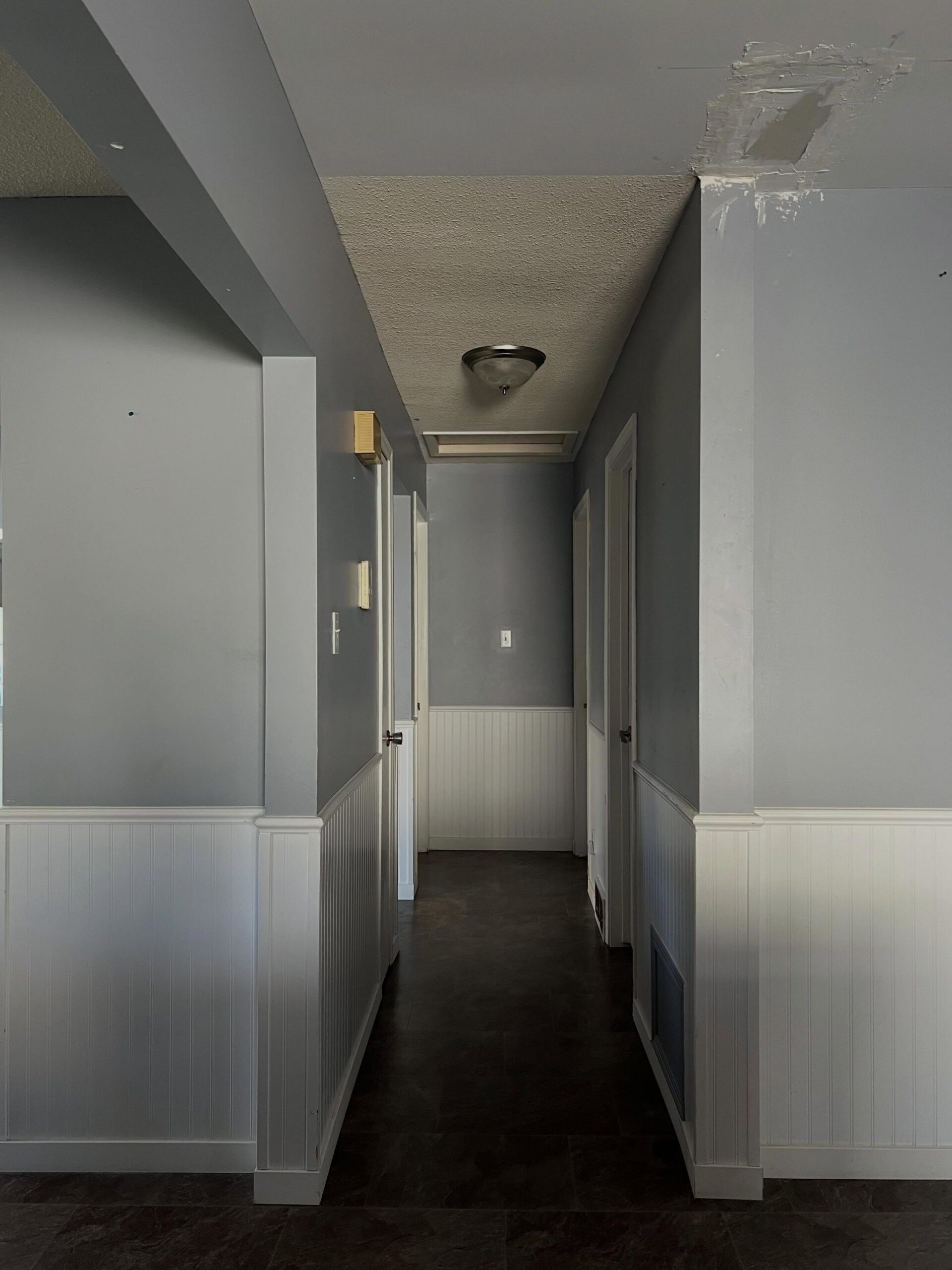
That was this tiny hallway before the makeover. Beadboard on the bottom, a mild blue-gray on top, popcorn ceiling, and dark tile running through. Builder-grade in every direction. The owners were not happy with it. They wanted it to feel like a designer space, not a leftover corner of a model unit.
They broke the small-space rule on purpose
So they did the opposite of what every “small space” rule tells you to do. They painted the upper walls almost black.
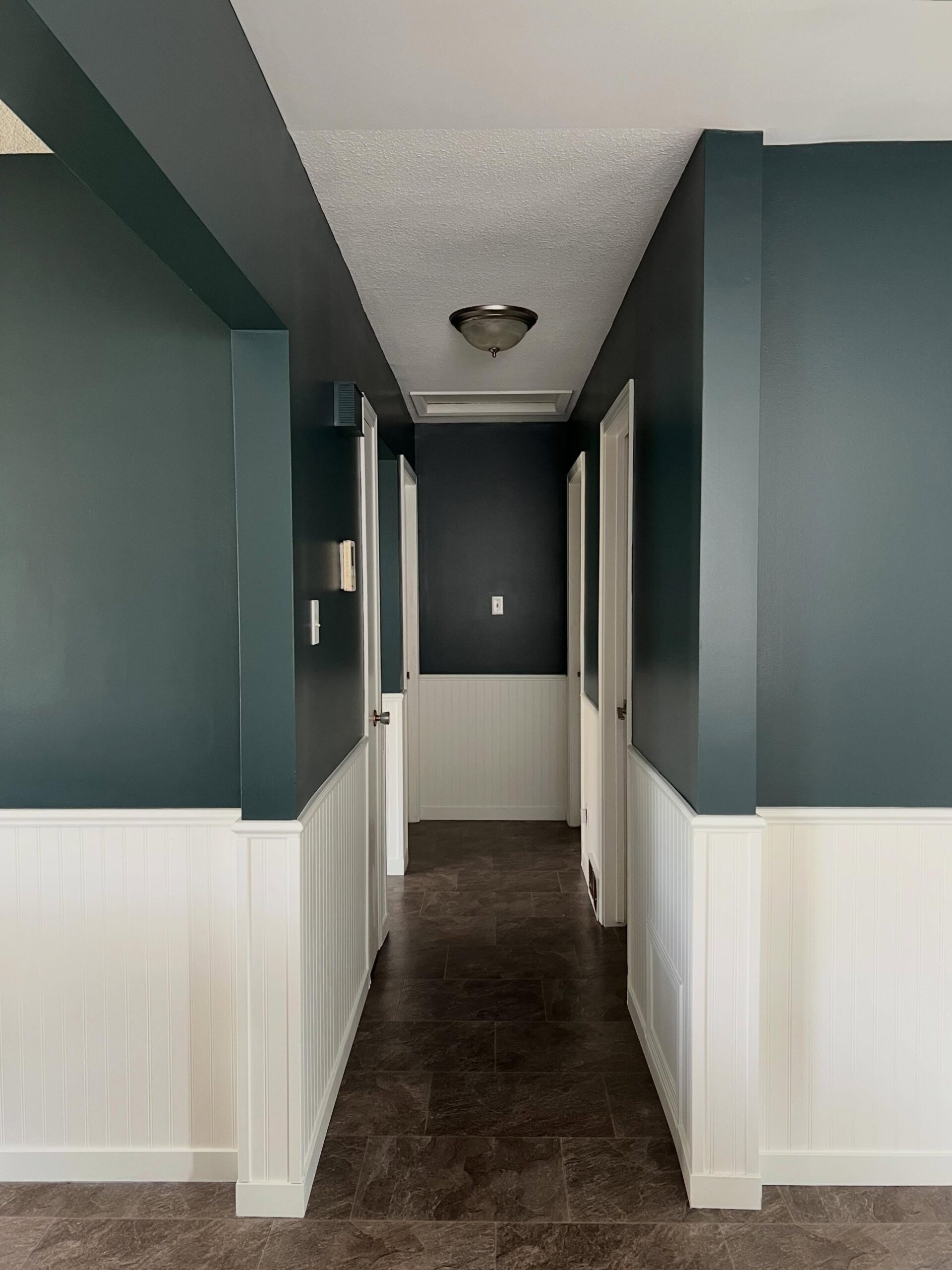
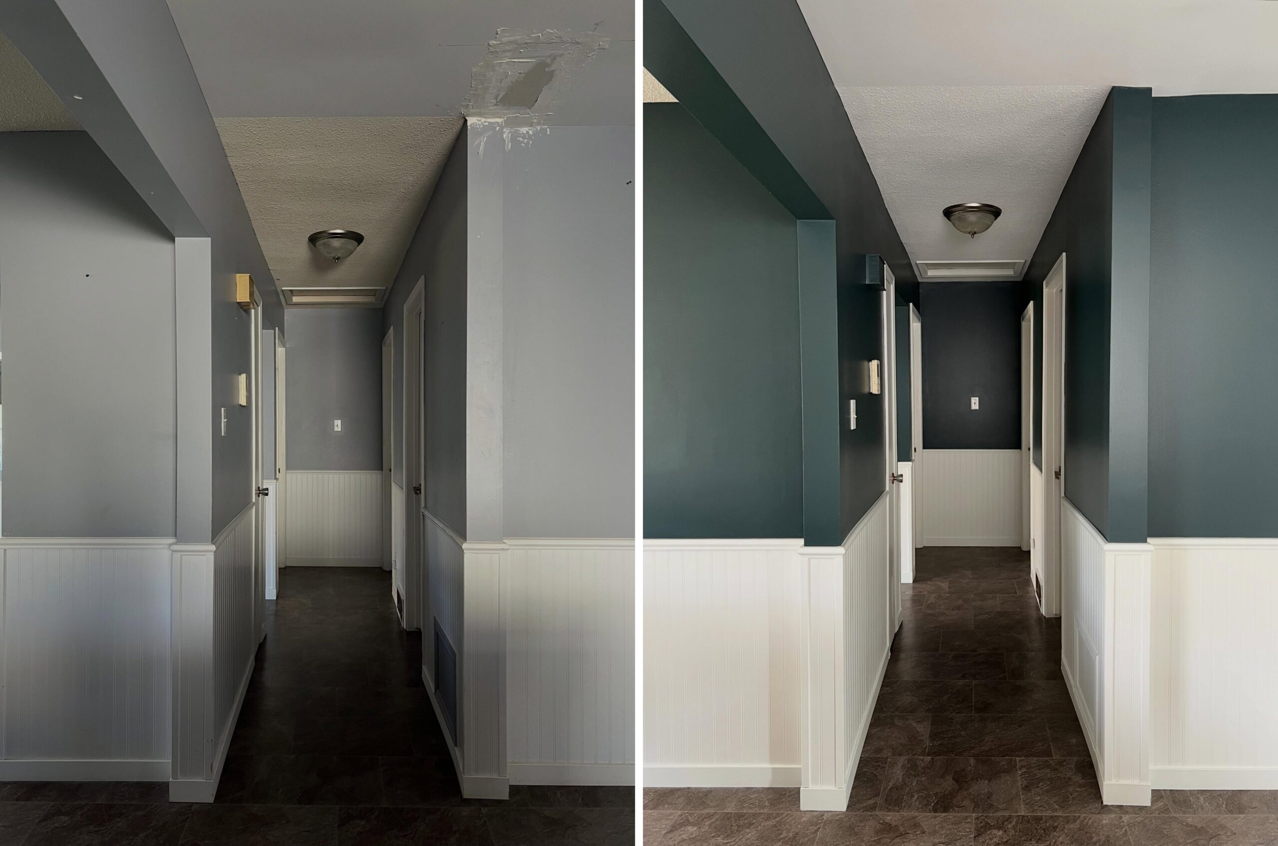
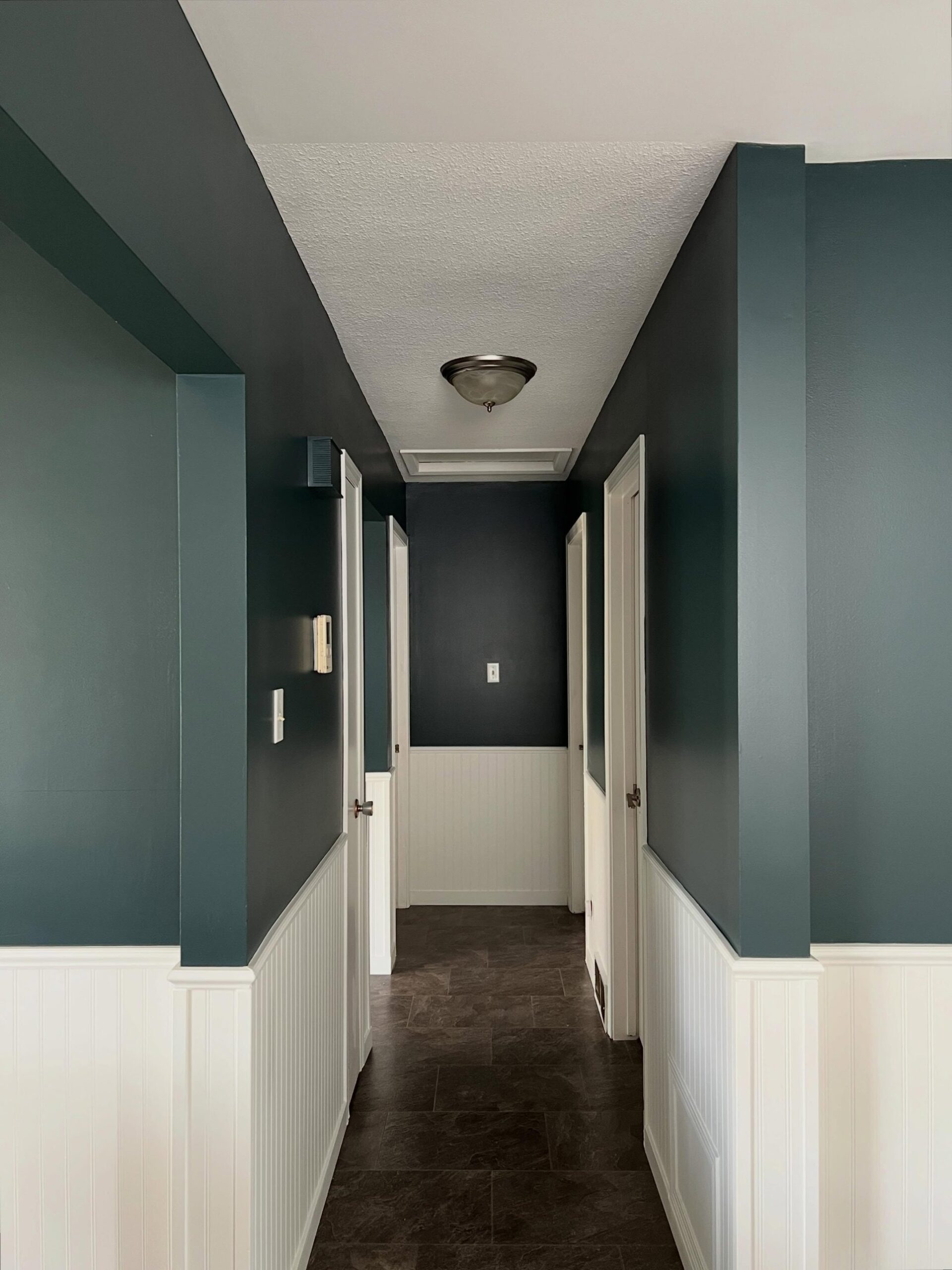
The color is Benjamin Moore Narragansett Green (HC-157). It is a deep, cool, near-black green from the brand’s Historical Collection. In a hallway this tiny, you would expect it to swallow the space whole. It does the opposite. Look at them next to each other.
Why the dark paint actually reads brighter
The green reads brighter. That is not a trick of the camera. It is how dark paint works against a bright lower half. Three things are doing the heavy lifting here.
The white wainscoting now bounces light upward right where your eye travels. The dark green on top recedes instead of pressing in, which makes the walls feel farther away. And the crisp line where the two colors meet gives the hallway a feature it never had before, so your eye lands on the shape of the space instead of its tightness.
Gray had none of that going for it. It just sat flat and muddy against the floor.

How they landed on Narragansett Green
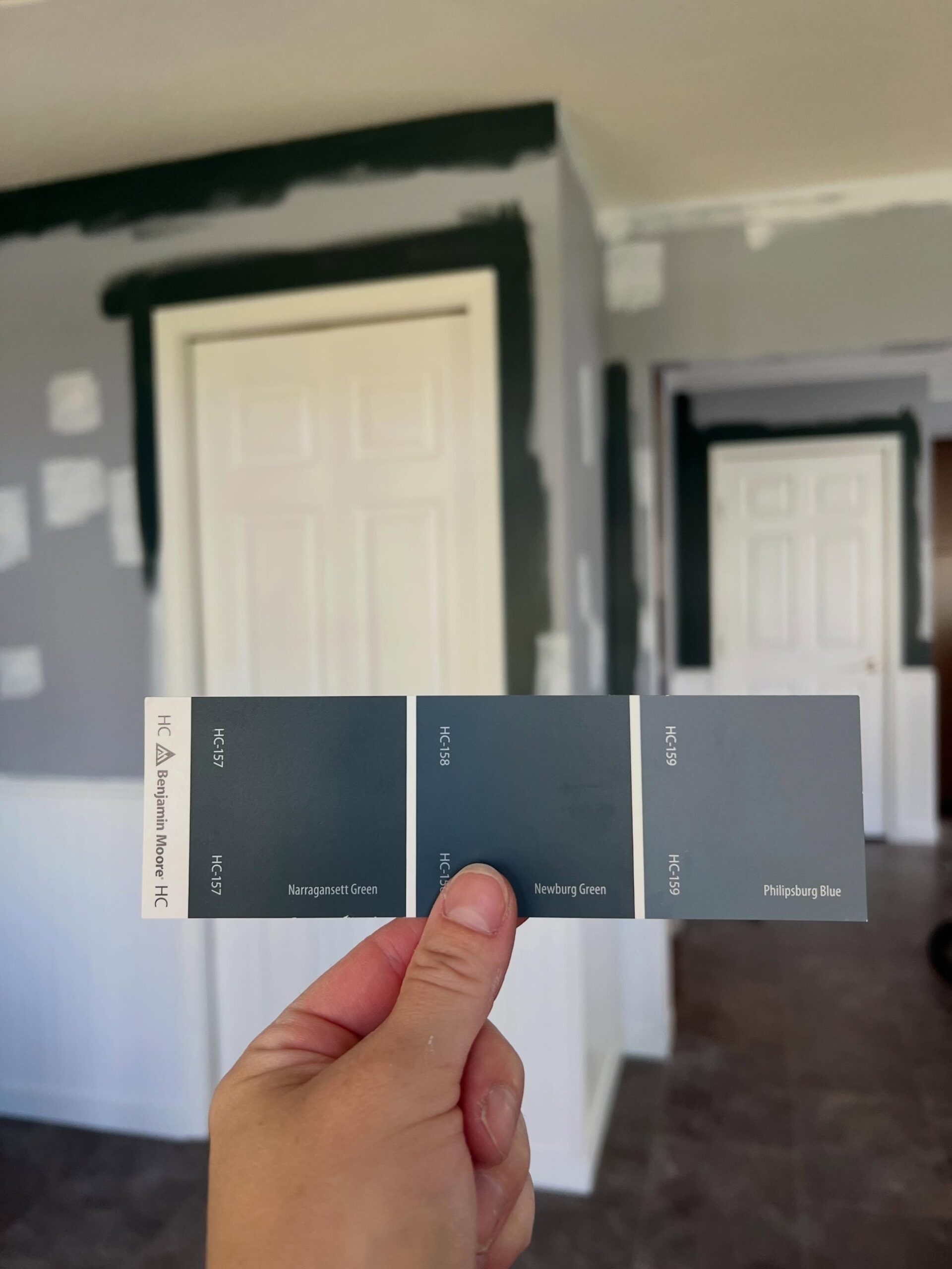
The pick was not an accident. They tested three deep colors from the same family: Narragansett Green, Newburg Green, and Philipsburg Blue. All three sat in that moody blue-forest bracket. They went with the darkest. The paint used was Dulux Lifemaster, a professional interior line. The finish on the wall reads soft and velvety, with no gloss bouncing back at you. That sounds counterintuitive for a dark hallway, but it is critical to the final look. The low-sheen color sits deep like a backdrop, while the white wainscoting carries all the sheen and reflection.
The same corner tells the same story
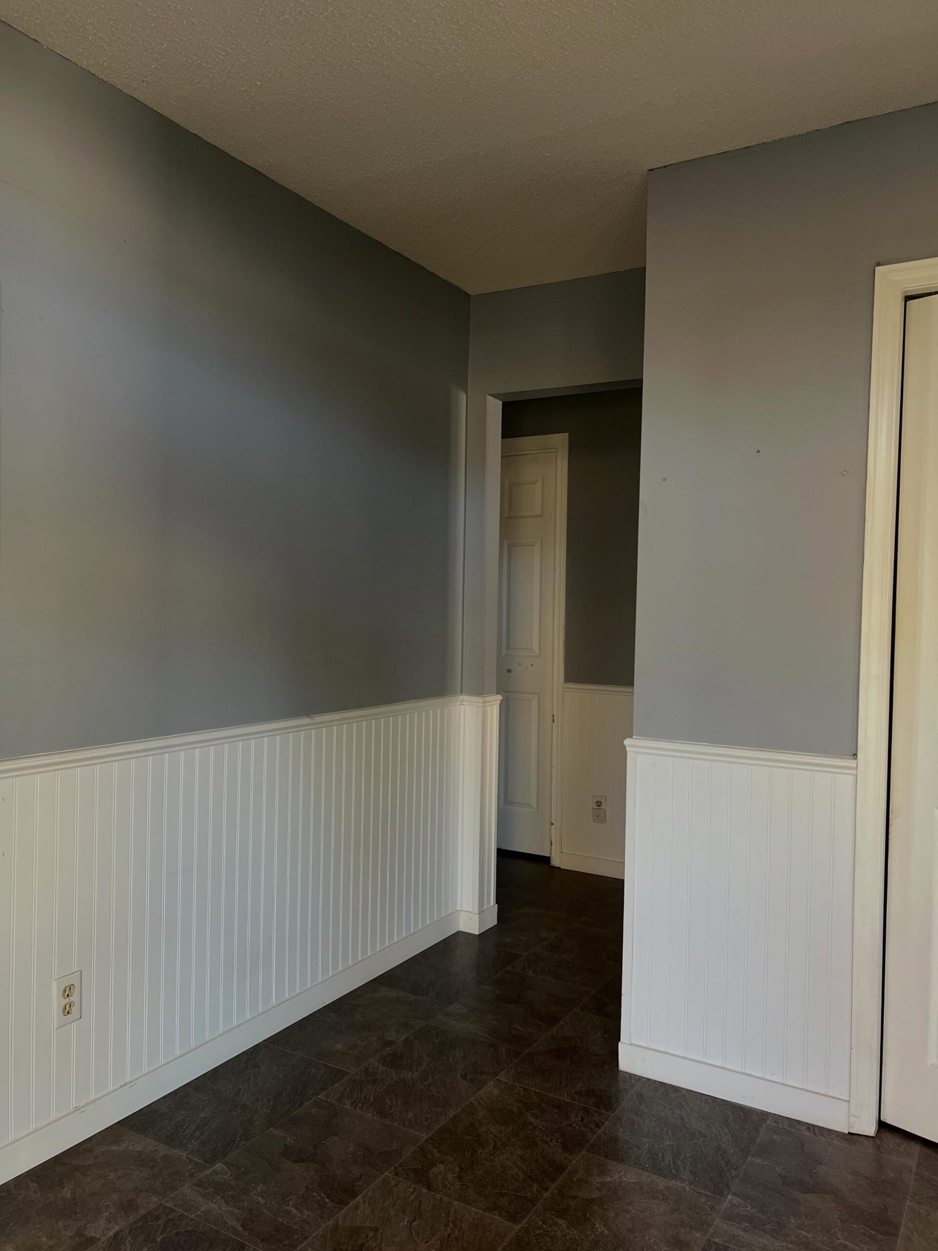
Same wall, same corner, same floor. Nothing moved except the paint.
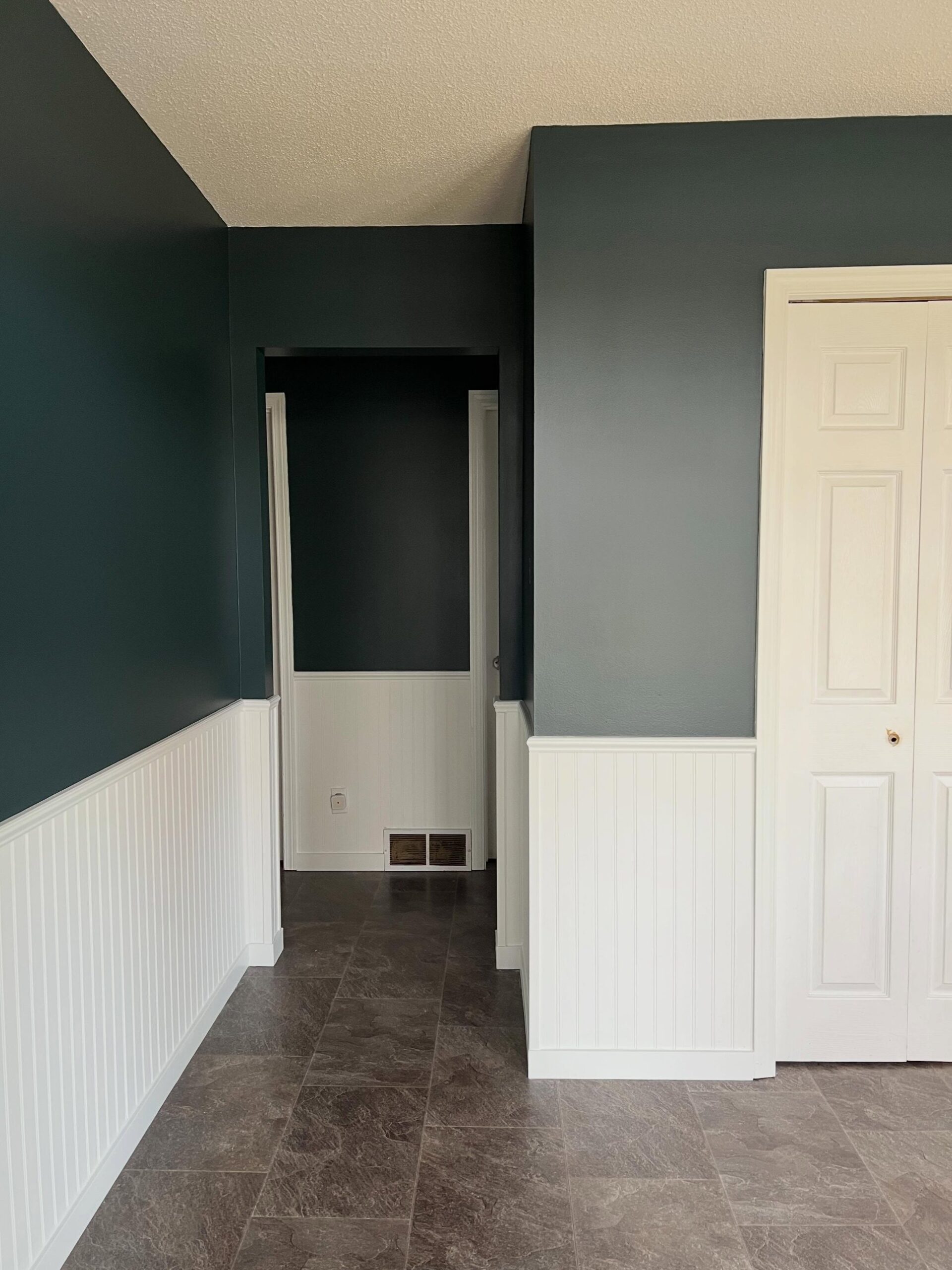
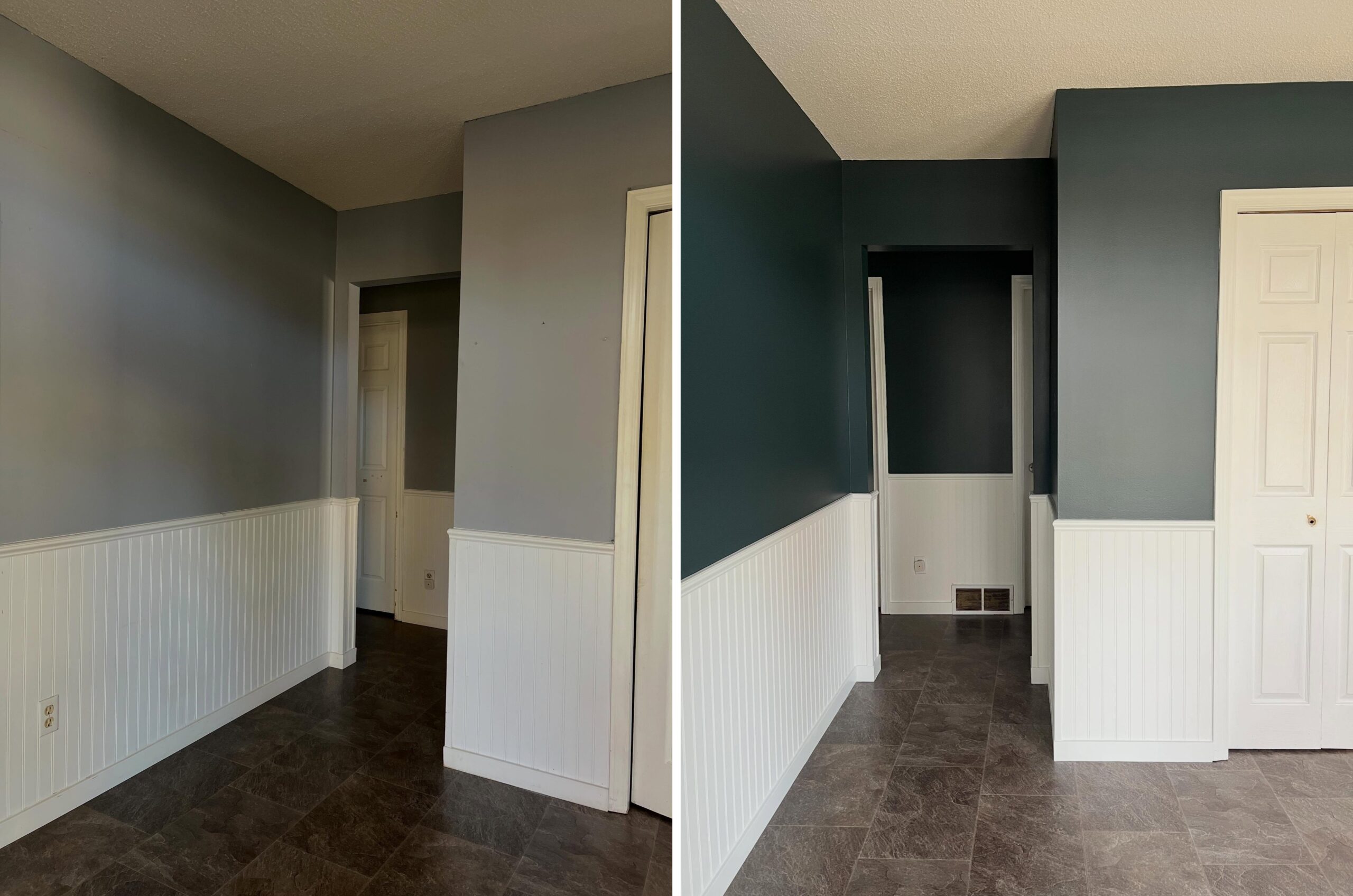
The dark green turns a plain corner into something that reads as architectural, like trim work without the trim. Your eye follows the shape of the walls now, not the awkward way the hallway opens up.
The landing that pulls it all together
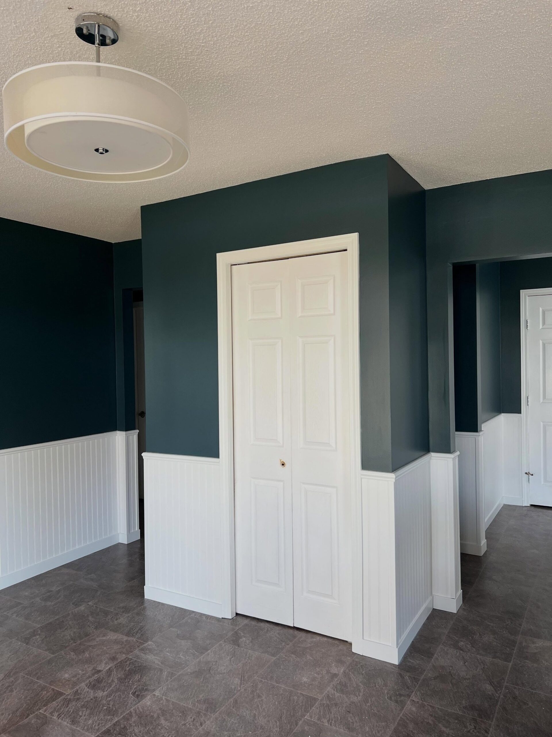
The lighting in the landing adds to the effect. A big white drum pendant pulls your eye up to the brightest part of the ceiling and gives the dark walls a focal point to frame. The combination reads less “forgotten corner” and more “landing you want to walk through.”
The gray-safety trap, and the fix
The takeaway: if you have a tiny, windowless hallway and you have been defaulting to gray because the rule says “small space, light paint,” the rule is wrong for your space. The real move is a dark upper wall paired with a bright, reflective lower half. The two-tone split is doing all the work. The color on top is just giving the space a point of view.
They trusted the vision. The hallway now reads like a designer space, not a pass-through. Which wall of yours have you been playing it safe on for too long?