

Dark green sounded like a good idea on paper. Moody, modern, the color every designer was raving about last year. But once it went up on all four walls of this room, the homeowner walked in one morning and realized she had basically built a cave for herself. A pretty cave, sure. But a cave.
So she called in the wallpaper team and asked for the opposite of everything she had just done. What they put up in its place is the kind of change you have to see twice to believe, because the room is the exact same size and the exact same shape, and yet it looks like someone built an addition.
The green walls were suffocating a beautiful room
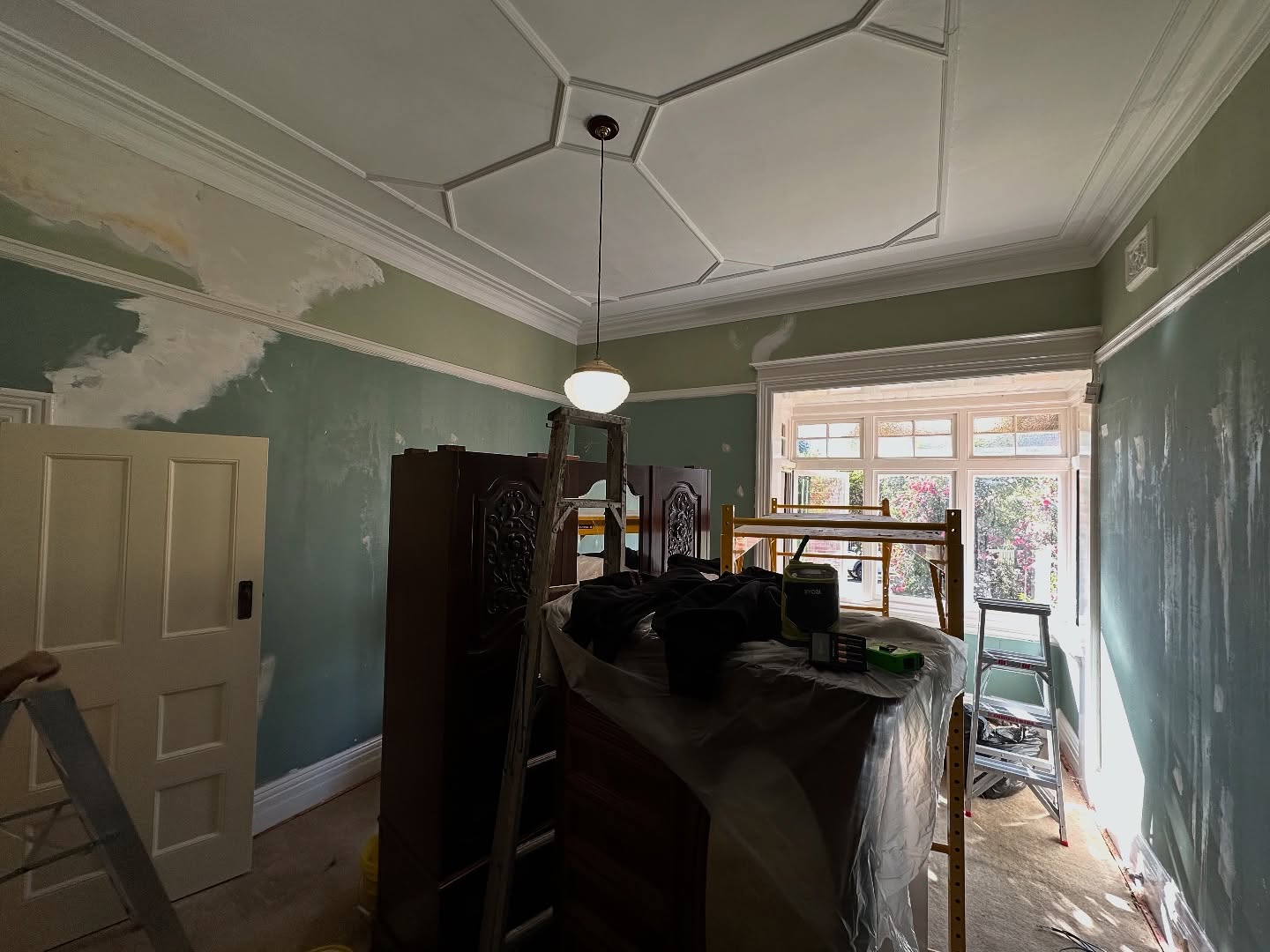
Here is what she was working with. Sage green pushed from the baseboard all the way up to the crown moulding. No break anywhere. Nothing to pull your eye around the room.
And look what the green did to that gorgeous ceiling. Those raised plaster shapes overhead are called a coffered ceiling, and they are a sign that whoever built this house in the early 1900s really cared about the details. You would walk past a hundred modern builds before you found one. But under all that green paint, the ceiling barely registered. It just sat up there, pretty and lonely, waiting for someone to notice it.
The bay window was the saddest part of all
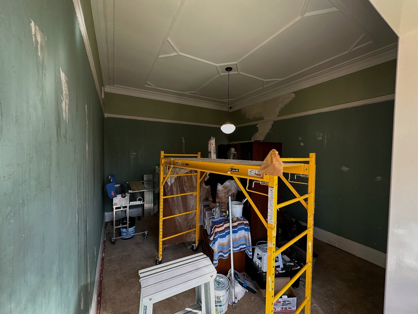
A bay window like this should be the happiest spot in the house. You should want to stick an armchair right there and lose a whole Saturday to a book. Instead, the hard green walls made the daylight pouring in feel almost blinding, like a flashlight in a dim room. The eye could not settle. The patches of white primer on the walls tell you she was already second-guessing the color weeks before the paper went up.
Something had to give.
They picked a leafy pattern so soft it almost disappears
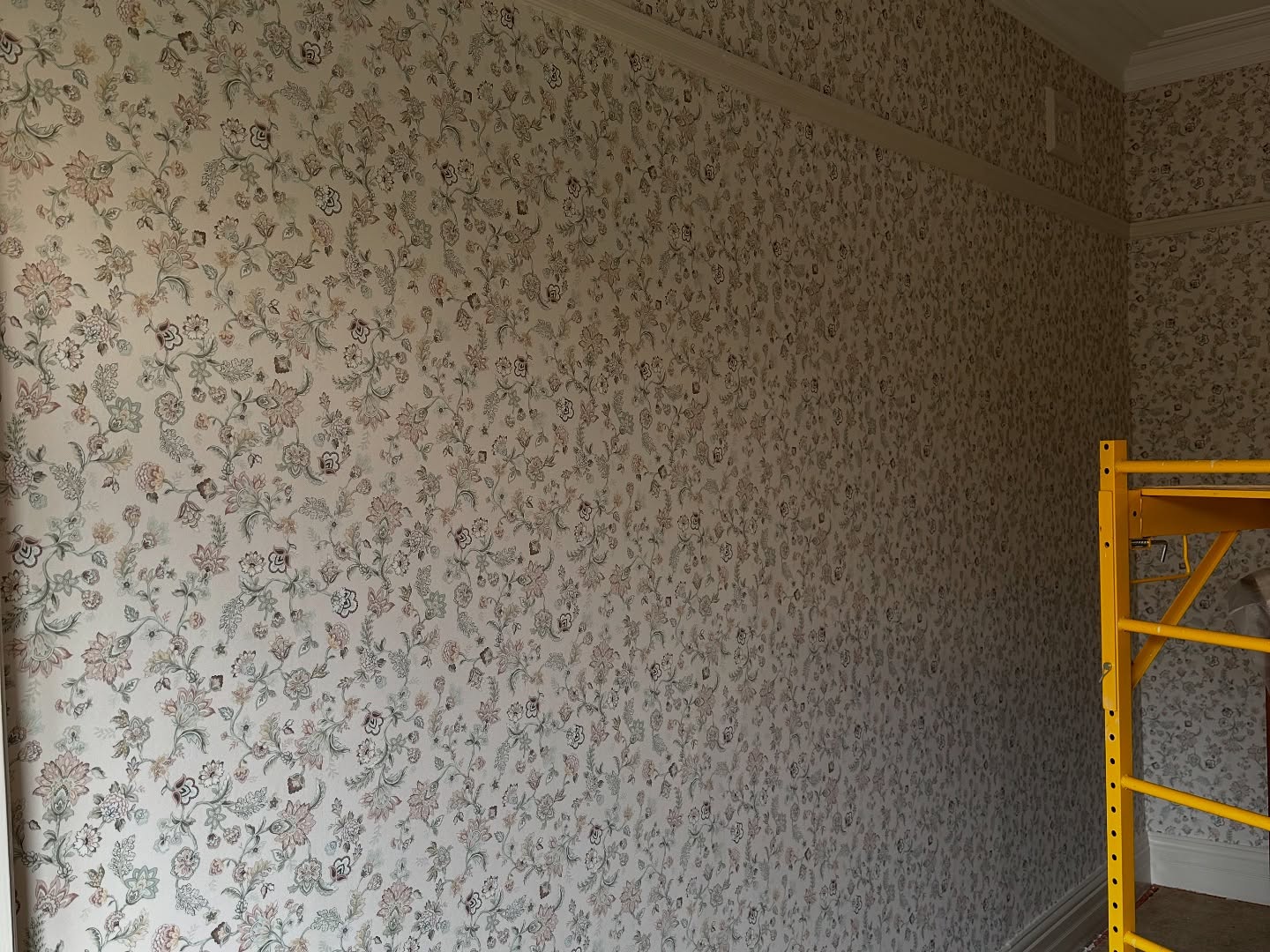
Here is the new paper up close. The background is a warm cream, almost the color of old paper. The vines and little leaves scattered across it are so faint that from across the room, you barely read it as a pattern at all. It just reads as a soft, textured, slightly glowing wall.
This is the trick a lot of homeowners miss with wallpaper. They go bold because they think bold is the point. But in a room with great bones, the wallpaper’s job is to shut up and let the architecture do the talking. This paper does exactly that.
Now the ceiling finally gets the spotlight it deserves
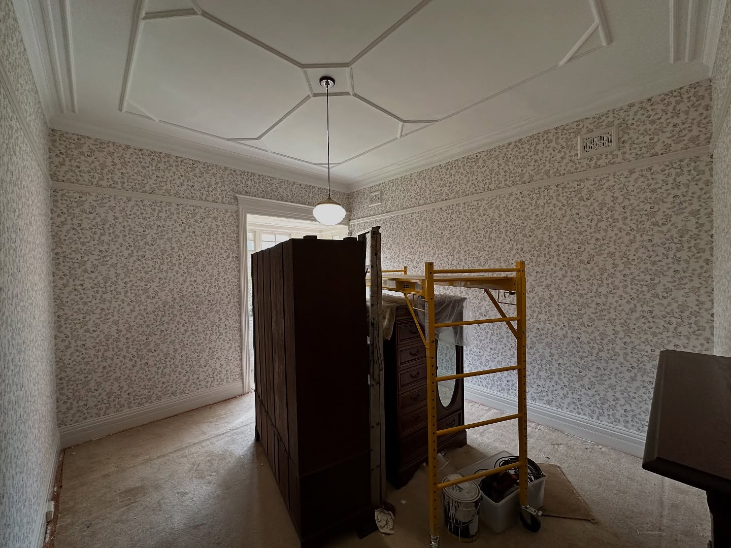
Look at that ceiling now. It pops. It feels sculpted. The soft cream walls give it something to lean against instead of something to fight with, and your eye walks naturally from the pattern below up to the shapes above. That whole upper half of the room, which was basically invisible under the green, is now the first thing you notice.
The room has not grown an inch. It just stopped being heavy.
The bay window is a reading nook now
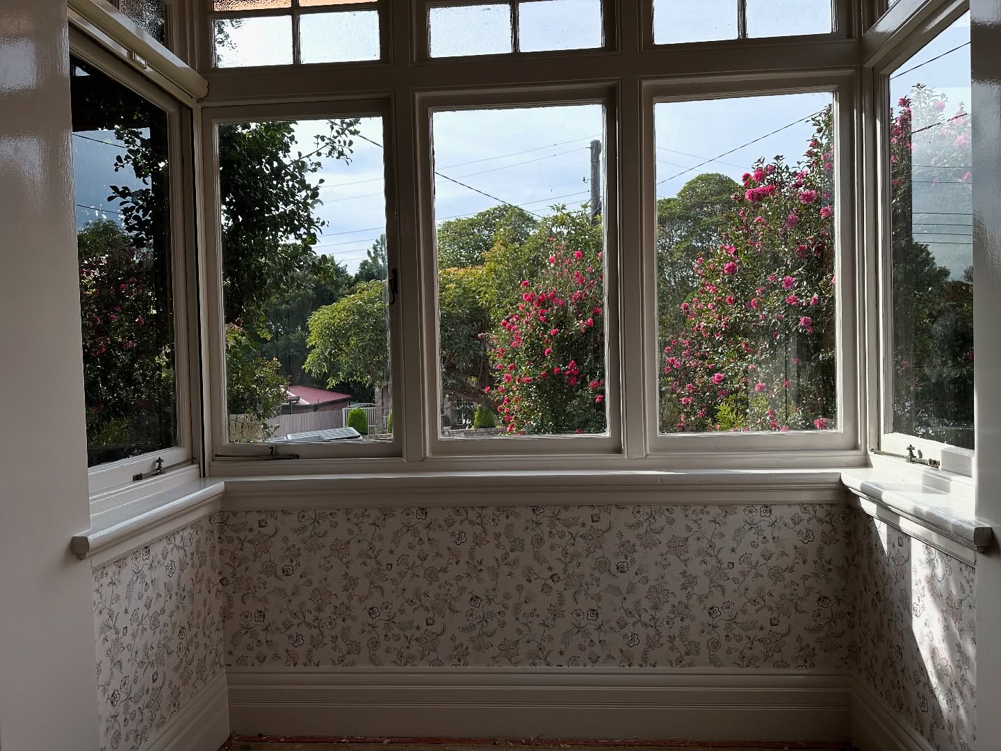
Same bay. Same windows. Same pink blooms outside. Totally different feeling. The cream background now catches the daylight instead of blocking it, and those camellias outside almost look like they belong to the pattern on the wall. You want to pull up a chair.
The full wall is a soft, lived-in postcard
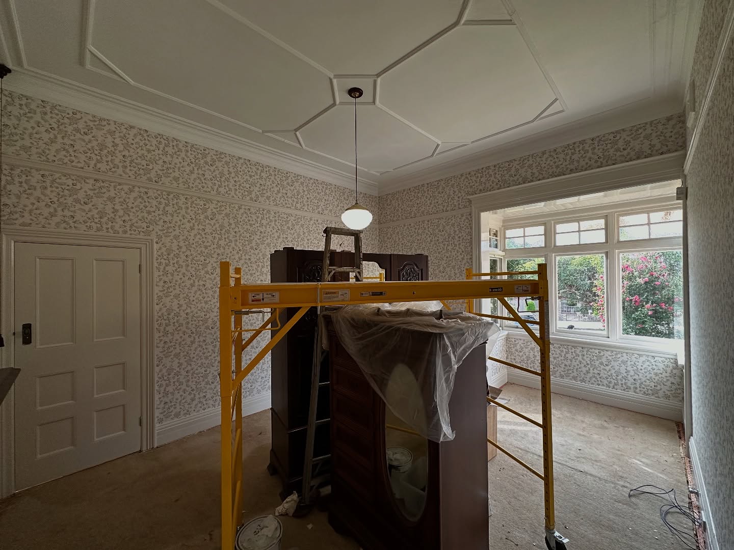
This is the same wall where the green used to sit. The paper covers the whole surface from the skirting to the top rail, but because the pattern is small and the background is warm, the wall reads as calm, not busy. It feels more like a grown-up garden print than a loud statement paper.
See both versions one above the other
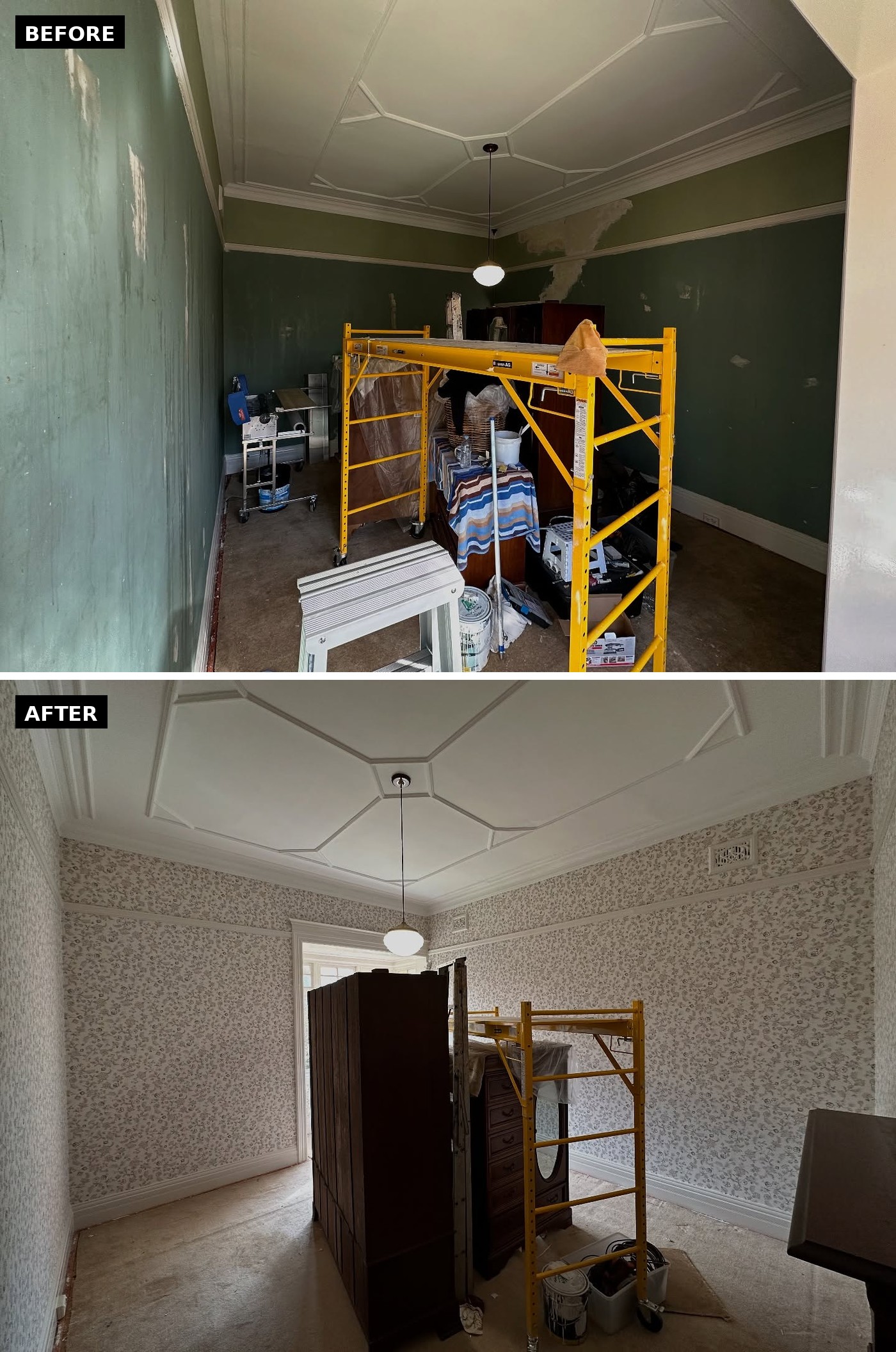
This is the whole story in one image. Same scaffold. Same ceiling. Same wardrobes in the middle. The only thing that changed is what is on the walls, and the room reads like two different houses.
The real lesson is about restraint, not pattern
If you own an older home with any kind of architectural detail (coffered ceiling, pressed tin, wide crown moulding, a nice bay window), you do not need to go bold on the walls to make the room feel special. The house already is special. You just need to pick something quiet enough to let it breathe.
She tried bold first. The room fought her. She tried soft, and the room thanked her. That is usually how it goes.