

Here’s a thing nobody tells you about small bathrooms: the beige advice everyone passes around doesn’t actually solve the problem. It just mutes it.
That’s what this Traditions bathroom was living with. A long, windowless galley. White vanity, white marble floor, chrome everything. Done by the book. And completely forgettable.
Then the homeowner did the exact thing every rulebook says not to. Covered every wall, floor to ceiling, in a loud chinoiserie floral. Peonies, pheasants, the whole aviary. Even the tiny toilet closet got wrapped.
What happened next is the part that surprised me. The room didn’t close in. It opened up.
The before that looked fine on paper
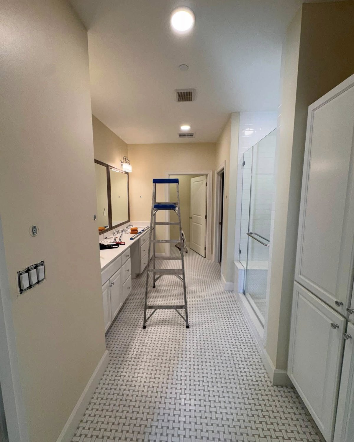
Nothing was broken. That’s the trap. The marble basketweave floor? Pretty. The glass shower? Fine. The vanity? Clean and white. You could tour this bathroom and tick every box on a design blog checklist.
But stand in the doorway and your eye does something telling. It races past everything, straight to the far wall, and lands on nothing. A hallway with a sink. The kind of room you walk through, not into.
The second angle tells on itself
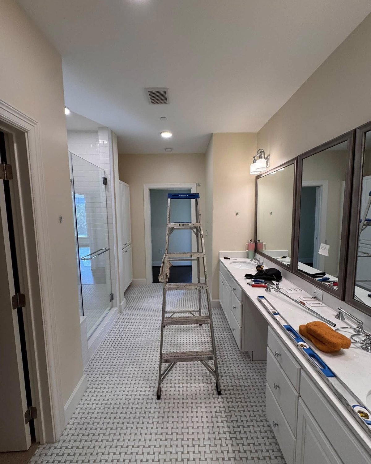
From this angle the diagnosis gets clearer. Three big mirrors, and all they’re reflecting is more beige. The silver frames, the chrome sconces, the polished faucets, all of it just sitting there with nothing to push against. Good hardware disappears when the walls behind it have nothing to say.
That’s really what was wrong. Not the pieces. The backdrop.
The moment the wallpaper went up
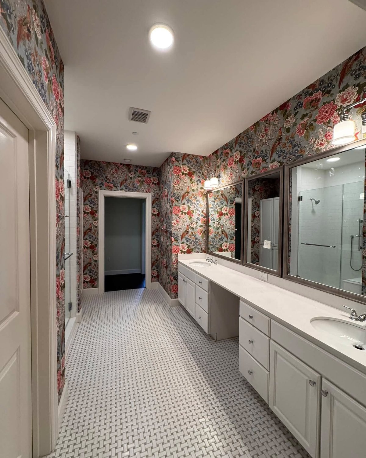
Walk in now and the room stops you cold. Soft dusty blue ground. Peonies the color of old roses. Little pheasants tucked between the branches. Every wall, right up to the ceiling. No accent strip, no break, no white chair rail trying to split the difference.
And here’s the trick your eye plays. It stops racing to the back wall. It catches on the pattern and settles. The room isn’t longer or wider than it was ten minutes ago, but it feels it, because you’re actually looking at the walls instead of past them.
The dusty blue does what the beige was supposed to do, only with depth behind it. The white floor and vanity, which read as builder grade before, suddenly look like crisp, deliberate choices. The chrome picks up the cool tones in the paper. Everything belongs.
The side-by-side nobody can argue with
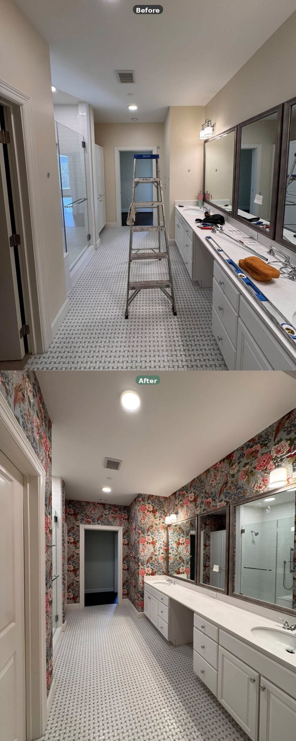
Same floor. Same vanity. Same mirrors. Same shower door. Same lights. Only the walls moved. Top panel looks like a nice rental between tenants. Bottom panel looks like somewhere you’d pay to stay the night.
The vanity wall finally has a job
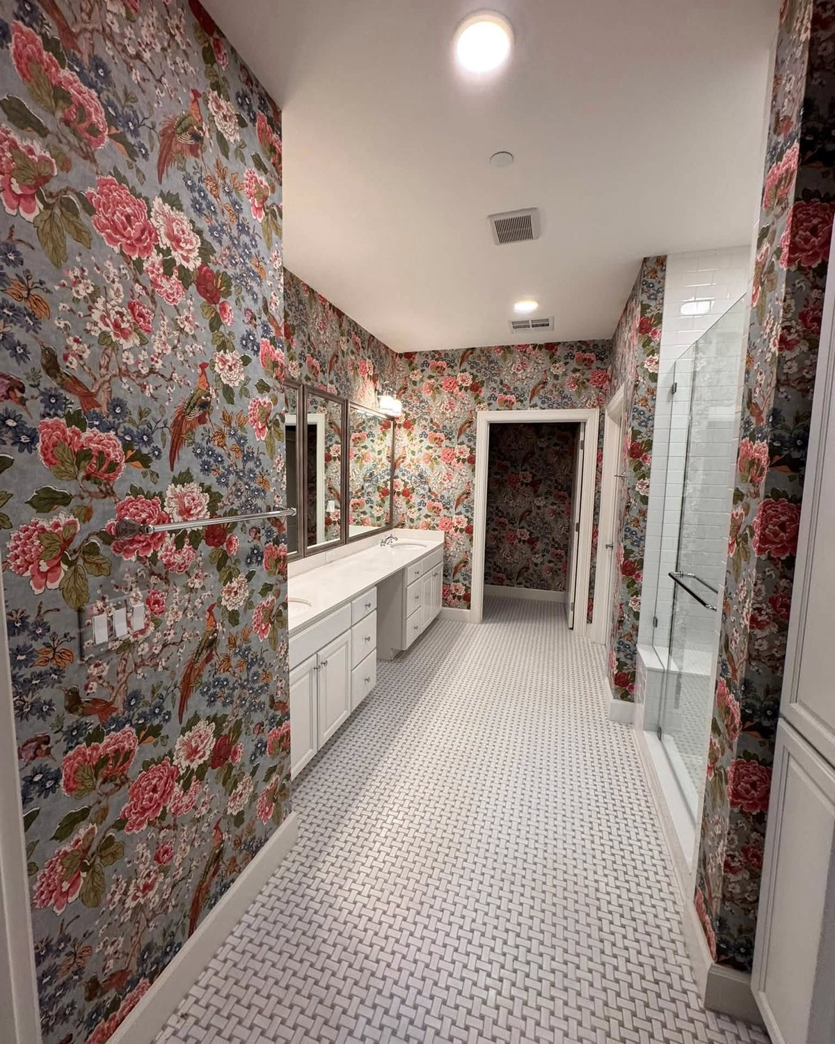
In the before, that long vanity wall was a blank beige rectangle holding up some mirrors. Now it’s doing real work. The silver frames pop. The chrome sconces have something to glow against. Even the white counter looks a touch warmer, because the paper pushes a hint of that dusty blue back at it.
A closer look at what the mirrors are reflecting now
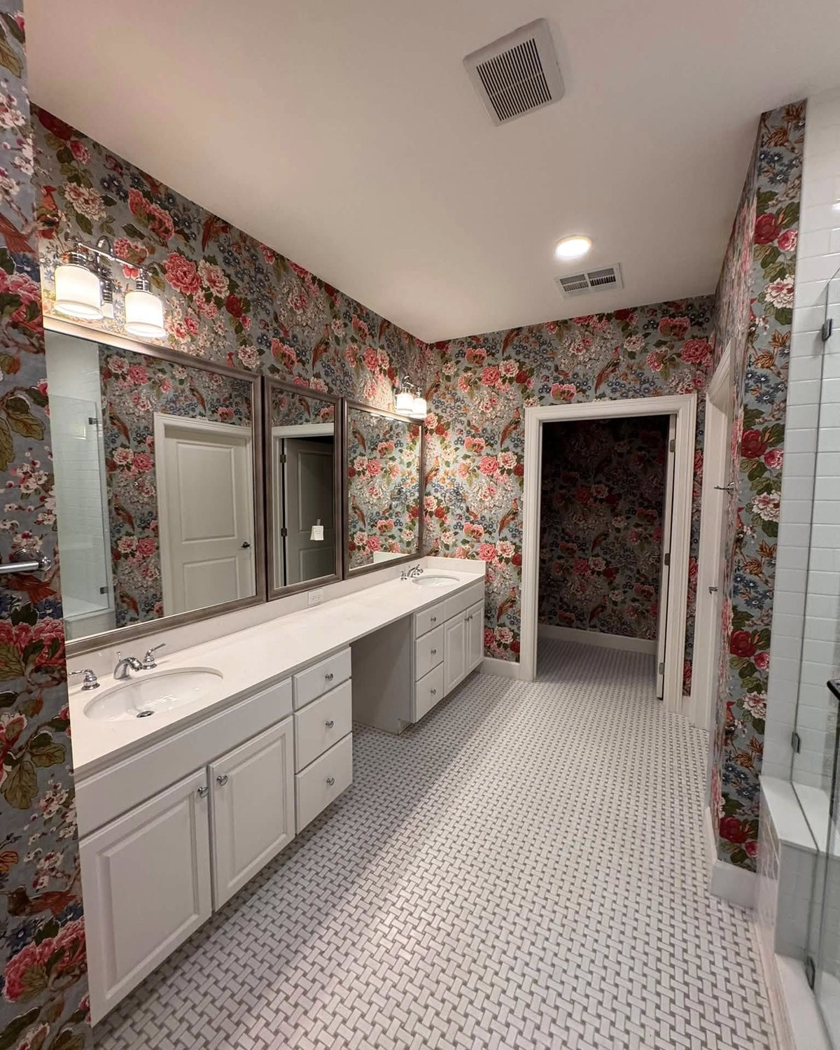
This is where you see the quiet multiplier effect. Every one of those three mirrors is now reflecting more pattern back into the room. Instead of doubling the beige, they’re doubling the depth. That’s the kind of thing you don’t plan for and then notice later.
The shower side that keeps everything from tipping over
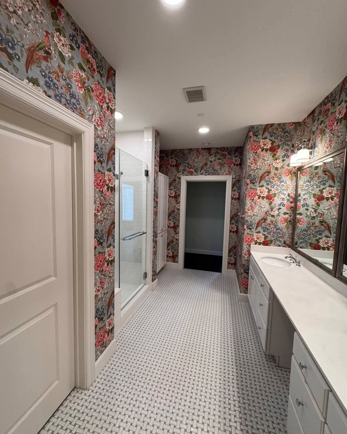
Here’s why the pattern doesn’t read as too much. Look at everything that stayed white. Shower tile, vanity, floor, counter, trim, ceiling. The wallpaper is loud, but it’s the only thing being loud. Every other surface is holding its breath, so the room reads as layered instead of busy.
See the little doorway at the back? It used to show you how narrow the room was. Now it frames a cozy little cutaway. Totally different mood, same architecture.
The toilet nook that was the saddest square footage in the house
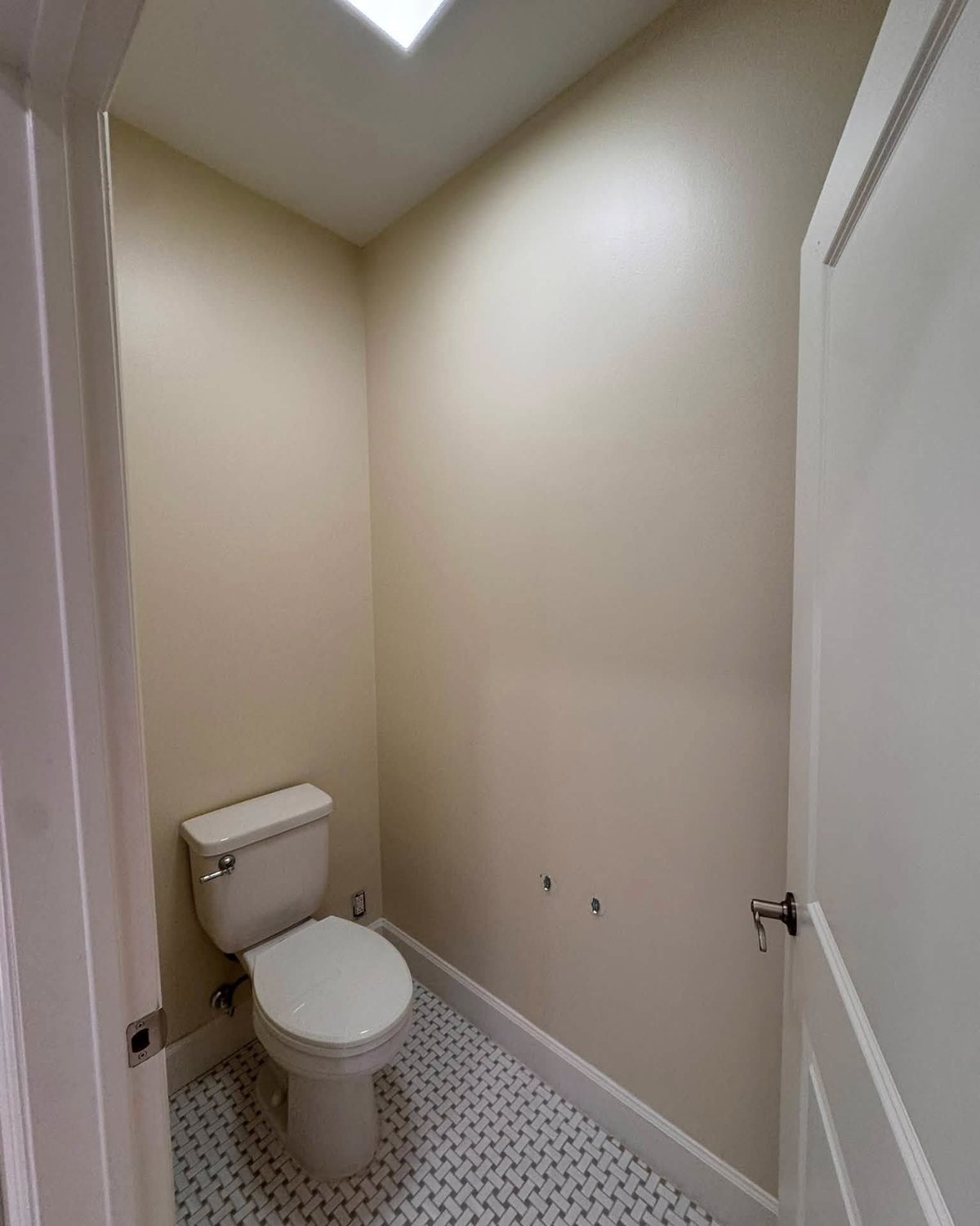
I want you to really look at this before. A tiny beige box with a toilet. There’s nothing in here to cut the eye on. It’s the architectural equivalent of being put on hold.
And then it became the best shot in the house
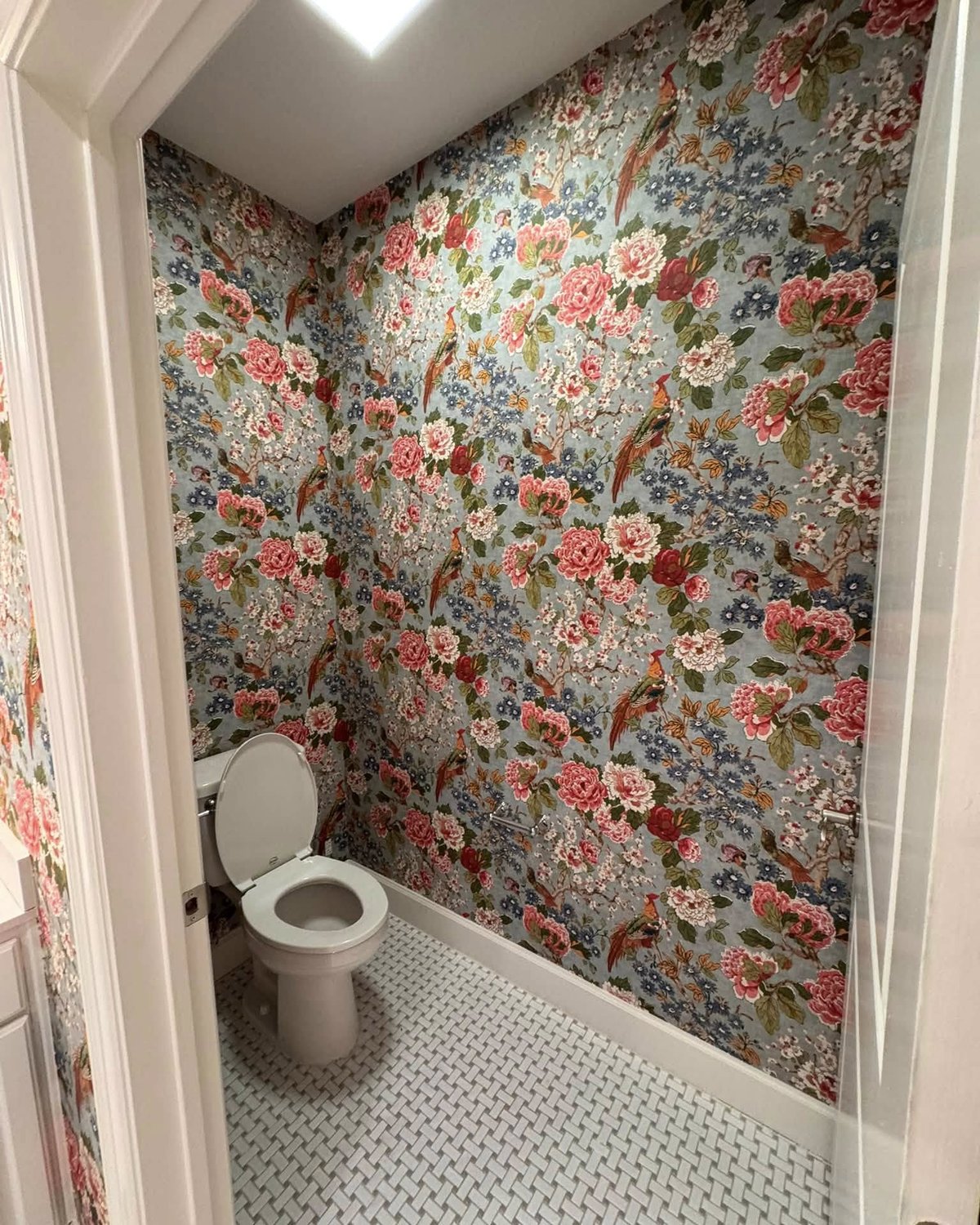
Same square footage. Same toilet. Same floor. Same skylight. Now it’s a jewel box. The small size, which was the water closet’s biggest weakness, turns into its biggest strength the second there’s something on the walls. A pattern wrapping you on all sides hits harder in a small room than it ever could in a big one.
The skylight does something lovely here too. It washes the top of the pattern a little lighter, so the blues at eye level feel saturated and the ones up high feel breezy.
Side-by-side: the water closet move
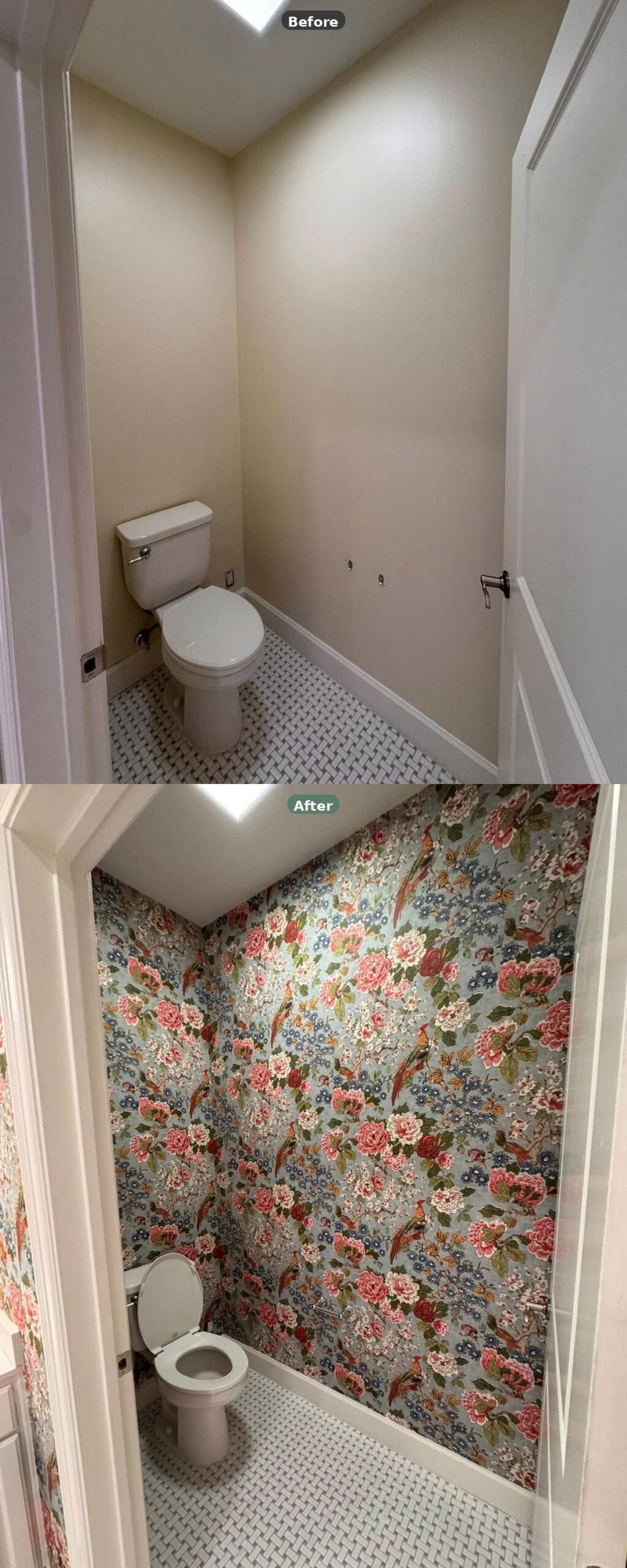
Nothing moved. Nothing got added. The toilet is in exactly the same spot. That’s the whole point of this comparison. The walls were the entire problem, and the walls were the entire fix.
Why loud patterns actually work in tight bathrooms
The old rule says busy walls shrink a small room. The real rule, the one nobody states out loud, is more specific than that.
In a small, windowless bathroom there’s nothing competing with the pattern. No window view pulling your eye outside. No sofa, no rug, no art, no big piece of furniture breaking the plane. The pattern has the room to itself. It becomes the view.
That’s why the boldest wallpaper you see in design magazines almost always lives in powder rooms and small baths. It’s not because designers are being brave. It’s because they know those rooms are the one place in a house where a maximalist pattern has no competition.
In a big open living room this wallpaper would be a mess. Here it reads as considered.
So if you’ve got a narrow beige bathroom staring at you right now, waiting for its turn, the thing you’ve been told to avoid might be the exact thing that fixes it.