
Here’s the thing nobody tells you about small, dark rooms. The advice everyone gives you is also the advice that keeps them forgettable.
Alaina had one of those rooms. A cramped office behind French doors. Grey walls that read flat in every light, white trim that vanished into them, one window pointed straight at the neighbor’s picket fence. A navy tufted desk chair and a damask slipper chair that had clearly never been introduced.
Then she broke every rule in the book, and the room turned into the one everyone in her comments wanted to copy.
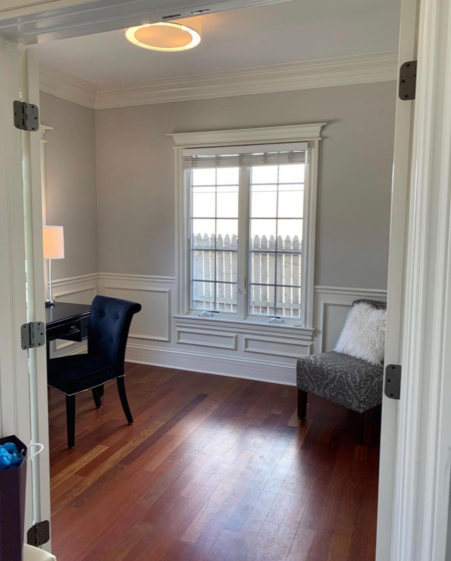
Nothing’s structurally wrong. Wainscoting, fine. Floors, fine. Window, works. The room’s just living on the “safe” setting, and you can feel it. Nothing pulls your eye anywhere. The fence outside is the loudest thing in the frame.
The advice everyone gives for rooms like this
Ask ten people what to do with that space and nine say the same stuff. Keep it light, white paint, nothing bold on the walls because pattern “shrinks a small room.” That’s how Pinterest ends up with ten thousand offices that all look like the same hotel room.
The rule isn’t wrong, it’s expensive. Big pattern in a huge living room just looks like big pattern. Big pattern in a 10 by 11 room with wainscoting starts to feel like a jewel box.
Alaina went jewel box.
What she actually did
Three moves. None of them subtle.
One. She papered the walls in Lee Jofa’s Davenport in Cloud. Think old-school trade house, the kind of paper designers pick for a formal dining room with twelve-foot ceilings. Big peonies, bellflowers, trailing leaves, soft greys on warm cream. Not a mini-print.
Two. This is the one that makes it work. She didn’t paint the trim white. Every piece of it, crown, wainscoting, window casing, sill, baseboards, the inside of the French door frames, got Farrow and Ball’s French Grey. A muted sage that reads neutral in low light and like a real color when the sun hits it.
Three. Everything fighting the pattern got pulled out. In came a brass four-arm Serena and Lily chandelier, layered Calico Corners roman shades in ribbed linen, and a sisal rug.
This is the one that stops you
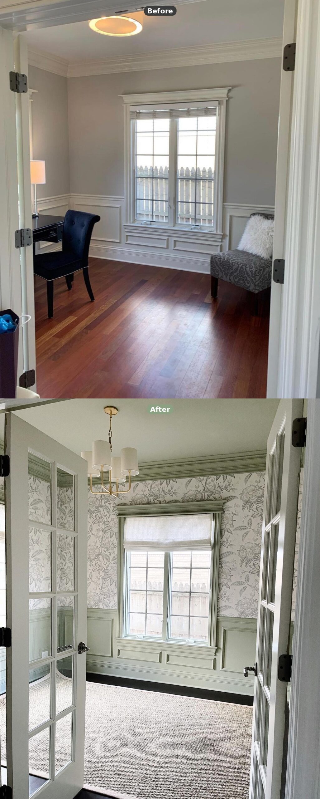
Same doorway, same window, same fence outside. Only paint, paper, light and rug changed. No walls moved. Just finishes.
The fence is still right there. You just stop noticing it, because by the time your eye reaches the glass it’s already been fed something better.
Why the sage trim is doing all the heavy lifting
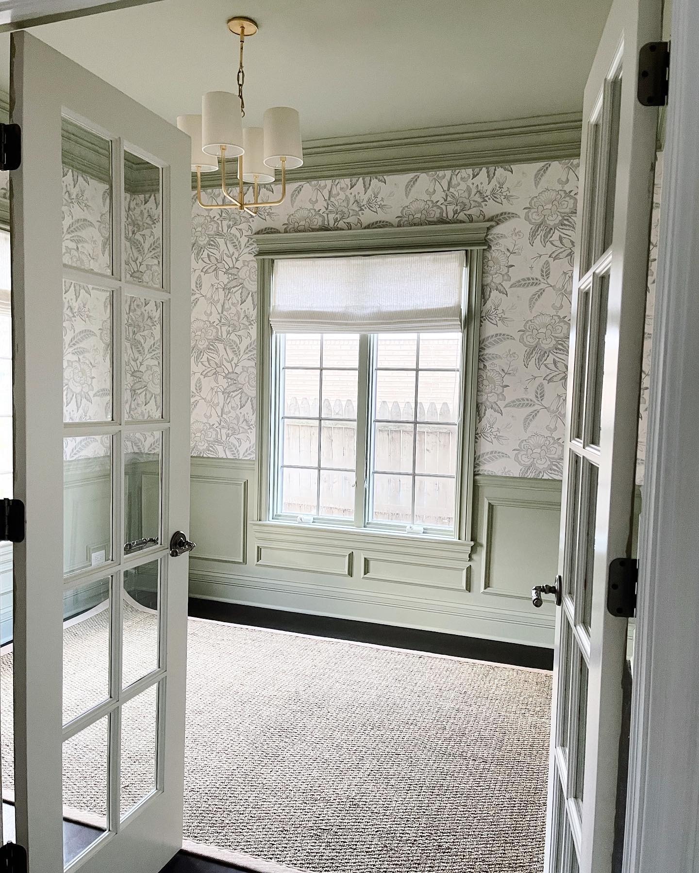
Paper the walls and keep the trim white and this room would look like too much. The white would chop the walls into chunks and the pattern would read loud because it has nothing to lean against.
French Grey pulls a quiet color right out of the wallpaper and repeats it on every hard edge. The crown helps the eye travel up. The wainscoting holds the pattern instead of fencing it in. The window casing isn’t framing a bad view anymore, it’s echoing the leaves next to it.
Most people copy a room like this, keep the trim bright white, and wonder why the whole thing feels frantic. The painted trim is the whole trick.
How two corner windows can feel this calm
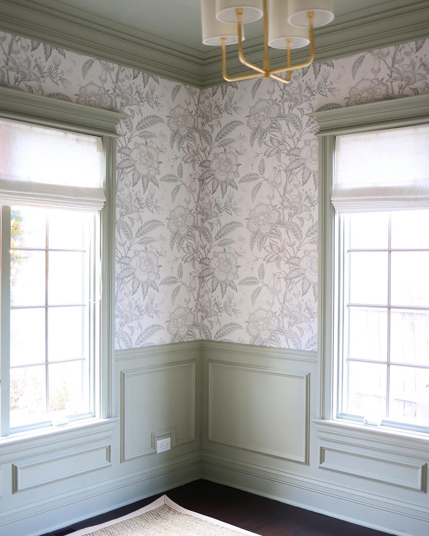
Push big pattern into a corner like this and normally your eye snags on the seam. Not here. The sage catches the corner and holds it together.
That’s why you can do a big floral in a small room without it eating you alive. The pattern needs a resting place. The trim is the resting place.
The low ceiling isn’t low anymore
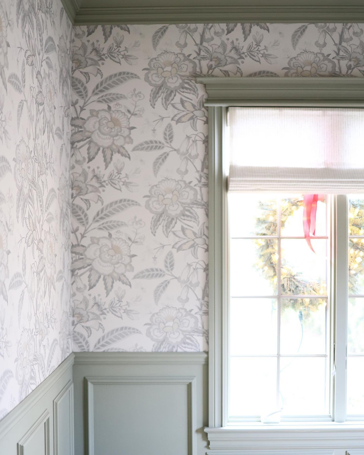
The ceiling hasn’t moved. It just reads taller.
A white crown against a white ceiling over a greige wall creates a hard stop. Your eye hits that bright line and parks. A sage crown over a soft floral wall lets your eye keep going. No brake, so the room breathes upward.
Not magic. Just color doing what color does when you stop fighting it.
Look how soft that pattern actually is
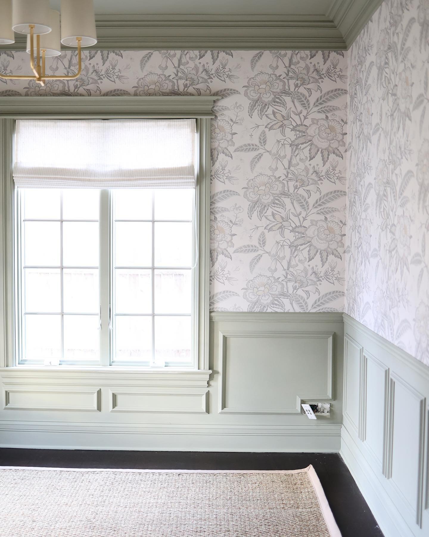
Look close at the Davenport pattern and you see why this scale works in a small room. The ground is almost cream. The flowers and leaves are drawn in a soft wash, more like a pencil sketch than a shouty botanical.
That softness is what buys the scale. Saturated colors or crisp lines would close in on you. Drawn like a whisper, it reads as depth, not weight. “Big floral” is a category, not a style. Pick a quiet one.
For context, here’s the standard playbook running
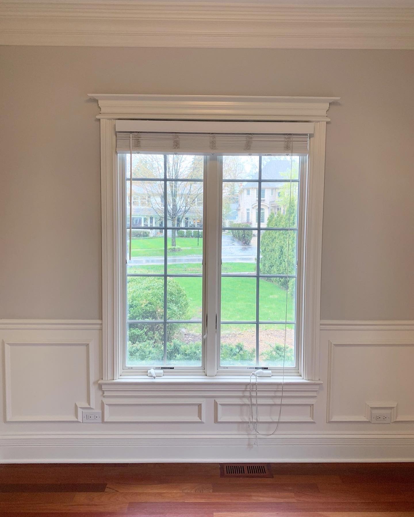
Beige walls, white trim, a window dressed in nothing. Not ugly, just the kind of wall you wouldn’t tell anyone about. Same bones as the office. The only difference is that in the office, somebody decided to commit.
Four things to steal
One. A large-scale traditional floral in soft, washed-out colors. Nothing crisp. Something that looks watercolored.
Two. Paint every piece of trim in one soft color pulled from the wallpaper. Crown, wainscoting, casings, sills, baseboards, door frames. All of it, not white.
Three. One warm-metal light fixture with a soft shade. Brass with ivory linen works.
Four. Pull any strong colors out of the furniture. Sisal and linen keep things quiet underneath.
The takeaway
The rule says small rooms should play it safe. Alaina proved the opposite. The smaller and more forgettable the room, the harder you should go on pattern and painted trim.
The room you’d normally close the doors on is actually the best candidate in your house for a big move. Small enough that materials don’t bankrupt you, private enough that your partner isn’t living with a bold pick in the living room, transformative enough that you start walking in on purpose.
The rule was wrong. The small room could handle more than anyone gave it credit for.