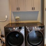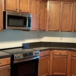

You know that moment when you walk into your kitchen in the morning and the cabinets look pink? Not warm, not honey, actually pink. For a lot of people that is their whole life with pickled oak. It looked fine on the showroom floor in 1998. It looked fine in the listing photos when they bought the house. Then they moved in and it followed them around for twenty years.
Sheila Spalding had that kitchen. Instead of ripping it out and spending the price of a used car on new boxes, she did two things. She painted the cabinets one specific warm white from Sherwin Williams. She changed the knobs. That is it. The granite stayed. The appliances stayed. The floor stayed. And the whole room jumped a decade forward.
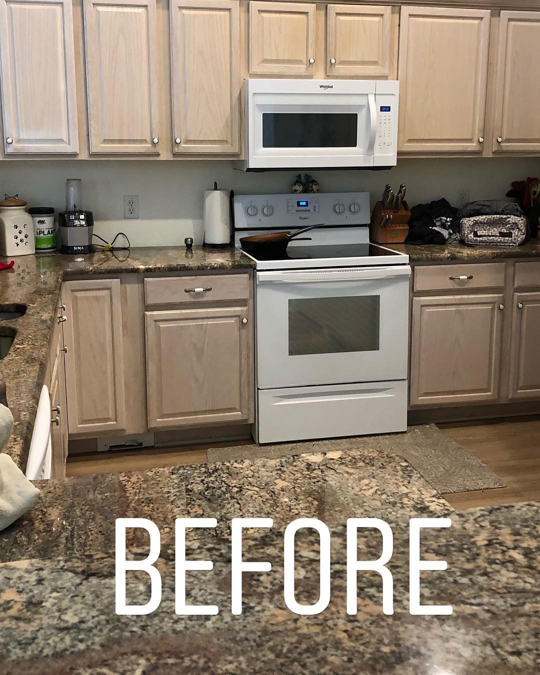
Pickled oak was a thing for about ten years. Builders loved it because it was cheap and the finish was fast. You take red oak, wipe a thin white wash over it, and let the grain show through. In the brochure it reads coastal. In real life it reads like a dentist office waiting room from 1999.
The real problem is the undertone. Red oak is pink at the bone. The white wash does not hide that, it just softens it. So on a cloudy afternoon the cabinets look beige and you tell yourself they are fine. Then the sun comes in and the whole wall turns salmon. There is no decorating around it. You cannot paint the walls a color that fixes it because the pink will fight whatever you choose.
Most people just live with it and feel vaguely annoyed in their own kitchen.
Same kitchen, same granite, different planet
Look at the top shot, then the bottom one. Same stove. Same microwave. Same counter. Same granite. Nothing in that room was replaced. The cabinet boxes are the same wood they have always been. All she did was change the color on the doors and the metal on the knobs.
Now look at the granite again. In the top shot it looks muddy and dated, like something you would apologize for at a dinner party. In the bottom shot it looks grounded, almost intentional, like the whole kitchen was designed around it. The granite did not change. Your eye just stopped reading it as “ugly brown” because the pink next to it is gone.
That is the whole lesson. If one color in a room is fighting everything else, the rest of the room looks worse than it really is.
Why Divine White and not just a regular white
This is the part people get wrong, and it is the part worth paying attention to if you are thinking about doing this yourself.
When you decide to paint oak cabinets, the first instinct is to grab the whitest paint on the shelf. Pure White. Extra White. Chantilly Lace. Simply White. They are all great paints. On this cabinet they would have been a disaster.
A cold white sitting next to a pink undertone does not cancel the pink. It makes it louder. The contrast pushes the warmth right out of the wood and into the room. You end up with cabinets that read even pinker than they did before, except now you have painted them and there is no going back to even the mediocre version you started with.
Divine White is from the HGTV Home line by Sherwin Williams. It is a warm white with a quiet beige base. Some people would call it a soft greige. The warmth in the paint meets the warmth in the old wood halfway so neither one has to argue. It is not cream, it is not yellow, it is not the kind of off white that makes you wonder if you left the lights on in the next room. It just settles down and lets everything else in the kitchen relax.
The short version. Warm wood needs a warm white. Cold white and warm wood is a fight. You will lose.
The knobs are doing more work than you think
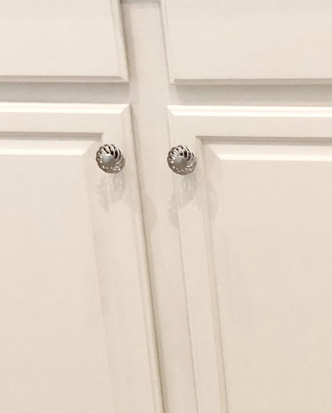
Sheila swapped the hardware at the same time. The new knobs are from Wayfair, brushed silver, with a little twisted rope detail around the outside. Cheap. Fast. The kind of thing you might skip because it seems like a small detail.
Do not skip it.
Old pickled oak kitchens usually came with the same two or three knob styles. Round wood knobs, plain chrome circles, or those little colonial ceramic ones with a flower on them. Your eye recognizes those knobs. They tell your brain “this is a nineties kitchen” before you even register the cabinet color. You can paint the boxes perfectly and if the knobs are the original hardware the whole thing still reads old.
Change the metal, change the shape, and the kitchen jumps forward on its own. It is the cheapest big upgrade you can make on a cabinet refresh and almost everybody underestimates it.
The floor finally gets to be pretty
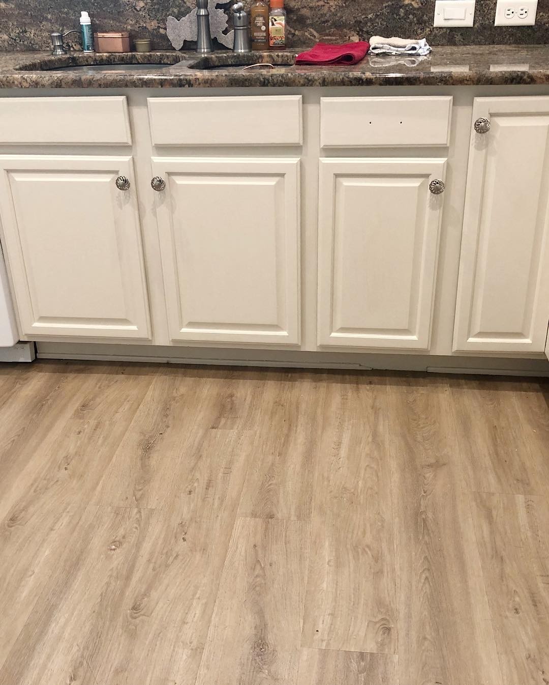
Here is a thing nobody warns you about. When the cabinets are a problem, everything near them inherits the problem.
The floor in this kitchen is a nice light wood look plank. It was always nice. In the before shot you barely notice it because your eye is too busy being pulled in six different directions by the pink wood above it. Two warm wood tones in the same room do not make the room feel cozy, they make it feel confused.
Paint the cabinets soft white and suddenly the floor has space to be seen. The planks look intentional. The whole lower half of the room calms down. You stop registering “oak cabinets on wood floor” and start registering “nice floor.”
The sink wall got the same treatment
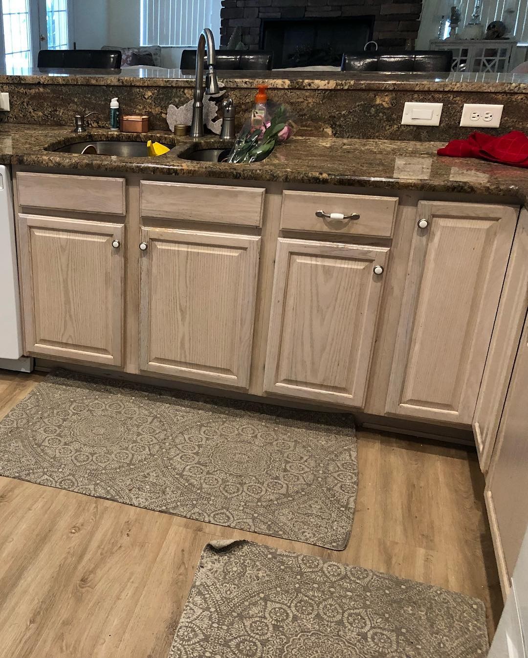
Same paint on the sink run. Notice how the wall above the counter now reads as a real color. Before, with the pink cabinets fighting it, that wall just looked like confused gray. After, it is a soft, settled background that you actually enjoy looking at.
This happens over and over when you fix one color in a room. Things you were about to replace stop needing to be replaced. The wall paint was fine. You just could not see it.
The finished kitchen in one honest shot
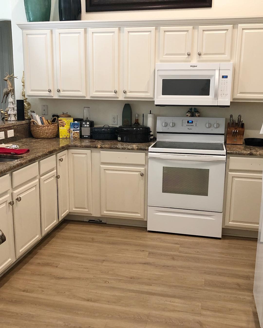
Same room. Same bones. Nothing structural changed. Nothing expensive got replaced. A gallon of paint, a sprayer, a weekend, a box of knobs from Wayfair, and a willingness to pick the right white instead of the loudest one.
If you want a number on it, a job like this runs a few hundred dollars for materials when you do it yourself. Compare that to the thirty grand quote you would get for new cabinets and new counters, and you understand why people are doing this instead of gutting their kitchens.
If you want to try this at home
A few things worth knowing before you start.
Pick a warm white, not a cold one. The test is simple. Buy a sample pot, paint a piece of poster board, tape it to one of your actual cabinet doors, and leave it there for a full day. Look at it in the morning, in the afternoon, and at night with the lights on. If it reads clean and quiet in every light, you have your color. If it reads pink or beige on the poster board, it will read pink or beige on your whole kitchen. Keep looking.
Do not skip the hardware. New knobs in a different finish than you had before will do more work than another coat of paint will.
Leave the granite alone for a minute. Everyone will tell you busy brown and gold granite has to go if you want a modern kitchen. Look at these photos one more time. It does not have to go. It has to stop fighting the cabinets. Give it a chance with the new color before you decide it is the enemy. Nine kitchens out of ten, the counter was never the problem.
And if you do all this and it still does not look right, that is okay too. At least now you have warm white cabinets you can live with for another ten years while you save up for the counters. That is still a win.