
The quote to tear this kitchen out would’ve landed between forty and eighty thousand dollars at 2026 pricing. The homeowner wrote none of those checks.
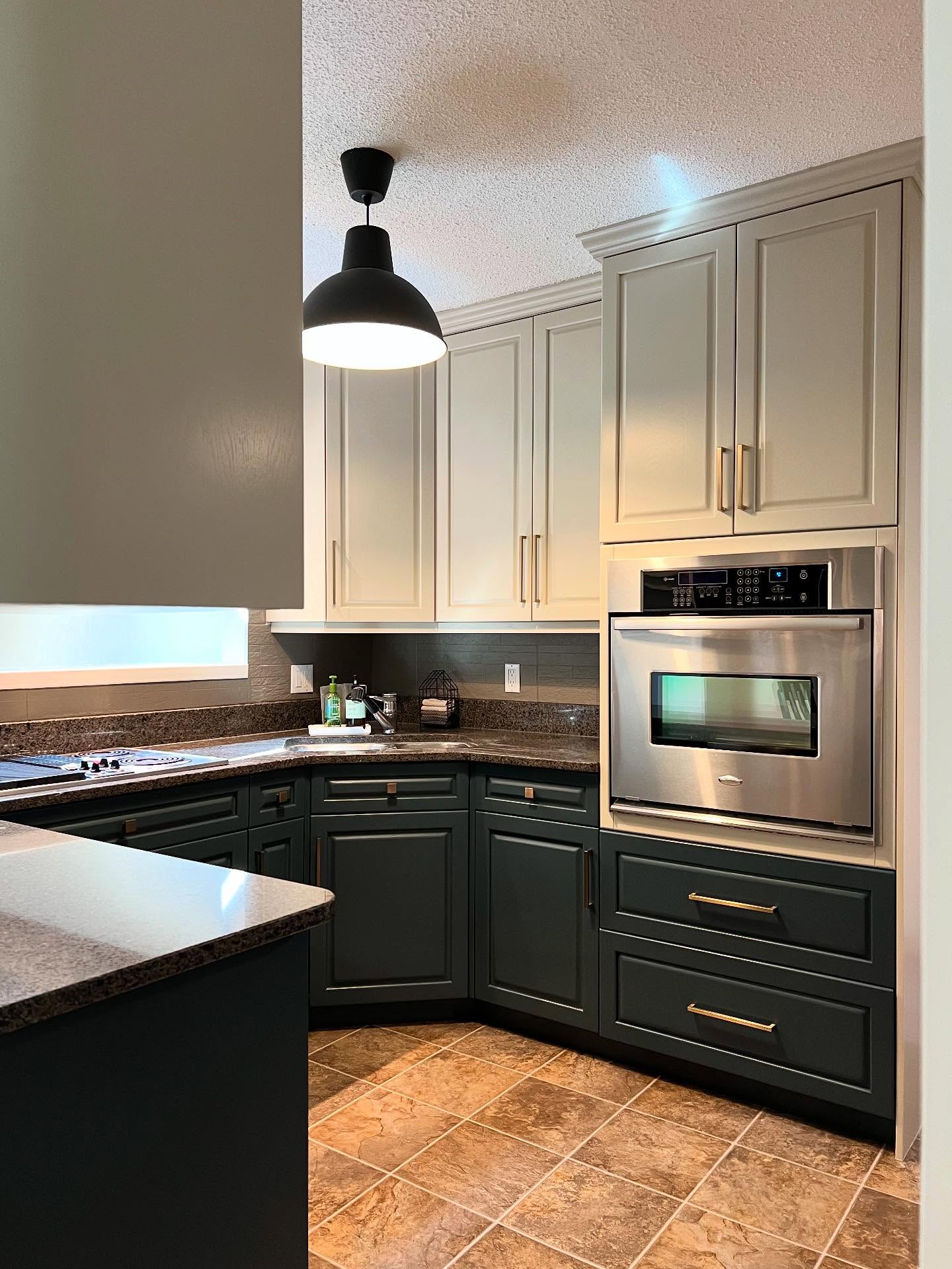
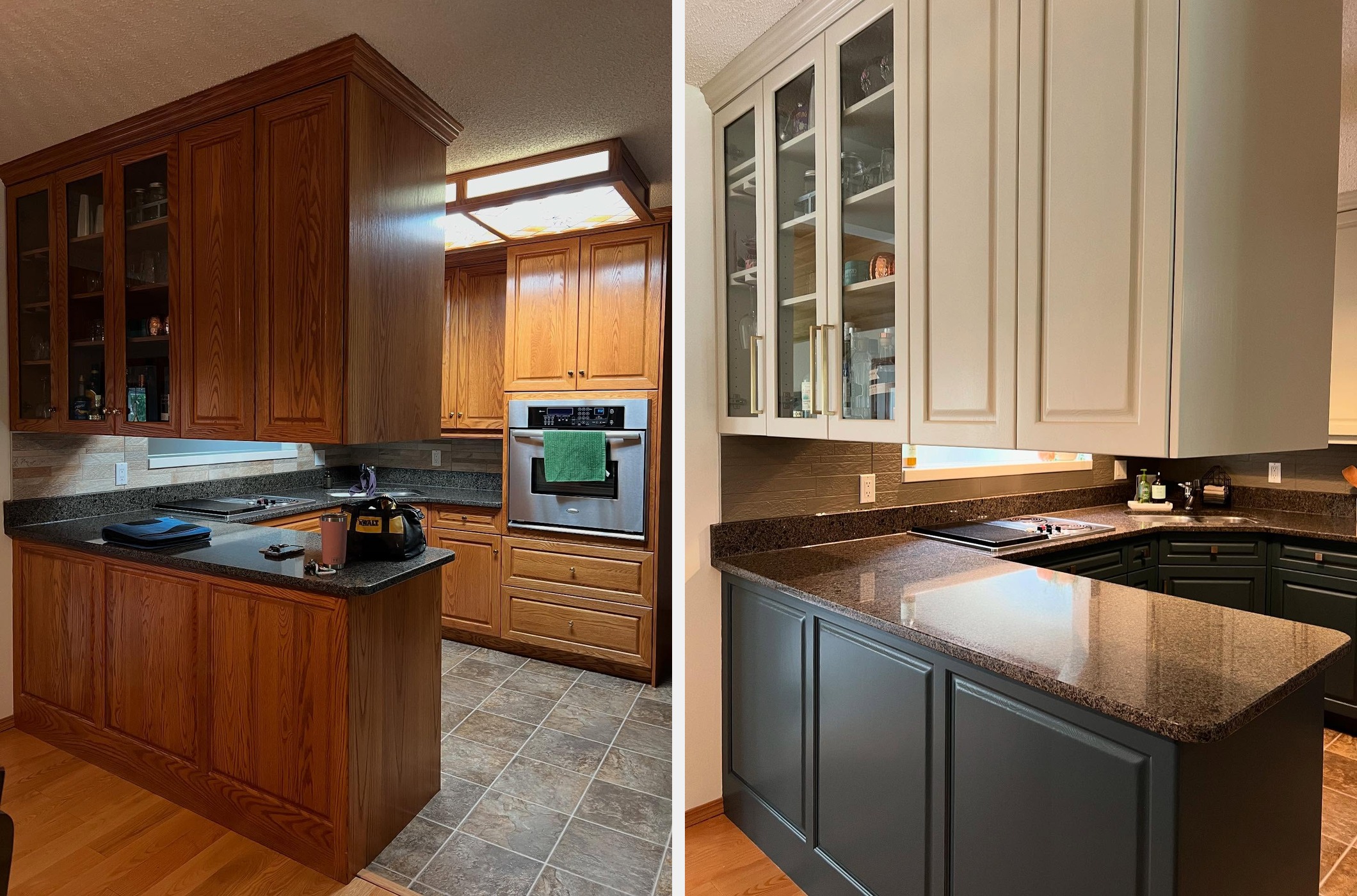
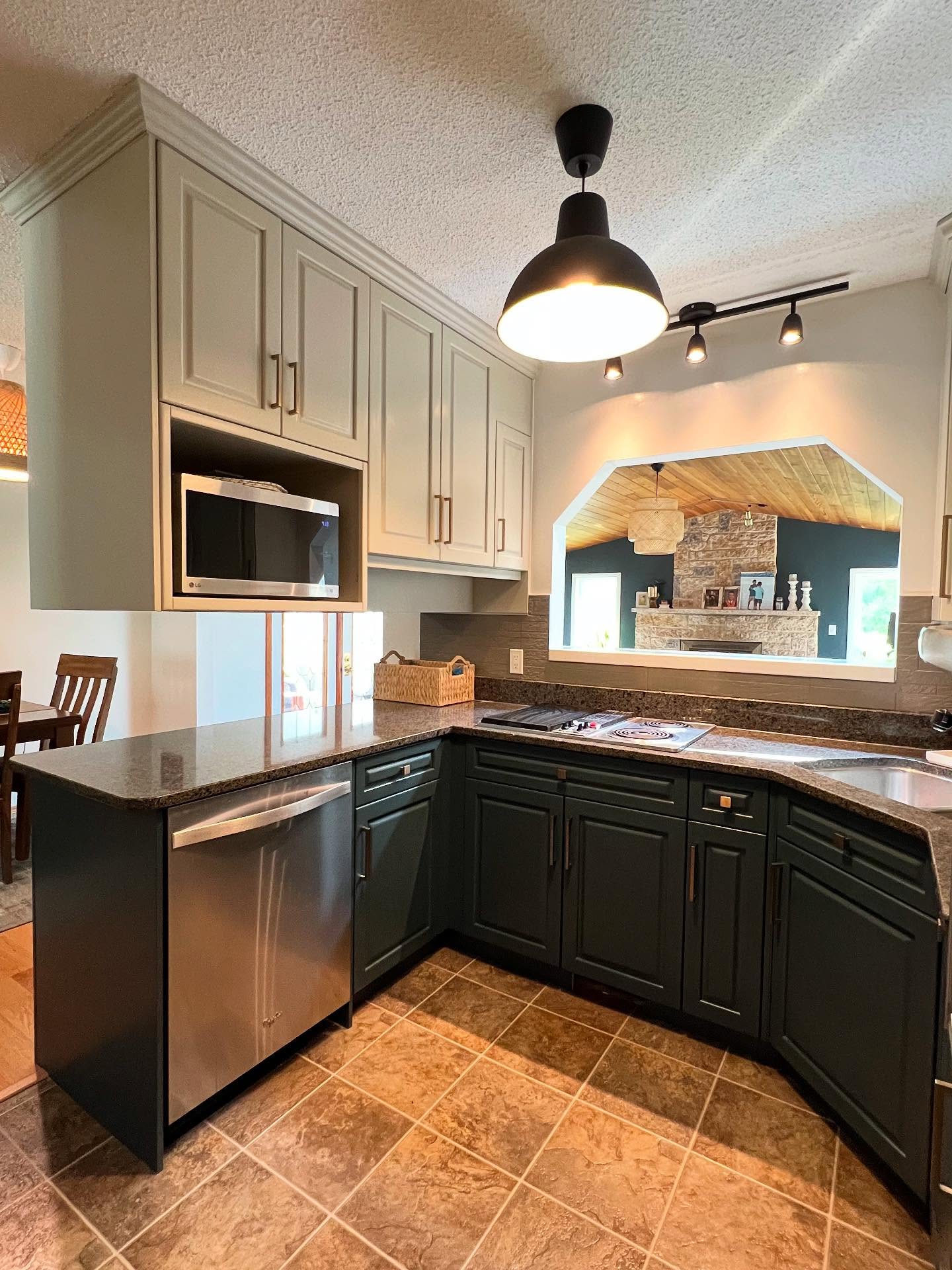
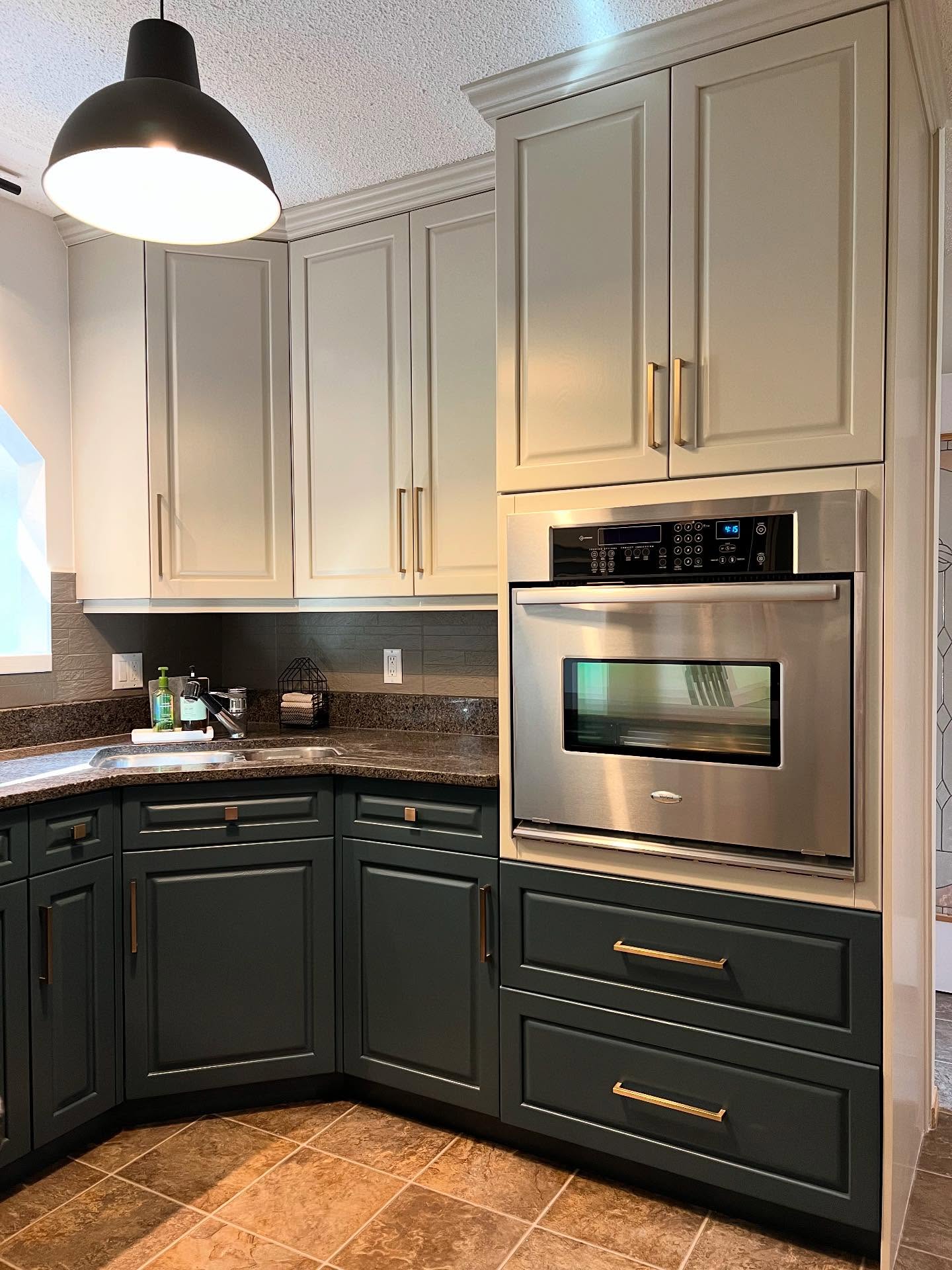
She didn’t take down a single cabinet door. She didn’t rip up a single tile. The granite she inherited stayed, the floor she walked on stayed, and the backsplash stayed too, which is the part that catches people off guard a few scrolls from now. What you’re looking at in the after shots is paint, two light fixtures, and new handles. That’s it. The whole rest of this kitchen was already there, buried under 2001.
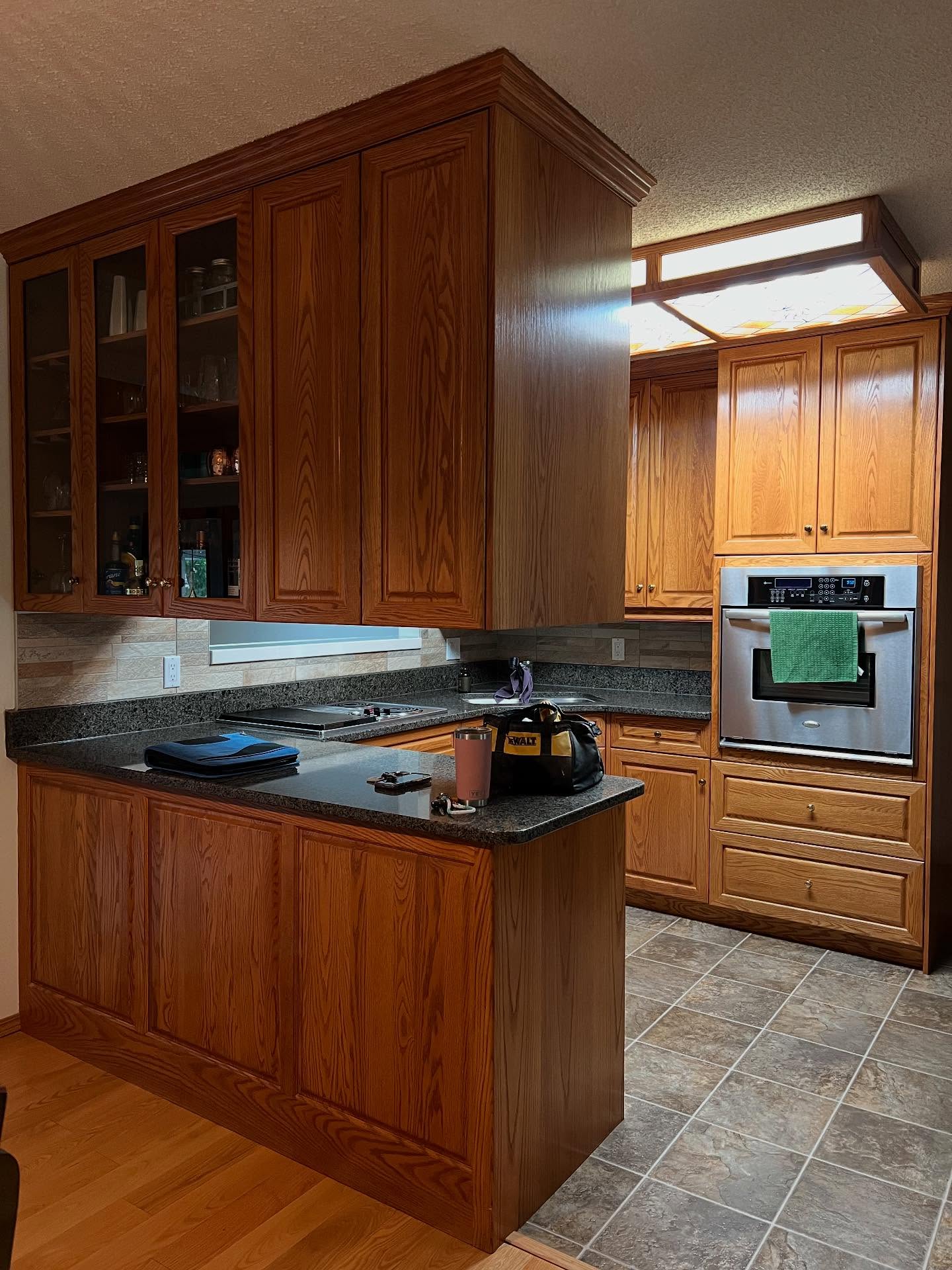
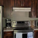
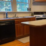
The before is textbook. Orange-brown oak with cathedral arches on every door. A stained glass fluorescent box in the ceiling that must’ve felt futuristic in 1998. Dark speckled granite, warm tan tile, and that classic late-nineties kitchen energy where everything is wood or stone and the whole room reads like a hunting lodge that lost its way to being a kitchen.
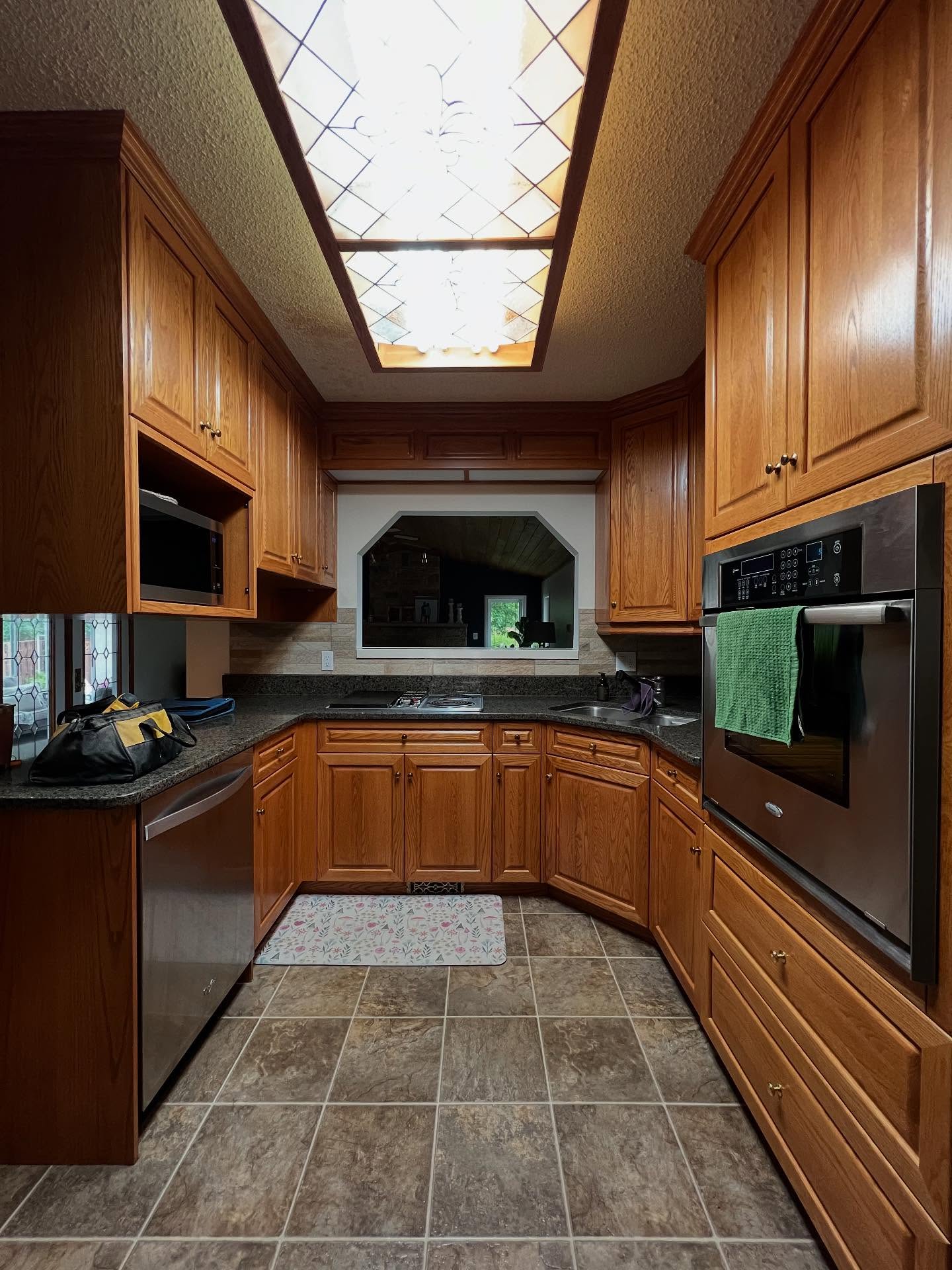
If you’ve ever stood in a room like this and been told the only way out is to gut it, the next few photos are going to feel personal.
Why these two Benjamin Moore colors in particular
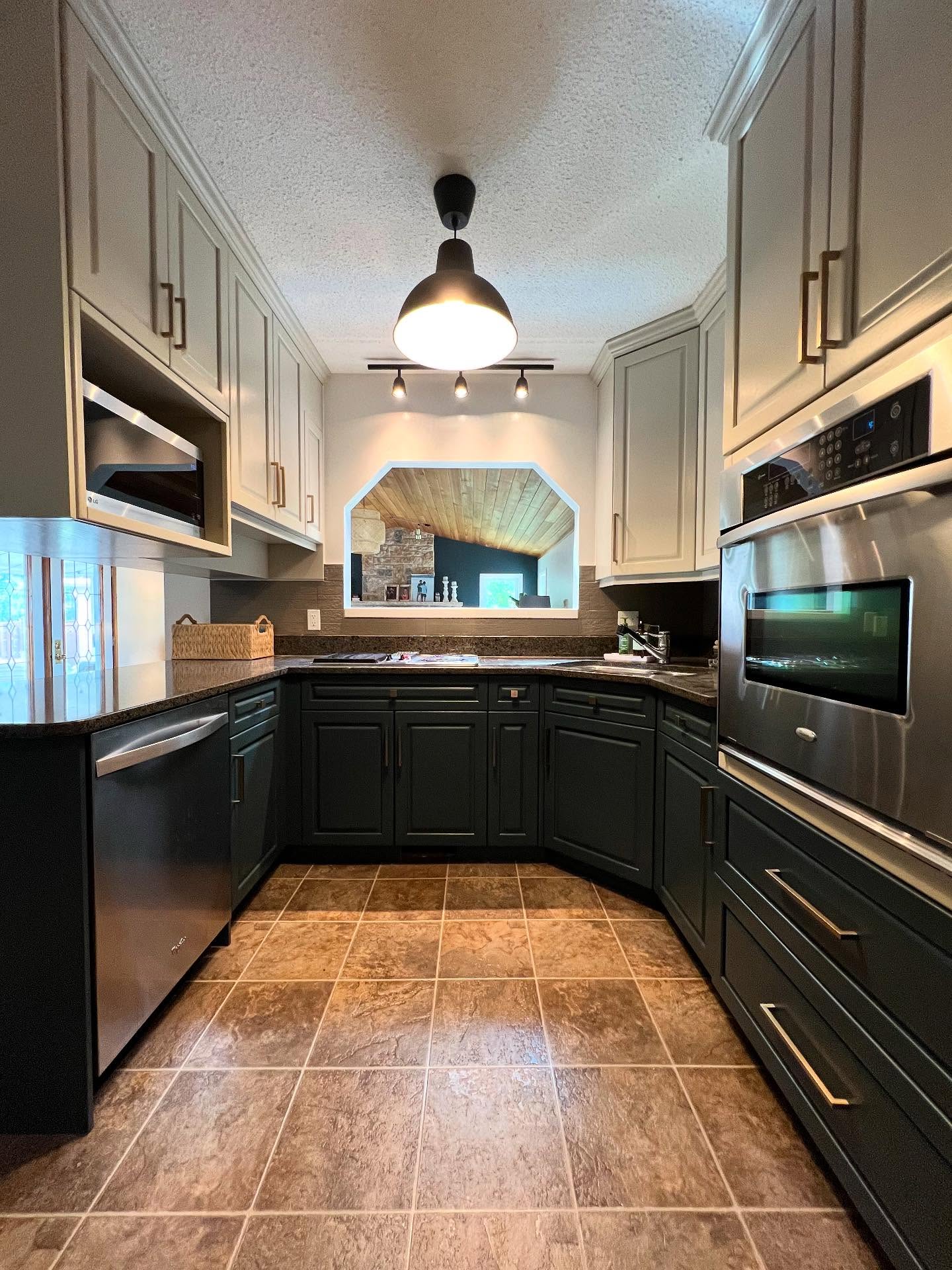
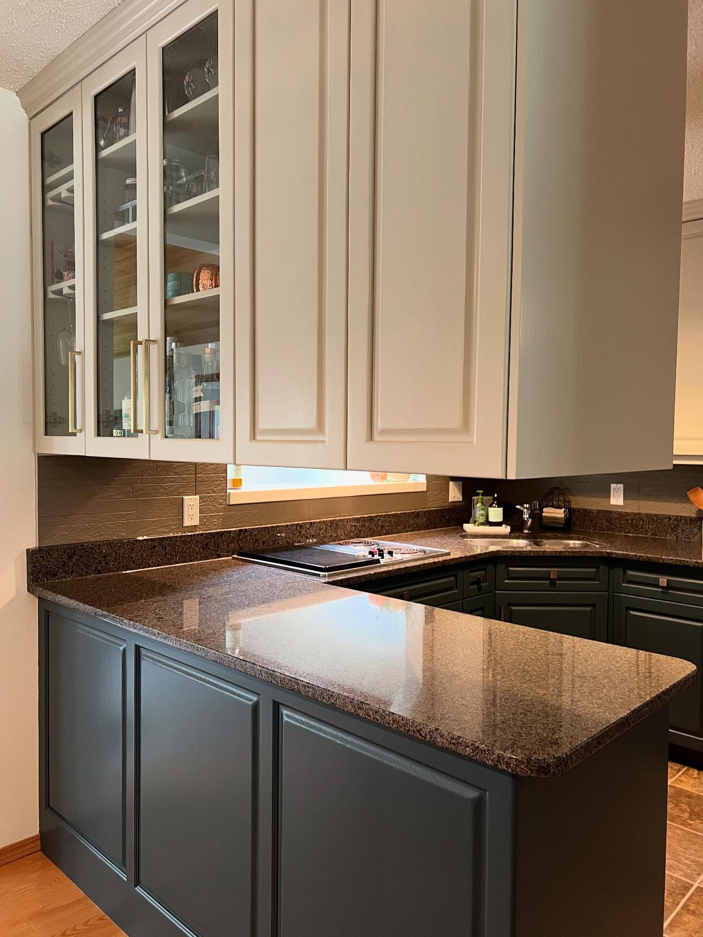
Her sister is an interior designer, and the palette came from her. Hazy Skies on the uppers, a quiet warm sage that lets the ceiling feel taller than it is. Lead Grey on the lowers, which is misleading as a name because the color is really a deep forest charcoal green. Swiss Coffee on the walls.
This wasn’t trend-chasing. It was a problem being solved on purpose.
Think about what wasn’t allowed to change. The floor was staying warm tan. The granite was staying brown-speckled. Any light paint on the bottom would’ve floated above a floor it didn’t belong to. Dark lowers pull the floor in and make it look like someone picked it on purpose. The ceiling is low, so going dark up top would’ve crushed the room. Light uppers open it back up. Those two colors aren’t a mood board. They’re the only answer the existing bones would accept.
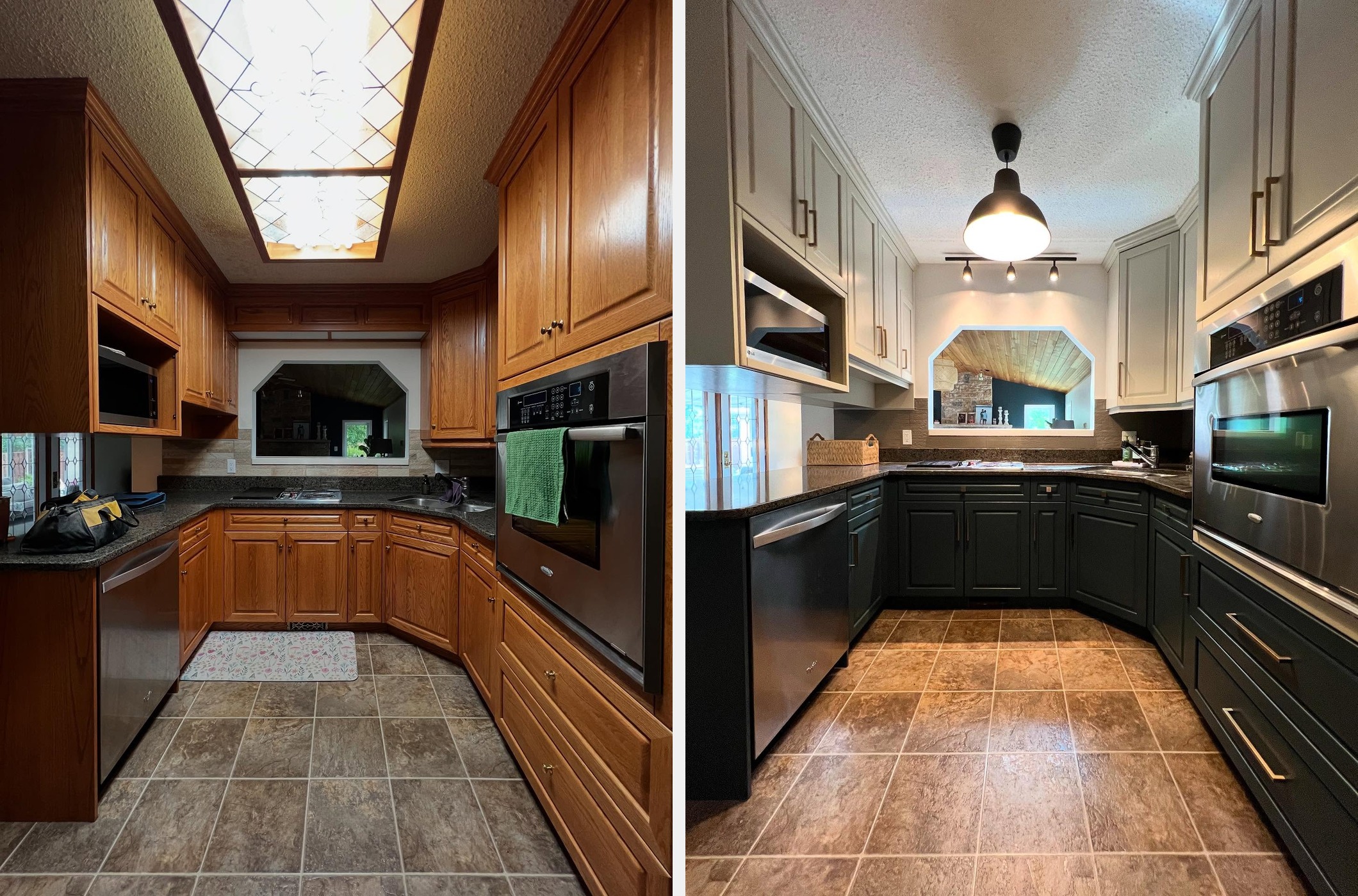
The sneaky move most people miss
Look at the backsplash in the after shots. Now flip back to the before.
It’s the same tile. She painted over it.
Same stone-look shape, same grout lines if you squint. All of it got a bonding primer and a darker gray topcoat so it would step back behind the Lead Grey lowers instead of pulling the room orange like it used to. That one surface is doing more work than the cabinets to sell this as a full gut. Replacing it would’ve meant drywall repair, counter protection, a tiler for a day, and fifteen hundred to three thousand dollars before you blinked. Instead it got a weekend and the right paint.
Done properly, with a bonding primer, two coats of a durable acrylic, and a sealer where water hits most, painted backsplash tile holds up for years. The internet mostly won’t tell you that, because the internet makes most of its money from people who sell tile.

What the brass is quietly carrying
Small detail, outsized job: the hardware.
Those long brass bar pulls on the deep green lowers are the reason the whole room reads warm instead of cold. If this project had reached for chrome, the Lead Grey would’ve landed as moody-apartment-rental. If it had gone black, the room would’ve felt heavy. The brass warms the green up and shakes hands with the warm tile on the floor. Three years ago this same project would’ve gone with brushed nickel, and the kitchen would be sitting on the wrong side of serious right now.

The two cheap swaps pulling their weight
Two more things, both cheap, both carrying a lot more than their price tag.
The stained glass fluorescent ceiling box got pulled out entirely. In its place, a matte black industrial pendant and a slim three-head track light. All in, probably two to four hundred dollars of fixtures. That ceiling box was personally responsible for about half the dated energy in the before shots. Losing it bought back a decade in one afternoon.
The ceiling itself got a fresh coat of white. Popcorn texture reads clean when it’s bright and crumbly when it’s yellowed. Nobody notices this one until you point at it, and then you can’t unsee what the old color was doing.
Also still in the wall and completely untouched: the Whirlpool wall oven from roughly fifteen years back. The paint around it does so much work that your eye never lands on it long enough to clock the age.
What this actually cost her
A full gut on this kitchen in 2026, with new cabinets, counters, backsplash, floor, lighting, and appliances, runs forty-five to eighty thousand dollars installed in most US markets. That number is why so many people live in kitchens they’ve been quietly hating for a decade.
This project was paint, hardware, two lights, and labor. Even with a professional painter doing the cabinets properly (sand, prime, two coats, full cure), you’re at three to six thousand dollars total. Call it under ten percent of the gut number.
The thumbnail reads custom. The invoice reads weekend. Every arched cathedral door that someone online would’ve told her to tear off is still right there, holding up a kitchen that looks nothing like the one she started with.



The paint color for the upper cabs I like. The dark bottom color, not so much. That said, to each their own. The stove & dishwasher are misplaced appliances, but they had to work with it maybe due to electrical budget. Not sure. My husband always says that I have champagne taste & a beer budget ;).
The pass through opening above stove could have been busted wide open to give the kitchen a look of more space. The little ‘hole’ they have doesn’t seem to go. Also, to give kitchen a more open look, take the cabinets off of the storage area above island section. Let in more light & opens up the overall look. Not so closed in feeling. You can still store nicer China, silver pieces, crystal, pic frames etc, but just have ‘organized clutter’ that looks like it all ties in.
I know things were picked to help ‘blend in the floor, but honestly, if at all possible, it should go. We gutted our kitchen & breakfast room a few years back & I wanted the 8×8 white tile removed. Bids were atrocious for the job!! We saved money by tearing up the tile ourselves (with help from family members) and put down a new sub floor (my son/husband are very handy). Basically we just had to buy the new tile which I did online vs paying the super high prices in tile stores. Hired a tile layer with good references & he finished the job. Your current floor just doesn’t meld well, vibe wise. With the darker bottom cabs it just darkens the small kitchen too much.
I like the lighting. A touch of modern with the more traditional style cabinets is a perfect way to go. I couldn’t really tell the patina of the pulls. Some seemed gold & some looked to be black. My thinking is if you have a flat finish on cabs, add high shine finish pulls to make them ‘pop’!
I know everyone’s a critic & opinions will be wide & varied. No biggie, let them roll. If you are happy that is all that matters.
I still love our kitchen upgrade. It was done with timeless classics & modern touches here & there. My fav part is the sea glass greenish, glass tiles we used as backsplash from the top of the quartz countertop all the way up to the bottom of white cabinets. A nice beachy touch for my beach vibe kitchen. It’s cheerful, fresh & it’s finishes/colors won’t ‘age out’ the kitchen. It’s been 11 years & I still get ‘Oh wows’ from visitors that see it. So you do you & be happy with your new look. Enjoy!!
Anything that gets rid of or covers that horrible oak is a win. That 90s look that refuses to go away 🤢.
I painted the inside of a 1999 travel trailer with beachy slate and sky blue behr beyond paint. For a summer beach hideaway. It looks… Better. Even painted over the ubiquitous 90s puffy denim window headers and etched mirrored cabinet doors 🤮. The paint is made for all surfaces including fabric and carpet. And it works very well. The camper went from poofy grandmas house / oaken cave to a clean bright looking beach getaway.
Sorry, but I think the problem is the old fashioned layout and design. It’s such a tiny kitchen.
Bump out that island and open it up.
I liked the comment about “lipstick on a pig.” Exactly!
I want to call out what great writing this is. Design writing can be so boring or utilitarian at best. Babir made it a drama. such a good read no matter what you think of the project.
I think it looks better, but the having the dishwasher so far from the sink is non-negotiable to me. Am I the only one who noticed that?
I like the grey cabinets….but, not the brown floor.
I absolutely 💯 love it!. Maybe change the hardware and faucets to Bronze, I think it would look just as great.
I have the same cabinets and now you are giving me ideas. I’ll be there until I pass so let the next person change it, if it makes me happy then that’s all that matters.
WOW! People are opinionated. If you don’t like it don’t do your kitchen like that. I think it’s a nice change. But that’s just my opinion. Those cupboards will be that way till they decide to change it. And they can strip the paint. It isn’t doing any harm to the cupboards,
Lipstick on a pig. It’s still a pig and resonates with late 20th century ‘aesthetic’ if you want to call it that. The peninsula and the ‘window’ into the other room just carve up the space like a bad butcher.
Liked it so much better in the before photographs. Just my opinion, but I think the wood is a lot classier.
I do not like anything about it. Cabs were lovely before but this look will grow tiresome in months. Don’t like any of it – choices could have been much more charming and interesting. Brighten with lighting . Chasing trends just costs money without satisfying.
And when natural wood becomes trendy, these cabinets will be going to the landfill.
I’m sorry, but they looked so much better unpainted. The gray and black just looks dull and cold.
It is so dark and the brass.screams 1980 . Also brass doesn’t go with stainless. I hope this is ai
next they should remove that popcorn ceiling.
If this were my kitchen, and I had the money, the first thing to go would be the hideous floor. Ugly in the 1980s, ugly in 2026. Painting the cabinets should be a crime. Those painted cabinets will be dated within a year or two and the paint will chip as the cabinets will inevitably get bumped as people work in the kitchen. Lightening up the backspash is a good idea. Here paint works fine. I’ve never understood why people want tiled backsplashes — grout needs to be frequently resealed. As far as the ceiling light fixture goes, the original one is cool. The main issue with lighting in a kitchen is whether it provides enough light for precision work, such as deveining shrimp or removing bones from fish. The replacement lighting is 1950s-1960s retro. Shrug. The countertops are too dark, but since they are functional, just keep them. A kitchen is all about practicality, not design trends.