

For about ten years, if your kitchen had dark espresso cabinets and busy speckled granite, every corner of the internet handed you the same prescription. Rip it out. Paint the cabinets white. Replace the counters. Swap the tile. Start over.
This homeowner ignored all of it. She picked up a single color, let a painter do his thing over one weekend, and ended up with what honestly looks like a different house.
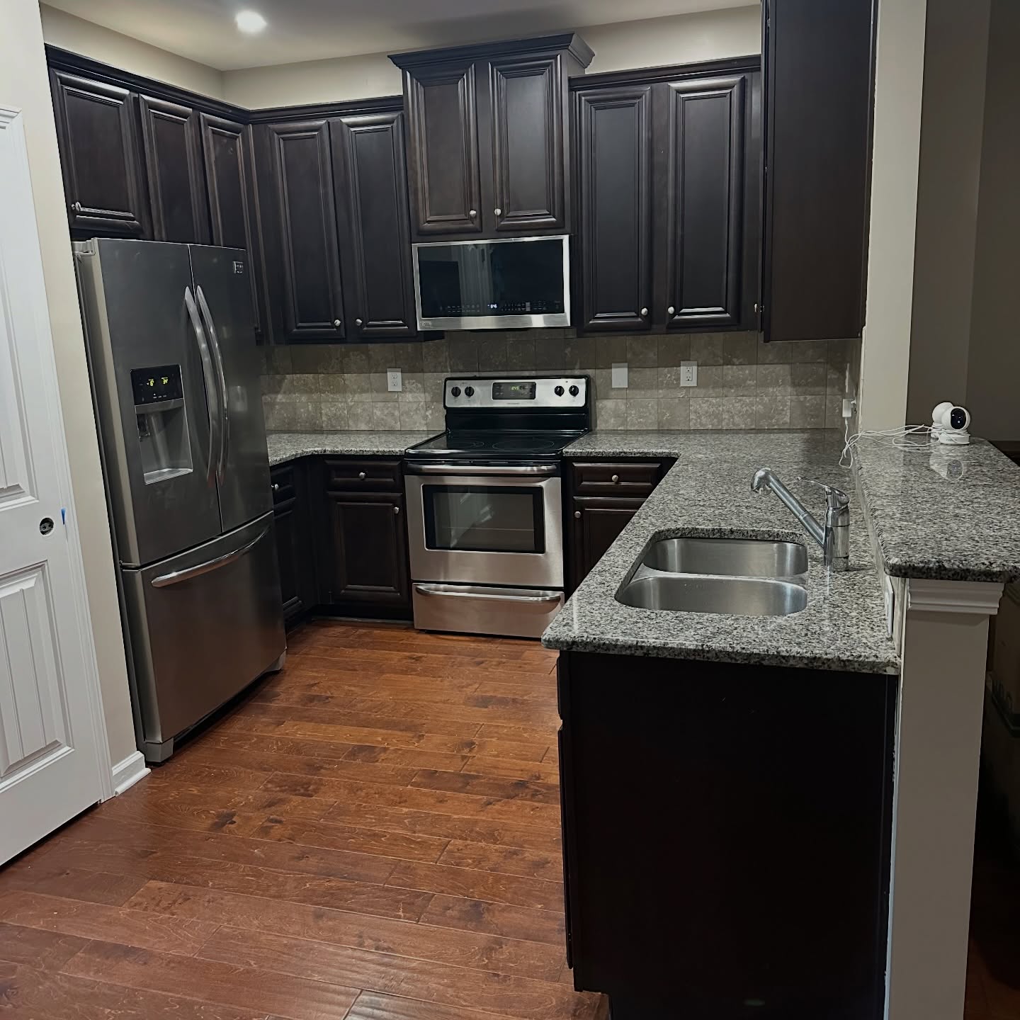
You have seen this kitchen before. Millions of American homes got built or flipped between 2008 and 2016 with this exact combo. The espresso stain was the fancy upgrade back then. The speckled granite was the “safe” counter that was supposed to work with anything. The warm beige tile sat in every builder catalog. Then around 2020, the internet turned on all three at once, and the only word anyone used for it was “dated.”
Everyone would have told her to go white. She went navy. Smart call.
The color is Sherwin-Williams Naval
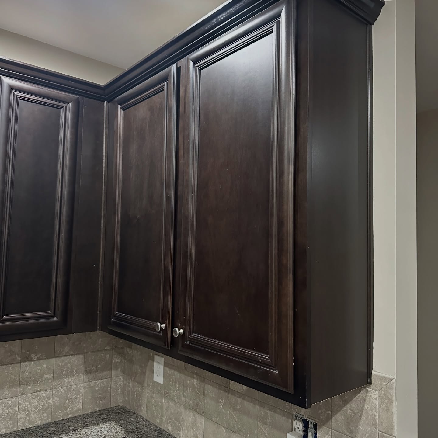
The cabinets got refinished in Sherwin-Williams Naval (SW 6244) in a satin sheen. One deep, almost black blue, sprayed over the exact same doors, the same crown, the same side panels. Clean the wood down, light sand, prime, two coats, done. Nothing else got swapped. The boxes stayed. The doors stayed. Even the little brushed nickel knobs stayed on.
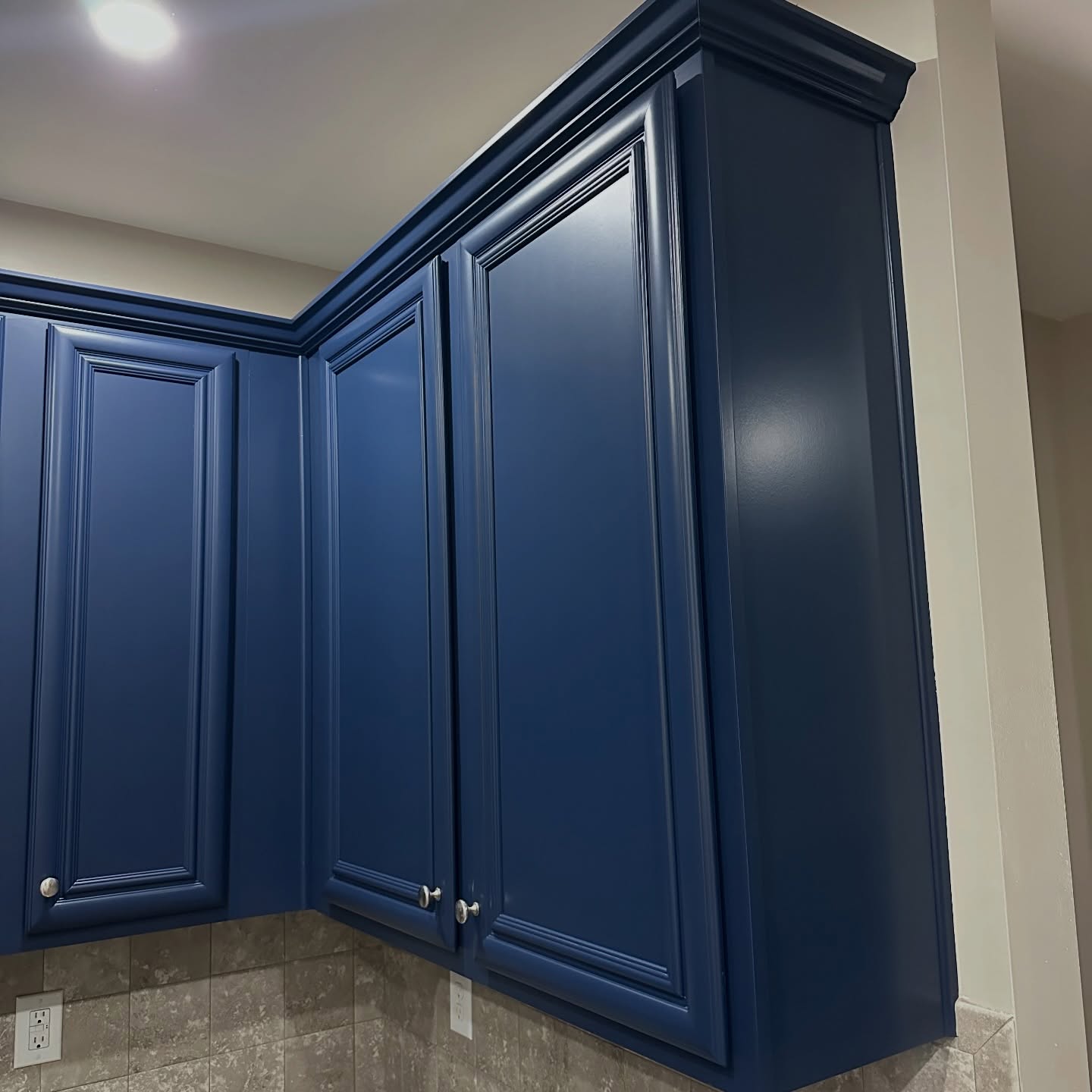
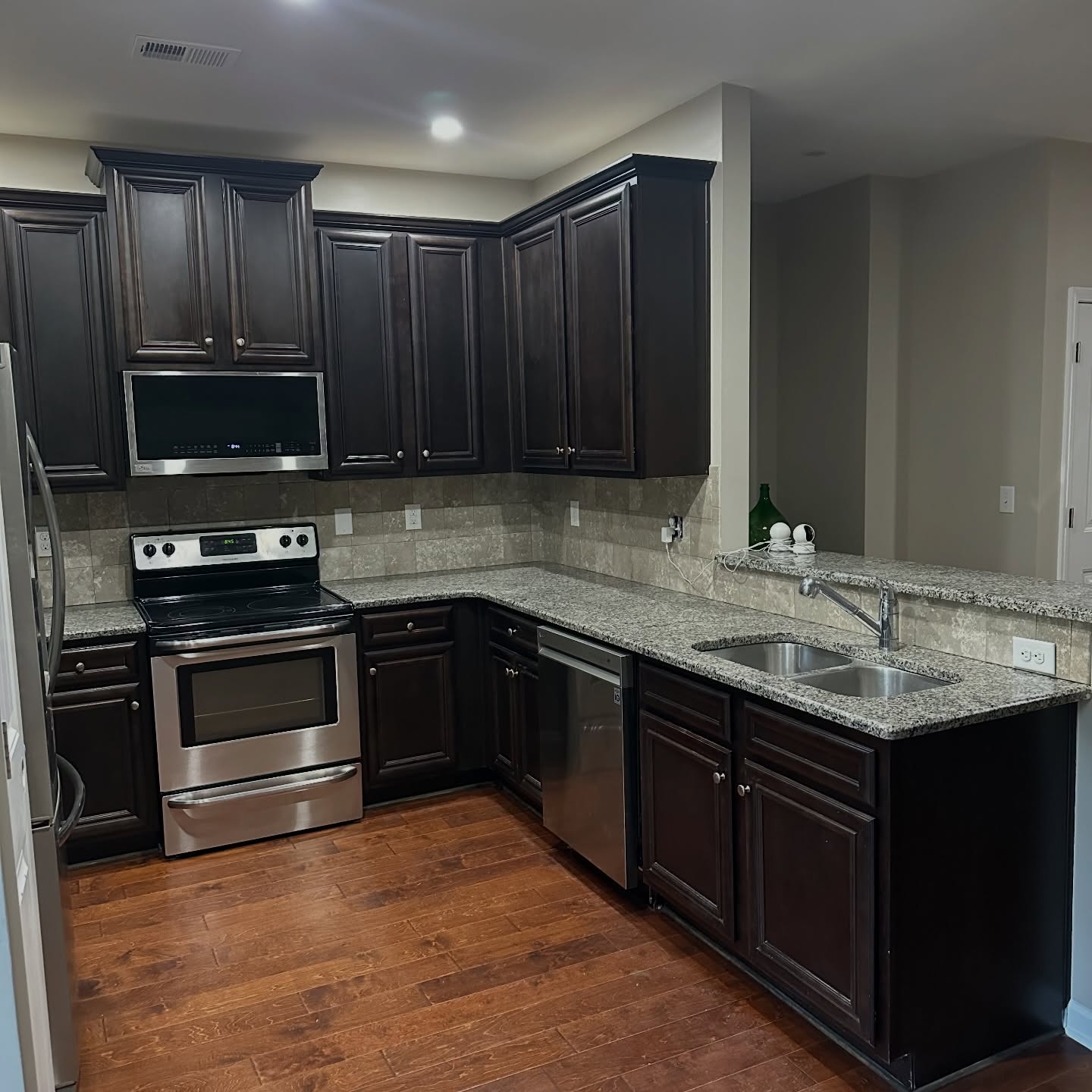
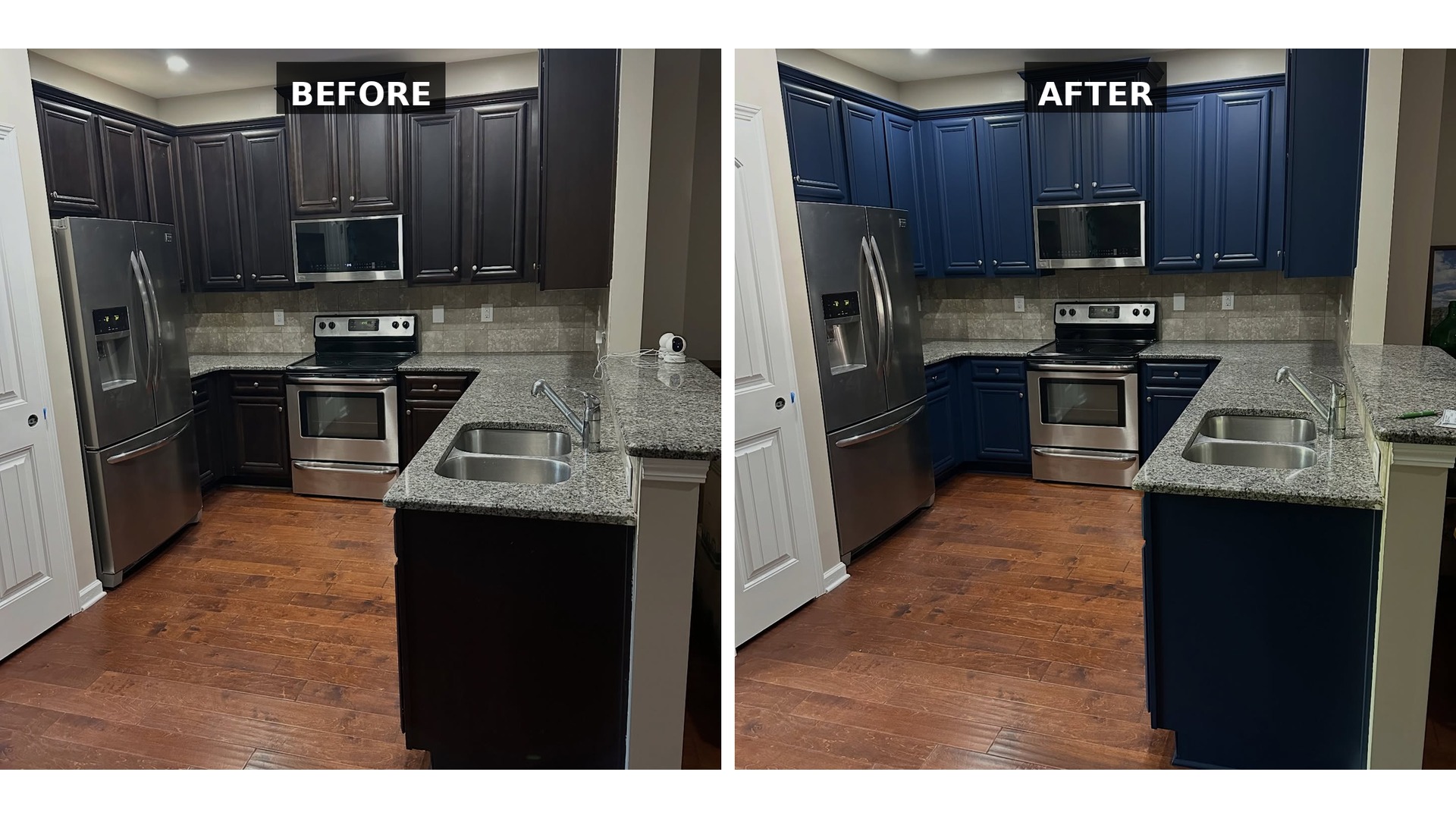
Here’s what those exact doors looked like a week earlier, in the espresso they came in.
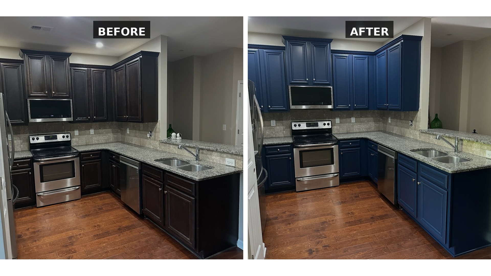
Side by side, so you can see what paint actually did to this door.
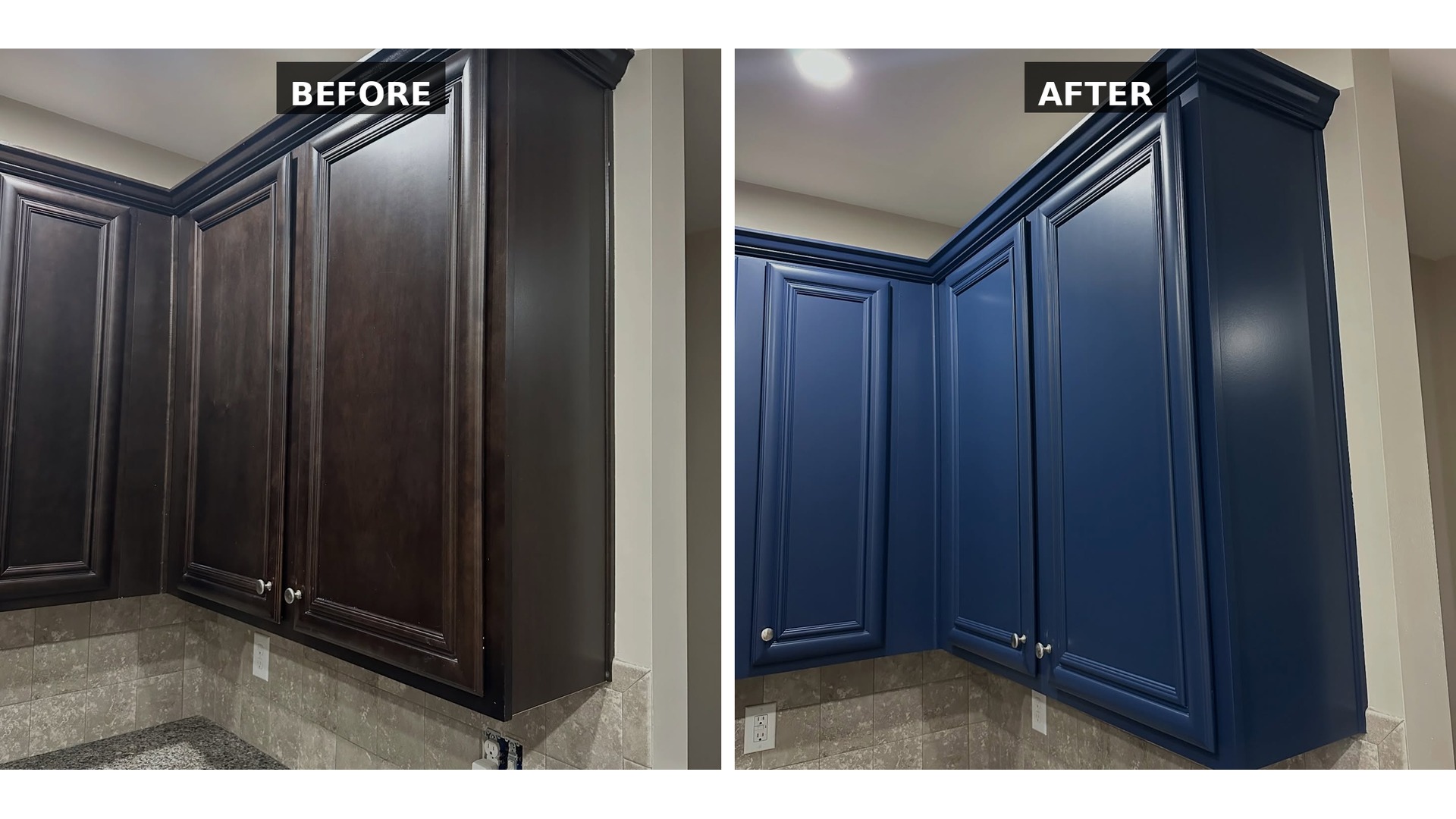
Watch what happens to the shape. Those raised panels were built to carry a dark finish. In the espresso, the shadow lines inside the molding read as streaks and grime. In the Naval, those same shadow lines turn into depth. The door stops looking cheap and starts looking like real cabinetry.

The granite is the real surprise
This is the part most people do not see coming. That busy speckled granite everyone kept telling her to replace? It is now the best thing in the room.
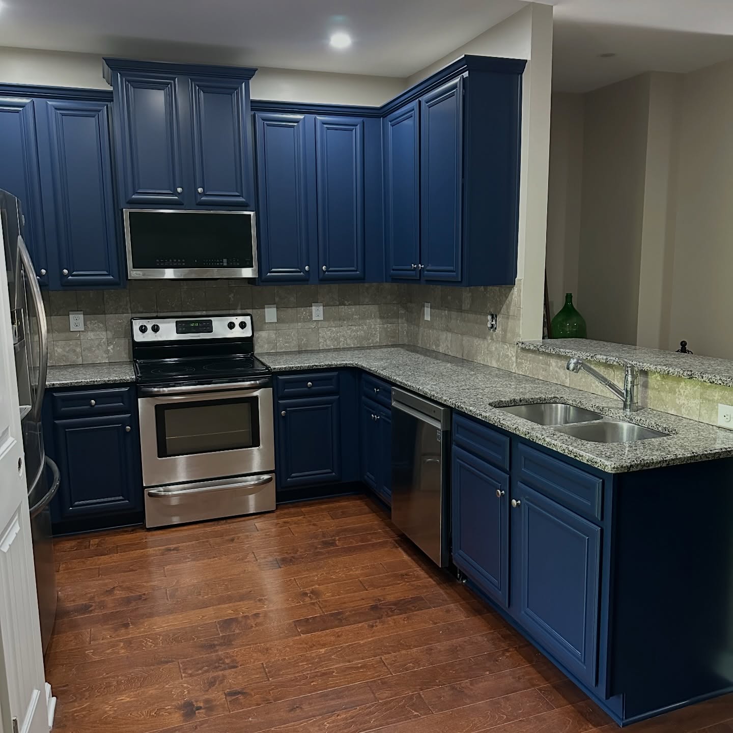
The stone has cool gray tones and tiny flecks of blue hiding in the pattern. Set it against brown wood and those cool colors get swallowed, so the counter just reads as noise. Set it against Naval, and the gray and blue in the stone finally have a partner. The speckle stops looking like a mess and starts looking like movement. A counter her painter was ready to help her replace is now the thing holding the whole room together.
The backsplash and the floor get to stay warm
This is the quiet reason white paint would have been a disaster here. The beige tile and the medium-dark hardwood are both warm colors. Paint the cabinets white and those warm pieces suddenly look yellow and tired next to the cool white, and you end up on the hook for new tile and new floors too.
Naval does the opposite. Deep cool color up top, warm stone in the middle, wood floor at your feet. That is how the expensive kitchens of 2026 are put together.
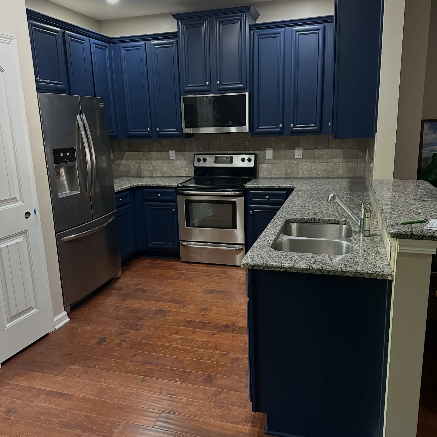
She did not chase a trend. She happened to land in the middle of one because she picked the one color that let every warm surface in the room keep breathing.
A quick test if you want to try this at home
Grab a dark navy paint chip at any hardware store and hold it up against your own granite and your own backsplash in the actual kitchen light. If the warm tones in your counter and your tile look richer and more intentional next to the blue, your kitchen is a strong candidate. If the warm tones look muddy or washed out, your stone is probably running cooler and a warm off-white would serve you better.
What stayed exactly where it was
Same cabinets. Same doors. Same granite. Same backsplash. Same floor. Same stainless fridge, stove, microwave and dishwasher. Same knobs. The only new material in the whole room is a gallon or two of paint.
The whole job was a clean, a light sand, a prime, and two sprayed coats of Naval in satin. One painter. One weekend without a working kitchen. One kitchen that stopped looking like 2012 and started looking like something she picked on purpose.
If this is the kitchen sitting in your house right now, you do not have the problem the internet keeps telling you that you have. You have a kitchen that is one color away from new.




Frankly, it looks better in the original colours.