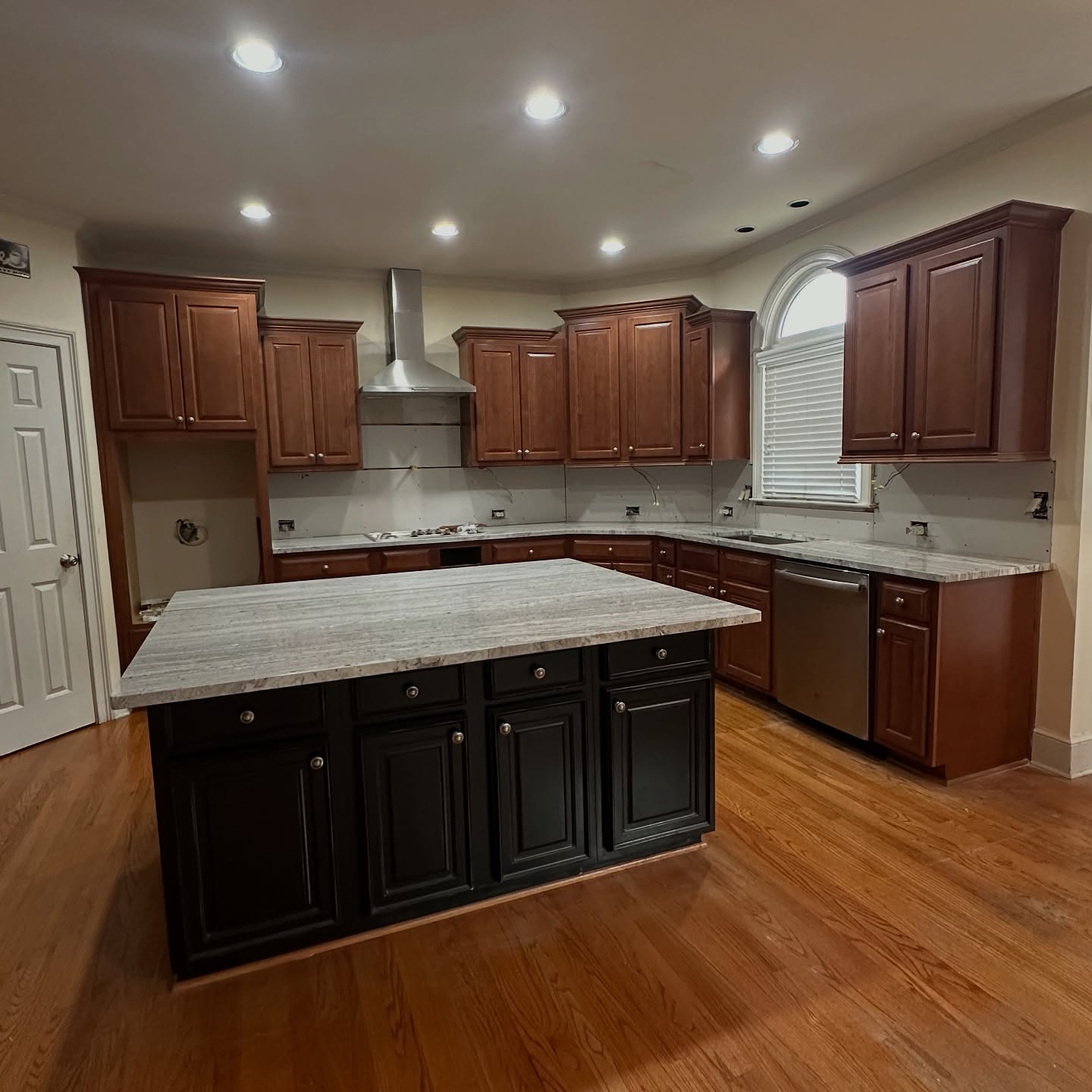
Picture this kitchen the way she bought it. Red cherry cabinets wrapping every wall. A near-black island parked in the middle. Dark oak floors tying the whole thing together. A beautiful piece of light granite sitting on top, looking lost on an island that wanted nothing to do with it.
Walk in and the room shrinks around you. You don’t notice the arched window over the sink. You don’t notice the vaulted ceiling. You notice the weight.
Then came the move no home blog would have suggested.
The move nobody would have suggested
Ask any realtor, any designer, any Pinterest board titled “small kitchen hacks.” Same answer every time: get rid of the dark island. Paint it white. Brighten the room. Rule one.
Here, that advice would have been wrong.
Look at what was actually happening in this kitchen. The island wasn’t the problem. The problem was that every other surface was fighting for attention too. Cherry on the walls. Black on the island. Dark oak underfoot. Cream paint. Cool gray granite. Five different stories in one room.
Your eye had nowhere to land. So the brain called the whole room small.
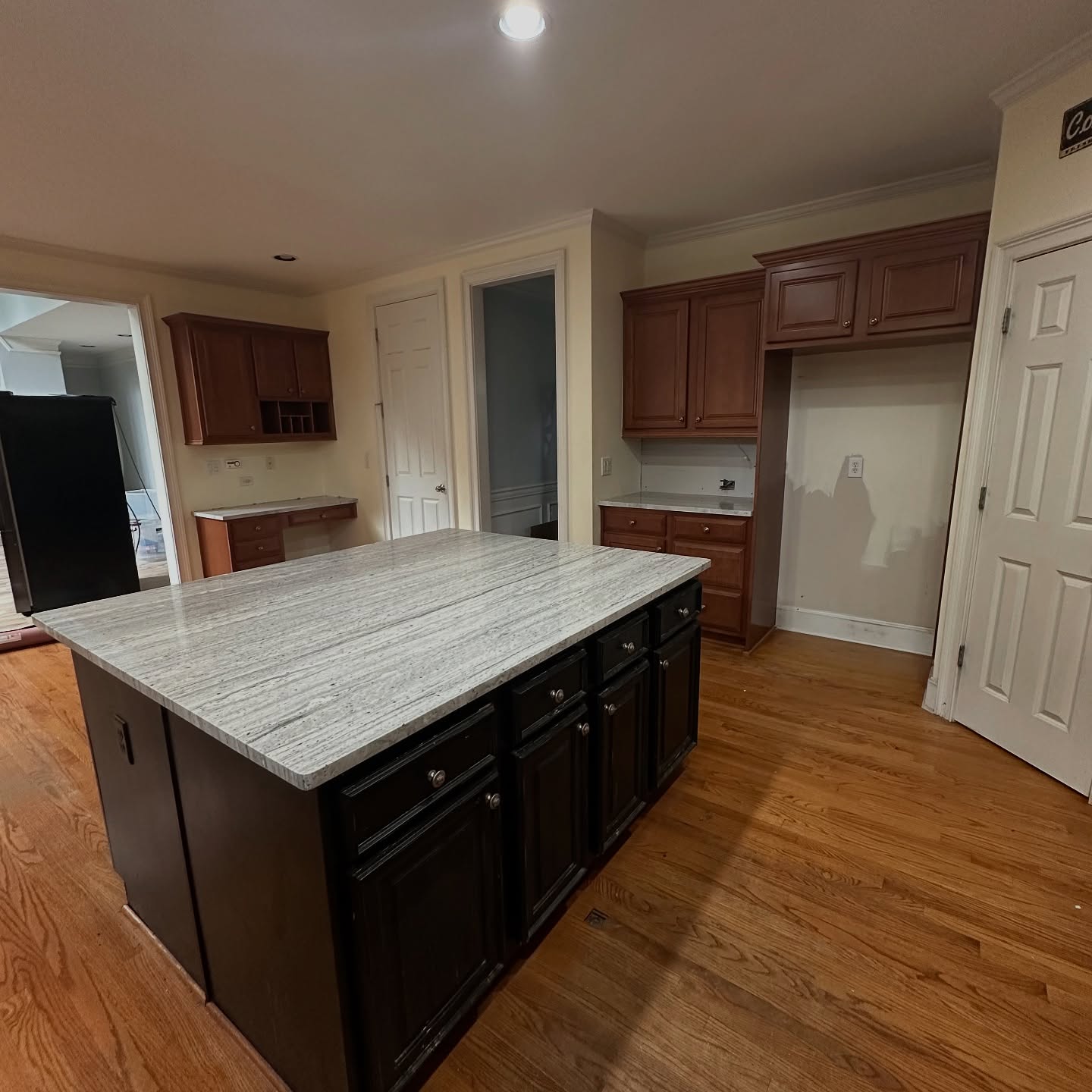
The coffee station and the arched window
Two features in this kitchen were being wasted. The built-in coffee station on the back wall almost disappeared into the cream paint behind it. The arched window over the sink, the one that gave this whole room its character, got swallowed by the wood crowding around it.
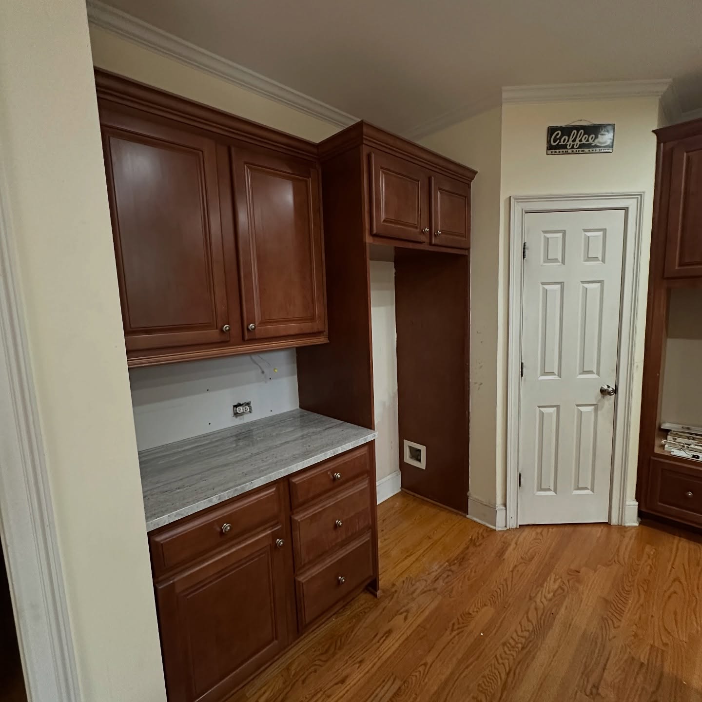
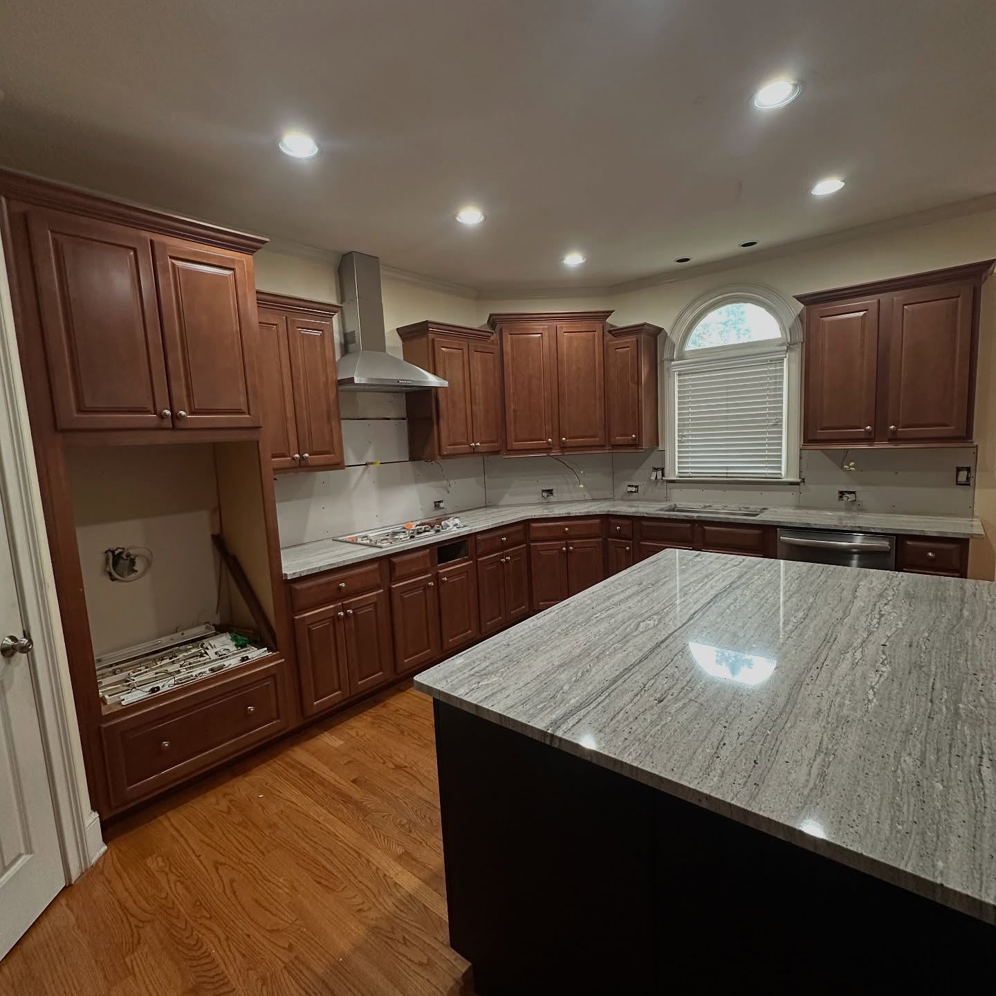
A room with this many good bones should not feel this heavy. That’s what she set out to fix. And she did it without ripping out a single cabinet.
What she actually painted, and why it worked
Three cans of Sherwin-Williams did the whole job. Big Chill SW 7648 on the perimeter cabinets, a soft gray that reads like quiet linen. Extra White SW 7006 on the walls. New gold knobs and bar pulls instead of the old silver ones.
Then came the risky part. Instead of painting the island white like everyone would have told her to, she went the other direction. Silken Peacock SW 9059. A deep teal blue with just enough green in it to pick up the veining in the existing granite.
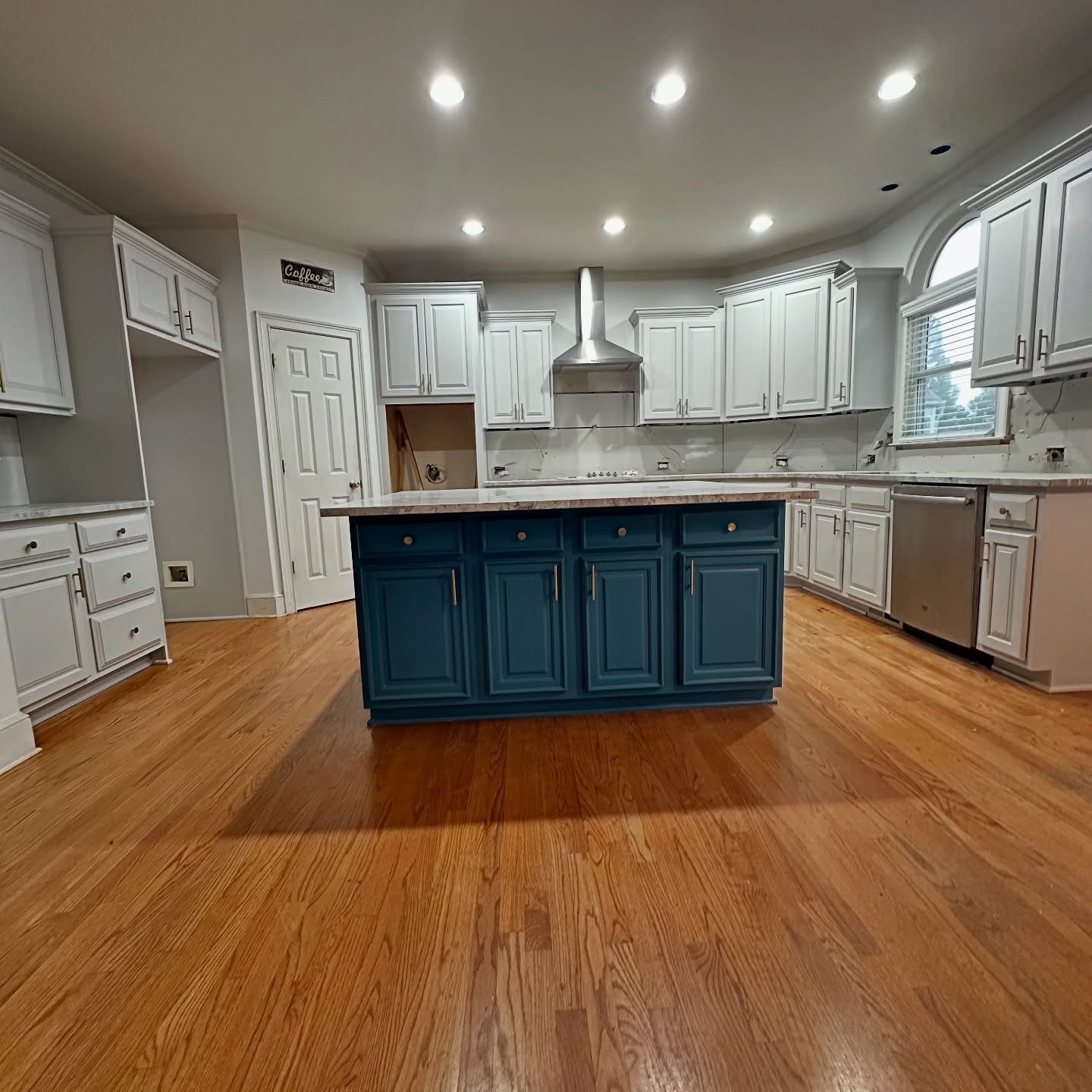
Look at the first after shot. The room doesn’t just look lighter. It looks bigger. The dark is still there, but now it’s in one spot instead of four. Your eye lands on the island and rests. The walls disappear. The ceiling feels higher.
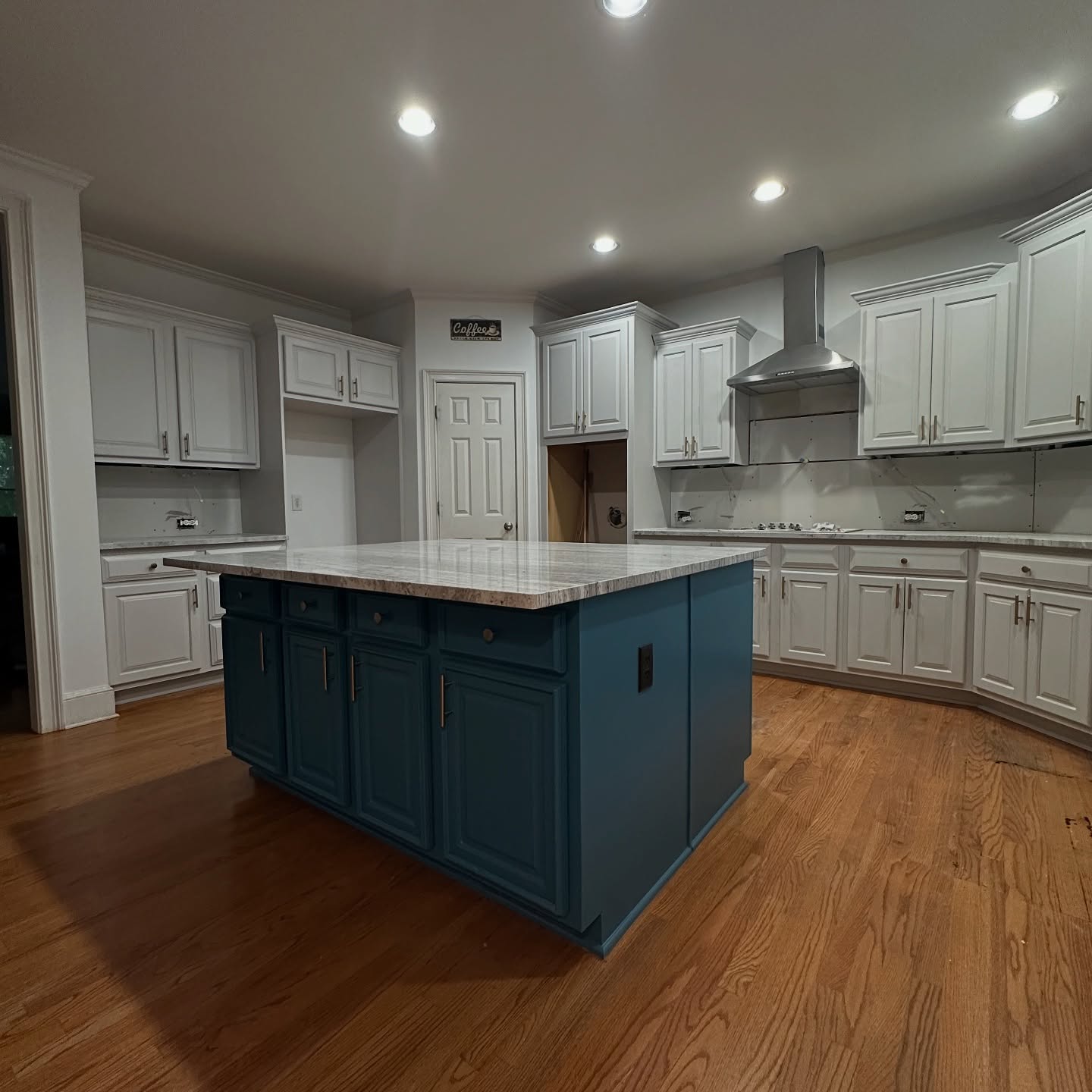
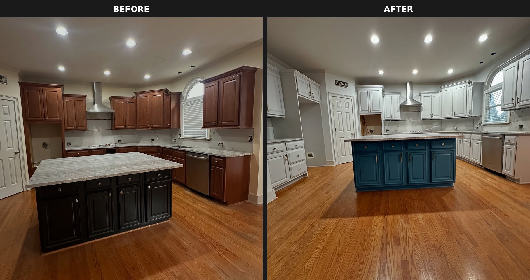
That’s the thing nobody prints on Pinterest. A kitchen doesn’t need to be bright to feel open. It needs one focal point and quiet everywhere else. The old setup had five. The new one has one.
Why peacock and not navy
Navy would have been the safe pick. Everyone paints an island navy. Here, navy would have been fine. Forgettable, but fine.
Peacock is the smarter call because of the countertop. That granite was there before the paint job. Nobody replaced it. It has green and gray veining running through it, and most island colors leave it looking stranded. The teal picks up the green. The granite finally has a friend.
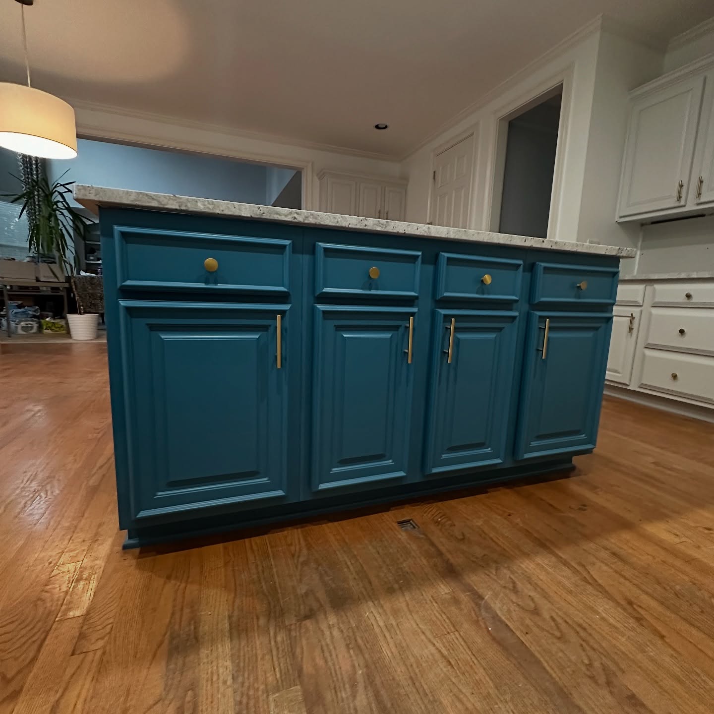
The gold knobs do the second quiet job. Gold is a warm metal. The teal is a cool color. The floor is warm. Without the gold, the island would have sat on the floor like a stranger at a party. With the gold, it belongs.
The arched window finally shows up
Same arched window as the before. Same granite. Same sink and dishwasher. All she changed was the color of the stuff around it.
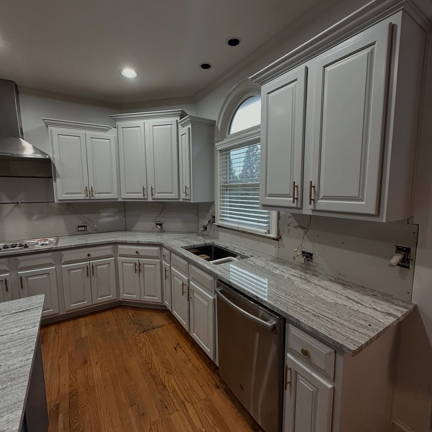
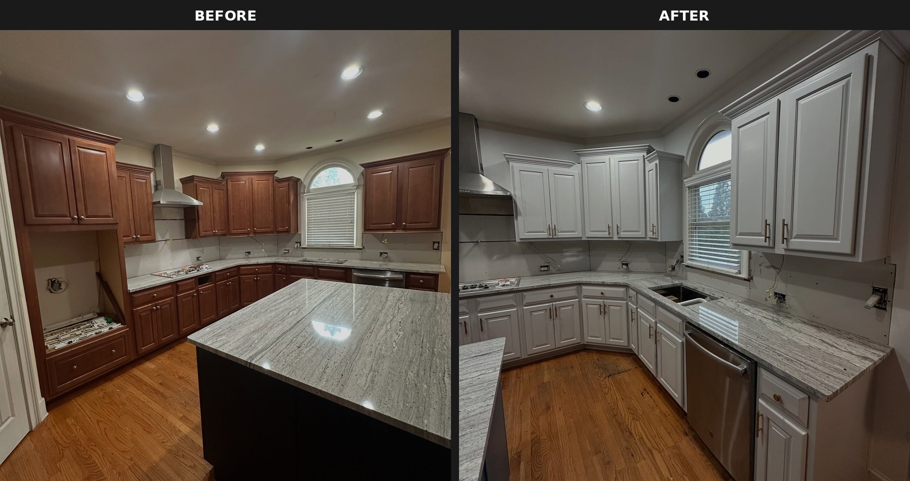
Now the window is the main event. The way it was supposed to be when the house was drawn up. The arch finally reads.
The desk nook that became a feature
The built-in desk between the pantry and the main kitchen used to look like someone forgot to finish a wall. Now it’s one of the best spots in the room.
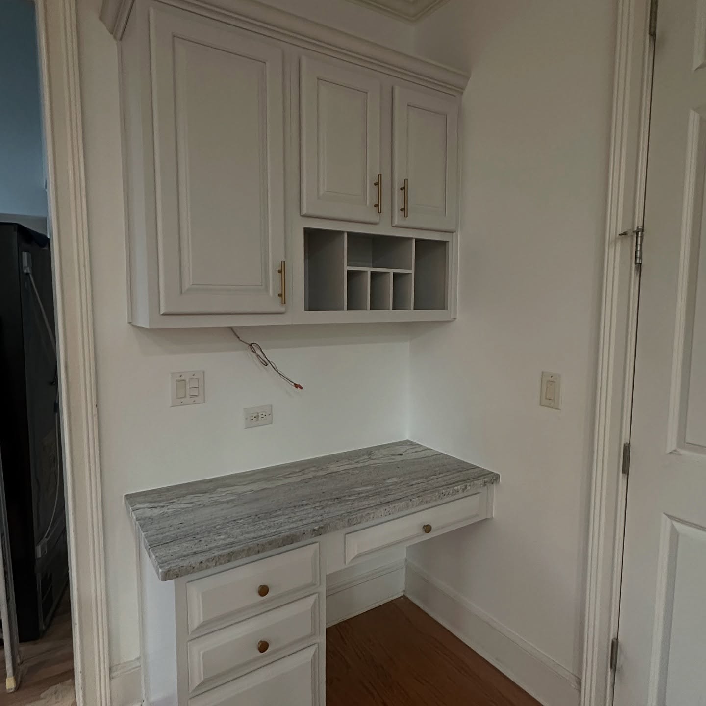
Those open cubbies above the desk were invisible against the cherry. In white, with brass hardware, they turn into a feature. You can picture coffee mugs up there, a small plant, a stack of notecards. The space has a job now.
The lesson worth taking home
Plenty of people live in a kitchen like the old one. Cherry everywhere, dark granite they can’t afford to replace, floors they don’t want to tear up. The usual advice is to save for a gut renovation.
This kitchen proves the usual advice is wrong. Same cabinets. Same granite. Same floor. Same layout. Three cans of paint and a drawer full of new hardware changed the whole feel of the room.
The real lesson isn’t paint your cabinets. Everyone already knows that one. The real lesson is this. Stop trying to erase the dark in your kitchen. Start placing it on purpose. One dark anchor in a light room makes the room feel bigger. Four scattered dark surfaces make it feel smaller. That’s the whole trick.