
Scroll through any “dated kitchen fix” video and you will hear the same three instructions. Rip out the tile backsplash. Rip out the busy granite. Pull the red-tinted cherry floors or paint them over. Then, and only then, you can start.
This homeowner ignored all of it. She kept the tumbled travertine. She kept the gold Santa Cecilia granite on every counter, island included. The cherry hardwoods stayed down. Not one tile was pulled, not one slab was swapped, not one board was replaced.
All she did was paint. Two colors, two coats each. And the kitchen stopped looking like 2005.
Here is the room she started with.
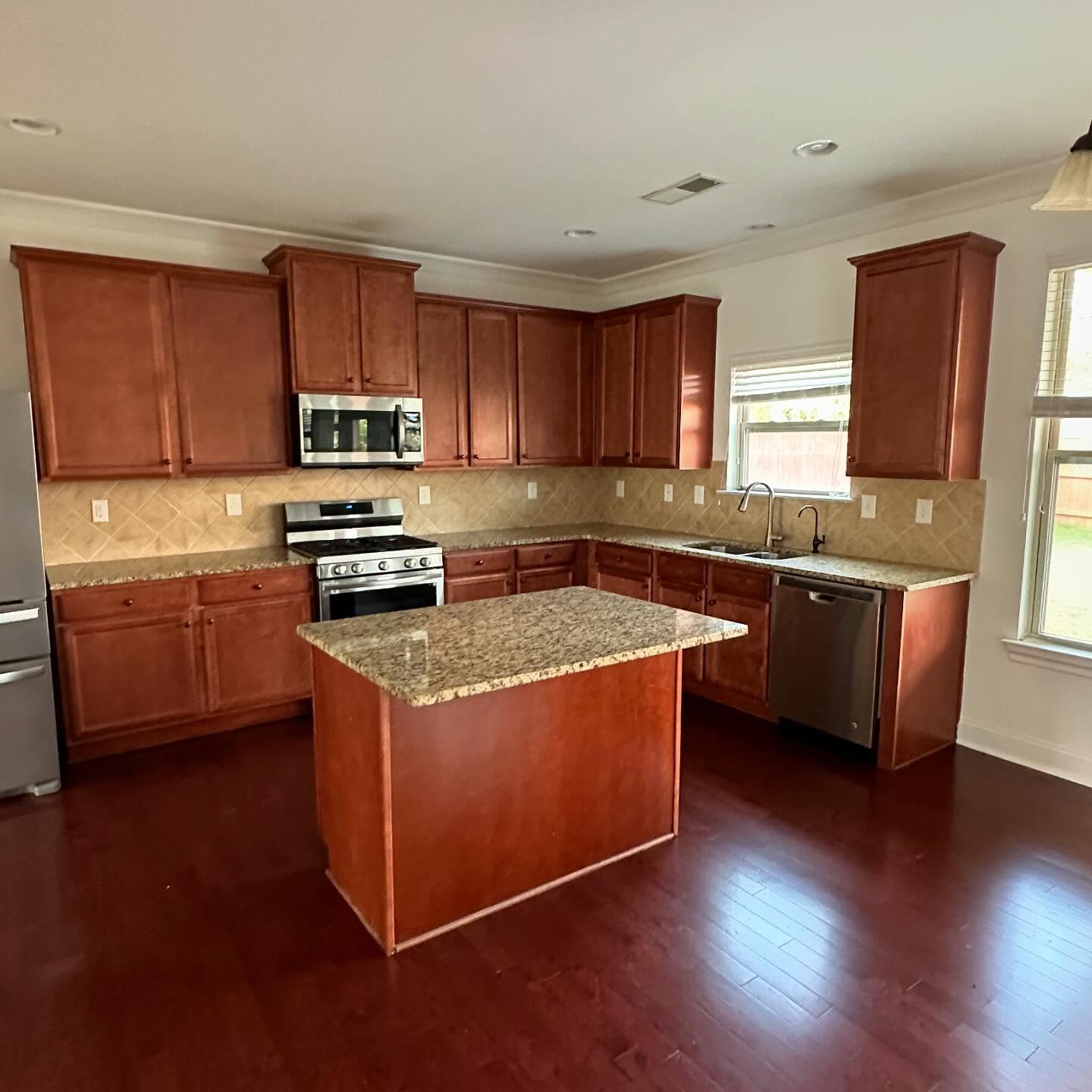
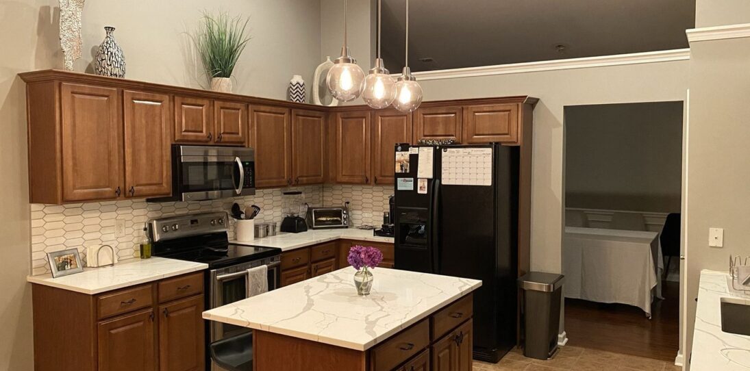
Nothing about it is broken. The layout works. The appliances are fine. It is just one note held too long. Everything in the room is some shade of warm red-brown, and the eye has nowhere to rest.
The before was not ugly, it was just one color stretched too far
If you grew up in or bought a house built between 2004 and 2014, this kitchen probably looks familiar. The raised-panel cherry doors were the upgrade finish most builders pushed. The gold Santa Cecilia granite came with the package. The tumbled travertine was the “fancy” option the sales rep talked you into. Put them together and you get a kitchen that was expensive at the time and reads as tired now.
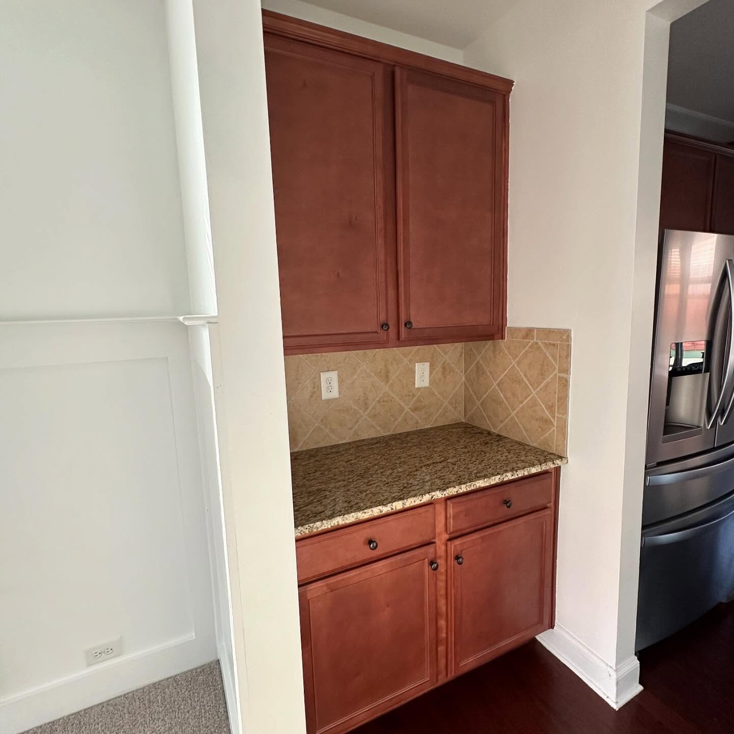
The coffee nook off the main kitchen tells the same story. Warm wood against warm tile against warm stone, no cool note to break it up. The backsplash is not the problem. The granite is not the problem. The paint on the wood next to them is.
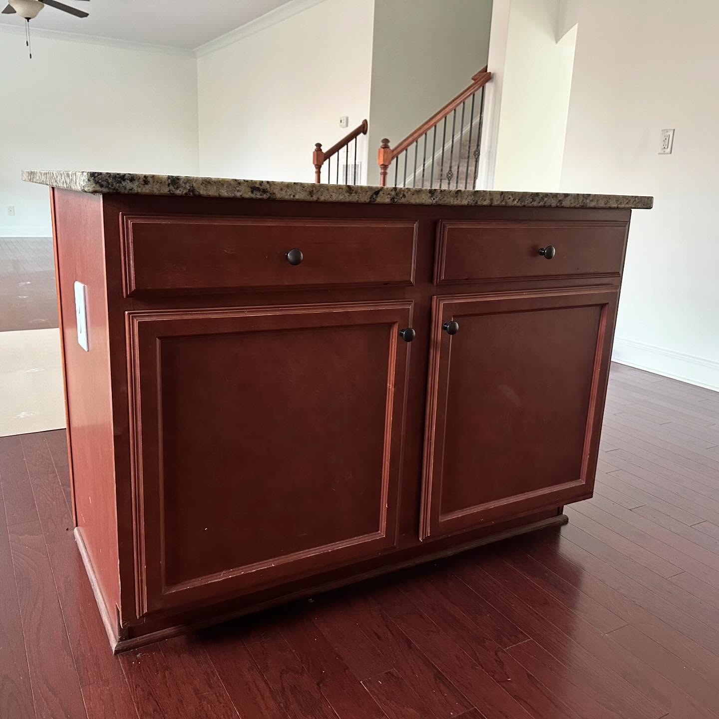
The island was the worst offender. A cherry box, sitting on cherry floors, holding up a granite top it was never a good match for. From any angle in the living room, your eye landed on it with nowhere else to go.
The two paint colors that quietly did everything
She picked two colors from Benjamin Moore and told the painters to leave everything else alone.
The perimeter cabinets got Accessible Beige. The island got Espresso Beans.
Accessible Beige is a warm, creamy neutral between an off-white and a soft greige. Not cold, not stark. That mattered, because a cold white next to gold granite would have looked like two fights happening at once. The warm cream reads as the same family as the stone and the tile, so the backsplash stops competing and starts belonging.
Espresso Beans is the opposite move. A deep, nearly black brown that picks up the darkest vein in the granite and gives the whole room a weight it was missing.
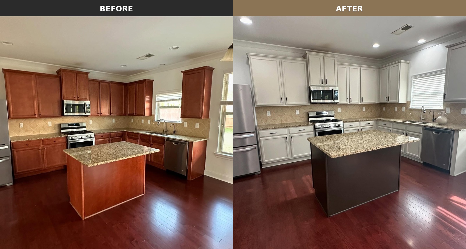
Put the shots side by side and the trick becomes obvious. Same backsplash, same granite, same floors, same cabinet doors. Only the paint moved, and the whole mood of the room moved with it.

The kept pieces finally get to carry their weight
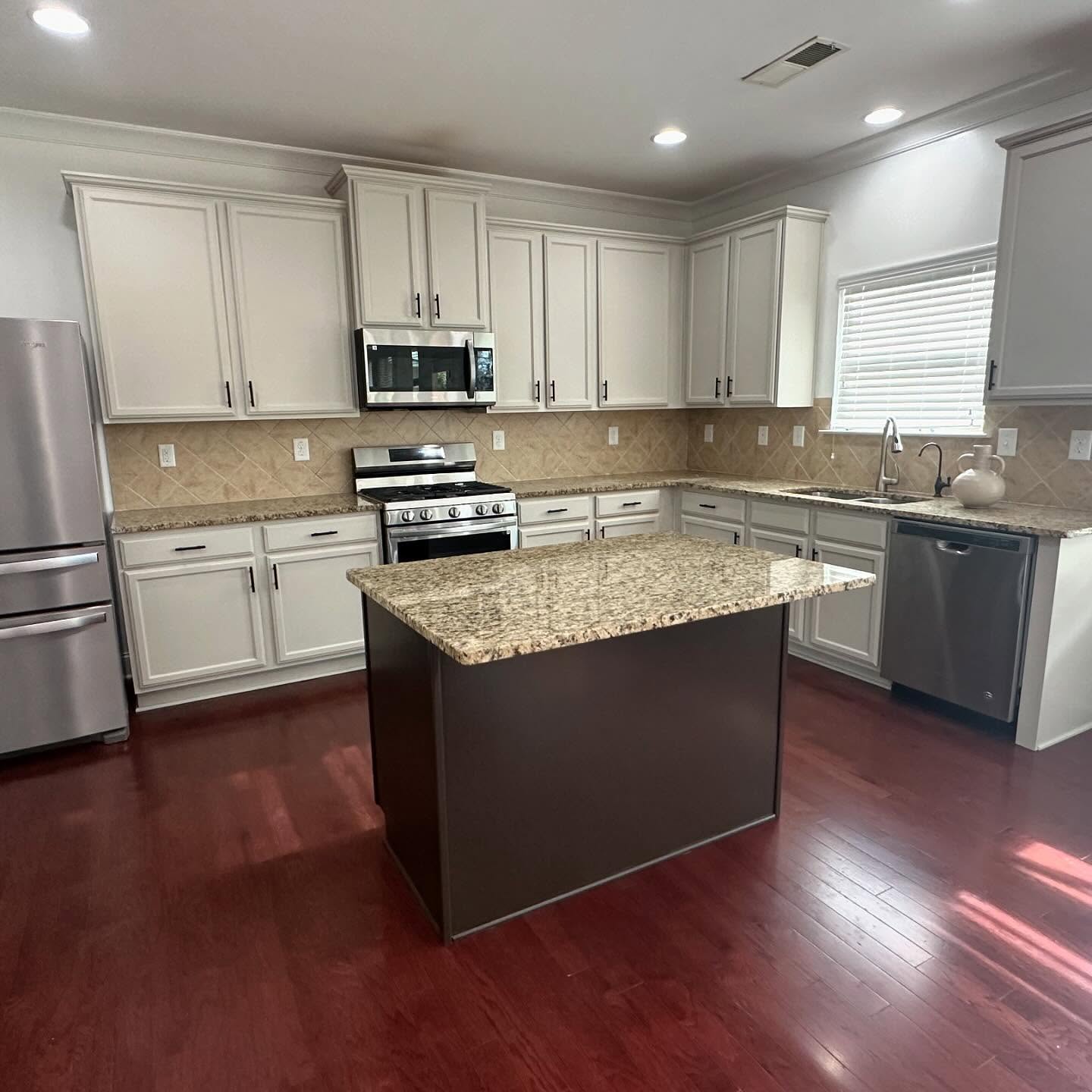
The best part of this project is not the paint. It is what the paint did for the things that did not get touched.
The travertine, which read as yellow and tired in the before, now reads as warm and intentional. The granite, which looked busy before, now looks rich. The dark veins pick up the island and the light flecks pick up the cabinets, and the stone suddenly looks like it was chosen to match the colors on purpose. Even the cherry floors, which everyone would have told her to rip out, look good in this room now.
The island did more work than any other piece
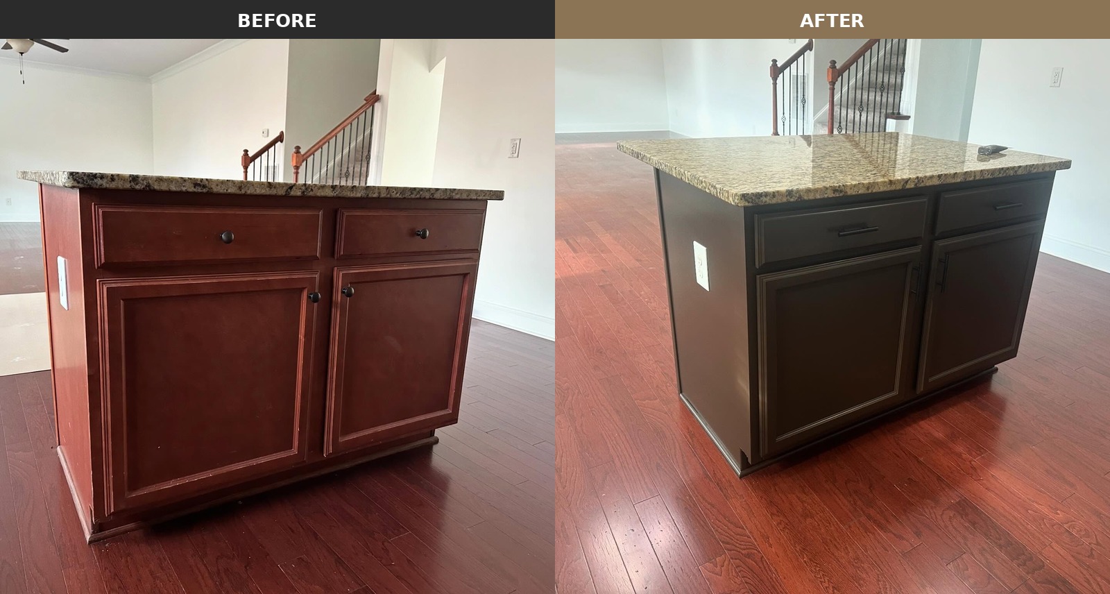
If one move carried the whole transformation, it was taking the island dark. A cherry island on cherry floors next to cherry cabinets was three repeats of the same note. The second it went Espresso Beans, it became the one thing your eye lands on first.
[IMAGE: espresso-island-granite-closeup-after.jpg] Espresso Island Close Up (After) | Credit: @duartpainting Alt: Close-up of the painted island from the living room side, showing deep Espresso Beans brown cabinets with matte black bar pulls, a gold and black speckled granite top, sitting on red cherry hardwood floors.
Up close you can see the painter left a thin lighter line inside the door panel grooves, so the panel shape still reads instead of disappearing into the dark paint. The round oil-rubbed bronze knobs got swapped for matte black bar pulls, which modernizes the whole piece more than paint alone would have.
The coffee nook is the clearest proof the paint did the work
[IMAGE: coffee-nook-before-after-comparison.jpg] Coffee Nook Before and After, Side by Side | Credit: @duartpainting Alt: Side by side comparison of the same coffee nook. Left shows red cherry cabinets with the tumbled travertine backsplash reading as dated. Right shows the same cabinets painted Accessible Beige with matte black pulls, and the travertine reading as warm and intentional.
If you want the full argument for this kind of project in one frame, this is it. Same tile, same grout, same granite, same wall, same fridge. The only thing that moved is the paint on the cabinets, and the backsplash that looked tired on the left is not tired on the right.
[IMAGE: painted-coffee-nook-matte-black-pulls-after.jpg] Painted Coffee Nook with Matte Black Pulls (After) | Credit: @duartpainting Alt: Finished coffee nook with cabinets painted creamy Accessible Beige, new matte black bar pulls and knobs, the original tumbled travertine diamond-lay backsplash, and speckled Santa Cecilia granite counter.
The hardware swap matters. The old round knobs were a quiet match for the cherry wood. The new matte black bar pulls give the creamy paint something crisp to push against, so the cabinet front has shape instead of going flat.
The small details that tie the room together
[IMAGE: white-upper-cabinets-black-hardware-after.jpg] Painted Upper Cabinets with Black Hardware (After) | Credit: @duartpainting Alt: Angled view down the painted cabinet run, showing stacked upper cabinets in creamy Accessible Beige, matte black bar pulls, the stainless gas range below, and the cherry hardwood floor stretching into a carpeted room beyond.
The crown molding on the uppers used to read as a heavy brown block cramping the ceiling. Painted, it reads as millwork. The stacked uppers show off the trim detail that was always there.
[IMAGE: white-cabinets-dark-island-wide-view-after.jpg] Finished Kitchen from the Living Side (After) | Credit: @duartpainting Alt: Wide view of the painted kitchen from the far living room side, showing the dark Espresso Beans island in the foreground, Accessible Beige perimeter cabinets, original backsplash and granite, and cherry floors.
From across the room, the kitchen finally reads like one room instead of a competition. The dark island anchors the center. The creamy cabinets step back. The backsplash and granite get to be background, which is what they were always meant to be. If you had to guess whether this took a full gut or a weekend with a brush, you would guess wrong.
Would you keep your own dated backsplash and granite for a paint job like this, or does the rip-it-all-out plan still feel safer? Tell us in the comments.
Source
- Benjamin Moore, Accessible Beige HC-172 and Espresso Beans 1221


Beige, white or cream always make me think big box store bought.
tbh I loved the initial color much more!!!
Wow, that’s a lot of outlets!