
Donna took on the kind of spare room every UK Airbnb host knows too well. Narrow back bedroom, beige walls, fresh carpet, nothing going for it. The finished space ended up looking like a boutique hotel in Portugal, and the strange part is how little she spent to get there.
The first photos from this project are almost painful if you’ve ever walked into a rental and wondered where to begin.
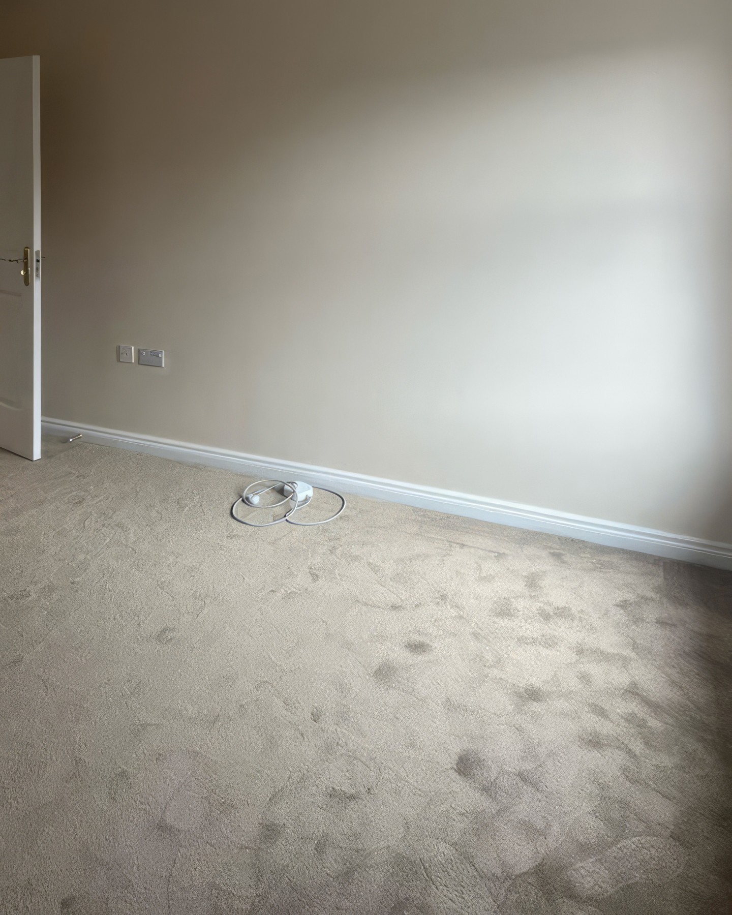
What you’re looking at is a blank beige rectangle with a door, a socket, and a lonely cable someone forgot to tuck away. The walls look like every UK new-build and rental repaint in the country. There’s nothing wrong here, which is the problem. Nothing to hook a guest’s eye, nothing to post about, nothing that whispers “you should book this one.”
The mid-renovation shot nobody wants to share
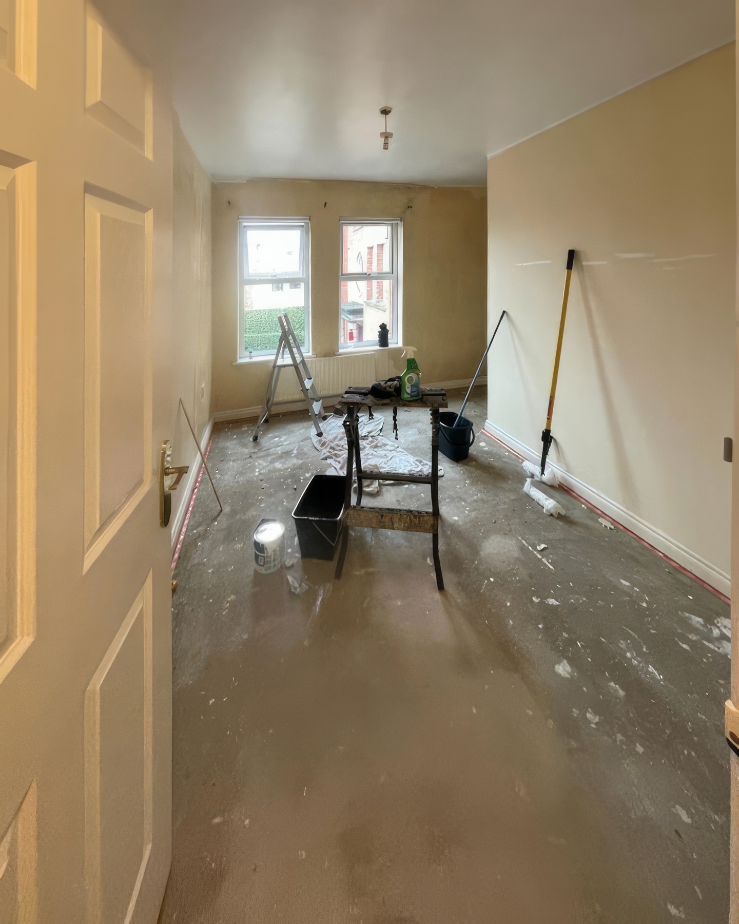
Halfway through the refresh the whole footprint of the room is laid bare. A pasting table doubles as a workbench, a stepladder sits parked by the twin sash windows, and a mop handle leans where art would eventually go. The shape of the room reveals itself as narrow and surprisingly ordinary. If you doubted this could ever feel expensive, you’d be right to be skeptical.
The decision that changed the entire budget
Most hosts walking into a room like this would start a shopping list running into four figures. A tufted velvet bed, custom curtains, a chair for the corner, framed prints, maybe a chunky rug to warm the carpet. Donna went the other direction.
She picked one surface, a peel-and-stick mural called Dominica from Wallpaper Mural, and let one wall carry the whole design on its back. Everything else stayed cheap, plain, and functional, which turned out to be the smartest move of the project.
See it side by side: the window wall then and now
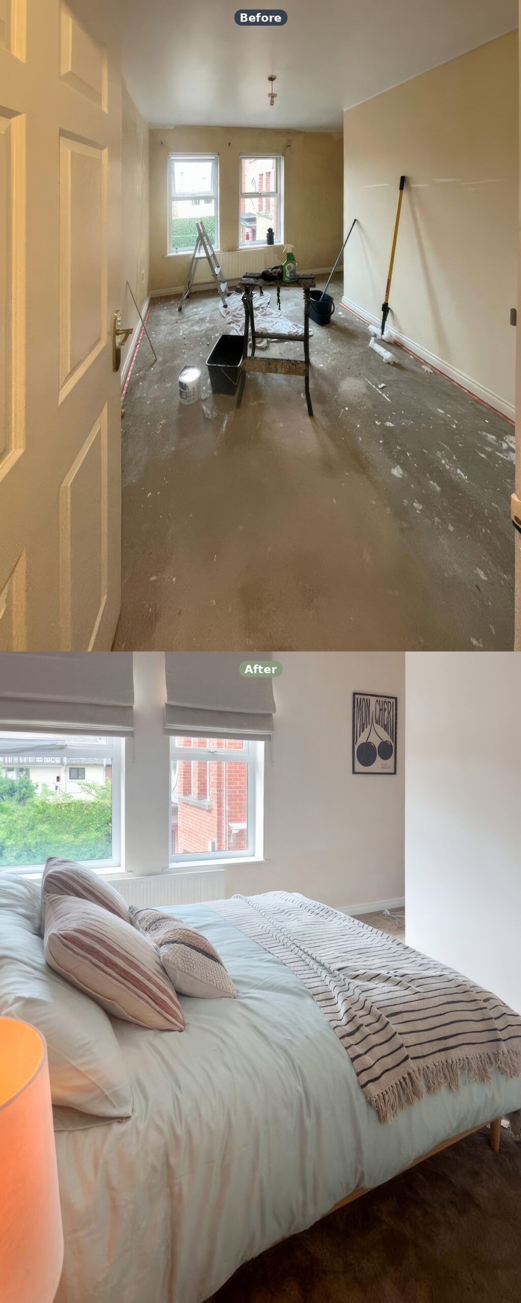
Same two windows on the far wall. Same chimney breast in the right-hand corner. The before is wide because nothing was worth zooming in on, the after pulls close because every surface earns attention now.
Grey Roman blinds have gone up, the walls read warm off-white, and the Mon Chéri print leans in the alcove where the mop handle used to lean. Nothing structural moved, the room just got dressed.
Setting the stage before the bed even arrived
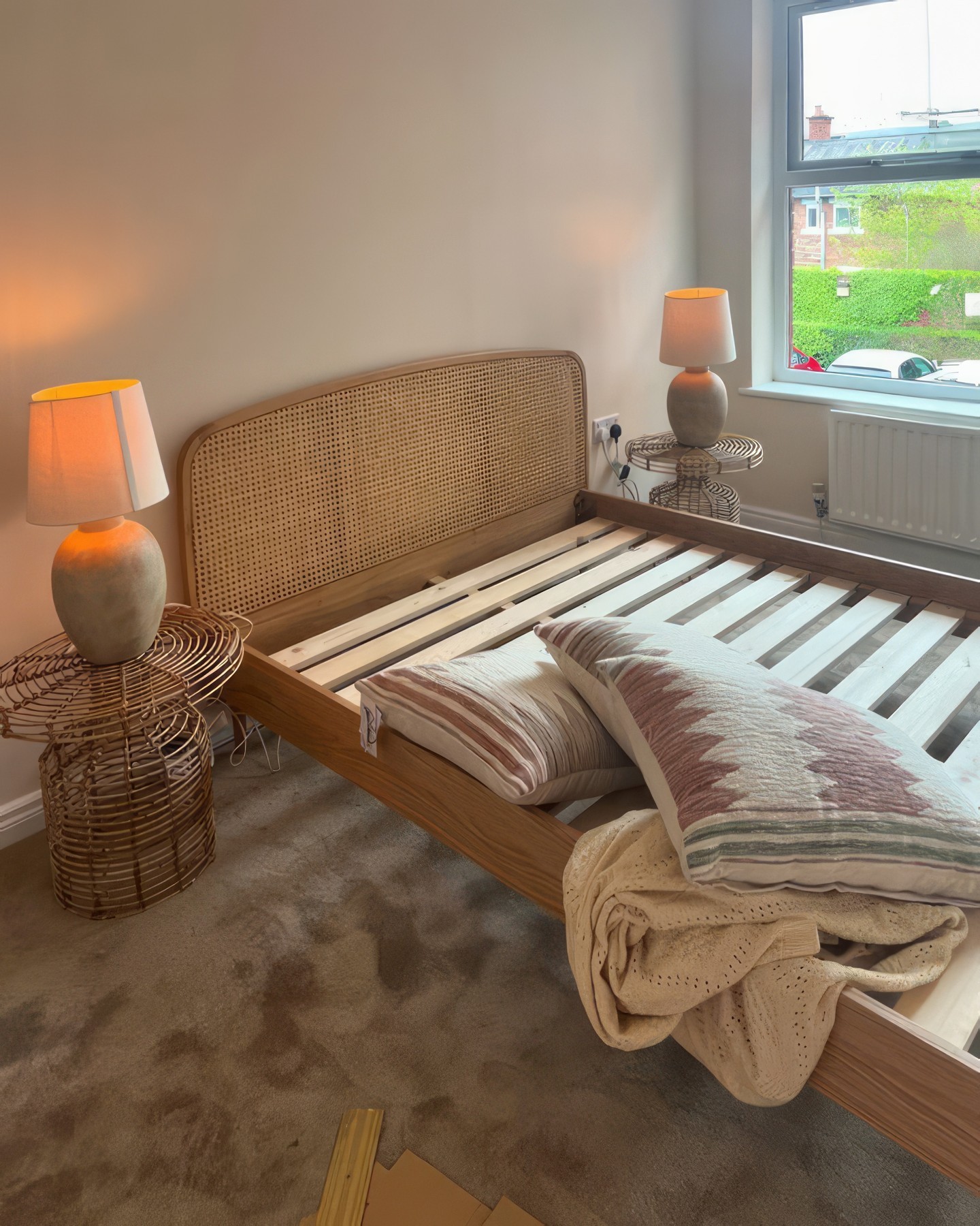
Look at this stage and something jumps out. The bed is still in pieces, slats exposed, mattress nowhere in sight, but both nightstands are already set up with their lamps glowing. Donna built the warm, lived-in mood first and dropped the furniture into it after.
The cane headboard is a budget piece from the kind of range you find on Wayfair or Made for under three hundred pounds. A quiet frame lets the wall behind it do the shouting.
Why that mural stopped guests mid-scroll
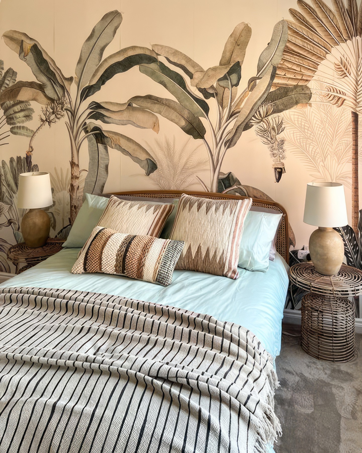
This is where the room stops feeling like a rental and starts feeling like somewhere you’d fly to for a long weekend. The Dominica mural fills the headboard wall with oversized banana palms in the muted sage and gold of a Victorian conservatory plate, nothing like the bright tropical wallpapers that flood Pinterest. It photographs beautifully in warm artificial light.
The striped Moroccan throw and the patterned cushions add just enough texture without pulling attention from the wall behind.
The bedding choice that did not try to compete
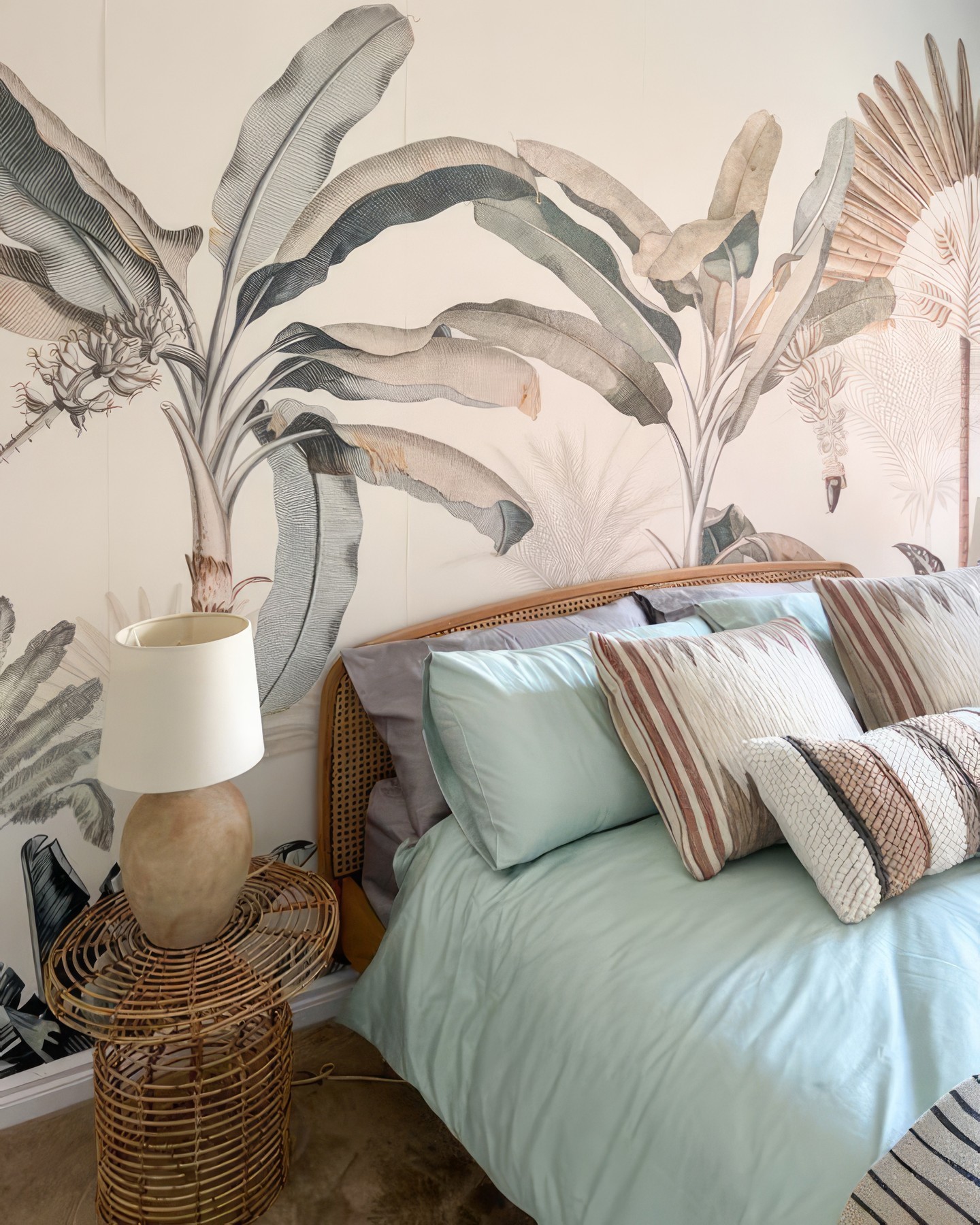
Pale sage bedding pulls one soft color straight out of the mural and leaves everything else alone. There’s no bold accent, no pattern fighting for airtime, no clashing cushion thrown in to “add interest.” Donna trusted the wall to do the heavy lifting, which meant the bed could stay almost invisible. In a small room, that restraint is worth more than any designer touch you could buy.
The lamp corner that keeps showing up in guest reviews
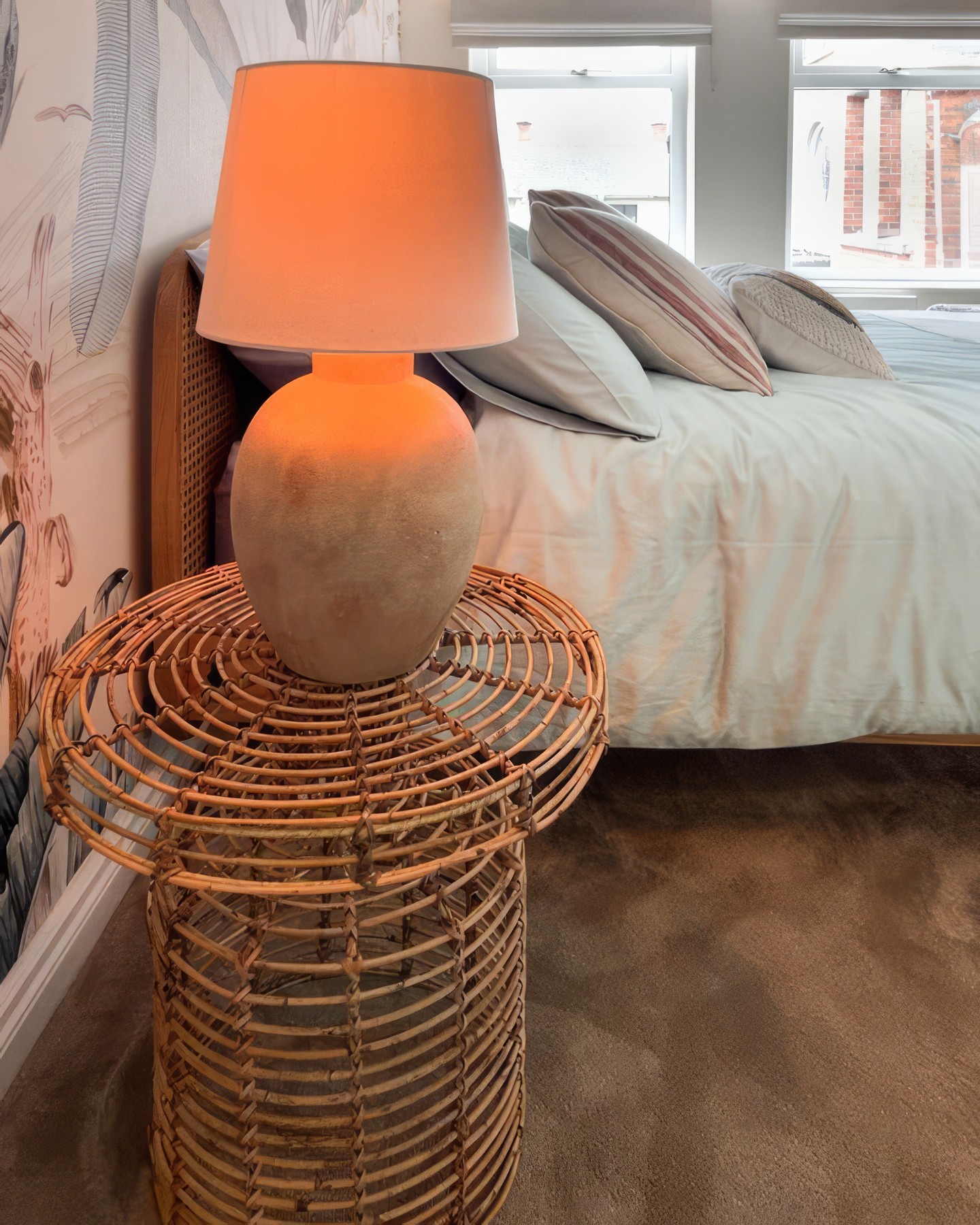
One detail guests end up photographing more than anything else is this corner. A rough matte terracotta urn with a plain white drum shade sits on a round rattan drum table, backlit by soft daylight and pouring warm orange glow at night. Costs less than a decent restaurant dinner to recreate, and does more for the room than a new headboard ever could.
The angle that actually sells the booking
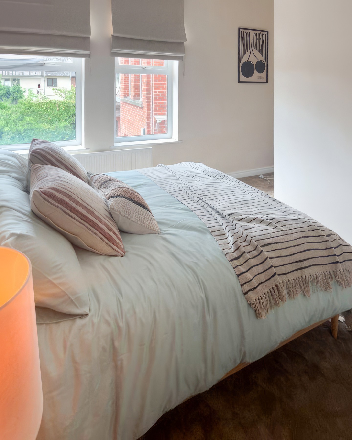
From the foot of the bed you finally see the real proportions, and the honest answer is that it’s still a modest UK back bedroom. But look at everything working together now. The grey Roman blinds soften the window glare, the Mon Chéri print in the alcove adds graphic black and white, and the striped throw brings in Moroccan texture that ties back to the pillows.
Nothing in this shot cost serious money, and yet it all reads as deliberately styled, which is what a guest skimming listings wants to see.
What a plain bedroom really needs
If you’re sitting on a blank rental box of your own, this project teaches a lesson worth taking in. Donna didn’t move a wall, swap the flooring, or hire anyone in. She spent on one surface, kept the furniture plain, added warm light, let the rest of the room stay quiet. The whole look rests on about four choices, which is why it travels so well to any blank bedroom.
You don’t need a renovation, you need one wall worth looking at and the confidence to leave everything else alone.