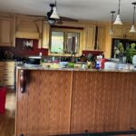
Scroll through the first set of photos and your brain starts writing a renovation estimate before you reach the end. Honey oak cabinets, dark speckled counters, a busy gray mosaic backsplash, and stone-pattern tile all stacked in the same room look like a kitchen stuck between two decades. The kind of room where the easiest answer feels like a dumpster and a credit card.
Then you get to the after shots. The counters never moved. Neither did the floor. The backsplash is the same backsplash. The stainless appliances are the same stainless appliances. Even those cathedral arch cabinets, the detail a flipper would have ripped out first, are still right where they always were. One can of paint did the whole thing.

Stand inside that first photo for a second. Where does your eye go? Probably straight to the floor. Then the busy backsplash. Then those heavy dark counters. If you were planning a refresh, that is your shopping list. New flooring, new counters, new tile. A quick tally gets you to around $20,000 before you have even paid a contractor, and that is where most of these projects quietly die on a notepad.
None of those things were actually the problem.

The oak was the loudest voice in the room
Here is the thing nobody tells you about a kitchen that reads as “dated.” The finishes have to agree on a temperature. Everything in the before shots was cool: slate-looking tile, near-black counters, icy mosaic, silver stainless. One surface was pulling in the opposite direction, and it happened to be the biggest surface in the room by square footage. Honey oak has an orange-amber tone that just takes over. It will not sit quietly.
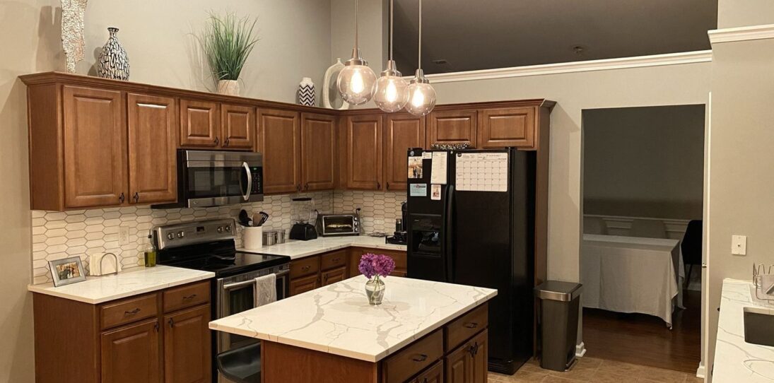

This is why the “I replaced my counters and the kitchen still feels tired” posts keep multiplying on Reddit. People spend thousands trying to quiet the softest instrument in the band while the loudest one keeps playing. Paint over the oak and every other finish stops competing. The whole room exhales.

Same room, read completely differently
The after shot feels like a different kitchen. It is not. Walk through what actually changed on this project and the list is embarrassingly short: cabinet color. That is it. The crown molding is where it was. The bronze flush-mount lights are the same bronze flush-mount lights. The brushed nickel bar pulls kept their original screw holes. The microwave never got unplugged.

What changed is how your eye moves through the space. The gray floor suddenly reads like a chosen color, not an afterthought. The dark counters calm down against the white above them. The mosaic tile reads current instead of early-2010s. And those cathedral arches, the thing most renovation accounts would have told the owner to flat-panel over, actually look pretty with Gypsum on them. Soft French-country quiet, not 90s builder-grade loud.

The pantry wall is the proof
If you only trust one shot, trust this one. Same cabinet. Same cathedral doors. Same brushed nickel pulls in the exact same spots. In the oak version, that tall column looks heavy, almost like it is leaning into the fridge. In the Gypsum version, the exact same cabinet reads as a crisp built-in that frames the fridge instead of crowding it. Nothing moved. Only the color.

Up close, the details hold
Painted-oak projects usually fall apart the second you walk right up to them. You start seeing brush drag, dust in the finish, hinges that no longer sit flush, caulk lines that drifted. None of that is happening on this one. The paint laid down cleanly across the arched tops and the raised panels. The brushed nickel bar pulls, which basically vanished into the oak before, finally have the contrast they were designed for.


Why Gypsum specifically
Gypsum is not a hospital white. It has a faint warm undertone that keeps the room from feeling sterile. A cold bright white like Pure White or Extra White would have fought those dark counters from the opposite direction, which is exactly the mistake the oak was making before. Gypsum lands in the middle. Clean enough to feel modern, soft enough to still feel like a kitchen you want to cook in. It also holds up under amateur cell phone lighting without going blue in the shadows, which is probably why the after shots photograph as well as they do.

If this is sitting in your own kitchen right now
Honey oak uppers, grayish counters, grayish floor, grayish tile, stainless appliances. That exact stack is in a few million American homes. If anyone has told you the floor has to go or the counters have to be replaced to make the room feel current, you got a very expensive misdiagnosis.
The cheapest fix is also the right one. Clean and prep the oak properly, prime it, roll on two coats of Gypsum (or any warm off-white in the same family), rehang the same doors with the same hardware, and give it a day to settle. The $20,000 quote shrinks to a long weekend and a few hundred dollars at the paint counter.