A kitchen like this is the one most of us would rush to rip out. Orange pine as far as the eye reaches, a plate rack that reads 1998, dark granite that’s seen a thousand Sunday roasts. The usual advice is grim: gut it, drop $25,000 (about €23,500) on new cabinets, eat takeaway for two weeks while the install happens.
The owner of this kitchen didn’t do any of that. She called in a spray crew, picked one paint color, and in a single day the whole room flipped. The wild part is what the paint actually revealed. This kitchen was never dated. Only the finish was.
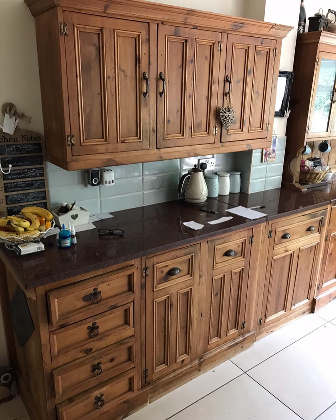
That’s the kitchen in its natural habitat. Chalkboard wall, fruit bowl on the counter, kettle plugged in, all the signs of a room that gets used every day. The first thing your eye grabs is the orange glow, and that one impression does all the work: dated, country catalog, next please. The furniture underneath is way better than you’d ever guess from a glance.
A joiner built this room by hand
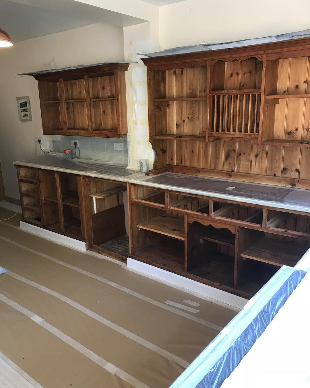
Here it is stripped, taped, and waiting for spray. Doors off, drawers pulled, every counter and tile sealed in plastic. Now you can actually read the carpentry. There’s a real wooden plate rack dead-center in the hutch, not a decorative one, a working one. Scalloped aprons run under every upper cabinet and along the plinths. The dresser end panels are scroll-cut, not straight. Leaded glass sits in the display doors. Even the little spice drawers get drop-ring pulls instead of the standard knobs you’d find on a flat-pack carcass. This is a joiner’s work, twenty-plus years old, cut and fitted to this exact room.
Same wall, one color apart
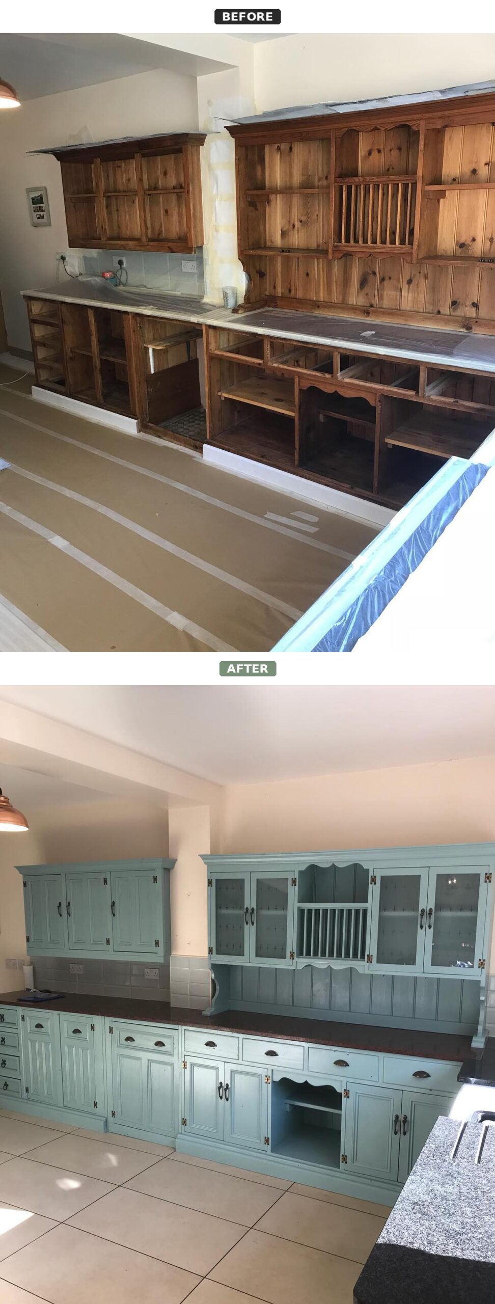
Stare at these two photos for ten seconds. Nothing structural changed. The cabinets didn’t move. The hinges stayed. Not a single door came off and never went back on. That’s the whole kitchen, same bones, just wearing a different coat
The color is Farrow and Ball Dix Blue, a soft gray-leaning teal from the traditional side of their palette. It’s the kind of shade you’d see on an antique Welsh dresser or Georgian wall paneling. That matters. A trendy navy would’ve fought the scrollwork and plate rack. A dusty sky blue would’ve looked thin against the dark granite. Dix Blue holds the room together instead of competing with it, which is exactly what a bespoke kitchen like this one needed.
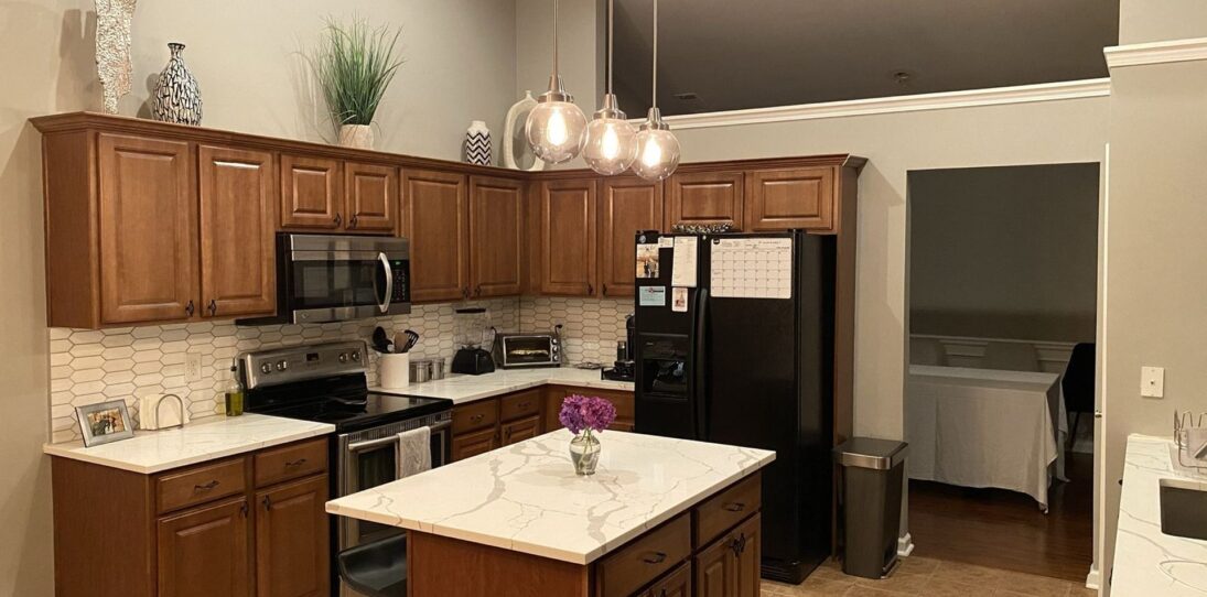

The color choice was the real decision
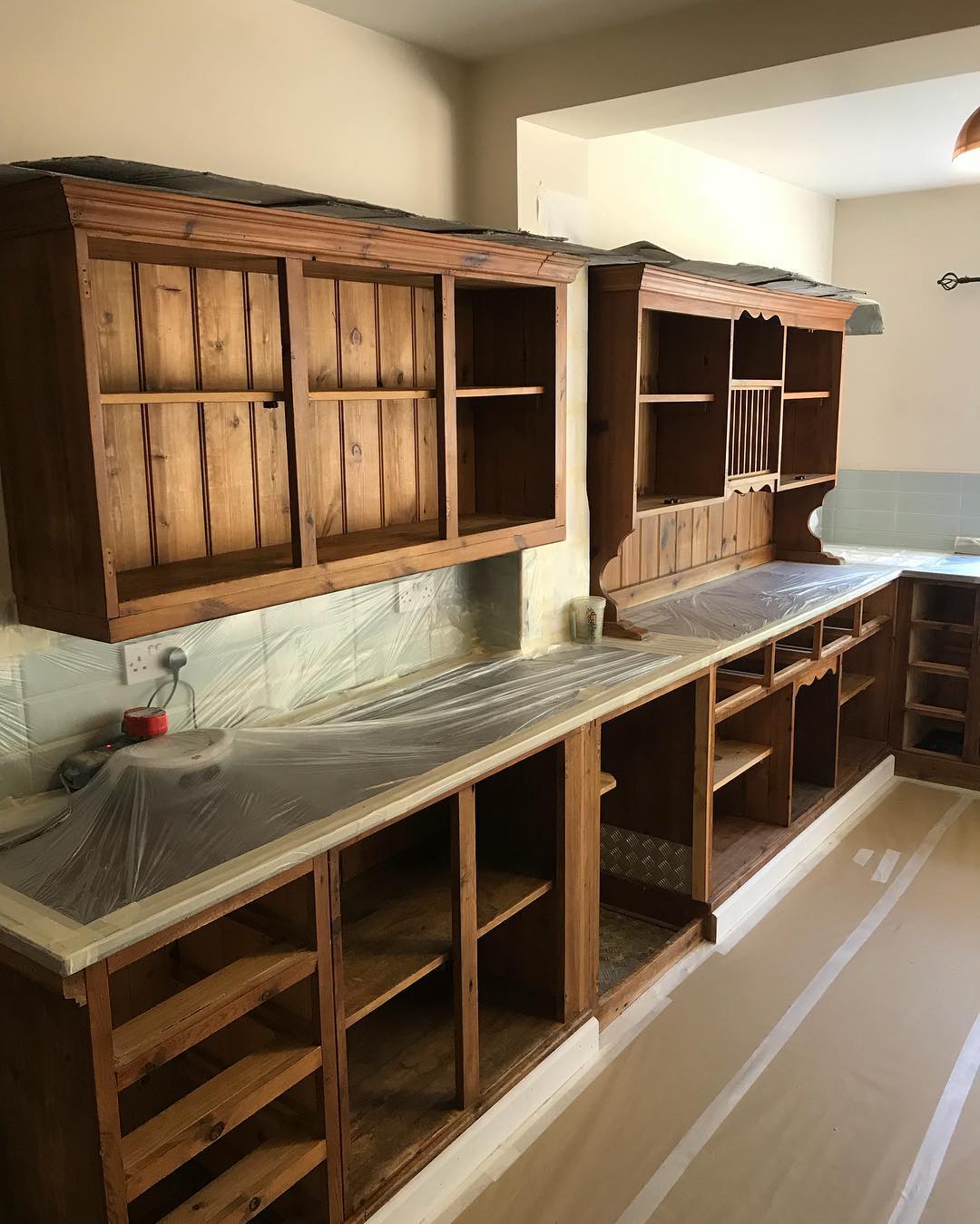
Picking the right blue for a country kitchen like this is harder than it looks. Check what the owner was working around. The soft green wall tile was already in. The dark granite wasn’t going anywhere. The brass tap over the sink was staying. Dix Blue is one of the few shades that doesn’t fight any of them. It threads between the green, the brass, and the granite like it was always the plan, even though it’s going on last.
The dresser, close up, before and after
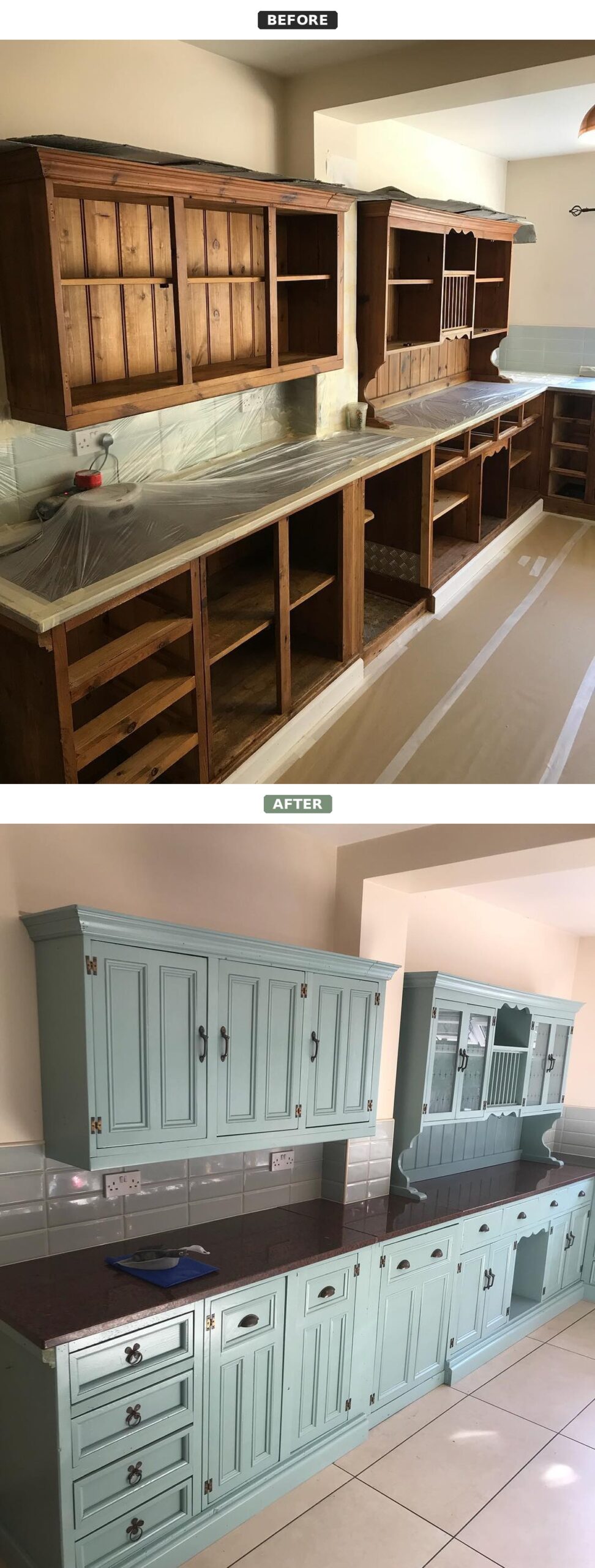
Zoom in and the whole trick becomes obvious. The paint didn’t invent a single detail. It just stopped the finish from shouting over everything that was already there.
Look at the scalloped apron tucked under the uppers. In the orange pine, it was invisible, just another ripple in the grain. In the blue, it reads as a soft, deliberate curve. The scroll bracket on the hutch hood stops looking fussy and starts looking like proper architecture. The cup pulls, which were drowning before, now sit on the paint like small dark pieces of jewelry. None of this was added in the respray. It was all already there. You just couldn’t see it through the orange.
Walk around to the sink wall
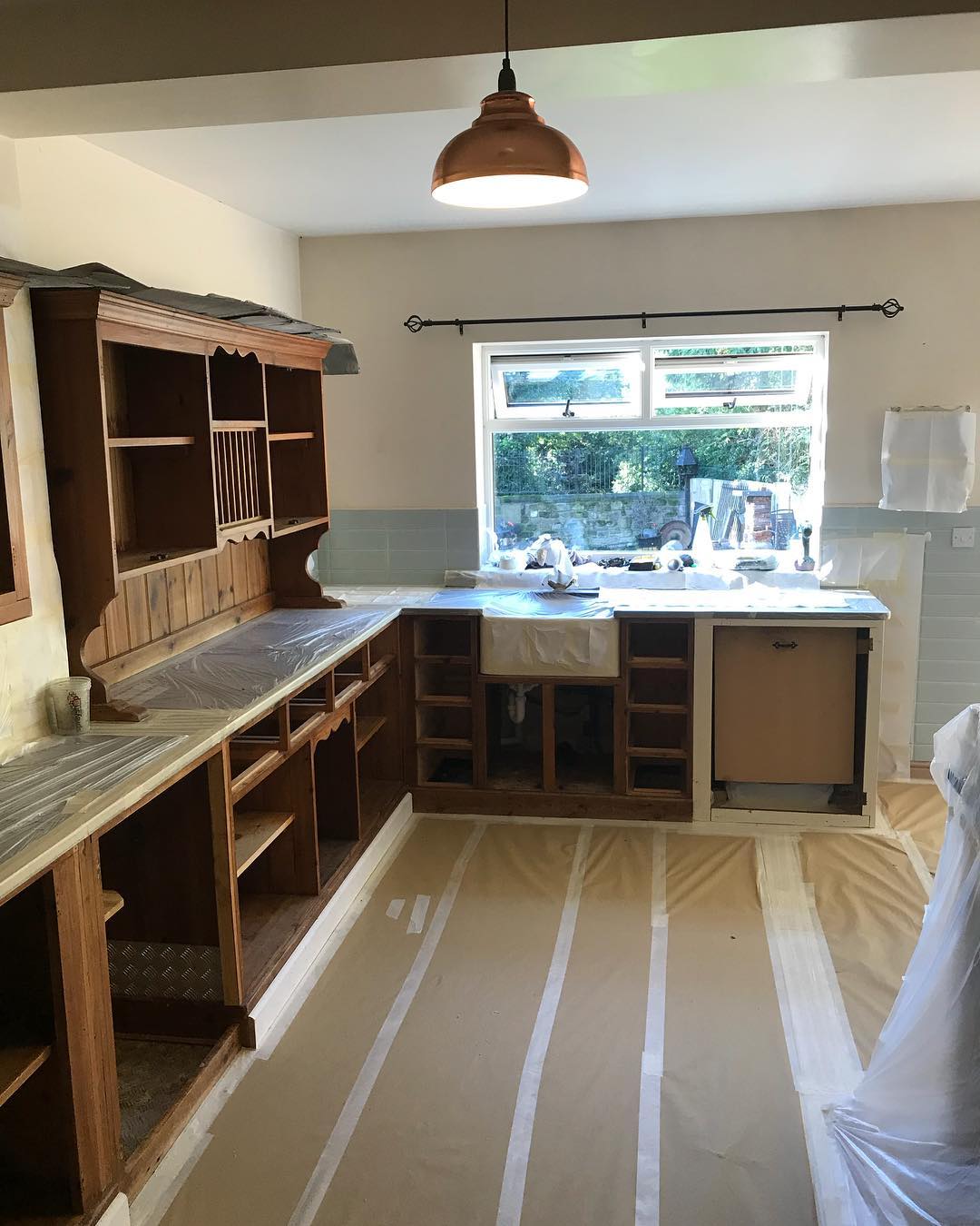
Same story over here, told a little differently. In this prep shot the farmhouse sink was literally pulled out for the spray job. The brass tap wasn’t even there yet. The whole U-shape felt heavy in the orange, and the pale green splashback tile looked random, like it belonged to another kitchen altogether.
Same window, completely different mood
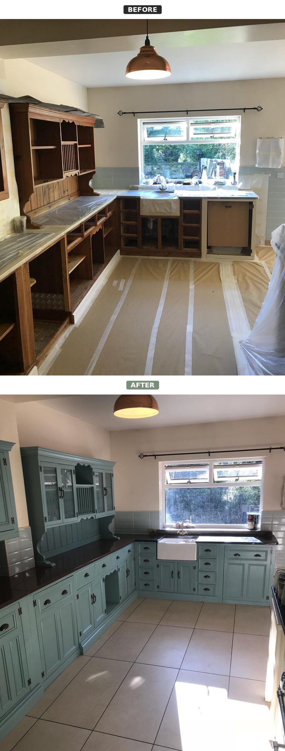
With the sink and tap reinstalled and the blue laid down, every piece in the frame starts talking to the others. The tile isn’t random anymore. It reads like one half of the color story, and the cabinets finish the sentence.
That brass tap, by the way, is the proof that the owner always had good taste. Nobody picks a brass tap and a real farmhouse sink for a flat-pack kitchen. They were waiting for a backdrop good enough to show them off. In the blue, they finally get one. The dark granite does the same trick. In the orange pine it looked oppressive and heavy. In the Dix Blue, it reads as grounding, like the base note in a chord.
If you’re stuck with a honey oak kitchen, borrow the lesson
Most kitchens we call “dated” aren’t actually dated. They’re miscolored. Before you quote out $25,000 (about €23,500) for new cabinets and the two weeks of takeaway dinners that come with the install, ask the questions that actually matter. Is the layout bad? Is the storage bad? Are the doors falling off their hinges? If the answer is no across the board, don’t tear anything out. Spray instead.
Nine times out of ten, your carcass is fine. Sometimes, like here, it’s way better than fine. It’s genuinely custom, and the only thing standing between you and a kitchen that looks hand-built is a coat of the right paint. One good day with a sprayer and a well-chosen color can out-perform a full rip-and-replace. This kitchen is the proof.