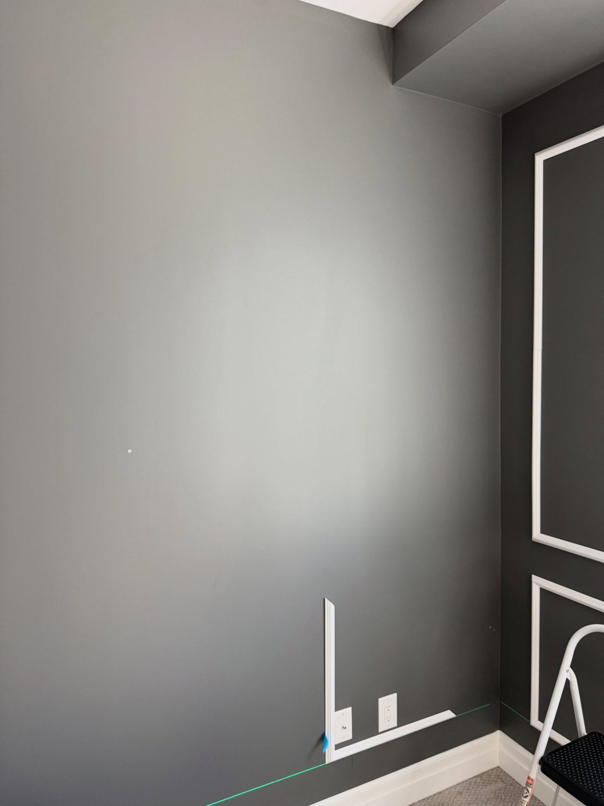
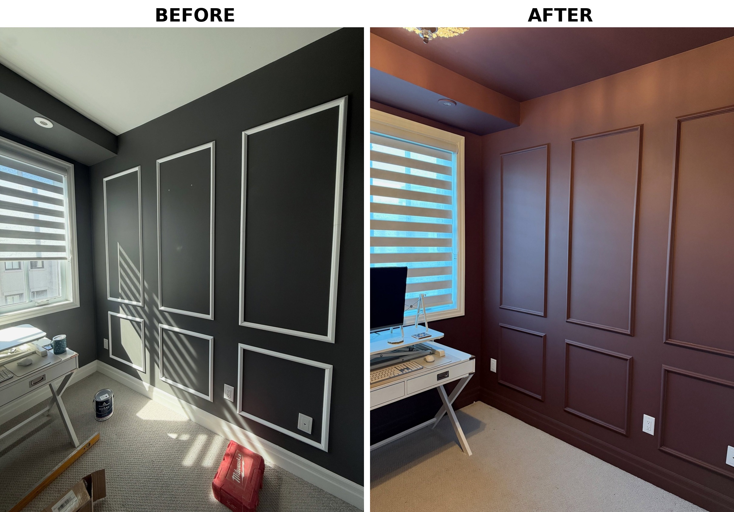
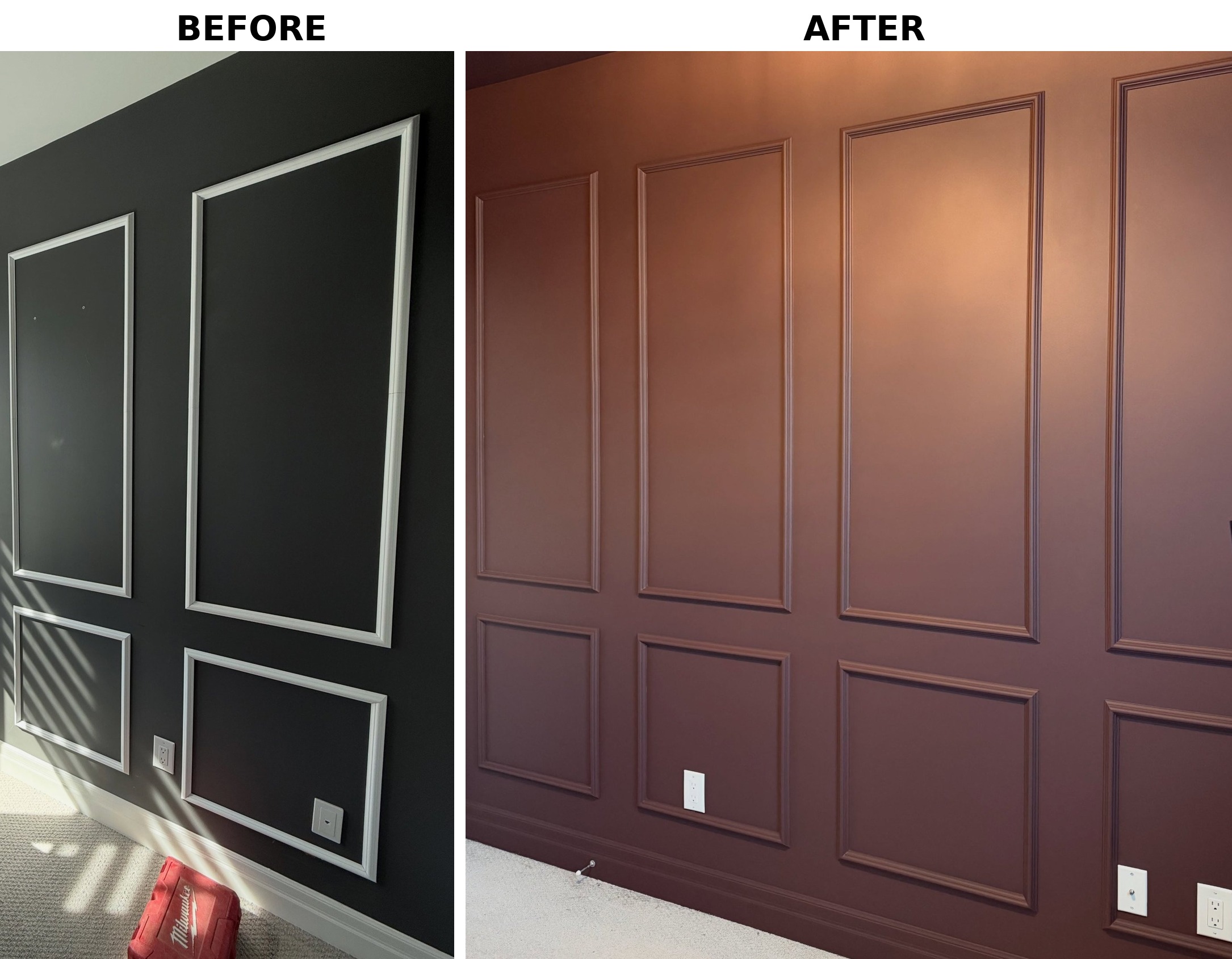
Her home office checked every box on the Pinterest list. Dark charcoal walls, white panel molding on the back wall, white baseboards, white ceiling, pretty little desk under the window. If you were scoring it against the YouTube tutorial, she nailed it. And it still looked like a room anyone could put together on a long weekend. That’s what she actually wanted to fix. Not the color. The feeling of same.
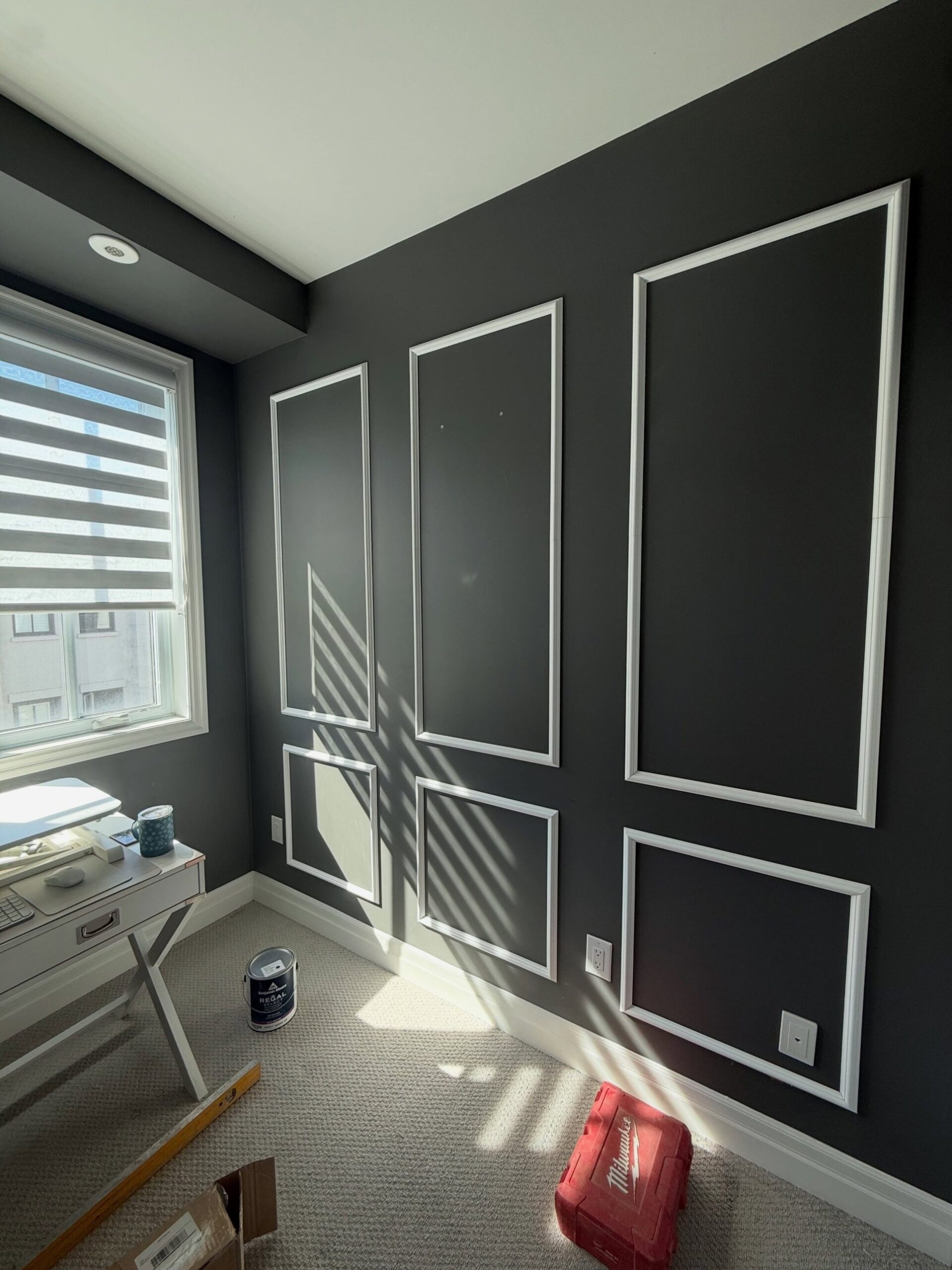
Here is what makes it awkward to critique. The room was done right. Clean caulk lines, evenly spaced panels, trim paint that did not bleed. She was not fixing a mistake. She was trying to escape a formula, the one every panel-molding tutorial on the internet pushes you toward. The fix she landed on breaks the single rule that whole formula is built on.
The one move every molding tutorial warns against
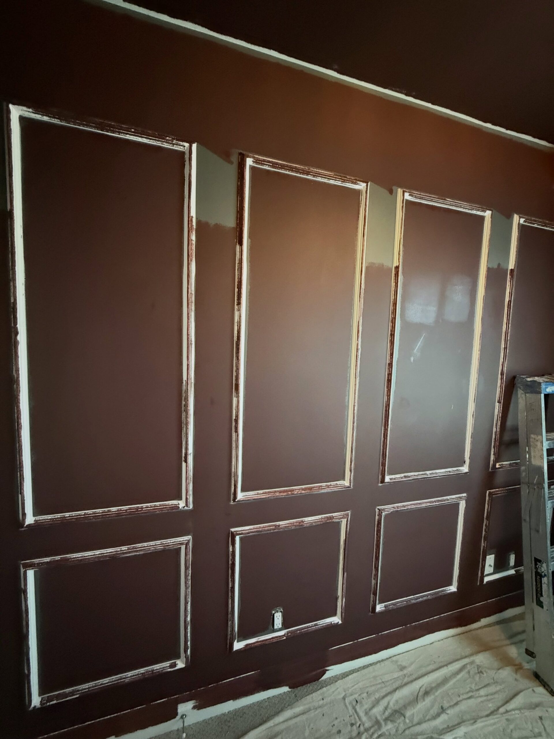
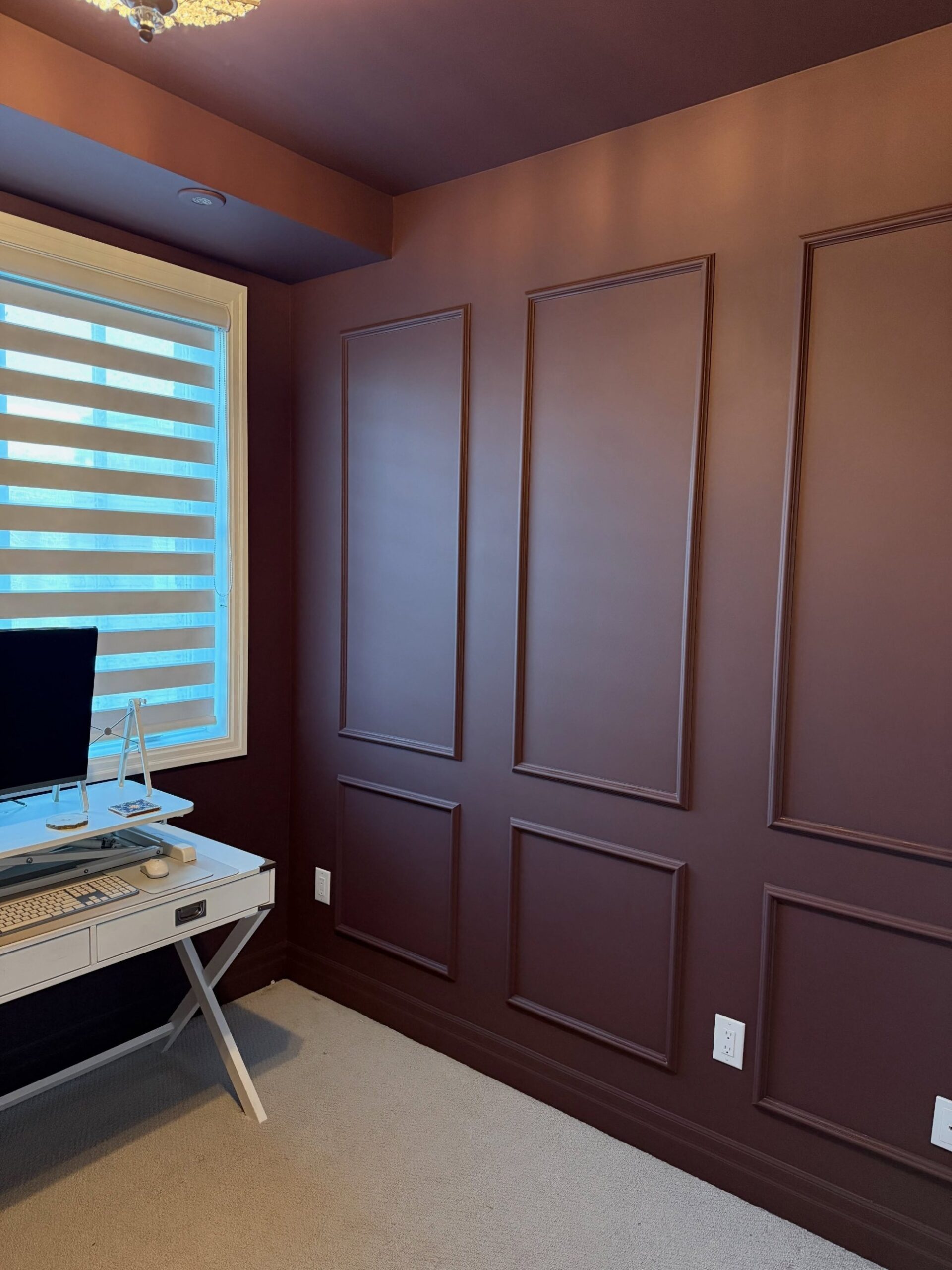
So she did the thing every molding tutorial begs you not to do. She painted the trim the same color as the wall. Then the baseboards. Then the ceiling. Everything in Sherwin-Williams Carnelian SW 7580, color-matched into Benjamin Moore paint, rolled from floor to ceiling with no breaks.
Why white trim makes paneled rooms look pre-assembled
Designers call it color drenching. The reason your DIY feed never recommends it is simple. Every big-box aisle, every Lowe’s handout, every “how to install picture molding” video repeats the same line: paint your trim bright white for contrast. That rule is why so many paneled rooms look pre-assembled. White trim against a dark wall tells your eye there are two layers in play. A flat wall in back, little picture frames glued on top. You can almost see the staples.
Where your brain stops seeing frames
Pull that color break out, and your brain reads the wall differently. Instead of frames, it reads shadow. The trim stops announcing itself and starts behaving like molded plaster in a 1920s apartment. Architecture, not applique. That shift is what makes a drenched room feel built instead of installed. Nothing had to come off the wall. The exact same cheap pine profile she had been staring at for two years suddenly looks custom.
The ceiling step most people chicken out on
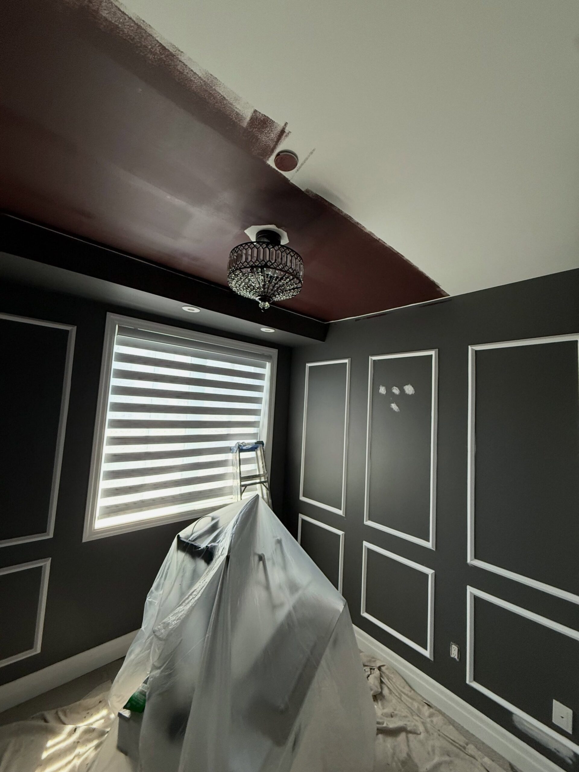
Now the ceiling. This is where most people quit. They tell themselves a white ceiling makes the room “feel taller” and leave it. That one call undoes the whole trick. A white ceiling draws a bright line around the top of the room, your eye hooks on it, and the box stays a box. Paint the ceiling the wall color and that line disappears. You stop measuring the height. A 10 by 10 office starts feeling like a cozy den instead of a converted closet.

Why Carnelian hits different than a true red
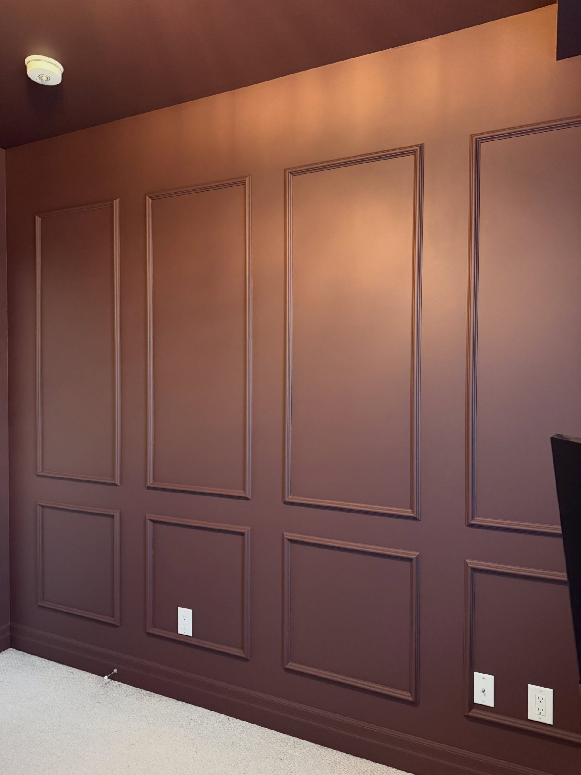
Here is where Carnelian earns its fee. In warm indoor light, it reads less like red paint and more like leather, closer to a tufted library chair than a bold accent wall. A true red would feel loud. A plum would push the room feminine. The brown base in Carnelian is what sells “handsome study” to an American reader, which is exactly the association she was reaching for.
The full before and after, side by side
The side-by-side makes the before suddenly feel obvious.
What she kept white on purpose
Pay attention to what she kept white on purpose. The window frame is still cream. The outlet covers stayed white. The carpet is still neutral. Little bright punctuation marks around the perimeter. Without them, the drench reads as a mistake, like she ran out of time. With them, it reads as restraint, like every surface was a choice.
Up close, the whole trick is one shadow
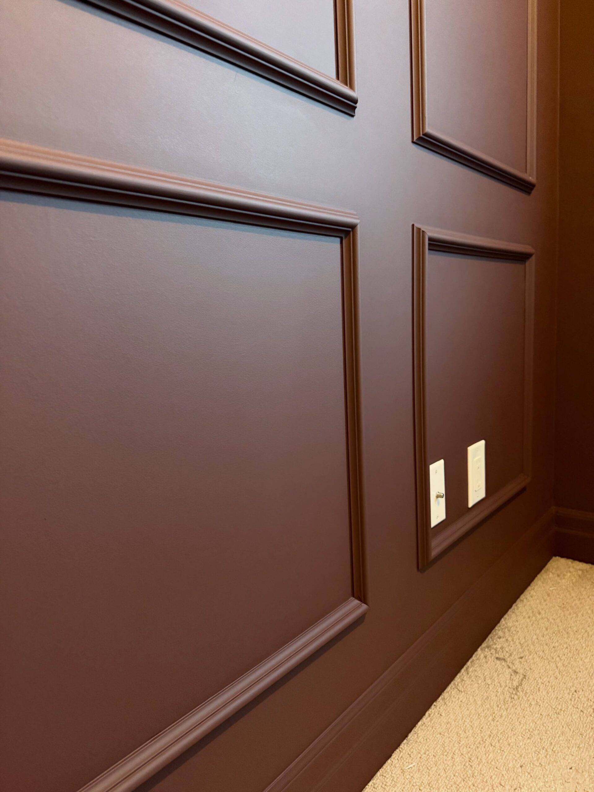
Up close, the whole magic is one small thing. Paint catches the lip of each profile. Shadow replaces the old white line. That shadow is what reads as expensive.
One weekend, one can, no demo
One can of paint. One weekend. No new trim, no demo, no contractor beyond the painter. The molding on your office wall is probably fine. It was the white paint on top of it that was costing you the custom look.