If you’ve stood in a dated cherry kitchen and tried to picture it painted, you know the problem. All-white oak makeovers are everywhere on Instagram, and most end up looking kind of flat. This one stands out because she didn’t paint it one color. She picked two, and she put them in the right places.
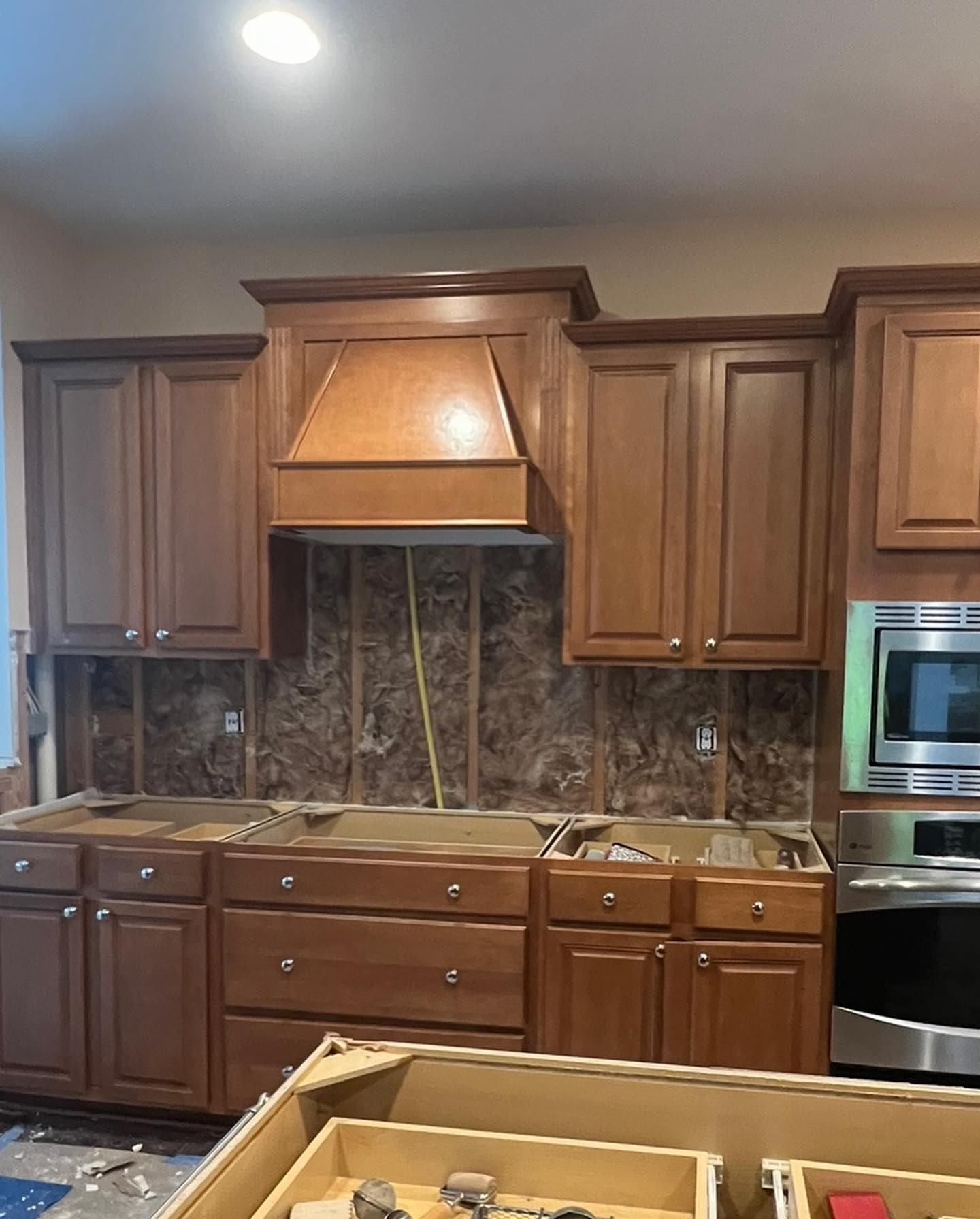
This is where she started. Deep orange cherry everywhere. Wall cabinets, lower cabinets, a huge wood hood over the cooktop, and an island that matched. The layout was fine. The marble backsplash and quartz counters were already there. But the wood color pulled everything toward one heavy brown tone, and warm recessed lights only made it worse.
The two-color move that most people skip
Instead of painting every cabinet white like the usual Pinterest tutorial, she split the kitchen in half. The perimeter went Sherwin-Williams Pure White (SW 7005), one of the cleanest cool whites they make. The island got Sherwin-Williams Iron Ore (SW 7069), a near-black charcoal with just enough warmth to feel soft instead of harsh. Two paint colors, one spray setup, and the whole personality of the room flipped.
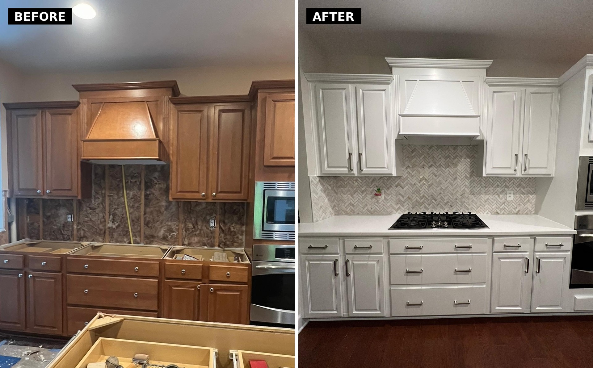
Look at the hood wall side by side. Same hood. Same wall. Same cabinet doors. Same backsplash tile. Nothing moved an inch. All that changed was the color, and suddenly the herringbone backsplash gets to breathe. Against the cherry, you barely noticed it. Against Pure White, it reads as the pretty marble it always was.
Why she made the island the dark one
The island is doing all the heavy lifting. This is the part most people miss when they try to copy a two-tone kitchen. The dark piece has to go on the smaller footprint, not the walls. If you paint the perimeter dark, the kitchen closes in. If you paint the island dark, it anchors the room without shrinking it.
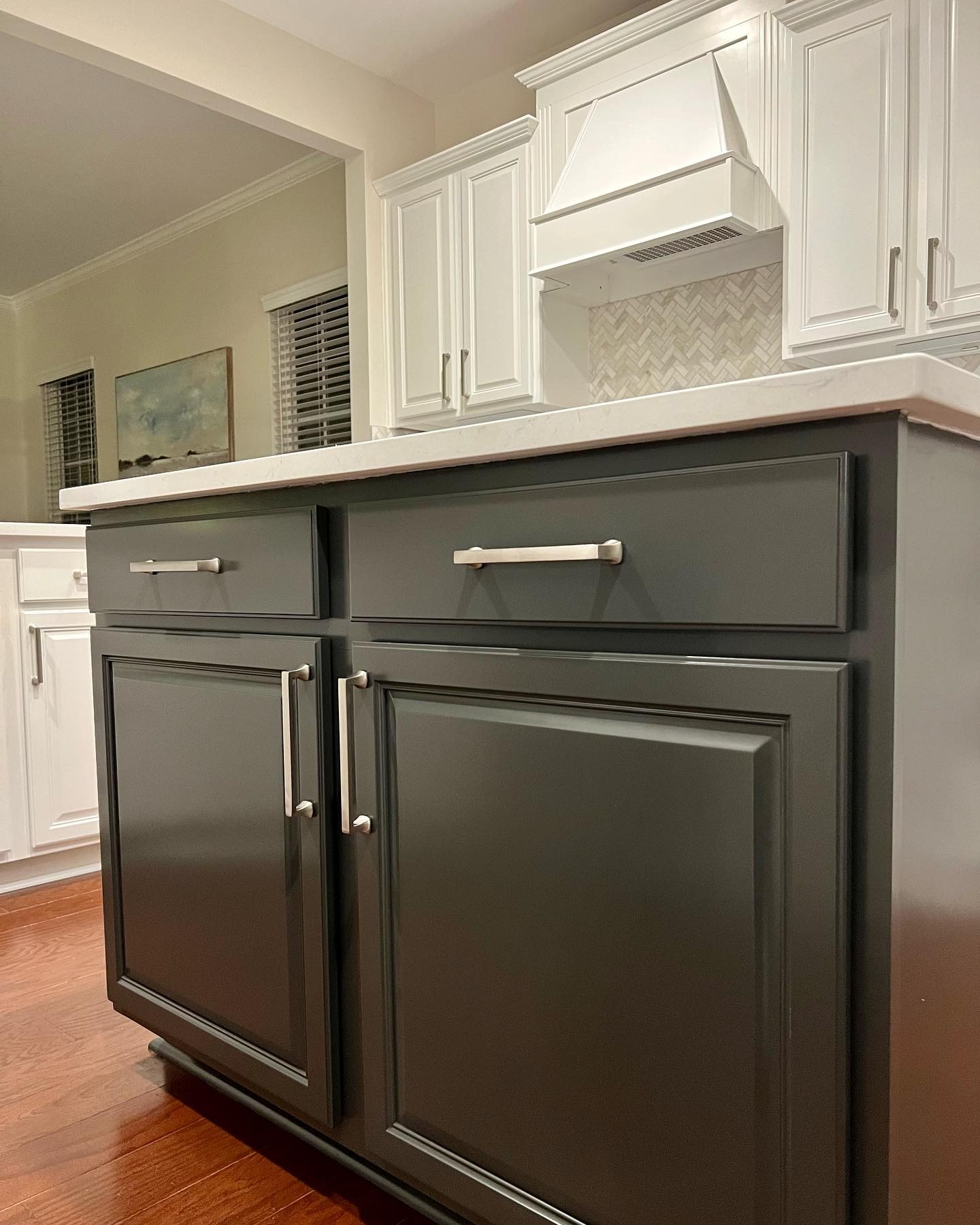
You can see how much depth the Iron Ore gives the room. The eye lands on the dark base first, then travels up to the bright white cabinets, and the whole kitchen reads as layered instead of washed out. It also helps the island take the daily hits better. Darker paint hides scuffs from barstools and hands in a way white paint never will.
The island had to be stripped first
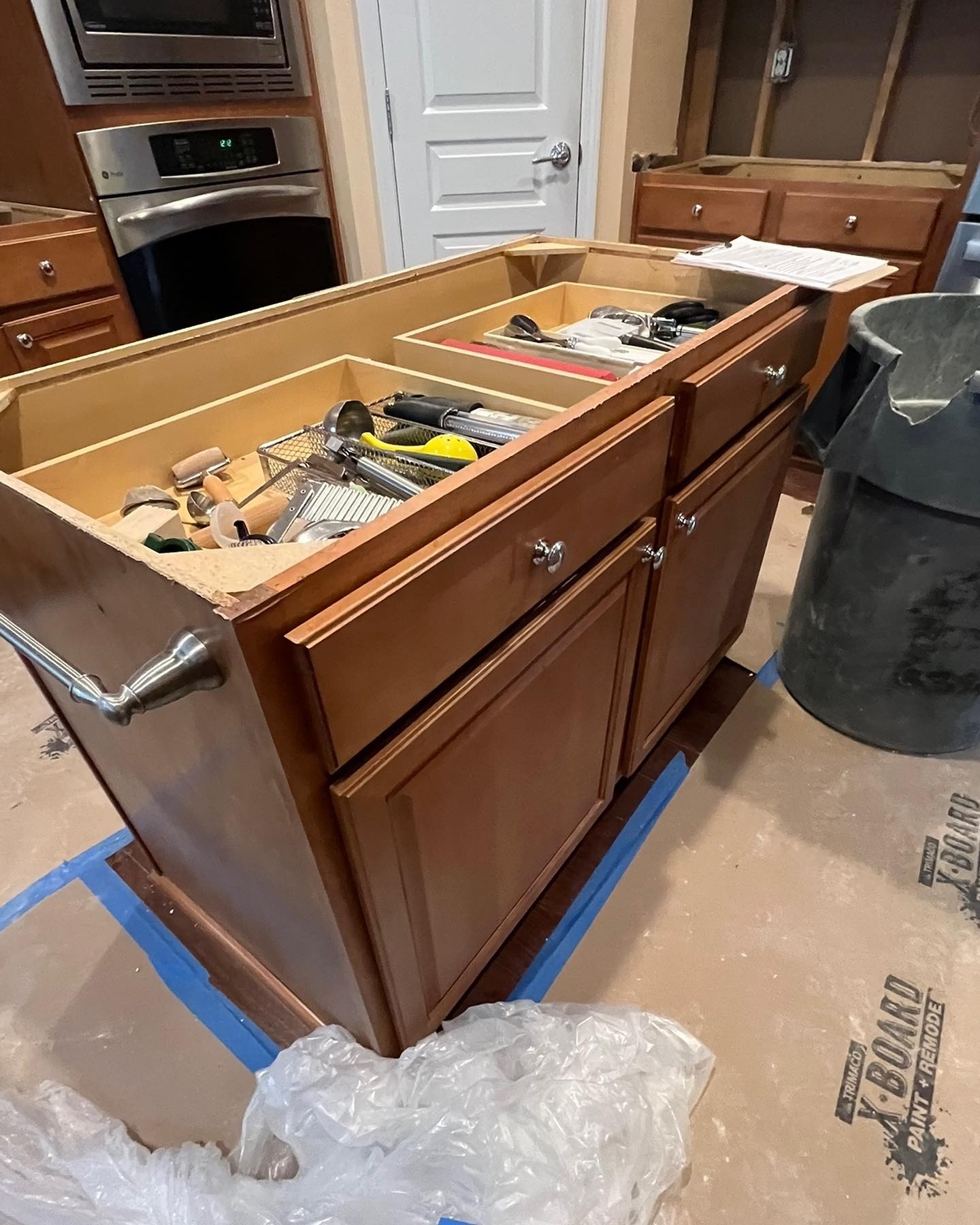
This is the honest middle of the project. Countertop off. Drawers yanked open and still full of her gadgets. Painter’s tape and X-Board paint protection all over the floor. You can see the boxes themselves never left the room. No ripping out, no new cabinetry orders, no contractor waiting on a shipment. Just a sprayer, a weekend, and patience.
The small hardware change that pulled it together
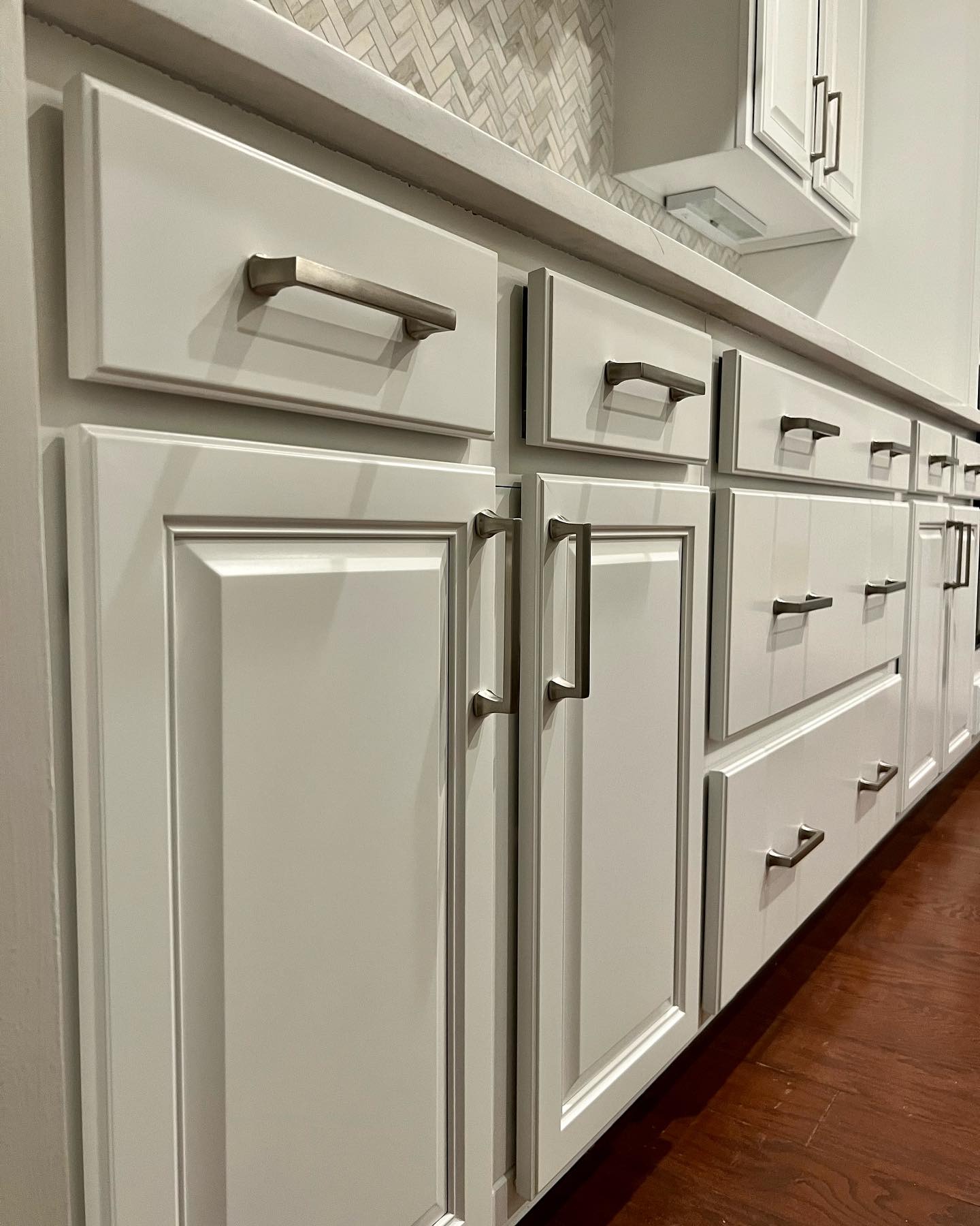
The other quiet win is the hardware. The original cabinets had tiny round knobs, the kind that scream mid-2000s builder. She swapped every one for flat, modern brushed nickel bar pulls. Still a budget fix, still something you can do in an afternoon, but those clean horizontal lines pull the whole kitchen into the current decade. The raised-panel doors would have looked dated with the old knobs. With the new pulls, they feel traditional with a modern edge.
The fridge corner tells the honest story
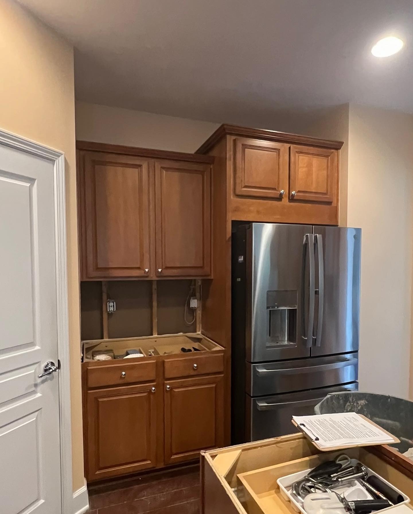
Before anything happened to this corner, it was dark on dark on dark. Three sides of brown wrapping around a stainless fridge. You can see why the whole kitchen felt heavy.
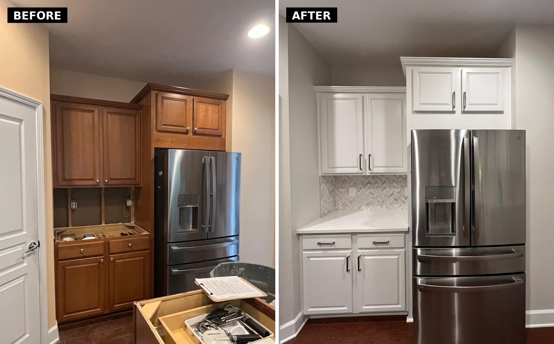
Put them side by side and the proof is right there. Same door on the left. Same tall upper cabinet. Same cabinet over the fridge. Same crown molding profile. Same fridge. The wall didn’t move, the appliance didn’t change, nothing structural shifted. But the corner went from feeling like a cramped service nook to feeling like the quiet, tidy end of a bright kitchen.
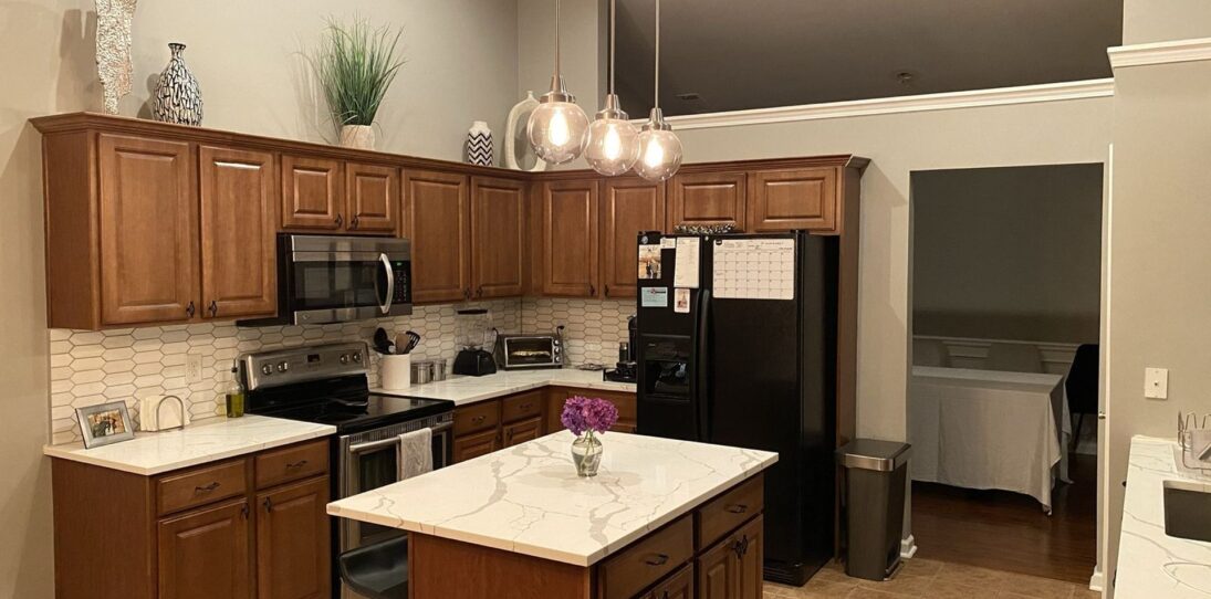

The after shots that keep getting saved
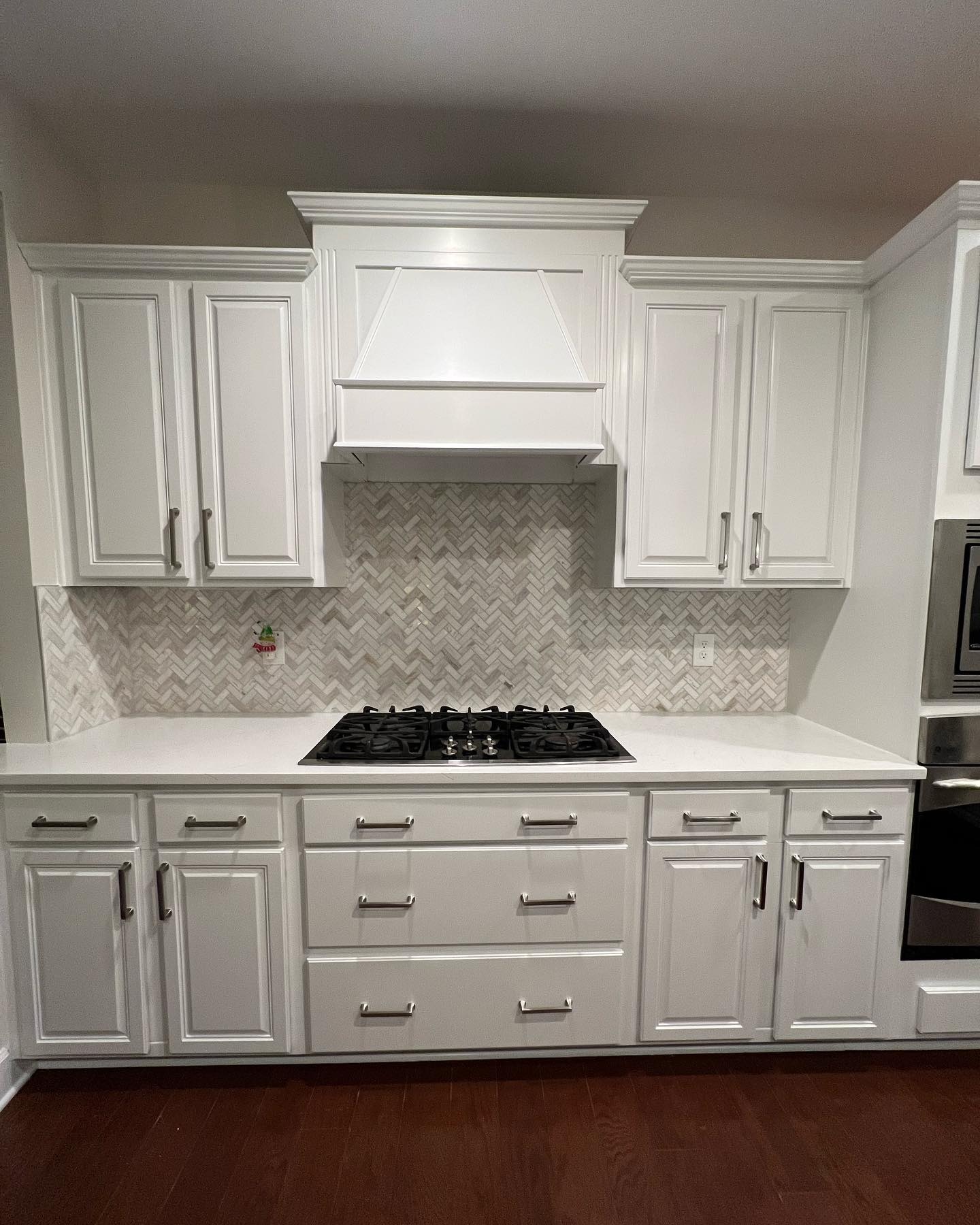
Head on, the hood wall reads like a brand new build. Same raised-panel doors, same hood shape, but with the modern pulls and clean finish they read as timeless instead of dated. Nothing on this wall is new except the paint and the hardware.
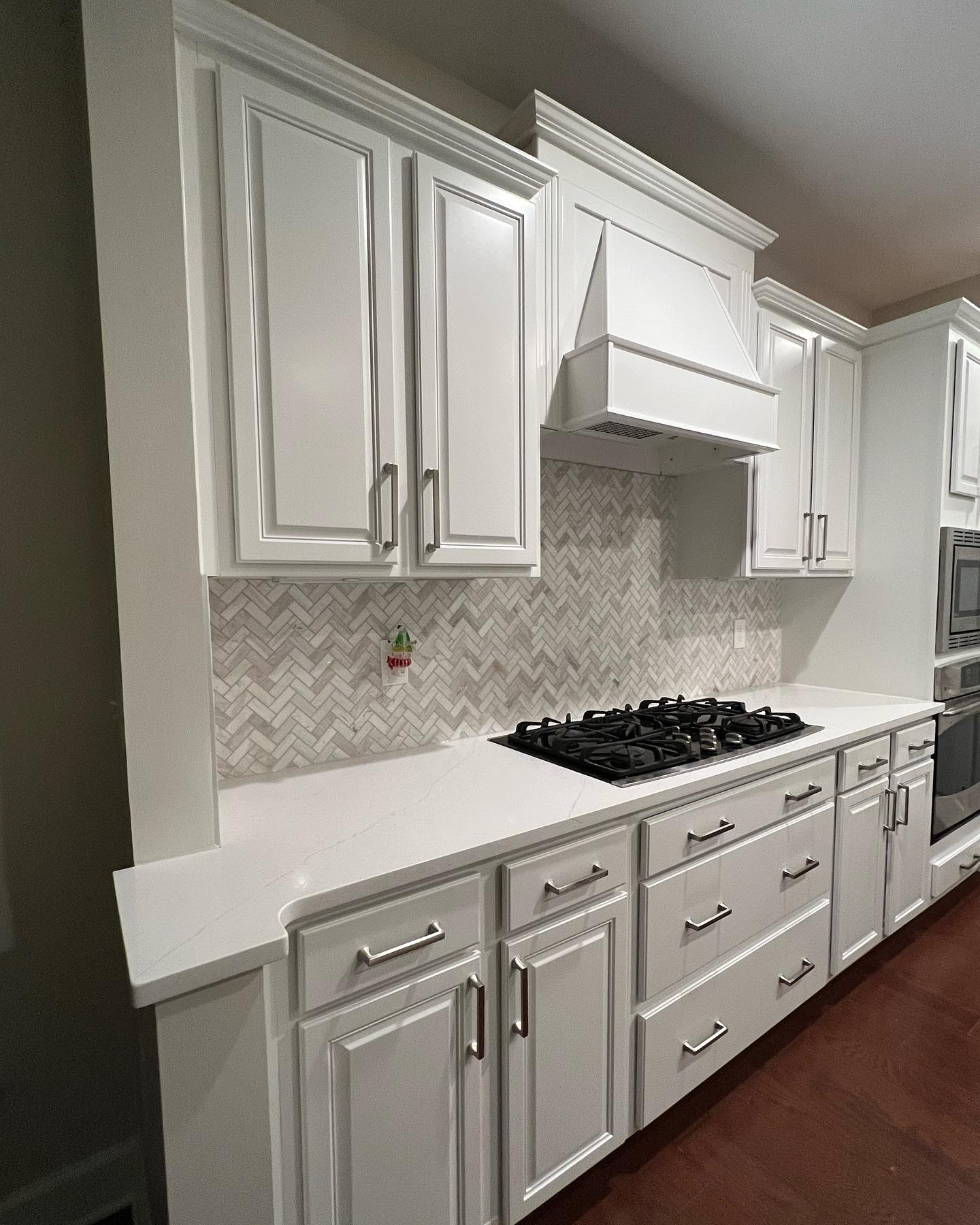
From this angle you can see how the Pure White takes on a slight warm cast under the recessed lights. It never goes blue or hospital-clean, which is the big fear most people have with a cool white. The herringbone backsplash finally gets to be the focal point it was always meant to be.
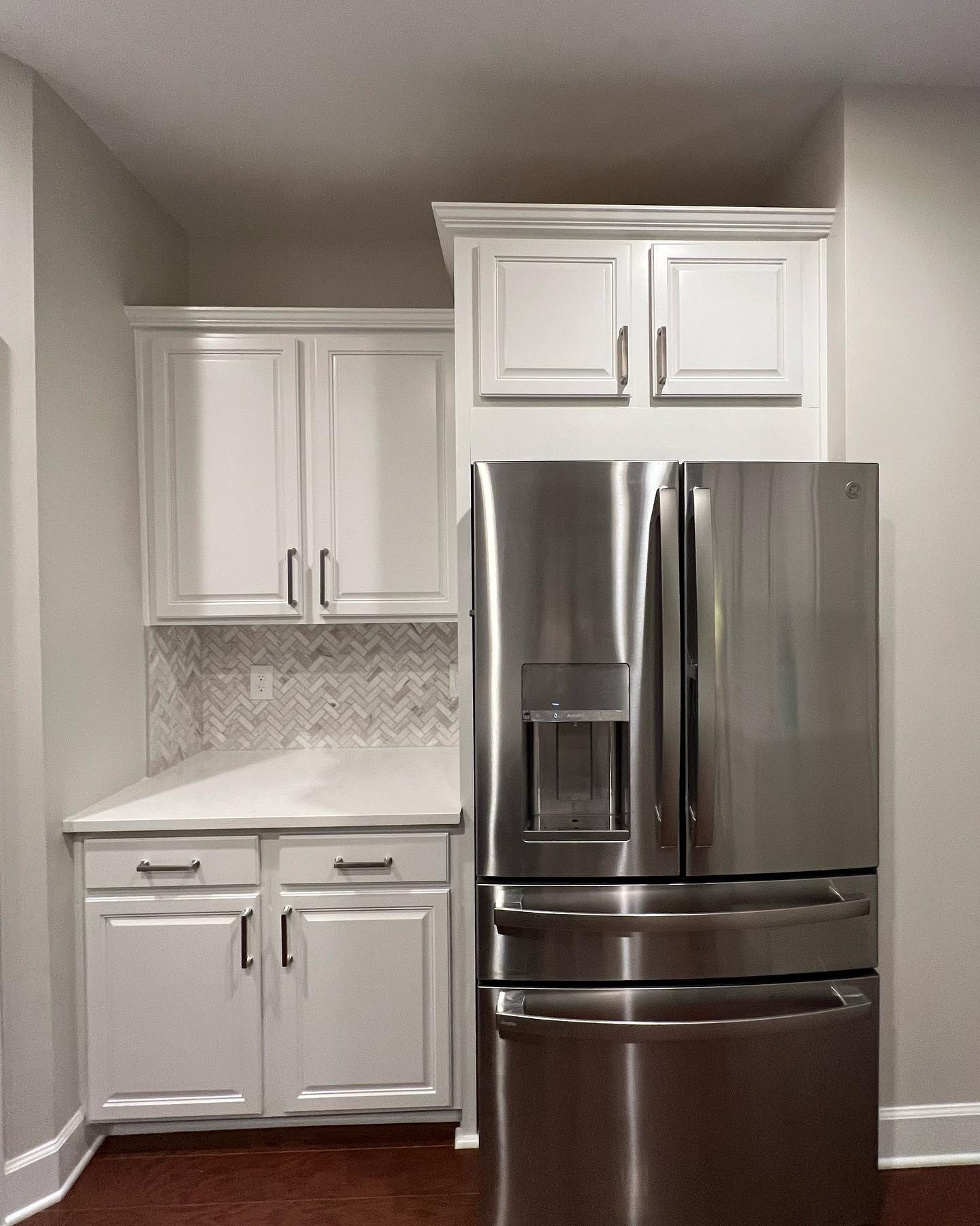
The fridge corner alone looks like a completely different kitchen. That’s the magic of a paint-only reno done well. No one walking in would guess the boxes are a decade old.
One wide shot that sells the whole idea
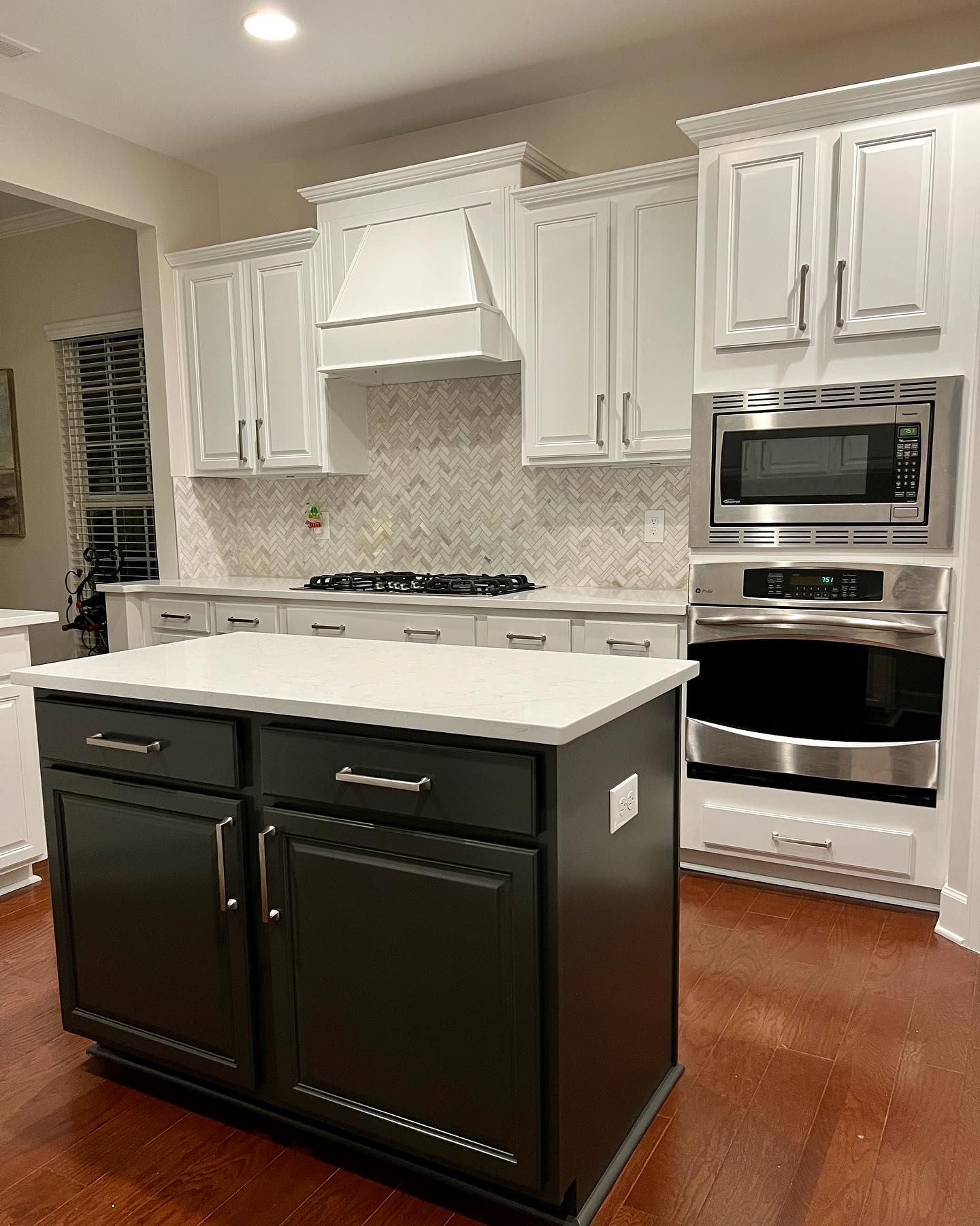
This is the shot that explains why the two-tone trick works. The dark island sits in the middle of all that white and gives the room a center of gravity. Without it, the kitchen would feel like a bright but flat box. With it, the room has layers and contrast and a reason to look at the island first. That’s the whole story.
What this actually cost
No new cabinets. No new counters. No new backsplash. No new flooring. No plumbing, no electrical, no permit, no contractor beyond the paint pros who ran the sprayer. She kept every single thing that was already working in this kitchen and only changed the one thing that wasn’t.
If your cabinets are dated but the layout is solid, this is the lane to steal from. Two cans of paint, a good sprayer, new pulls, and the discipline to leave one thing dark so the white has something to play against. That last part is what separates the kitchens people save from the ones people scroll past.