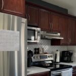
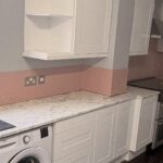
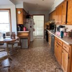
A new owner walked into a yellowed IKEA kitchen that was quietly hiding real copper counters, oak floors, and twin AEG ovens underneath. What she did about it took one weekend, two tins of paint, and no trade quote.
The first time she saw the kitchen, she nearly wrote the whole house off because of it. The cabinet doors were that yellowed shade of white that flat-pack fronts settle into after a few years of steam and sunlight. There was a strange orphaned vent pipe sticking out of the wall where a chimney hood used to live. Half the splashback was finished and half was raw plaster. It looked tired in the way that makes you reach for a pen and start scribbling demolition numbers.
She was ten minutes from calling it a gut job. Then she actually looked around.
What the previous owner had already paid for
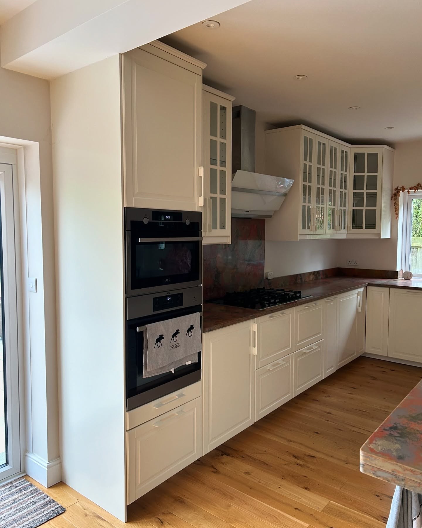
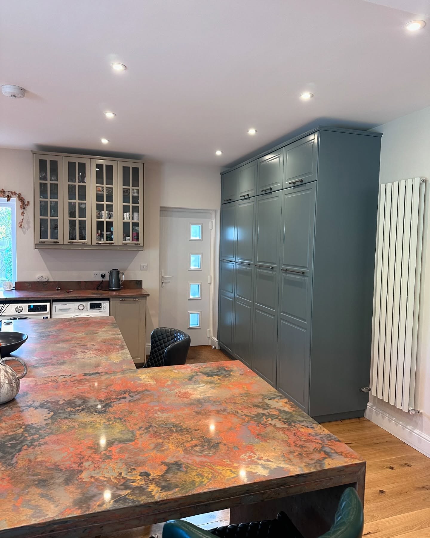
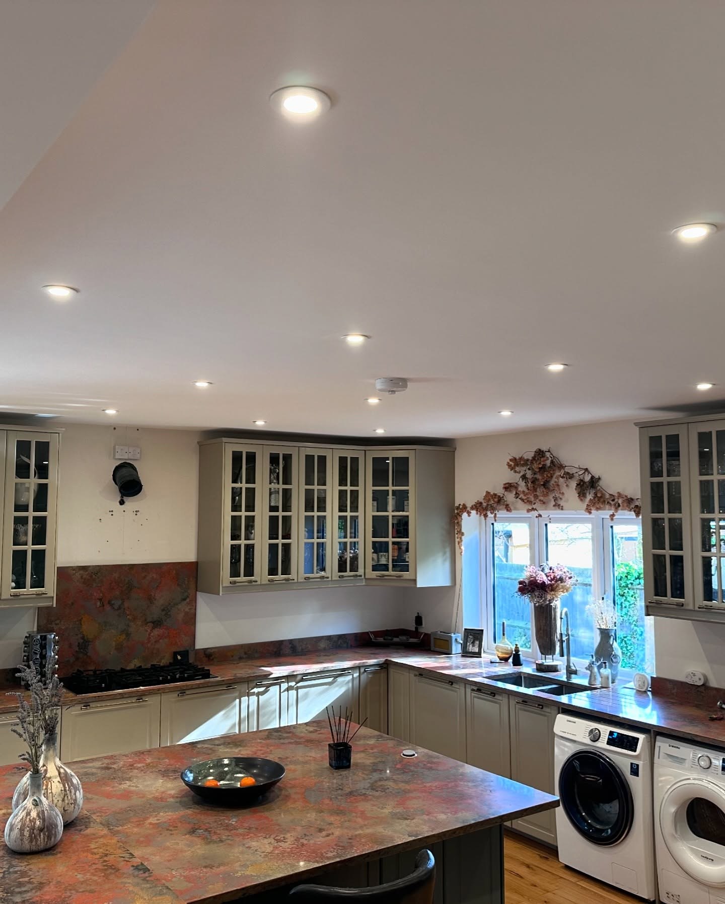
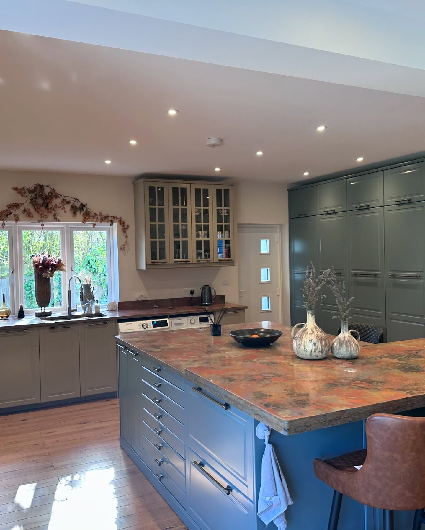
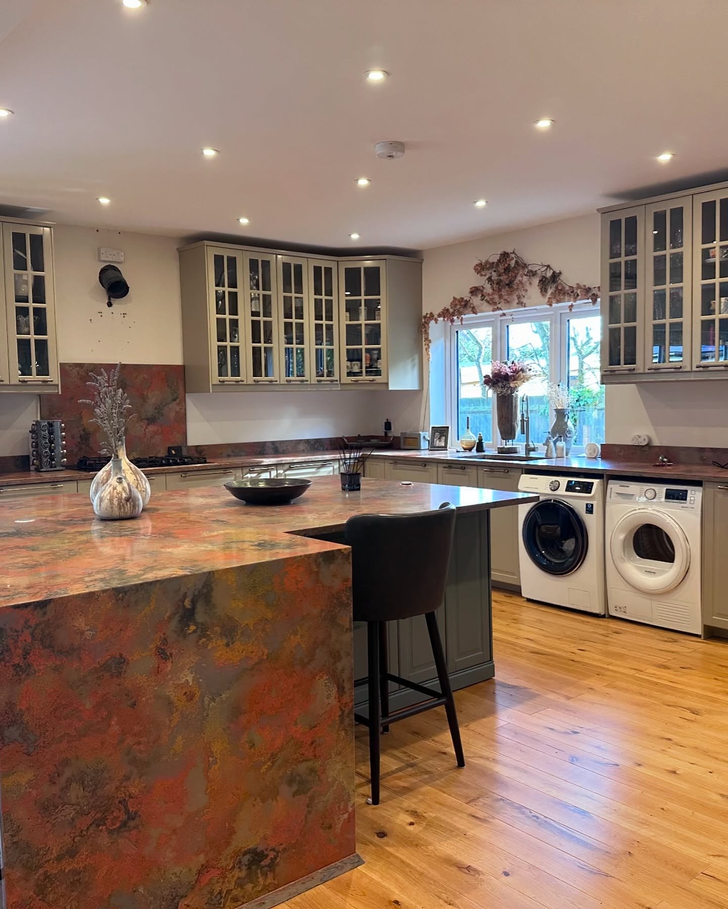
The counters were copper patina, poured and sealed, with real rust and amber bleeding through slate. Not laminate pretending to be copper. The actual thing. The splashback behind the hob was cut from the same stuff. Underfoot was wide-plank oak, finished properly, the kind of floor that gets better with scuffs instead of worse. Behind one door sat a pair of AEG ovens stacked in a tall housing. A gas hob with cast iron grates. Glazed wall cabinets with internal LED strips. A double Samsung utility stack set into the counter run without a gap.
None of this is flat-pack money. Someone had spent a serious budget in this room. And then, somewhere near the end of that budget, they had bolted on the cheapest doors in the IKEA catalog and called it finished.
Why this happens on nice houses
It is the oldest story in renovation. You start with the bones. Layout, flooring, counters, appliances, extraction, electrics. The invisible and semi-visible things quietly eat the entire budget. By the time you reach the doors, which happen to be the only thing a guest actually notices from the hallway, the money is already spent. So you walk into a showroom and pick the cheapest fronts that will close over the drawers you already bought. You tell yourself you will upgrade them in a year.
A year passes. Three years pass. The doors yellow. Everyone stops noticing them because everyone stops noticing anything they see every day. Then you sell the house, and a new person walks in, and the first thing they see is the door you promised yourself you would upgrade.
What she changed and what she left alone
She did not touch the carcasses. She did not touch the counters, the splashback, the floor, the sink, the taps, the hob, either oven, the washer, the dryer, the LED strips, or the layout. She did not take a sledgehammer to anything. She did not live out of a microwave for two months.
She did three things.
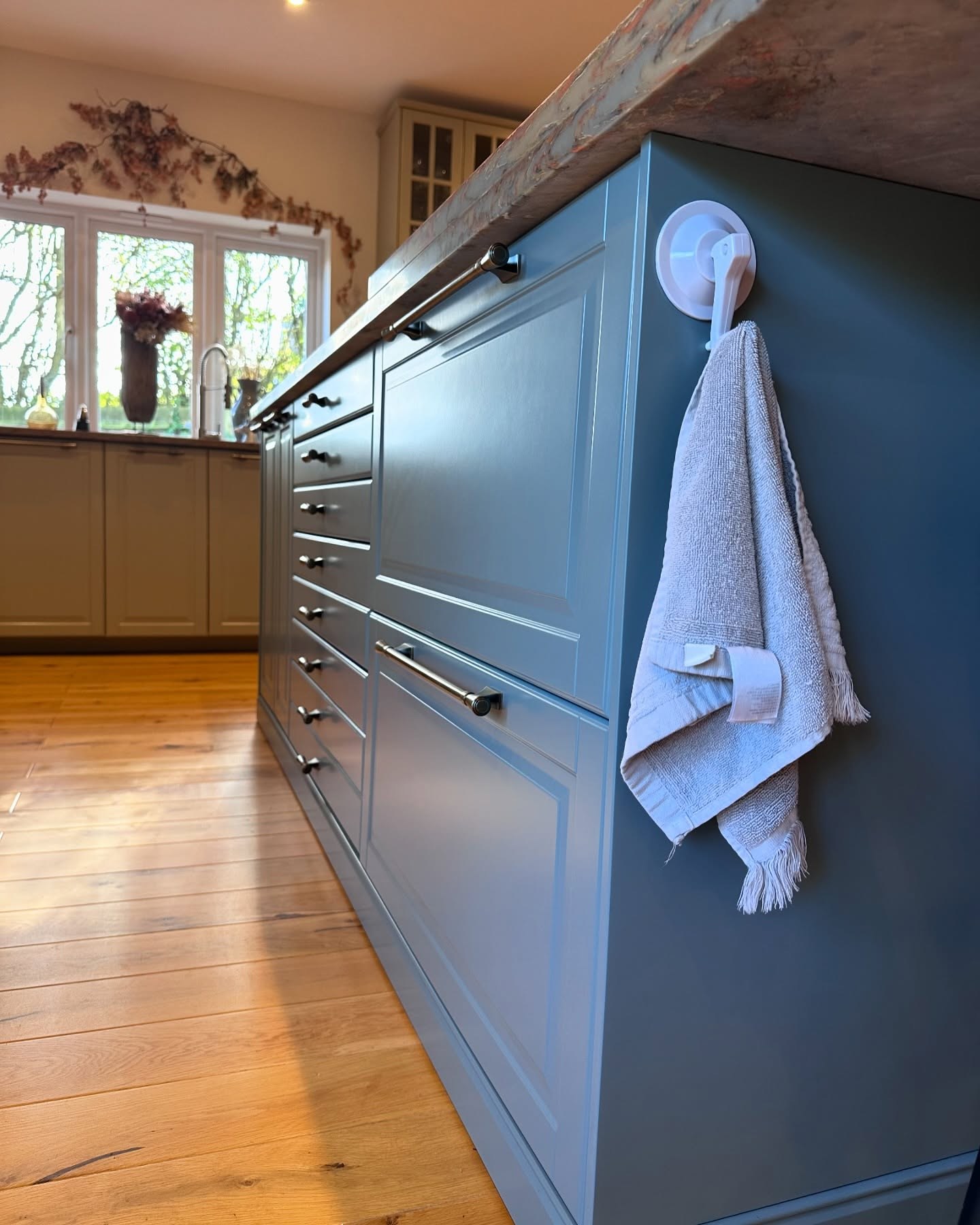
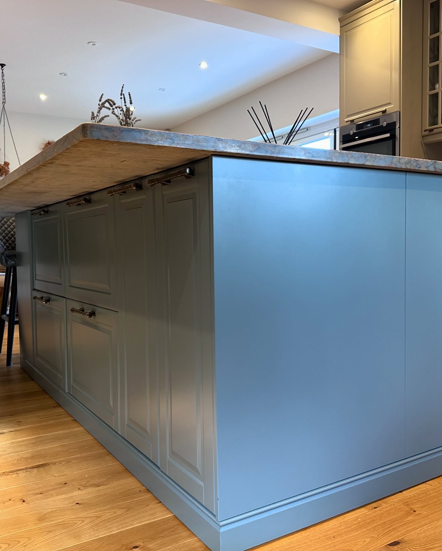
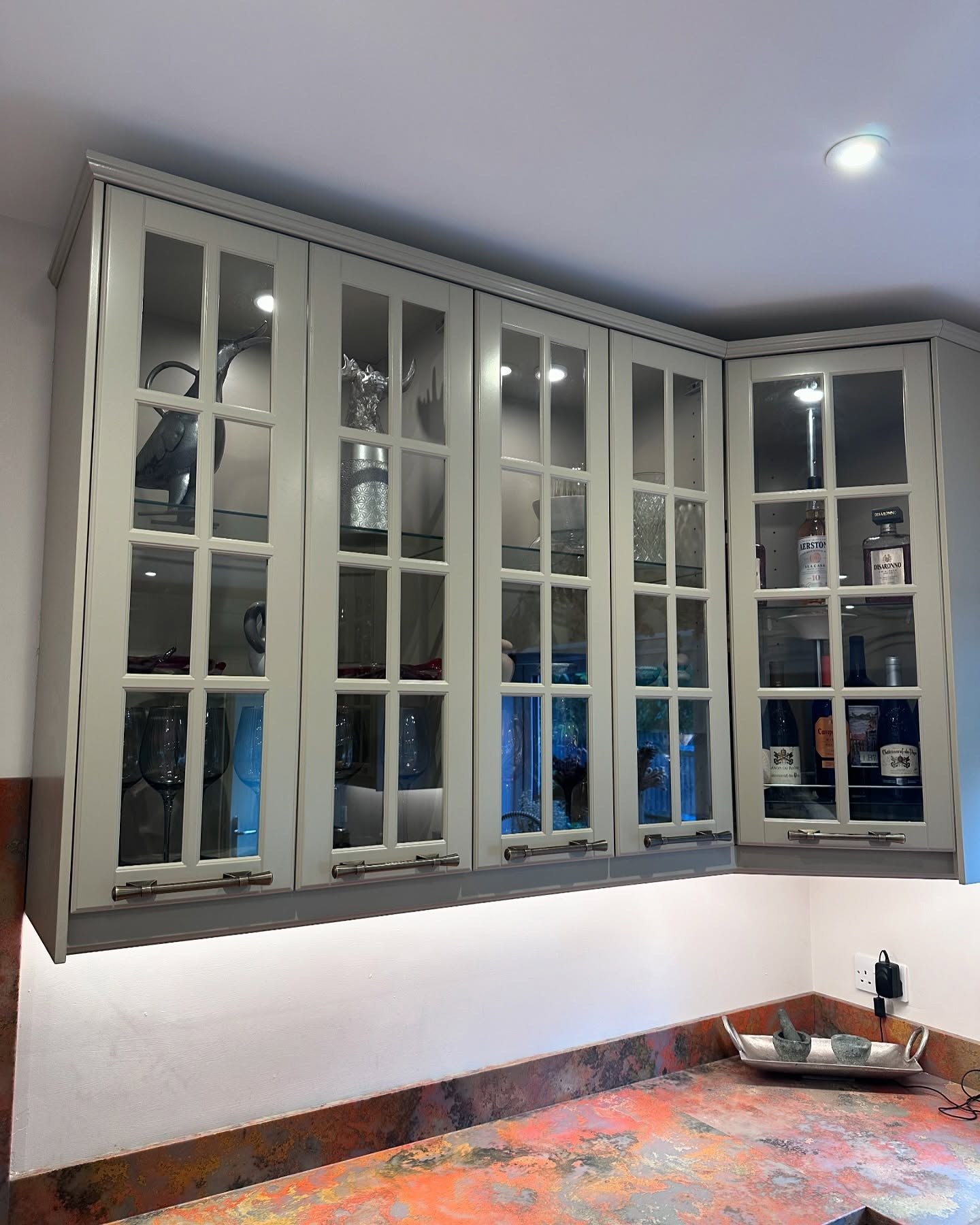
She painted the wall cabinets and their frames in Farrow & Ball Light Gray, which despite the name reads as a warm putty tone, not a true gray. She painted the island and the whole run of floor-to-ceiling pantry doors in Farrow & Ball De Nimes, a deep blue that goes almost charcoal in low light and reveals a quiet teal note when the window hits it. And she pulled every IKEA handle off the cabinets, replaced them with long brushed-nickel bar pulls on the tall doors and small bronze-tone cup handles on the drawers, and repositioned several of them so the proportions stopped reading as flat-pack.
Three decisions. One weekend of work.
Why the counter suddenly looks expensive
Here is the thing nobody talks about with copper patina surfaces. On flat white doors they read as loud. Almost tacky. Your eye cannot figure out whether to look at the counter or the cabinets, so it bounces between them and the whole kitchen starts to feel busy.
Dark the cabinets down and the counter stops shouting. The slate undertones in the copper find the blue in the island and lock in. The amber finds the warmth in the Light Gray and relaxes. You stop seeing a loud countertop on a cheap kitchen and start seeing a designed surface that the room was clearly built around. Nothing physically changed about the copper. The frame around it changed, and the frame is what decides whether something looks like a feature or a mistake.
The island is where the money looks like it went
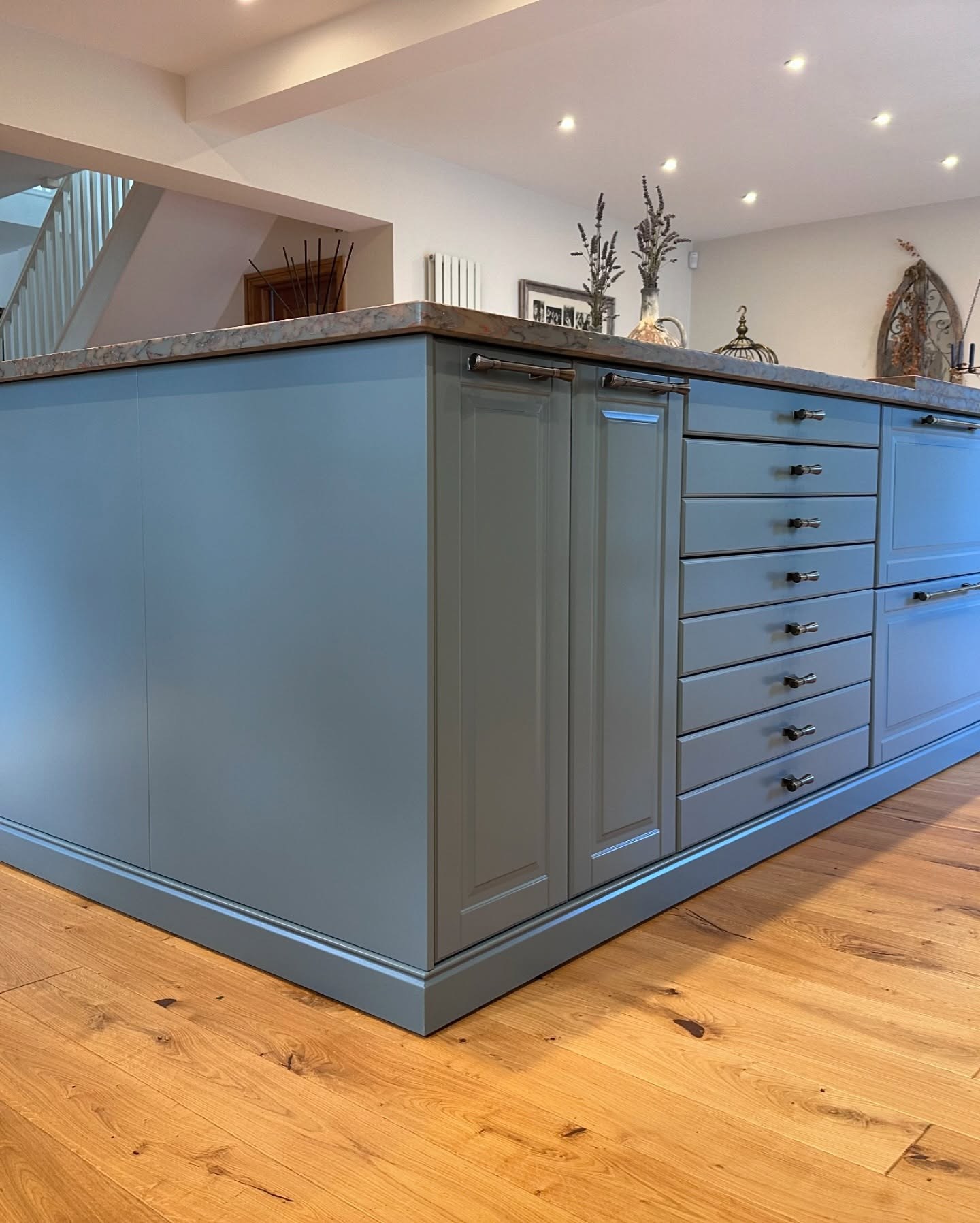
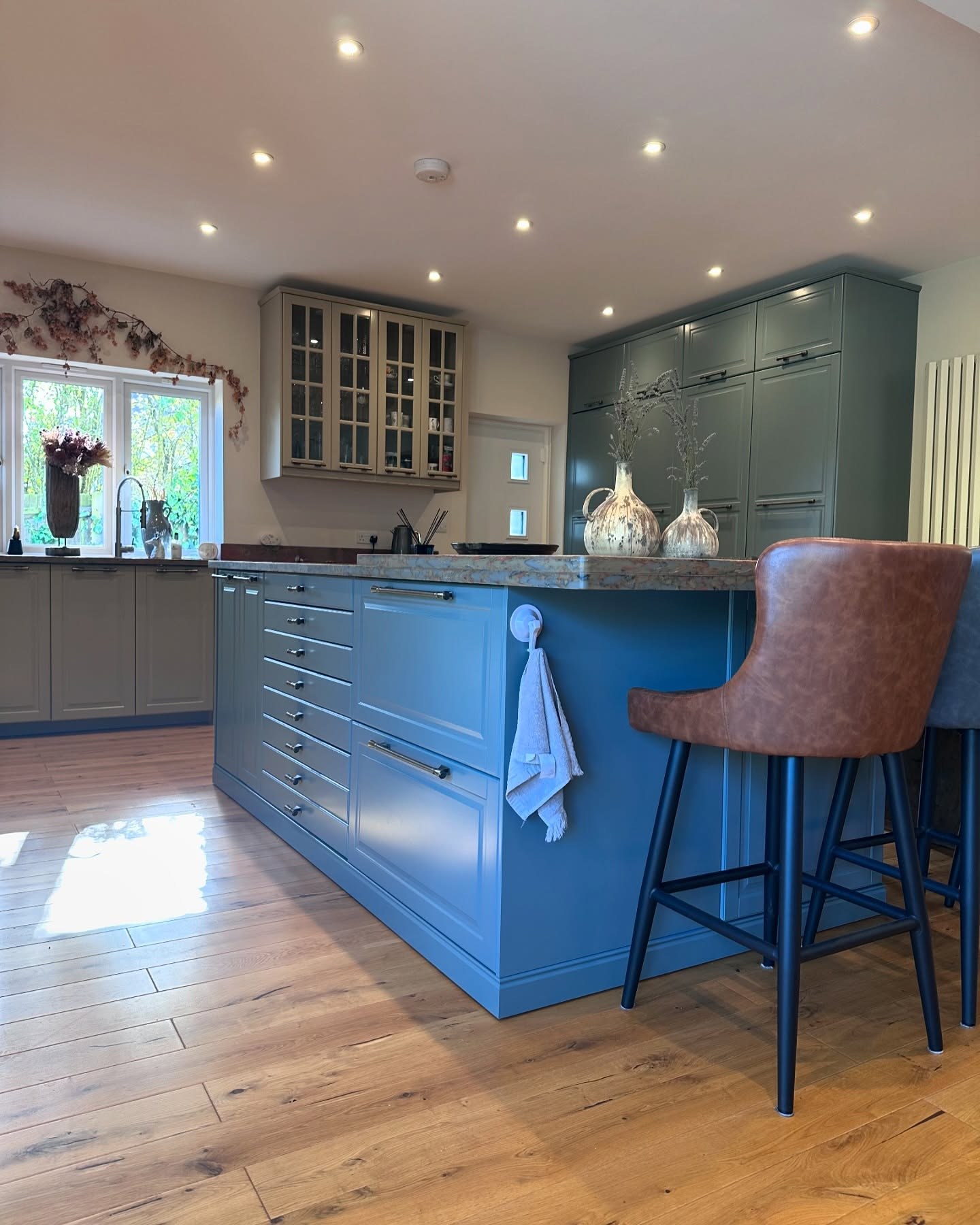
If the kitchen has a hero now, it is the island. De Nimes is a particular kind of blue. It is dusty enough to feel grown-up instead of nautical, deep enough to anchor a room with warm floors, and quiet enough that the counter on top of it stays the focal point.
Walk around to the service side of the island and you can see how far the thinking went. The drawers are stacked eight deep in one bank. Bar pulls on the doors are long enough to span two drawer heights, which is a design cue borrowed from bespoke joinery. The cup handles on the drawers are set flush to the top edge of each drawer face, not centered, so the fronts read like cabinet drawers instead of catalog boxes.
The handle swap is doing more than you think
Paint gets the credit on jobs like this because paint is the obvious change. The handles are what keep the room from reading as “someone painted their IKEA.” It is the detail that fools your eye into thinking the whole thing was custom.

Three things to notice. First, the finish is consistent across the entire kitchen. Brushed nickel on the bar pulls, bronze-tone on the cups, both warm metals that pick up the copper in the counter instead of fighting it. Nothing chrome. Second, the pulls are long. A short handle on a tall door makes the door look like a locker; a long bar pull makes it look like furniture. Third, where she moved them, she moved them to spots a joiner would have picked. Top edge on the drawers. Centered a third down from the top on the tall doors. Little decisions that add up to a kitchen that nobody would guess started life in a flat box.
Why the Light Gray side is almost invisible
This is the part that would be easy to miss. Farrow & Ball Light Gray is not a gray in any ordinary sense. Hold a chip of it next to the old cream doors and it looks like you barely changed anything. That is on purpose.
If she had painted the wall cabinets a cooler, truer gray, the kitchen would have split in half visually. One side blue, one side gray, counter in the middle, and your eye would not know where to settle. Light Gray is warm enough to hand the show to the island and the pantry wall without disappearing. It still gives the glazed uppers weight. The LED strips inside the glass doors stop looking like a leftover IKEA feature and start looking like a bar cabinet.
How two colors avoid fighting each other
Two-tone kitchens go wrong when nobody decides which color is the lead. The rule she stuck to is simple enough to steal. The softer color does the wall-mounted and perimeter cabinets. The stronger color goes on the pieces that stand on the floor and act like furniture. Island and pantry bank in De Nimes, everything else in Light Gray.
What that gives the room is a center of gravity. Your eye walks in and lands on the blue. It stays there, looks at the counter, and then drifts out to the lighter perimeter. If both colors competed, the room would feel busy. One leads, one supports, and the whole thing settles.
What this should tell you about your own kitchen
Nobody is suggesting every tired kitchen is sitting on secret copper counters. But a lot of kitchens are quietly better than the doors on them. Decent slab fronts hiding under old laminate. Solid carcasses hiding under paint that went chalky. A perfectly good hob under a hood that dates the whole room. A floor that has another twenty years in it. Lighting that already works.
Before you call anyone for a quote, stand in the middle of your kitchen and take inventory of what was actually paid for underneath. Counters. Floor. Appliances. Layout. Extraction. If three of those five are good, you are closer to a different kitchen than you think. A tin of the right paint, a bag of the right handles, and one weekend with a roller might get you there. The previous owner of this house spent a fortune and still got it wrong. The new owner spent a weekend and got it right.
That is worth staring at your own doors for a minute.