

Most of us have an entry like this and most of us pretend it doesn’t exist. A squeeze of floor by the front door. A closet with cheap hollow bifolds. A staircase shooting straight up. You walk through it, drop your keys, forget it.
Denise Godbout (@denisegodbout on Instagram) refused to keep pretending. She picked a color a lot of people would never try on such a small space, taped a line at chair-rail height, and turned the whole thing into a room you want to stand in. The paint is Benjamin Moore Cinnamon Slate. The move is smaller than it looks.
Scroll back to the realtor photo from 2019 and you’ll see the problem.
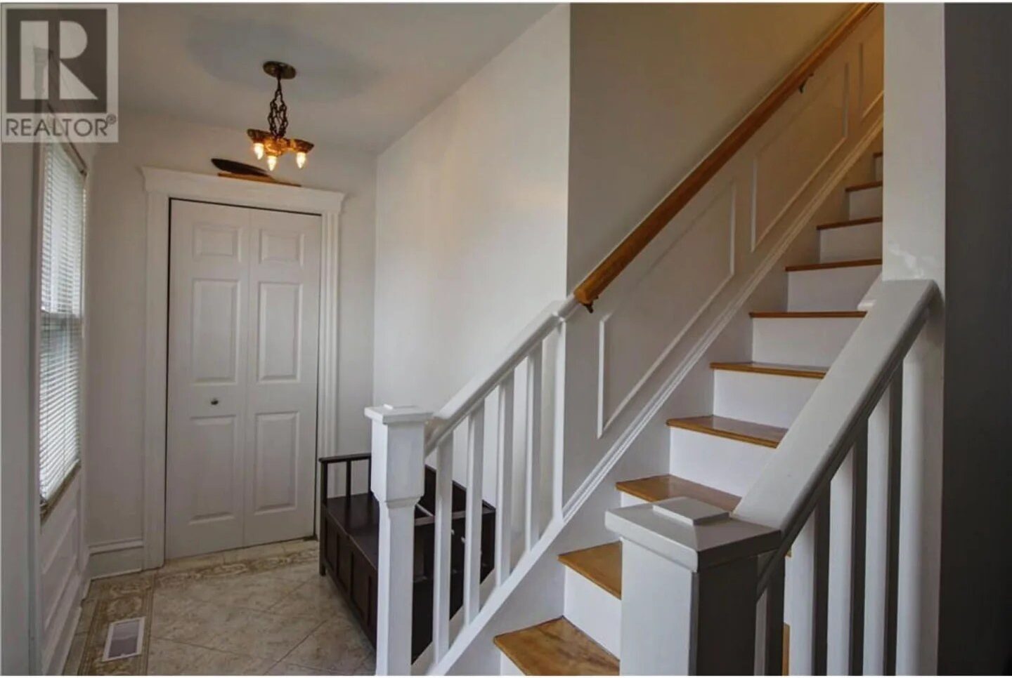
Flat off-white everywhere. White trim, white doors, white walls, white banister. A little antique chandelier pretending to add charm. A dark bench shoved in to break up the vacancy. The tile on the floor is actually pretty (that scrollwork border is the best thing in the room) but the rest of the space is doing nothing to back it up.
By 2021 she’d softened the edges. Sheer curtains. A distressed round mirror. A coat rack tucked in the open closet.
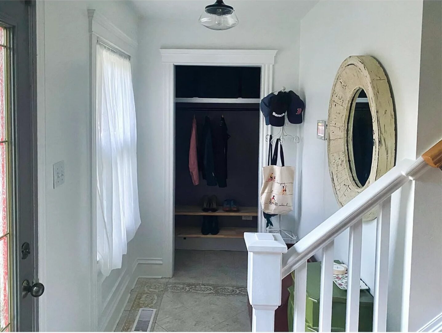
Here’s what I love about including that middle edit: it proves the point. Nice accessories can’t save a space drowned in one flat color. The walls were still blank. The closet still read as builder-grade. The hallway still felt like a hallway.
The one tape line that fixed everything
Here’s the move, and it’s smaller than you think.
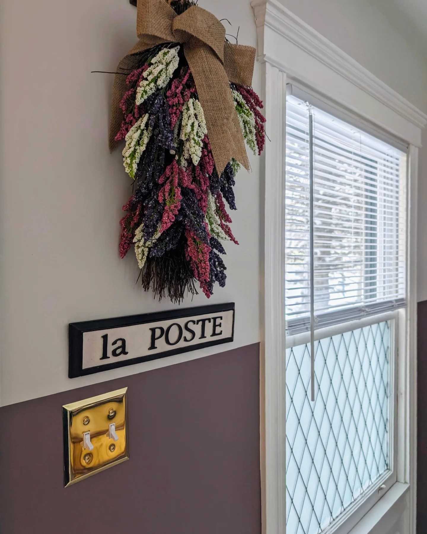
She painted the bottom portion of every wall in Cinnamon Slate (that smoky, dusty mauve-brown everyone is talking about). She stopped at roughly door-casing height, maybe four and a half feet up. Above the line and across the ceiling, she used Benjamin Moore Pale Oak, a warm creamy off-white. Then she painted the bifold closet doors, the door frame, and the baseboards in the same Cinnamon Slate as the lower wall.
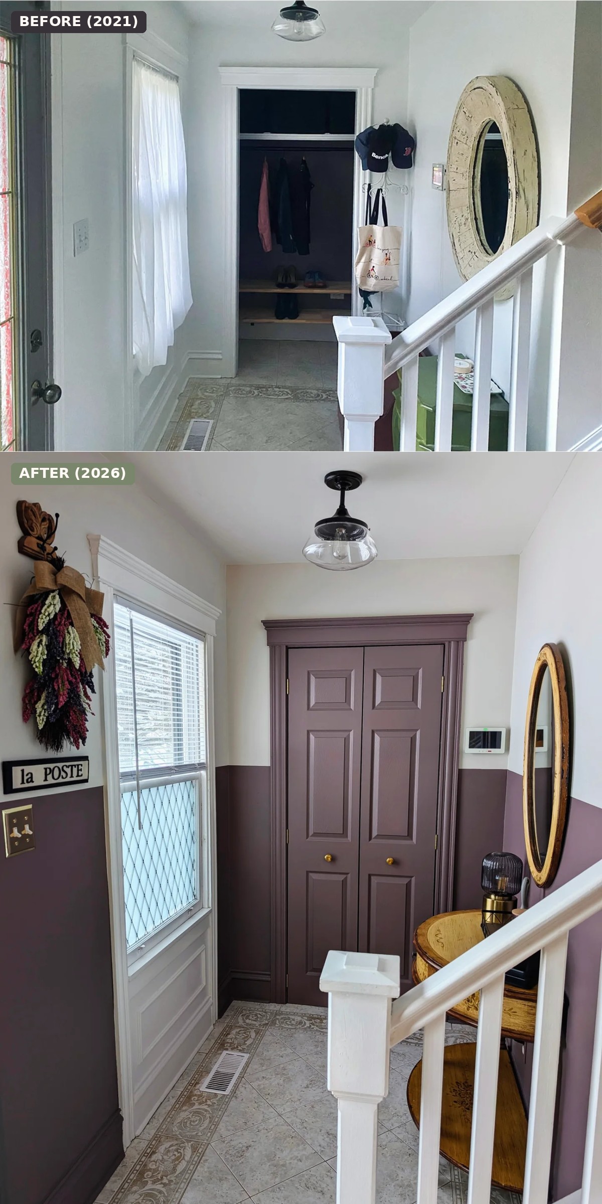
Why does this work in a space this tiny? A couple of reasons, both worth stealing.
First, the color block at chair-rail height tricks the eye. Your brain reads the wall as two pieces, almost like there’s wainscoting under a chair rail even though there’s no molding. The upper half pushes the ceiling up. The lower half grounds everything so the furniture feels anchored instead of floating.
Second, pulling the trim and the closet doors into the dark color is the brave call most people won’t make. We’re trained to keep trim white “to brighten things up.” But in a small entry, every white edge becomes a visual bump. Paint the trim in, and the eye glides. Fewer edges, bigger room. That’s the whole trick.
The color that pulls a quiet bait and switch
Cinnamon Slate is what paint-nerds call a chameleon. It shifts a lot depending on the light.
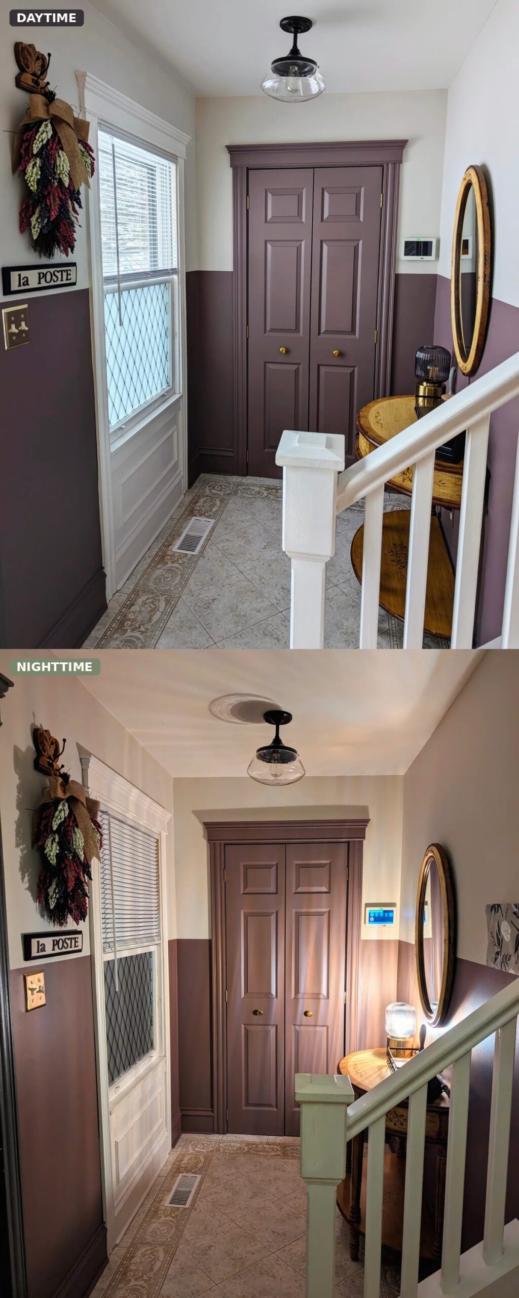
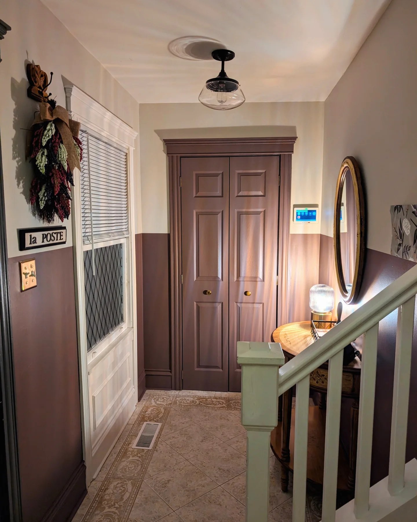
In the daytime the walls read as a cool, muted mauve-brown. Almost a greige with a pink secret. Under warm bulbs, the same walls shift into a glowing rosy plum, closer to Benjamin Moore Barberry. Denise said it herself: the night version looks like Barberry, the day version does its own thing. Two colors, one paint can.
Here’s the full night mood:
And the daytime cool version:
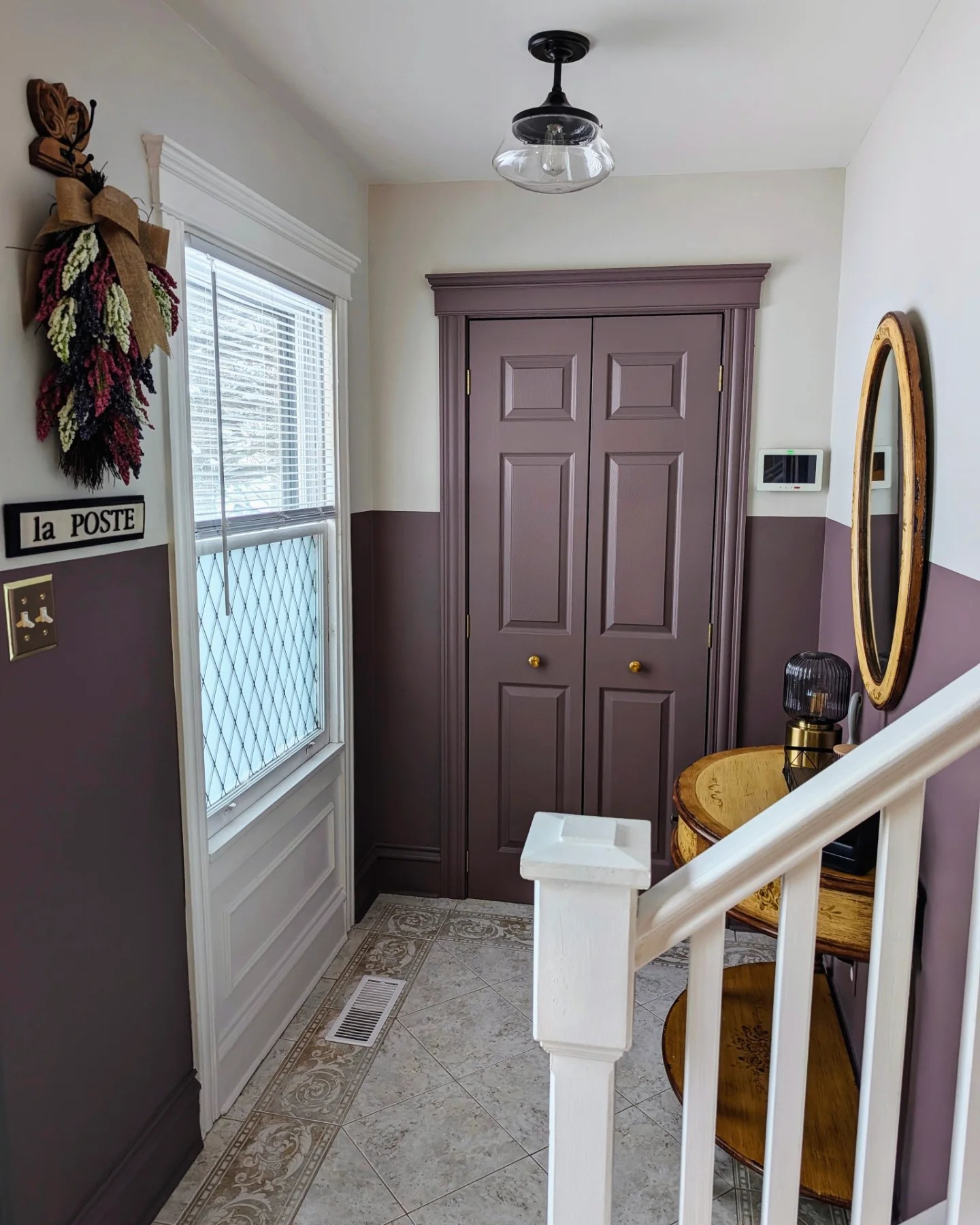
If you’ve ever been burned by a paint color that looked perfect on the chip and sad on the wall, this is the opposite problem. You get two moods from one pick.
The small finishes doing big work
Paint got the wall there. The hardware and the thrifted pieces are what make it look expensive.
The closet doors got a swap to beehive-style polished brass knobs from Yesterhome. Tiny change. Massive upgrade.
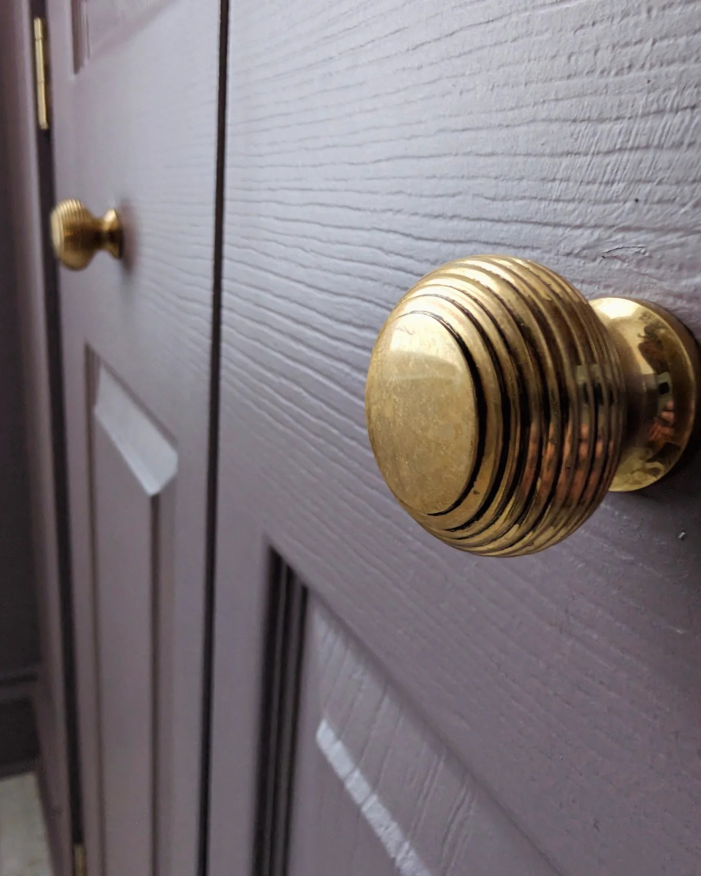
Gold hardware against a muted mauve door is one of those pairings that makes people assume you hired a designer. It’s the same color move you see in old Parisian apartments. The knobs are small, but they carry weight.
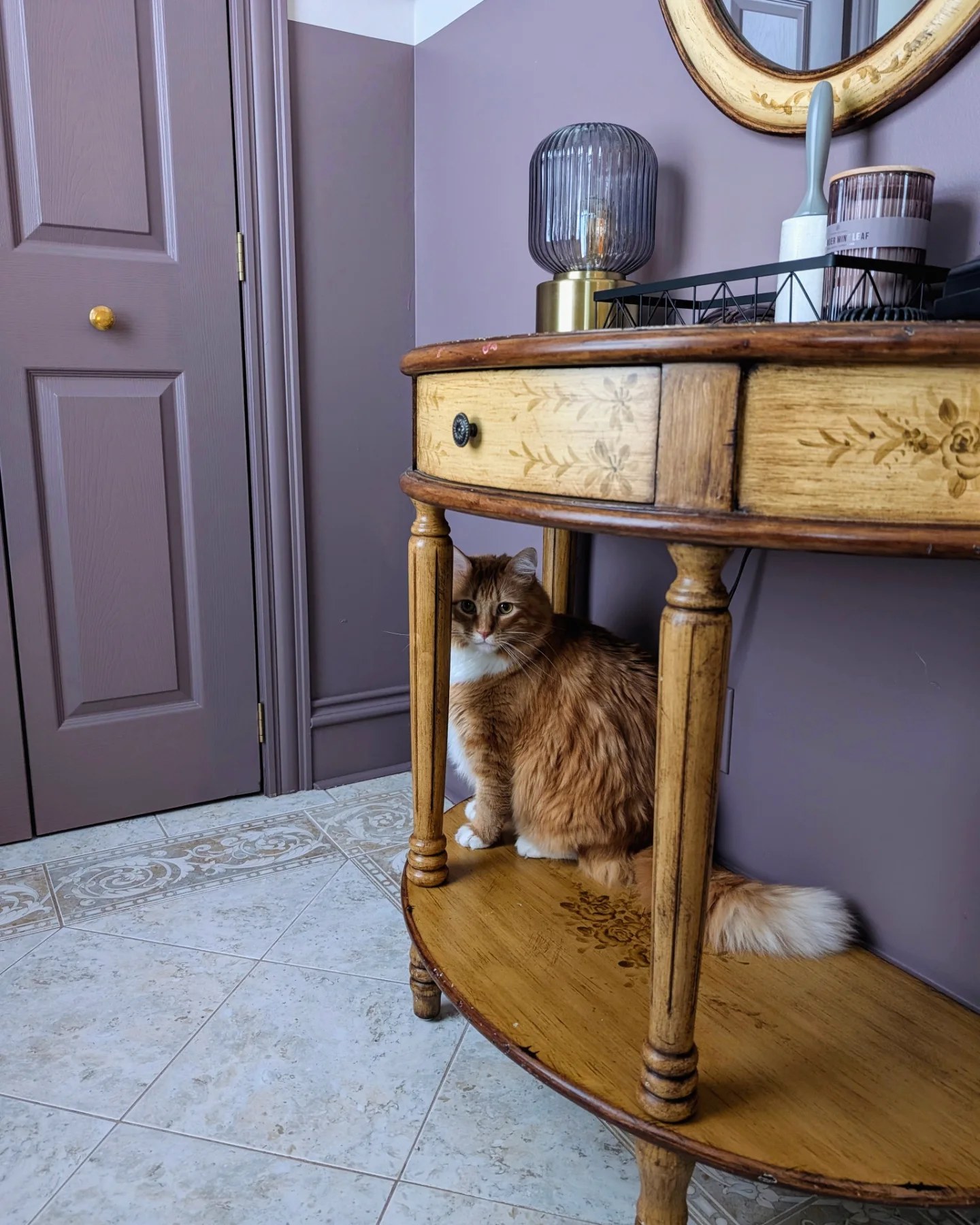
The half-moon table and oval gilded mirror both came from Facebook Marketplace. Against the old white walls they would have looked like two orphan antiques. Against Cinnamon Slate, the wood tones and gold leaf read as deliberate. Parker the cat agrees.
The la Poste sign is the kind of detail that could read as too much in a different space. Here it lands because it sits right at the color line and bridges the upper and lower halves of the wall. The brass double switchplate underneath picks up the knob finish. Everything is talking to everything else.
How she made it feel like part of the house, not a hallway
The real sign a small space has leveled up: it doesn’t end at the doorway.
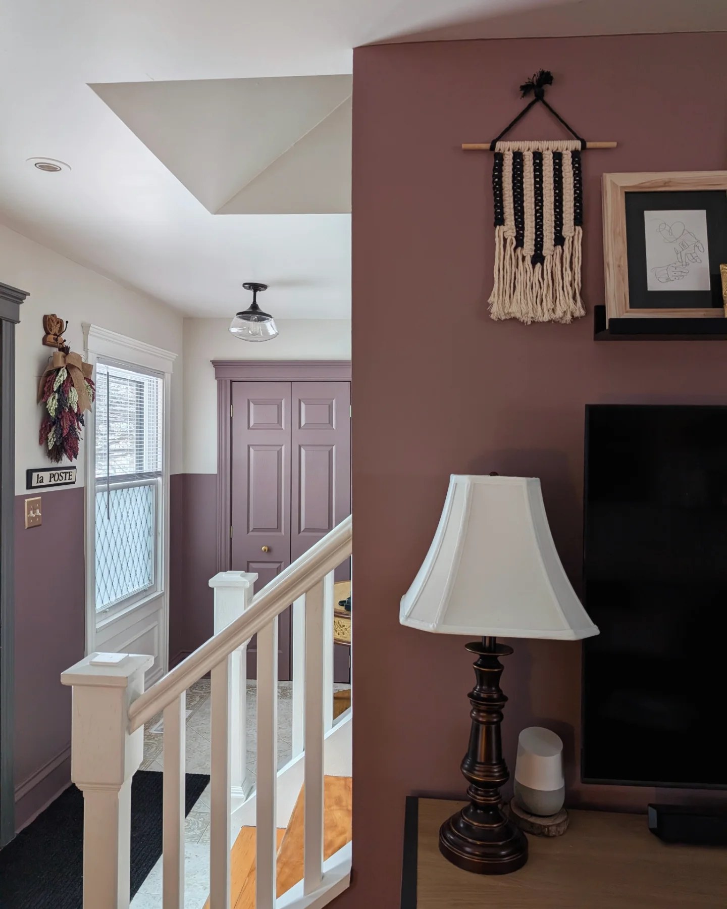
She carried the Cinnamon Slate family onto the living room feature wall too. So when you move between rooms, your eye doesn’t trip. The two spaces read as one considered home. That’s the detail a lot of entry makeovers miss.
What to copy if your entry looks like her 2019 photo
You don’t need to reno. You need two paint cans, a roll of painter’s tape, a weekend, and the nerve to stop using white.
Pick a color you love at both ends of the day (test a chip in your actual light before you commit). Tape a level line at door-casing height. Paint everything below it, closet doors and trim included. Paint everything above in a warm off-white. Swap your knobs for something with presence. Haunt Marketplace until a decent vintage table and a round mirror find you.
That’s the whole playbook. A pass-through turns into a room, and a room turns into the first thing anyone compliments when they walk in.