Most cherry-kitchen makeovers follow the same script. Strip every bit of wood out of the room, paint it crisp white, put in stainless, call it a day. The homeowners who worked with @refreshedandrefurbishedmb and designer @elevatedlivinghomedesign skipped that script, and the finished kitchen is the proof.
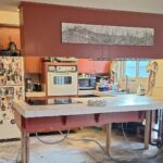
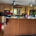
If you grew up in a house like this, you know the problem instantly. The cherry cabinets are everywhere. The walls are a moody teal that fought the wood instead of flattering it. The chrome dome light stuck to the popcorn ceiling is pulling the whole room back to the mid-2000s. Nothing in this room agrees with anything else.
What they did about it is interesting. They left one piece of the old kitchen in place on purpose. Not out of nostalgia. That piece carries the whole new look.
Most of the budget went into the usual (paint, counters, tile, flooring, appliances), but the single decision that made the room feel custom cost them nothing. They just resisted an urge. Walk through it with me.
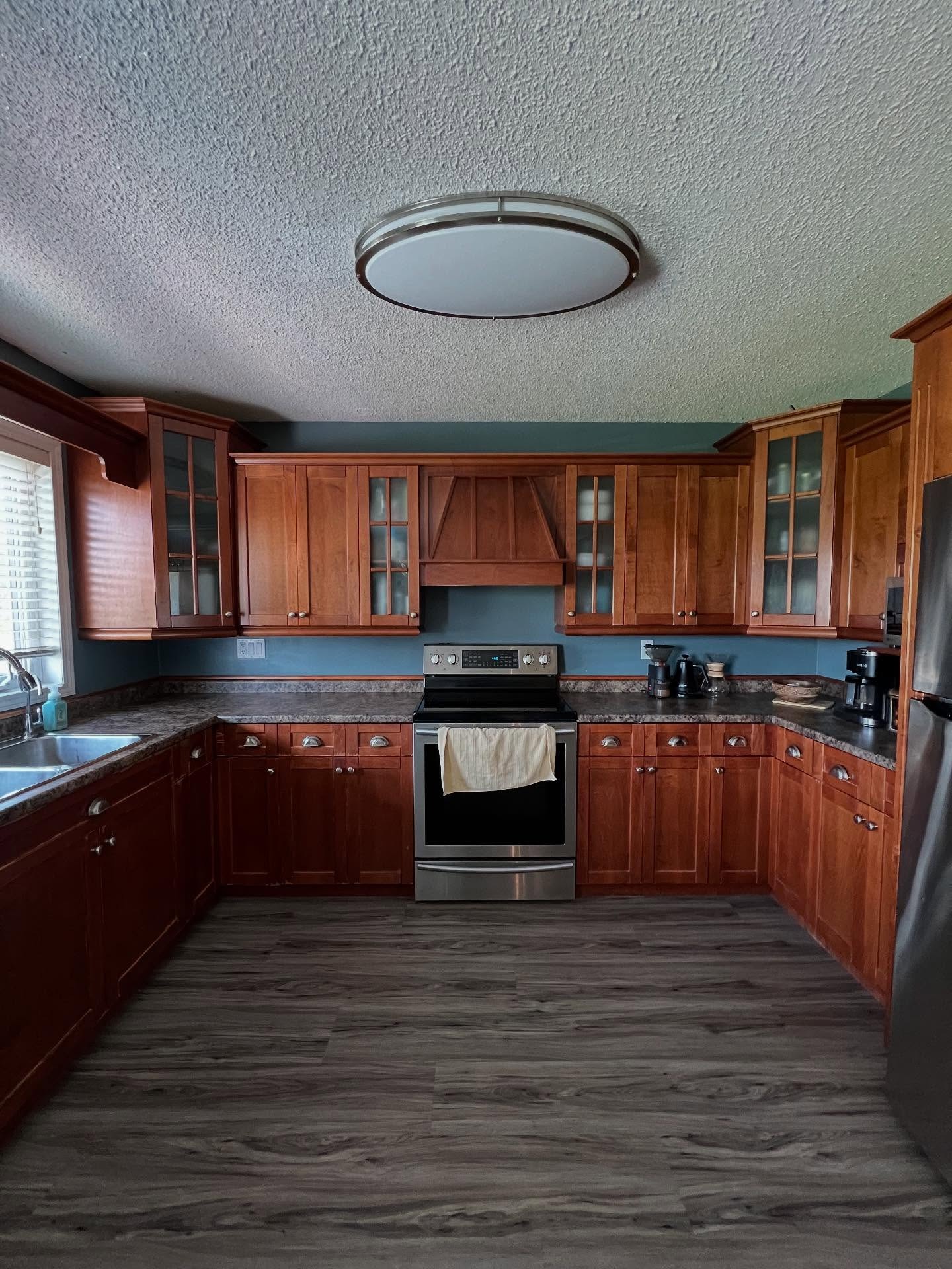
The one thing they refused to paint over
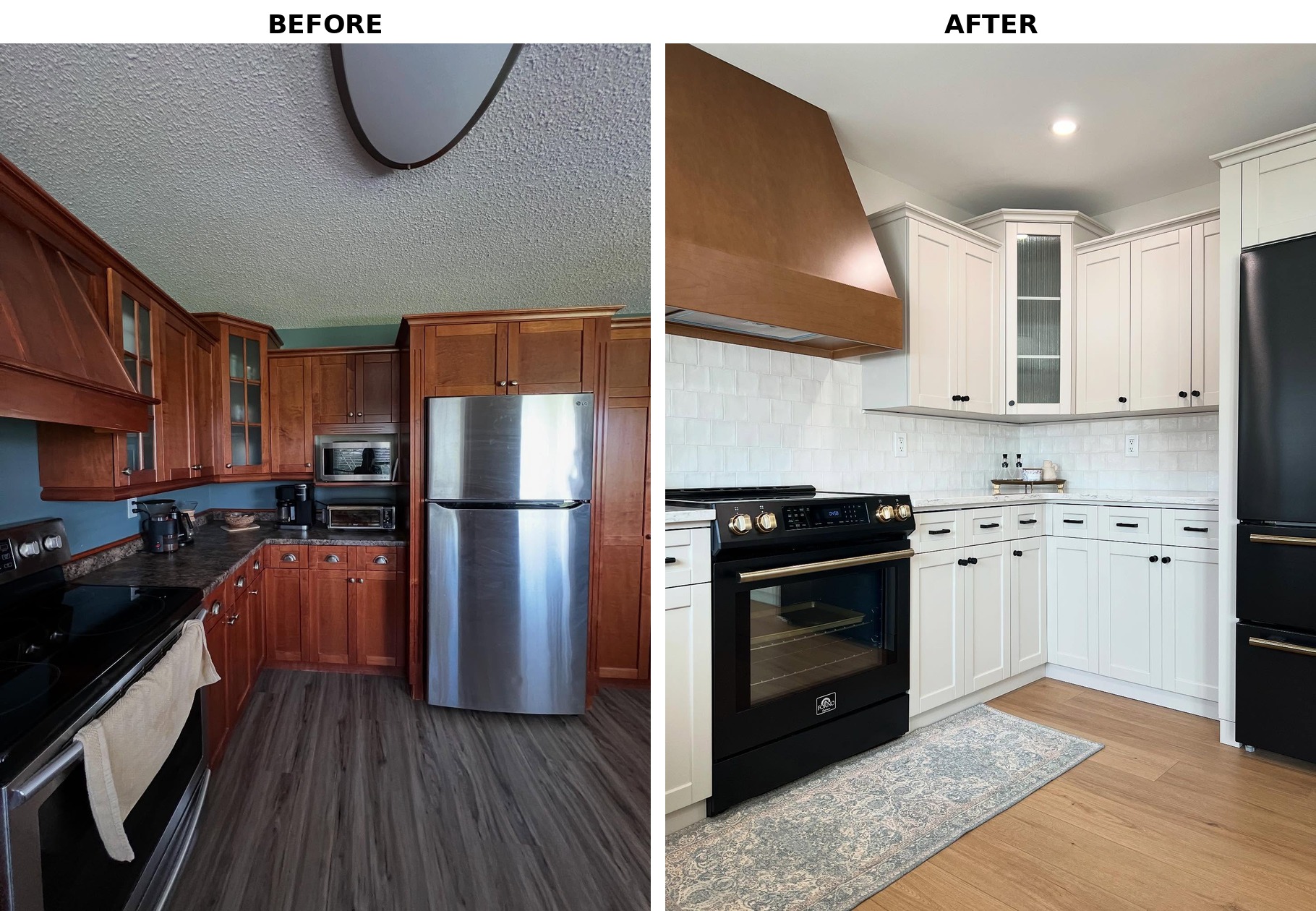
Look at the hood above the stove in that first photo. It’s a nice piece of wood. The trouble is that it’s drowning in a sea of matching cherry. You almost don’t notice it, because every surface around it is doing the same job it is.
A lot of homeowners in this spot would have painted it. It would have been the easy call. Everything goes white, hood included, and nobody has to think about contrast ever again.
They didn’t do that. They quieted the room around the hood instead. Every other warm wood surface got painted out, and the hood was allowed to stay exactly as it was. That one leave-it-alone call is what gives the finished kitchen a focal point, instead of letting it read like every other white-and-stainless flip.
Why Worldly Gray beat plain white
The cabinets got sprayed in Sherwin-Williams Worldly Gray (SW 7043). That specific pick is doing more than it looks like.
Worldly Gray is a soft warm greige. It reads as a neutral in most light, but there’s just enough brown underneath it that it sits comfortably next to a wood hood instead of fighting it. If they had gone with a cool bright white (Decorator’s White, say, or Chantilly Lace), the hood would have suddenly looked orange and out of place. Worldly Gray lets the wood stay.
Here’s the stove wall before and after, with the same hood in both shots.
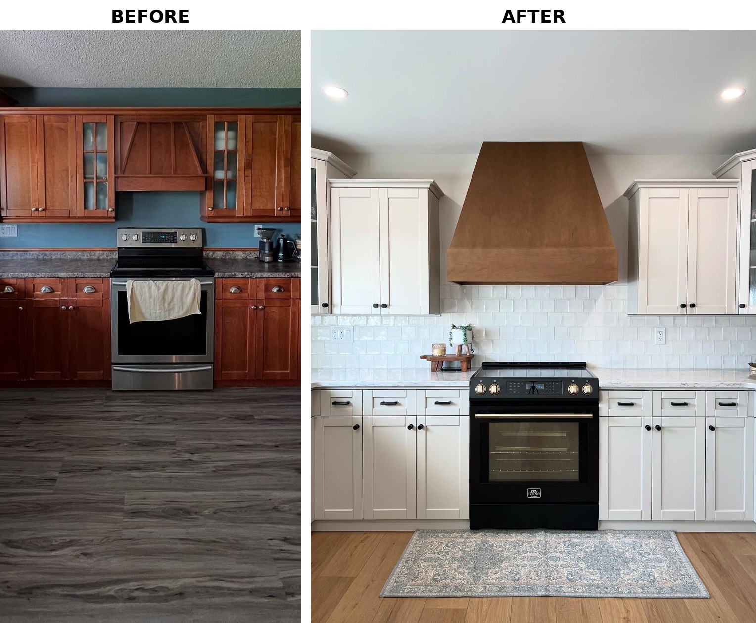
Same hood. Different job. Now your eye lands on it, which is what a hood is supposed to do in the first place.
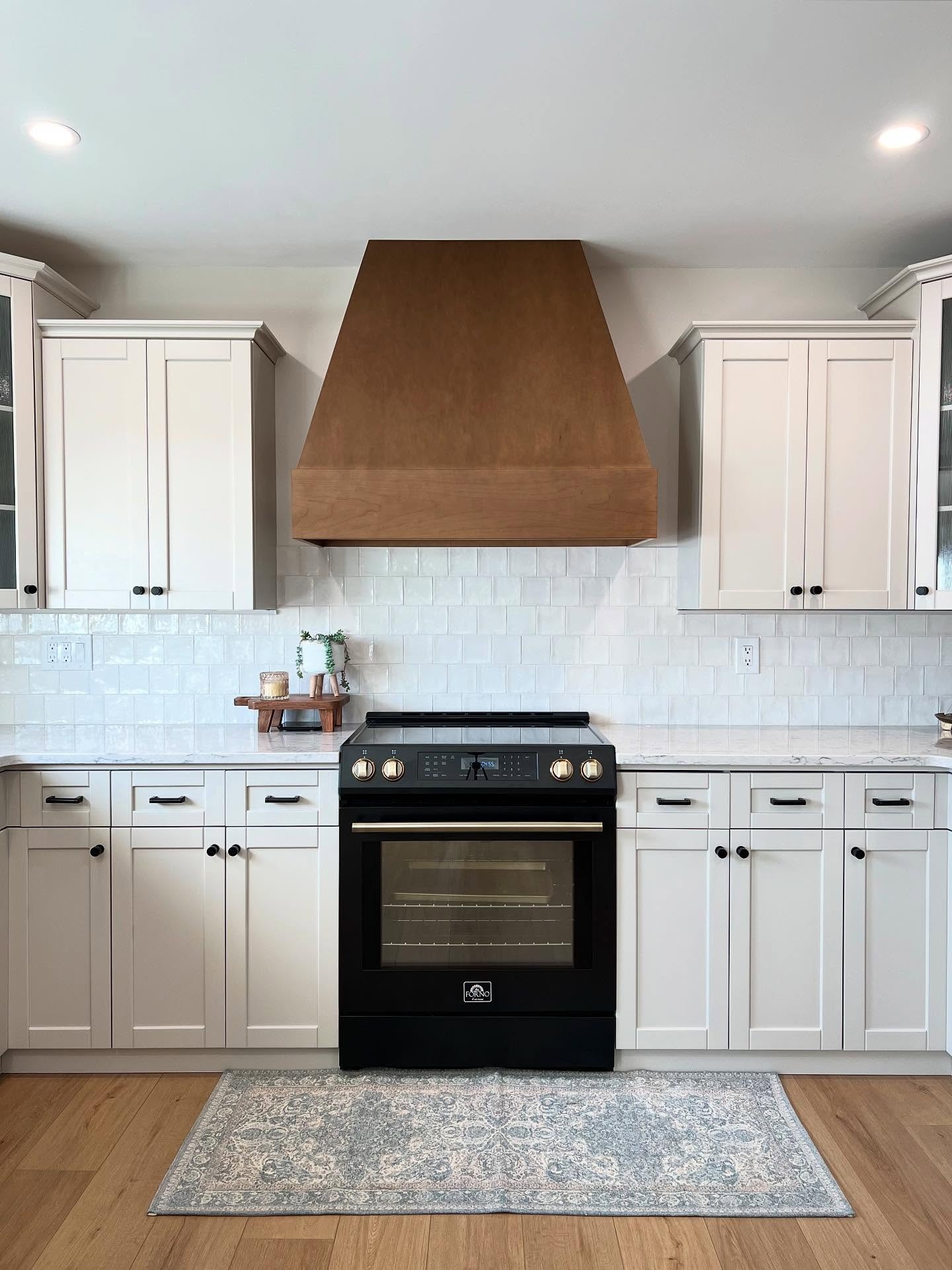
Notice how calm the whole backdrop is. Cabinets, tile, counters, all stepped back so the hood and the stove can be the show.
The fridge wall got a whole new rhythm
The old fridge wall was busy for a tiny space. Microwave shoved into a cherry cabinet, a top-freezer stainless fridge, a built-in toaster oven, cherry everywhere.
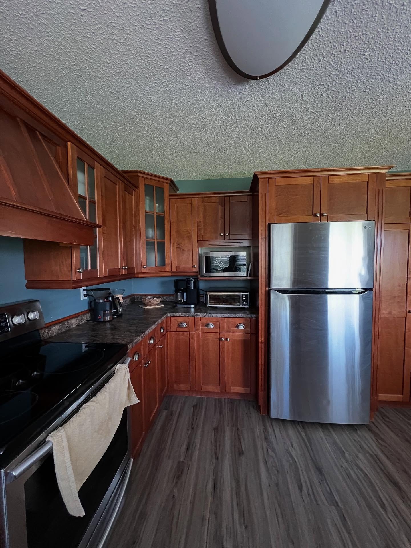
They cleared it up and swapped the stainless top-freezer for a matte black Forno bottom-freezer with brushed brass handles. If you’ve been assuming stainless is always the safe pick, this is where that logic breaks down. On a soft greige and white kitchen, stainless would have read cold and generic, like every builder-grade flip you’ve already scrolled past. Matte black with brass hits totally differently. It picks up the warmth from the wood hood and the black from the cabinet pulls in one move.
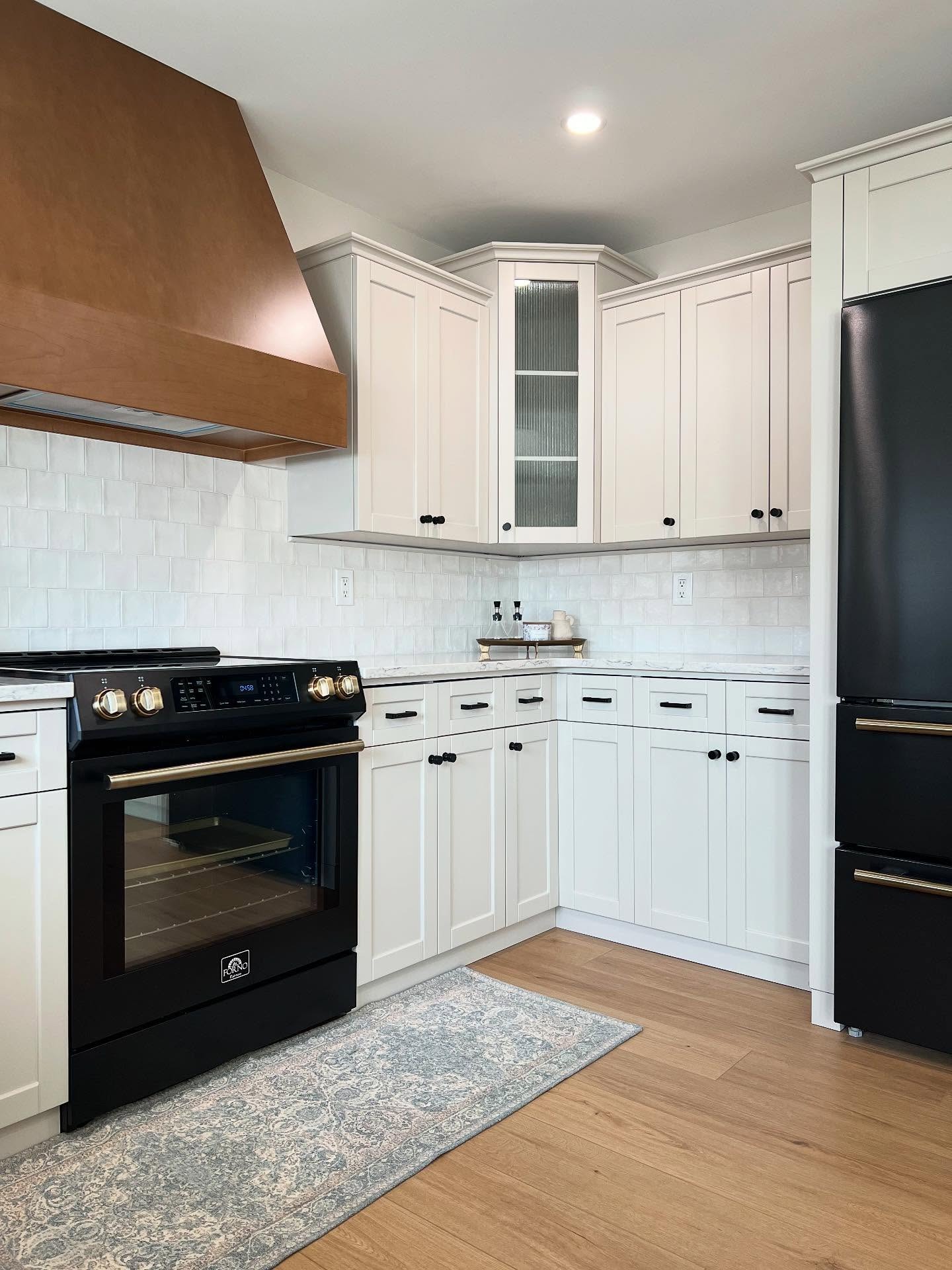
The glass-front corner cabinet above the counter is a small design win too. In the before, that corner had a plain door that killed any sense of depth. The reeded glass now lets the eye travel further and makes a tight corner feel bigger than it is.
The sink wall and the floor nobody’s talking about
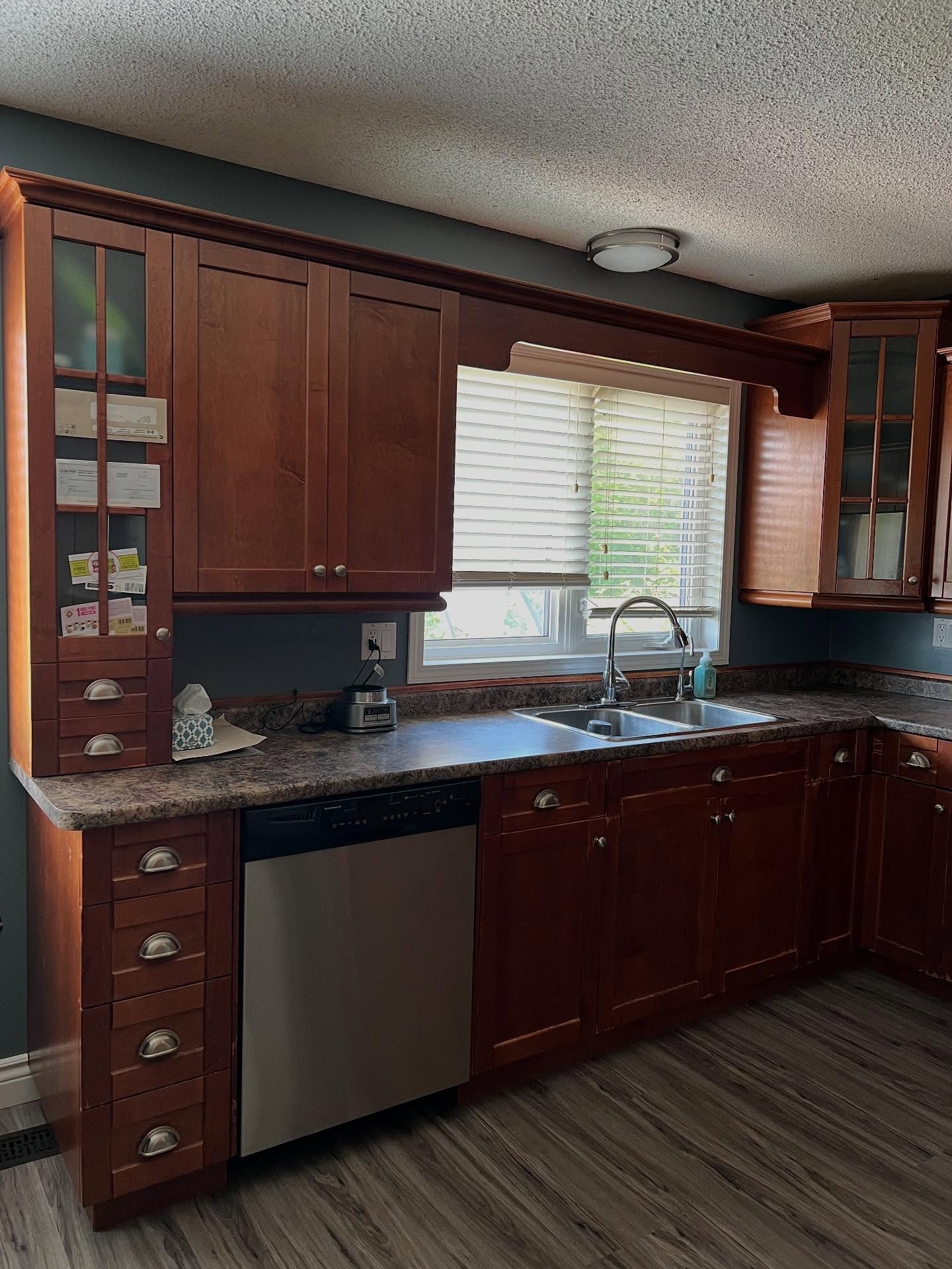
The sink wall in the before was workable, but it was carrying a lot. Dark laminate counter with that busy brown speckle. Cherry cabinets that pulled the window into a kind of frame nobody asked for. The decorative scrolls on either side of the window were peak early-2000s custom cabinetry.
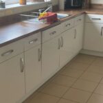
The after loses the brown speckle for white quartz, swaps the chrome faucet for matte black, and most importantly, pulls out the gray vinyl plank floor and puts natural oak in its place. The oak is a bigger deal than people realize. The old gray floor was cool-toned and was quietly fighting the warm cherry above it. The new oak sides with the hood and the brass, so the whole room is finally pointing the same direction.
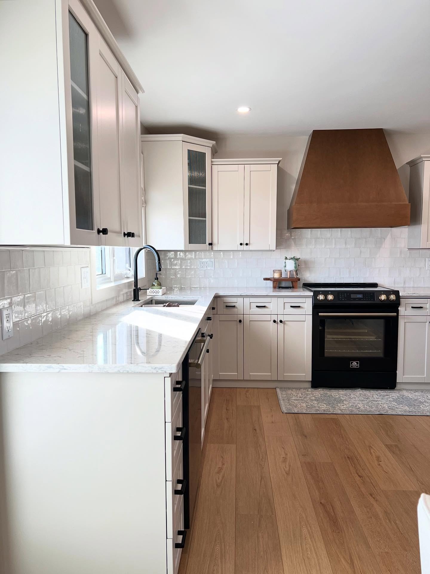
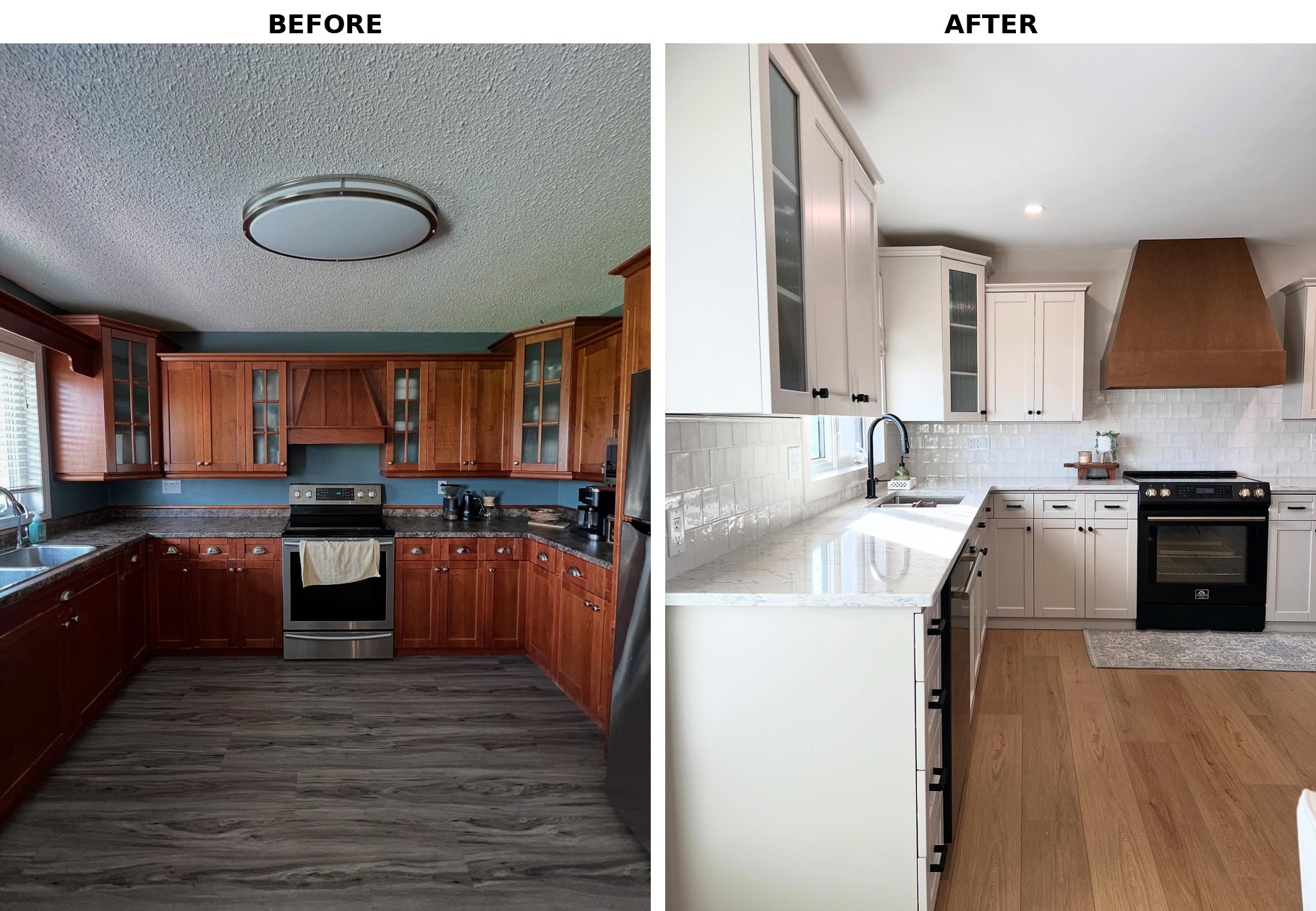
And if you compare the two wide shots, you’ll notice something that costs nothing to point out: no walls moved. Same U-shape, same window, same stove spot, same fridge spot. Every expensive thing stayed where it was. The whole custom look came from paint, counters, tile, flooring, appliances, and smoothing out that popcorn ceiling.
Why this won’t look dated in three years
The before was pure 2005. The obvious makeover (all bright white, chrome everything, cool gray floors) would land you in pure 2019, which is already starting to feel tired.
What they did instead borrows a little from the English kitchen look, a little from modern farmhouse, a little from the quiet luxury trend, and doesn’t fully belong to any of them. That’s usually how a room ends up looking custom instead of catalog-ordered.
Cabinet color for the record: Sherwin-Williams Worldly Gray (SW 7043). Hood is the original wood, left alone.
If you were doing this to your own kitchen, which call would you make first, the paint or the appliance swap?