
If a cream-painted kitchen with subway tile and granite is the dream, this couple in Georgia was already living it. They had the tile, the stone, the farmhouse sconce, the whole “finished” look Pinterest keeps selling.
And then they called a painter.
Not because anything was broken. The cabinets were in good shape and the granite still looked like money. The owners just walked in one too many times and felt nothing. You can do everything “right” and still be bored by your own house.
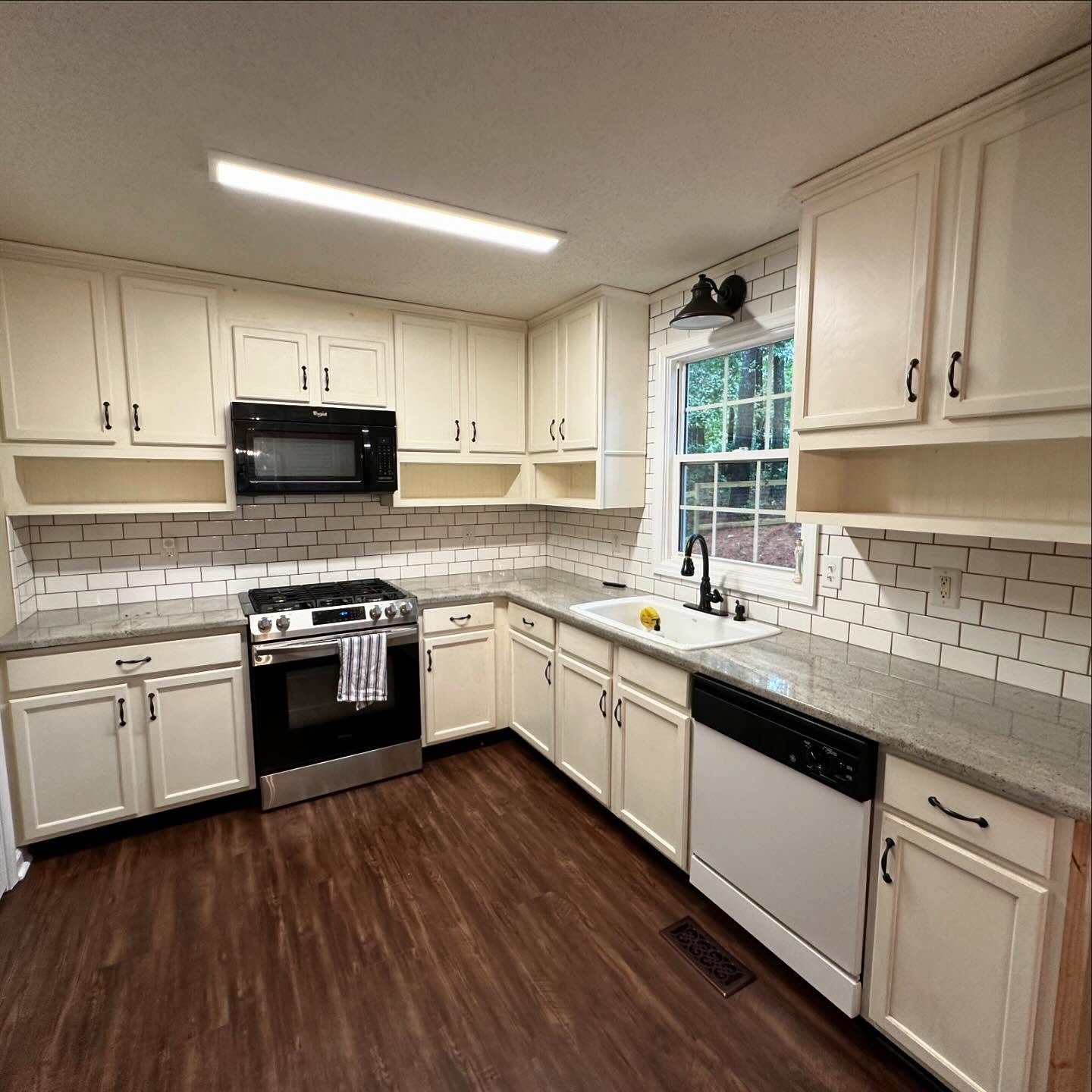
Their fix was smaller than a remodel and bigger than most repaints. The bones stayed, the surfaces that worked stayed, and the result still reads like a custom build.
What they actually changed (it’s more than just paint)
Before I talk color, the honest part: this was not only a repaint. Three things happened at once. Every cabinet box and door got painted. A tall pantry column was framed in beside the back door, which you can see in raw wood below. And a mudroom bench with coat hooks was built into the wall beside the fridge. Everything else, the tile, counters, floor, sconce, sink, and black pulls, stayed.
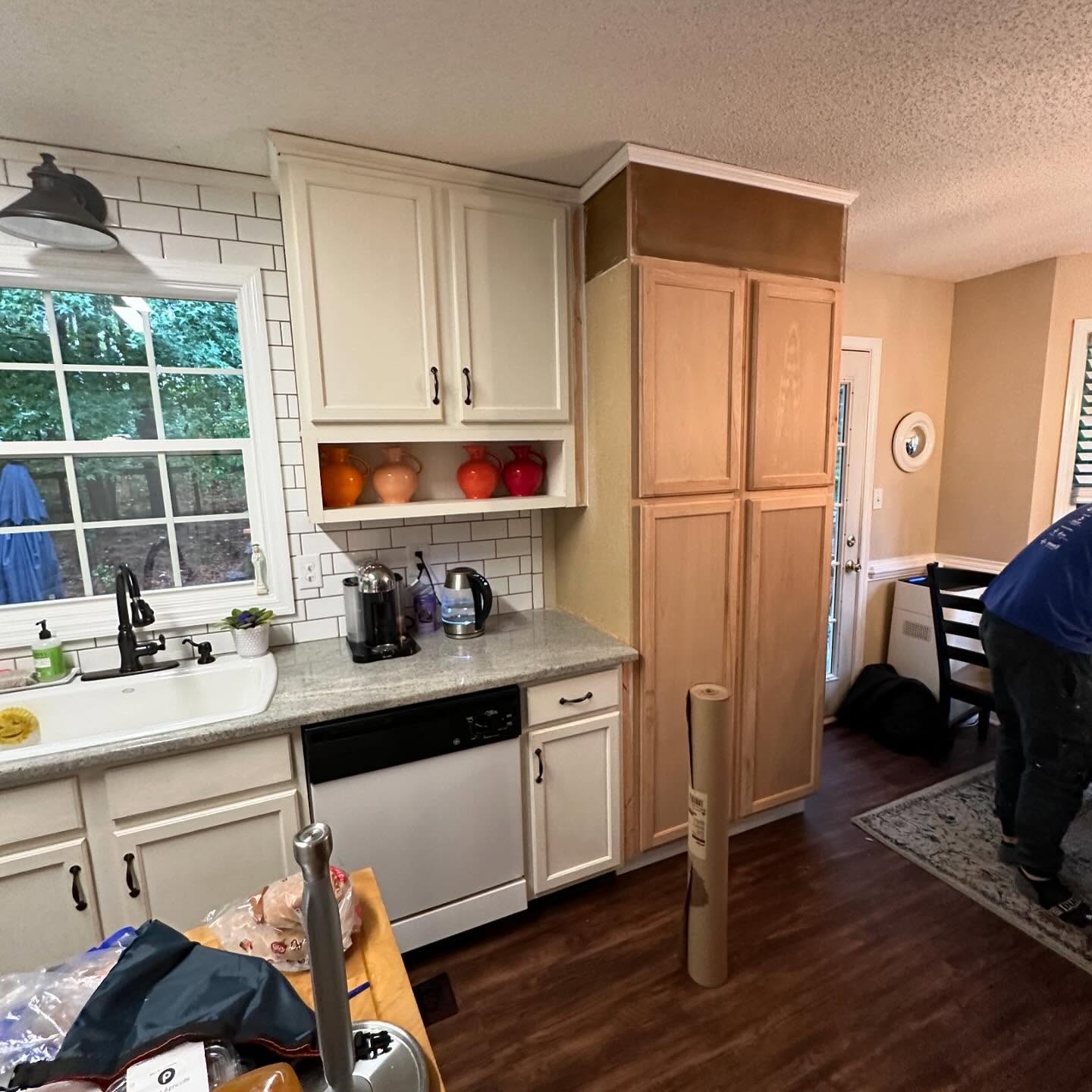
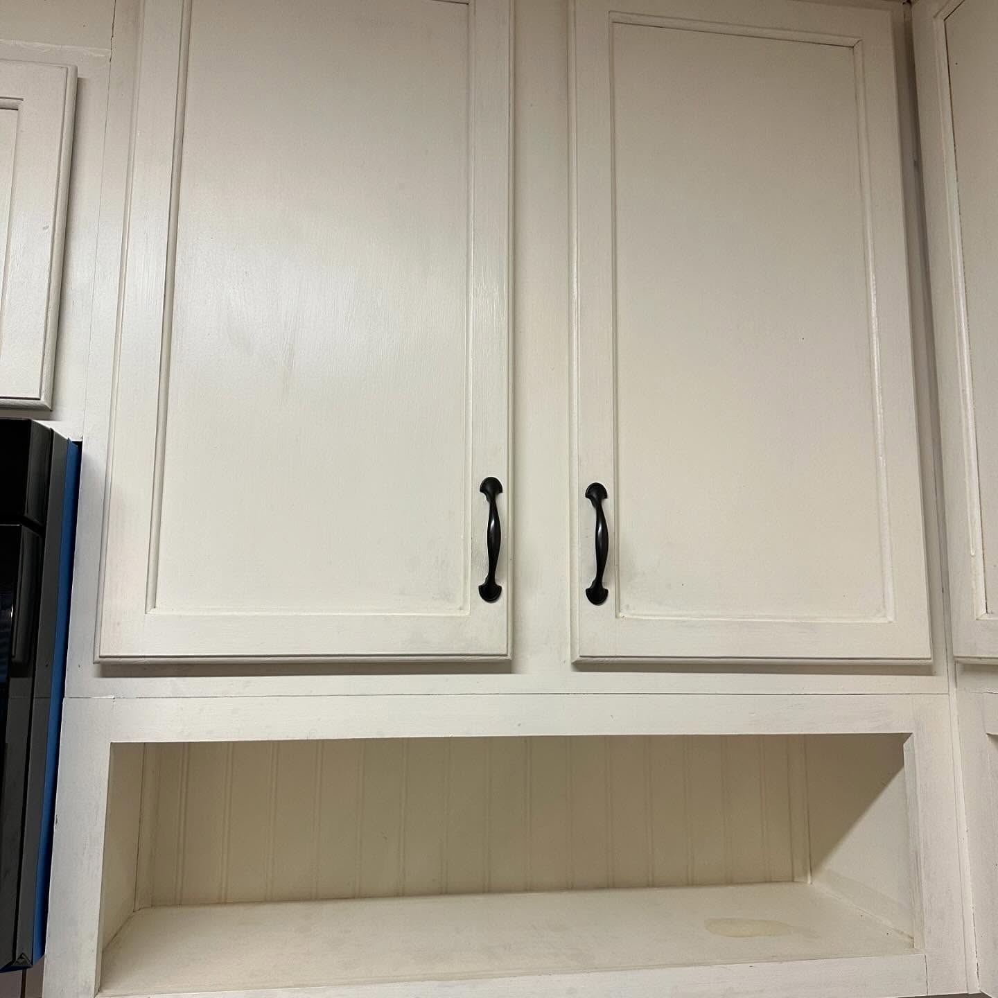
Up close you could tell this was a well-loved kitchen, not a sad one. The upper cabinets had a vintage beadboard shelf tucked underneath, and the hardware was already right.
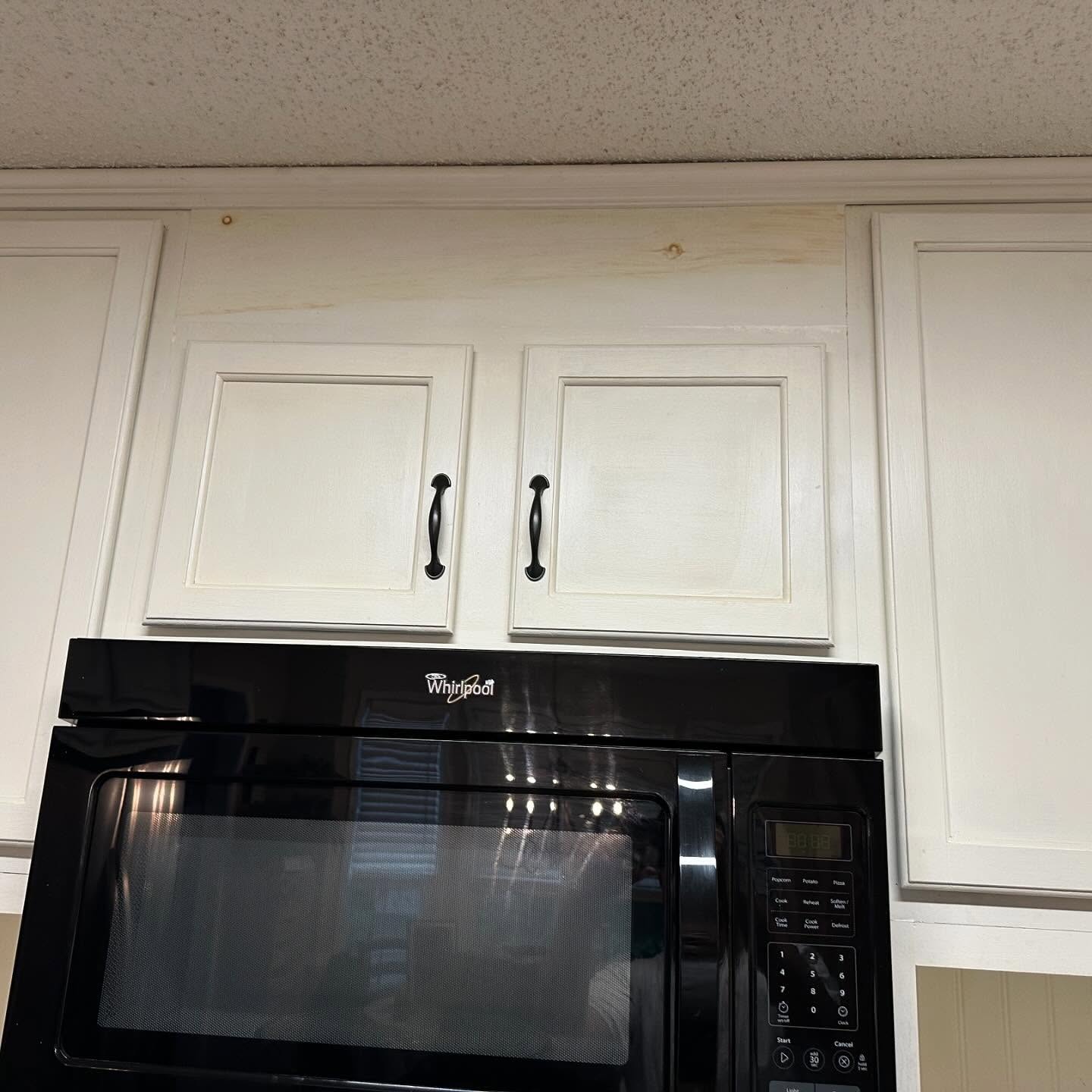
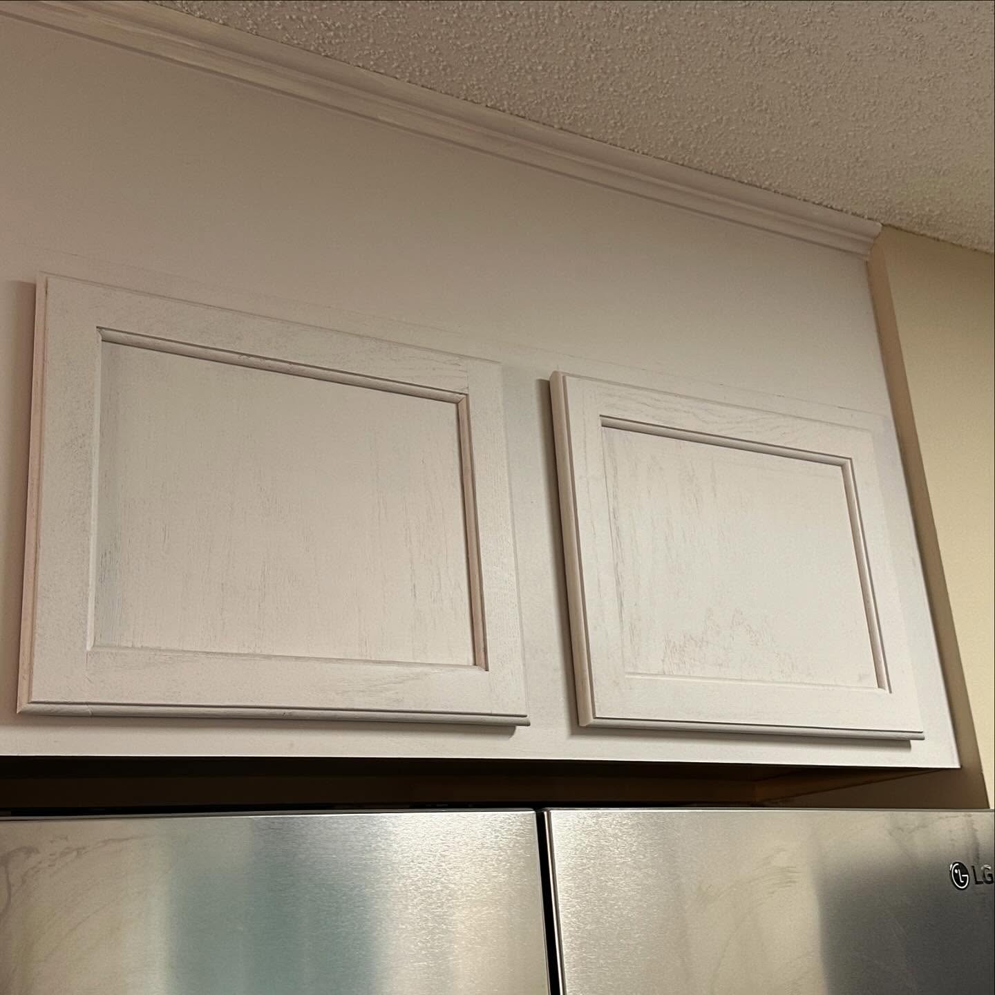
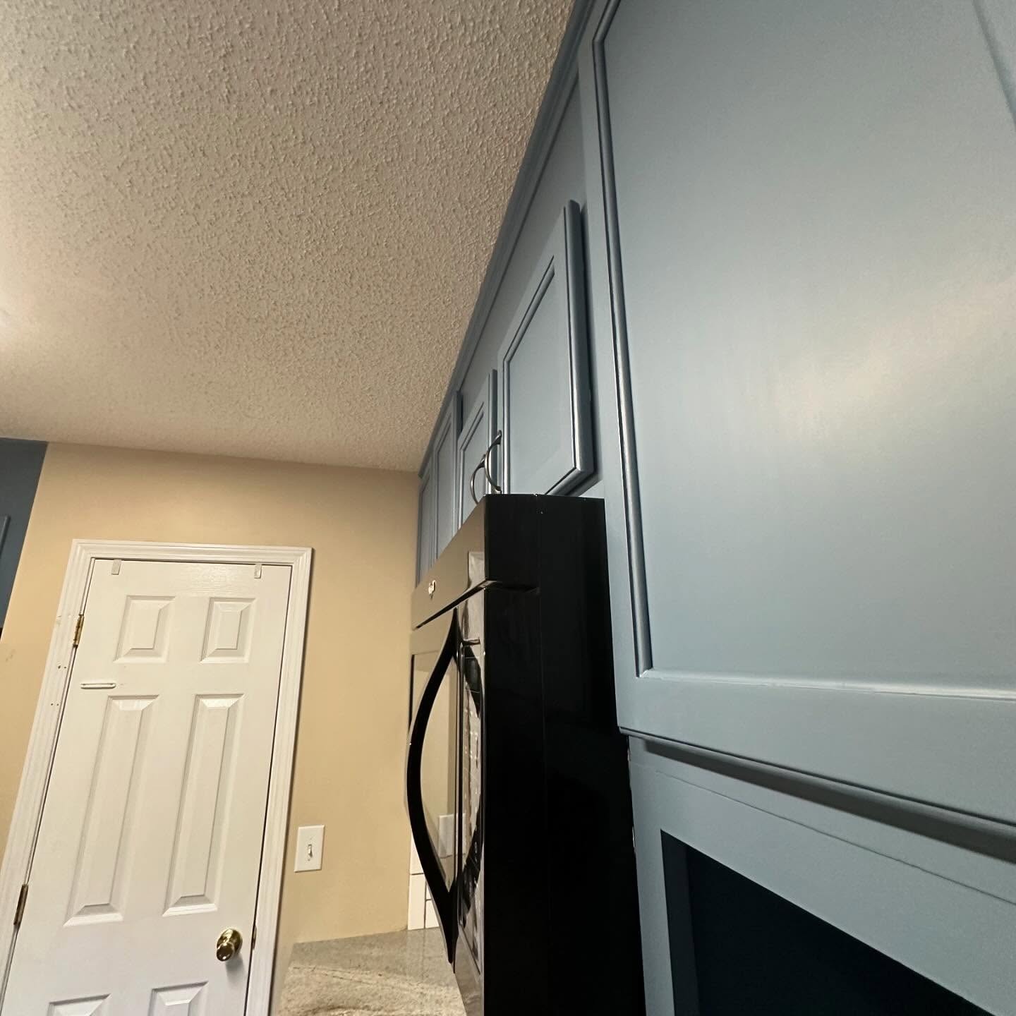
The small stuff was handled too. The gap above the microwave had been patched with fresh wood, waiting for primer.
Why this blue, and not a louder one
The color is Benjamin Moore Philipsburg Blue HC-159, from their Historical Collection. In morning light it reads almost like a soft grey. In warm evening light the blue steps forward. That shift is what makes it safe for people who have never painted a cabinet in their life.
A lot of folks jump straight to Hale Navy or Newburyport Blue for “dark blue kitchen.” Philipsburg Blue sits beside those two, a little dustier and a little more grey, and it doesn’t shout.
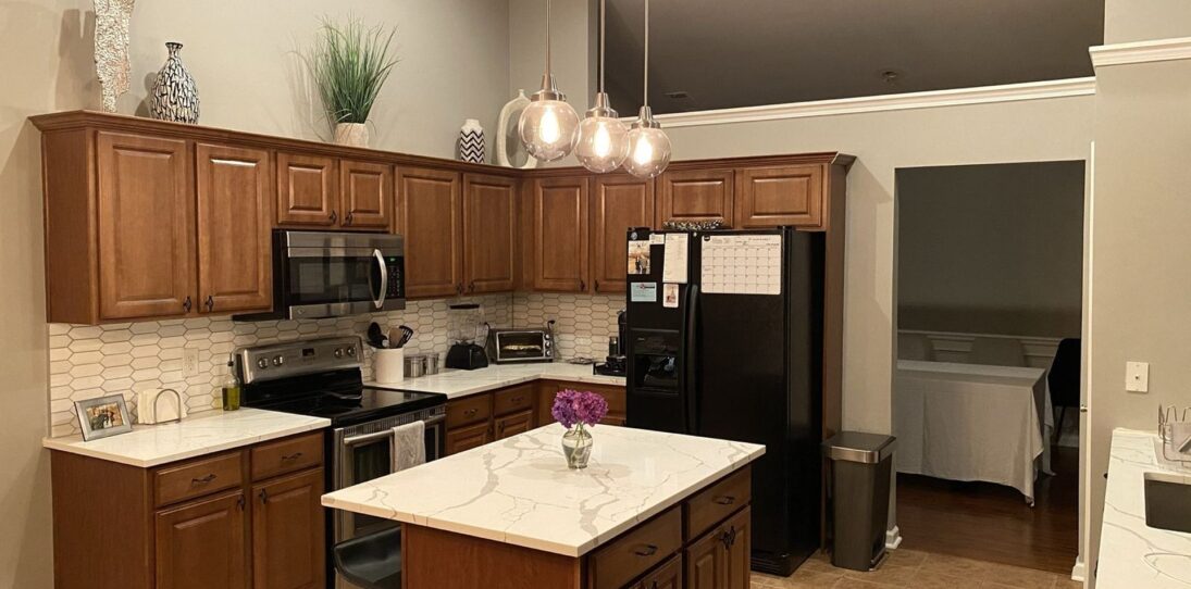

The finish most DIY repaints never get right
Painter Duart Painting out of Georgia posted the step list, and it is the reason the final cabinets look factory-sprayed instead of brush-marked.
Sand the old cream paint first to kill the surface texture. Lay down a primer coat on every door and box. Then, before the color goes on, sand again over the dried primer. That second sand is the step almost no weekend project bothers with. It is also the one that turns a good repaint into a smooth repaint.
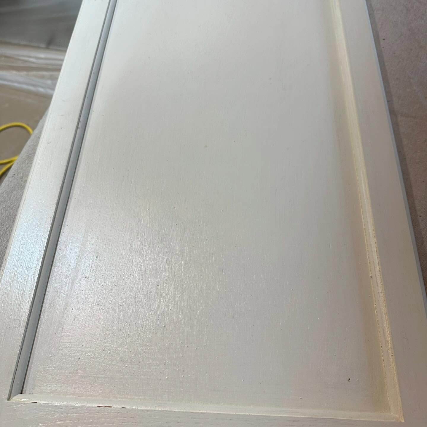
After that comes two coats of color in Benjamin Moore Command, their waterborne cabinet enamel. It levels out as it dries so brush strokes disappear, and it cures hard enough to take daily use without chipping around the handles.
The reveal
Same subway tile. Same granite. Same wood floor. Same farmhouse sconce. Same black pulls. The room only changed its mind about one thing, and the whole kitchen now reads custom.
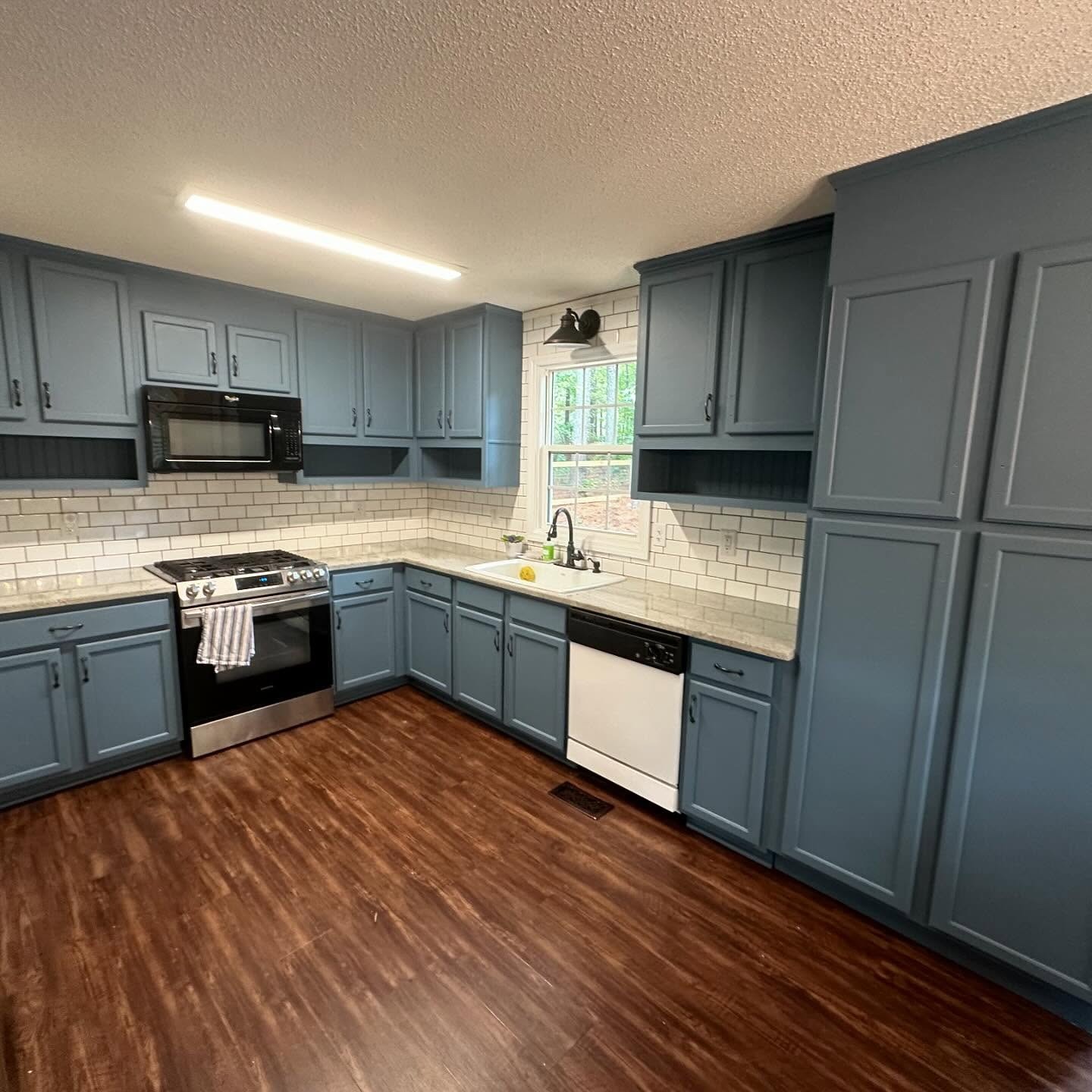
Beside the fridge, the raw-wood pantry got dressed up into a full built-in with a mudroom bench, two hooks, and a cubby. It opens straight into the living room, so now the kitchen and the hangout space share one color story.
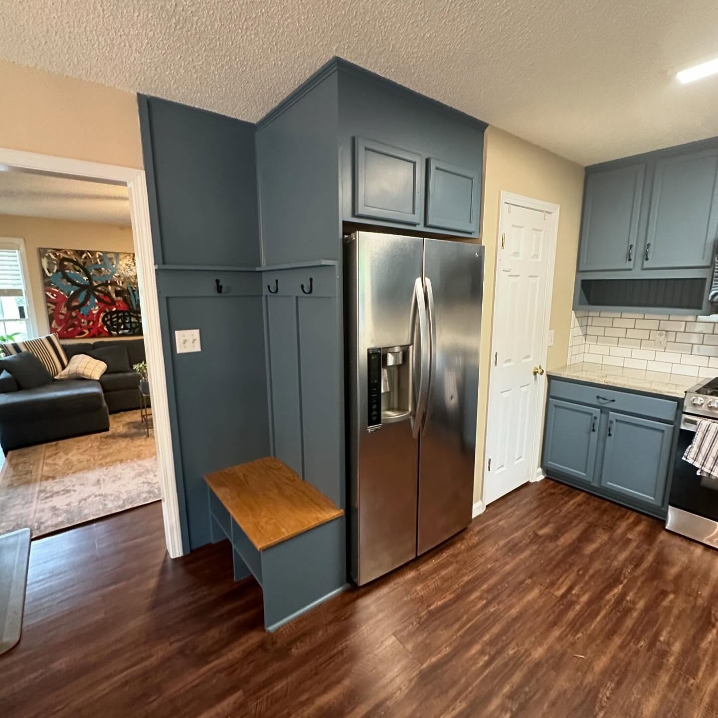
The color travels all the way up to the ceiling. The crown and the little open shelf under the microwave got painted in a deeper shade of the same blue, which is what makes the room feel built instead of painted.
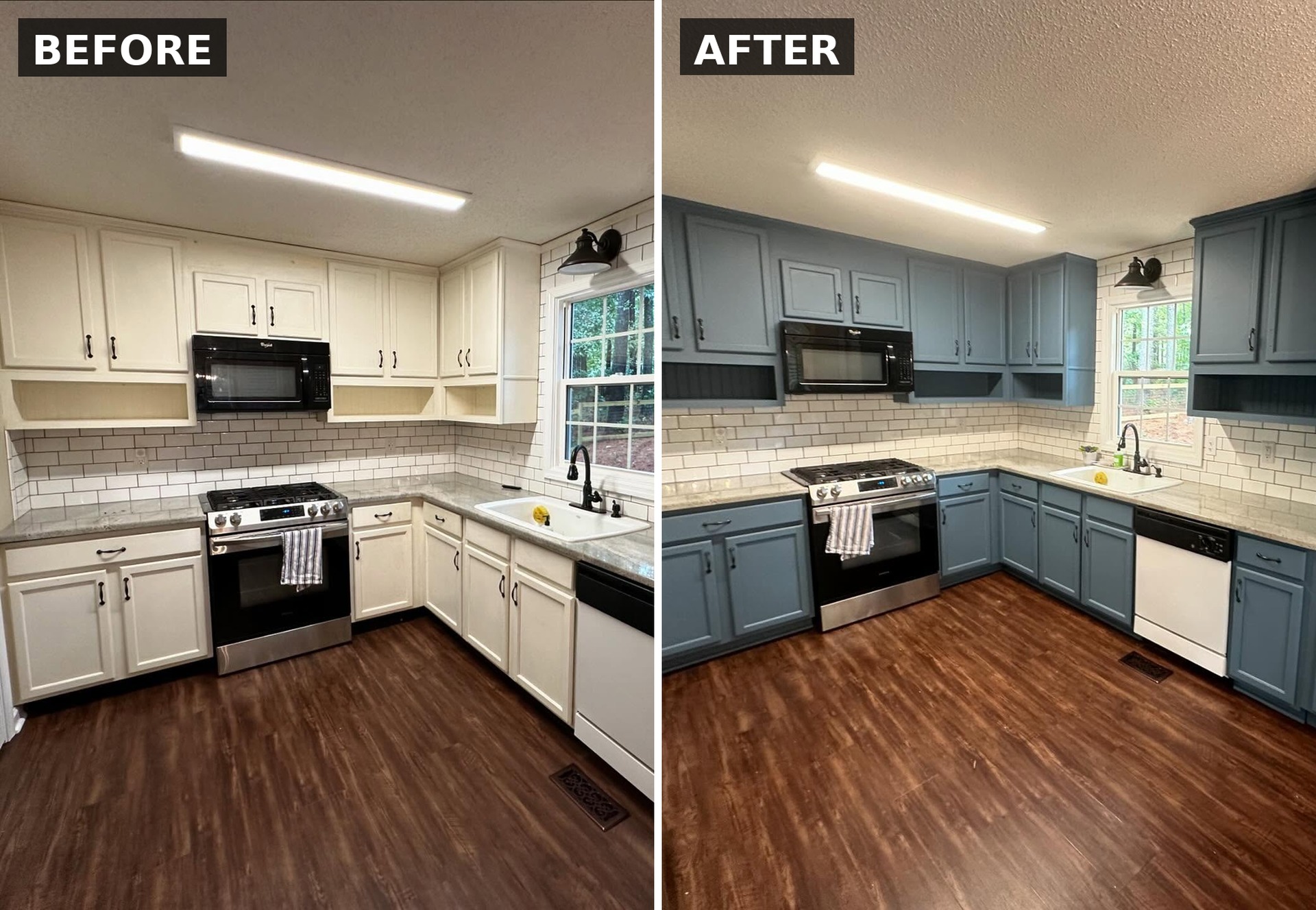
Side by side
Here is the cooking wall, start and finish. Same stove, same microwave, same sink, same tile, same floor, same window, same sconce. Only the cabinet color moved.
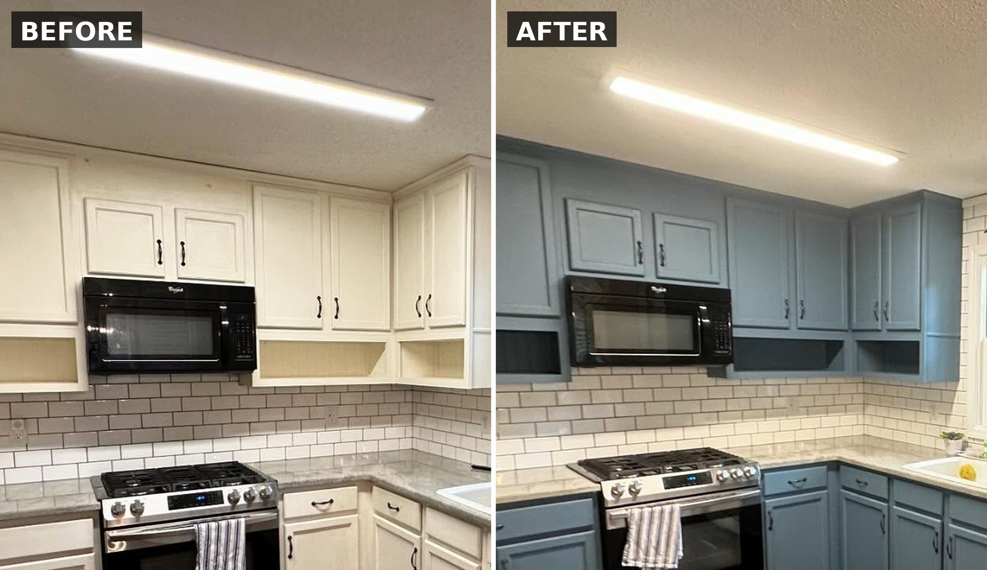
Now zoom in to the microwave wall. Nothing moved, nothing got swapped, nothing new was built. The black microwave, the stove, the subway tile, and the open shelf below the cabinets are all in the same place. The dusty blue is doing all the work, and painting the shelf back in a deeper shade is why it finally reads as one built-in instead of two cabinets with a hole underneath.
And this one is the corner where paint stopped being enough. You can see the raw wood pantry column on the “before” side, waiting to be finished. By the “after,” it is painted, a bench seat with coat hooks has been framed in alongside it, and the whole stretch reads like one custom mudroom instead of a kitchen tapering off into a hallway.
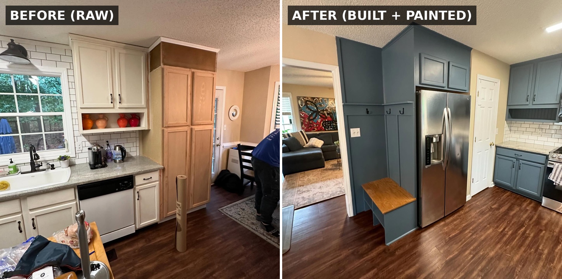
Those three images are the whole case for Philipsburg Blue on a cream kitchen you already like.
Steal this if your white kitchen feels flat
You don’t need to redo your counters, your tile, or your floor. You need to look at the one finish in the room that keeps going “meh” at you, and swap it for something with a little mood.
A few things worth remembering if you are leaning in. Philipsburg Blue deepens in warm light, so test a swatch on the actual door at night, not just by the window in the morning. Paint the trim and the open shelf backs in a slightly darker shade of the same blue; it reads custom for almost no extra effort. And do not skip the second sand after primer. Would you go this dark, or stay a shade lighter?


The blue cabinets look amazing. I commend you for taking on this project yourself. You saved alot more money than gutting your kitchen and buying new cabinets. I have painted kitchen cabinets so I appreciate the hard work that goes into it and the floor is perfectly fine. Some people seem to think we’re all made of money. The backsplash, cabinets and floor all blend together very nicely. I did like the suggestion of a runner if you feel you’d like to throw in some additional color without adding a bunch of expense and if you want to change out the handles for something brighter, that would be a nice extra touch that’s also not very expensive but its not absolutely necessary. At the end of the day, its Your kitchen so it doesn’t really matter what anyone else thinks. You rocked it!
Not a fan of this particular blue AT ALL, but it’s not my kitchen either. I think if they change the backsplash and wall color it would work better, but something is just “off” on the whole scheme. I believe had they picked a green or grey-green, they would have nailed it, especially with the flooring.
Also, it was was a perfect opportunity to do two-toned cabinetry. I would have loved to have seen that!
Exactly. It stand out like a door thumb instead of looking cohesive.
It’s too dark of a blue. A shade or two lighter. This 60-70ties color revival is getting old real fast.
I don’t like that blue – I agree the colour needed to be changed but that blue is too dark.
Sorry but I do not like this at all. Glad I saw it though so I know not to do the same thing with my similar looking floor. Those two colors just do not go together to me. A darker blue might. Since it’s done, I would suggest a couple of runners on the floor, a stainless front on the dishwasher, brushed brass hardware and light fixtures to lighten things up, and add some glass doors on the uppers.
I am not a fan of the color, floors or light. I think this is too dark. I would have claustrophobia. I think this is hideous!!
Like the color, but the floor looks atrocious with that blue
Who has horrible Brown floors with a blue collar scheme, rip out the horrible floor and put nice grey dark grey tiles or something anything different than that
Stunning transformation, love that blue.
Units are a lovely colour. Problem is they are not right with the floor.
I like the white better
I am distracted by the flooring. Omnipresent wood planking look everywhere today.
I dont actually care for the blue. The color would wear on me fast. Kitchen still needs updating overall.
Not a great color it would wear on me fast
People don’t realize how much work goes into changing cabinet colors. In 2009, we bought a foreclosed 90’s home with the solid oak cabinetry and white appliances. I wanted cherry cabinetry and stainless steel. We bought all new appliances but I stained the cabinets in Home Depot Red Oak. They came out beautiful, almost custom looking. Now that I have yellow/gold/black granite, I want to stain them ebony. I think it will work, especially if I swap some of the solid doors for glass and add under cabinet lighting to offset the black. What do you think?
The result is amazingly beautiful. Color alone is transformative. No ceiling scrape needed, not even change in lighting. I’m sold!
I would paint the door and wall the same blue
I agree about the dishwasher — the white definitely needs to be changed out to match the other appliances.
It’s definitely an improvement! However I feel like it needs all of the accessories that make a kitchen feel like home & maybe a plant or two 🪴
The backsplash was too white for the creamy white cabinets. The blue sets it off and looks great.
Beautiful color choices. Went from a box store kitchen look to a professionally designed look. Two suggestions: switch out the front of dishwasher with same stainless finish as the fridge & stove and switch the ceiling light to track lighting.
Great job, the blue looks fantastic and really works well with the living room art. The new built is look to be well thought out. And, finally, great job getting similar before and after pictures, including the dish towel and smiley scrubby