Most UK semis start their entryways the same way. Pale gray on the walls, a bit of textured paper near the door, white ceiling, oak floor if you’re lucky. It’s the paint-chart equivalent of staying quiet in a room.
This homeowner was stuck in exactly that loop. A narrow stairwell, a glass balustrade, a skylight doing all the lighting work from above, and a hallway nobody noticed. Every design rule for small spaces says the same thing when you’re staring at a corridor like that: keep it light. Dark paint will shrink it. Dark paper will swallow it.
They went the other way anyway.
The walls got Dulux Inkwell, which sits in the deepest end of their teal-navy range. Grandeco Life’s peacock damask paper, packed with birds and lotus blooms on a near-black ground, went up on the feature walls. Every piece of trim was repainted in Benjamin Moore Super White to push the contrast. Nothing structural was touched. The oak handrails, the oak doors, the oak-look flooring, all of it stayed exactly where it was.
What came back was a hallway guests stop walking through.
What the entrance looked like before
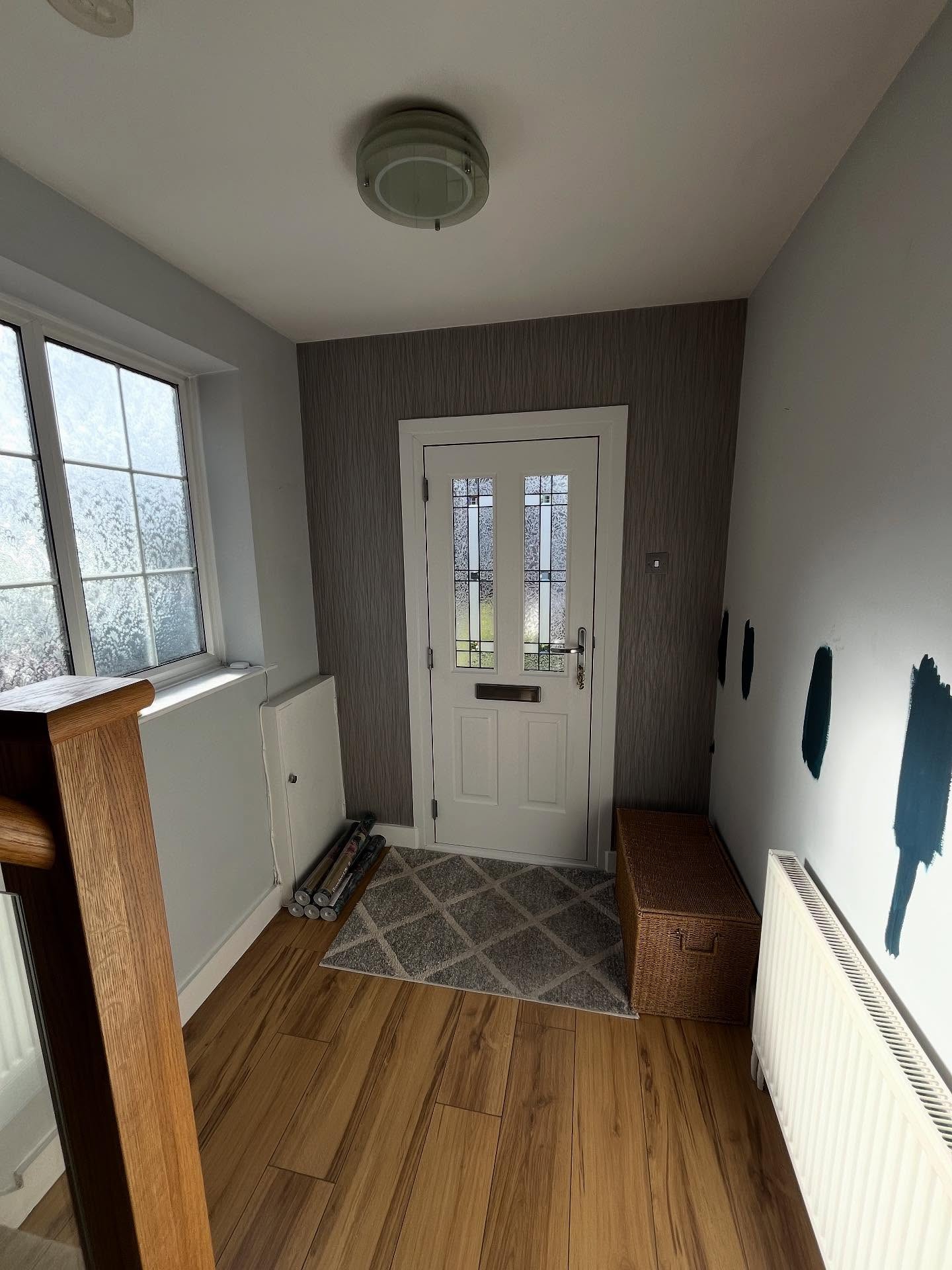
The starting point was pure UK semi: gray textured paper around the door, cool gray on the surrounding walls, and a few dark paint test patches drying on the right wall where the homeowner was sampling colors. The door itself wasn’t the problem. The whole backdrop was just blending into everything else.
The same door, reframed
Now the peacock paper does all the work. The white composite door pops out of the pattern instead of fading into it, and those leaded glass panels suddenly glow against the darker surround. The corner reads like something you’d walk into at a small hotel, not the standard step-through to a coat hook.
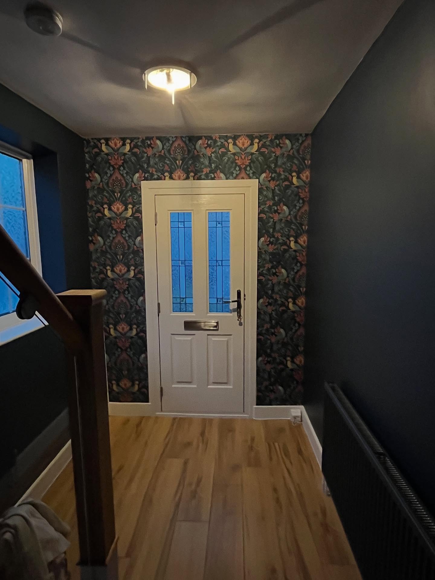
Downstairs at the bottom of the stairs
The ground floor corridor in the before shot is fine. Just fine. The oak floor is carrying the whole room on its own, and the walls above are doing nothing to help.
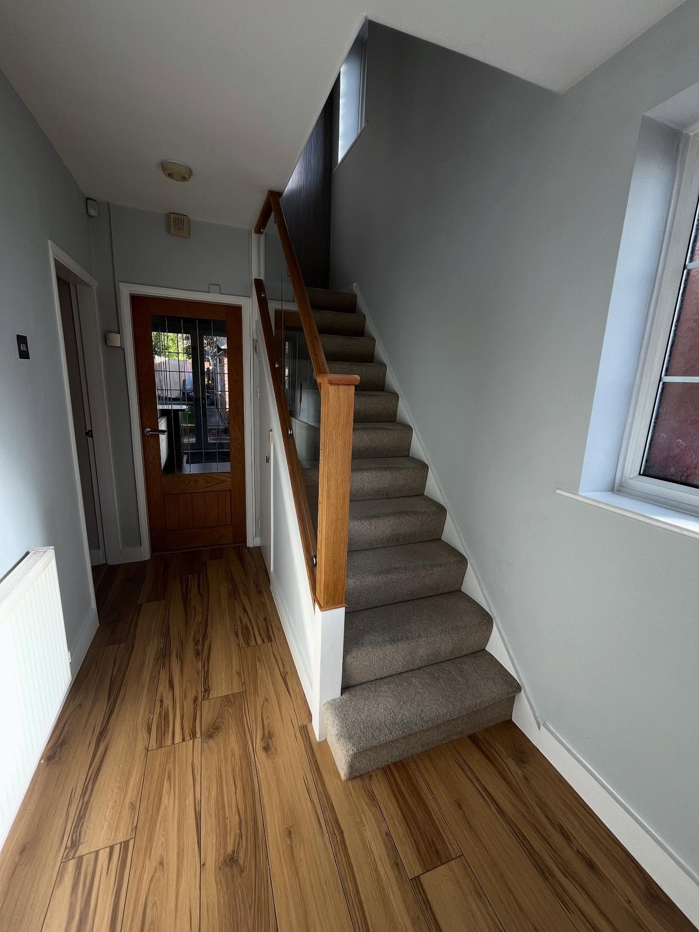
What Inkwell does to the ground floor
The paint pushes the walls back and lets the floor and the oak doors step forward. Your eye keeps traveling instead of bouncing off flat plaster. It’s the trick that catches most people off guard. Dark colors read as receding, not advancing, which actually makes the corridor feel longer than it did in gray.
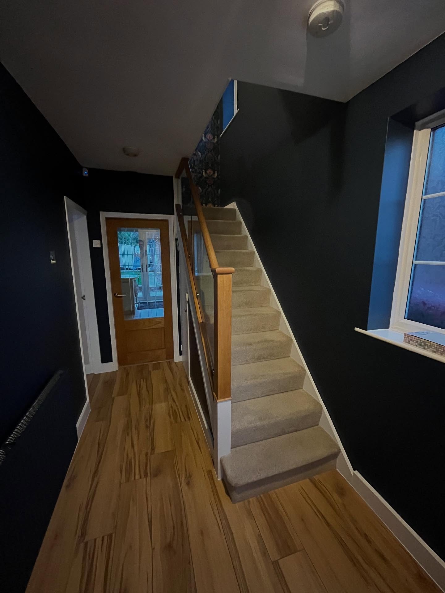
Up the first flight, still gray
Halfway up the stairs, the old scheme runs out of steam. There’s a feature wall at the top with a textured gray paper on it, and your eye just slides right off.
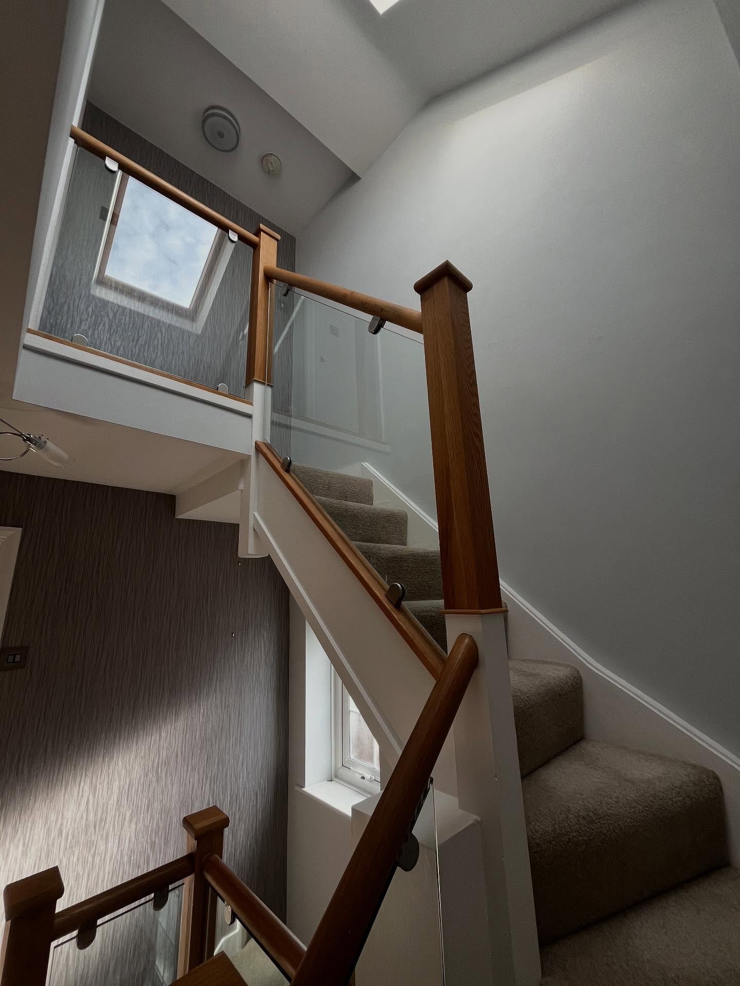
The pattern you walk toward
Peacock paper on that same wall turns the stairs into a destination. There’s a reason to walk up now. You’re going toward something. The dark paint around it keeps the pattern from floating on its own little island, so it reads as part of the wall, not glued onto it.
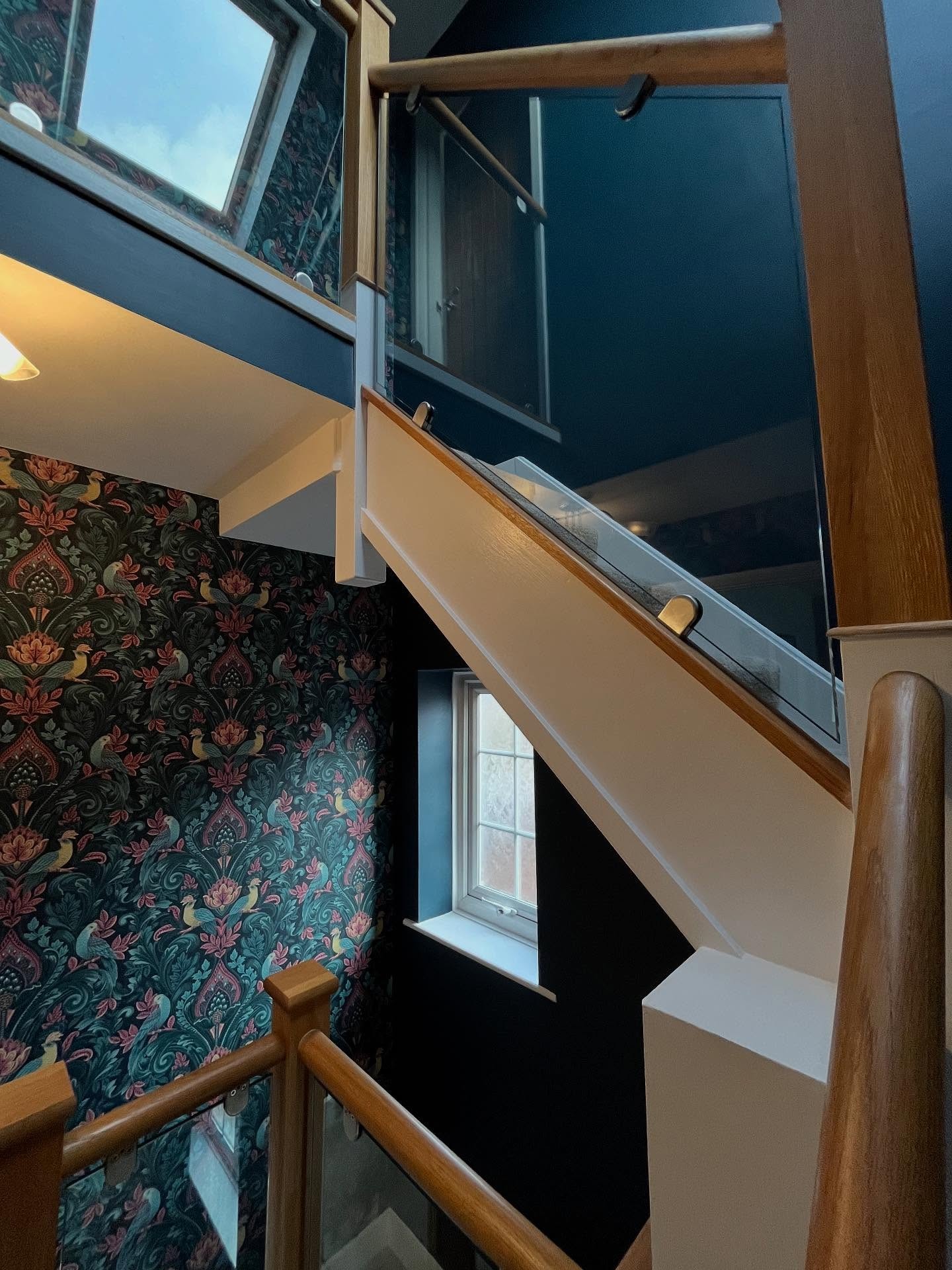
Under the skylight, pre-paint
Here’s the view most people warn you about. A narrow stairwell dropping two floors, limited daylight at the bottom, walls close on either side. The gray version plays it safe. It also plays it invisible.
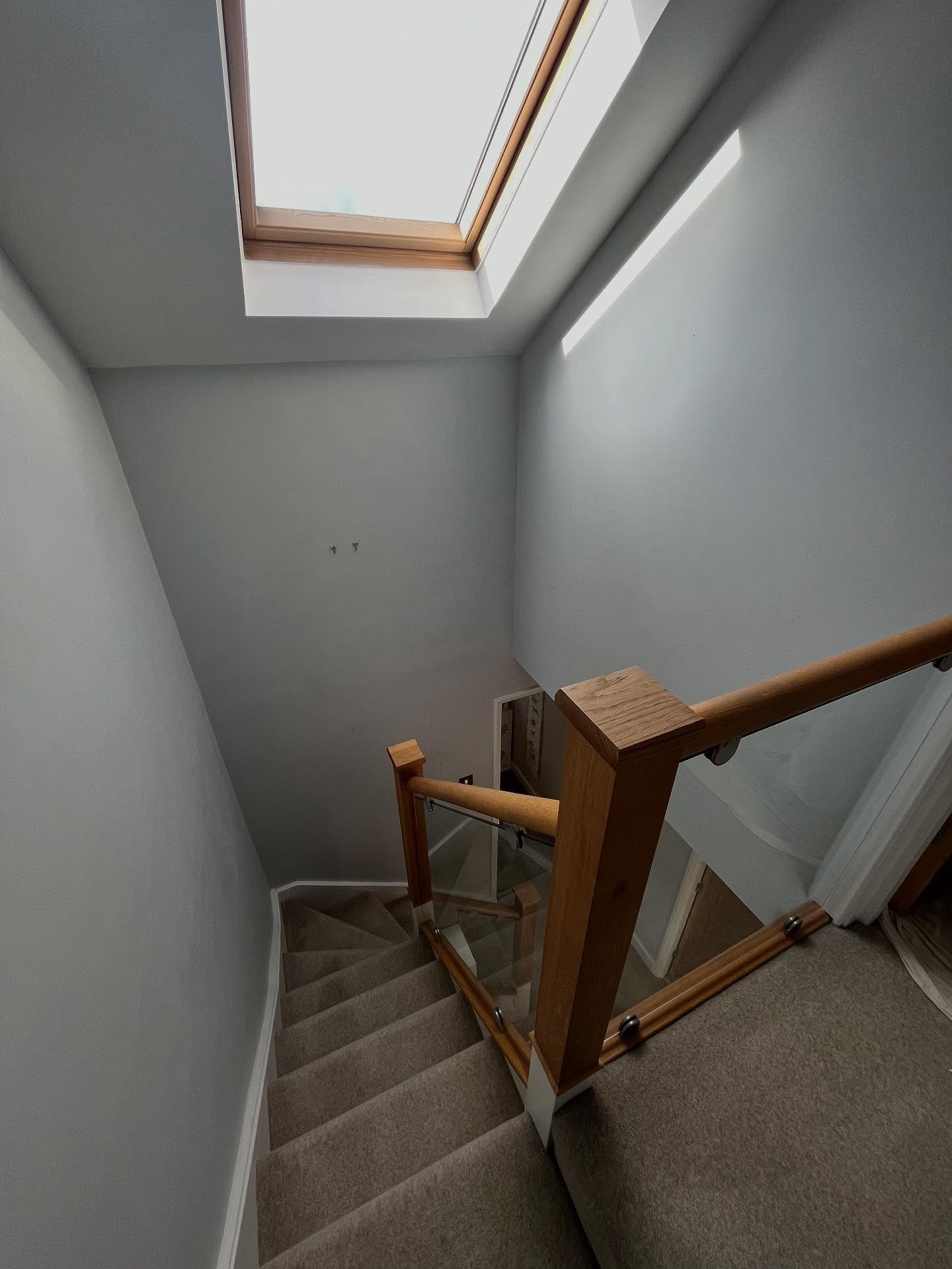
What the skylight makes possible
This is the spot where dark paint usually fails, but the VELUX at the top saves the day. Daylight falls straight down and the Inkwell walls just soak it up. What catches your eye instead is the staircase itself and the white woodwork, now reading like a line drawing cut through the darkness. You can actually see the structure of the stairs for the first time.
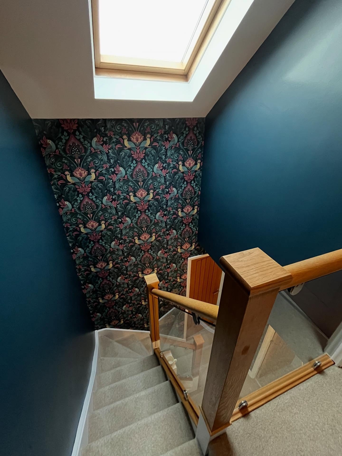
Stack the two versions and the bright elements swap roles. In the before, the walls are the lit thing. In the after, the staircase is.
The view back down to the door
Standing on the upper landing and looking down used to mean looking at an unfinished-looking wall full of test patches. Not exactly the first impression the owner was going for.
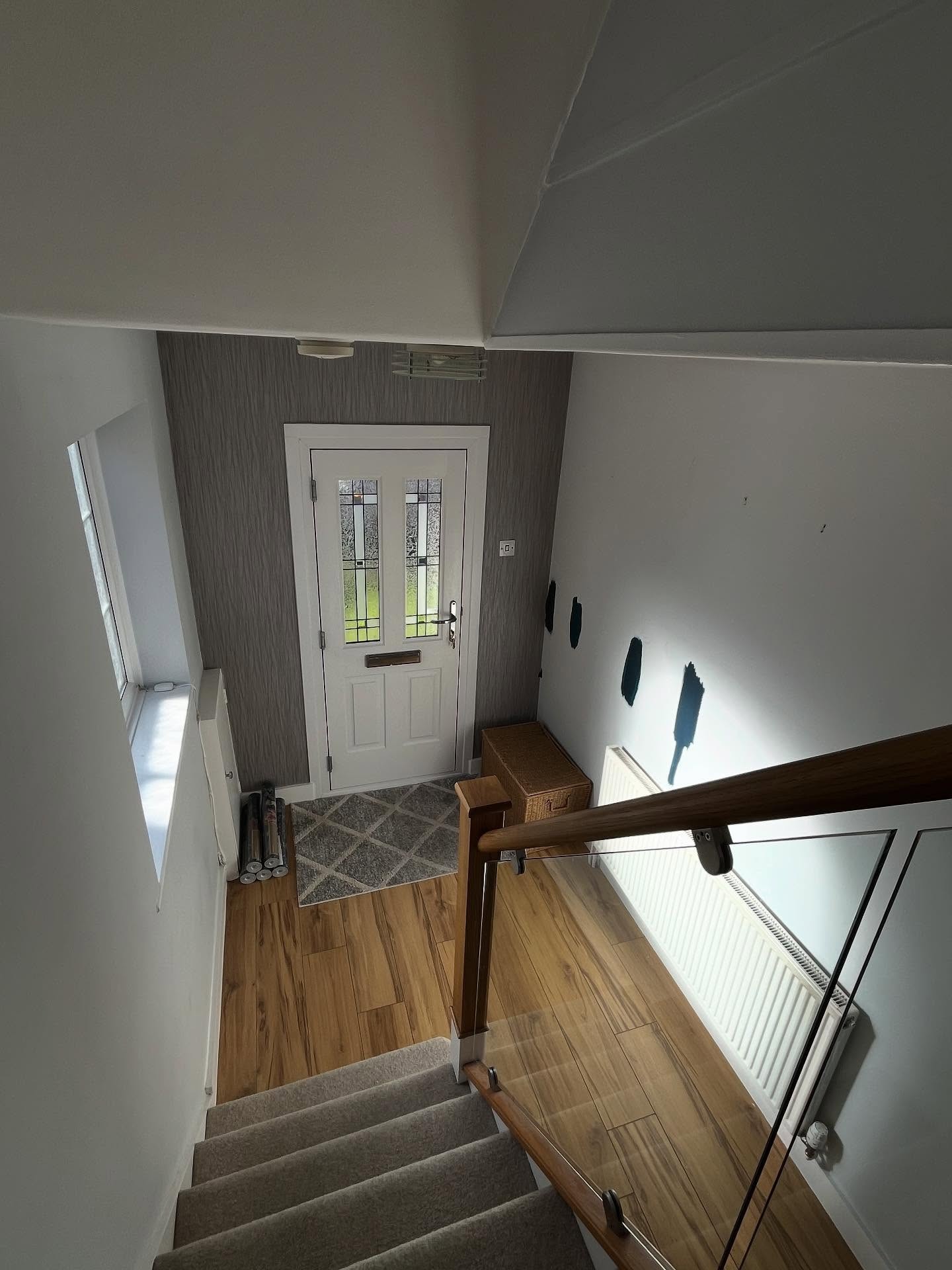
Same view, new drama
Now the view down feels like dropping the curtain on a stage. Dark paint on both sides, white trim running down the stairs, and the peacock paper framing the door at the bottom. The depth of the stairwell actually reads better in dark than it ever did in gray.
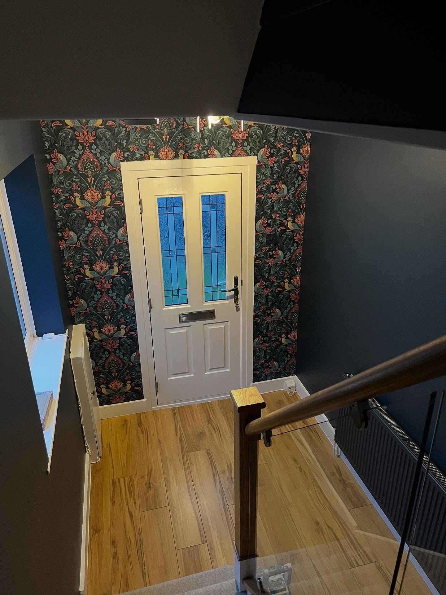
The staircase is identical. The feeling isn’t.
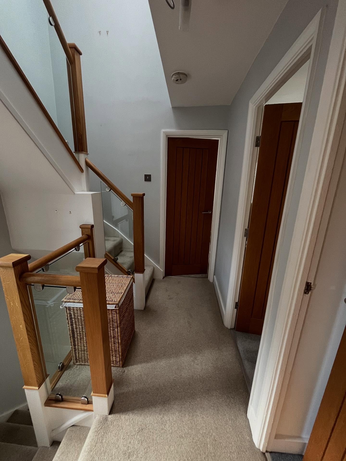
Upstairs before the pattern arrived
The upstairs landing got the same gray-everything treatment. Oak doors, a wicker basket on the floor, a glass balustrade wrapping around the stair opening, and nothing to pull your eye in any direction.
Pattern running between the doors
The peacock paper now runs between the oak doors like a frame around each one. The Super White architraves cut the dark into clean rectangles, so the landing doesn’t feel heavy even with that much pattern wrapping around. Each door suddenly looks placed, not just installed.
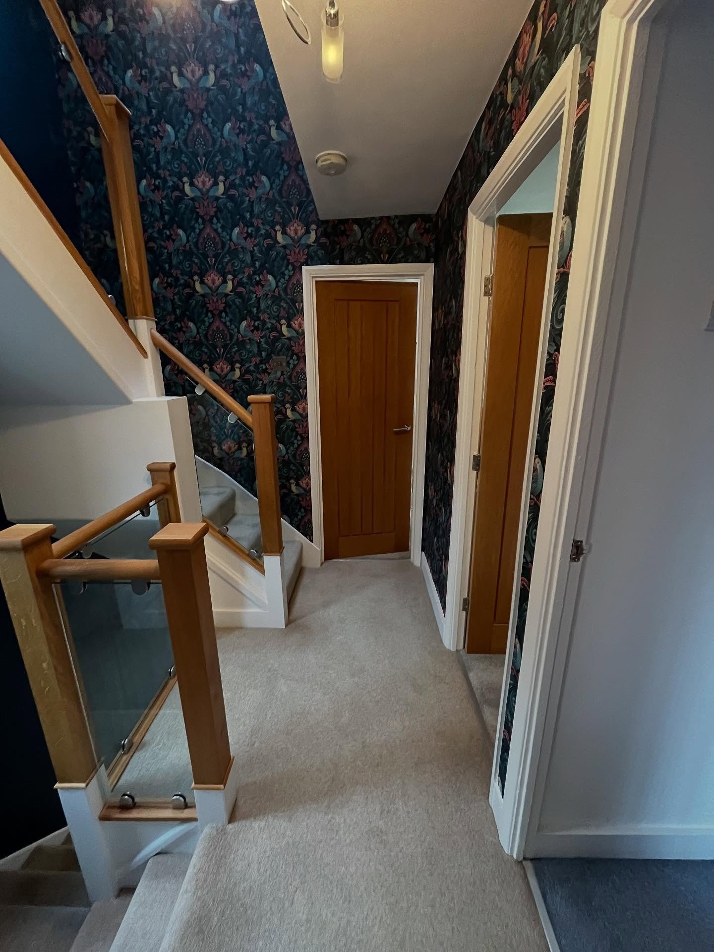
Oak hardware stays. Everything else changes.
The last corridor, still in gray
The short stretch of landing heading toward the bathroom was the most ignorable part of the house. Pale gray walls, white skirting, a pendant light nobody noticed.
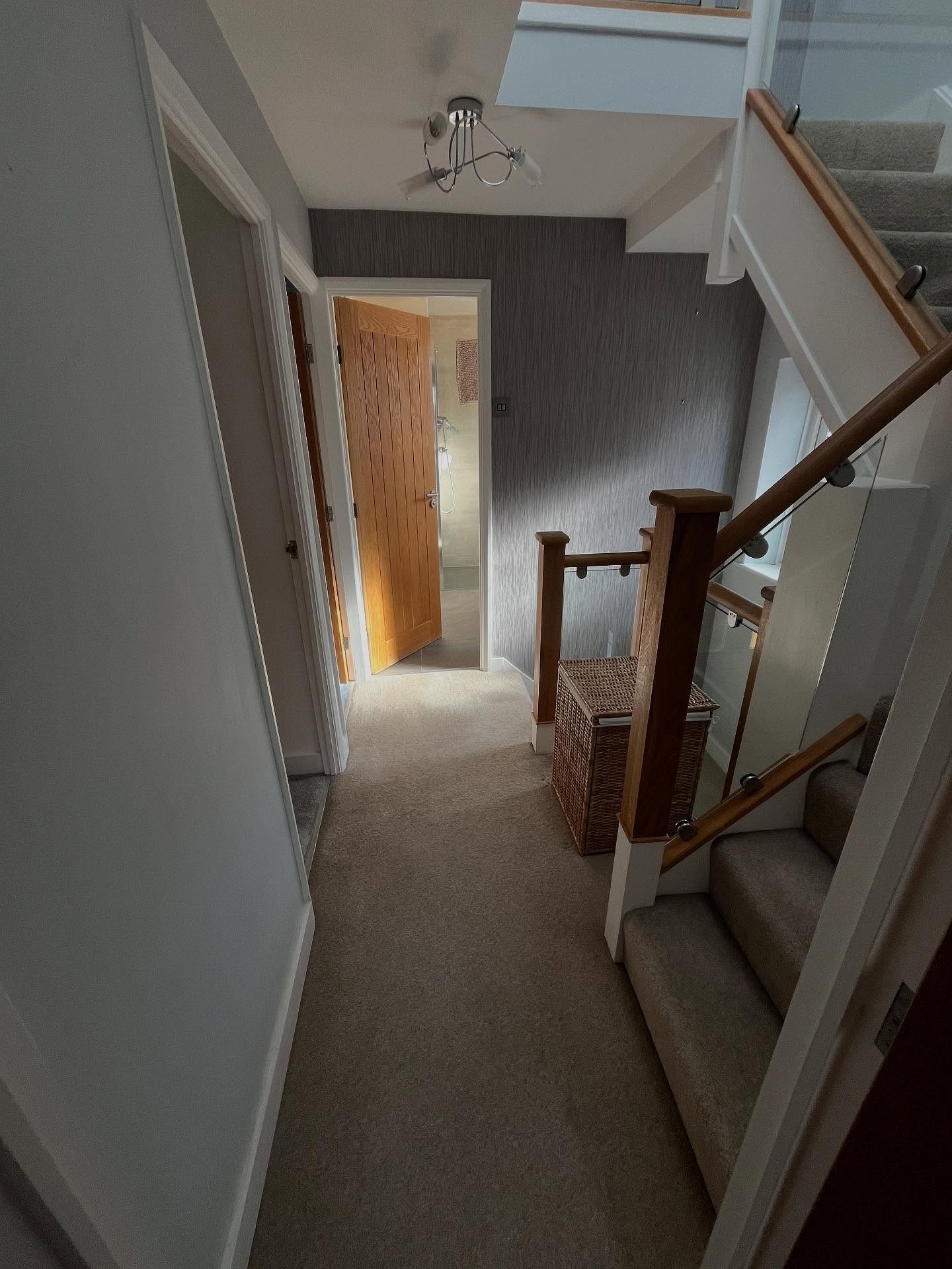
Same stretch, now reads as hotel
Switch it to Inkwell with the peacock paper wrapping both walls, turn the pendant on, and the corridor stops being a corridor. It becomes an actual room. People stop walking through it and start looking at it.
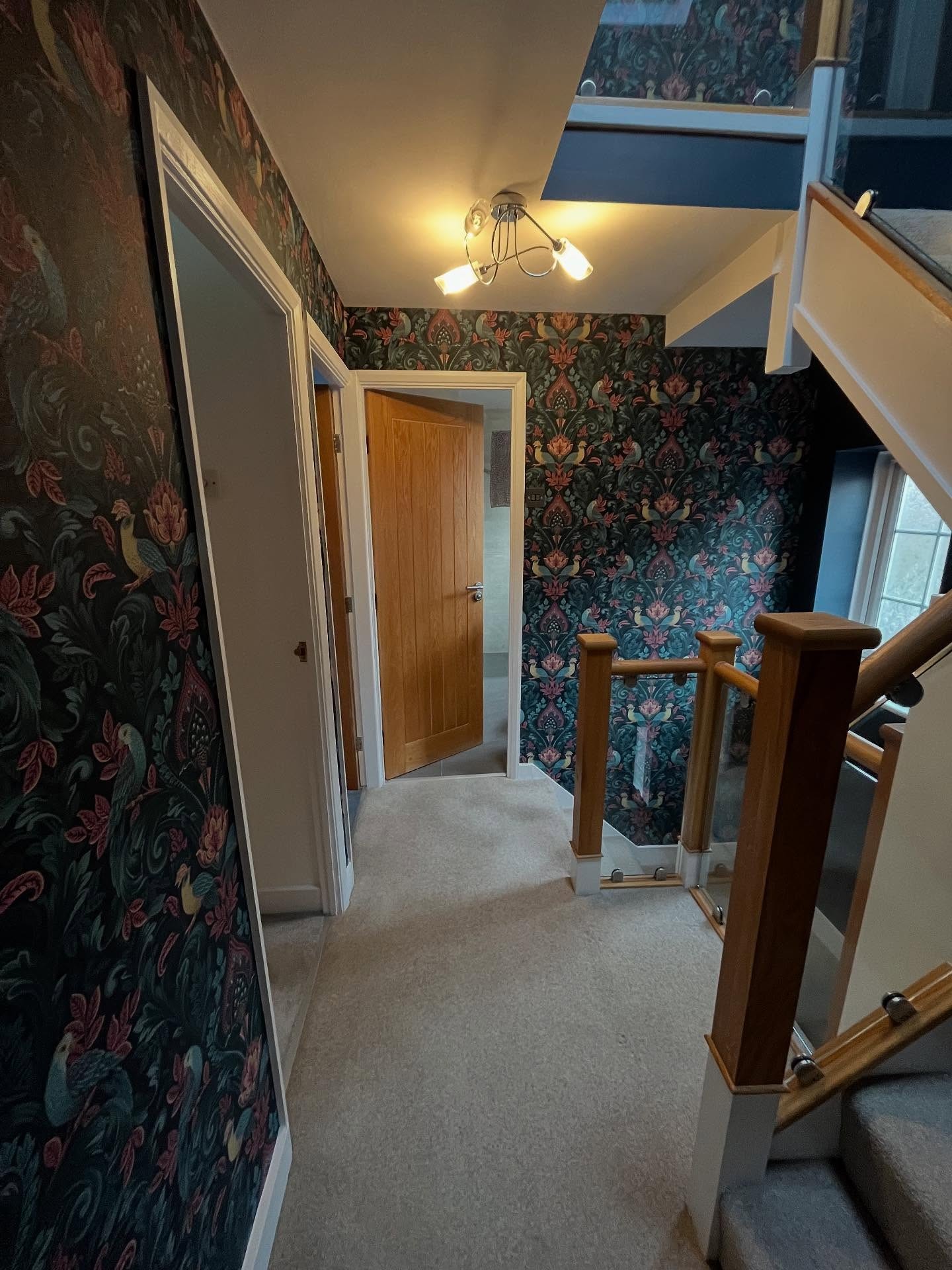
Same four doors. Only the walls between them changed.
Why this works when most dark hallways don’t
Three things kept this scheme from folding into cave territory. The skylight and the window on the half-landing throw daylight into the stairwell all day, which gives the dark walls something to absorb instead of nothing. The glass balustrade keeps the stairs visually open from any angle, so no matter where you stand the structure stays readable. And the peacock paper shares the same deep teal-navy base as the Inkwell paint, which means the paper sits onto the color instead of fighting it.
The warmth of the oak handrails, the oak floor, and the oak doors is what stops the whole thing from feeling cold. Without those, this would read as moody but sterile. With them, it reads as moody and lived-in, which is a very different thing.
Super White on the woodwork is the quiet hero. It carves the architecture into clean lines through the darkness and gives your eye something to rest on. Without that bright trim, all the dark surfaces would blur together.
Pale paint doesn’t automatically make a hallway feel bigger. In a narrow stairwell with real overhead light, dark paint can do the opposite of what most people expect. It pushes the walls into the background and lets the staircase, the woodwork, and the pattern become the main event.
The before photos show what the standard rule would have given these homeowners if they’d followed it. The after photos show what going against it looked like. That’s the whole story.