
If you’ve ever walked into a bedroom and thought “this is fine, but it feels like it’s from 2012,” you already know the room we’re about to show you. Dark cherry sleigh bed. Big aqua shag rug. Paisley duvet in cream and rust. Family photos in matching wood frames above the bed. Nothing is broken, but nothing is fresh either.
The homeowners didn’t gut the place. They didn’t touch the floor, didn’t move a wall, didn’t even take down the ceiling fan. What they did was smarter and a lot cheaper than a reno. They swapped five things and let one wall do the work.
The room they started with
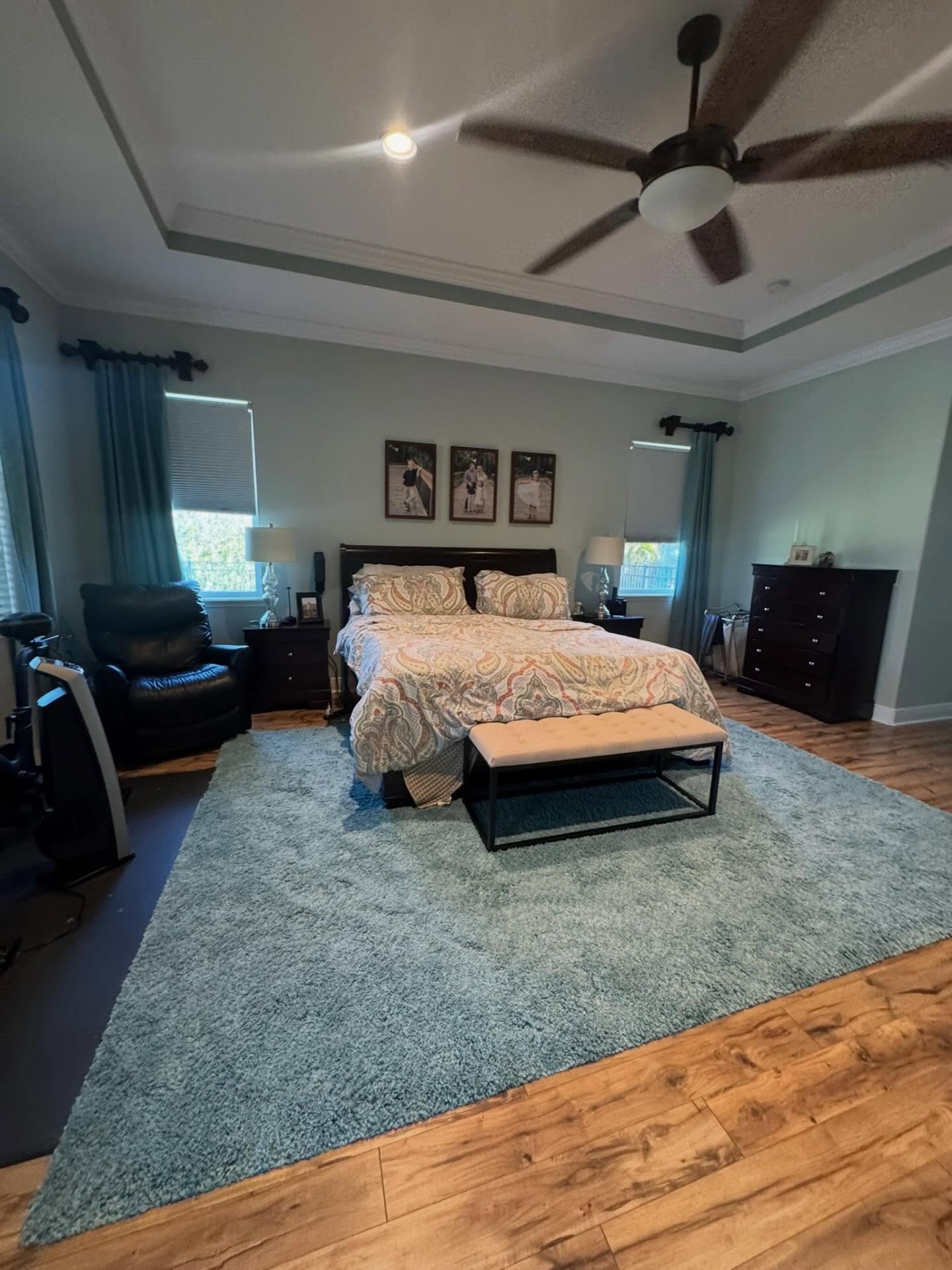
The problem here isn’t any single thing. The paisley is pretty. The sleigh bed is solid wood. The rug is soft underfoot. The problem is that every piece was chosen on its own, and when you line them all up, nothing talks to anything else. The rug yells blue. The duvet yells rust. The bed yells dark wood. Your eye has nowhere to land.
The whole thing turned on one wall
The wallpaper is the hero of this makeover. Not the bed, not the lamps, not the quilt. A blue-and-cream shibori-dyed grasscloth went up behind the headboard, and once it did, the entire room had a point of view it didn’t have before. Every blue that followed had something to echo. Every cream had a place to land. The wall stopped being background and started being the reason the room works.
Same room, same windows, same ceiling
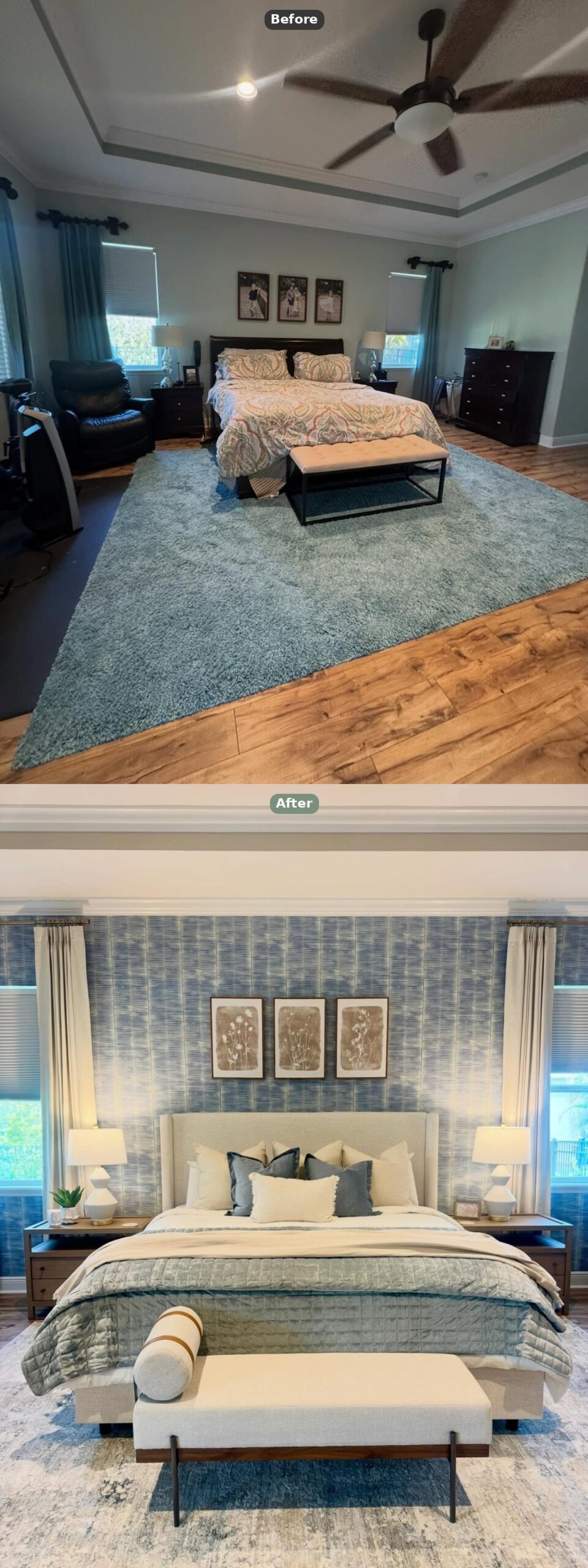
Look at the two shots stacked. The tray ceiling didn’t change. The windows didn’t change. The crown molding is identical. What changed is the amount of noise in the room. The before is loud and uncoordinated. The after is calm and deliberate, and it got that way without anyone picking up a sledgehammer.
The new bed knows its job and gets out of the way
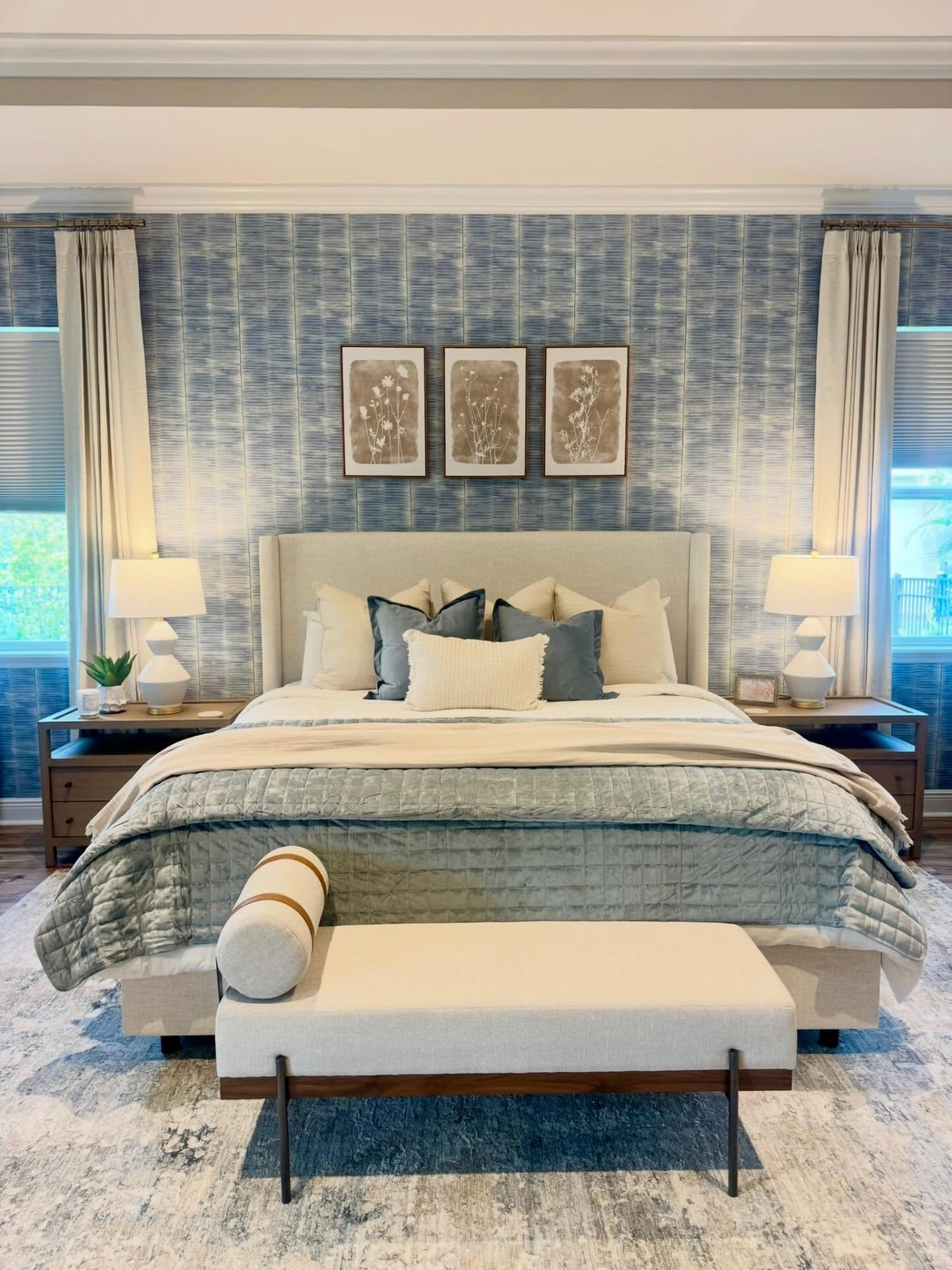
See how quiet the new bed is? Clean cream upholstery. No carvings. No posts. No stain to compete with the wood floors. It sits there and lets the wall do the talking, which is exactly what a good headboard should do when the wall behind it is this strong. The three sepia botanical prints borrow their brown from the picture frames and nothing else, so they read as part of the plan instead of sentimental add-ons.
Pay attention to the lamps
Small thing, big difference. The old chrome spindle lamps vanished against dark wood. These white ceramic geometric ones pop against the blue like punctuation marks, and they flank the bed in a way that actually finishes the composition instead of just lighting it.
The view from the other angle tells the real story
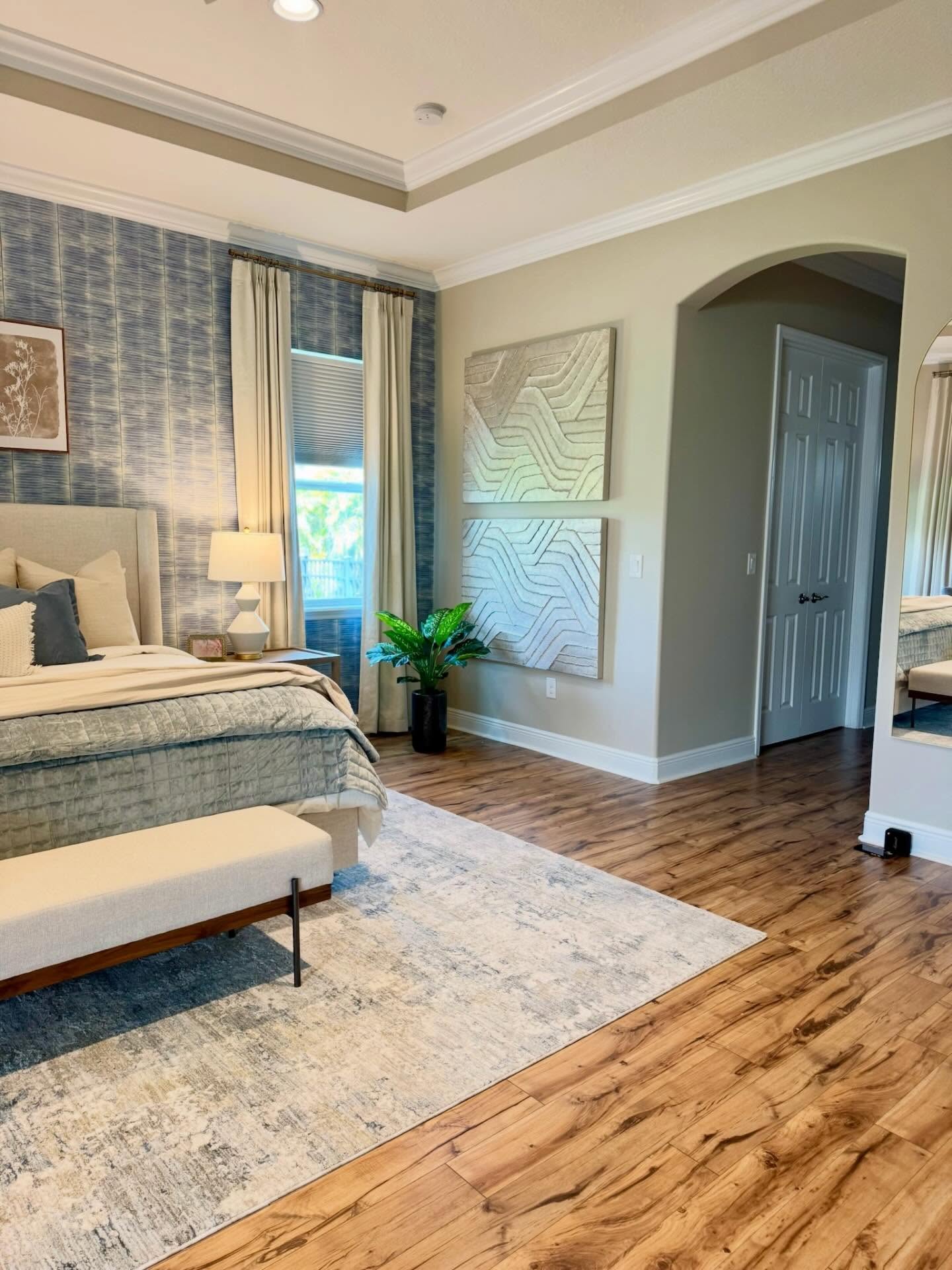
This is where the new rug earns its money. A faded blue-and-cream distressed pattern instead of a solid color. If it had been a flat blue, it would have fought the wall. Being faded and layered, it looks like something the family picked up on a trip rather than something that showed up in a delivery truck last Tuesday.
The arched doorway to the closet got a quiet moment too, flanked by a sage painted segment that pulls the whole corner together.
The reading corner stopped being a chair graveyard
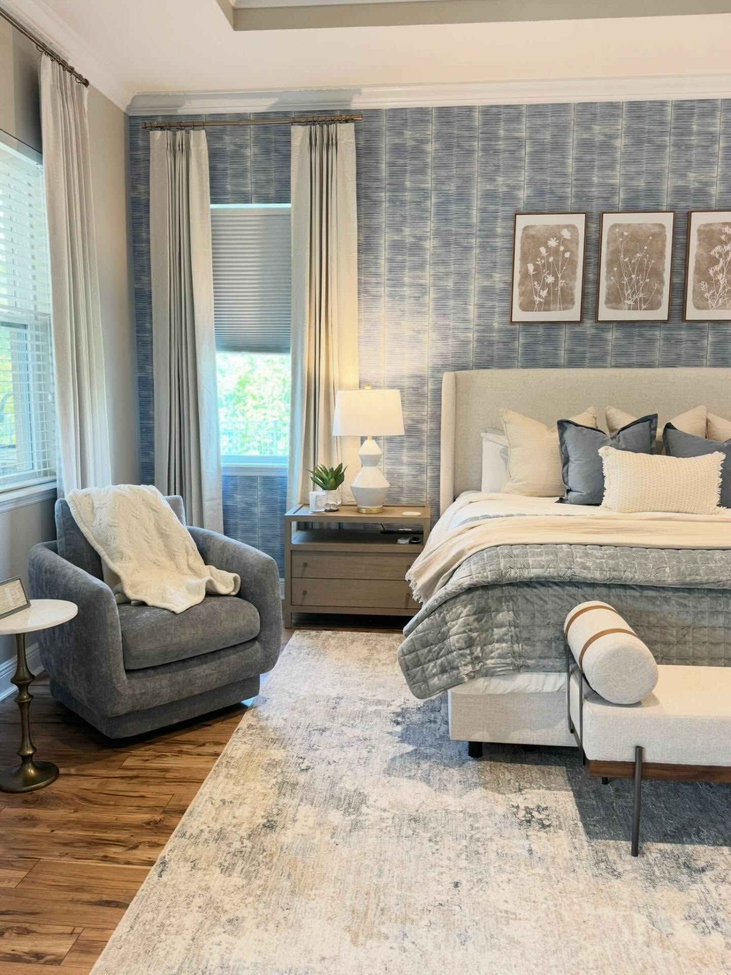
Before, this corner had a black leather recliner pushed against the wall with an exercise bike crammed next to it. Functional, sure. Inviting, no. The new slate blue velvet swivel chair with a soft white throw and a little brass pedestal table turns the same corner into somewhere you’d actually want to sit with coffee and a book. The chair picks up the blue from the wall. The throw picks up the cream. The brass side table nods to the lamp bases. Nothing is random.
The details on the dresser are not accidents
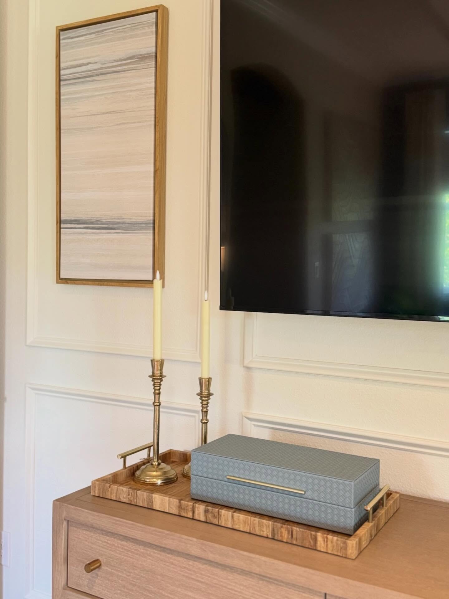
This is the step most homeowners skip, and it’s the step that separates “nice room” from “styled room.” A striped wood tray anchors the vignette so the objects on top don’t float. Two brass taper candlesticks give height.
A slate blue woven jewelry box carries the room’s color story over to a wall the wallpaper doesn’t touch. That’s three objects, grouped, finished. Compare that to the before dresser, which was lost in dark wood and buried under picture frames, keys, loose receipts, and whatever else had landed there that week.
The wall opposite the bed finally has a point
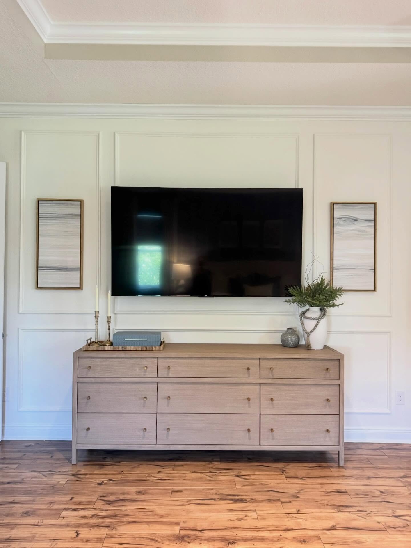
The TV wall used to be a blank. Now it has picture frame molding painted the same soft white, which gives the whole wall architecture it was missing. A long weathered oak dresser with brass knobs replaced the tall dark chest the before room had shoved into the corner. Two narrow neutral prints flank the TV so it stops looking like a black hole. A simple white ceramic vase with greenery breaks up the straight lines. None of this required a contractor.
What you can actually take from this
You don’t need a full renovation to get a change this big. You need one wall that commits, four or five supporting swaps that speak the same language, and the discipline to stop buying prettier versions of the mistakes already in the room. Credit to the team at Embrace Your Space FL for keeping the bones and only changing what was actually in the way.