The design of a wine label can make or break the success of a new wine introduced to the market.
View in gallery
Wine Labeling
Even beyond the quality of the wine itself, the design of a wine label plays a primary role in the purchasing decisions of customers. It is on this fact that many graphic designers have focused their attention to making creative, compelling wine labels that connect a bottle of wine with its buyer.
30 Wine Label Ideas to Inspire
To celebrate the work of these designers, TheCoolist has selected 30 of the most impressive wine label designs in recent history. To read it right, we suggest you enjoy this list over a freshly popped glass of wine.
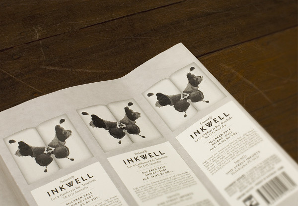
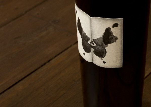
1. Inkwell Wines Rorschach-Inspired Wine Bottles
View in gallery
Just as every wine may affect each palette differently, the Rorschach inkblot test’s meaning is different to each viewer. With this wine label design, Inkwell Wine asks, “what do you see?” The crew at /M/A/S/H/ was hired to rejuvenate Inkwell’s label design and brand identity, and this bottle was precisely what the winemaker needed. If you can find a bottle of Inkwell’s 2007 Shiraz, it wears this label proudly. Even after you drink it, we recommend holding on to this bottle for its simple, compelling wine label design. [link]
Inkwell Wine Gallery
View in gallery View in gallery
 View in gallery
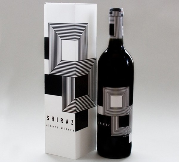
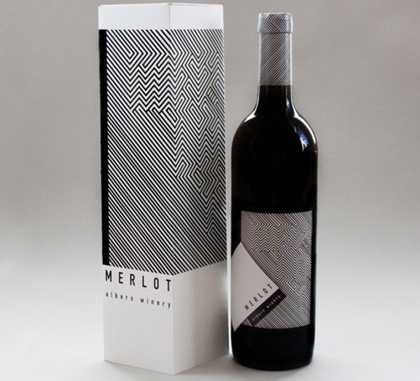
2. Meeta Panesar Wine Label Designs
View in gallery
Meeta Panesar’s wine bottle designs were created as an homage to the Op Art movement and the work of artist Joseph Albers. Panesar carried that Op Art tradition into these conceptual wine labels, some flush with color and geometry, others with tightly wrapped black-and-white lines. While Meeta Panesar’s wine labels remain a packaging art concept, we’d love to see his work commissioned and produced. [link]
Homage to the Op Art Wine Label Gallery
View in gallery View in gallery
 View in gallery
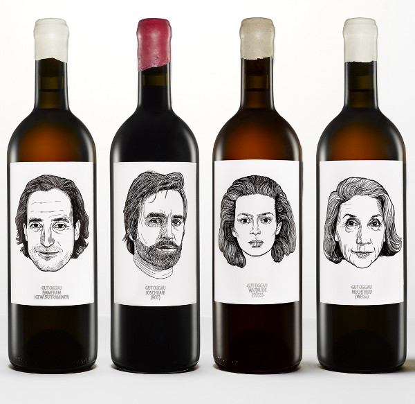
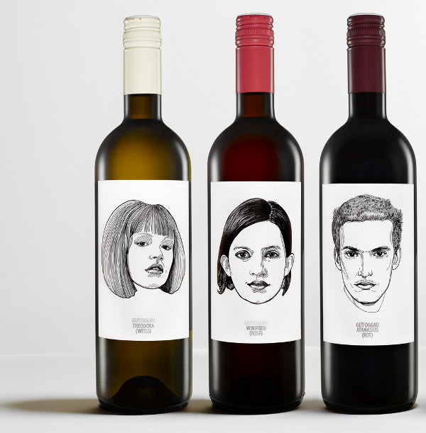
3. Gut Oggau Portrait Wines
View in gallery
The Oggau Estate is an Austrian winery that has given its wine more than just a flavor, but a personality… nine of them, to be exact. The Gut Oggau Portrait Wines were designed by Jung von Matt to give each Oggau wine label its own unique signature. Jung von Matt explains: “Just like every man, every wine has its own individual character ranging from young to mature, from playful to complex. We assigned a face, a story, and a name to these different attributes. Eventually, this led to a typical family clan with grandparents, parents, and children.” [link via jvm]
Oggau Estate Wines Gallery
View in gallery View in gallery
 View in gallery
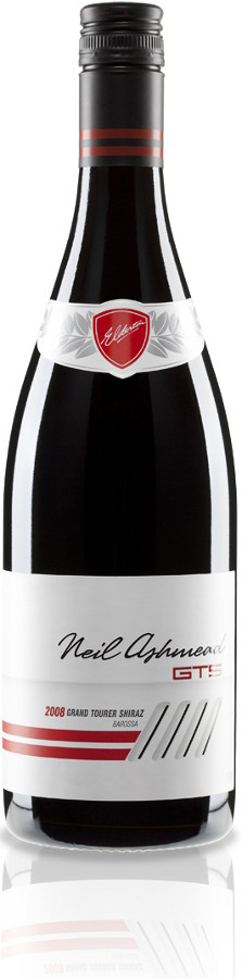
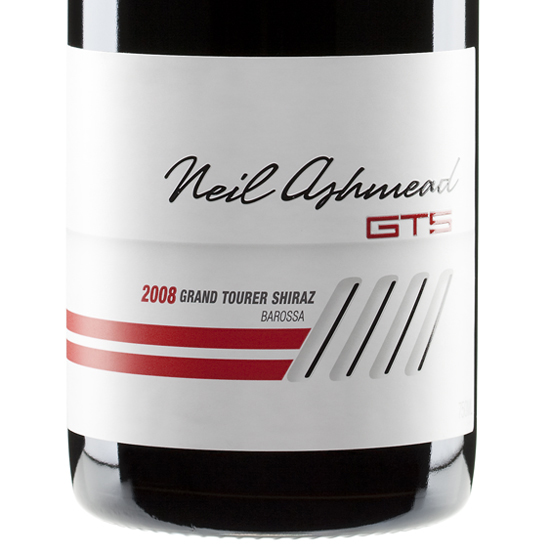
4. Neil Ashmead GTS
View in gallery
Elderton Wines of Australia has bottled wine in tribute to auto (and wine) enthusiast Neil Ashmead. The Neil Ashmead GTS, or “Grand Tourer Shiraz” features a racing-styled label bearing Ashmead’s signature. This bottle’s best attribute, however, is its’ six-speed stick shift screw-on cap. The creatives at Fuller, an Australian ad agency, deserve plenty of praise for this creative wine label design. [link]
Neil Ashmead GTS Gallery
View in gallery View in gallery
 View in gallery
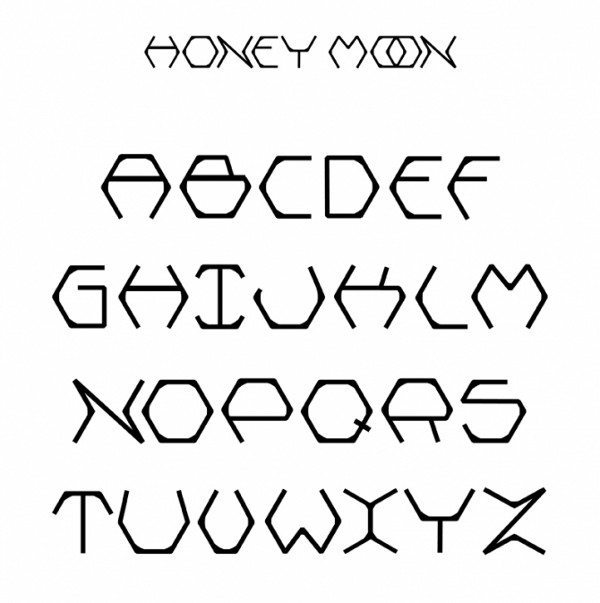
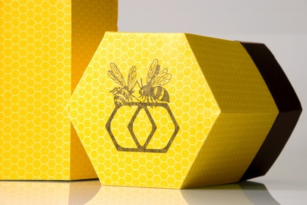
5. Honey Moon Wine
View in gallery
While we’ve never had the palette for sweet wines, this bottle by designer Lauren Golembiewski has our sweet tooth a-humming. Golembiewski created the Honey Moon Wine concept as an annual gift to past and prospective clients in celebration of a budding summer. The “honey moon” is the first full moon of the month of June, known as the perfect moment to begin the harvest of honey. While the bottle is certainly an achievement of its own, Golembiewski also created the honey moon font as shown in the gallery below. [link]
Honey Moon Wine Gallery
View in gallery View in gallery
 View in gallery
6. Versus Wine Pouch
View in gallery
Those who look down their noses at pouch wine should take a note of caution– this design is looking down its nose at you. The Versus Wine Pouch takes advantage of the new form of packaging by making a clean, clear impression with notes of both purity and royalty. The waves of wine are endearing to the product, while the golden diamond logo represents a product of rich quality. While the jury is still out until we taste it, the packaging makes a strong statement on its own. [link]
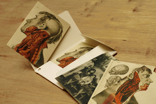
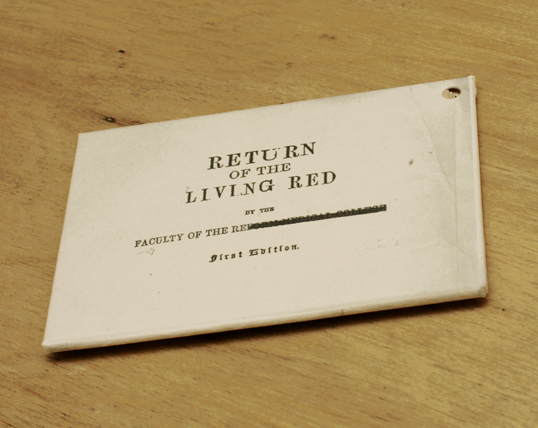
7. Return of the Living Red
View in gallery
The crew from /M/A/S/H/ returns to this list with a special bottle for Redheads Wine. A collaboration with Redheads Studio yielded a bottle called “Return of the Living Red”– a simple, provocative design with a throwback to classic horror films. Save for a seal of blood-red wax over its cork, Return of the Living Red is only adorned with a simple, aged envelope containing clues about the bottle’s contents. The cards within the envelope continue the horror story, showcasing the illustrative handiwork of the /M/A/S/H/ team. [link]
Return of the Living Red (Gallery)
View in gallery View in gallery
 View in gallery
8. Sav Sparkling Wine
View in gallery
While Sweden may not strike you as a typical wine producer, the Scandinavian country has some interesting contributions to the world of wine. Sav Sparkling Wine isn’t borne of grapes, but a birch sap that is pressed in the virginal wine-making region of Jämtland. Sav’s bottle and identity are inspired by the very tree from which this wine is created, the white birch. After the cover is peeled away, the label is a minimal white with solid black lettering. We’re a bit apprehensive to taste a wine made from sap, but we’re quite pleased with the label alone. [link]
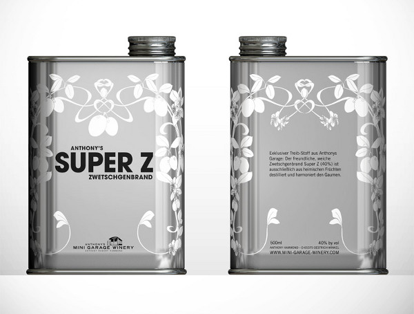
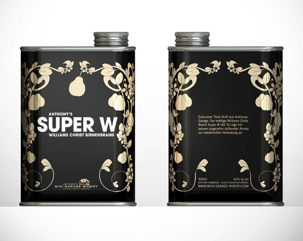
9. Mini Garage Winery
View in gallery
As long as you don’t store these wines in your garage (especially next to the turpentine), you’re in for a tasty treat of packaging design. The Mini Garage Wines and Brandies by Anthony Hammond have a literal conception– Hammond’s wine is produced in a former tractor shop in Germany. The packaging is amongst the most creative on this list, although we’re skeptical about their ability to preserve the original flavor of the product. Perhaps its the condition of the rusty turpentine cans in our own garage… [link]
Mini Garage Winery (Gallery)
View in gallery View in gallery
 View in gallery
10. Lunar Vine Wine
View in gallery
Lunar Vine Wine wanted to add a dash of color to their bottles– who better to hire than UK design firm DeathByColor? DBC created these wild wine bottles as lush and colorfully explosive as they could be. While this tends to communicate “these wines taste like soda pop”, we can certainly appreciate the artist’s vision. Our favorite is the Shiraz, it is no surprise that we go for the most colorfully conservative… [link]
11. Matsu Organic Wine
View in gallery
A quick glance at these bottles instantly communicates this winery’s main value– three generations of expertise. The Matsu Organic Wine bottles show the history of this wine from grandfather to grandson, showing the focus this family has put into its grape over these generations. Each label represents a different wine from Matsu, “El Pícaro”, “El Recio” and “El Viejo”– each with its own personality and flavor. [link]
12. Segreto Wine
View in gallery
When Segreto commissioned a special design for a limited edition anniversary vintage, Takk! Design delivered a strong, bold signature for the product. The result was a pitch-black bottle with a thick, subtly scripted font showcasing the brand’s mark winding around the label. Pair three bottles together, the name is spelled out in its entirety with little separation. If you were in the right place at the right time, you may have been lucky to pick up a bottle (or three) from your personal wine boutique. If you are one of the few, give us a call when you uncork, yeah? [link]
13. Let It Grow Wine Bottles
View in gallery
Brazilian design firm LetItGrow wanted to reach out to their clients with a special gift. The designers took 100 empty wine bottles, painted them white, and then illustrated each bottle by hand. Before delivering the unique work of art, they wrapped each unit in a vacuum-sealed black plastic label with a description of its contents. We don’t know about you, but in some circles shipping an empty wine bottle as a gift is a criminal offense… no matter how beautiful they look! [link]
14. Francis Ford Coppola “Carmine” Wine Jug
View in gallery
The design crew at Sfaustina created this obelisk of a wine jug for the film’s most noteworthy wine lover, Francis Ford Coppola. Coppola’s father, Carmine, used to stock wine jugs in his basement where the young Francis would play. The young Coppola attempted to carry a jug across the basement with a pencil through the handle, but the pencil broke and the jug shattered. To recreate Mr. Coppola’s childhood, Sfaustina designed this jub with a dark label with sheet music written by Francis’s father and a black pencil in the handle. The name, of course, is “The Carmine”, named for the Coppola family patriarch. [link]
15. Shefa Profusion Wine
View in gallery
The word “Shefa” translates from Hebrew as “profusion”, with these wines named as such for their youthful abundance. The Shefa Profusion Wines are flush with Hebrew iconography and imagery, giving these a decidedly Middle Eastern appearance. While little is known about the waters within, the bottles themselves certainly have an intoxicating effect. [link]
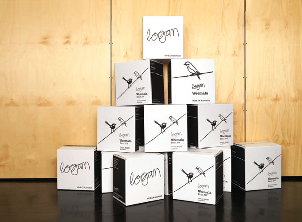
16. The Logan Weemala Wine Collection
View in gallery
In name and in symbol, the Logan Weemala Wine Collection faithfully represents its homeland. “Weemala” is the name of the region where these grapes were grown, and is the aboriginal word for “good view”. To give this collection a face, War Design selected five birds common to the Weemala region, making each a symbol for one of Weemala’s varietals. The end result is a simple, playful, and attractive series of labels for a great Australian winery. [link]
The Logan Weemala Wine Collection (Gallery)
View in gallery View in gallery
 View in gallery
17. Laughing Stock Wine
View in gallery
The designers at Laughing Stock Wine took a literal approach to designing their label. A stock ticker twists and wraps around the bottle, displaying the basic details of the wine contained within. The name of the wine is displayed as a stock symbol, “LFNG”, with the vintage year below it. In all, the design does an excellent job of conveying the character of the brand. [link]
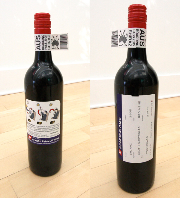
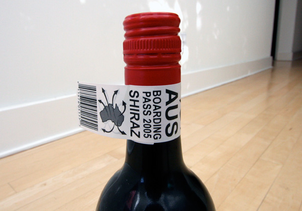
18. Boarding Pass Shiraz
View in gallery
An instant classic, the Boarding Pass Shiraz label is one of the most creative theme-based designs in recent years. The front label is essentially a boarding pass with the travel details replaces with information about the wine. This 2005 Shiraz has been a big hit in the world of packaging design, encompassing the entire air travel experience in one bottle. [link]
Boarding Pass Shiraz (Gallery)
View in gallery View in gallery
 View in gallery
19. DolceVita Wines
View in gallery
Designer Romulo Castilho gave DolceVite Wines a veritable fireworks display for their packaging. In a true Carnival fashion, these Brazilian wine labels explode with color, gold for the light and purple for the dark. Sleek and sophisticated, Castilho’s designs served DolceVita a strong statement for their labels. [link]
20. Saddler’s Creek Winery “Naked” Wine Bottles
View in gallery
Saddler’s Creek Naked Wine Bottles remove the label altogether, leaving nothing but naked glass in its place. The name and details about the wine are then printed directly onto the bottle with gold ink for Chardonnay, purple for Merlot. These bottles were designed to stand out from a lineup of paper labeled bottles, and from a quick glance– they certainly succeed. [link]
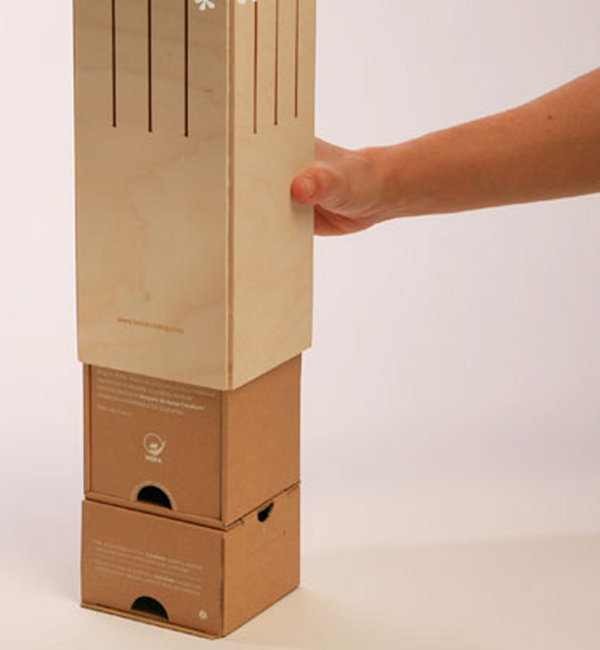
21. The Wine Case Lamp by Ciclus
View in gallery
In a society where consumption nearly always ends with waste, the Wine Case Lamp is a bold statement. After you finish this bottle, its case can be constructed into a fully functional (and well-designed) slatted lamp. Just pop the cork, fill up a few glasses and let there be light. [link]
The Wine Case Lamp by Ciclus (Gallery)
View in gallery View in gallery
 View in gallery
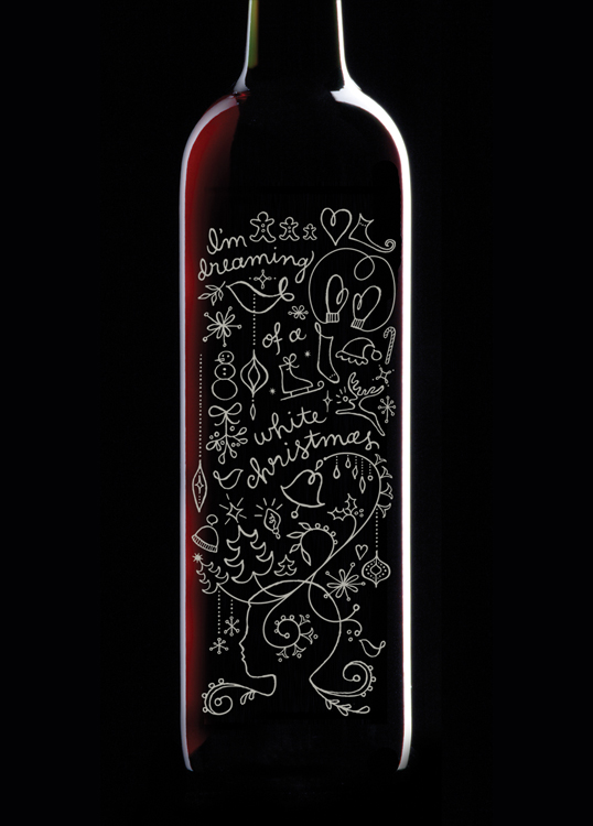
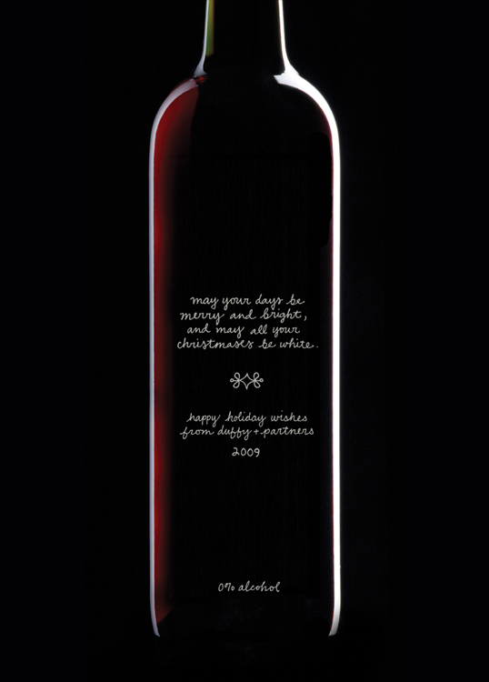
22. Duffy and Partners Holiday Wine
View in gallery
To share some holiday cheer with its friends, family, employees, and clients, the firm of Duffy and Partners sent out this well-designed bottle of Holiday Wine. “I’m dreaming of a white Christmas,” exclaims this bottle’s label. While we love the illustration and the creative vision for the bottle, we’re having a tough time getting past the little mark on the back which shows “0% alcohol”… [link]
Duffy and Partners Holiday Wine (Gallery)
View in gallery View in gallery
 View in gallery
23. B Frank Wine
View in gallery
The best part about B Frank Wine’s label is the part you add yourself. If it’s time for a heart-to-heart with a friend, co-worker or lover, this is the bottle you want to have handy. Just be frank, speak your mind, and get it out in the open. This design is the work of Talia Cohen for the B Frank digital marketing agency. Quite frankly, we love it. [link]
24. USB Port Wine
View in gallery
Due to a recent law, if a specific wine doesn’t come from Portugal, it can no longer be called “port”. So to sidestep this little legality, Peltier Station Winery and 6 West Design devised the “USB Port Wine”. The label comes as close to saying “port” as possible, without actually saying it– even spelling out “im_ant” and “_folio” on the rear side of the bottle. The binary code above the name on the front also spells out Peltier Station Winery, completing the look on this design. [link]
25. Vine Parma Wine
View in gallery
Designer Raya Ivanovskaya has put a wealth of cultural flavor into the Vine Parma Wine design. Wrapping around this bottle are hieroglyphics, totems, and a mystic language telling tales of times past. Inserted subtly into this design are the basic details about the wine– including a bar code, distribution information, alcohol content, and more. This is more than just a wine bottle, it’s a work of art… [link]
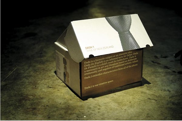
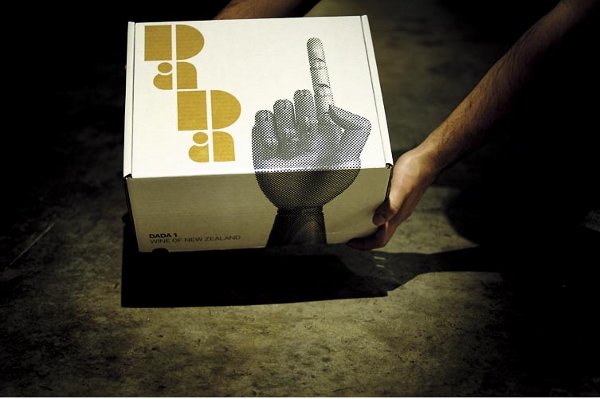
26. Dada Wine
View in gallery
Suckers for a good typeface will fall for the design of Dada Wine in a heartbeat. This progressive bottle design features a fresh, bubbly, bold, and golden logo taking up most of the front label space. The signature Dada hand supports the logo, while the business end of this design is moved to the back, justified to the left. Order one of these, it’ll arrive in a case sharing the same fresh branding as the bottle of Dada wine itself. [link]
Dada Wine (Gallery)
View in gallery View in gallery
 View in gallery
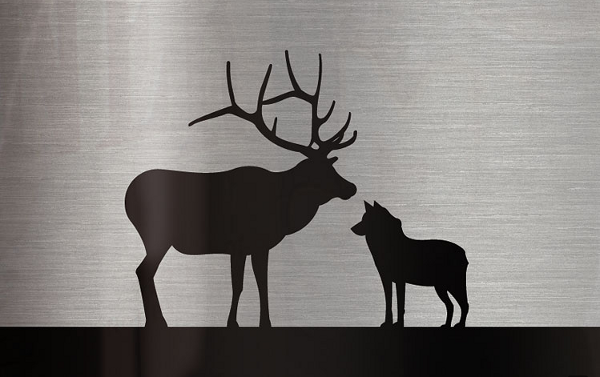
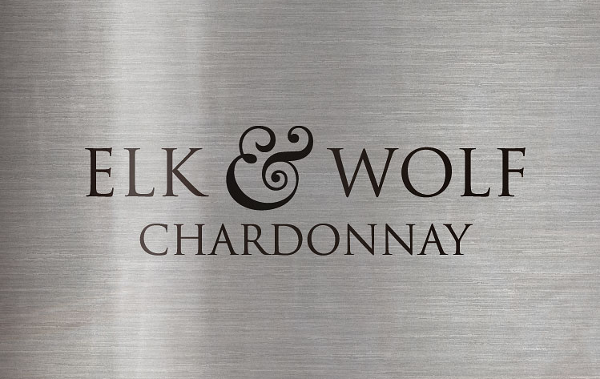
27. Elk and Wolf Chardonnay
View in gallery
Elk and Wolf Chardonnay wants to serve their wine cold– so cold, in fact, that only aluminum could properly do the trick. The only problem there is that wine aficionados don’t only want their Chardonnay cold, they want it in a glass bottle. To help sell this unusual container to a group who might avoid it, SocialUK gave this aluminum bottle a classy, refined look. If you’re going to reach for an aluminum bottle of Chardonnay, SocialUK worked pretty hard to make sure that it is this one. [link]
Elk and Wolf Chardonnay (Gallery)
View in gallery View in gallery
 View in gallery
28. Ben Schlitter’s TwentyFour Wine
View in gallery
Designer Ben Schlitter has made his mark using ordinary objects to create new designs. His TwentyFour Wine continues this technique with a label inspired by rubber bands– and a cork sealed by one. The name TwentyFour describes the circumference of the wine bottle at exactly 24 cm. In all, this work represents an interesting take on the wine label and a refreshing inspiration on the part of Ben Schlitter. [link]
29. Lazarus Wine’s Braille Wine Bottle
View in gallery
While this label may be a tough read for the layman, its design is strikingly attractive to those who cannot understand its language. The Lazarus Wine bottle features a label printed in big, bold braille with either a black or yellow background. There is an English description at its base for those who can’t feel what this wine is about, but that’s precisely why we like it– it’s the mystery of this one that makes us want to pop the cork. [link]
30. Very Chic Wine Samplers
View in gallery
All you need to get to know a good wine is to take a slow, calculated and careful sip. Very Chic Wine hopes to make an impression before you sample with this attractive, floral-inspired packaging. For the potential buyers, customers, and friends of Very Chic Wine, this packaging certainly makes a strong statement about the quality of the wine contained within. [link]
So we’re curious. What are your favorite wine labels in the list above?
We had a difficult time narrowing this list down to 30, let alone picking our own favorite. Let us know your thoughts in the comments.
In the meantime, we’d like to thank the people at TheDieLine and LovelyPackage, whose brilliant coverage of packaging design led to many of the discoveries in this feature.
Thanks for reading — if you enjoyed this one, be sure to check out these other features:


King’s Court Estate Winery’s Queen Riesling
You missed Down The Rabbit Hole Wines – if you’re looking for great wine labels – well worth a look! http://www.downtherabbitholewines.com.au
Honey Moon Wine: What a bespoke branding set on its own from the font, to the cork and neck seal, to the die cut label. The Carmine wine jug’s understated matte on gloss label, replete with sheet music and pencil–just so elegant! But the Anestasia vodka is stunning. Can’t imagine the iterations it took to get the angles right for the best form.
Anestasia vodka, karim rashid designed.
Not wine, but check out karim rashids bottle for anestasia vodka. Other cool bottle designs by zaha hadid, and i love the bottle for Elit vodka also.
So awesome, thanks for sharing Steve!!
These are some seriously cool labels … so much better than the boring ones we see in the supermarkets