Musical album covers most essentially offer a visual representation of the music they adorn. Many have cynically reduced the importance of album covers to glorified advertisements so they’ll stand out on store shelves. However, that narrow assessment diminishes the impact these works of visual art have to heighten the experience of listening to an album. Album cover art captures the thematic or cultural essence into a less ephemeral form than the music alone is capable of producing.
View in gallery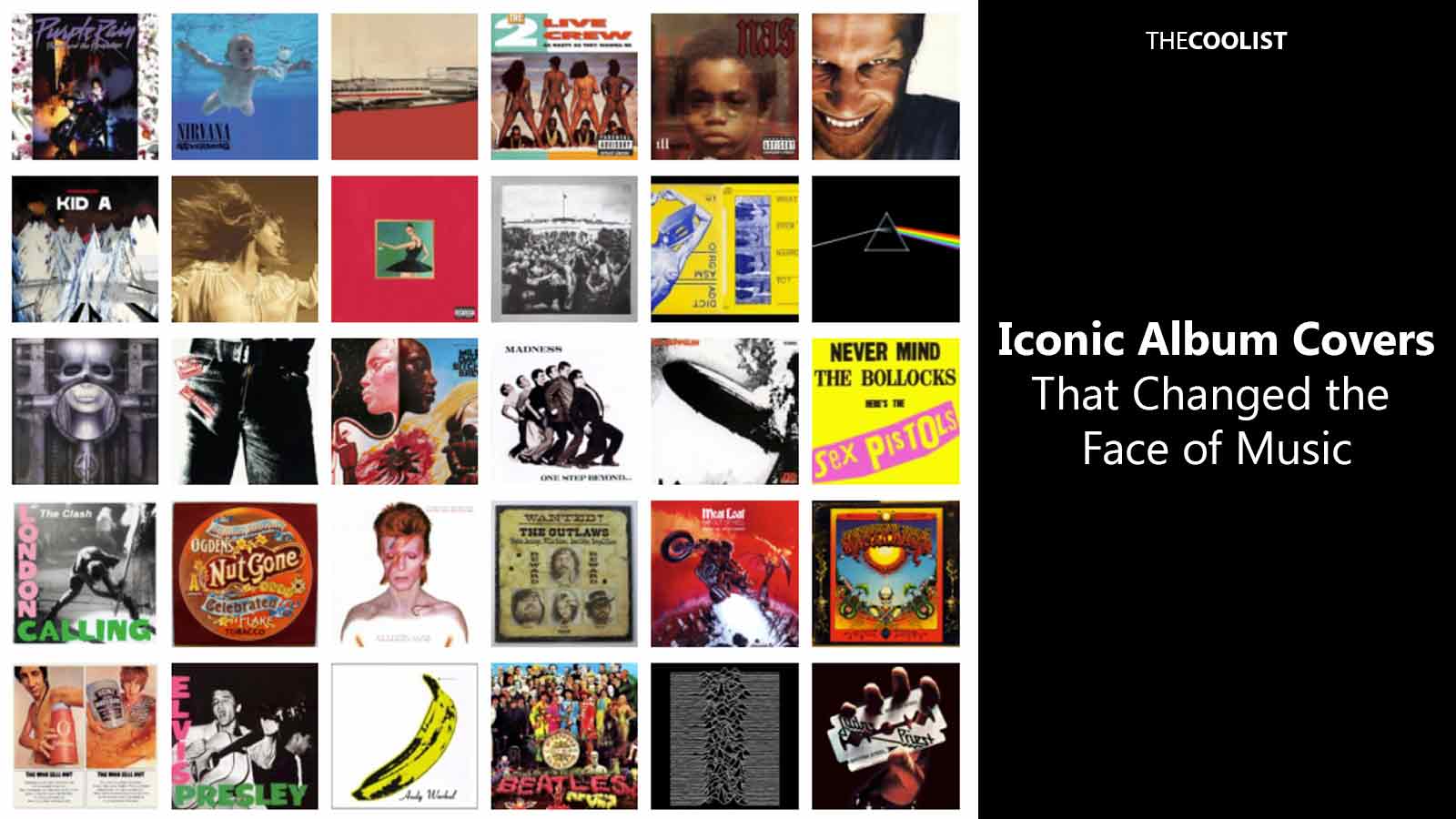
Moreover, the most iconic album covers have continually transcended their intended commercial and artistic purposes to shake the music industry and pop culture as a whole. The memetic devices within their cultural contexts evoke the adoration, intrigue, or even rage that fuels or even defines a particular cultural zeitgeist. At the very least, the best album art sets the stage for imitators and innovators alike to continue fleshing out the art form. What’s clear is that the historic course of album covers has been anything but linear or limited to one type of music or another. What initially picked up steam in the rock ‘n roll era has evolved through the myriad jazz, hip hop, metal, and pop album covers that define musical moments in time and place.
Below, we examine the aesthetic and cultural impacts of 30 of the most iconic and influential musical album covers of all time.
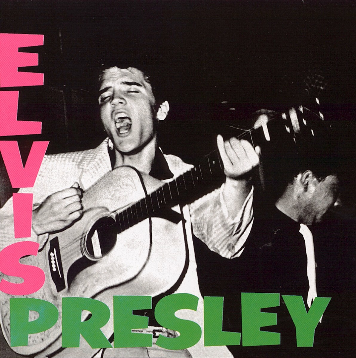
1. Elvis Presley (1956)
A plain album cover, but for the time it was a revolution. The sexy, arousing, gyrating rocker graces the front of “Elvis Presley” (1956), with a guitar taking center stage; effectively ushering in the age of rock ‘n’ roll.
View in gallery
This image of Elvis, exuding raw energy and charisma, not only symbolized his groundbreaking impact on music but also captured the essence of a cultural shift towards youth and rebellion. The cover’s simplicity and focus on the artist himself marked a departure from the more reserved album art of the era, making it an iconic representation of rock ‘n’ roll’s emergence and Elvis’s status as a music legend.
2. Sgt. Pepper’s Lonely Hearts Club Band (The Beatles, 1967)
A complicated picture to put out, simply because getting the rights to all of the influences represented, “Sgt. Pepper’s Lonely Hearts Club Band” by The Beatles (1967) is a complex love note to a complex time that many consider the greatest album cover ever made.
View in gallery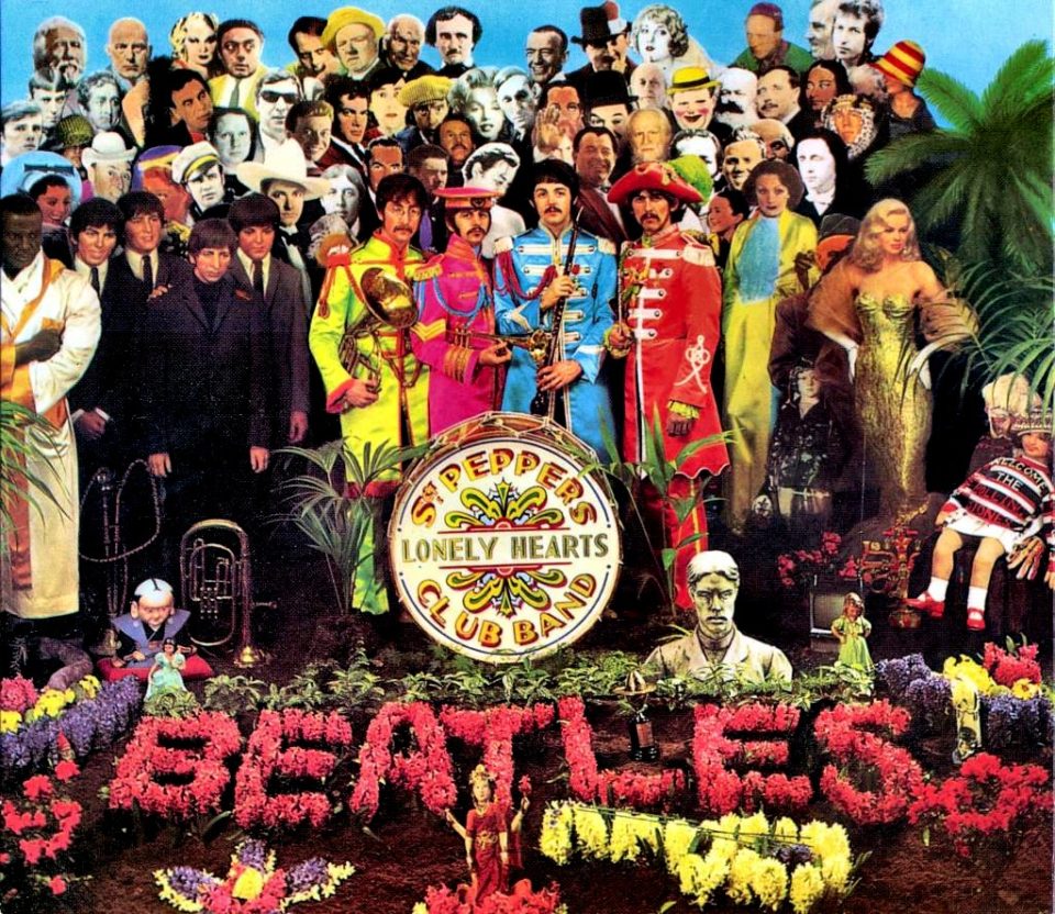
This cover art, with its vivid and crowded collage of historical figures and celebrities, perfectly encapsulates the spirit of the late 1960s, blending art, music, and popular culture. It set new standards for creative ambition in album artwork, transforming the cover into an integral part of the album’s artistic statement. This groundbreaking design not only reflects the album’s experimental and groundbreaking music but also serves as a visual representation of the era’s cultural revolution.
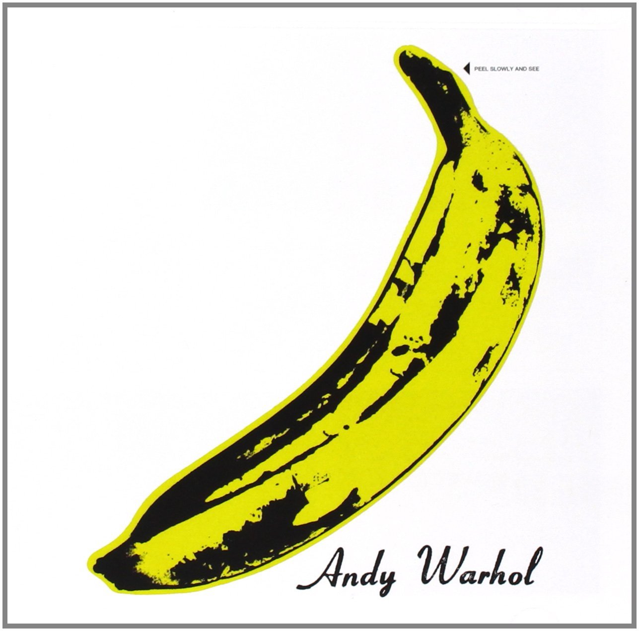
3. The Velvet Underground & Nico (1967)
At the time of its production, the self-titled album “The Velvet Underground & Nico” (1967) confused many, leading them to believe that pop-artist Andy Warhol, who designed the cover, was actually in the band. In truth, its simplistic, but manipulative nature has given rise to many unknown musicians seeking works from known artists.
View in gallery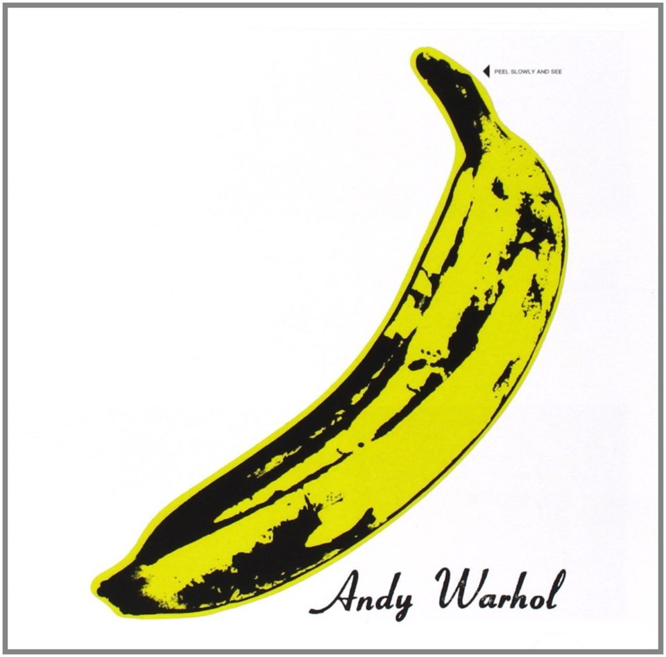
The iconic banana sticker, inviting listeners to ‘Peel slowly and see,’ not only became a symbol of the album’s avant-garde sound but also highlighted the merging of visual art and music during this era. This collaboration set a precedent for how influential art could enhance a band’s image and intrigue, blending the underground music scene with the high art world. Warhol’s involvement lent the album an air of artistic credibility and mystique, cementing its status as a cultural and aesthetic landmark.
4. The Who Sell Out (The Who, 1967)
Playful and nakedly pointing out the pervasive nature of capitalism and advertising, “The Who Sell Out” (1967) cover offers up deodorant and beans in a satirical stab at consumerist culture, poignant in a world where Iggy Pop’s “Lust for Life” was played over vacation commercials.
View in gallery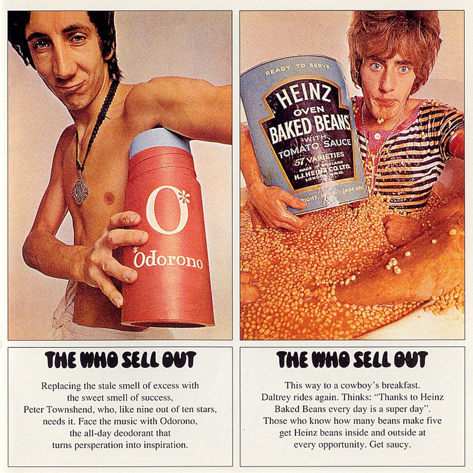
This cover art cleverly embodies the album’s concept, which blurs the lines between music and marketing, mocking the very commercialism it seems to embrace. The juxtaposition of mundane products with the band members themselves, as if they were products for sale, not only critiques the growing commercialization of the music industry but also reflects the band’s irreverent and innovative approach to rock music. It’s a tongue-in-cheek yet insightful commentary, as relevant today as it was in the 60s.
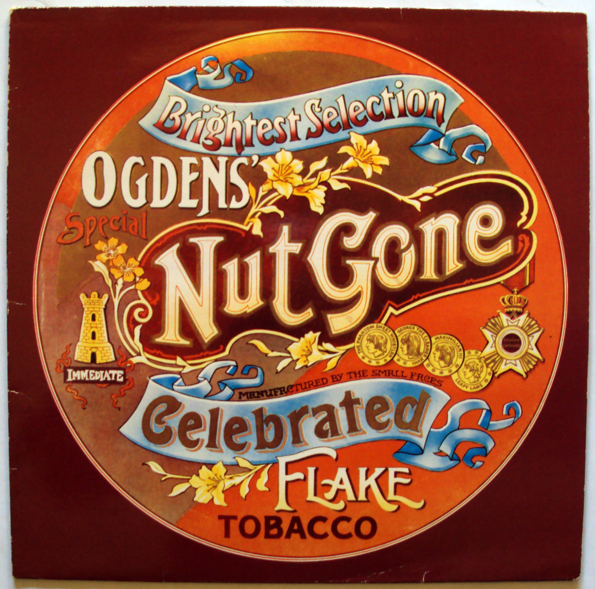
5. Ogden’s Nut Gone Flake (Small Faces, 1968)
Resembling a tin of tobacco, the art of “Ogden’s Nut Gone Flake” by Small Faces (1968) created a stampede of artists who stopped making their album covers look like album covers, and instead stood as an example of doing whatever the hell the band wanted, however odd, to go with their music.
View in gallery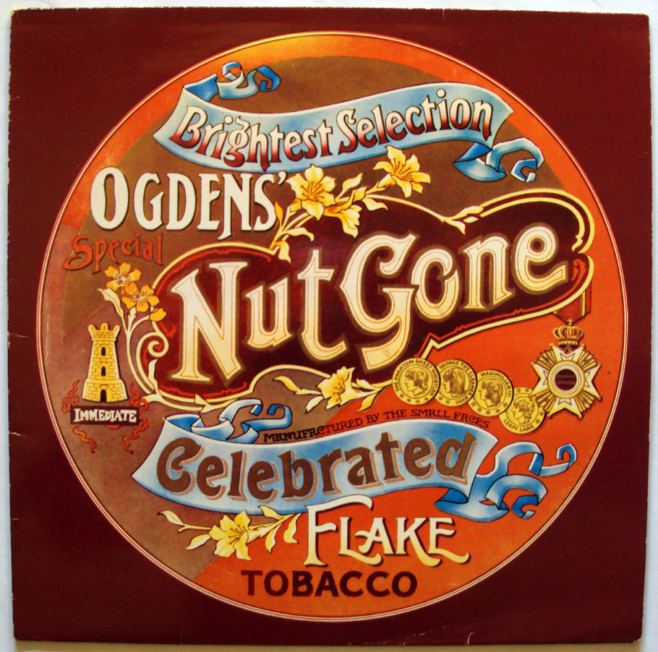
This innovative and unconventional approach not only broke the mold of traditional album design but also mirrored the album’s whimsical and experimental nature. The cover’s unique circular design and the novelty of its packaging reflected a growing trend in the 1960s where album art became an extension of the music’s creativity and a statement of artistic freedom. It’s a whimsical, yet bold declaration of the band’s willingness to defy norms and embrace the unexpected.
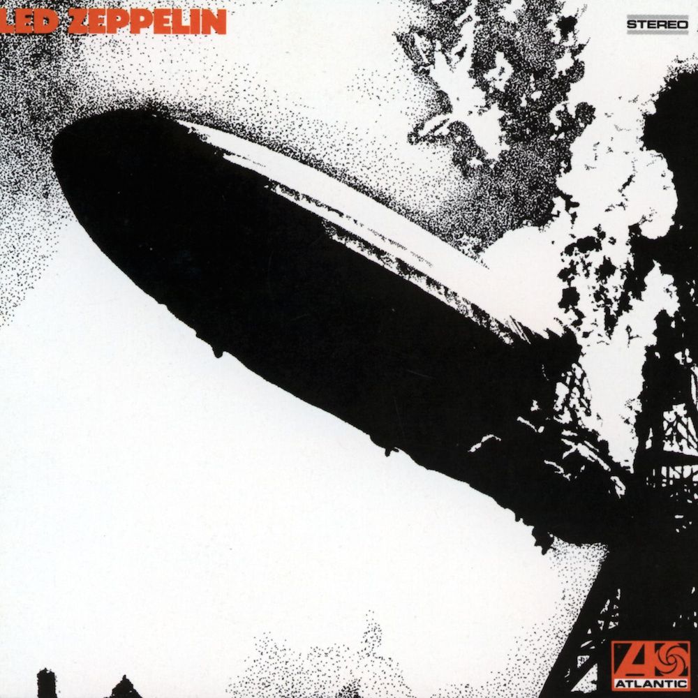
6. Led Zeppelin (1969)
While the destruction of the Hindenburg was long before, showing such a disaster on an album, as done on Led Zeppelin’s debut album (1969), would be like a burning twin towers on a box of cereal. It got attention and said in a single photograph: Nothing is sacred.
View in gallery
Its bold and provocative imagery not only marked Zep’s dramatic entrance into the rock scene but also symbolized the explosive impact they would have on music. The cover’s jarring depiction of the Hindenburg disaster reflected the band’s raw power and the era’s shifting cultural norms, challenging conventional sensibilities and setting a new standard for rock album art. It’s a visual embodiment of the band’s legendary sound – groundbreaking, powerful, and steeped in controversy.
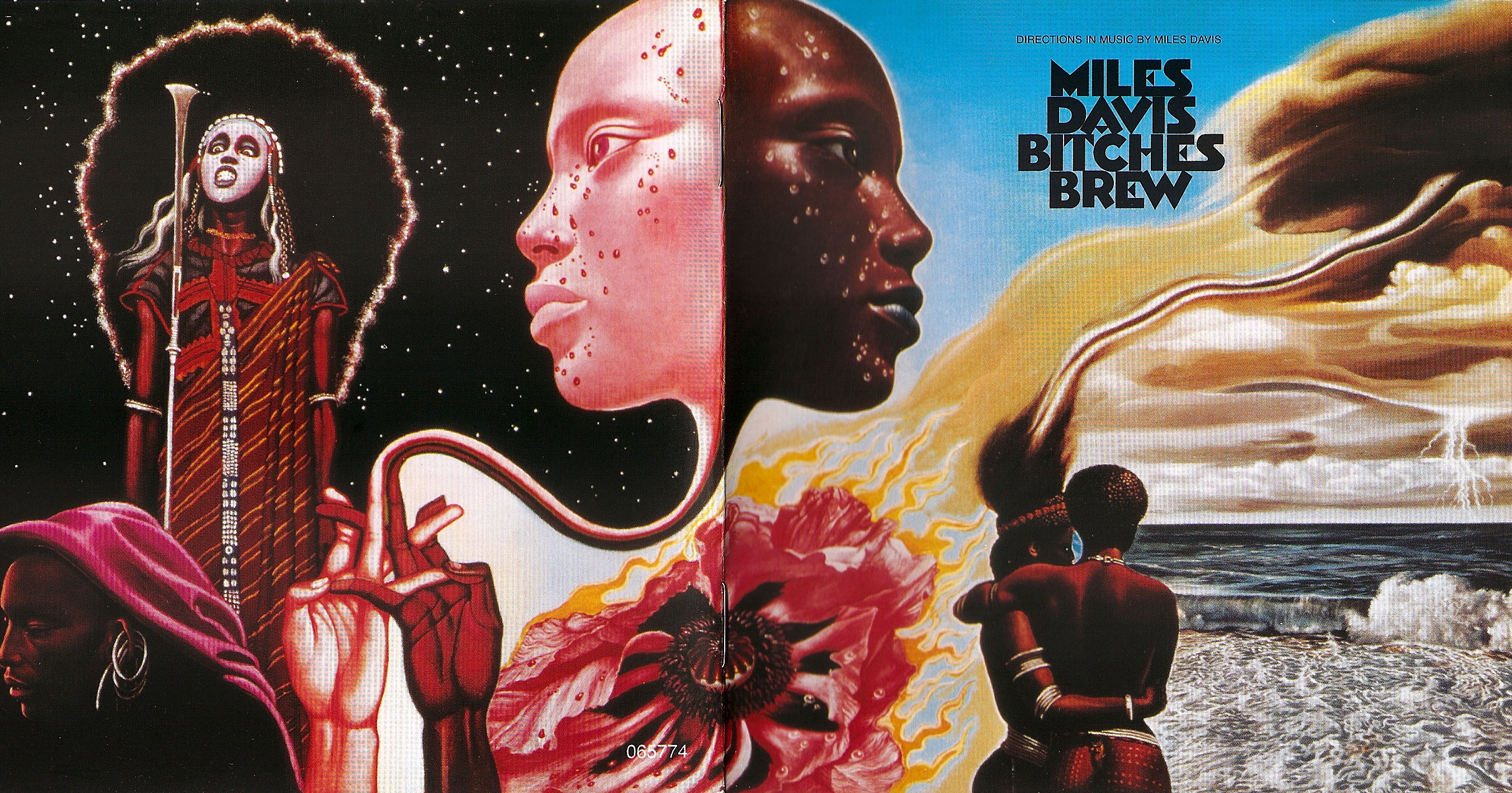
7. Bitches Brew (Miles Davis, 1969)
Surrealist art is a difficult mistress to capture, and is done badly far more often than done right. To put it onto the wandering genius of Miles Davis, as seen on the cover of “Bitches Brew” (1969), shows how timeless and subconscious the power of jazz truly is.
View in gallery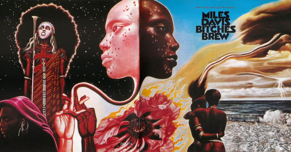
The album’s cover art, with its abstract, swirling forms and haunting, ethereal figures, perfectly encapsulates the groundbreaking and experimental nature of the music within. It’s a visual representation of the album’s fusion of jazz with psychedelic and rock elements, symbolizing the innovative and boundary-defying spirit of Davis and his work. This cover art not only reflects the complexity and depth of the music but also serves as a visual metaphor for the transformative power of jazz.
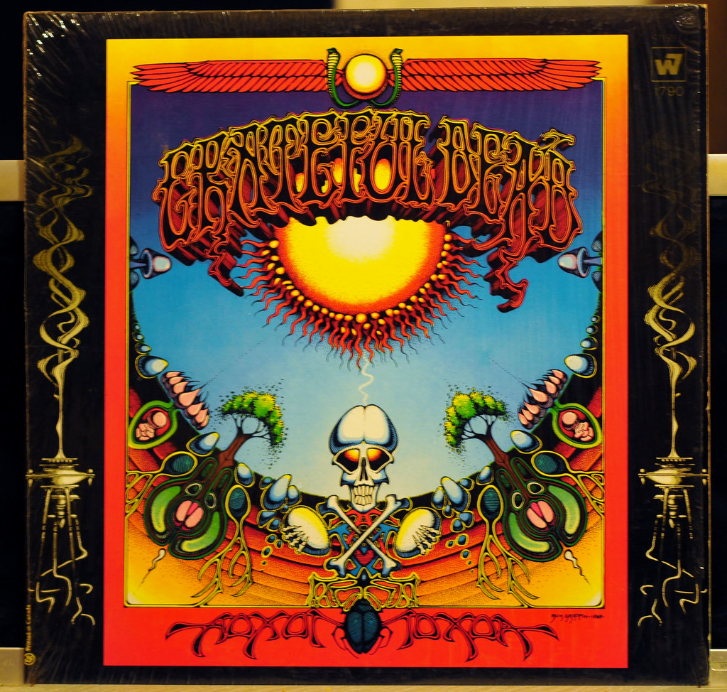
8. Aoxomoxoa (Grateful Dead, 1969)
One of the first, and most notorious examples of the psychedelic art that would come to define the Dead, “Aoxomoxoa” (Grateful Dead, 1969) comes from Rick Griffin, a surfer who helped epitomize the genre. The cover’s intricate, surreal imagery captures the spirit of the late 1960s counterculture, reflecting the band’s experimental and hallucinogenic musical style.
View in gallery
Griffin’s artwork, with its blend of fantastical elements and bold, swirling colors, not only became synonymous with the Grateful Dead’s identity but also helped define the visual aesthetic of the psychedelic era in music. It’s a visual trip, mirroring the mind-expanding experiences that the music and the culture of the time promised.
9. Sticky Fingers (The Rolling Stones, 1971)
Blatantly sexual and showing a genital outline right through a pair of jeans, “Sticky Fingers” by The Rolling Stones (1971) is an aggressive objectification of men and a nod to the sexual revolution. This cover, designed by Andy Warhol, not only pushed the boundaries of what was acceptable in album art but also reflected the Stones’ edgy, provocative nature.
View in gallery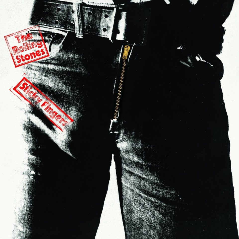
It’s a brazen statement on sexuality and rock ‘n’ roll’s role in the cultural shifts of the era, embodying the rebellious spirit and the breaking of social taboos that the band and the 1970s were known for.
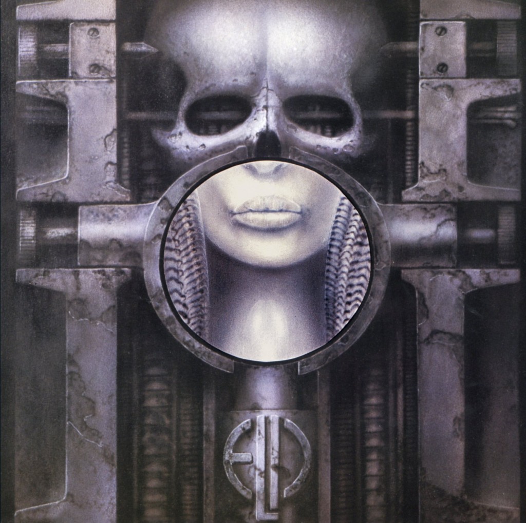
10. Brain Salad Surgery (Emerson, Lake & Palmer, 1971)
Fans of Tool, Alien, and the artist H. R. Giger will recognize this as the progenitor of odd and uncomfortably industrial artworks gracing the front of many records. Metalheads will see many emulations of this on countless albums, but this uniquely bio-mechanical look started right here.
View in gallery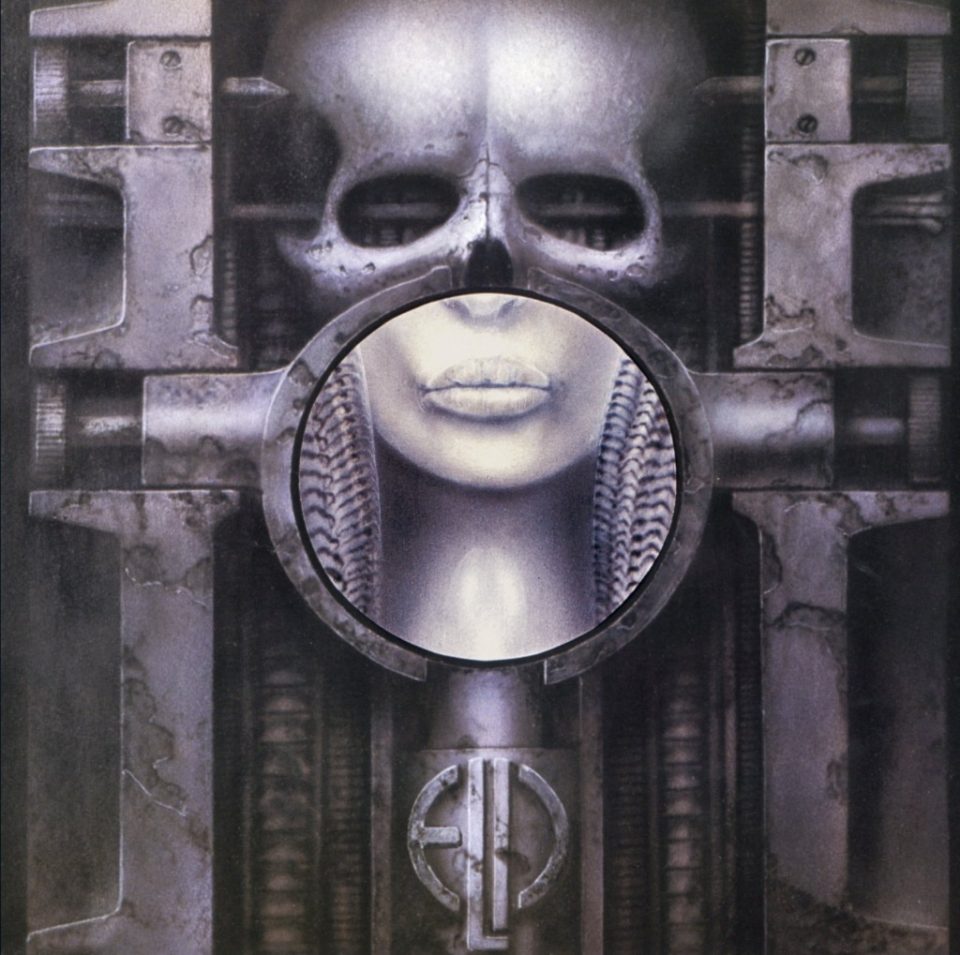
The cover, with its eerie and intricate fusion of human and machine, not only set a new standard for album art aesthetics but also perfectly mirrored the album’s experimental and progressive sound. This groundbreaking work by Giger introduced a new visual language into the rock genre, blending surrealism with a futuristic edge, influencing not just music but also broader artistic realms.
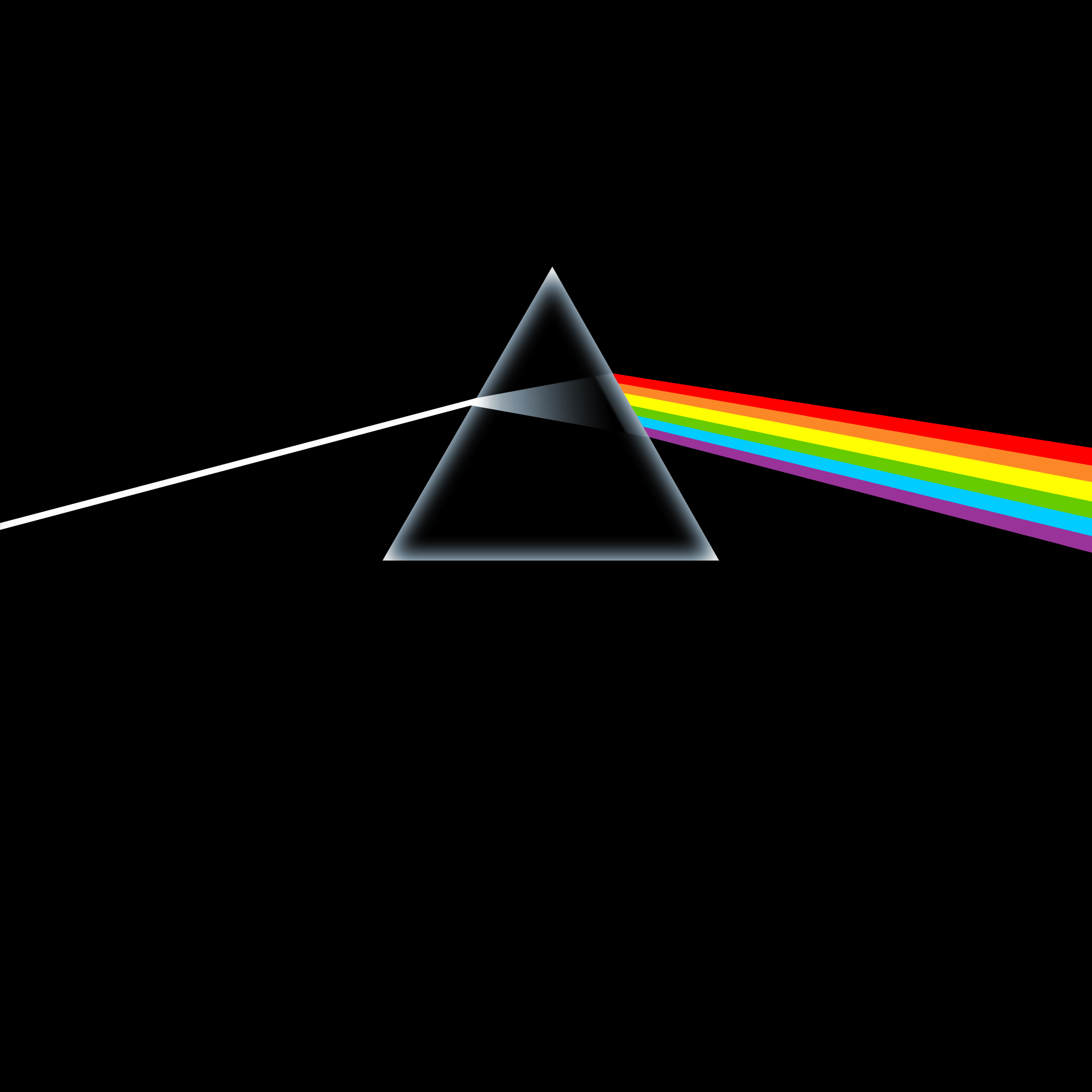
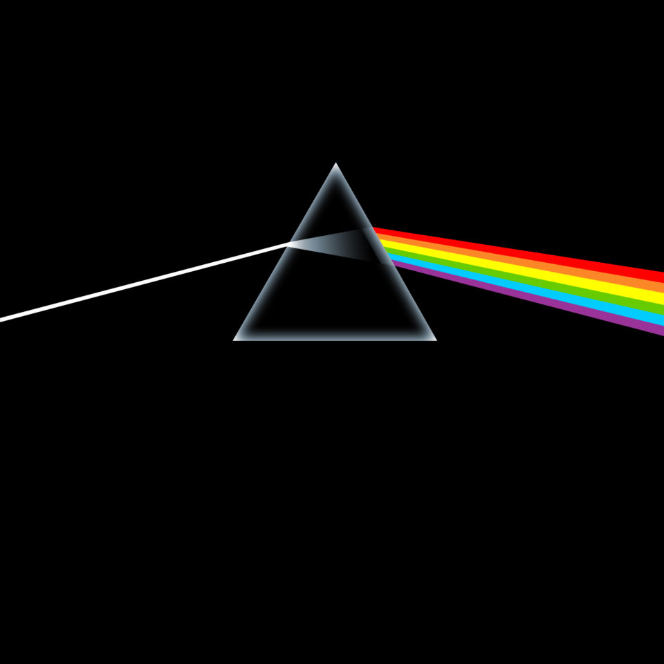
11. Dark Side of the Moon (Pink Floyd, 1973)
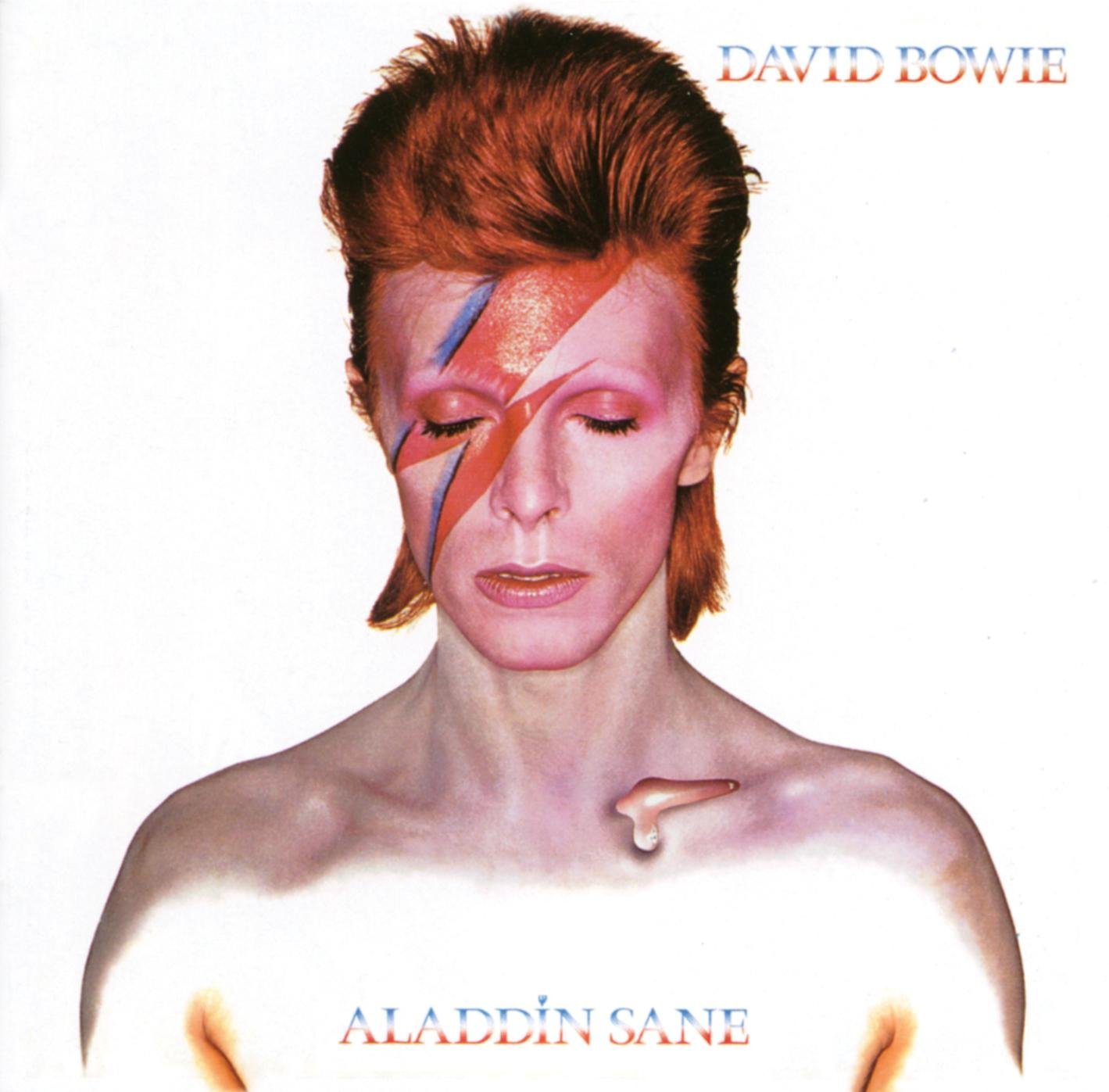
12. Aladdin Sane (David Bowie, 1973)
Coming on the heels of the Ziggy Stardust era, “Aladdin Sane” (1973) by David Bowie introduced a whole new character, “Aladdin Sane” (A lad insane), burying his past and redefining himself again. The cover, with Bowie’s iconic lightning bolt makeup across his face, became one of the most recognizable images in rock history, symbolizing his constant evolution and chameleonic approach to music and persona.
View in gallery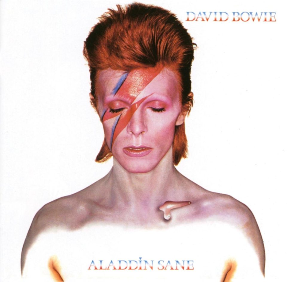
This striking image, blending glam rock and avant-garde aesthetics, not only reflects the album’s experimental nature but also serves as a visual manifesto for Bowie’s influence on the art of reinvention in music. It’s more than an album cover; it’s a call to action for artists to embrace change and push creative boundaries. The entire anthem is a plea to other musicians to never stop changing and growing.
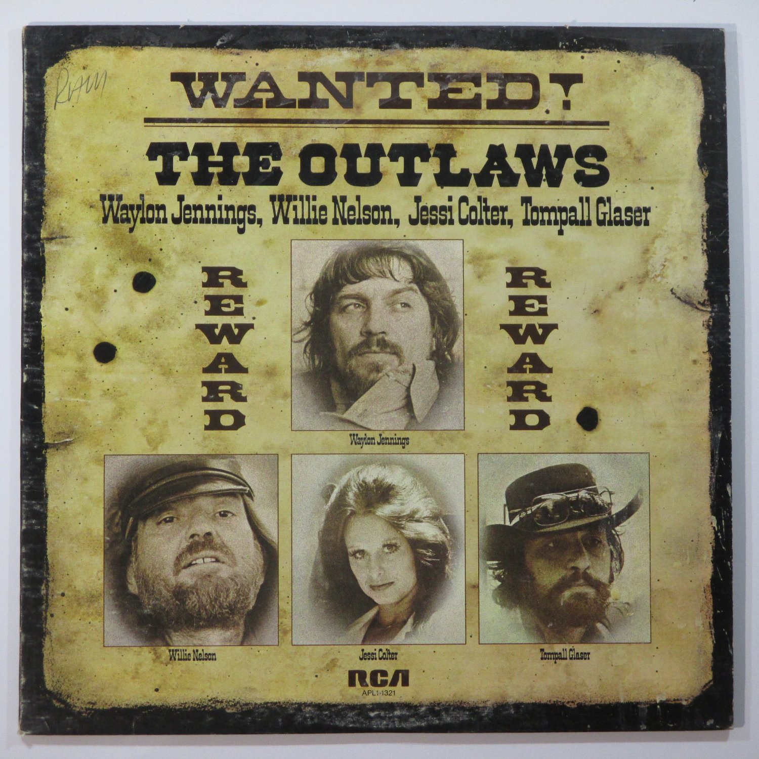
13. Wanted! The Outlaws (Waylon Jennings, Jessi Colter, Willie Nelson and Tompall Glaser, 1976)
One of the most popular country albums ever to hit the shelves, “Wanted! The Outlaws” (Waylon Jennings, Jessi Colter, Willie Nelson, and Tompall Glaser, 1976) proved that country crooners could be as hard-core as any rocker. The cover, with its old-west ‘Wanted’ poster style, not only gave the album a rugged, rebellious aesthetic but also perfectly encapsulated the ‘outlaw’ movement in country music, which embraced a more unpolished and authentic sound.
View in gallery
This image, juxtaposing the traditional country look with a renegade attitude, appealed broadly to both the old guard and a new generation, significantly changing how many viewed country musicians. It symbolized a shift in the genre, moving away from clean-cut to gritty, and in doing so, redefined the cultural and musical landscape of country music.
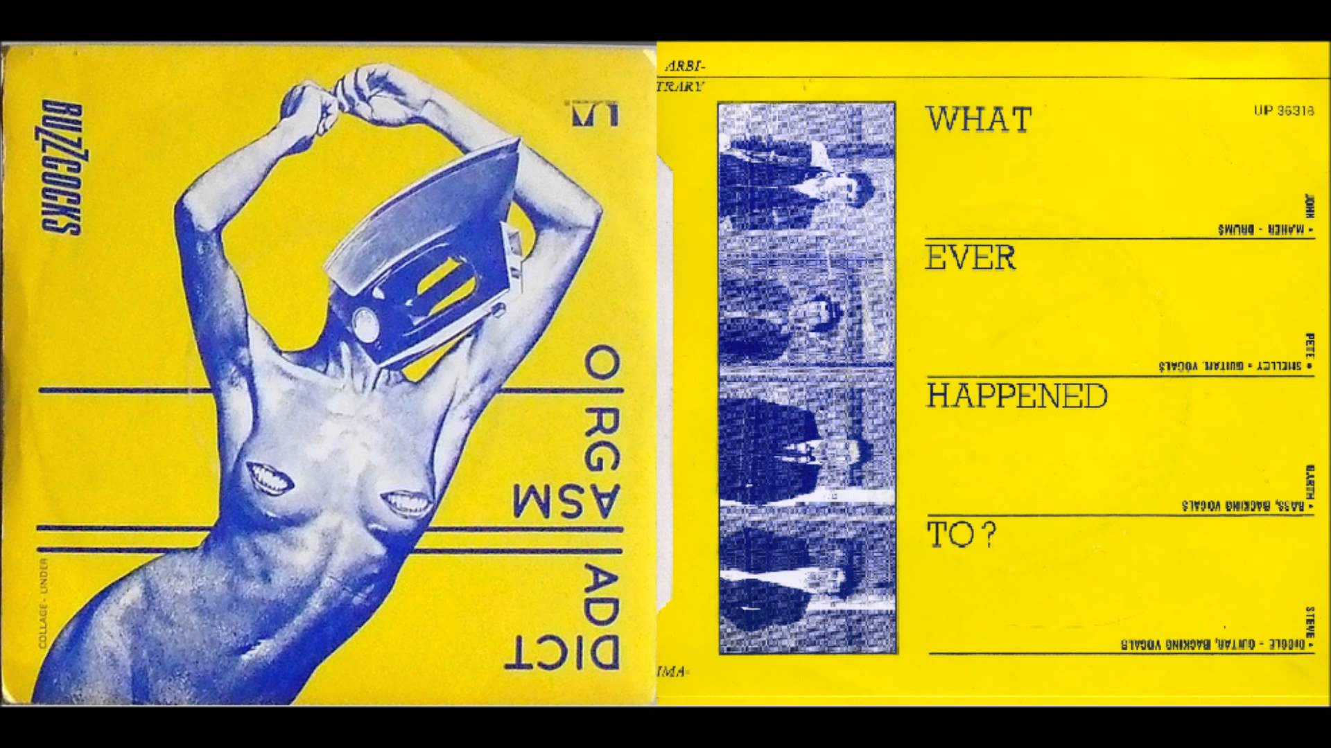
14. Orgasm Addict (Buzzcocks, 1977)
About as post-modern as it gets, the semi-sexual yet utterly disturbing world presented by both the mishmash imagery and the odd word arrangement on Buzzcocks’ “Orgasm Addict” (1977) draws the eyes in several directions; none very pleasant, but all piquant. The cover art, with its jarring collage of a domestic iron and human body parts, reflects the punk era’s inclination toward shock value and its challenge to conventional taste and sensibilities.
View in gallery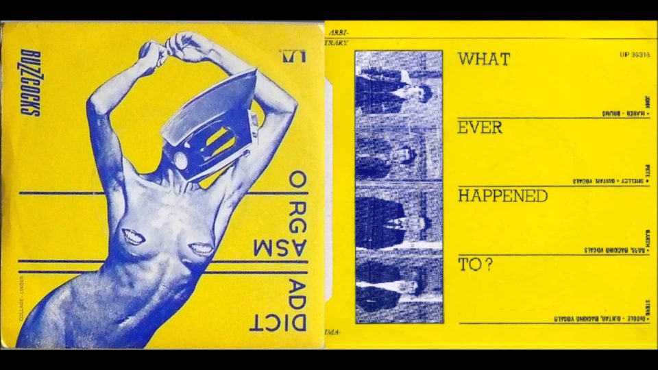
It’s a visual embodiment of the band’s provocative and irreverent approach to music, symbolizing the raw energy and anti-establishment ethos of the punk movement. This cover doesn’t just grab your attention; it demands it, embodying the chaotic and confrontational spirit of the times.
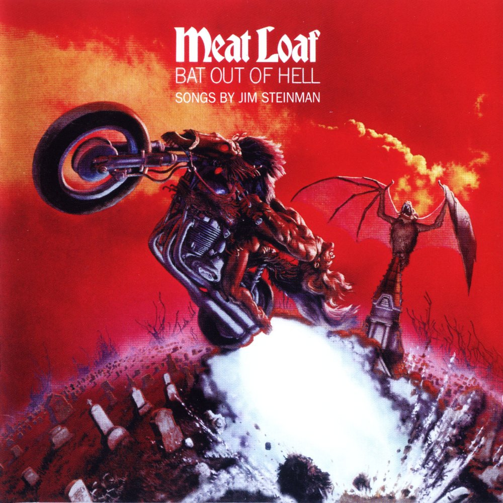
15. Bat Out of Hell (Meat Loaf, 1977)

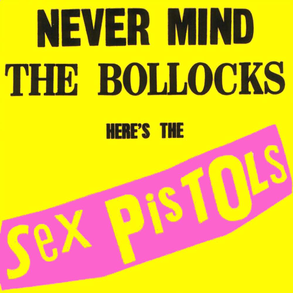
16. Never Mind The Bollocks (The Sex Pistols, 1977)
Simple yet unforgettable, the brash, bright coloration of “Never Mind The Bollocks” by The Sex Pistols, along with the ransom-note lettering, tells you all you need to know about the decidedly brutal, tacky, unpretentious, violent Sex Pistols and the punk scene they embody. This cover art, with its jarring visual style, encapsulates the raw, rebellious ethos of punk culture in the 1970s, defiantly rejecting the polished aesthetics of mainstream music.
View in gallery
The use of bold, anarchic typography not only reflects the band’s confrontational music but also symbolizes a broader cultural shift towards anti-establishment attitudes and DIY ethics in art and music. It’s a visual punch in the face, perfectly mirroring the disruptive and provocative nature of the music and the punk movement as a whole.
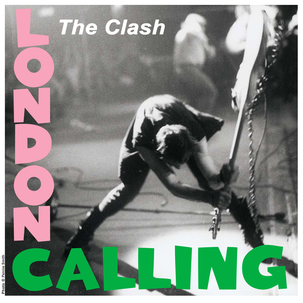
17. London Calling (The Clash, 1979)
True, this is just a rip-off of Presley’s first album pictured previously, but the message of The Clash’s “London Calling” (1979) cover is very different. Instead of rock coming to the mainstream, this is it dying in cacophonous splendor with the guitar clearly about to meet its end on the stage of a show.
View in gallery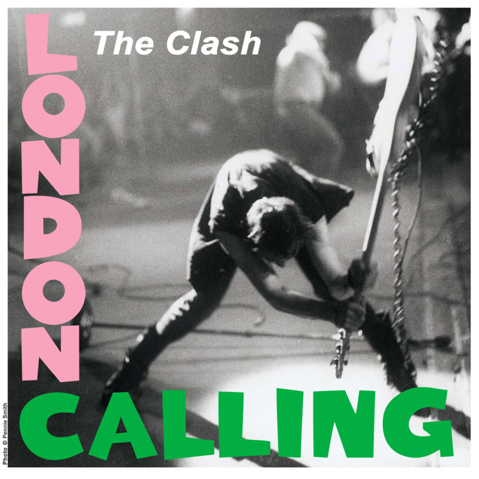
The photo of Paul Simonon smashing his bass guitar, caught in a moment of raw, anarchic energy, symbolizes the death of traditional rock ‘n’ roll and the rise of punk’s more confrontational, anti-establishment ethos. This iconic image not only captures the spirit of the punk movement but also serves as a visual manifesto for the band’s revolutionary sound, challenging the status quo of the music industry and society at large. It’s a deliberate subversion, transforming Elvis’ symbol of rock’s birth into a symbol of its rebirth into something grittier and more real.
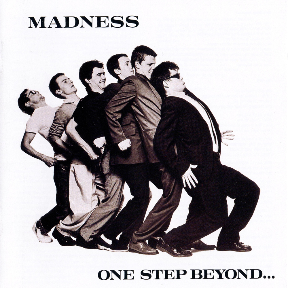
18. One Step Beyond… (Madness, 1979)
There isn’t much to this piece of art, but it came at a time when the music world was deadly serious about the death of disco and the rise of punk and metal. Here we can see everything that would come to define much of ’80’s pop music.
View in gallery
The kitschy look would also inspire such bands as Devo, The Aquabats, and everyone from Peter Gabriel to Roy Orbison to the Ska of the mid-’90’s.
19. Unknown Pleasures (Joy Division, 1979)
The album cover of Joy Division’s “Unknown Pleasures” is a defining cultural and aesthetic emblem in music history. Its iconic visual of white lines forming a pulsar wave on a black background encapsulates a minimalist and abstract aesthetic that was groundbreaking for its time.
View in gallery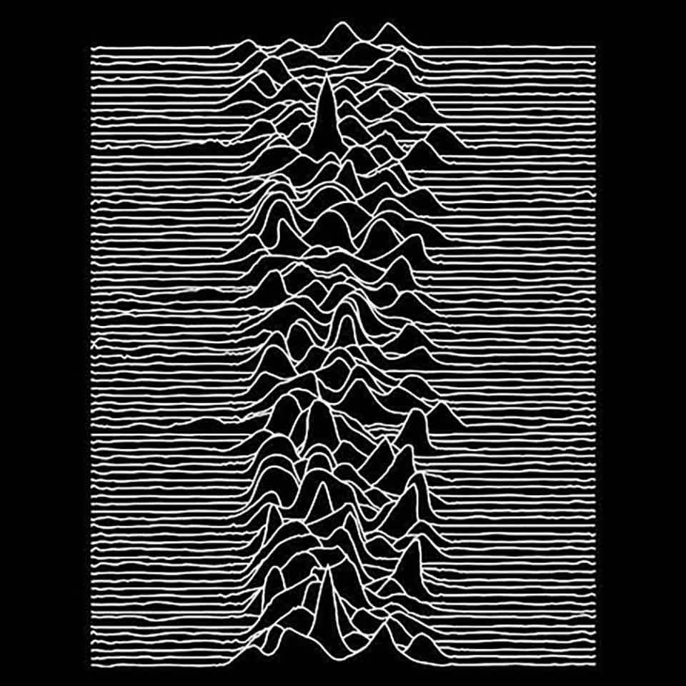
This imagery, both enigmatic and stark, reflects the band’s introspective and somber sound, becoming synonymous with the post-punk movement. Its enduring influence is seen in its widespread recognition and adaptation in popular culture, transcending music to become an emblem of alternative and underground sensibilities.
20. British Steel (Judas Priest, 1980)
Judas Priest’s “British Steel” is a seminal icon in heavy metal, combining raw industrial imagery with a rebellious spirit. Featuring a hand gripping a razor blade with the band’s logo and album title, it visually captures the album’s hard-edged sound and the aggressive, powerful essence of metal music of that era.
View in gallery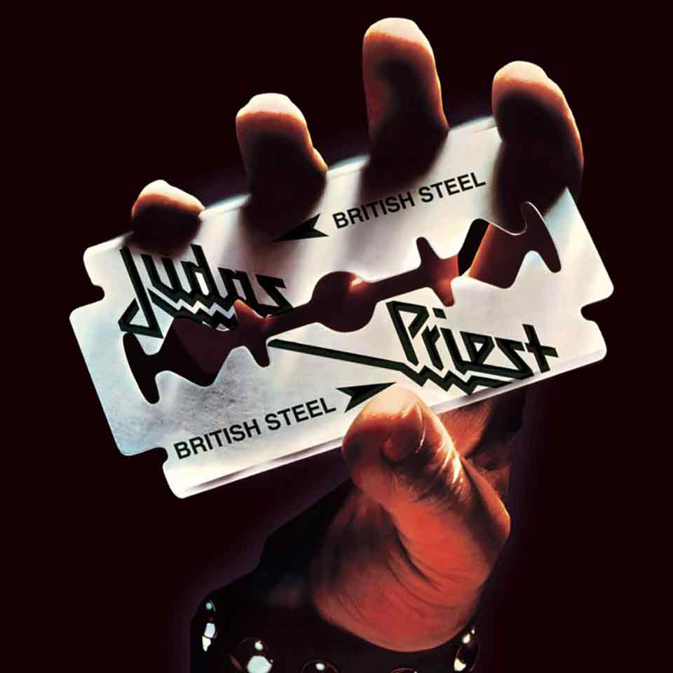
This cover art not only reinforced Judas Priest’s identity as metal pioneers but also symbolized the genre’s broader themes of strength, defiance, and edginess, making a lasting impact on the aesthetic sensibilities within the heavy metal community and beyond.
21. Purple Rain (Prince and the Revolution, 1984)
Prince’s “Purple Rain” album cover is a quintessential representation of the artist’s unique blend of sensuality, mystique, and eccentric genius. Featuring Prince on a motorcycle, set against a hazy, purple-tinted backdrop, it encapsulates the fusion of rock, R&B, and pop that defines the album.
View in gallery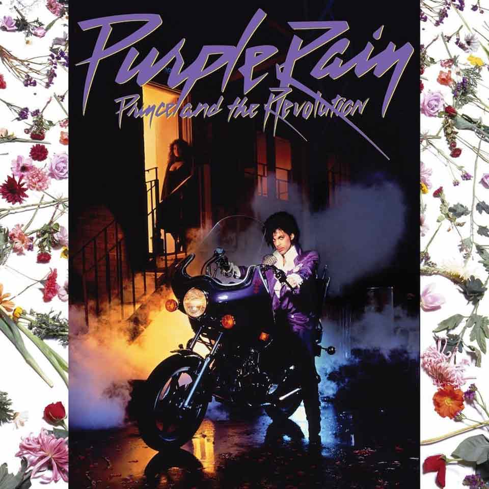
This imagery, projecting an aura of enigmatic charisma, not only solidified Prince’s iconic status but also visually symbolized the 1980s blend of glamour and rebellion. Its enduring influence is reflected in its recognition as a symbol of artistic individuality and the blending of gender norms in music and fashion.
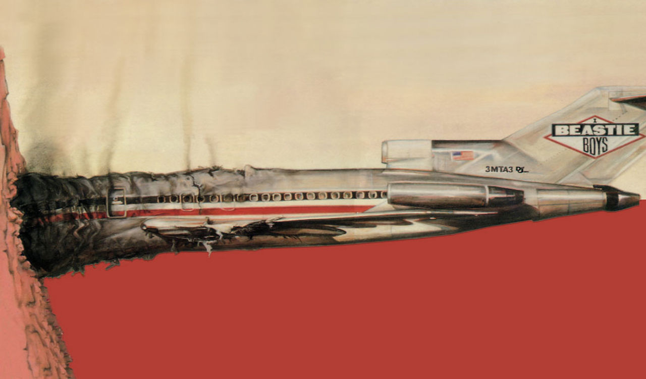
22. Licensed To Ill (Beastie Boys, 1986)
Originally showing a 747 crashing into a mountain, with the “3MTA3” tag on the side appearing to read “Eat Me” when viewed in a mirror, the cover of Beastie Boys’ “Licensed To Ill” (1986) is “l33t speak” before the moniker existed, and a strong anti-technology message that inflamed many. This provocative imagery served as an early example of rebellious and subversive messaging in album art, resonating with the youthful, anti-establishment energy of the era.
View in gallery
The cover’s clever visual play and edgy humor underscored the Beastie Boys’ irreverent approach to music and culture, making it an iconic piece of 1980s pop art.
23. As Nasty As They Wanna Be (2 Live Crew, 1989)
The first album to be actually tagged as officially, legally obscene, 2 Live Crew’s cover for “As Nasty As They Wanna Be” still raises hackles as most claim it is openly misogynistic, others claiming it is nigh-pornographic, and still a third set saying it’s actually about female empowerment.
View in gallery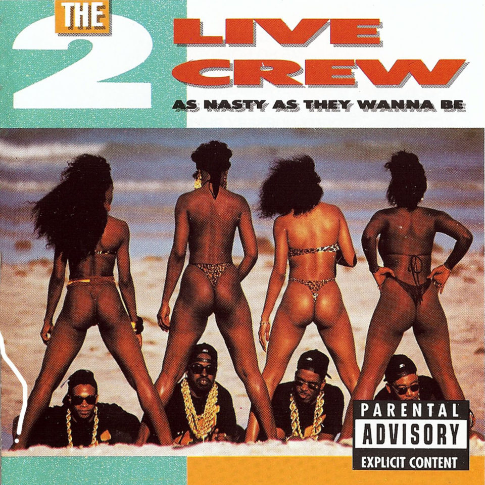
This controversial cover became a symbol of the intense cultural battles over censorship, artistic expression, and sexual imagery in the music industry. It sparked significant legal debates that highlighted the tension between First Amendment rights and societal norms. Additionally, the album art’s reception and the discussions it provoked reflect the complex dynamics of power, race, and gender representation in the late 20th-century American cultural landscape.
24. Nevermind (Nirvana, 1991)
Nirvana’s Nevermind is iconic in representing the early 1990s grunge movement, capturing the spirit of a generation and symbolizing a shift in the music industry.
View in gallery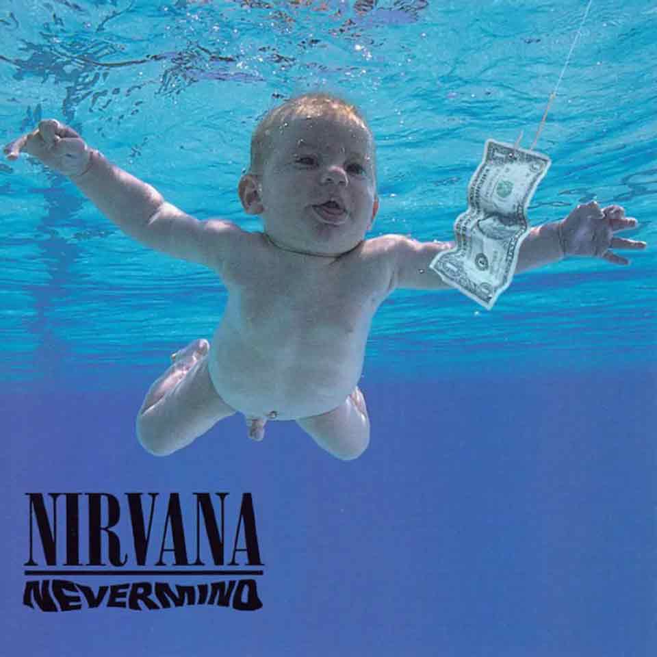
The image of a baby swimming towards a dollar bill on a hook not only became instantly recognizable, but it also conveyed a powerful message about innocence, capitalism, and the pursuit of material wealth.
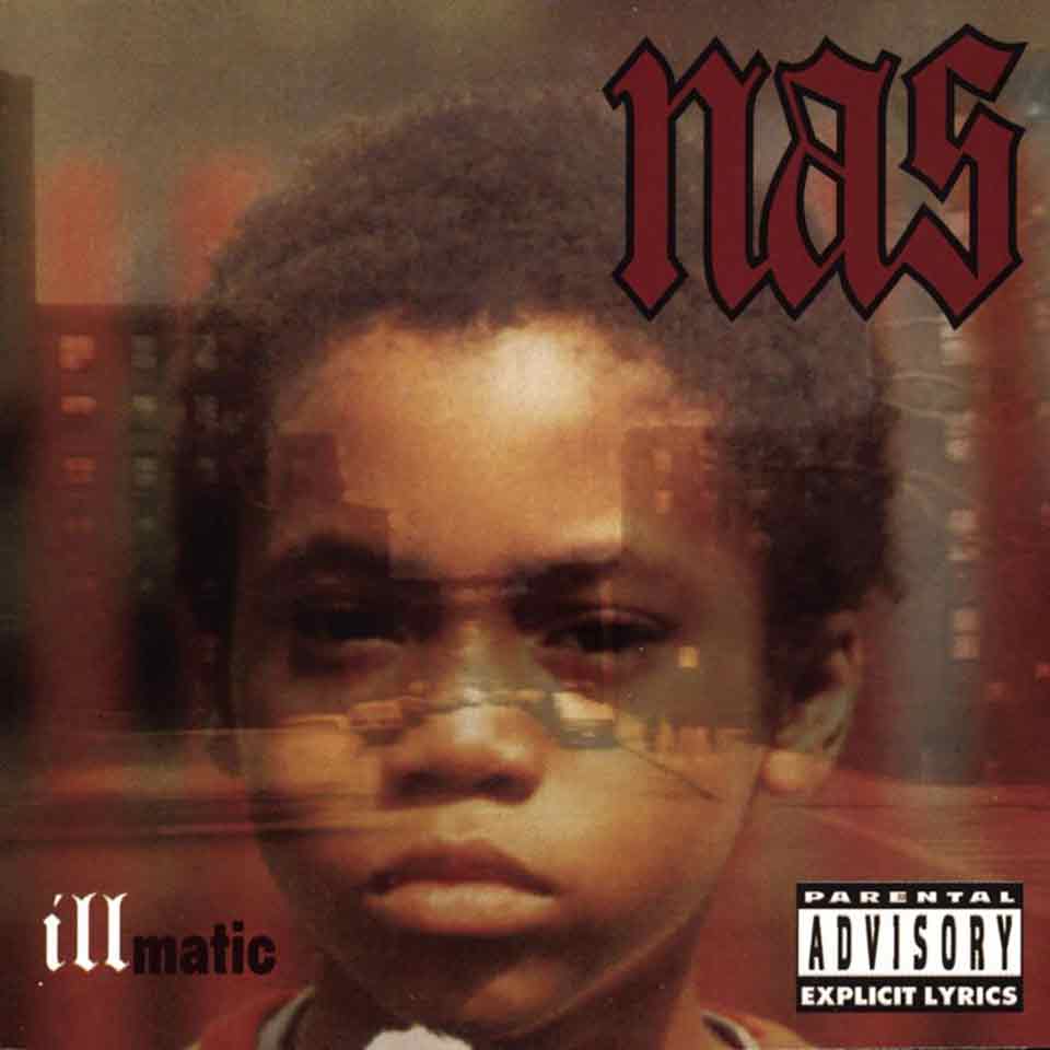
25. Illmatic (Nas, 1994)
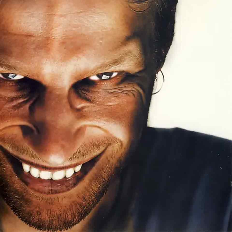
26. Richard D. James Album (Aphex Twin, 1996)
27. Kid A (Radiohead, 2000)
Radiohead’s “Kid A” album cover is a striking embodiment of the album’s innovative and experimental nature. Created by artist Stanley Donwood, the cover features an abstract, dystopian landscape that mirrors the album’s themes of technological alienation and environmental decline.
View in gallery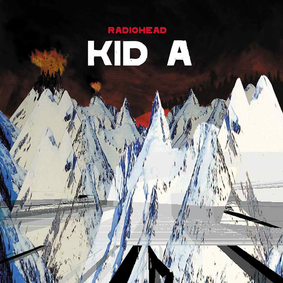
Donwood’s unsettling, digitally manipulated imagery marked a significant departure from traditional album art, reflecting Radiohead’s shift from conventional rock to a more electronic and avant-garde sound. This cover not only encapsulates the mood and message of “Kid A” but also symbolizes the anxiety and complexity of the early 21st century, making it a significant cultural and aesthetic marker in the realm of music and art.
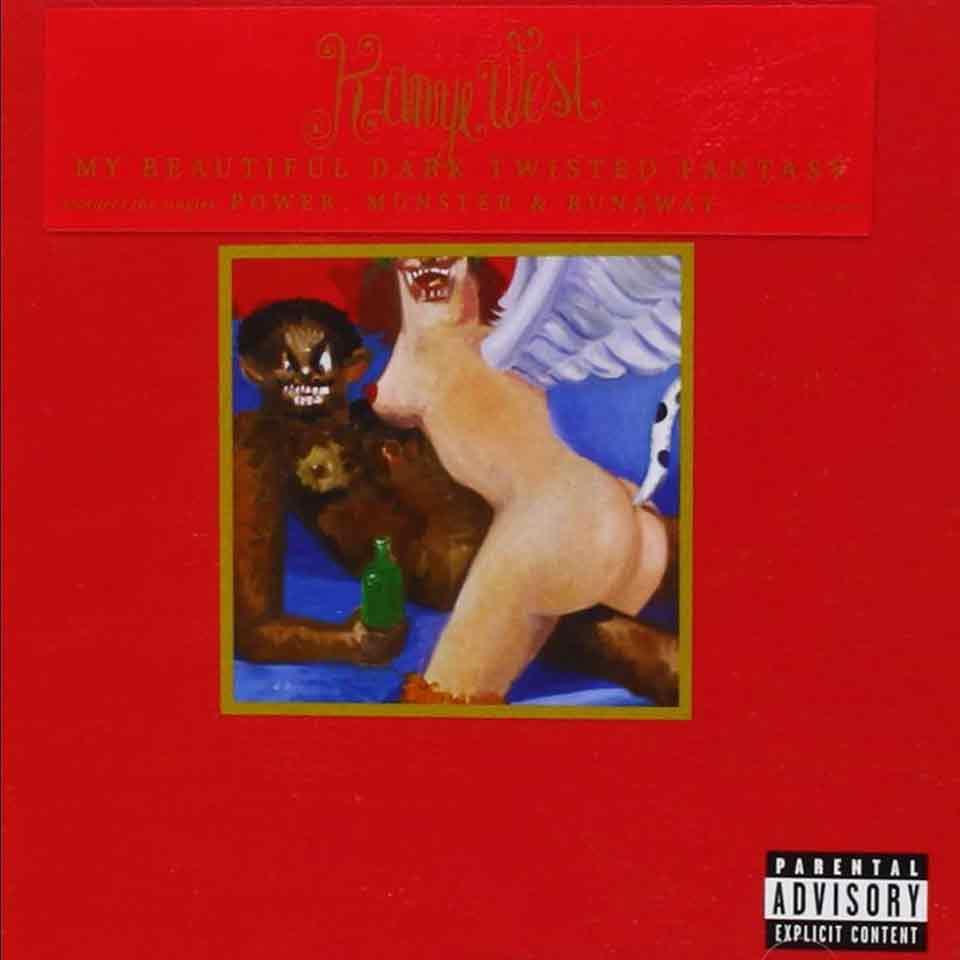
28. My Beautiful Dark Twisted Fantasy (Kanye West, 2010)
30. Fearless (Taylor’s Version, 2021)
The album cover of Taylor Swift’s “Fearless (Taylor’s Version)” holds significant cultural and aesthetic importance, symbolizing artistic ownership and reinvention. This re-recorded album’s cover art, featuring Swift in a sepia-toned, ethereal setting with her gaze fixed confidently ahead, is a mature reinterpretation of her original “Fearless” album. It resonates with themes of empowerment and nostalgia, while also signifying Swift’s journey from a young country star to a seasoned artist taking control of her music legacy.
View in gallery
The cover art’s aesthetic, blending the familiar with the new, visually represents the album’s unique place in music history, where an artist revisits and reclaims their earlier work, creating a powerful statement in the ongoing conversation about artists’ rights in the music industry.