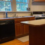
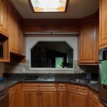
If you have cherry cabinets, somebody online has probably told you they have to go. The granite too. The travertine backsplash. All of it, apparently, is a problem only a demo day can fix.
A couple in Atlanta didn’t buy that. They looked at their 2000s builder kitchen and changed exactly one thing. The color.
Four days later, they had a kitchen that looks like it belongs in 2026.
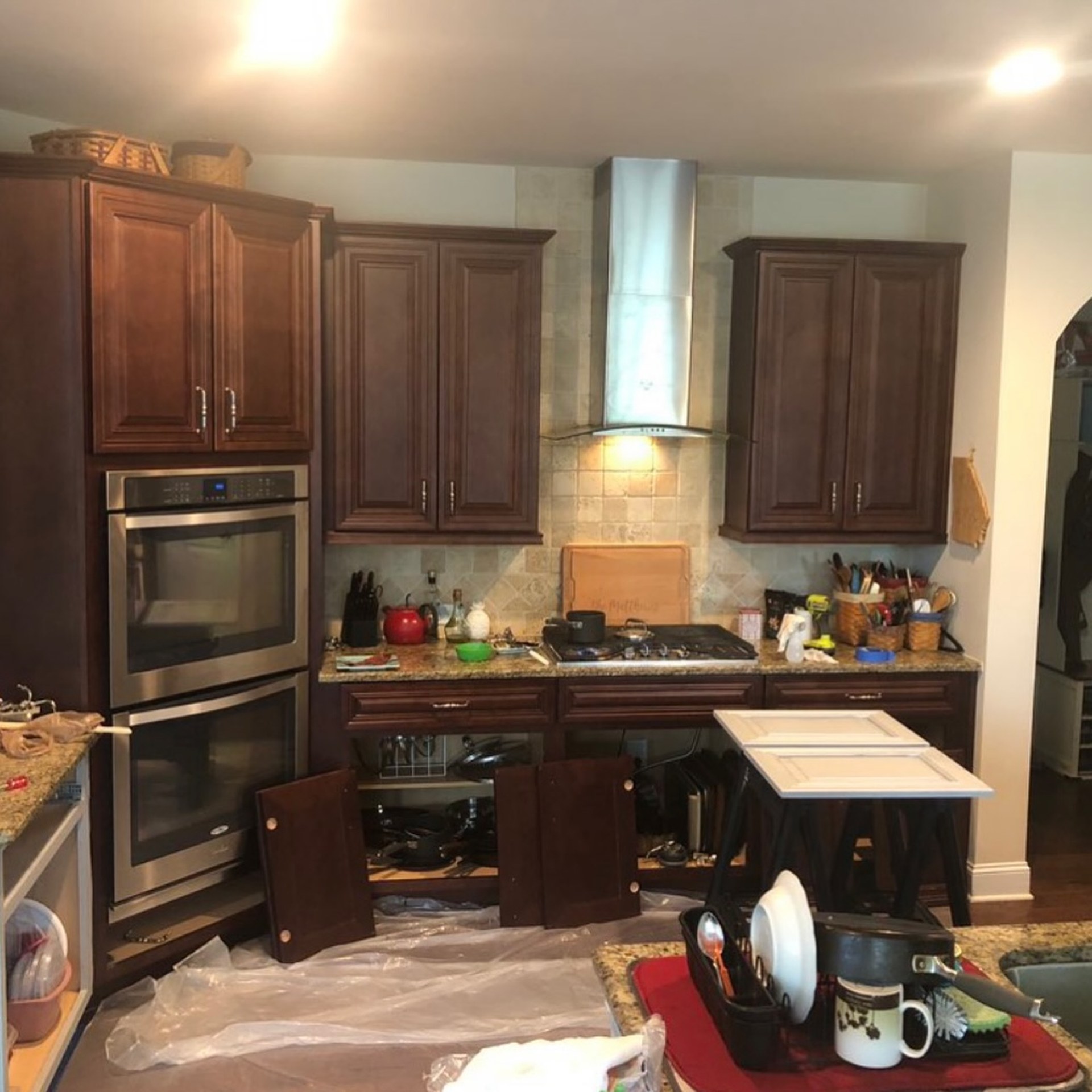
This is the kitchen almost every American grew up around
If you grew up in a suburb between 2004 and 2012, you ate breakfast in a kitchen that looked like this. Reddish raised-panel cabinets, beige travertine backsplash with diamond accents, speckled brown granite the builder called Baltic Brown or Santa Cecilia, little silver pulls shaped like Victorian candlesticks.
For fifteen years this was what “upgraded” meant. Then around 2016, every design account online turned on it, and the only acceptable answer became “rip it all out.” The quote for that is usually forty to eighty thousand dollars, with six to twelve weeks of eating takeout on the dining room table.
Duart Painting, the Atlanta crew behind this project, did it in four days and left everything except the cabinet color alone.
What the crew actually did
Cabinet paint jobs fail for the same reason every time: somebody skipped the prep. This one did not.
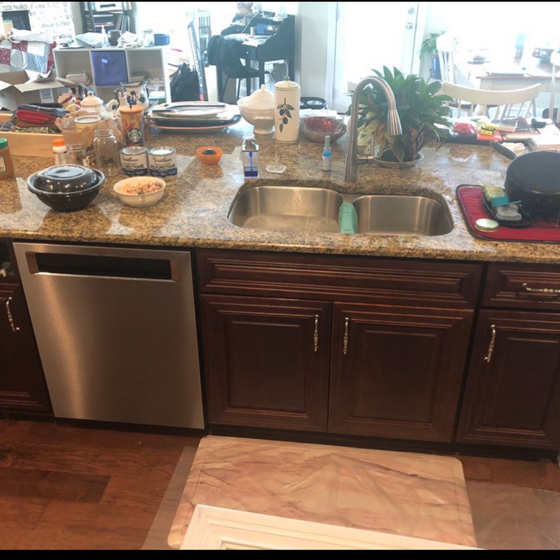
Every door and drawer front came off and went to the shop. The cabinet boxes still on the wall got a serious degreasing first, because kitchen cabinets collect a thin film of cooking oil over the years and paint will not stick to that no matter what primer you buy. Then came a sand to break the glossy factory lacquer, then a bonding primer made for slick surfaces.
Only after all of that did color go on. Two coats of Sherwin-Williams Gallery Series cabinet-grade topcoat, sprayed with an HVLP gun. That’s the part most weekend jobs skip. A spray gun lays paint down flat, no brush marks, no roller stipple. It’s the difference between cabinets that look repainted and cabinets that look factory.
The color is Origami White SW 7636. Warm, with a touch of cream. That matters, for reasons we’ll get to.
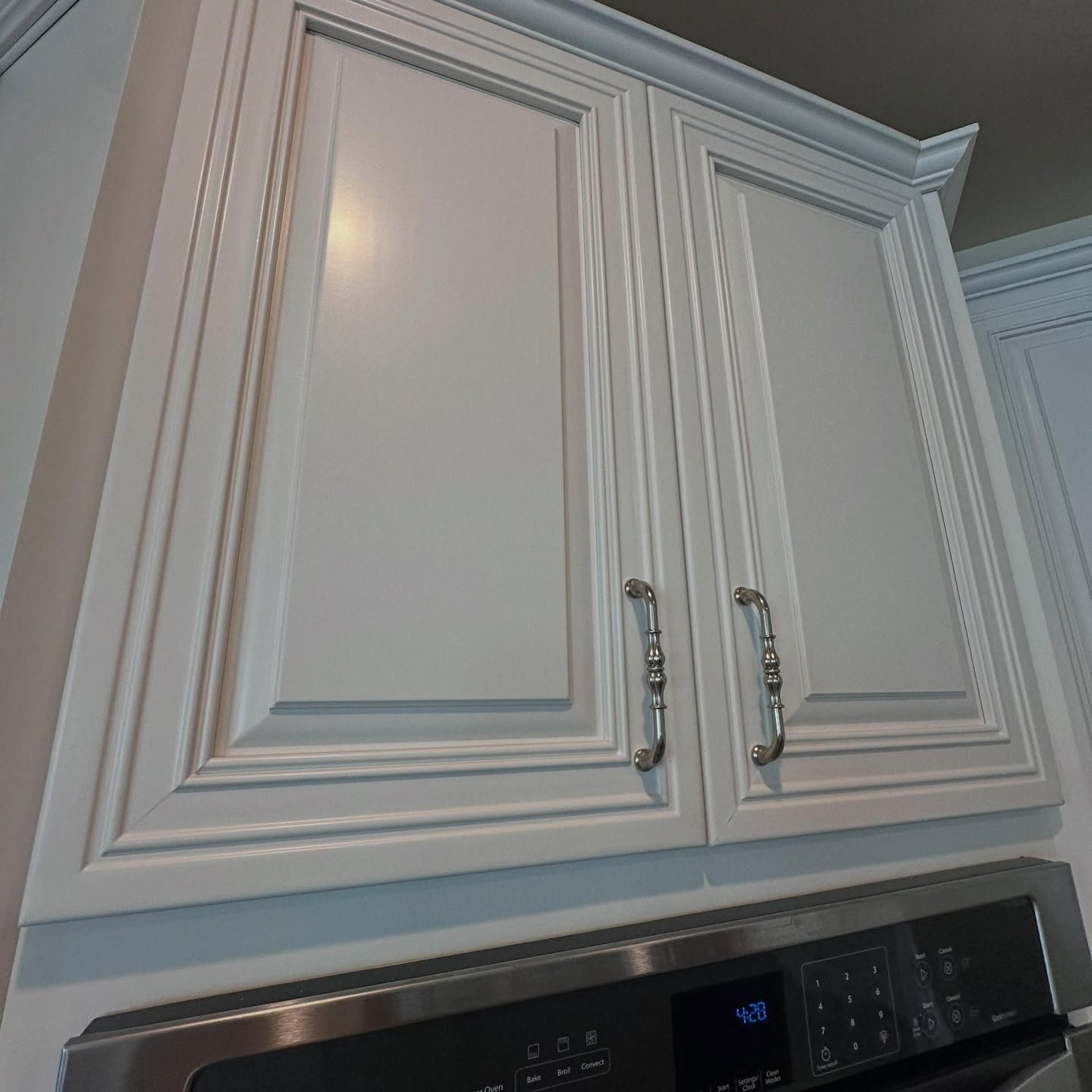
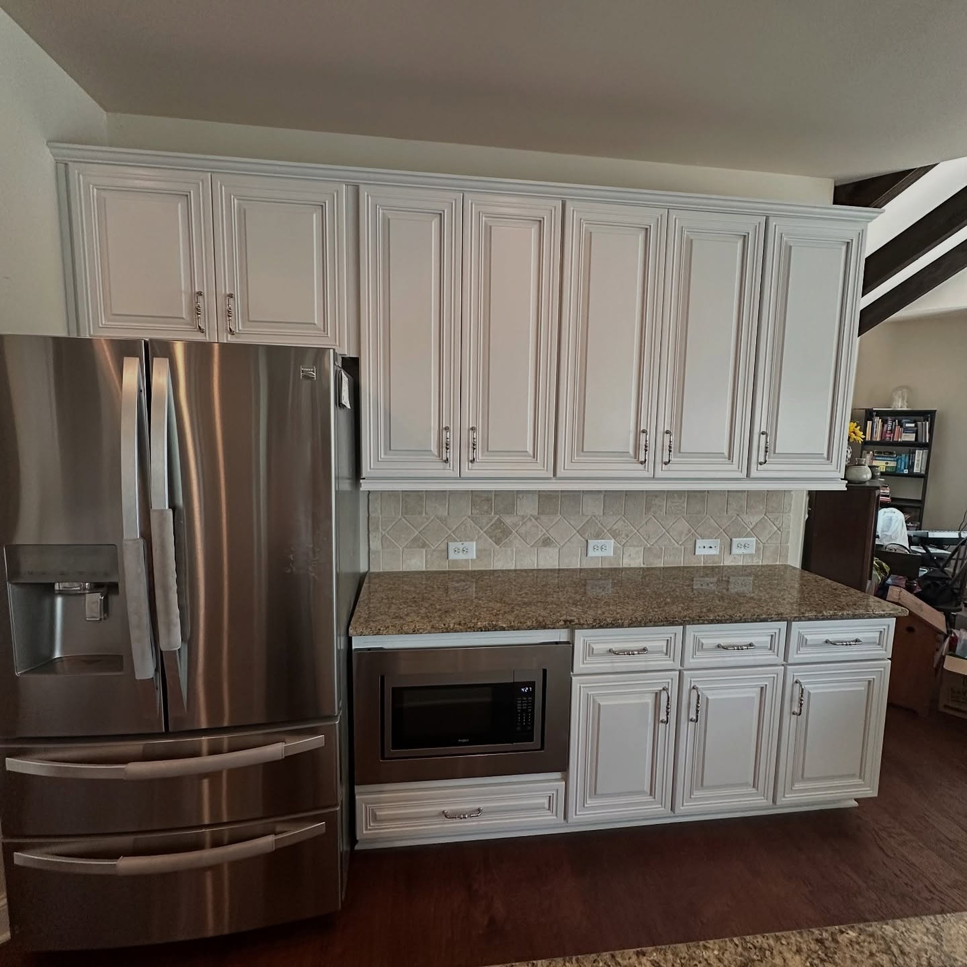
Up close you can see why the finish matters as much as the color. No brush strokes. No orange peel. Paint drops neatly into every groove of the raised panel instead of pooling at the edges. And the original silver pull, the one everybody online would have told you to replace, looks right at home on a white door.
Why Origami White, specifically
This is the part most people get wrong when they try to copy a kitchen like this.
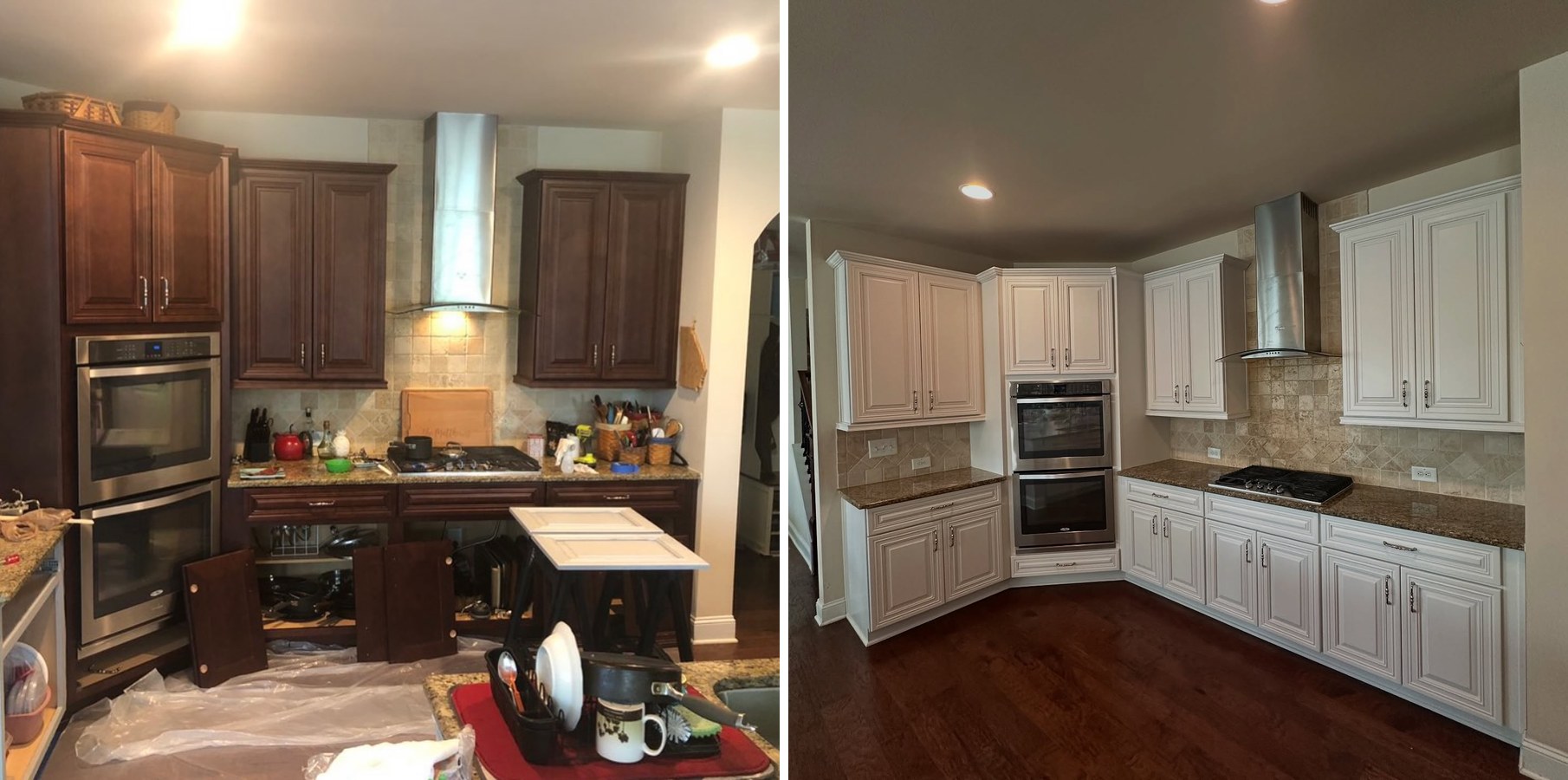
The granite is warm. The travertine is warm. The floors are warm. Drop a cool white or a trendy gray onto cabinets sitting in the middle of that, and you end up with a kitchen that looks like three kitchens arguing over who’s in charge.
Origami White has just enough cream to agree with the counters and backsplash instead of fighting them. Nothing in the room suddenly reads as leftover. Everything looks like it was chosen together, even though only one thing actually was.
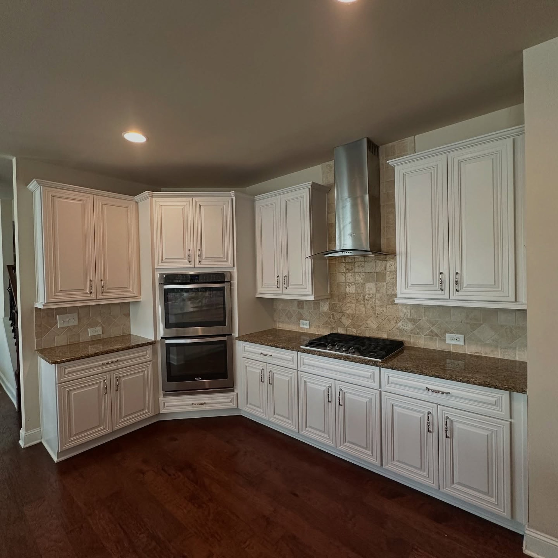
The double oven stack looks intentional instead of heavy. The chimney hood almost disappears. The travertine, which read as dated next to the cherry, now looks like a thoughtful choice. The ceiling even feels taller. None of that is actually different. The eye just stopped getting pulled to the floor by a wall of dark wood.
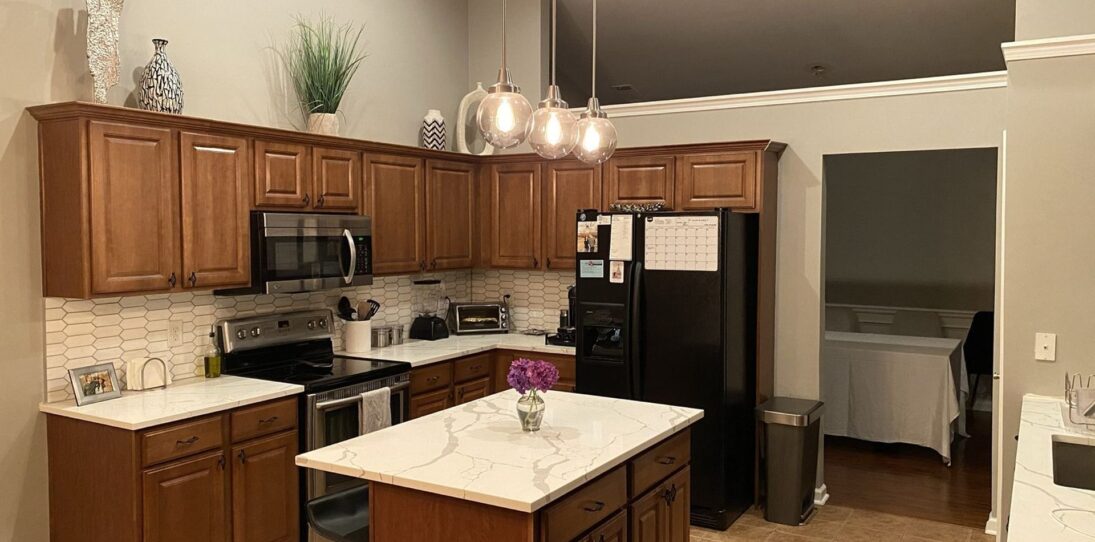

The fridge wall is the clearest proof
If you still aren’t sold that a color change can carry this much weight on its own, this one should settle it.
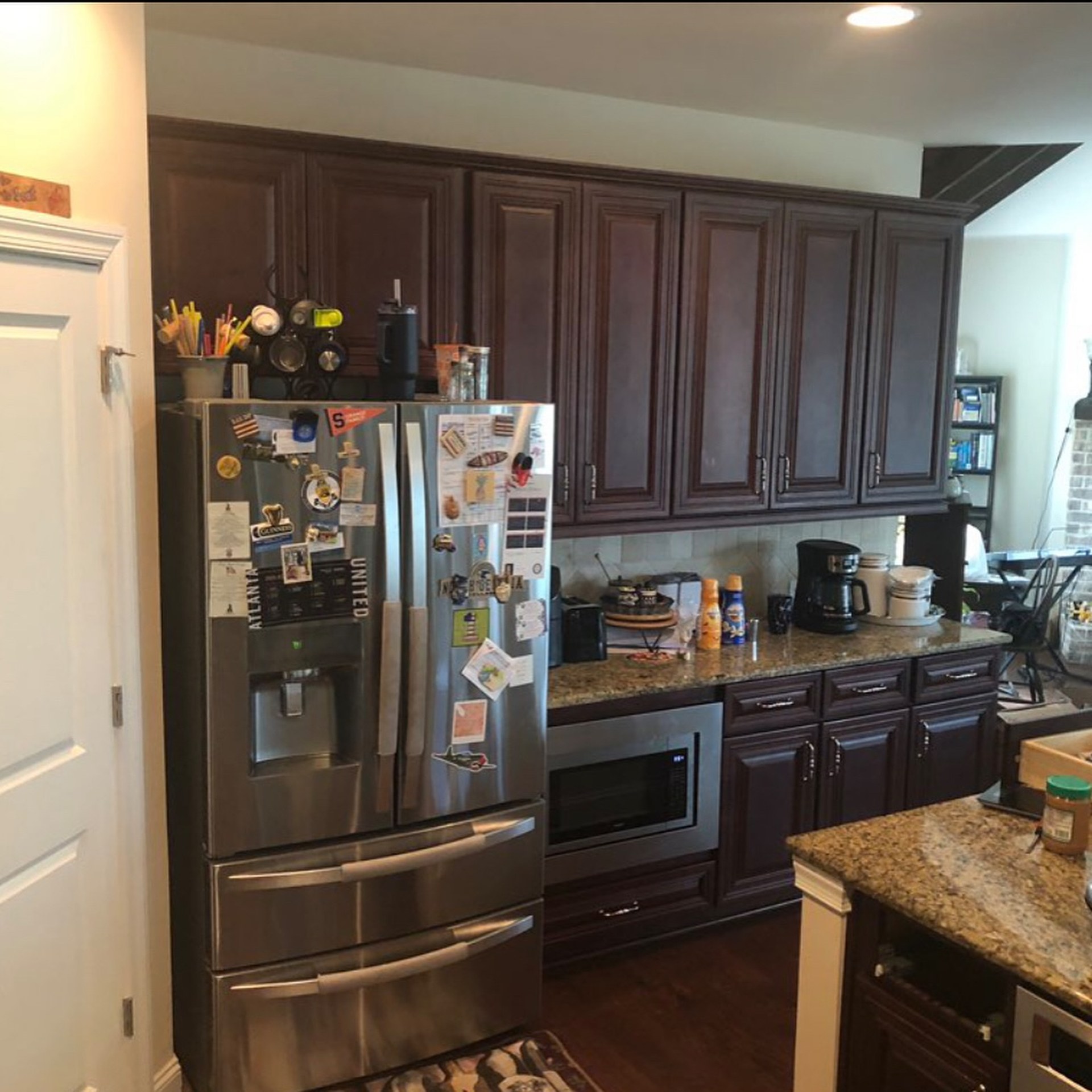
This is the lived-in version of the before. Magnets on the fridge, kids’ sports schedules, a coffee pot going in the corner. The dark cabinet wall behind all of it is doing what dark cabinets always do: shrinking the space and swallowing the light.
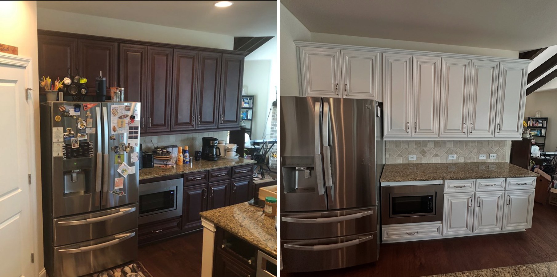
Same fridge, same microwave, same backsplash, same cabinet layout right down to the drawer stack under the microwave. The before reads as a cramped dark corner you want to walk past. The after reads as the clean, airy workhorse of the kitchen. Nothing moved. One finish changed.
The island reveals a ceiling nobody could see before
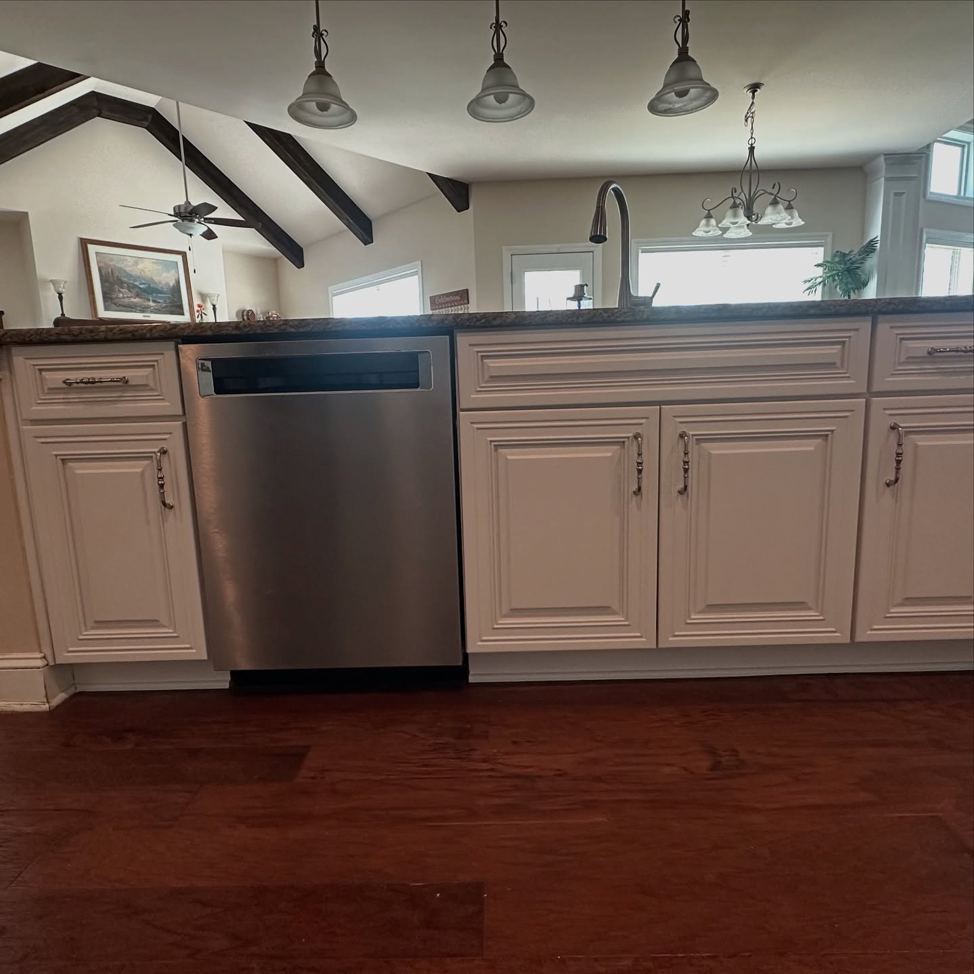
Those iron pendants and the exposed wood beams were there the whole time. You just couldn’t see them properly before. The dark cabinets pulled so much attention down to eye level that the upper half of the room was basically invisible.
Paint the cabinets white and the architecture shows up. The pendants read as a design choice. The beams become a feature. The room is twice as tall as you thought.
What this kitchen actually proves
The cabinets were never the problem. The finish was.
Those builder cherry boxes from the 2000s are almost always real wood. Dovetailed drawers, solid face frames, raised panels cut from actual lumber. Built better than most mid-range cabinets sold new today for fifteen thousand dollars a kitchen.
What people hate is the orange-red stain and the glossy lacquer on top of it. Both photograph badly under phone cameras and LED bulbs. Neither is structural.
Strip the color off, respect the warm tones the room is already committed to, put a warm white over the top, and leave everything else where it is. Granite stays. Backsplash stays. Hardware stays. Appliances stay.
Four days. One color. No demo. The kitchen most of America has been told to tear out just needed somebody to rethink the finish.