
There’s a particular kind of quiet frustration that comes with a kitchen you can barely see in. Lights on at 2 p.m. Lights on while you make coffee. Lights on and the room still looks like somebody drew the shades.
This client’s narrow condo kitchen was exactly that. She’d basically made peace with it.
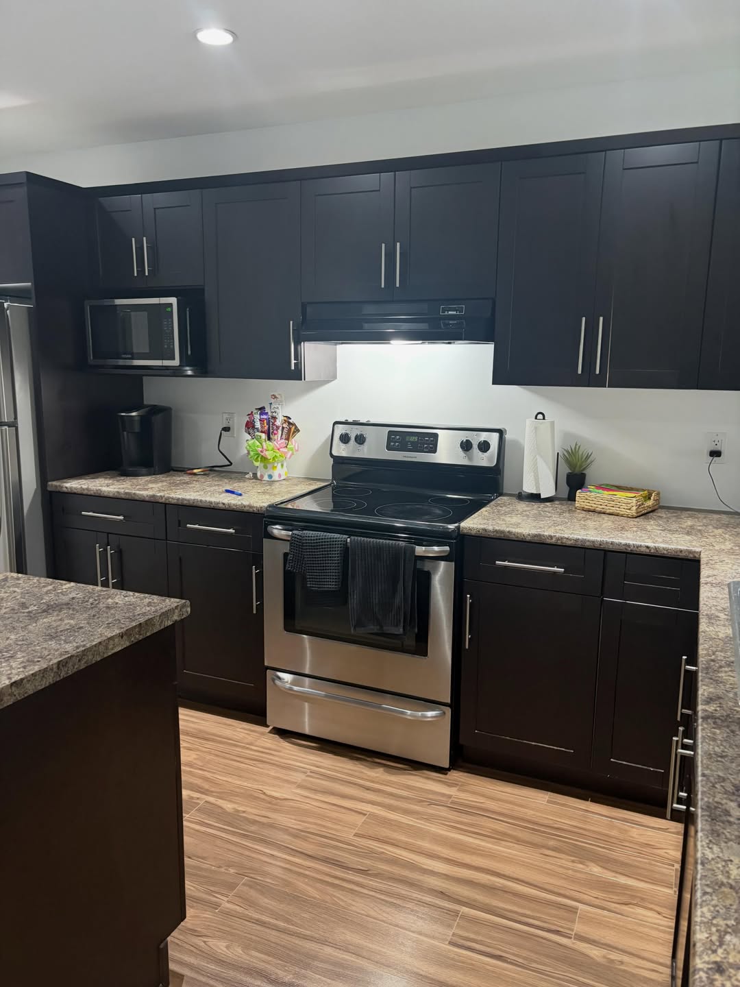
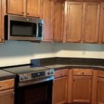
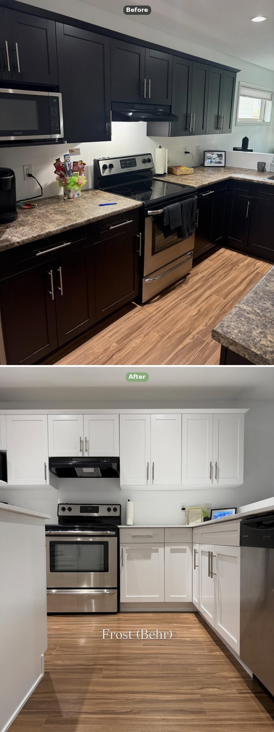
Espresso shaker cabinets packed the walls from floor to ceiling. The brown granite counters had so much movement your eye didn’t know where to rest. A black range hood sat right in the middle of it all. Nothing broken, nothing ugly. Just a room that soaked up every bit of light the recessed cans were throwing down.
The window situation
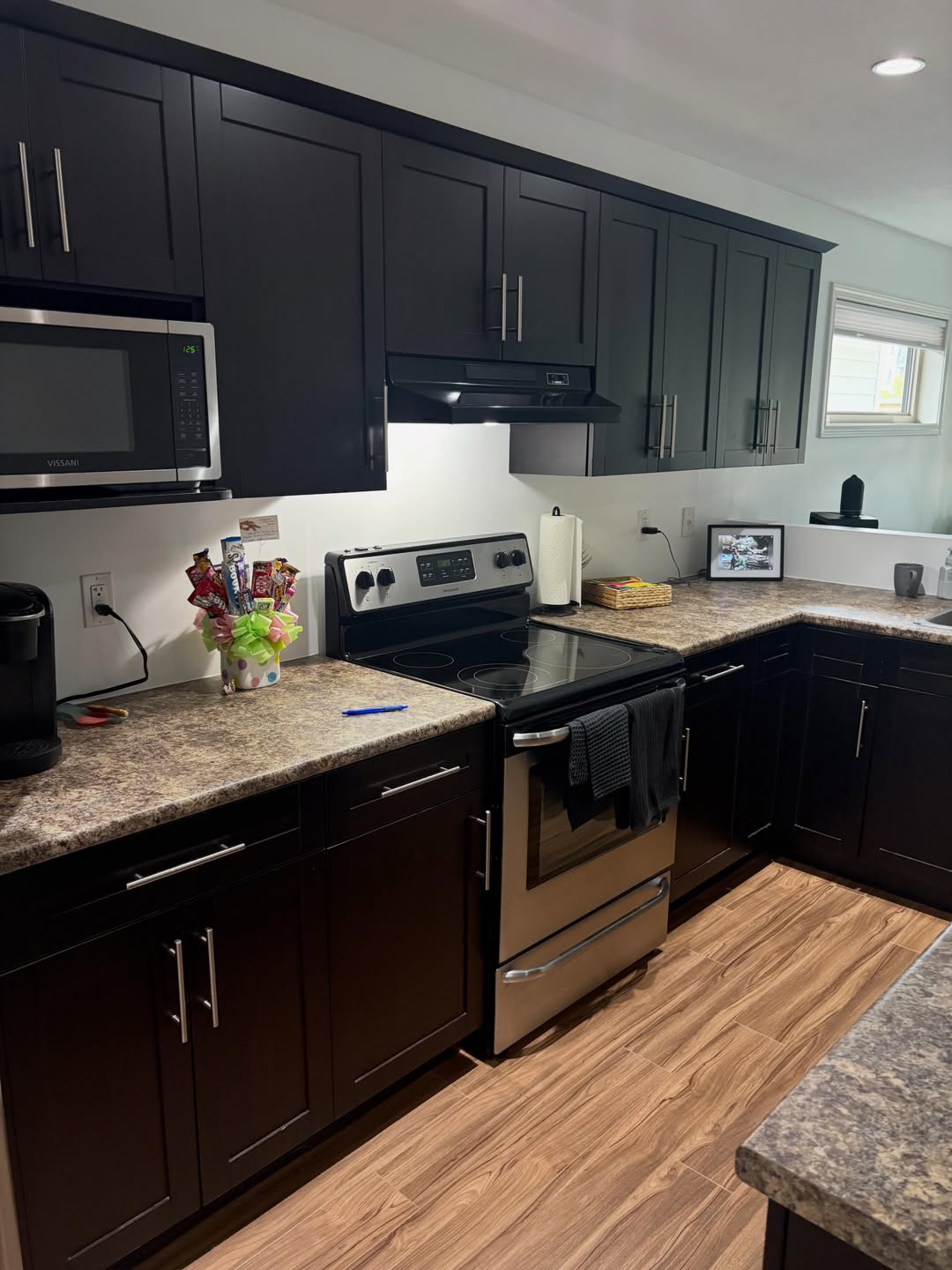
Look at the top-right of the frame. That little slice up by the ceiling? That’s the only natural light the kitchen gets. It’s a code-required window more than it’s a window-window. A skylight would’ve helped, except you can’t add a skylight to a condo. Bigger bulbs was the next idea on her list. Spoiler: more bulbs weren’t going to fix this either.
Three dark layers in one narrow galley
Here’s the thing nobody tells you about dark kitchens. One dark element is fine. Even two can work if the room is big enough to breathe. But stack dark espresso cabinets with warm busy granite and a black range hood inside a narrow galley with a half-window, and it stops being a design choice. It becomes a cave that happens to have a stove in it.
Why a dark cabinet eats your lights
She’d been thinking about this wrong, and the fix matters for anyone in a dim kitchen. Your cabinets take up more visual surface than anything else in the room. More than the walls, more than the floor. If they absorb light instead of bouncing it back, the lights have nothing to work with.
You can keep adding brighter bulbs or another recessed can, but the light still dies the second it hits the wood. Flip those cabinets to a reflective surface and the lights you already own start doing their job.
The paint color that did the real work
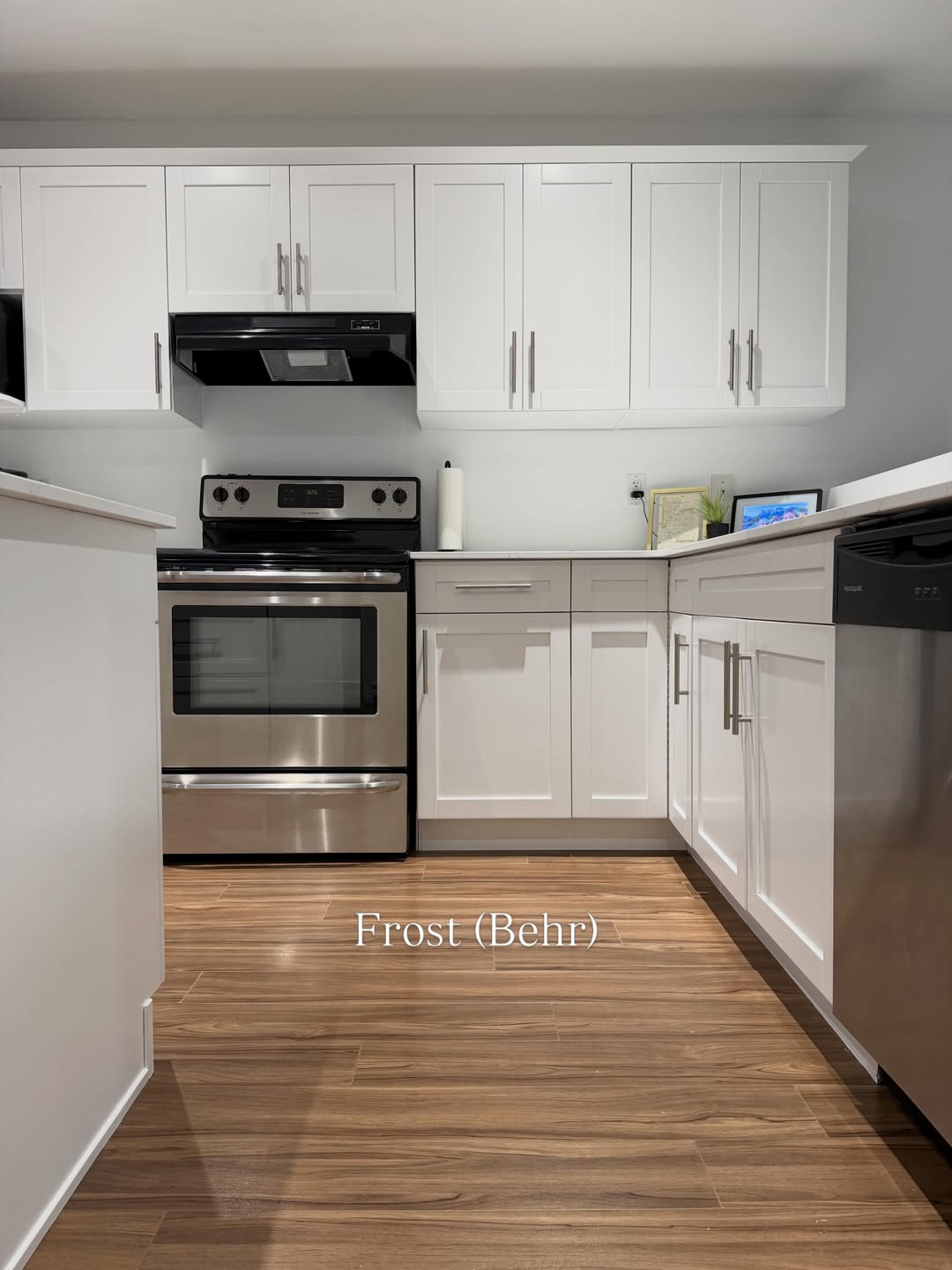
Behr Frost, laid down with the Sherwin Williams Gallery Series cabinet line. Not an off-white, not a creamy white. A cool, crisp, almost-blue-leaning white that stays true under warm bulbs instead of yellowing out. The cabinet boxes stayed put. The shaker doors stayed. The brushed nickel pulls stayed. The only things that actually changed were the color and a new white quartz counter to replace the brown granite.
Same stove wall, both kitchens
Same stove, same hood, same window up top. Only the cabinets and the counter changed.
The one dark thing they kept on purpose
Here’s a small detail that matters. Look at the hood. It’s still black.
The client wanted it gone. Her painter talked her out of it, and that was the right call. Pulling a range hood means dropping ceilings, patching vent lines, buying a new unit, probably chasing a permit. All of that work to erase one dark anchor from a room that was about to be close to all white anyway. Against a wall of Behr Frost cabinets, the black hood doesn’t read as a mood killer. It reads as a deliberate contrast. A punctuation mark.
Where the ghost chairs make sense now
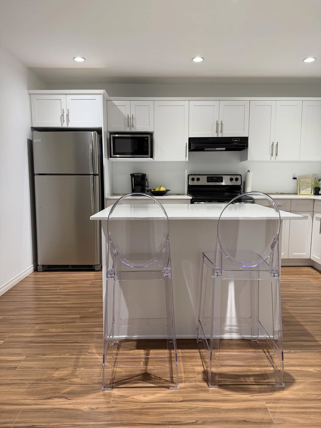
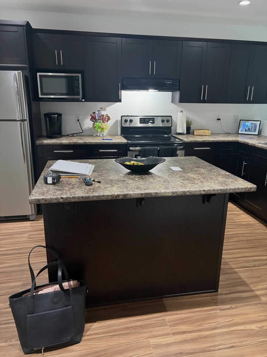
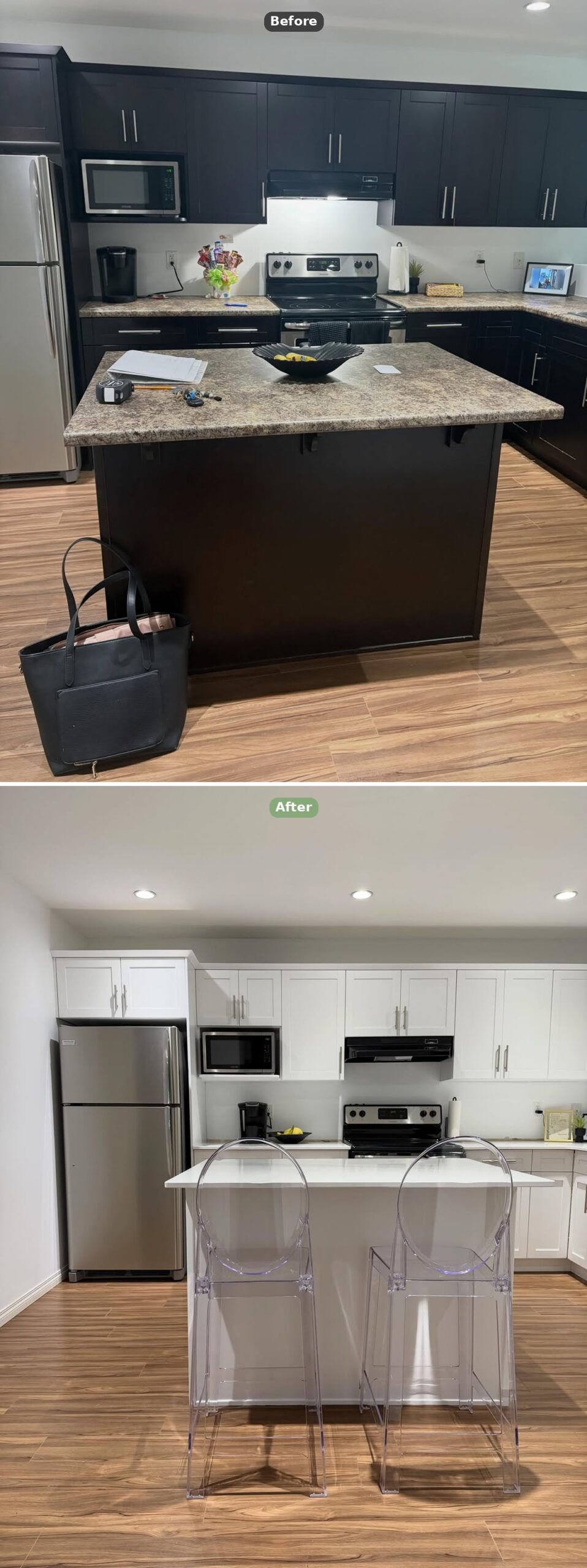
The clear acrylic chairs were always at the island. In the before shots you barely notice them because there’s too much visual noise to pick them out. In the after, they finally get to do what ghost chairs are supposed to do: take up zero visual space and let the island read as the hero of the room.
Same kitchen from the entry, before and after
Same island footprint, same back wall, same appliances tucked in the same spots. The whole room just started breathing.
Walking in for the first time after
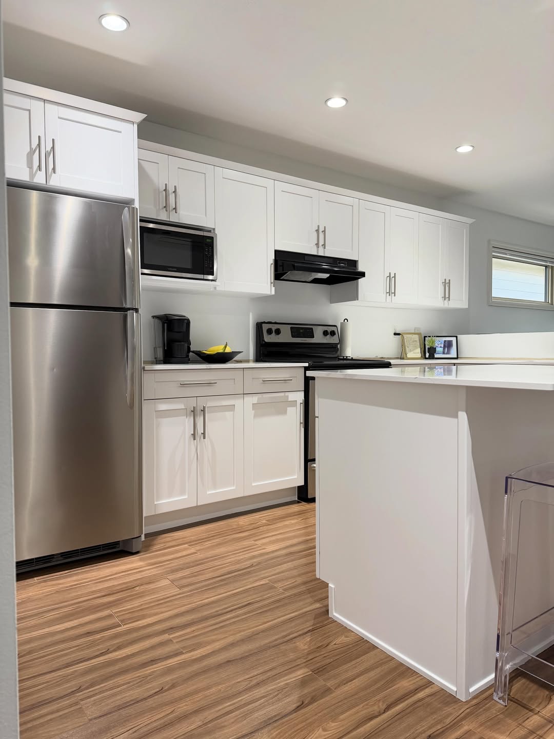
Nothing about the kitchen’s footprint moved. Same narrow galley, same small window, same wood-look floors underfoot. But stepping in, it reads nearly twice as big. The ceiling feels taller because the uppers blend into the wall instead of chopping the room in half horizontally.
The recessed lights finally have surfaces to bounce off. That one sliver of a window up top? It’s actually contributing now.
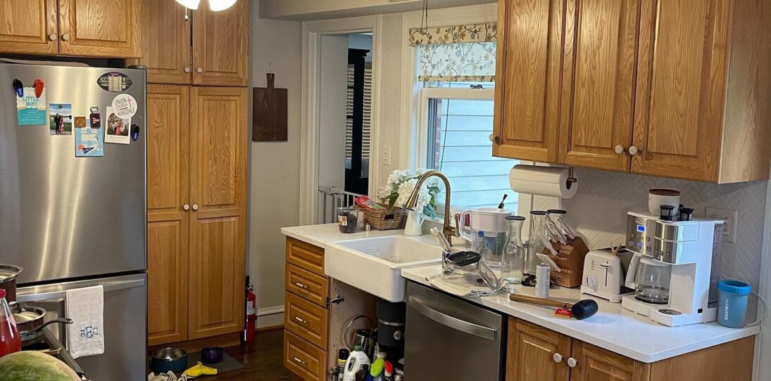
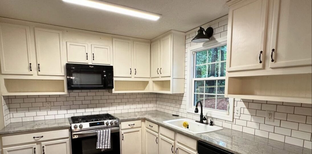
The far side of the kitchen finally shows up
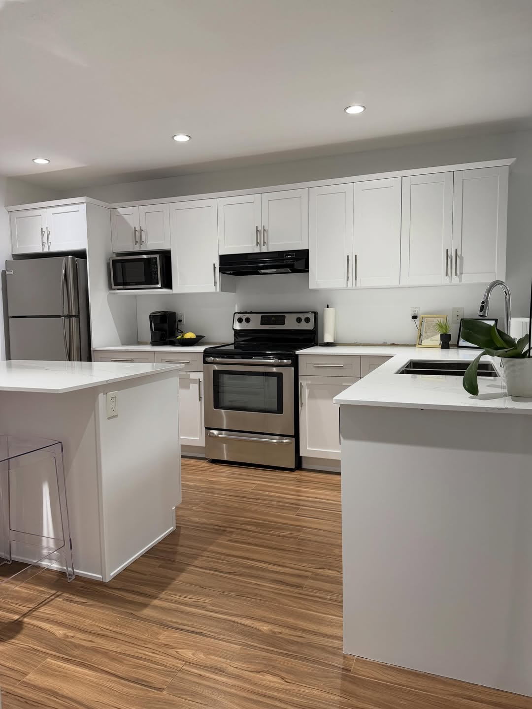
From the sink end, you can finally see the whole room at once. Before, the two ends of the kitchen felt like separate little rooms because the dark cabinets swallowed the space in between. Now there’s one continuous bright surface running from the fridge all the way around to the sink, with the quartz tossing whatever daylight sneaks in back up at the ceiling.
Here’s what makes a kitchen look custom: not fancy materials. Half the showrooms you’ve walked through use the exact same shaker doors and brushed nickel pulls. The custom feel comes from every surface agreeing on one story. Before, this room had three stories arguing. After, it tells one, and that’s the whole trick.
If your own kitchen feels like a cave
Stop blaming the window. Really. The window matters less than you think.
Look at your cabinets instead. If they’re dark wood, dark stain, or anything that soaks up light instead of reflecting it, that’s your actual problem. Paint them Behr Frost or any cool crisp white with no yellow undertone. If your counters are busy and warm toned, trade them for something quiet and cool. Even laminate works if you want to test the idea on a budget before the quartz goes in.
You’ll be shocked at how much daylight your kitchen was getting all along. You just couldn’t see it bouncing around.